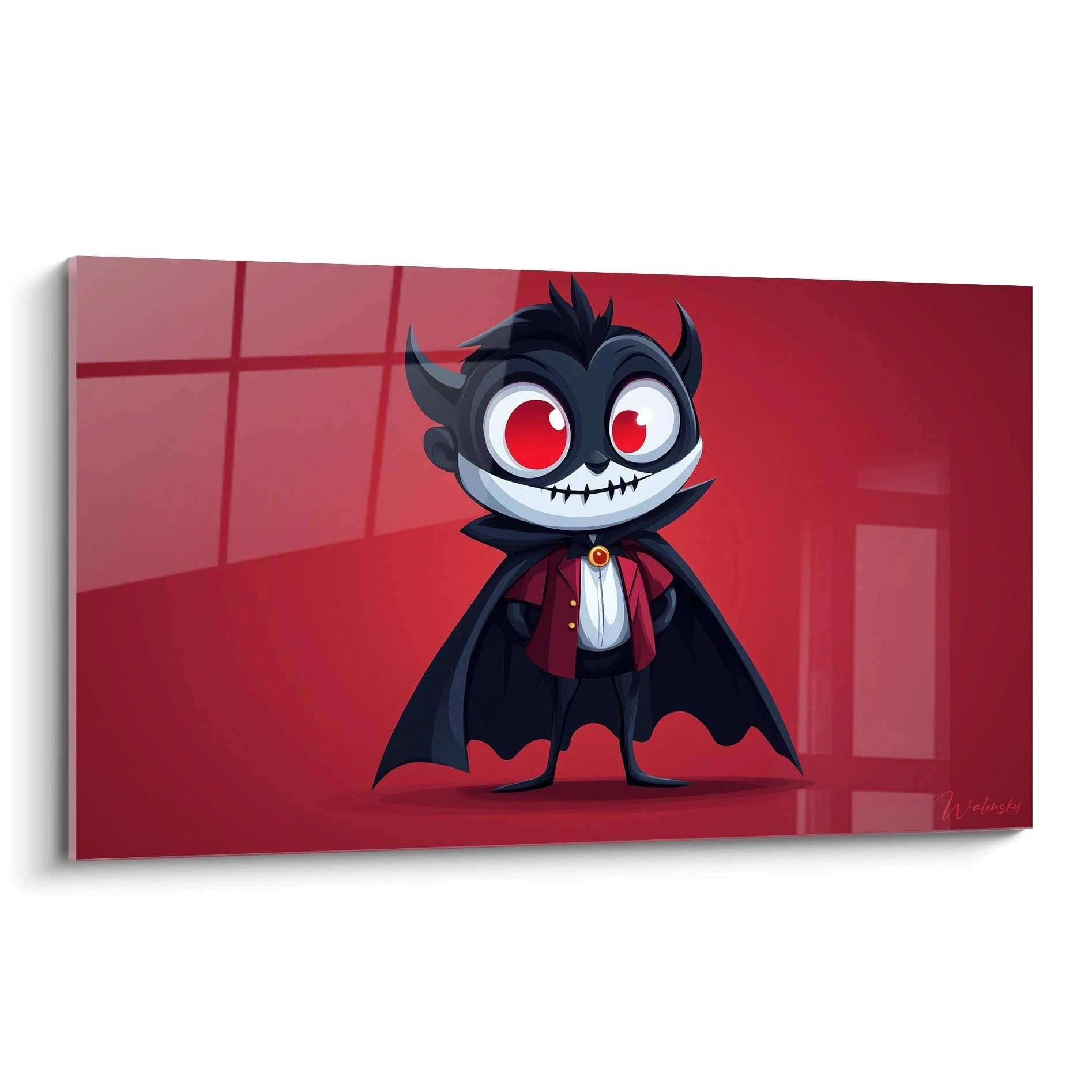
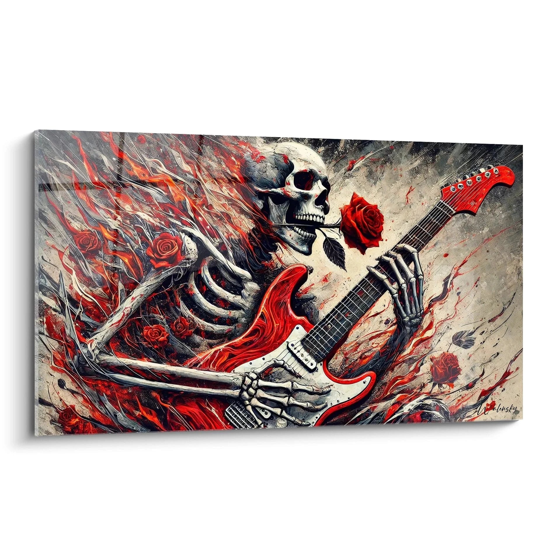
Why does red art capture the eye?
Why does red wall art capture the eye?
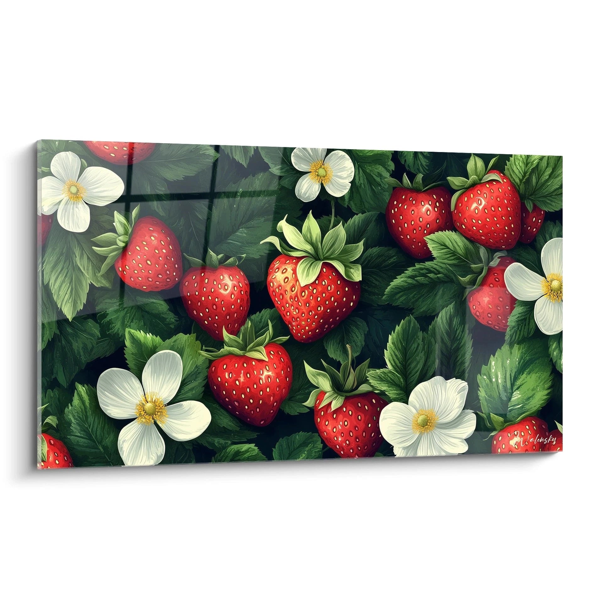
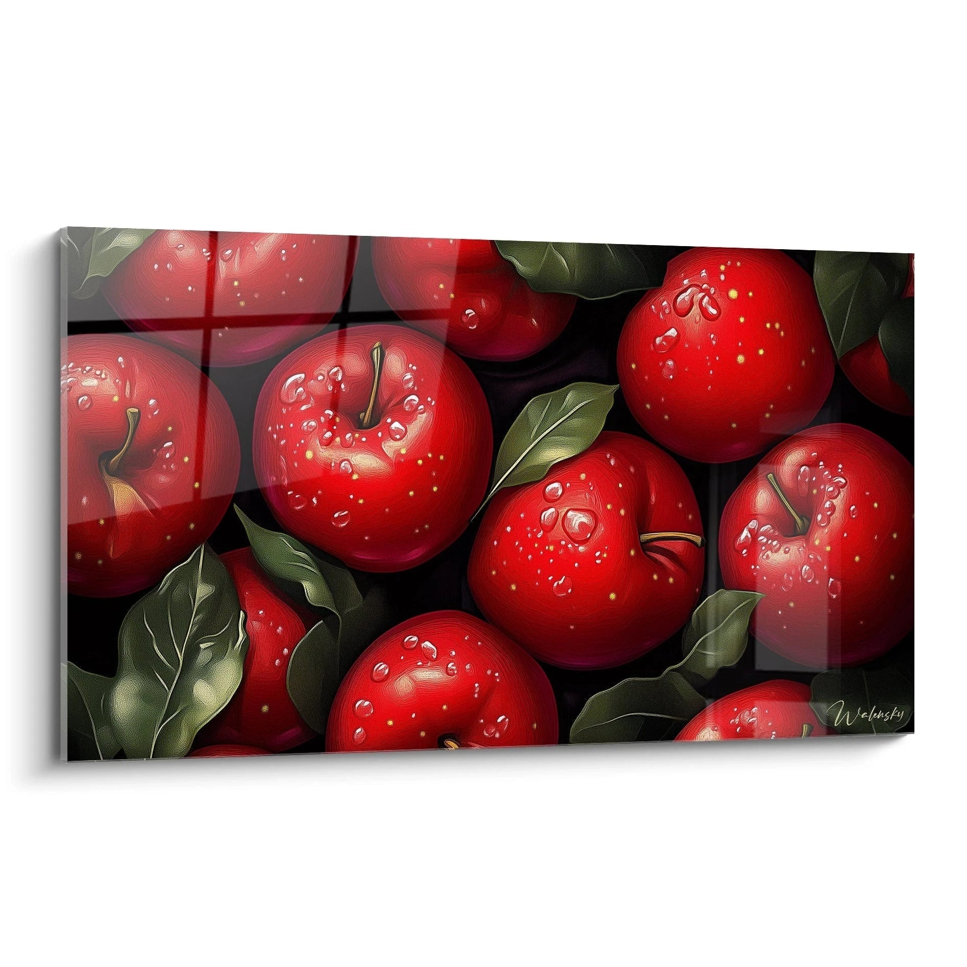
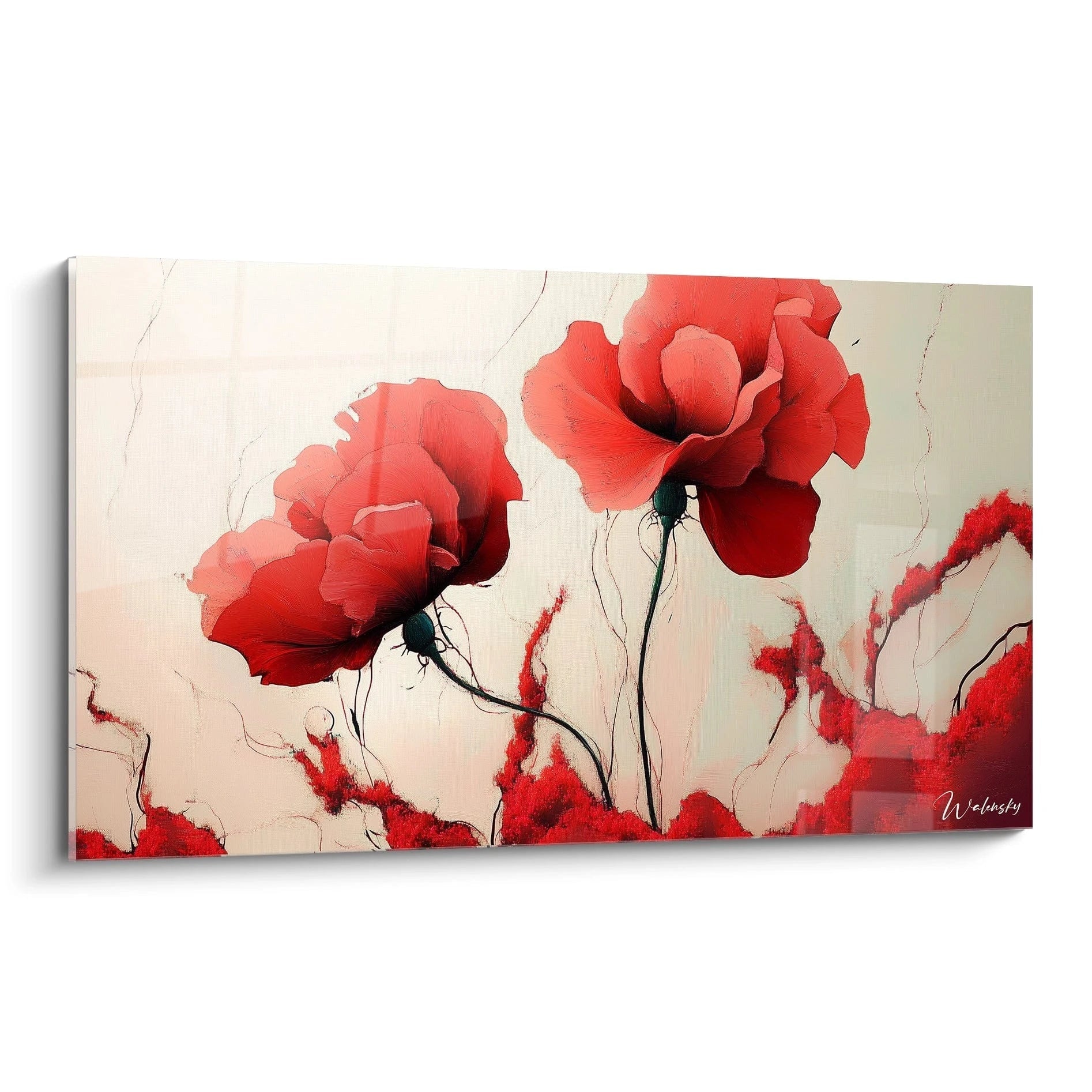
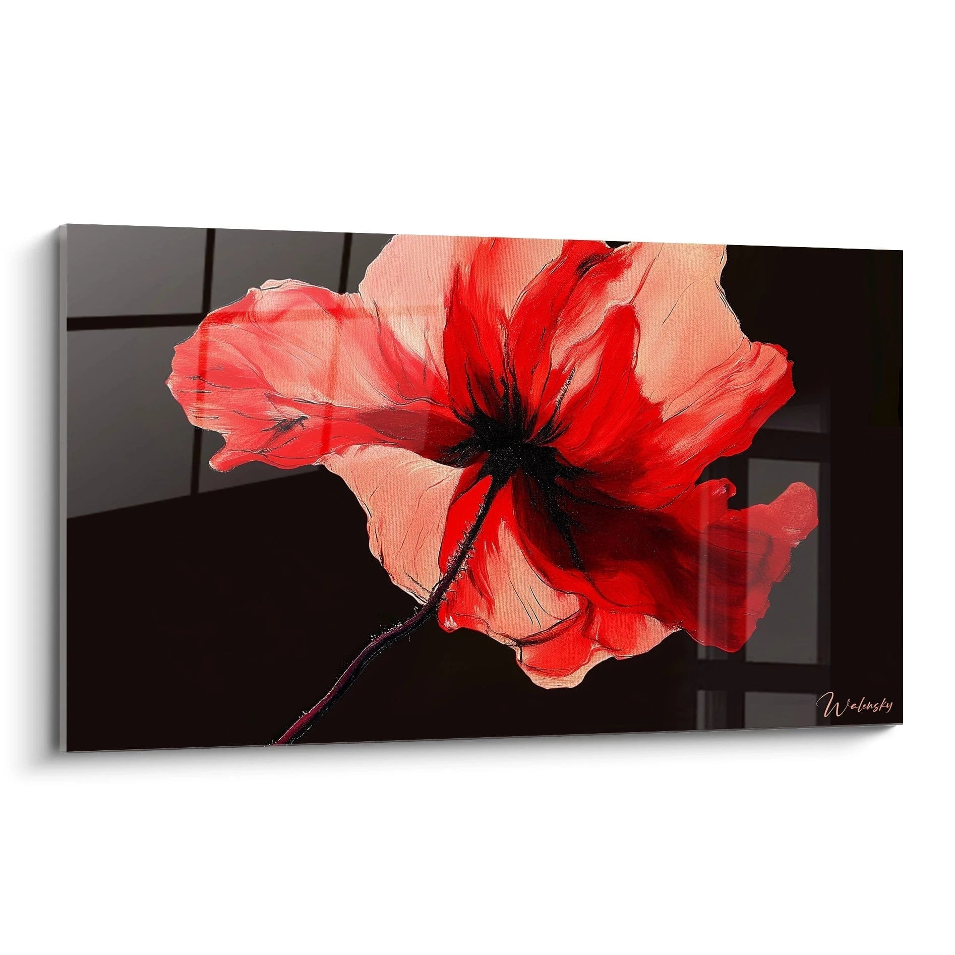
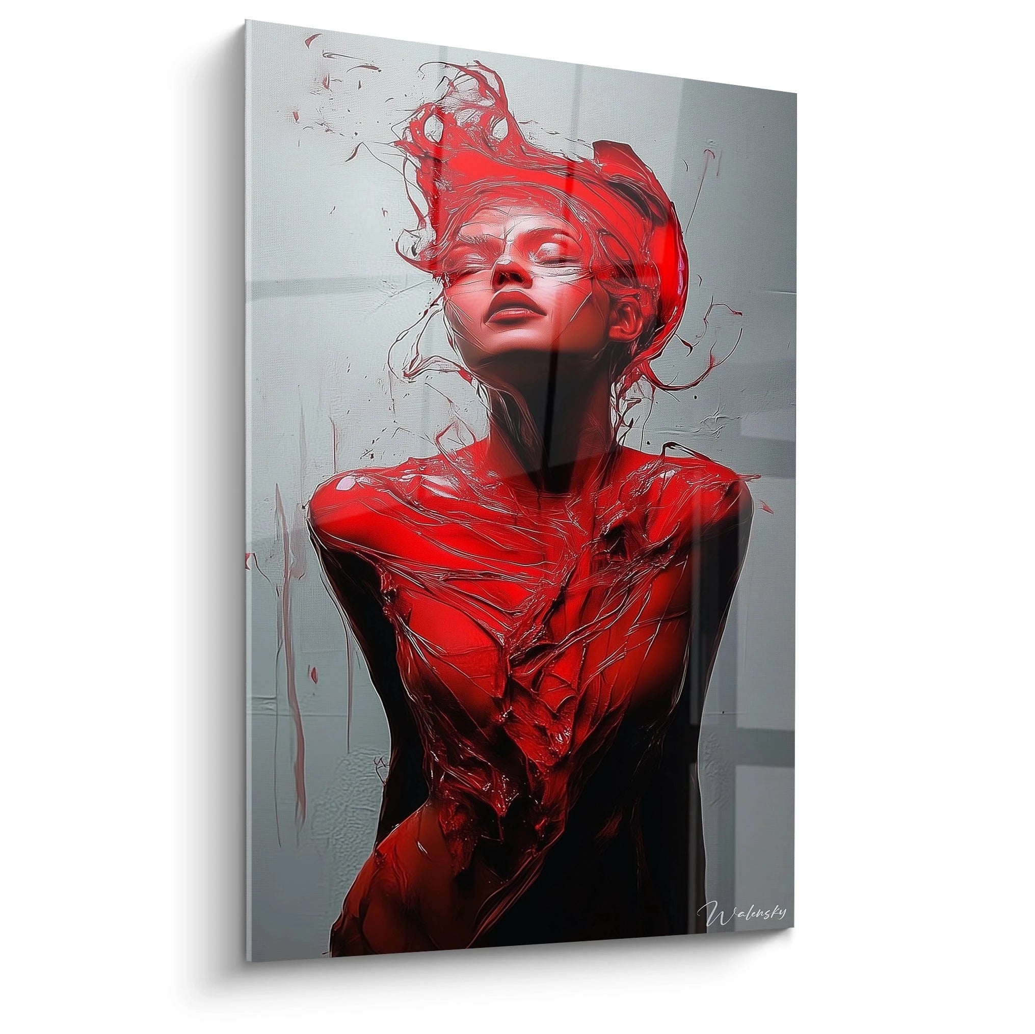
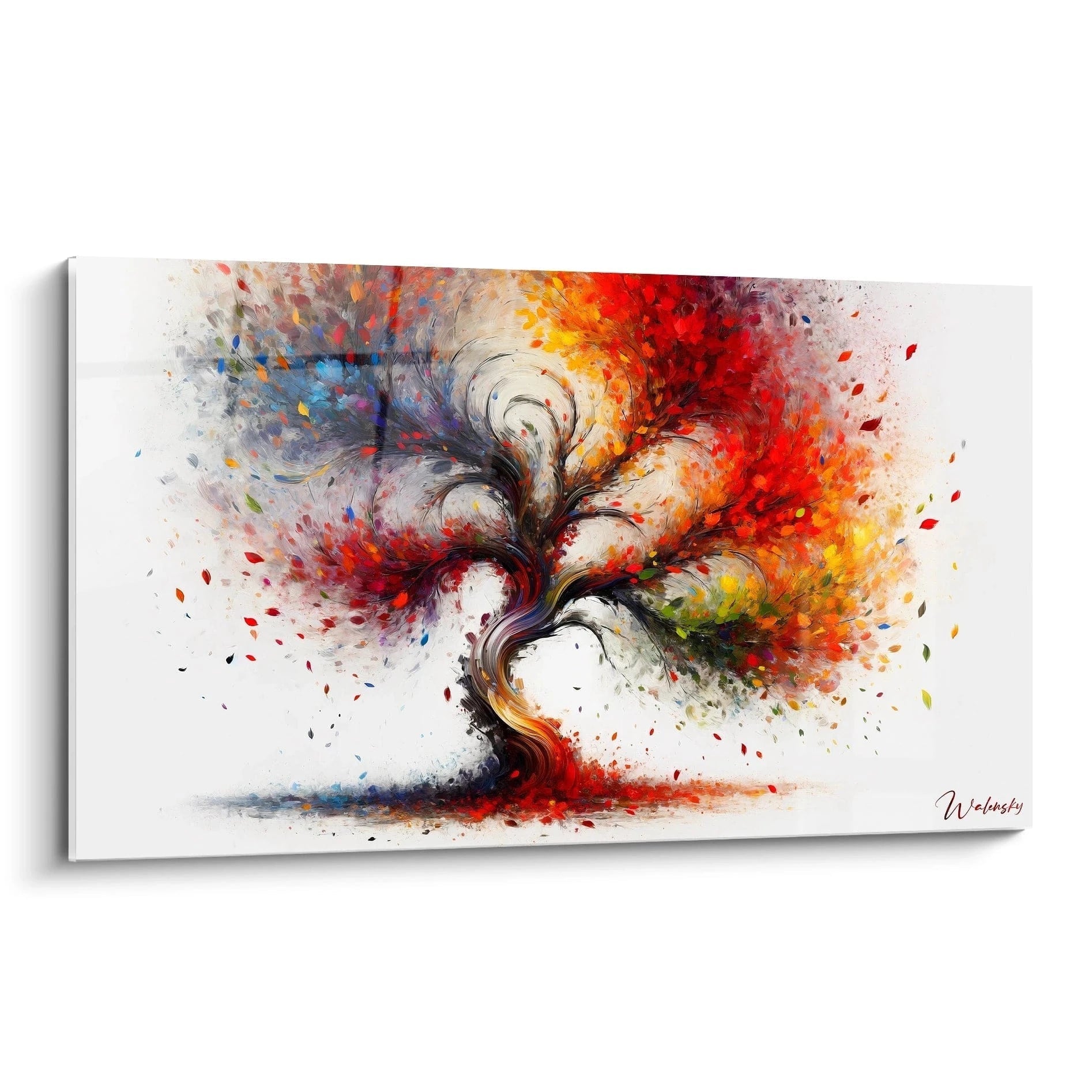
A red artwork is a piece of art that instantly captures attention, becoming a true focal point in any space. This color, both powerful and vibrant, possesses an exceptional chromatic intensity that makes it difficult to ignore. Due to its high wavelength, red is perceived more quickly by the human eye, creating an immediate contrast effect with its surroundings. Whether on a red canvas or in an artistic composition, red dominates the space, attracting and holding the gaze. It is a shade that evokes strong emotions and leaves a lasting impression, making each red artwork a masterpiece in red wall decoration.
The psychological influence of red wall art
Red exerts a powerful psychological influence, capable of stimulating deep emotional reactions. A red artwork can evoke passion, love, but also urgency and energy. This color activates areas of the brain linked to vigilance and excitement, thus increasing heart rate and the intensity of emotions felt. In a decorative setting, a red art piece can instill a sensation of warmth and dynamism. It not only attracts the eye, but also influences the mood of those who observe it. For example, a red frame in an office can stimulate creativity, while a red painting in a living room creates a vibrant and welcoming atmosphere.
Red as a symbol of passion and energy in wall art
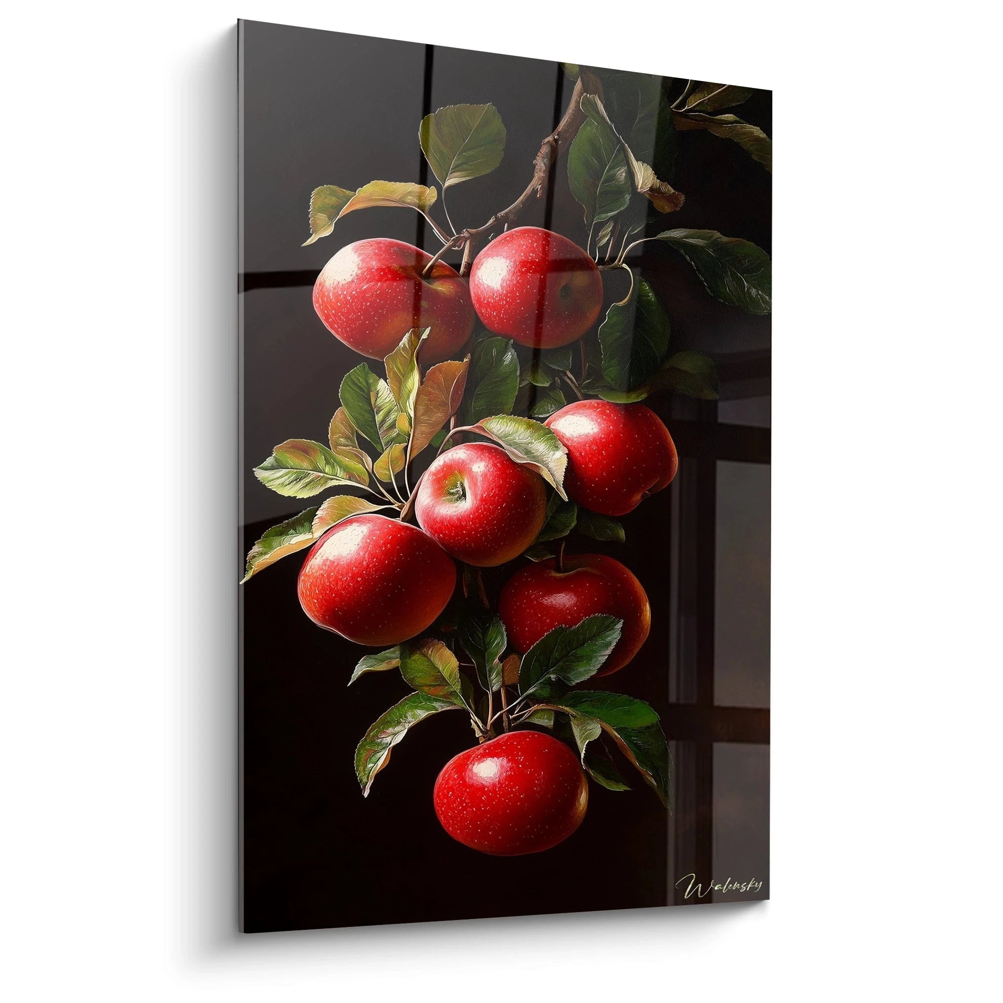
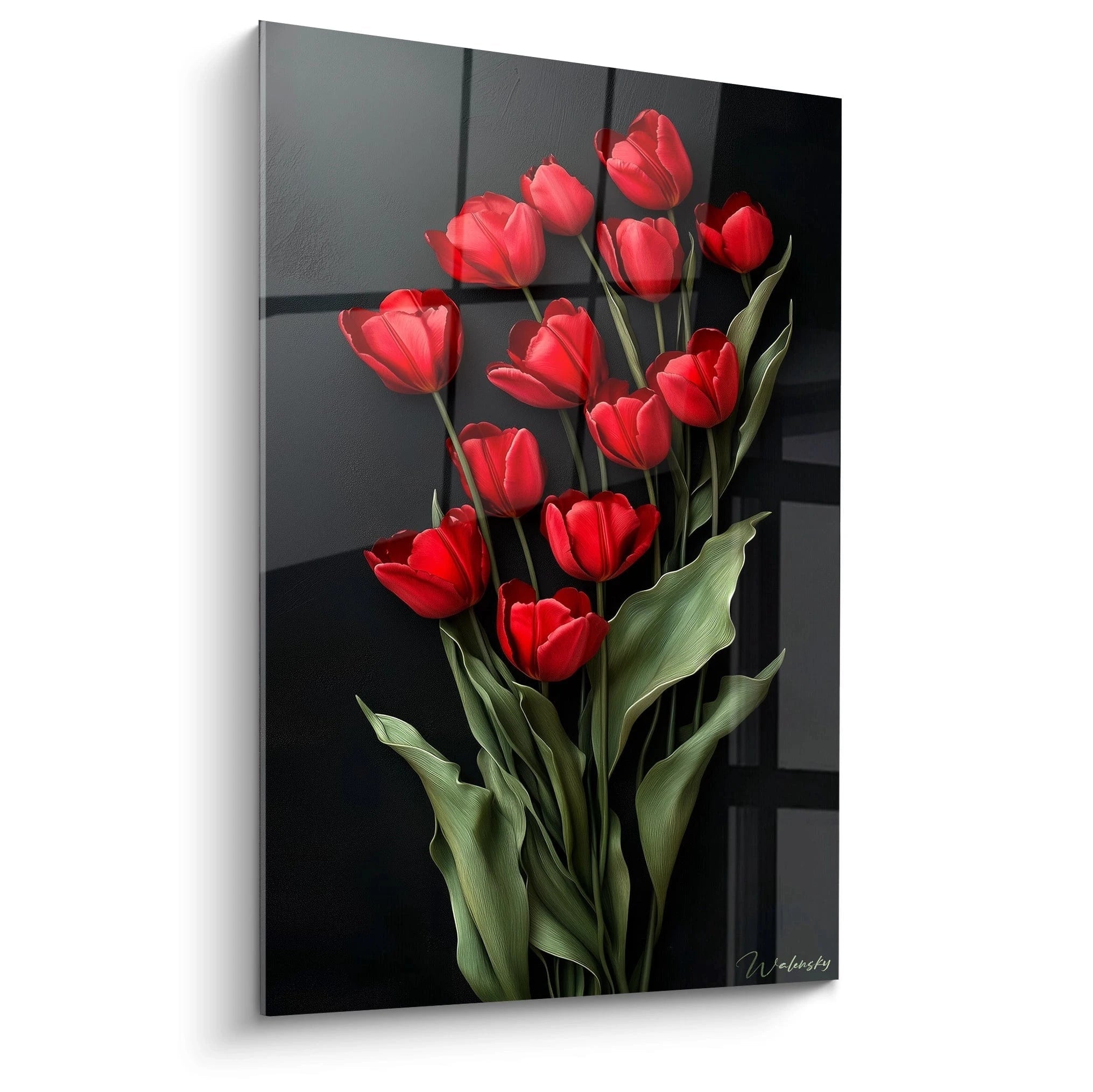
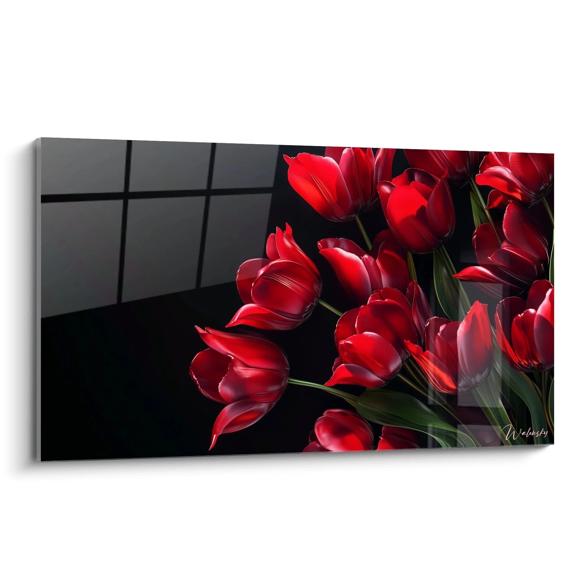
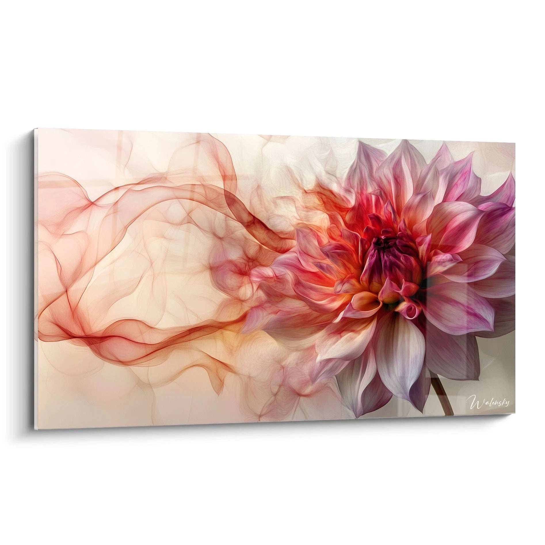
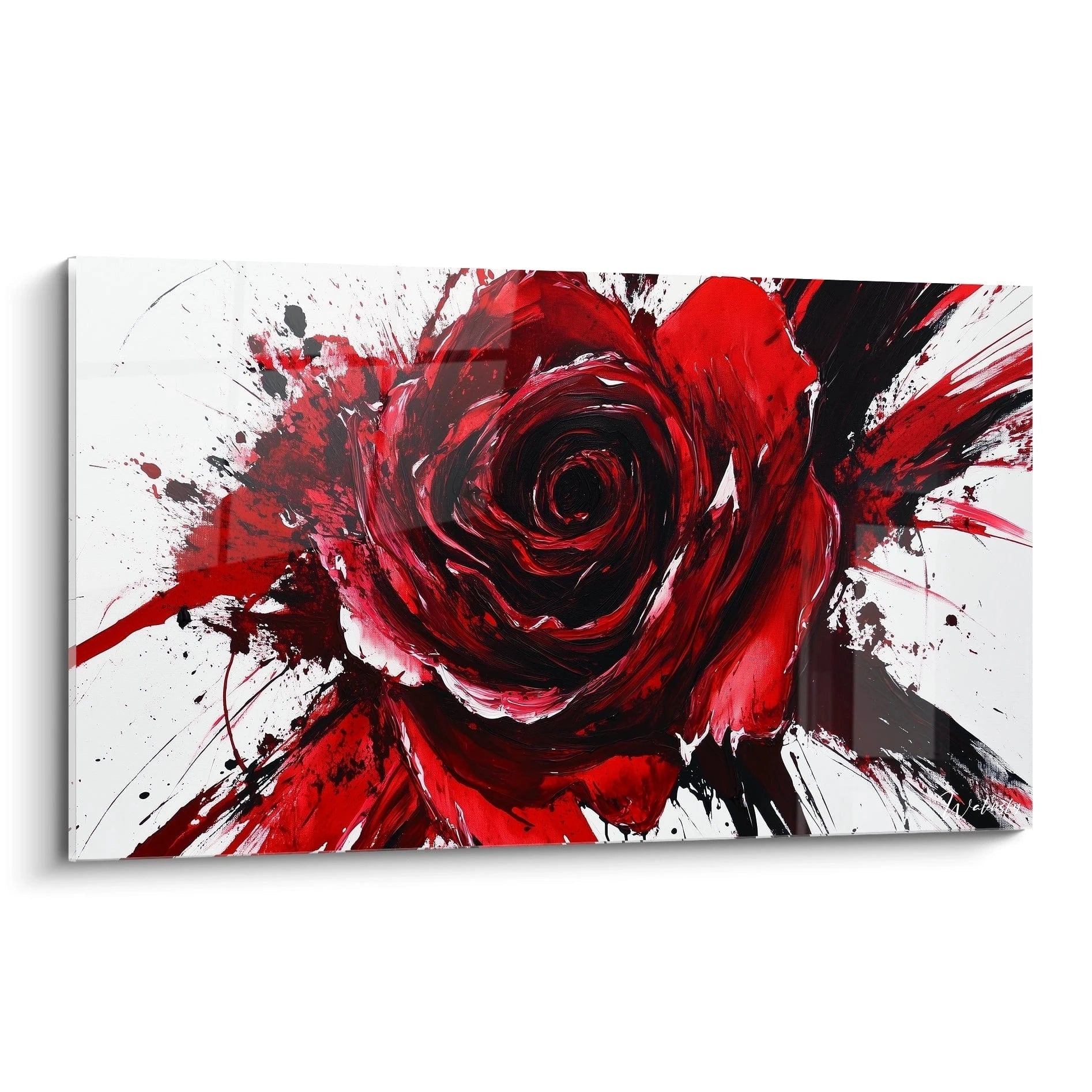
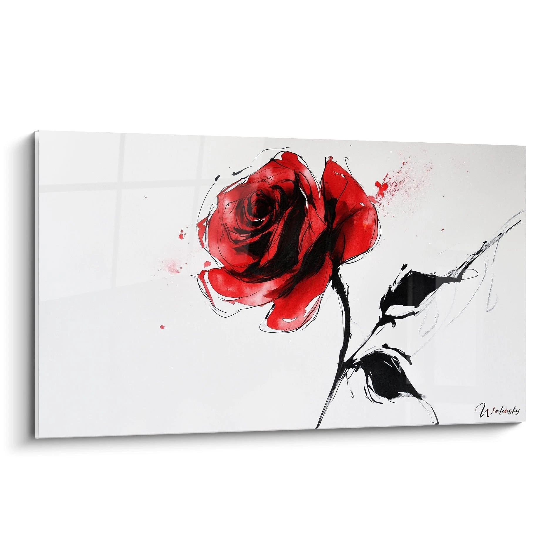
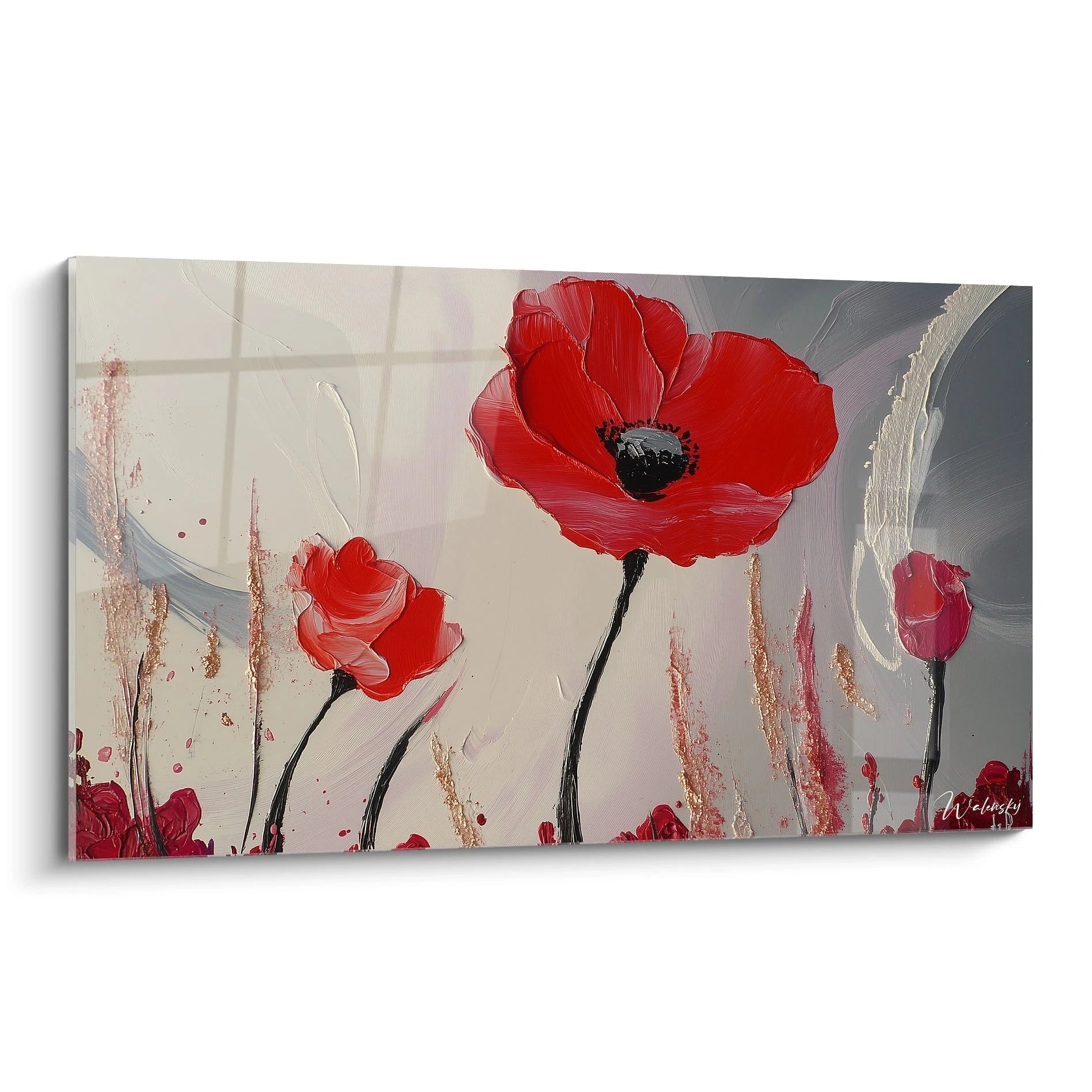
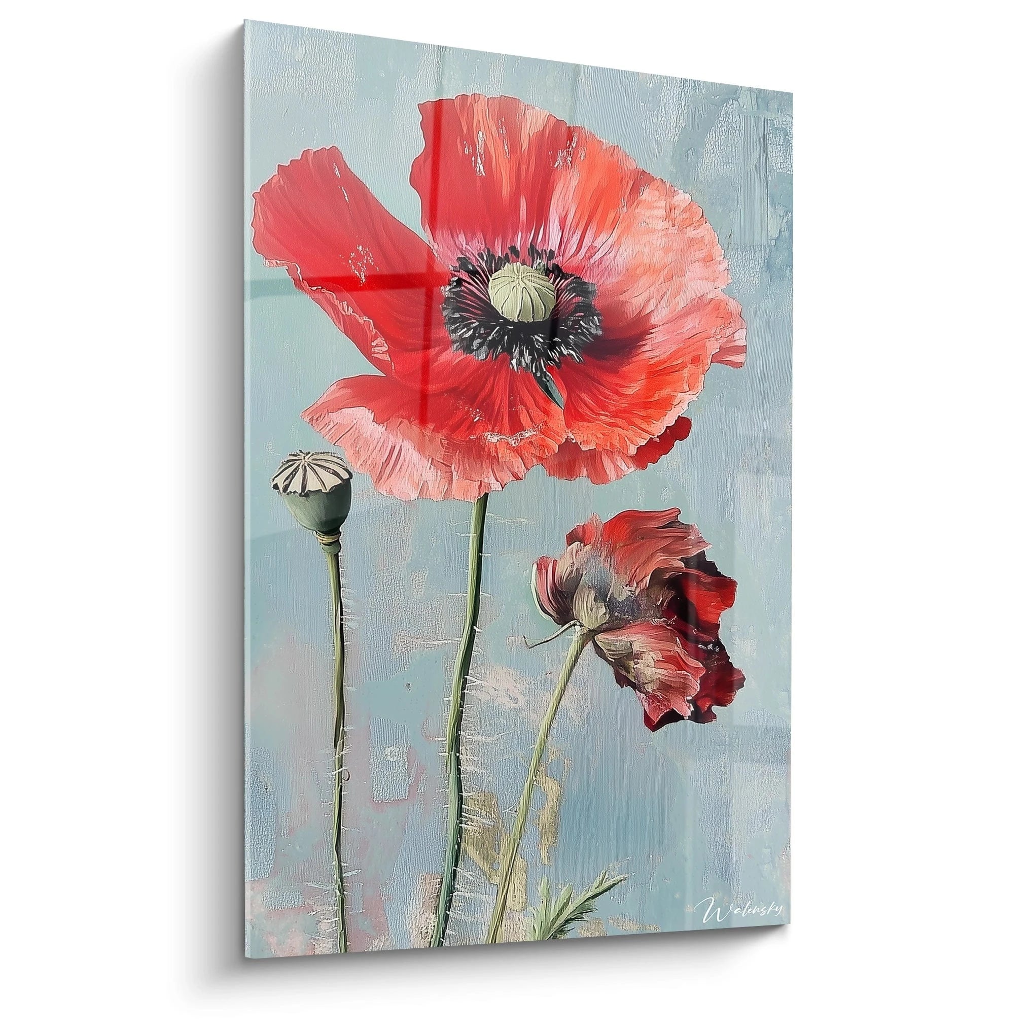
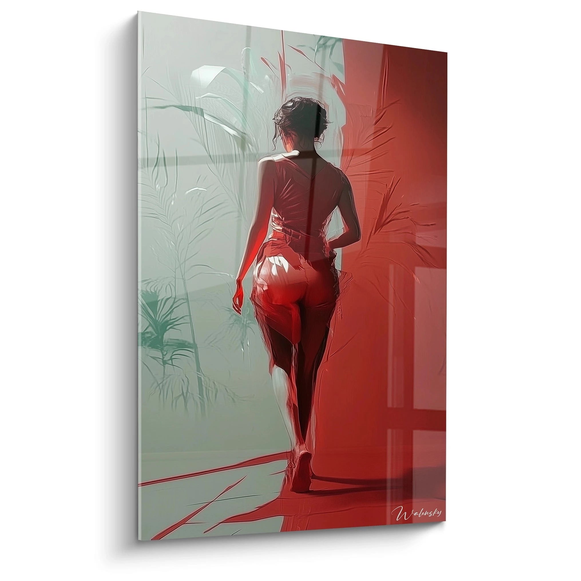
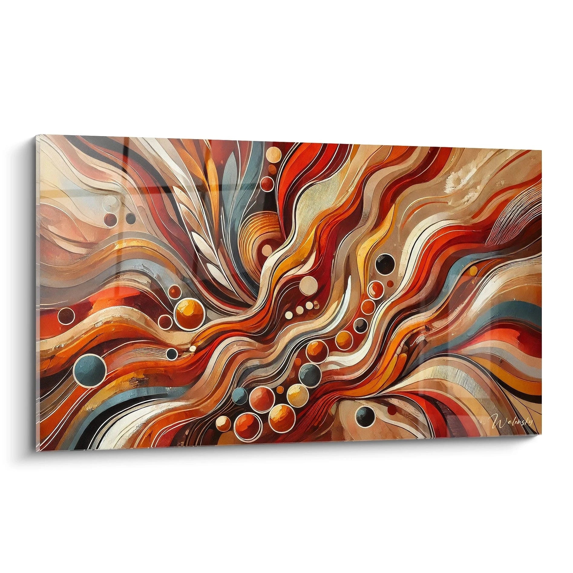
For millennia, red has been the universal symbol of passion and energy. A red abstract artwork expresses intense emotions, oscillating between ardent love and raw power. This color is often associated with fire, blood, and life itself, thus creating an instinctive connection with our deepest feelings. In a contemporary red artwork, red can represent inner strength, determination, and vitality. Shades such as crimson red, burgundy, or vermillion enrich this symbolism by bringing variations in intensity, each evoking specific atmospheres. Whether for a red poster or red wall art, red imparts incomparable energy to the space it occupies.
The effect of red on space perception
Red has the power to modify space perception. When integrated into a red artwork, it can create the impression that objects are closer, thus creating a more intimate atmosphere. This ability to "advance" visually in a room makes it a preferred choice for interior designers wishing to structure a space. A wall decorated with a red design artwork can warm a room, making it more welcoming and dynamic. Furthermore, the use of red gradients allows for playing with perspectives, giving depth to the environment. A well-placed red artwork can transform a neutral space into a vibrant location full of character.
The artistic contrast of red with neutral tones
Red reaches its peak when contrasted with neutral tones such as white, gray, or black. A red artwork on a light wall creates a striking artistic contrast, highlighting every detail of the work. This contrast allows for emphasizing the aesthetic impact of red, accentuating its vibrancy and depth. For example, a minimalist red frame on a white background immediately captures attention, becoming the focal point of the room. This play of oppositions also allows for creating a subtle color harmony, where the balance between boldness and sobriety is perfectly mastered. The addition of varying red shades, such as burgundy or scarlet, further enriches the visual composition.
Bright red vs deep red: which impact to choose?
The choice between bright red and deep red in a red artwork depends on the desired effect. A bright, vibrant, and saturated red is synonymous with bold style and visual dynamism. It instantly attracts attention, perfect for modern spaces or environments where one wishes to create a strong aesthetic impact. Conversely, a deep red, such as burgundy or crimson, offers a more sophisticated and warm atmosphere. It evokes elegance, reflection, and emotional depth. In a contemporary red artwork, the use of different red shades allows for playing with contrasts and bringing additional visual richness. The balance between bright red and dark red can thus transform a work into a true sensory experience, captivating the observer through its complexity and beauty.
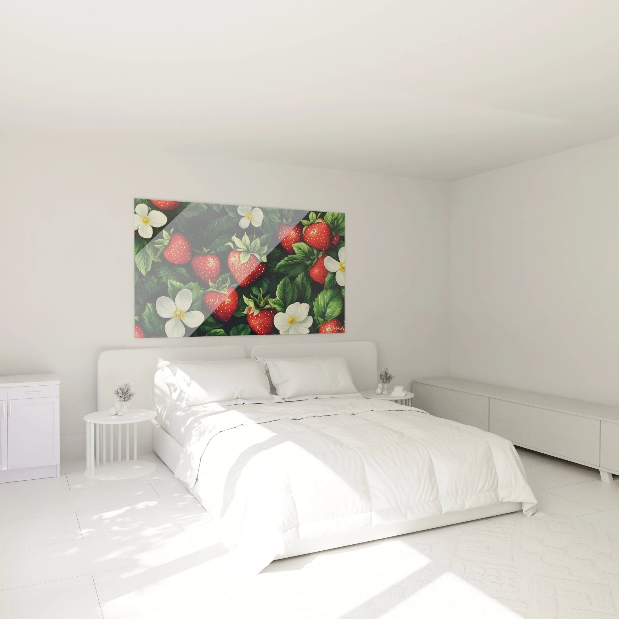
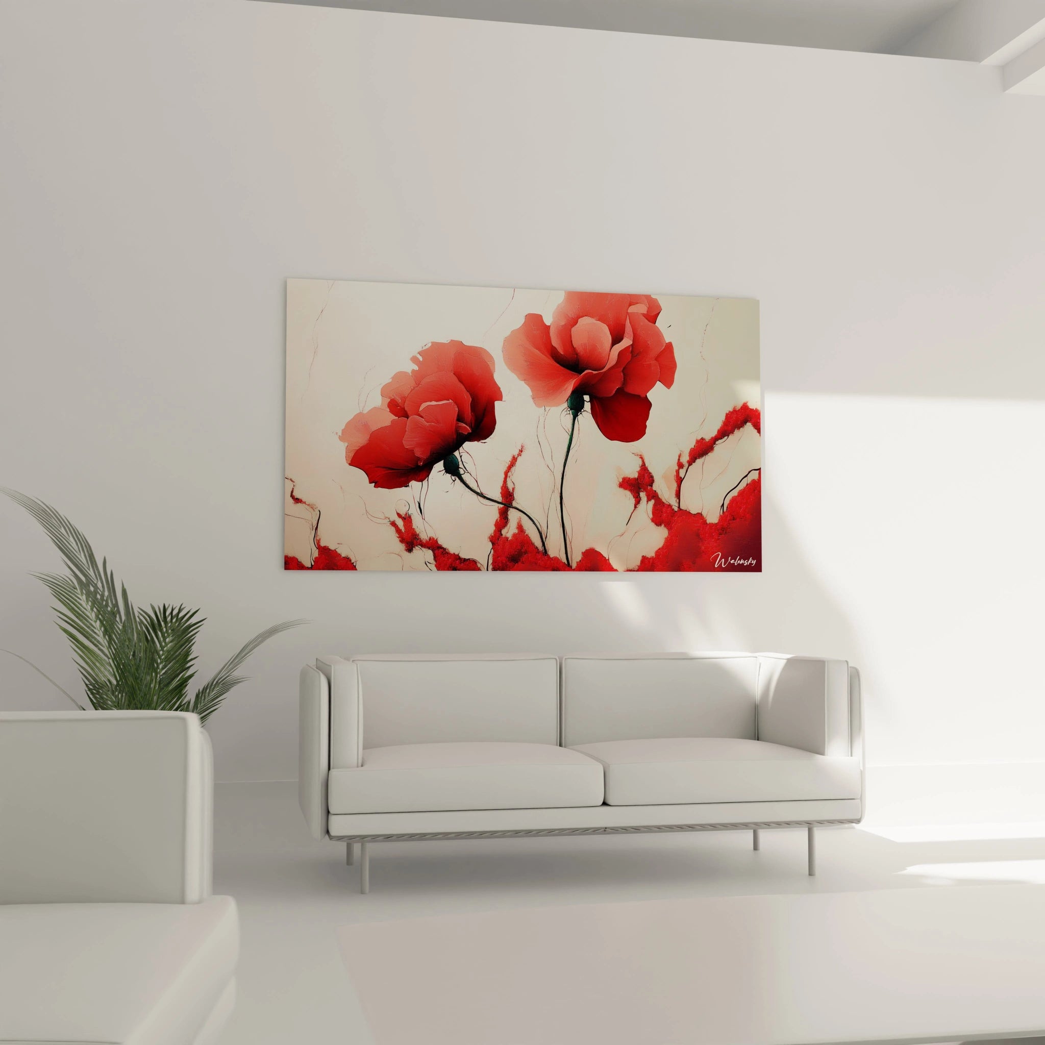
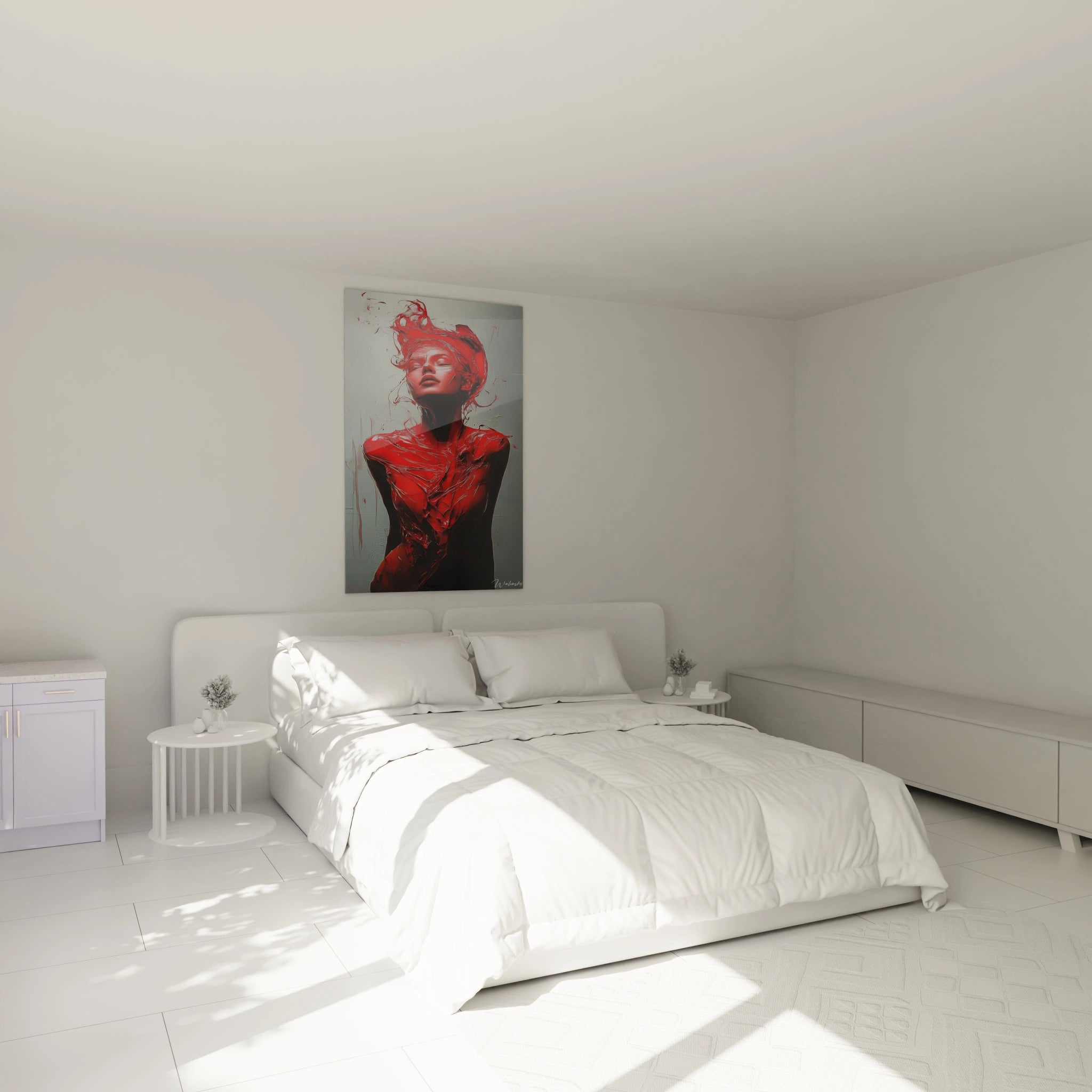
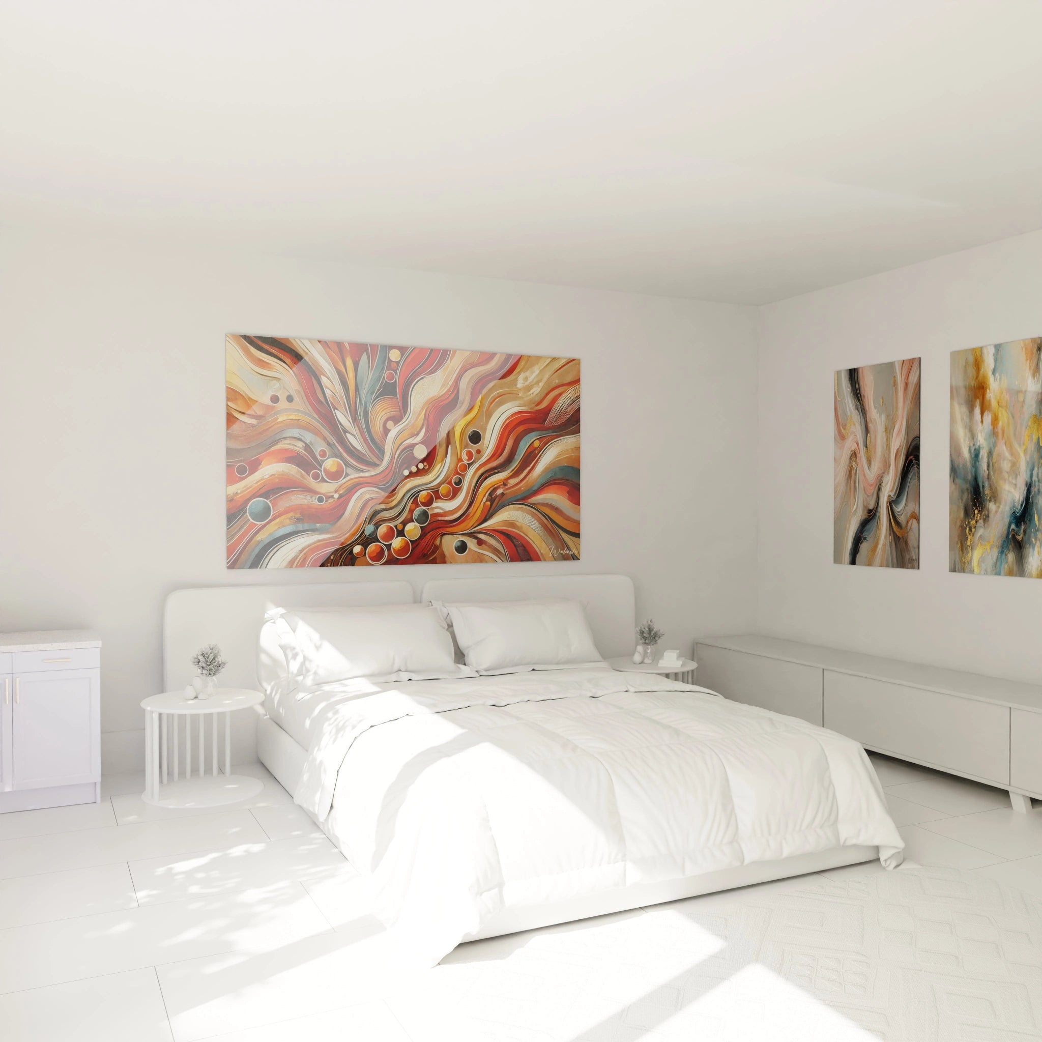
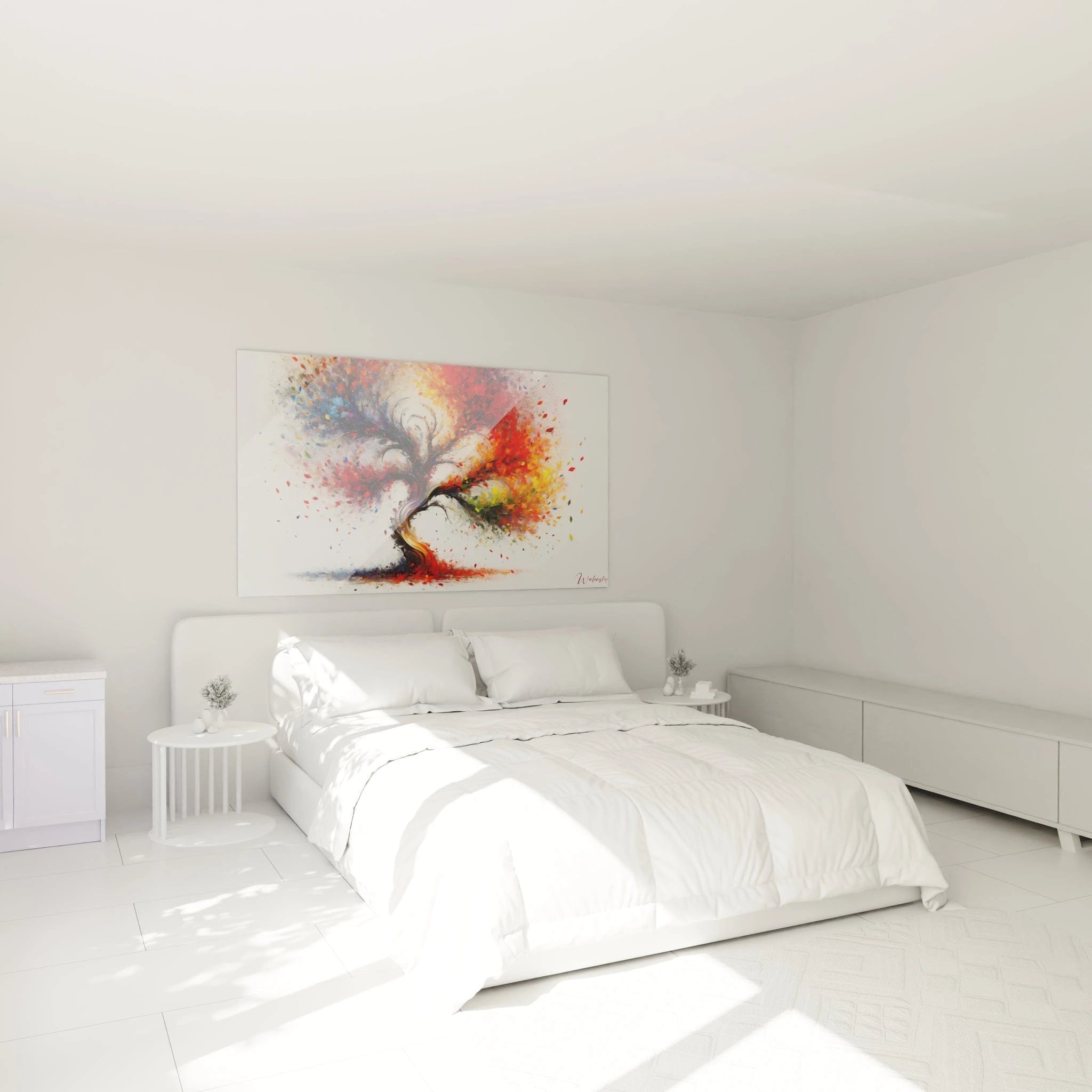
How to integrate a red artwork into a minimalist interior?
In a minimalist interior, each decorative element must be chosen with care to create a subtle balance between simplicity and personality. A
red artwork can transform a refined space into a vibrant location, thanks to its
aesthetic impact and
energetic tone. To take advantage of its visual power without compromising harmony, it is essential to adopt suitable approaches. Discover how to integrate a red artwork with style, optimizing every detail of your interior decoration.
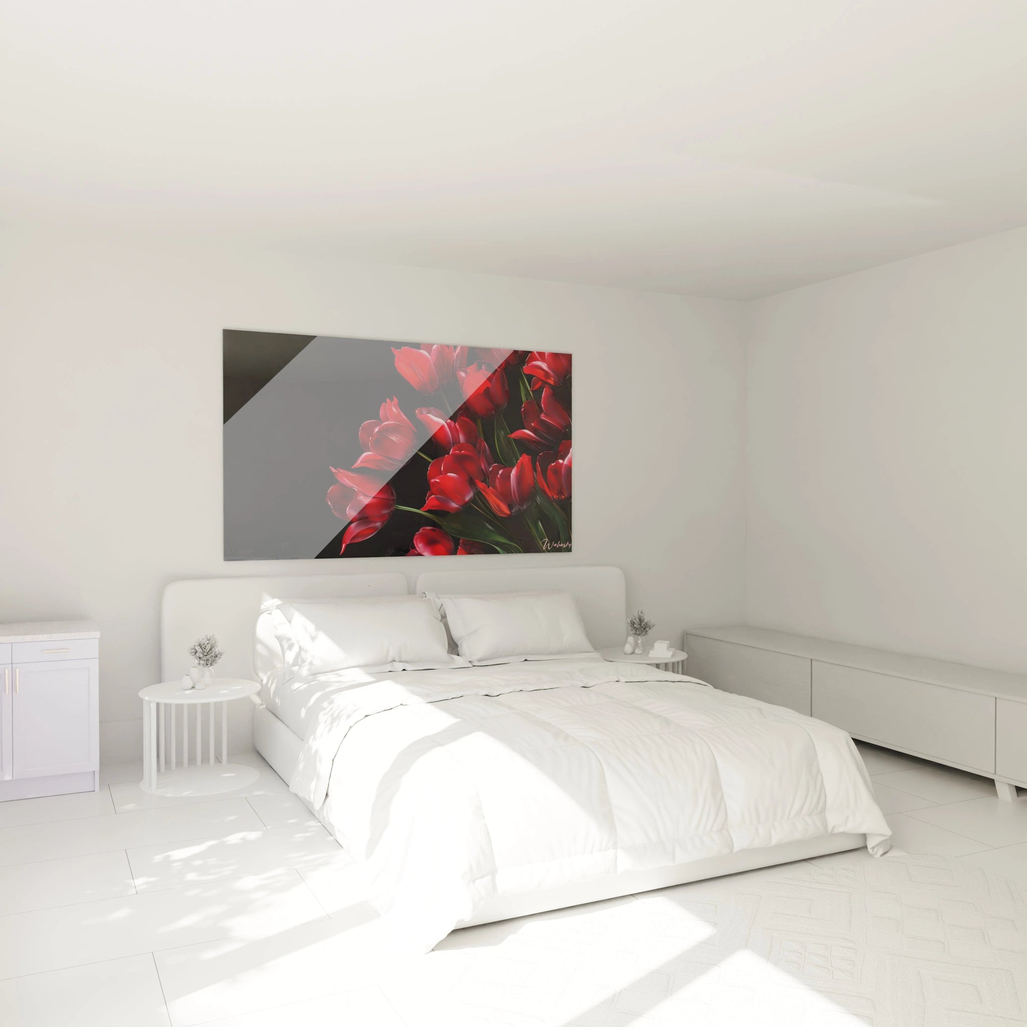
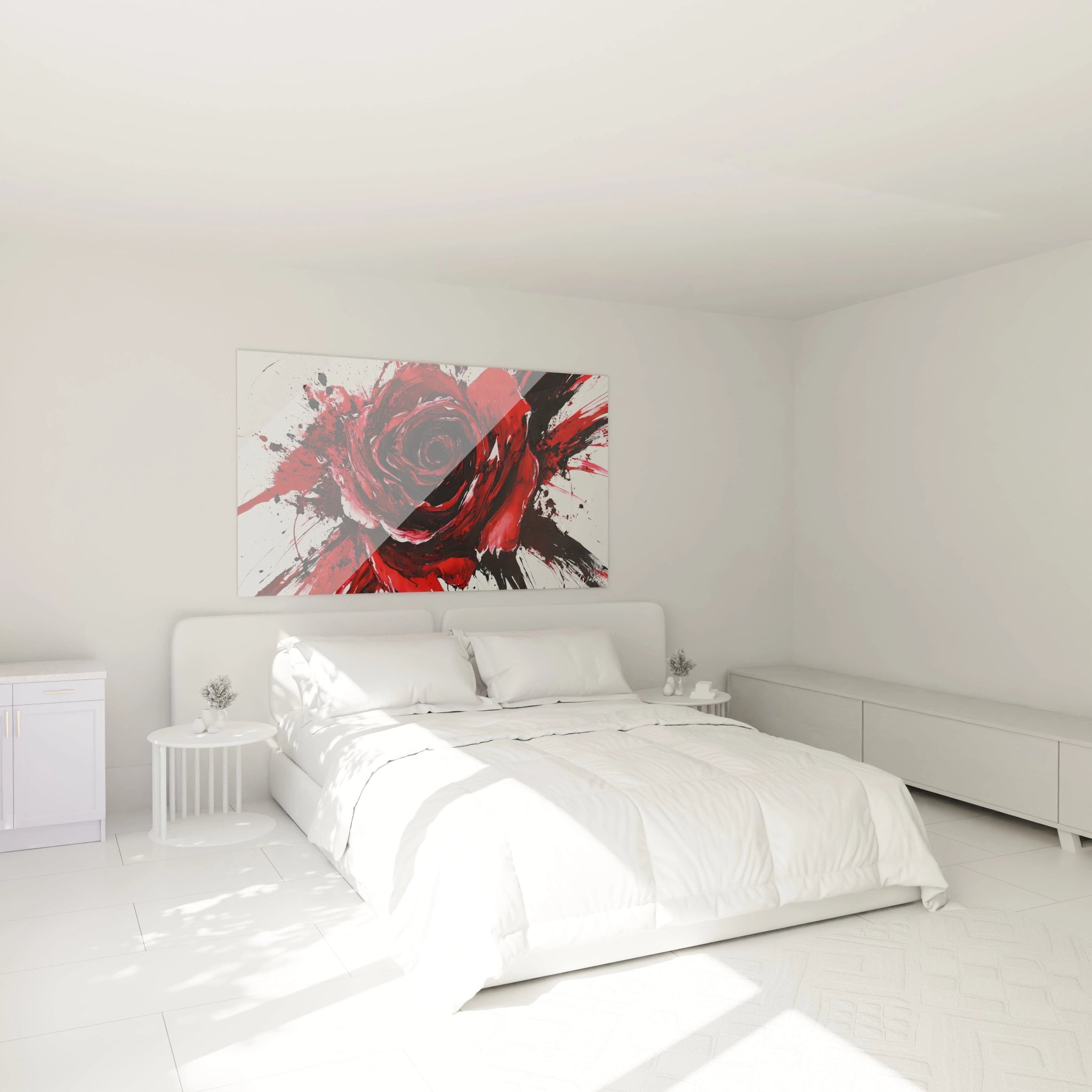
Create a focal point with red wall art
A
red artwork naturally attracts the gaze, making it an excellent choice for establishing a
focal point in a minimalist room. Placed on a white or light gray wall, it creates a
striking artistic contrast. Leave empty spaces around the work to reinforce its central role. For example, above a sleek sofa or in a bright corridor, a red artwork instantly captures attention, thus becoming the visual heart of the room. This approach highlights the
vibrant expression of the work without weighing down the atmosphere.
Harmonize red with sober palettes
Integrating a
red artwork into a minimalist interior is based on
color harmony. Combine it with neutral tones such as white, beige, pearl gray, or black to temper its intensity. These shades create a visual balance, highlighting the
red shade without saturating the space. An intense red such as
crimson red
or deep
burgundy pairs perfectly with natural materials and simple textures. For greater coherence, add small
color accents in decorative objects such as cushions or vases, as a discreet reminder of the artwork.
Choose refined frames and materials
Frame choice is crucial to enhance a
contemporary red artwork. Favor thin
red frames or black matte metal structures to maintain the purity of minimalist style. Materials such as light wood, brushed aluminum, or acrylic glass add a modern touch without diverting attention from the work. For an even more refined effect, opt for invisible mounts that give the illusion of a floating artwork. This approach highlights the
artistic brilliance of the piece while preserving the visual balance of the room.
The balance between simplicity and intensity
Integrating a
red artwork into a minimalist décor means finding the right balance between sobriety and boldness. Leave empty spaces to create
visual dynamism and avoid clutter. A single well-chosen piece is enough to transform the atmosphere of a room. To reinforce coherence, think of discreet reminders of red in complementary decoration elements, thus creating
color harmony without overloading the space. The contrast between the simplicity of furniture and the intensity of the work enhances the sensation of sophistication.
Tips for avoiding visual overload
In a minimalist interior, the key is to avoid visual overload. Limit yourself to a single
red wall art piece per room to preserve volume balance. Avoid accumulating decorations in bright colors that could compete with the artwork. Lighting plays an essential role: a spotlight directed at the work or well-directed natural light can enhance the
red gradients, from bright
vermillion to deep
scarlet red
. Finally, opt for furniture with clean lines and neutral walls to give full prominence to the
aesthetic impact of the artwork.
A well-integrated
red artwork thus becomes far more than simple decoration: it embodies the very essence of your space, combining
bold style, balance, and visual emotion.
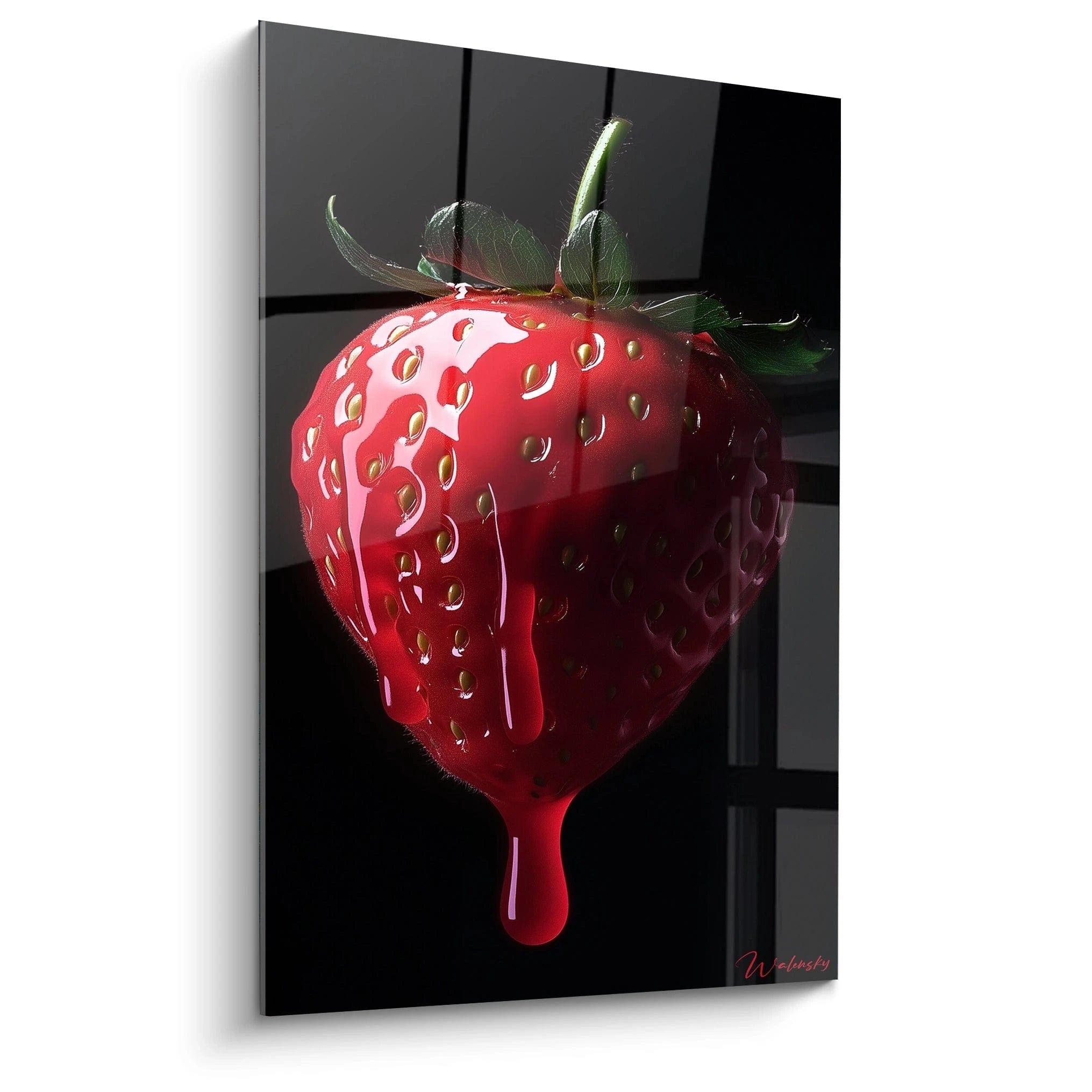
Red artwork and room atmosphere: what emotions to evoke?
The
red artwork is much more than a simple decorative element. It infuses unique energy into the space it occupies, creating a
powerful visual emotion through its
immediate aesthetic impact. The richness of
red shades – ranging from
crimson red to deep
burgundy – allows for adapting its effect according to the room, its style, and the desired atmosphere. A true
focal point in decoration, a
red artwork captures the gaze and energizes the atmosphere by playing on
chromatic intensity and
artistic contrast. Let's explore how this vibrant color can transform your interior and evoke varied emotions depending on the space.
Red to Energize a Living Room
In a living room, the
red artwork
becomes a key element for infusing lively and welcoming energy. It creates
visual dynamism that instantly attracts attention, making the wall on which it is placed a true
focal point. A
red design artwork with vibrant shades such as
scarlet red or
vermillion stimulates conversation and promotes a friendly atmosphere. Combined with neutral tones such as light gray or beige, it balances the space while avoiding visual overload. Coordinating cushions or subtle
color accents throughout the room reinforce this effect without weighing down the atmosphere, thus creating perfect harmony between modernity and comfort.
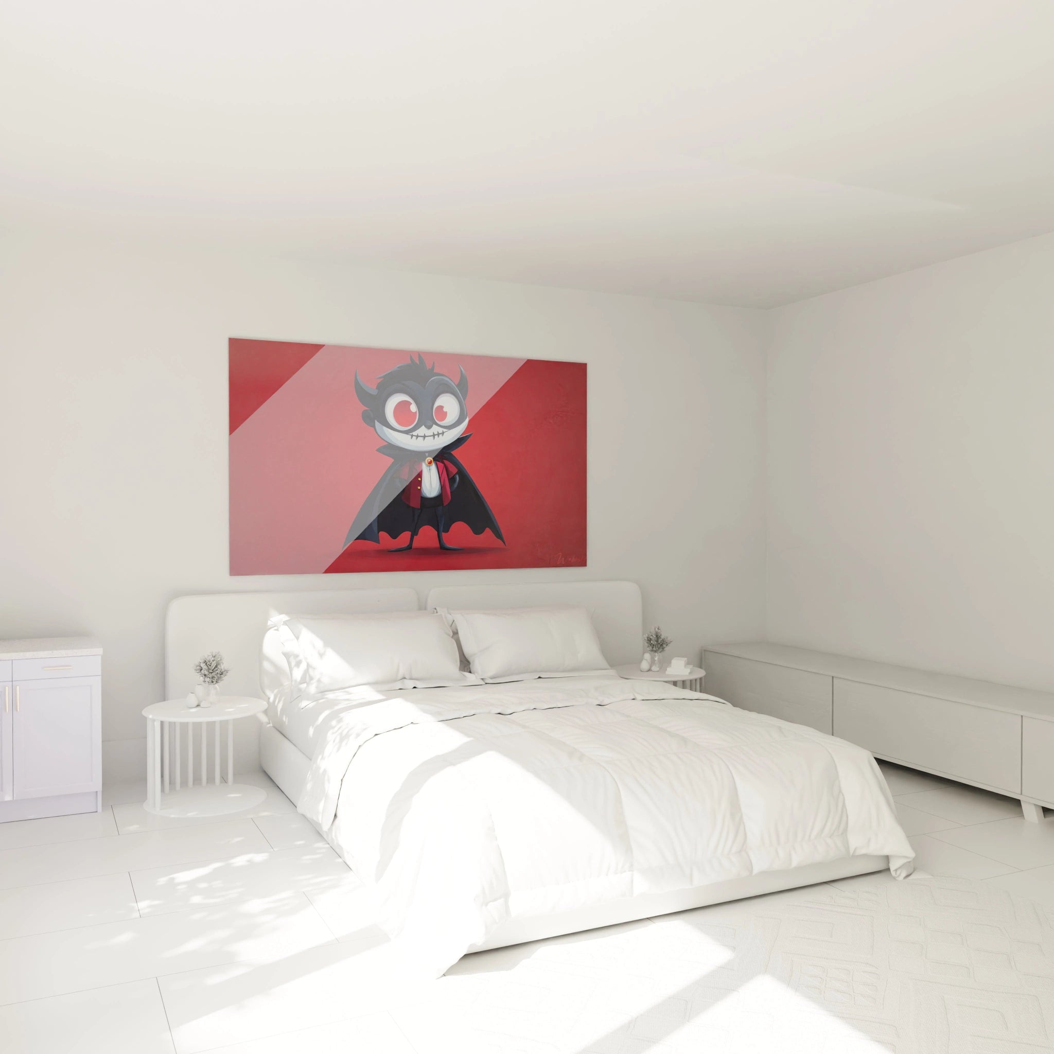
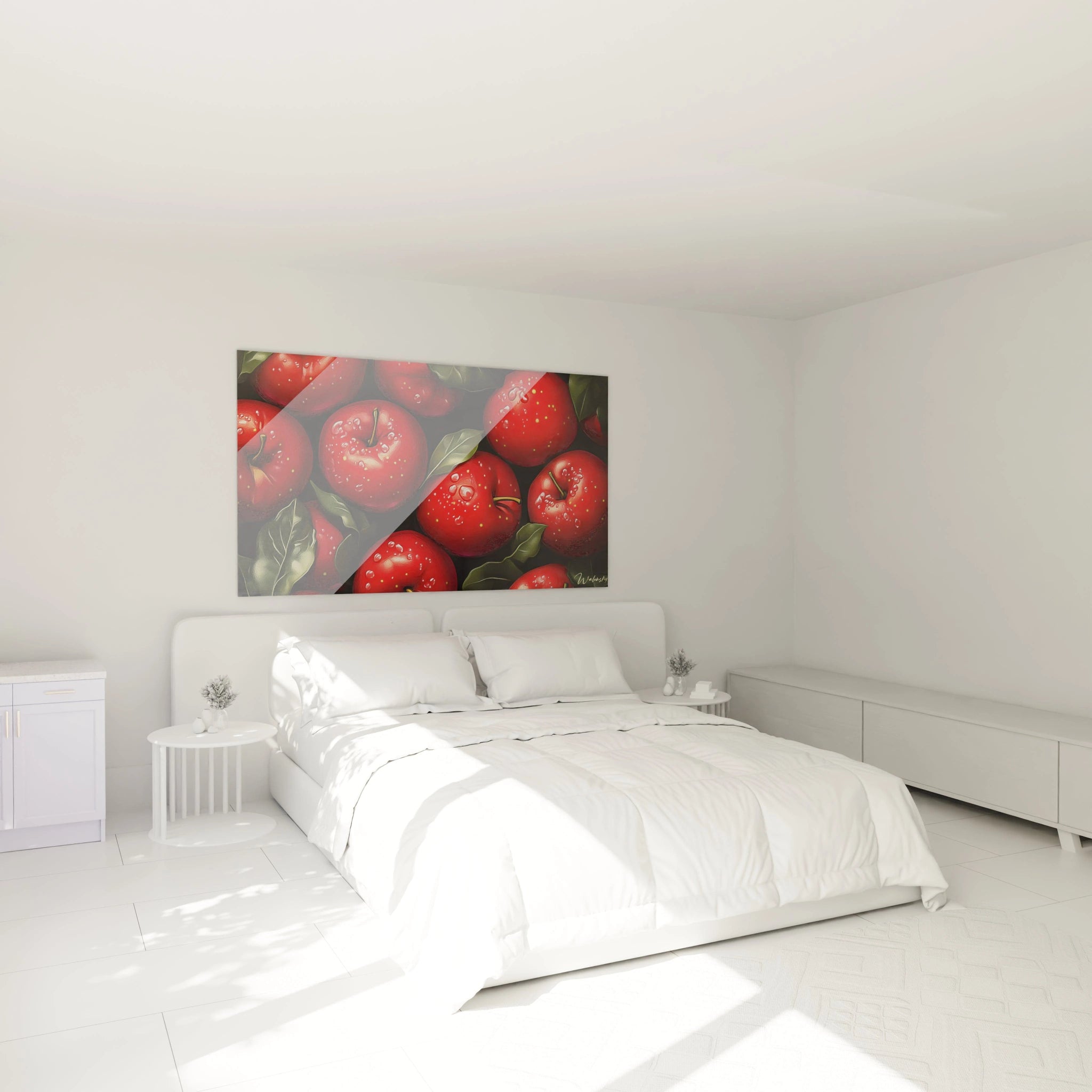
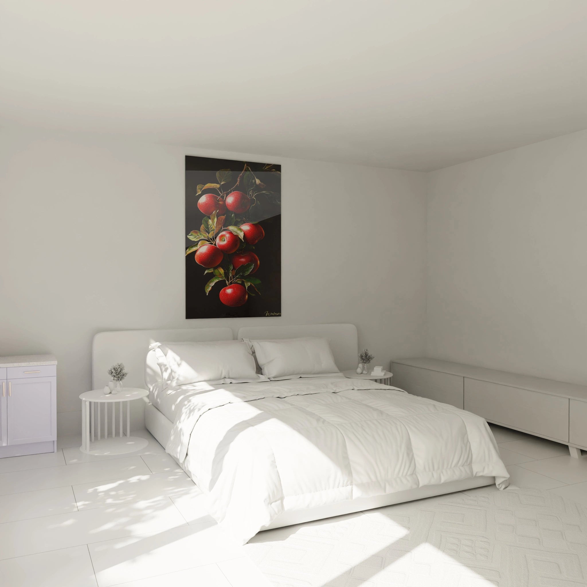
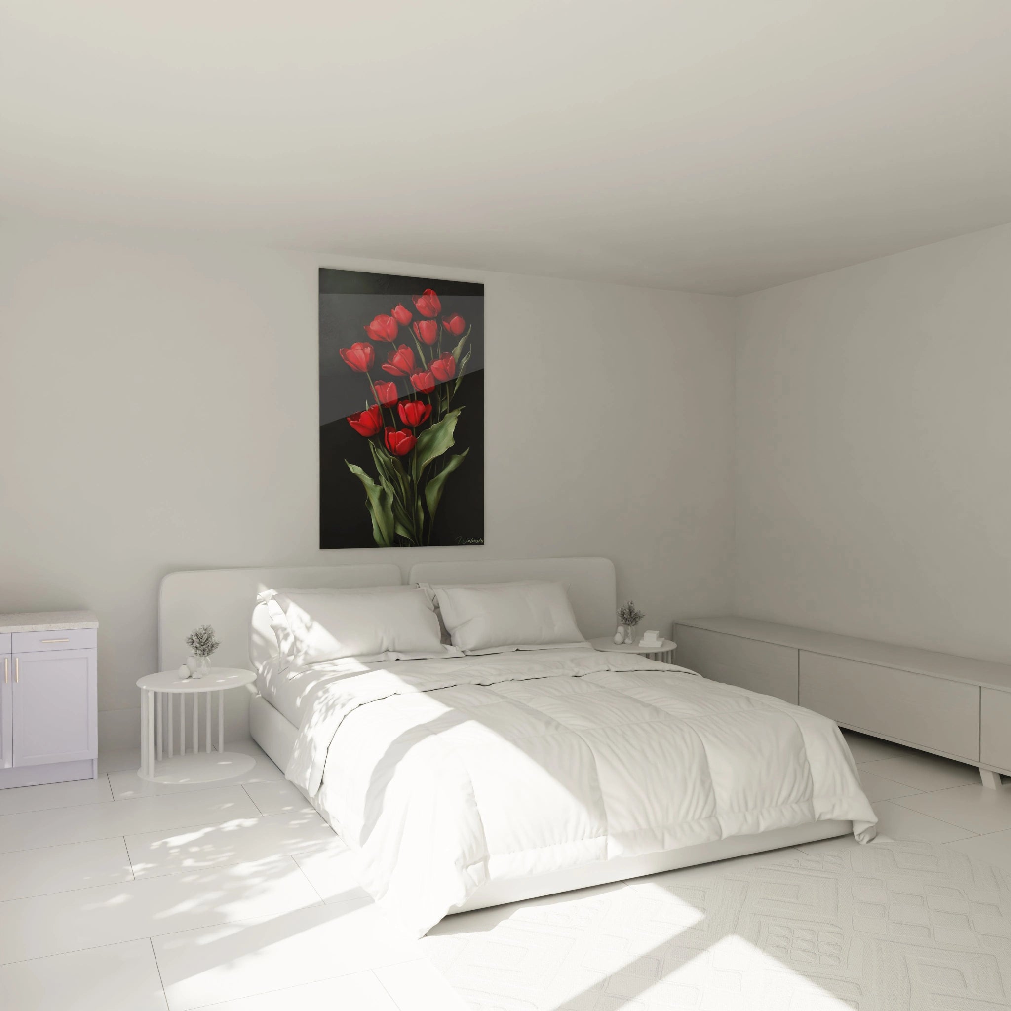
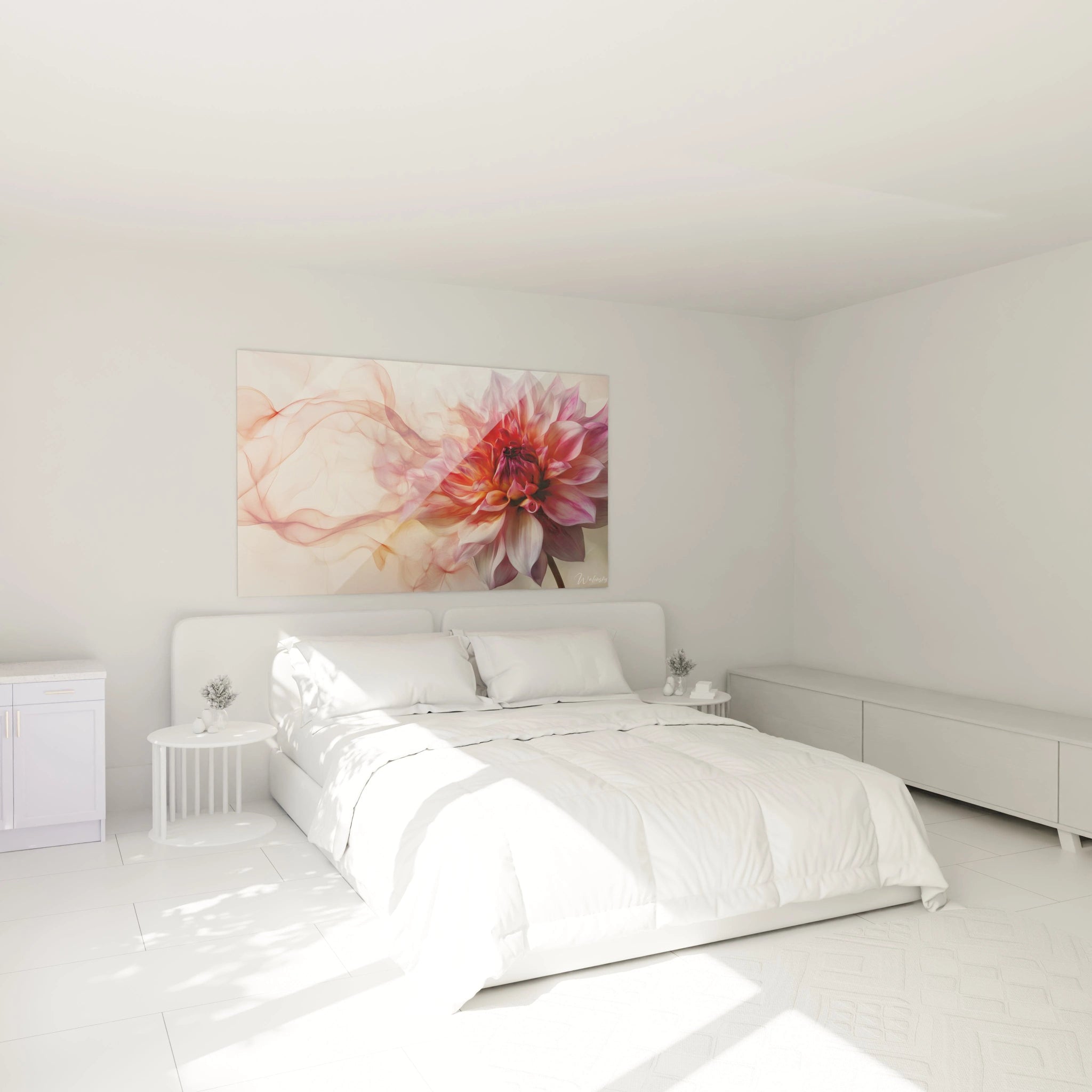
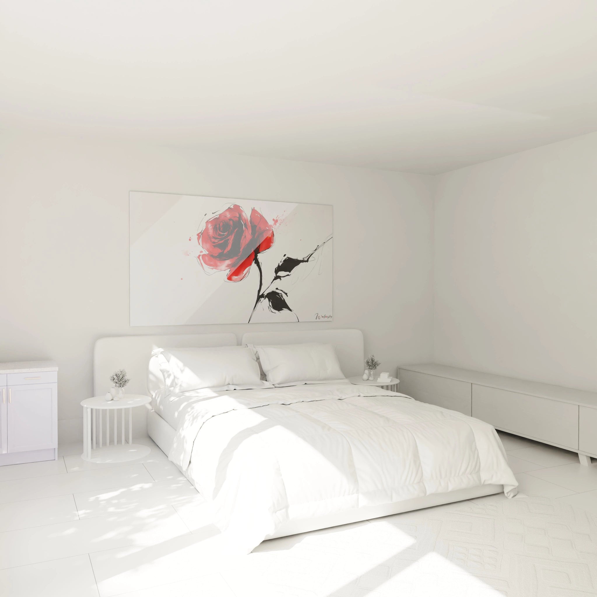
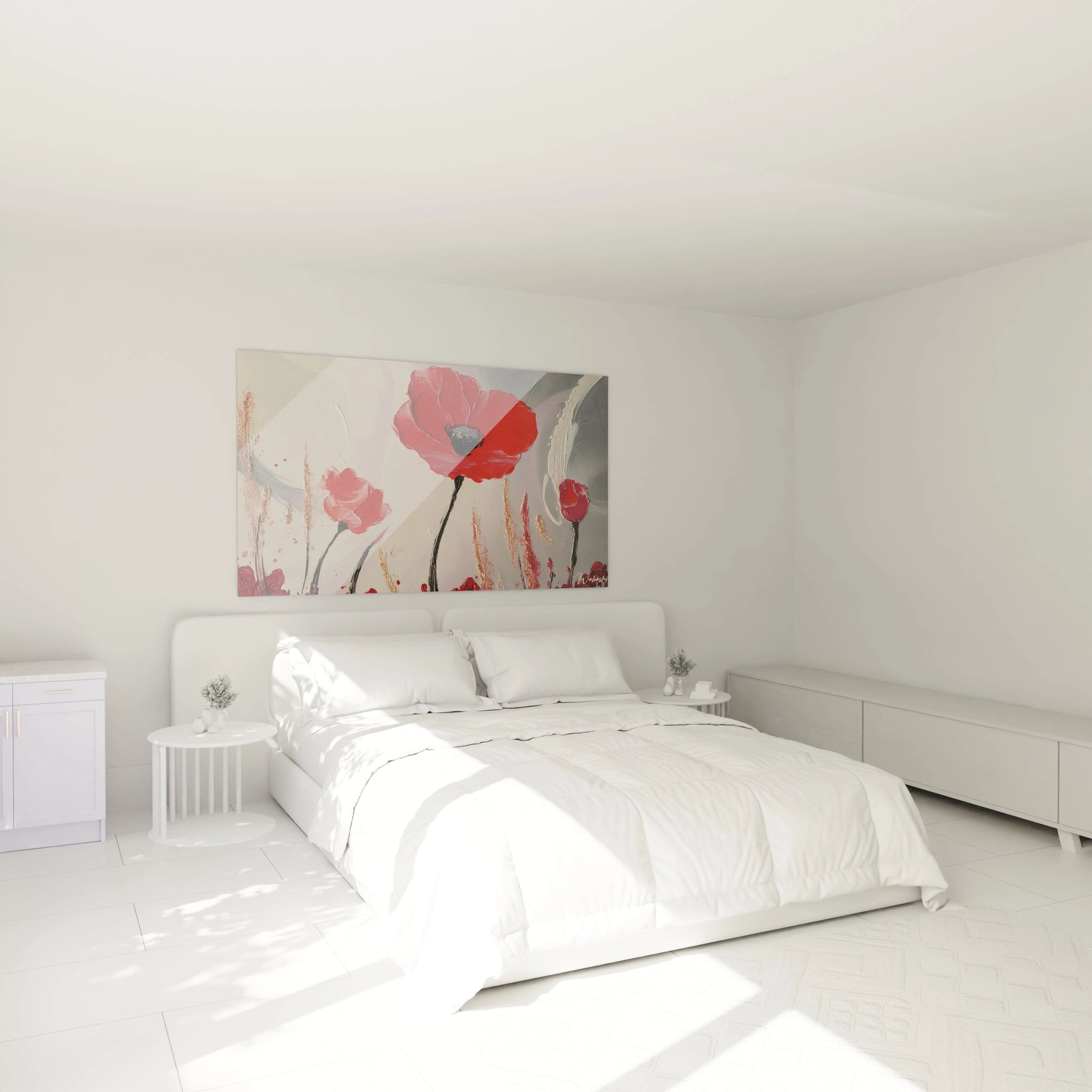
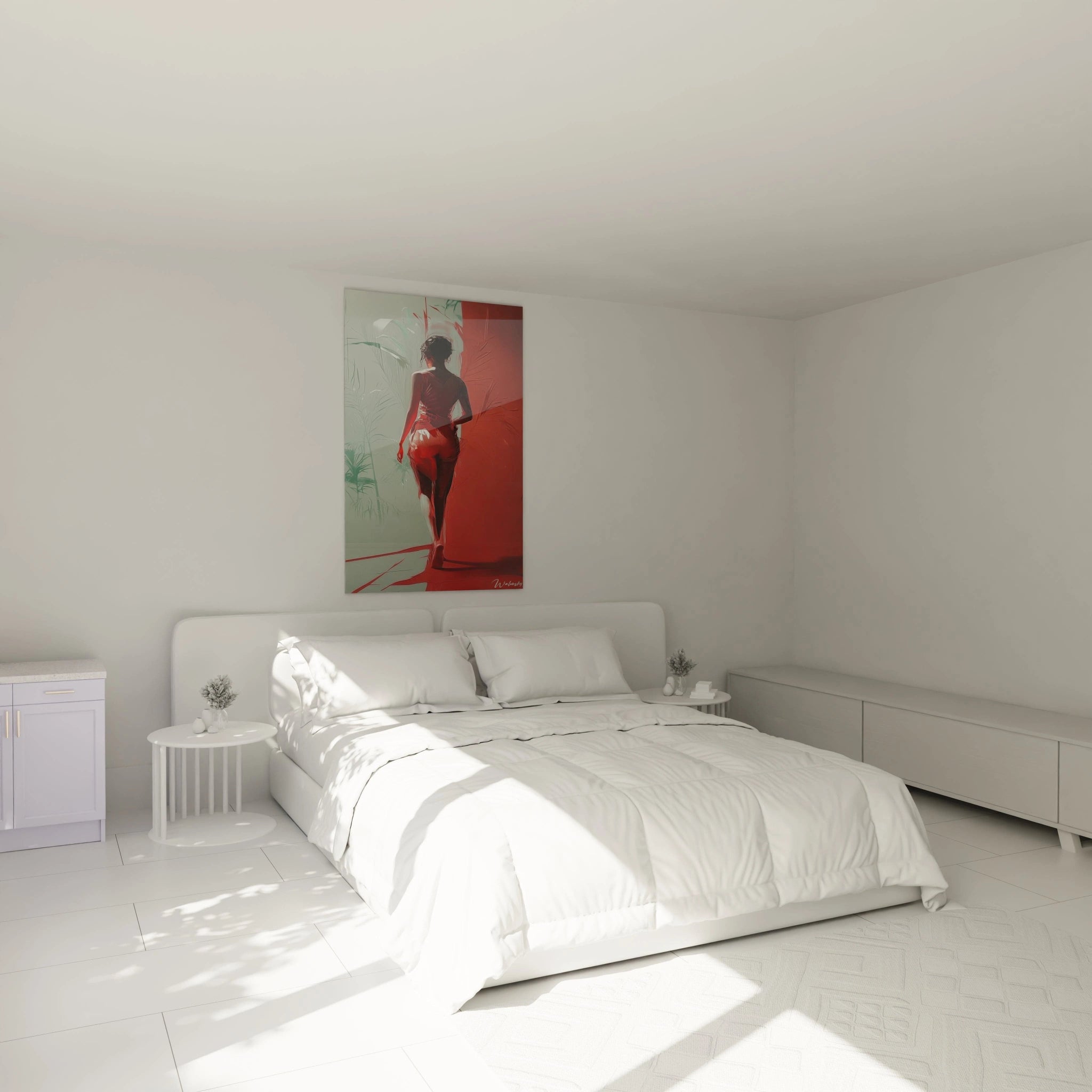
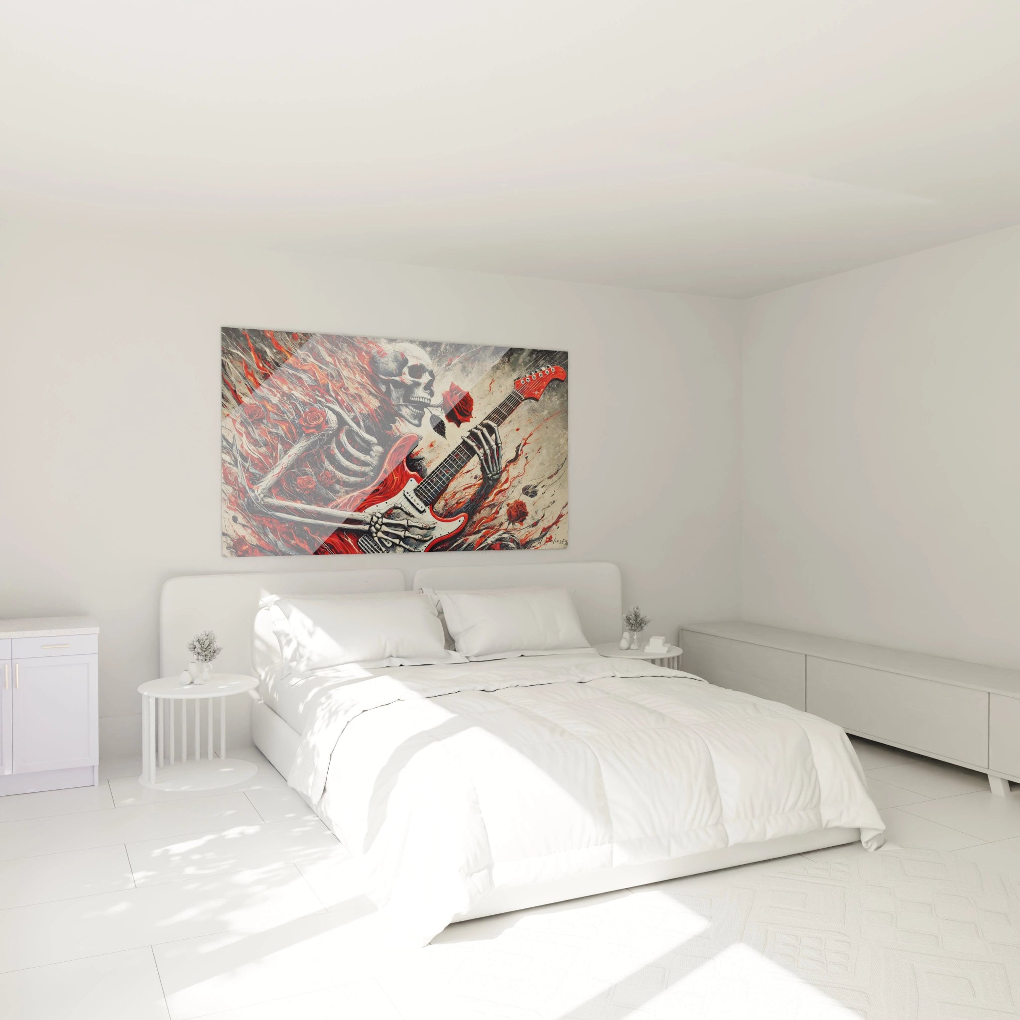
Bring Warmth to a Bedroom with Red Shades
The
red artwork is an excellent choice for warming the atmosphere of a bedroom. Softer
red shades, such as
burgundy or
crimson red, bring a
warm atmosphere and enveloping feel, ideal for a relaxation space. A
contemporary red artwork or a minimalist
red painting above the bed creates a cocooning effect while adding a touch of elegance. For harmonious balance, combine it with natural materials such as linen, light wood, and textiles in soft tones. This combination creates an intimate atmosphere, conducive to relaxation, while maintaining a subtle
aesthetic impact.
Accentuate Energy in an Office with Red Touches
The red artwork can play an essential role in an office by stimulating concentration and creativity. A red art piece strategically placed on a wall visible from your workspace infuses a dose of dynamism and energy. Vermillion red or scarlet are particularly effective shades for promoting productivity. Combine these vibrant colors with minimalist red wall decoration elements, such as thin frames or red posters, to avoid visual clutter. The balance between neutral colors and color accents allows for creating a space that is both stimulating and calming, conducive to inspiration.
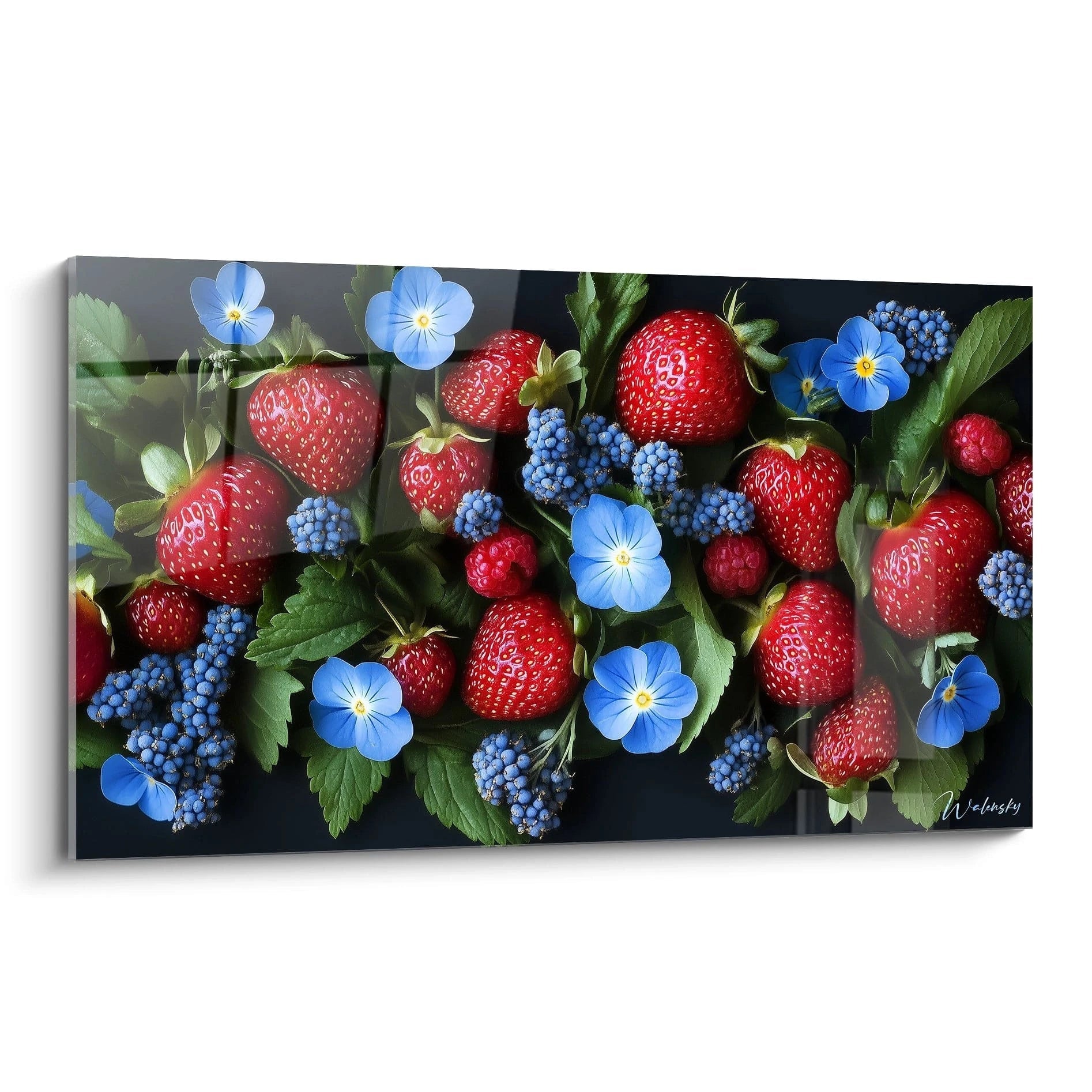
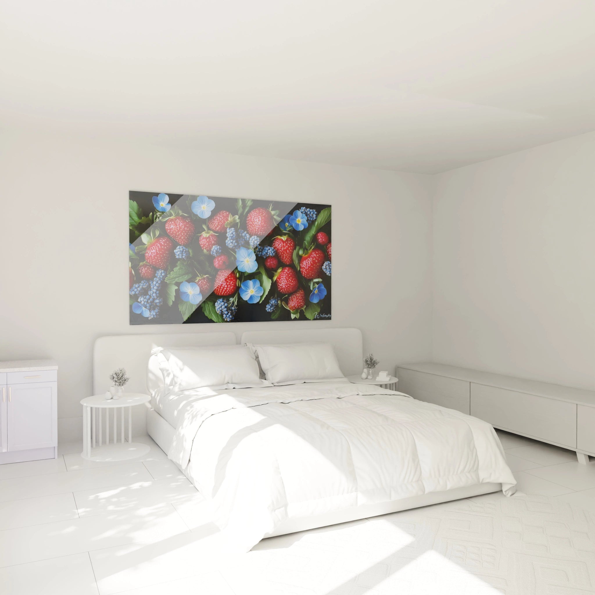
Red in Social Spaces: Kitchen and Dining Room
In social spaces such as the kitchen or dining room, the red artwork is synonymous with warmth and dynamism. It stimulates appetite and promotes a lively and welcoming atmosphere. A red abstract artwork or a red canvas with modern patterns can transform a plain wall into a vibrant central element. Opt for luminous reds such as cherry red in the kitchen, or deeper tones such as burgundy in the dining room for a touch of elegance. Pair them with natural materials – wood, stone, metal – for a harmonious contrast and color harmony that enriches the space.
Adapt your red choice according to room function
The effect of a red artwork depends heavily on the room in which it is placed. In a living room, it creates visual dynamism and friendliness; in a bedroom, it brings a touch of intimacy and warmth; in an office, it stimulates concentration; and in social spaces, it reinforces the festive atmosphere. The choice of red shades should be adapted to the room's function: bright reds for dynamic spaces, and deeper reds
for calming atmospheres. The integration of artistic contrasts, red gradients, and complementary decorative elements ensures balanced decoration, both bold and refined.
A red artwork is much more than a simple decorative element; it is an expression of your style, your emotions, and your personality. By playing with red shades and mastering visual balance, you can transform any space into a vibrant, inspiring, and aesthetically captivating location.