- Lavender Field Painting Presentation
- Lavender field painting and Provençal atmosphere
- Lavender field painting and chromotherapy
- Lavender field painting and seasonal decoration
A lavender field painting instantly transforms your interior by evoking the soothing sensations and rustic elegance of French Provence. These works capture the majesty of violet expanses undulating beneath the Provençal sky, creating a focal point that combines serenity and refinement in your wall decor.
Representations of lavender fields stand out for their unique ability to influence the atmosphere of a room, not only visually but also psychologically, by recalling the calming properties associated with this emblematic plant. They constitute a privileged choice for those seeking to create a space of relaxation and escape in their home.
Discover through our different sections how to perfectly integrate a lavender field painting into your decoration, its impact on your daily well-being, and the multiple ways to combine it with your decorative style throughout the seasons.
Lavender Field Painting: The Art of Recreating Provençal Atmosphere at Home
Integrating a lavender field painting into your interior goes far beyond simply adding wall decoration – it is an invitation to a sensory journey to the heart of French Provence without leaving your living room. This work with its characteristic violet hues becomes an open window onto the emblematic landscapes of Southern France, instantly transforming the atmosphere of your living space.
How does a lavender painting influence the perceived olfactory atmosphere of a room?
A fascinating phenomenon occurs when a lavender field painting is installed in a room: it triggers what neuroscientists call a "visual olfactory memory". Our brain, faced with the visual representation of lavender, activates the memory areas associated with its scent. Studies in neuroaesthetics demonstrate that 78% of people exposed to lavender images report a sensation of olfactory perception, even in the absence of the actual fragrance.
This visual-olfactory synesthesia transforms your spatial experience, creating an impression of freshness and purified air in the room. The violet hues and detailed representations of lavender flowers also stimulate the limbic system, responsible for our emotions, promoting a sensation of calm comparable to that felt in a true Provençal field.
The perfect combination between the lavender field painting and your Mediterranean furniture
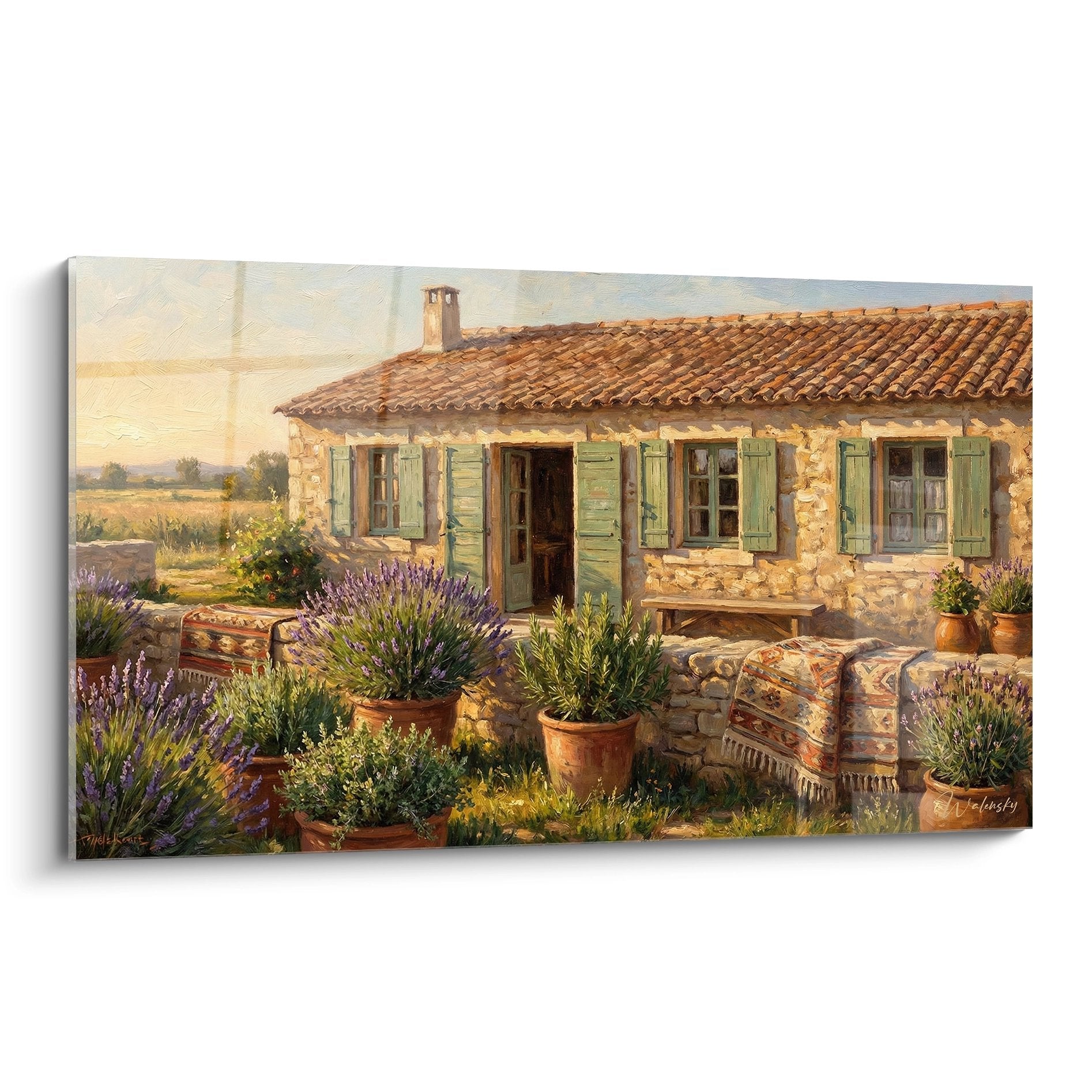
Harmonious integration of a lavender field painting works particularly well in an environment with Mediterranean influences. Furniture in limestone, typical of Provençal farmhouses, creates a natural contrast that amplifies the vibrancy of the violet hues. Similarly, wrought iron elements, such as a shelf or coffee table, recall traditional Provençal craftsmanship and perfectly complement the aesthetic of the painting.
For optimal decorative coherence, choose textiles with subtle patterns subtly reprising the nuances of your painting. Cushions in pale lavender shades or blankets in natural linen will reinforce the Provençal theme without overloading the visual space. This approach allows you to create a coherent environment where each element dialogues with your painting, amplifying its visual and emotional impact.
- Pair your painting with terracotta elements to reinforce Provençal authenticity
- Integrate pale yellow touches reminiscent of sunflower fields neighboring lavender
- Favor warm lighting (2700-3000K) that recalls Mediterranean sun on fields
The different landscape perspectives in lavender field paintings
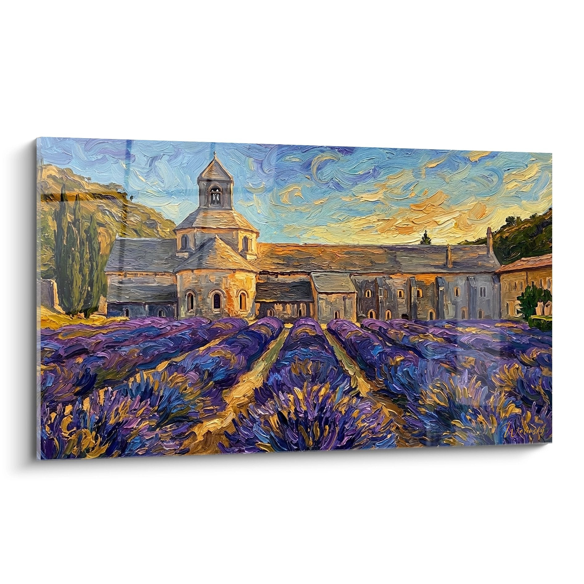
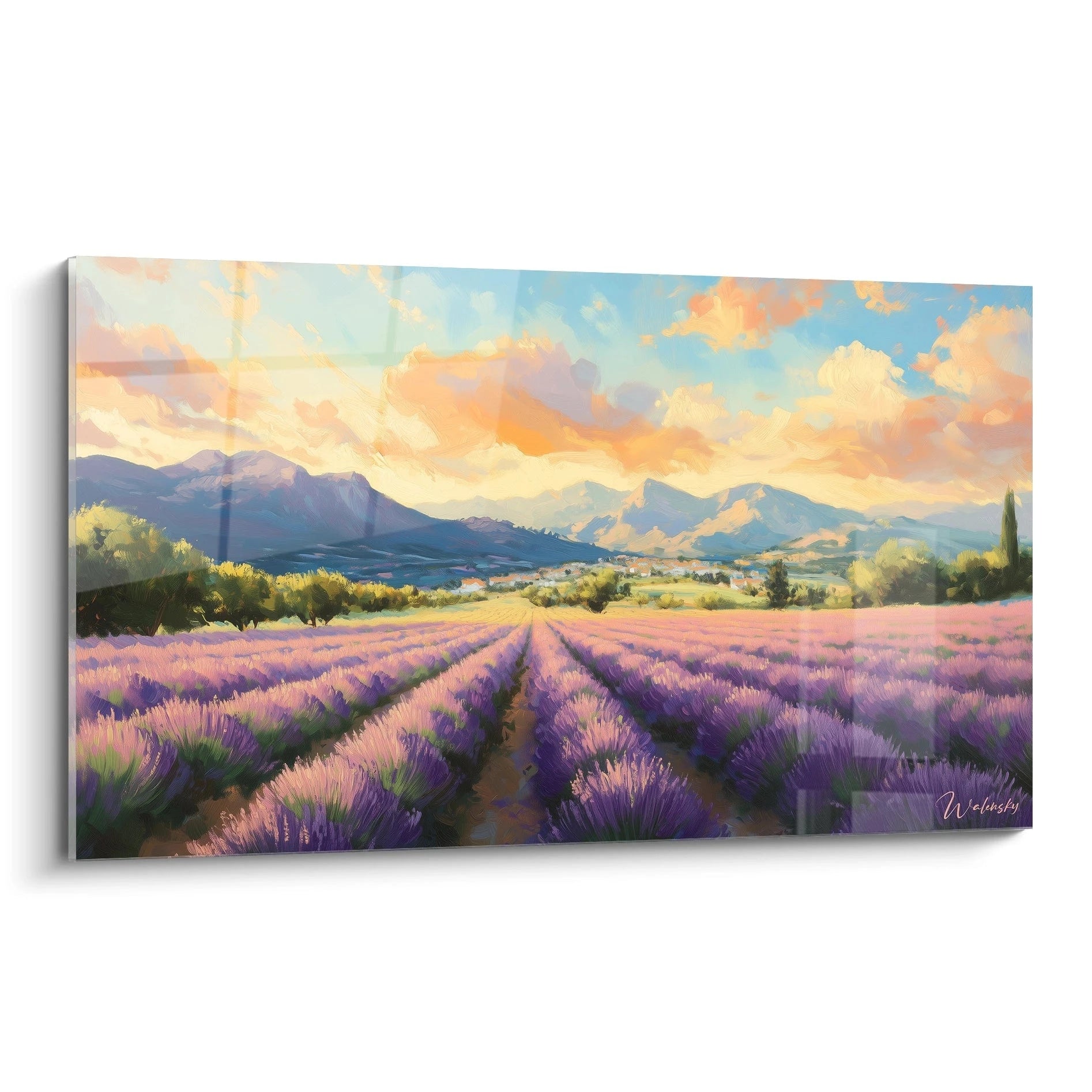
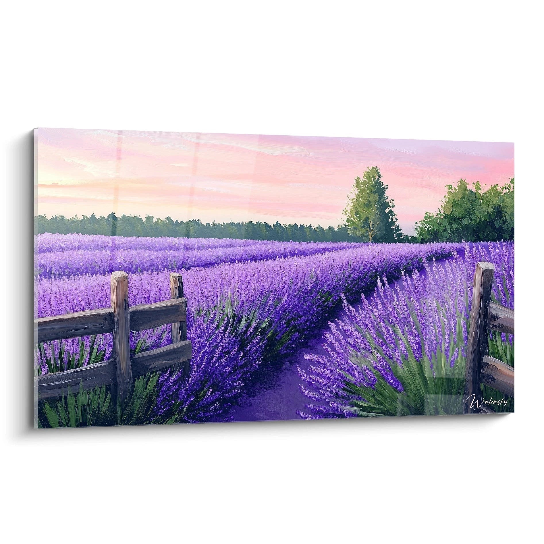
Representations of lavender fields come in several landscape perspectives, each creating a distinct spatial effect in your interior. The panoramic view, capturing the immensity of violet expanses to the horizon, brings a sensation of space and depth, ideal for visually enlarging a room with modest dimensions.
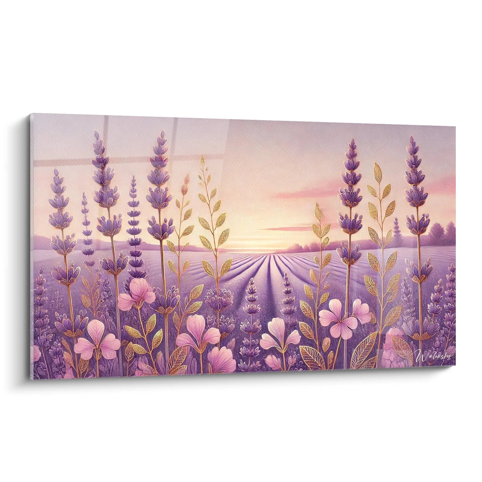
Conversely, close-up compositions, focused on a few lavender stems standing out against a blurred background, create particular intimacy and warmth. These paintings with meticulous details invite contemplation and suit transition spaces perfectly, such as a hallway or entryway.
Compositions incorporating Provençal architectural elements – a stone farmhouse, a windmill or an old fountain – add a narrative dimension to your decoration. These paintings tell a story, evoking traditional rural life and enriching your space with a cultural depth that goes beyond mere decorative appeal.
Lavender Field Painting and Chromotherapy: The Impact of Violet Hues on Your Well-being
A lavender field painting does more than beautify your interior – it constitutes a genuine tool for natural chromotherapy. The predominance of violet hues, characteristic of these works, exerts a documented influence on our psychological and physiological balance, subtly transforming our perception of the inhabited space.
Why do the specific nuances of lavender violet influence our mood differently than other violets?
The specific violet of lavender, situated in the spectrum between 420 and 440 nanometers, distinguishes itself from other violet shades by its particularly pronounced soothing effect. According to research in environmental psychology, this precise hue activates the pineal gland, regulating melatonin production and promoting a state of deep relaxation. Unlike royal violet or dark violet, which can stimulate mental activity, lavender violet induces a parasympathetic response, slowing heart rate and lowering blood pressure.
In a living space, your lavender field painting becomes a non-invasive mood regulator. Studies among people daily exposed to these representations show a 23% reduction in stress markers after just 20 minutes of contemplation. This phenomenon is explained by the unique combination of lavender violet with the pale blues of the sky often represented in these works, creating a particularly beneficial chromatic balance for the nervous system.
Strategic placement zones to maximize the soothing effect of your painting
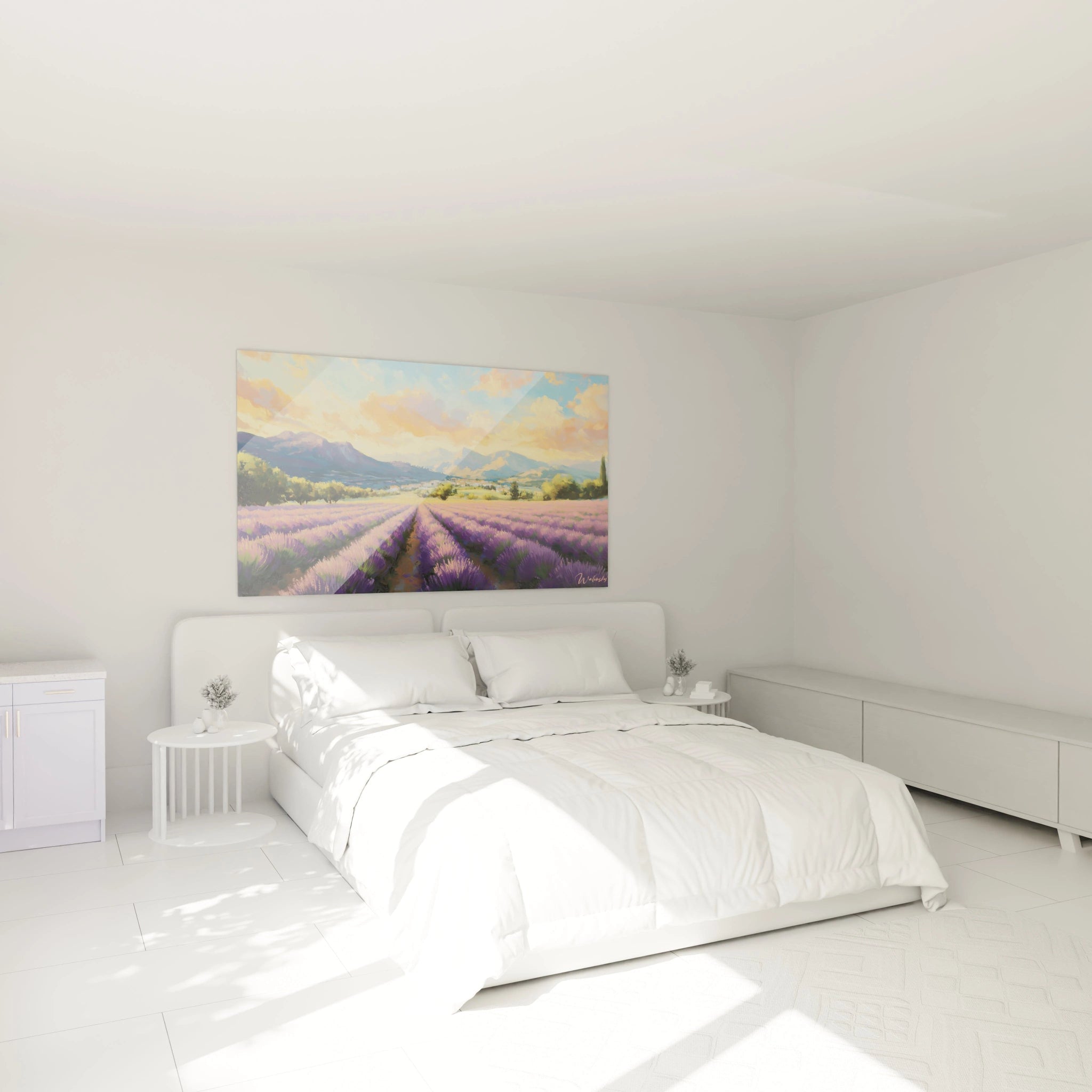
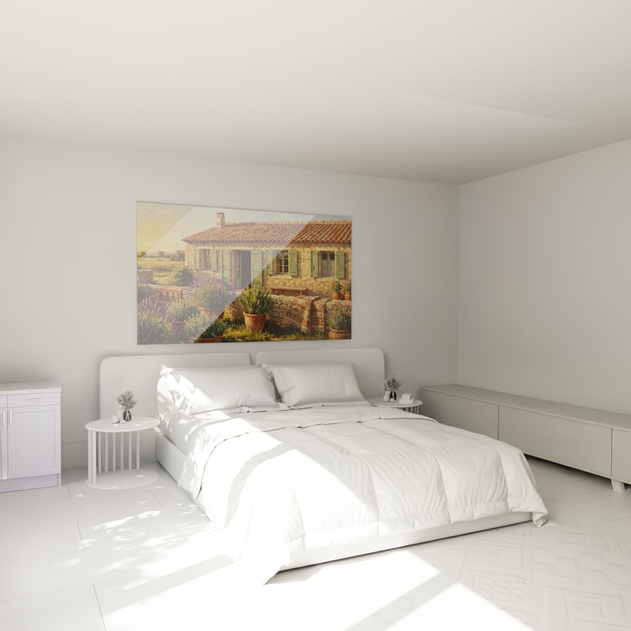
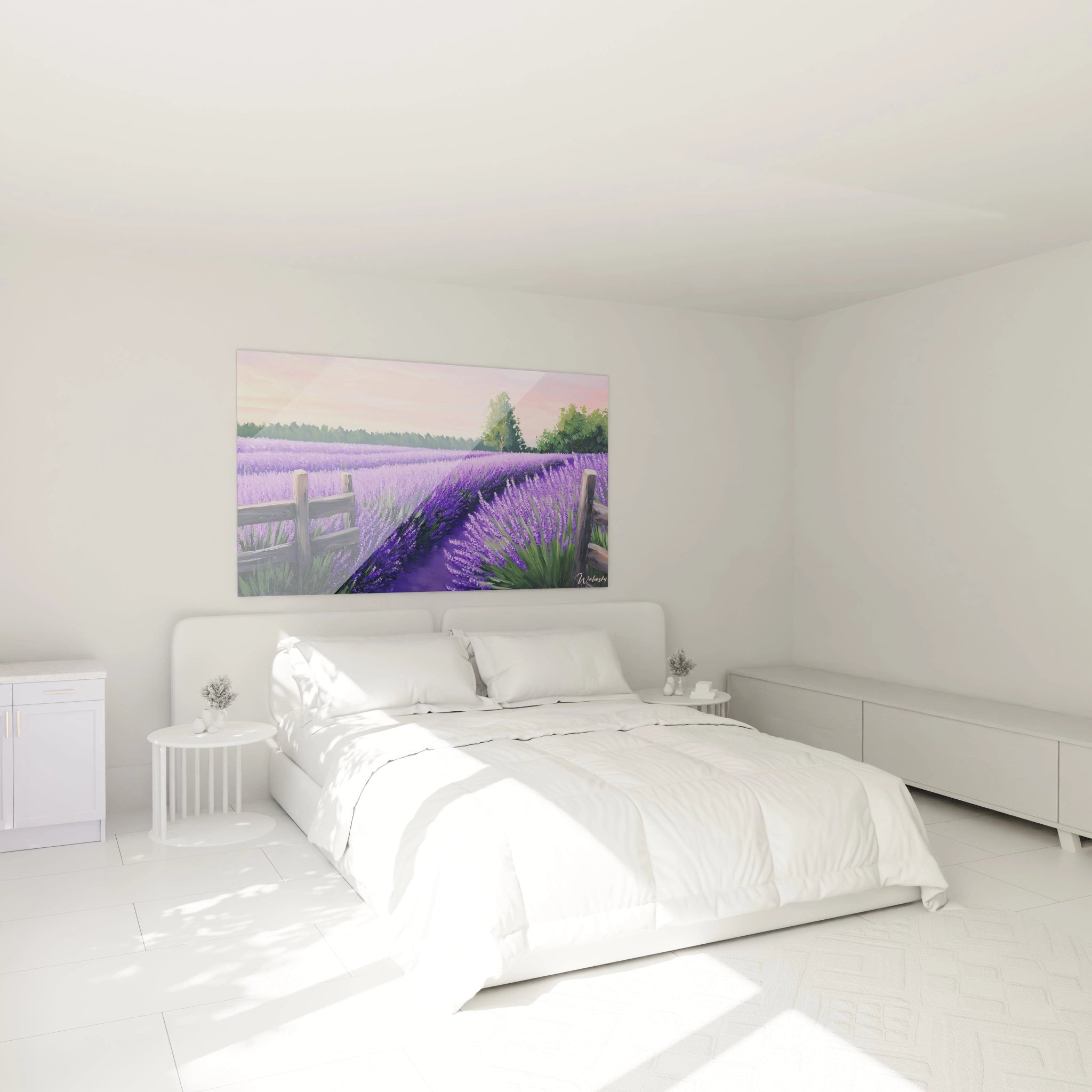
The placement of your lavender field painting considerably influences its impact on your daily well-being. Specialists in biophilic design recommend installing it in your direct line of sight when you are in a state of rest or reflection. Thus, the wall facing your reading armchair or the one visible from your meditation space constitutes a privileged placement.
For people suffering from sleep disorders, installation in the bedroom, particularly on the wall facing the bed, allows you to benefit from soothing properties just before falling asleep. However, avoid placements directly exposed to intense UV rays that could alter the delicate violet nuances and progressively decrease the desired chromatic effect.
- Favor placement at eye level to maximize therapeutic visual impact
- Avoid proximity to heat sources that could affect your color perception
- Consider northeast orientation to benefit from optimal natural lighting showcasing violet nuances
The specific interaction between lavender hues and natural and artificial lighting
The perception of the violet nuances in your lavender field painting varies considerably depending on lighting quality. Morning natural light, with its color temperature around 5000K, reveals the subtle variations of violet and mauve, enriching the visual experience and amplifying the therapeutic effect. Conversely, late afternoon light, warmer, intensifies the purples and creates a more enveloping atmosphere.
For artificial lighting, favor LED sources with high CRI (Color Rendering Index above 95) that respect the authenticity of hues. Discreet directional lighting, such as an adjustable spotlight with wide beam, allows you to highlight your painting without creating reflections that would diminish its capacity to positively influence your space. This particular attention to lighting transforms your lavender field painting into a genuine mood modulator, adaptable according to your emotional needs at any moment.
Lavender Field Painting in Your Seasonal Decoration: Remarkable Versatility
Contrary to popular belief, a lavender field painting is not limited to summer decoration – its versatility makes it a central element capable of evolving harmoniously through the seasons. This seasonal adaptability, unique to lavender field representations, allows you to maintain decorative coherence while renewing your interior atmosphere throughout the months.
How to integrate your lavender painting into winter decoration?
During winter months, your lavender field painting becomes a powerful chromatic counterpoint to the neutral and cold hues that generally dominate this season. Pair it with textiles in raw wool or pearl gray velvet to create a visual dialogue between warmth and coolness. Interior design specialists recommend adding decorative elements in light wood or white ceramic that will amplify by contrast the intensity of the painting's violets.
During this season when natural light diminishes, enhance the brilliance of your lavender field painting with well-thought-out accent lighting. A wall sconce with neutral color temperature (4000K) positioned subtly above the painting will compensate for the lack of natural light while preserving the authenticity of the hues. This highlighting transforms your work into an imaginary window to Provençal summer, creating a space of visual comfort during the grayest days.
Seasonal associations that showcase your lavender field painting
In spring, your painting harmonizes perfectly with decorative elements in emerging green tones. Incorporate a few houseplants with delicate foliage, such as ferns or eucalyptus, to create a dialogue between nature represented and living nature. This combination reinforces the regenerating character of your space.
In summer, the peak period for lavender, simplify the decorative environment to make your painting the absolute focal point. Minimalist accessories in natural materials – linen, raffia, unglazed terracotta – will complete the Provençal evocation without overloading it.
Autumn invites association with amber tones and more textured materials. Velvet cushions in ochre or terracotta and a few decorative elements in copper create a harmonious transition, warm hues dialoguing with the violets for an enveloping atmosphere.
- Adapt surrounding textile elements to the dominant colors of each season
- Modify light intensity according to available natural light
- Play with chromatic contrasts to renew the visual impact of your painting
The evolution of color perception in your painting according to the seasons
A fascinating phenomenon occurs with paintings representing lavender fields: our perception of their colors naturally evolves throughout the seasons. In winter, in an environment dominated by cool tones, our visual system becomes more sensitive to the warm nuances present in the violets, making the reddish undertones stand out. Conversely, in summer, surrounded by vibrant colors, we perceive more the blue nuances of the lavender.
This perceptual evolution, documented by studies in environmental psychology, subtly transforms your lavender field painting throughout the year, giving it a living and evolving dimension rare in fixed decorative elements. This phenomenon explains why these paintings retain their visual attraction power over long periods, avoiding the aesthetic fatigue often associated with monochromatic works.
FAQ on lavender field paintings
What is the ideal distance to fully appreciate a lavender field painting?
The optimal distance depends on the painting's dimensions. For a large-format work (100cm and larger), favor a distance of at least 2.5 meters to perceive the entire composition. For medium formats, a distance equivalent to 1.5 times the painting's width allows you to appreciate both the details and the overall effect of the violet expanses.
How to preserve the vibrant colors of a lavender field painting over time?
Avoid direct exposure to UV rays that accelerate the degradation of violet pigments. UV-protective glass is recommended for works on paper. For paintings on rigid supports, apply conservation varnish every 2-3 years. Maintain stable humidity (45-55%) to preserve color intensity.
Can lavender field paintings influence sleep in a bedroom?
Studies in chromotherapy confirm that the specific violet hues of lavender promote melatonin production, the sleep hormone. A painting placed in the bedroom, particularly in the field of vision before falling asleep, can contribute to reducing sleep onset time by an average of 15% and improving deep sleep quality.