


Jonquille Artwork
The collection Daffodil Painting brings together floral compositions where white petals and golden hearts traverse each canvas like a first ray of spring. Ivory backgrounds, deep blues, or vibrant fields: these daffodil paintings play on contrasts to bring the flower messenger of renewal to life. Between botanical precision and graphic stylization, each piece invites a new light and lasting softness into the interior that welcomes it.
 Painting Three Yellow Daffodils and Royal Blue on Checked Background - Olive Green Stems Upright - Daffodil Edition273,90 €
 Painting Yellow and Orange Daffodils with Long Green Leaves - Beige Sand Splashes - Daffodil Edition273,90 €
 White Daffodils and Turquoise with Colorful Geometric Facets - Purple and Orange Background - Jonquille Edition273,90 €
 Painting Yellow and Black Daffodils Near a Gridded Window - Two Orange Petals - Daffodil Edition273,90 €
 Painting Transparent Daffodils with Golden Hearts - Spring Breath - Daffodil Edition273,90 €
 Painting White and Yellow Daffodils on Saffron Fluid Background - Petrol Blue Flows - Daffodil Edition273,90 €
 Painting Yellow and White Daffodils with Veined Trumpets - Tight Closed Buds - Daffodil Edition273,90 €
 Painting of Yellow and Orange Daffodils with Wide Undulating Petals - Sky Blue Background - Jonquille Edition273,90 €
 White and Orange Daffodils Painting - Corolla Leaning Forward - Daffodil Edition273,90 €
 Painting of a Bouquet of White and Orange Daffodils - Pastel Pictorial Touches - Daffodil Edition273,90 €
 White and Orange Daffodils on Washed Beige Background - Grouped Slate Blue Stems - Daffodil Edition273,90 €
 Painting of White and Yellow Daffodils with Closed Buds - Turquoise Runs in Background - Daffodil Edition273,90 €
 Painting of Yellow and Orange Daffodils Towards a Bright Blue Sky - Curved Black Stems - Daffodil Edition273,90 €
 White and Yellow Daffodils Painting with Sculpted Petals - Scaled Cracked Wall - Jonquille Edition273,90 €
 Four Petals Cream and Amber on Pearled Gray Background - Slender Gray Leaves - Jonquille Edition273,90 €
 White and Cream Daffodils Painting with Tight Buds - Wide Grey-Blue Foliage - Jonquille Edition273,90 €
 White and Yellow Daffodils on a Sparkling Gold Background - Knife Impasto - Jonquille Edition273,90 €
 Painting White and Yellow Daffodils on a Vibrant Saffron Background - Light Paint Splashes - Daffodil Edition273,90 €
 White Daffodils with Golden Heart Painting - Spring Dew - Daffodil Edition273,90 €
 White and Orange Daffodils Painting with Dark Stems - Dense Compact Bouquet - Daffodil Edition273,90 €
 Painting White and Orange Daffodils Near Cherry Blossoms - Hairy Willow Branches - Daffodil Edition273,90 €
 Painting White and Yellow Daffodils with Wavy Green Ribbons - Three Trumpet-Shaped Corollas - Daffodil Edition273,90 €
 Yellow and Orange Field Under a Low Sun on the Horizon - Distant Brown Hills - Jonquille Edition242,90 €
 Yellow and Gold Field Towards Distant Purple Mountains - Rays of Sunrise - Jonquille Edition242,90 €
In the same family
Also explore the theme Nature
-
 View all5000
artworks
-
 Aloe vera94
artworks
-
 Tree64
artworks
-
 Tree of Life50
artworks
-
 Azalea106
artworks
-
 Bamboo241
artworks
-
 Nature's Beauties372
artworks
-
 Cornflower133
artworks
-
 Cactus81
artworks
-
 Camellia197
artworks
-
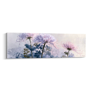 Chrysanthemum225
artworks
-
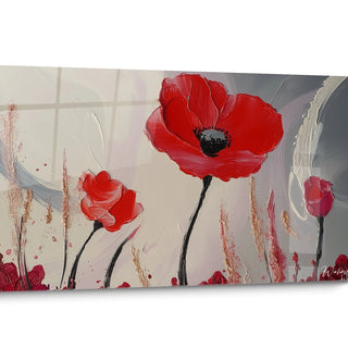 Poppy341
artworks
-
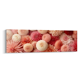 Dahlia161
artworks
-
 Eucalyptus119
artworks
-
 Banana Leaf72
artworks
-
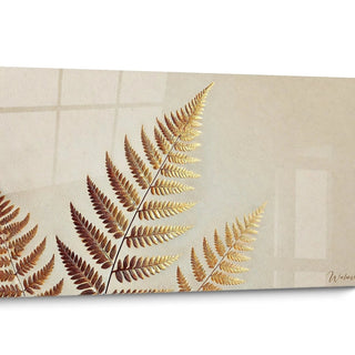 Golden Leaf2
artworks
-
 Flower276
artworks
-
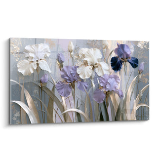 Iris Flower179
artworks
-
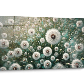 Wildflowers5
artworks
-
 Pebbles9
artworks
-
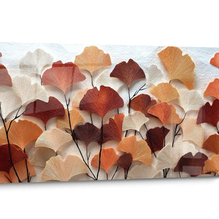 Ginkgo71
artworks
-
 Glycine217
artworks
-
 Hydrangea140
artworks
-
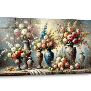 Garden18
artworks
-
 Lavender135
artworks
-
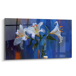 Lily135
artworks
-
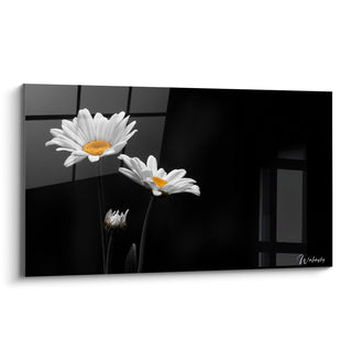 Daisy156
artworks
-
 Monstera8
artworks
-
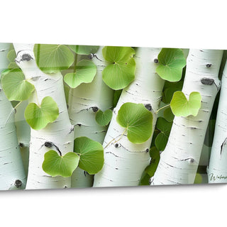 Other Nature80
artworks
-
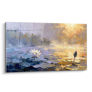 Water Lily105
artworks
-
 Olivier321
artworks
-
 Orchid87
artworks
-
 Palm Tree375
artworks
-
 Peony168
artworks
-
 Roses14
artworks
-
 Terracotta436
artworks
-
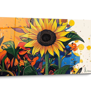 Sunflower152
artworks
-
 Tulip542
artworks


All about Jonquille Artwork
- Daffodil Painting Presentation
- Gold from the Cold
- The Gesture and the Trace
- One Flower, Multiple Perspectives
The Daffodil Painting collection brings together works that celebrate a flower that is simple in appearance, but charged with a rare visual force: its white petals widely open around a golden trumpet create, canvas after canvas, a motif immediately recognizable. What unites these daffodil paintings is not a unique palette but the same way of capturing the moment when the flower fully opens, as if frozen in its most beautiful bloom.
The backgrounds vary - deep navy blue marine, pearly ivory, misty morning sky, or abstract sage green waves - but each composition retains this tension between the lightness of the corollas and the graphic structure of the stems. It is this diversity of treatments around a single subject that enriches the collection: it includes interpretations close to watercolor as well as bold and contemporary blocks of color.
This collection is for those who seek to bring an entire season into a room, without waiting for the real spring. It is particularly suitable for spaces that lack natural light or vibrant color, where a painted daffodil can play the role of a window open onto an imaginary garden.
Beyond the floral motif, these daffodil paintings share a common intention: to give a living presence to a wall, by the sole force of a simple flower, treated with an almost botanical attention to its veins, its curves and its own light.
Why does the daffodil carry the colors of renewal on these paintings?
Where does this particular yellow come from that dominates the daffodil paintings?
The yellow that runs through these daffodil paintings is not an arbitrary choice: it faithfully reproduces the hue of the flower itself, one of the first to break through a still cold soil at the end of winter. This color, between mustard and bright orange, owes its intensity to the fact that the daffodil blooms before other bulbs, in a still pale light that it seems to concentrate in its trumpet. On the canvas, this yellow captures the eye first and immediately establishes a feeling of nascent warmth, like a visual signal of the season's restart.
Why do these flowers always seem to be facing forward?
The daffodil has an anatomical peculiarity that these daffodil paintings exploit without naming it: its flower almost always grows tilted, the trumpet oriented towards the ground or diagonally, never straight up to the sky like a sunflower. This slightly inclined bearing, inherited from the fragility of its stem facing the winds of late winter gardens, gives the compositions a tilted and lively appearance rather than a frozen one. It is this slight imbalance that prevents the flower from appearing rigid and confers on it, on the canvas, an almost natural movement.
What does the contrast between the white petals and the dark background tell?
On several of these canvases, the almost pearly white of the petals stands out against a deep blue or greenish background, a contrast that owes much to the way the daffodil actually grows: often on the edge of shadow, under trees still bare, before the clear light of spring floods the undergrowth. This play of light and shadow is therefore not simply an aesthetic search but a direct echo of the flower's natural habitat. Hung in a dark room, this contrast acts as a source of light in its own right, without depending on ambient lighting.
How does the pictorial technique shape the gaze on these daffodil paintings
Why do some corollas appear almost translucent?
Some daffodil paintings adopt a treatment close to watercolor, with fluid outlines and visible splashes in the background, a technique that restores the real texture of the daffodil petal, fine and slightly translucent to the light. This technical choice is not decorative: it reproduces the physical sensation one experiences when observing a daffodil in the ground, where the sun partially penetrates each petal. The result gives the canvas an unusual depth, as if the flower were still breathing on the wall.
What accounts for the almost sculpted appearance of some leaves?
The stems and leaves dark green, almost black in places, are treated with a graphic sharpness that contrasts with the softness of the petals, a technical contrast that structures each composition vertically. This rigor in the tracing of the foliage recalls the way in which the daffodil retains firm and upright foliage even when its flower begins to bend. In a daffodil paintings collection, this graphic choice creates a stable visual base that balances the apparent lightness of the corollas.
Why do some backgrounds resemble abstract stained glass windows?
In several pieces, the background is composed of geometric shapes or colored waves that evoke a stained glass window or a window more than a natural decor. This abstract treatment deliberately detaches the flower from any precise botanical context to make it exist as a motif in its own right, almost heraldic. It is a way of modernizing a classic floral subject without ever betraying the recognizable silhouette of the daffodil, by playing on the gap between the precision of the flower and the abstraction of the background.
To whom do these daffodil paintings really speak according to their composition?
Why do these canvases seduce those who do not like flowers that are too tame?
Unlike classic floral compositions, often symmetrical and soothing, daffodil paintings play on arched stems, views from the ground or tilted corollas that break the expected symmetry. This assumed irregularity particularly attracts people tired of overly smooth floral scenes, who seek a plant presence with character rather than a simple soothing decoration. The daffodil, by its naturally disordered growth in clumps, lends itself perfectly to this freedom of composition.
Why does the daffodil speak more to those who are waiting for the change of season?
The daffodil is associated in the collective imagination with the end of winter more than with the full spring, because it blooms before most other bulbs. Those who hang a daffodil painting often seek less a general evocation of nature than a precise signal: that of a restart after a dark period. This link with a particular turning point moment, rather than with a whole season, distinguishes this collection from other floral subjects that are more neutral in their temporal symbolism.
How do these compositions differ from a simple painted bouquet?
Several daffodil paintings adopt a framing taken from the ground, plunging the gaze into the heart of a field rather than presenting a posy, which radically changes the viewer's relationship to the flower. You no longer look at an arranged composition but you find yourself immersed in a lived scene, almost at the height of a child lying in the grass. This choice of perspective speaks to those who seek, in a canvas, a physical sensation of a lived moment rather than a simple decorative representation of a floral motif.
FAQ on daffodil paintings
Why does the daffodil often return with a blue or dark background in this collection?
This contrast echoes the flower's natural habitat, which often grows on the edge of shadow before the arrival of full spring light. The dark background highlights the white and yellow of the petals, creating a visual brilliance that acts as its own light source, particularly suited to rooms lacking natural brightness.
Are these daffodil paintings suitable for a decor that isn't particularly floral?
Yes, because several compositions depict the daffodil in abstract or geometric backgrounds rather than a naturalistic setting, which detaches the flower from any classic countryside universe. It then becomes a graphic motif in its own right, capable of integrating into an interior that doesn't seek a traditional floral atmosphere.
Why choose a daffodil rather than a more common flower like a rose or a sunflower?
The daffodil carries a specific symbolism linked to the very beginning of spring, before the blooming of other flowers, which gives it a value of announcement rather than just floral beauty. Those who prefer it often seek this discreet signal of renewal rather than a flower associated with love or summer abundance.
Further reading
Our articles on this topic
- Which colour to pair with a daffodil painting based on your existing living room
- Daffodil yellow panoramic painting on a white wall: how to make the pairing work
- Daffodil painting in an adult bedroom: harmonizing colors and a spring atmosphere
- Jonquil Scandinavian painting: how to integrate it into a narrow or dark entryway
- Daffodil painting for Mother's Day: which symbolism to choose?
- Wildflower painting with watercolor effect: the secret of golden-reflected poppies for your bedroom
L'art qui suscite l'envie
Maison belge d'art mural grand format
14 jourspour changer d'avis*
Protection Walenskyincluse
Fabriquéen Italie
FormatXXL
Kit de fixationtoujours fourni
* Hors tableaux personnalisés et tailles personnalisées


