


Chrysanthemum Artwork
This collection features a flower that never reveals itself entirely: the Chrysanthemum Painting brings together flower heads with petals curled towards the heart, powdery roses, mauve, late-season oranges, and cut foliage that stands out in silhouette. Some canvases place the flower on a beige reminiscent of old paper, while others feature a deep black crossed with a splash of ink. Between a botanical illustration and a Japanese-inspired motif, these paintings bring a softness of late season to a wall that never feels heavy.
 Chrysanthemum Roses and Purples with Bluish Leaves - Trio of Drooping Stems - Chrysanthemum Edition233,90 €
 Chrysanthemum Trio in Pale Yellow and Navy Blue - Lilac Cloudy Background - Chrysanthemum Edition233,90 €
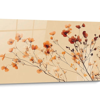
 Orange and Yellow Flowers Painting with Curled Petals - Found Herbarium - Chrysanthemum Edition233,90 €
 Chrysanthemum Ivory and Navy Profusion Print - Engraved Floral Pattern - Chrysanthemum Edition233,90 €
 Chrysanthemum Pink and Brown on Black Background - Japanese Floral Pattern - Chrysanthemum Edition233,90 €
 Chrysanthemum Blue Sky and Iced Lavender Painting - Morning Frost - Chrysanthemum Edition233,90 €
 Chrysanthemum White and Black Table - Curved Petals - Reflection on Dark Glass - Chrysanthemum Edition233,90 €
 Chrysanthemum Pink and White Painting on Beige Background - Delicate Sweetness - Chrysanthemum Edition233,90 €
 Chrysanthemum Coral Table with Tentacular Midnight Blue Leaves - Petals in Swirls - Chrysanthemum Edition233,90 €
 Chrysanthemum Red and White Tableaux with Silhouetted Leaves - Ink Splatter Corner - Chrysanthemum Edition233,90 €
 Chrysanthemum Pink and Pale Green Painting with Filamentous Petals - Closed Bud Neighbor - Chrysanthemum Edition233,90 €
 Chrysanthemum Pink and White Painting with Long, Tapered Petals - Surrounding Closed Buds - Chrysanthemum Edition233,90 €
 Chrysanthemum Pink and Burgundy Table with Amber Leaves - Gold Outlines Highlighted - Chrysanthemum Edition233,90 €
 Chrysanthemum Ivory and Coral Table with Curled Petals - Floral Awakening - Chrysanthemum Edition233,90 €
 Chrysanthemum Coral and Lavender Painting with Swirling Petals - Vibrant Turquoise Foliage - Chrysanthemum Edition233,90 €
 Golden and Green Chrysanthemum Table with Single Stem - Antique Botanical Print - Chrysanthemum Edition233,90 €
 Chrysanthemum Ivory and Blue Tableau with Swirling Petals - Marine Glazed Reflection - Chrysanthemum Edition233,90 €
 Chrysanthemum Ivory on Red Background with Crimson Disc - Greek Gold Pattern - Chrysanthemum Edition233,90 €
 Chrysanthemum White on Emerald Green Background - Silent Grace - Chrysanthemum Edition233,90 €
 White Chrysanthemum on Terracotta Geometric Background - Silent Bloom - Chrysanthemum Edition233,90 €
 Chrysanthemum Coral and Grey Painting with Swirling Petals - Duo of Delicate Flowers - Chrysanthemum Edition233,90 €
 Chrysanthemum Painting in Pale Pink and White Relief - Pastel Impasto - Chrysanthemum Edition233,90 €
 Blue Indigo Flowers on Ivory Background - Blue Ink Breath - Chrysanthemum Edition233,90 €
 Chrysanthemum Painting Pink and Burgundy with Frilled Petals - Duo of Intertwined Flowers - Chrysanthemum Edition233,90 €
In the same family
Also explore the theme Nature
-
 View all4980
artworks
View all4980
artworks
-
 Aloe vera94
artworks
Aloe vera94
artworks
-
 Tree64
artworks
Tree64
artworks
-
 Tree of Life50
artworks
Tree of Life50
artworks
-
 Azalea106
artworks
Azalea106
artworks
-
 Bamboo241
artworks
Bamboo241
artworks
-
 Nature's Beauties372
artworks
Nature's Beauties372
artworks
-
 Cornflower133
artworks
Cornflower133
artworks
-
 Cactus81
artworks
Cactus81
artworks
-
 Camellia197
artworks
Camellia197
artworks
-
 Poppy341
artworks
Poppy341
artworks
-
 Dahlia161
artworks
Dahlia161
artworks
-
 Eucalyptus119
artworks
Eucalyptus119
artworks
-
 Banana Leaf72
artworks
Banana Leaf72
artworks
-
 Golden Leaf2
artworks
Golden Leaf2
artworks
-
 Flower275
artworks
Flower275
artworks
-
 Iris Flower179
artworks
Iris Flower179
artworks
-
 Wildflowers5
artworks
Wildflowers5
artworks
-
 Pebbles7
artworks
Pebbles7
artworks
-
 Ginkgo71
artworks
Ginkgo71
artworks
-
 Glycine217
artworks
Glycine217
artworks
-
 Hydrangea140
artworks
Hydrangea140
artworks
-
 Garden18
artworks
Garden18
artworks
-
 Daffodil163
artworks
Daffodil163
artworks
-
 Lavender135
artworks
Lavender135
artworks
-
 Lily135
artworks
Lily135
artworks
-
 Daisy156
artworks
Daisy156
artworks
-
 Monstera8
artworks
Monstera8
artworks
-
 Other Nature80
artworks
Other Nature80
artworks
-
 Water Lily105
artworks
Water Lily105
artworks
-
 Olivier321
artworks
Olivier321
artworks
-
 Orchid87
artworks
Orchid87
artworks
-
 Palm Tree375
artworks
Palm Tree375
artworks
-
 Peony168
artworks
Peony168
artworks
-
 Roses14
artworks
Roses14
artworks
-
 Terracotta436
artworks
Terracotta436
artworks
-
 Sunflower152
artworks
Sunflower152
artworks
-
 Tulip542
artworks
Tulip542
artworks


All about Chrysanthemum Artwork
- Chrysanthemum Painting Presentation
- The Fold of the Petals
- The Herbarium Page
- Ink and Black Background
The Chrysanthemum Paintings gathered here all revolve around the same autumn flower, captured at the precise moment when its petals curl towards the heart. We see groupings of stems drooping under the weight of their flower, foliage sometimes bluish and sometimes reduced to its mere silhouette, powdery roses, mauve, deep browns and a few oranges that pop. None of these canvases seek a living room bouquet: they isolate the flower, place it on a plain background and let it occupy all the space.
The unity of the Chrysanthemum Paintings does not come only from the subject, but from the way it is framed. The background is almost always flat—a beige of old paper, a deep black, a off-white—and the flower casts no shadow. This gives images halfway between a herbarium sheet and a Japanese fabric pattern, two traditions that have learned to look at this flower from the front, without decoration and without perspective.
Hanging, these paintings warm without weighing down. The curled capitules create a spiral reading that holds the eye longer than a flat-laid flower, and the cut foliage brings the dark part that prevents the whole from turning into a pretty thing. On a light wall, the beige backgrounds blend into the wall paint and let the color work alone; on a dark partition, the black backgrounds disappear in turn and the corolla alone seems lit from within.
This collection speaks to those who are a little bored by conventional bouquets and interested in botany: lovers of old prints, curious about Eastern motifs, autumn gardeners who know what it costs to have a November flowering. It is also addressed to those who want color without fuss, in an entrance, a hallway or above a library. You can hang only one, for the flower; you can gather several, and then see appear the true richness of the subject, this same corolla ranging from the softest pink to burnt orange.
What the spiral of petals tells about the Chrysanthemum Paintings
Why do the petals curl towards the heart on a Chrysanthemum Painting?
Get closer to a Chrysanthemum Painting and look at the center of the flower: the petals are never flat, they curl into a horn and return to the middle like a spiral that closes. This is not a painter's convenience. What is taken for a single flower is actually a capitule, an assembly of hundreds of tongue-shaped florets, and centuries of horticultural selection have favored curved varieties, each tongue curling inwards. The canvas simply follows an architecture that gardeners have patiently made.
This curling changes the way we look at the wall. A flat-laid flower disperses the gaze towards its rays; here, each petal returns to the center, and the eye turns instead of sliding. This is what gives these paintings their spiral reading, slower, almost hypnotic, and which explains that they are noticed even after weeks of cohabitation. In a room where one only passes, they retain a few seconds more than average, and these seconds are enough to change the atmosphere of a wall panel.
On these paintings, the stem bends towards the side of the heaviest capitule
Nothing grows straight in the Chrysanthemum Paintings: the stems bow, cross in an X shape, sometimes emerge from the bottom of the frame, and the flower looks askew rather than directly at us. Follow a stem with your gaze, and it will always lead you to a capitulum that is too large for it — it is the plant that dictates, traditional cultivation suppressing secondary buds to concentrate all the sap into a single flower. Painters have made this constraint a principle: these diagonals give the canvases a movement that vertical flowers would never have had.
The lobed leaves, the only dark area in the Chrysanthemum Painting
You come for the flower, you stay for the leaves. In a Chrysanthemum Painting, they are deeply lobed, almost tattered, and the painters treat them either as dark silhouettes, or in a bluish green that only appears in backlight. This cut-out is the plant's botanical signature: it allows it to be recognized even without a single flower open. On the canvas, it plays another role: it provides the share of shadow and nervousness that prevents roses and lilacs from becoming overly sweet, and it structures the image as a line drawing would.
What the Chrysanthemum Paintings owe to herbarium sheets
Where does this beige old paper color come from that recurs in each Chrysanthemum Painting?
No vase, no table, no cast shadow: in a good half of the Chrysanthemum Paintings, the flower floats on a slightly uneven beige, dotted with light spots and visible fibers, like a leaf that has been stored for too long. Look at the edges: the color darkens a little there, exactly as a paper yellowed by light. This background is not decorative, it quotes horticultural collections from the 19th century where each new variety was recorded by hand, and it places the flower in a page rather than in a room.
These capitula are painted flat, never seen in foreshortening
There is something flattened in these Chrysanthemum Paintings, in the literal sense of the term. The stems spread out on the same plane, the leaves are presented frontally, the flower is seen in a three-quarter view or full-on but never in foreshortening: exactly the position in which a botanist arranges a plant before sliding it under a press. This convention is not a impoverishment, it comes from a discipline — showing all the organs in a single glance — and it produces images of rare readability.
This bias has a direct consequence on a wall. A classic still life creates depth and demands distance; these canvases remain on the surface and can be read as closely as desired. You can therefore live them up close, in a narrow corridor or on a wall already occupied, without the image eluding you. They behave less like an open window than like an enlarged page, and a page is something that approaches the eyes.
Rust, saffron, Burgundy: autumn is contained in the corolla alone
No mist, no russet undergrowth, no leaves on the ground: and yet the Chrysanthemum Paintings smell of the end of the year. Everything is contained in the corolla itself. Look at the restrained tones used by the painters — rust, saffron, Burgundy, creamy white, never a tender green or a spring pink — and you already have the entire season. A few canvases go further and let a single outer petal brown, at the edge of the capitulum: it is the only sign of passing time that these images allow themselves.
Black backgrounds and projected ink: the oriental share of the Chrysanthemum Paintings
Why do some Chrysanthemum Paintings place the flower on an absolute black?
On several Chrysanthemum artworks, the background isn't a piece plunged into shadow: it's a solid black, without gradients or lighter corners, against which the rose petals and browns are cut out like on a lacquer. Look closer and you'll see that the black stops against the flower without transition, without a halo, as if the corolla had been placed on it. This is the solution used in lacquerware and fabrics from East Asia, where the dark background exists only to make the motif shine: here, it makes the flower almost phosphorescent.
Why does the ink gush into the empty corner, far from the capitulum?
A stained corner, a few free splashes away from the flower: this gesture returns often enough in the Chrysanthemum artworks for one to stop seeing it as a clumsiness. It recreates two habits of ink painting, the brush too full that is allowed to fall and the seal placed in a corner, which deliberately unbalances the sheet. In this tradition, the void is never neutral: an accident must come to sign it. That is why these compositions seem to breathe while they are, in reality, very constructed.
Old rose, earth brown, saffron orange: the range of a Chrysanthemum artwork
The colors of the Chrysanthemum artworks form a family immediately recognizable: old rose, ashen mauve, earth brown, saffron orange, aged yellow, almost never bright red or clear blue. Put two canvases side by side and you will see that even the whites tend towards cream, and that each petal darkens as it moves inward, as if the flower kept its shadow inside. It is this internal gradient that distinguishes these canvases from a peony or a poppy, built on flat areas.
On a wall, this muted range blends with almost everything natural: light wood, terracotta, ecru linen, stone. It avoids the trap of the floral painting that shouts, because its colors seem already passed, as if filtered by a late-day light. One can therefore hang it in a room that is already well filled without triggering a color battle: the softness of late season acts as a binder between the already present tones.
FAQ on chrysanthemums artworks
Do these artworks necessarily evoke All Saints' Day and cemetery flowers?
In France, the association exists: after the First World War, it became customary to decorate graves with the only flower still valiant in early November. But look at what is painted here: exploded capitula, pink, mauve and orange, with petals rolled and disordered, carried by free stems — nothing to do with the tight pompons sold by the side of the road. Hung, these canvases read like a bouquet of late season, never like a memory of a cemetery.
How to distinguish a chrysanthemum from a dahlia when the canvas does not name it?
You have to look at three things. The petals of the dahlia are pointed, rigid, arranged in a regular rosette; those of the chrysanthemum curl into soft, often unequal, flaps, and curl towards the heart. Then the leaves: wide and smooth in the dahlia, deeply lobed and slightly greyed in the chrysanthemum. Finally, the stem, straight and fleshy on one side, thin and tilted on the other, often branched into small groups of two or three flowers. These canvases always check the second answer.
Do the Japanese motifs in this collection mean that the flower comes from Japan?
The processing comes from Japan, the plant from China. What you see on these canvases—a flat background without depth, a complete absence of shadows, a flower framed like a fabric pattern—is a Japanese visual grammar, that of kimonos and lacquers. The flower, for its part, was cultivated in China long before it reached the archipelago, where it became the imperial emblem. In other words: Japanese layout, Chinese subject, and a collection that embraces both.


