


Clock Painting
Here, time becomes matter and color. Each wall clock painting in this collection transforms the dial into a pictorial surface, between sculpted relief, expressive splashes and chromatic swirls. Acrylic glass amplifies the play of light on painted metal, textured rock or gilded foam, giving these wall clocks an almost living presence. A collection designed for those who refuse to choose between function and emotion, and want time, on their wall, to tell something too.
 Swirl Clock Painting Pink and Gold - Delicate Swirl - Clock Edition242,90 €
 Abstract Wall Clock Painting Green and Terracotta - Fragments of Time - Clock Edition242,90 €
 Swirl Pink and Gold Impasto Painting - Dance of Petals - Clock Edition273,90 €
 Gilded Marble Clock Painting with Peach Flowers - Timeless Elegance - Clock Edition273,90 €
 Blue and Ivory Gold Japanese Wave Painting - Marine Breath - Clock Edition273,90 €
 Sculpted Ochre and Sage Green Abstract Wall Clock Painting - Cycle of Time - Clock Edition273,90 €
 Gilded Roman Numeral Clock Painting - Suspended Twilight - Clock Edition273,90 €
 Wall Art Clock Blue Teal and Terracotta Abstract - Warm Eclipse - Clock Edition273,90 €
 Wall Art Clock Swirling Blues and Ochre Abstract - Vibrant Vortex - Clock Edition273,90 €
 Gilded Clock Painting with Black Sculpted Mechanisms - Timeless Splendor - Clock Edition273,90 €
 Painting Roman Clock with Golden Feathers Whirlwind - Golden Whirlwind - Clock Edition273,90 €
 Relief Geometric Beige and White Wall Clock - Mineral Silence - Clock Edition273,90 €
 Wall Art Clock Petrol Blue and Terracotta Textured - Mineral Collision - Clock Edition228,90 €
 Relief Rose and Gold Spiral Painting - Delicate Vertigo - Horloge Edition228,90 €
 Square Dial Painting White and Teal - Balance of Time - Clock Edition228,90 €
 White Clock Painting with Multicolor Keys - Joyful Splash - Clock Edition228,90 €
 Painting Clock blue and gold swirls painted - Whirlwind Breath - Clock Edition228,90 €
 Gilded Clock Painting with Silver Swirls - Baroque Radiance - Clock Edition228,90 €
 Painting Woman Leaning on a White and Black Clock - Embrace of Time - Clock Edition228,90 €
 Textured Red and Orange Flower Painting - Vibrant Bloom - Clock Edition228,90 €
 Painting Dial gray and red splashed with paint - Explosion of time - Clock Edition228,90 €
In the same family
Also explore the theme 🔥 The Originals 🔥
-
 View all573
artworks
-
 Spectral Animals33
artworks
-
 Colors Gone Wild31
artworks
-
 Cyberpunk111
artworks
-
 Epoxy (Style)47
artworks
-
 Fluid Mythoscene10
artworks
-
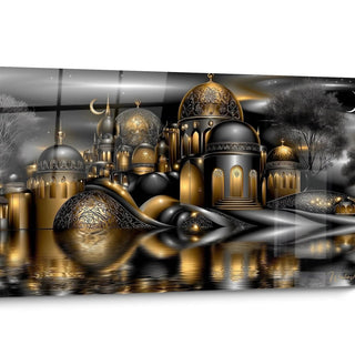 Originals Black Gold14
artworks
-
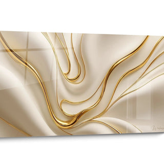 Abstract Relief10
artworks
-
 Statue169
artworks
-
 Crochet Style25
artworks
-
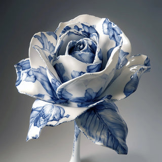 Porcelain Style8
artworks
-
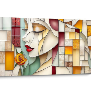 Stained Glass Style31
artworks
-
 Trompe-l'oeil8
artworks


All about Clock Painting
- Presentation Clock Painting
- Controlled chaos of the gesture
- Rock, relief and matter
- Movements and circular currents
This collection brings together clock paintings that do more than tell the time: they stage it. Each piece marries a functional mechanism with a bold pictorial composition, where colour, material and the artist's gesture matter as much as the hands themselves.
You will find dials crossed by bursts of colour, swirls of paint in deep tones, mineral reliefs that seem carved from rock, and waves inspired by Japanese woodblock prints in which time curls within the foam. This diversity of treatments gives the collection its unity: each clock painting is as much a wall artwork as an everyday object.
These pieces are for those who want a clock to stop being a merely practical accessory and become a visual anchor in a living room, an entrance or an office. They suit interiors seeking a strong statement without sacrificing the legibility of the time.
By hanging one, you choose a dual object: useful and contemplative, anchored in the passing of time yet resolutely focused on the image it composes on the wall.
What splattered paint says about time on these clock paintings
Why do some of these clocks seem to have exploded in colour?
On several clock paintings in this collection, the dial surface appears to have been struck by a burst of paint, as if the mechanism itself had trembled under the impact. This aesthetic owes much to Abstract Expressionism, the movement born in the mid-twentieth century in which the painter's rapid, instinctive gesture became the main subject of the work. Applied to an object as codified as a clock, this pictorial freedom creates a striking contrast between the rigour of time passing and the apparent chaos of the material. Hung at home, such a piece introduces a rare visual tension, a frozen movement that captures the eye well beyond its primary function.
Where does the energy running through some of the dials of the collection come from?
The black drips, bright red flashes and touches of green and blue that animate some of these clock paintings borrow their intensity from the dripping technique, popularised by post-war American painters who let paint flow freely onto the canvas. This process, long reserved for ambitious wall formats, finds an unexpected translation here on a timekeeping object. The result defies expectations: you no longer just read the hour, you read an entire composition, with its zones of tension and calmer breathing spaces. For an interior seeking a point of visual rupture, this approach offers a sharp contrast with plainer, linear clocks.
Does this pictorial language suit every room in the house?
A clock painting marked by this colourful chaos needs a space able to absorb its intensity without being overwhelmed: a generously proportioned living room, a wide corridor or a creative studio suit it particularly well. The visual density of these pieces works best when it has some distance and surrounding walls that are more neutral, letting the bursts of colour breathe. This type of dial appeals to those who like their interior to tell a story of movement and energy rather than silent calm, and who see time as a living material rather than an abstract datum.
What sculpted texture reveals on these clock paintings
Why do some dials in this collection seem cut from stone?
Several clock paintings in this selection play on a mineral relief effect, with thick impasto that evokes rock shaped by slow erosion. This approach draws on palette-knife painting, a technique of applying matter in thickness rather than in fine glazes, creating almost tactile reliefs under the light. The choice of terracotta or petrol blue tones reinforces this geological impression, as if two different masses of rock faced each other across the dial. This treatment gives the object an almost sculptural presence, far removed from the usual refinement of a classic dial.
What does the contrast between smooth and textured areas on these clocks reveal?
The alternation between an almost flat cream background and strongly raised coloured masses creates, on some of these clock paintings, a play of shadows that shifts with the angle of natural light. This principle recalls bas-relief sculpture, where depth arises from the interplay of hollows and projections rather than colour choice alone. On a wall, this effect literally changes appearance over the course of the day, morning light carving different shadows from those of evening. This variability gives the object a life of its own, well beyond its horological function, and particularly rewards interiors crossed by changing light.
Who is this mineral, textured language meant for?
A clock painting with sculpted matter appeals to lovers of chromatic restraint who still want strong relief, a presence that asserts itself without resorting to bright colour. This language suits entrances, offices and living spaces where a discreet yet textured visual anchor is wanted, able to converse with raw materials such as stone, wood or waxed concrete. These pieces please those who favour material over decoration, and who prefer an everyday object to assert itself through volume rather than sparkle.
What the painted swirls say about these clock paintings
Why does time seem to swirl across some of these dials?
On several clock paintings in the collection, broad curved brushstrokes wind around the dial like a breath captured in mid-motion. This circular composition echoes the very principle of the clock, whose hands turn endlessly, but pushes it further by dissolving the numerals into the pictorial gesture rather than isolating them clearly. The result evokes both an abstract painting and a measuring instrument, blurring the boundary between functional object and contemplative artwork. This visual choice establishes an almost hypnotic rhythm, where the eye follows the curves before finding the hour itself.
What does this swirling palette owe to the colours that make it up?
The navy blue,golden ochre or violet that dominate some of these clock paintings are not chosen at random: they are deep, warm tones which, combined in gradients, create an impression of continuous movement, like a changing sky captured at different hours of the day. This colour range owes much to the gestural painting of the mid-twentieth century, where thick, generous colour carried as much meaning as form. On a wall, this kind of palette brings enveloping warmth while keeping an almost nocturnal depth, a rare balance that avoids both coldness and excessive saturation.
Does this circular rhythm suit every mood?
A clock painting structured by these broad circular movements naturally finds its place in a room where you want to slow the gaze rather than capture it abruptly: a dimmed living room, a bedroom or a reading corner suits it well. The wide, enveloping gesture of the composition invites contemplation rather than a quick reading of the hour, which makes it a fitting choice for anyone wanting an object that can soothe as much as inform. This approach especially appeals to those who like time to be suggested gently rather than announced abruptly.
FAQ about clock paintings
Why do some clock paintings in this collection seem almost abstract, to the point that you forget the time?
Because the painterly gesture deliberately takes precedence over the immediate legibility of the dial. These pieces borrow from expressionist or gestural movements a freedom of composition that turns the clock into a contemplative surface before it is a quick-reading instrument. The hour is still there, but it has to be earned, which suits those who want an object you actually look at rather than glance at distractedly.
Does the wave inspired by Japanese woodblock prints have a real link to Japanese clockmaking tradition?
No, this clock painting draws on the graphic language of prints of breaking waves, not on a Japanese tradition of timekeeping. It is an aesthetic dialogue between an ancient marine motif and a Western functional object, not a historical reconstruction. This meeting creates a hybrid object, both decorative and horological, without claiming any specific cultural authenticity.
Do these brightly coloured clock paintings suit an interior that is otherwise fairly sober?
Yes, provided they are treated as a single focal point rather than one element among many. On a clear wall with neutral surrounding tones, the chromatic intensity of these dials becomes a controlled accent rather than visual overload, allowing a sober interior to welcome a strong pictorial touch without losing its overall balance.
Further reading
Our articles on this topic
- Giant clock painting for the living room: the decor solution that fills a bare wall
- Time as a Central Theme in Wall Art
- Black and white large-format clock mechanism painting: the decor guide
- Original acrylic glass painting with a gallery art effect: create an exhibition at home
- Adaptive Smart Art Clock, Wall Art That Adapts to Time
- Stained glass style painting in a bright entrance: what effect depending on time of day and orientation?
L'art qui suscite l'envie
Maison belge d'art mural grand format
14 jourspour changer d'avis*
Protection Walenskyincluse
Fabriquéen Italie
FormatXXL
Kit de fixationtoujours fourni
* Hors tableaux personnalisés et tailles personnalisées


