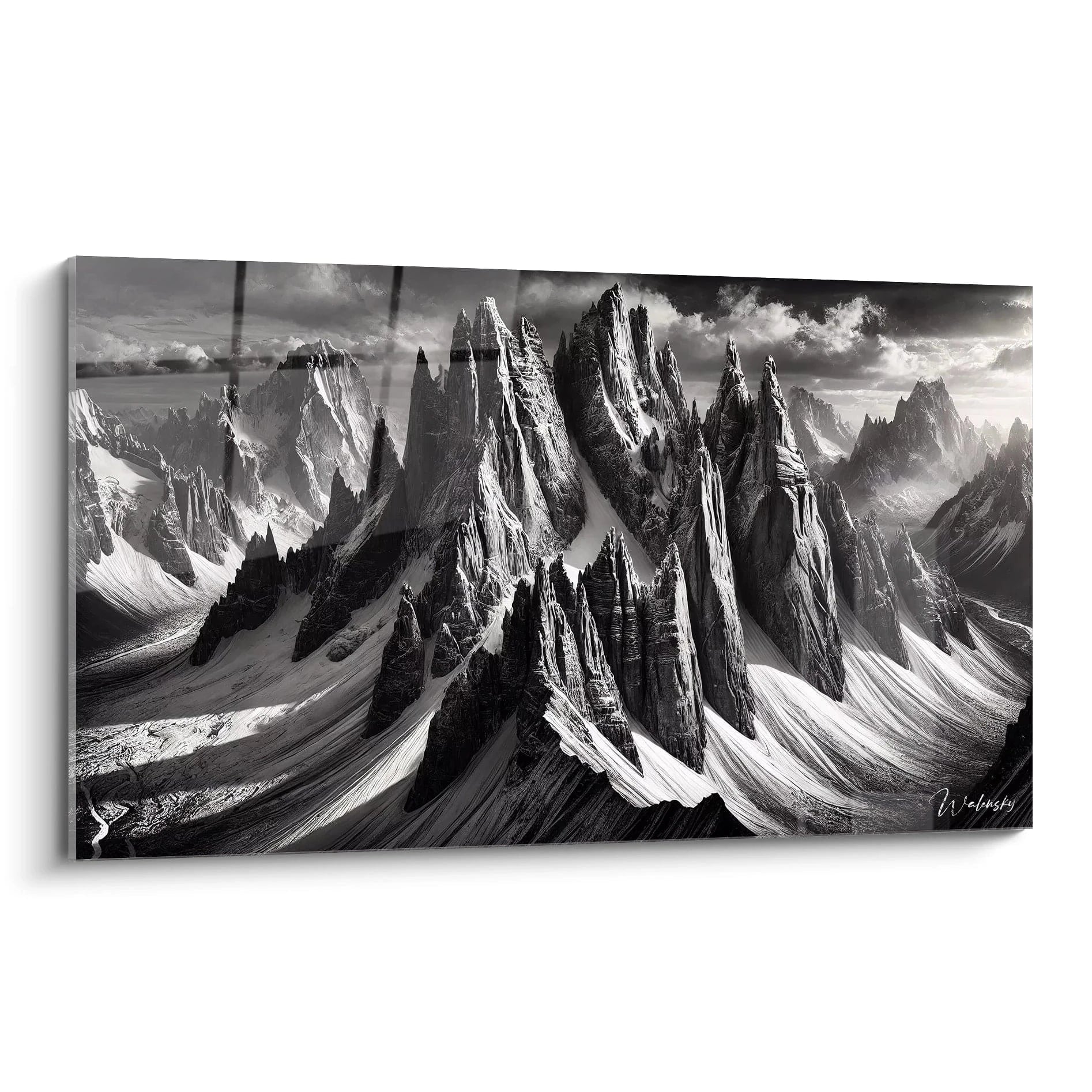
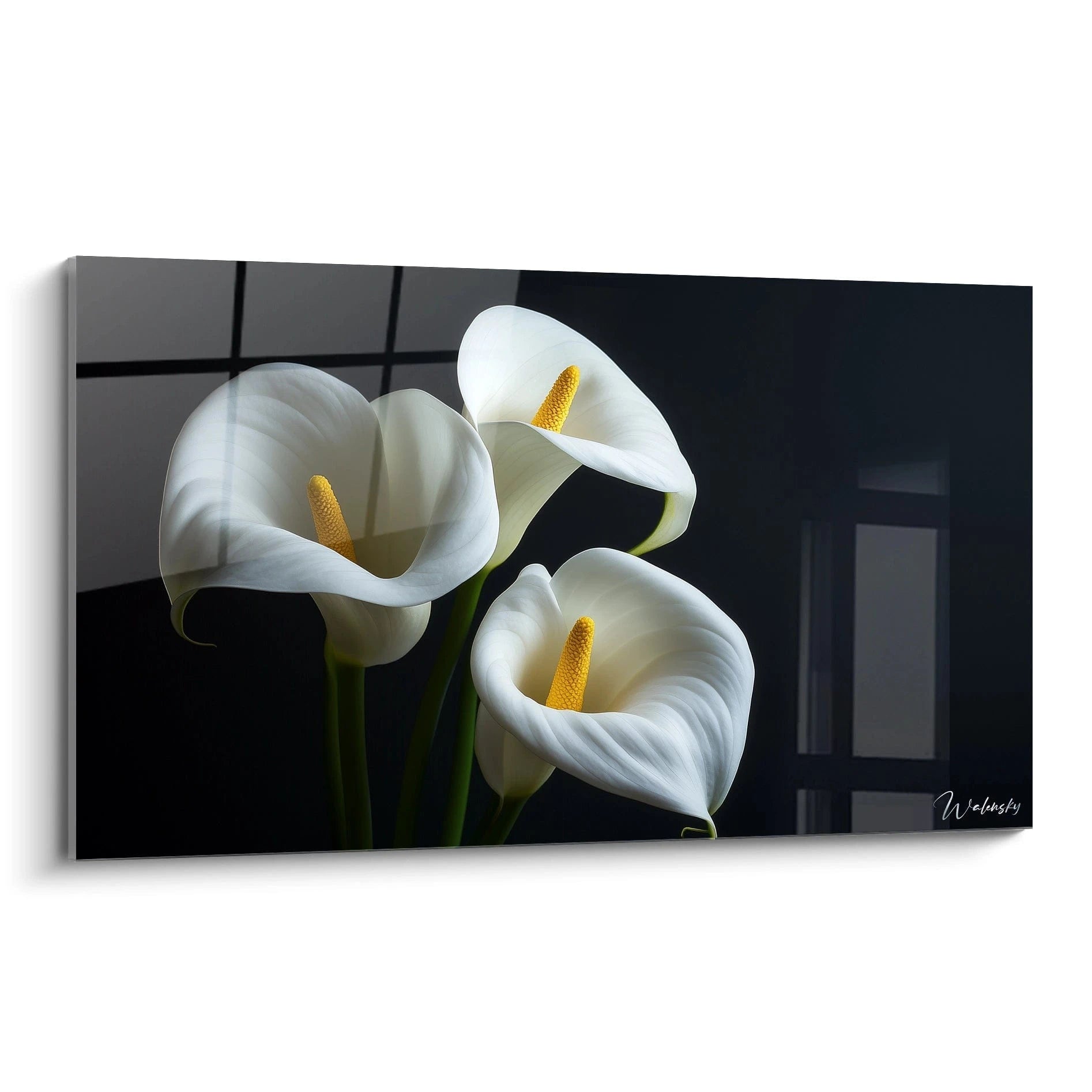
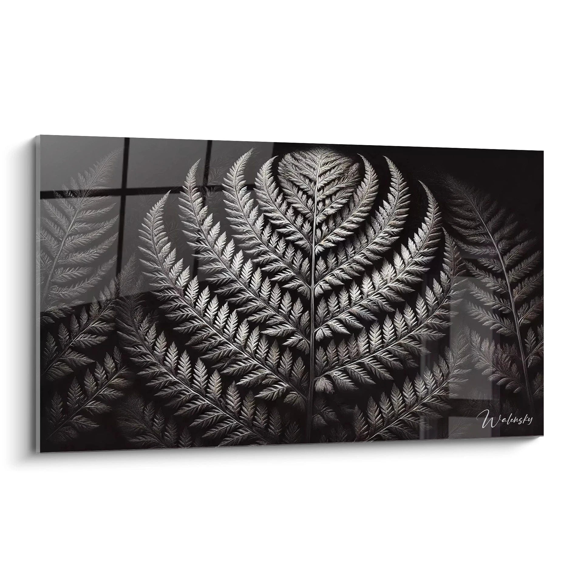
Designing a medical space requires particular attention to the visual atmosphere created for patients. A black and white waiting room wall art represents a decorative solution favored by healthcare professionals seeking to establish a neutral and calming environment. This bicolor chromatic approach eliminates excessive stimulation while offering a structuring visual presence, essential in environments where anxiety must be minimized. The large available formats allow effective coverage of the often-imposing walls of medical offices, clinics and care centers, transforming cold surfaces into reassuring focal points.
The Psychological Impact of Monochrome in Medical Spaces
The use of a black and white waiting room wall art responds to specific psychological requirements in care environments. The bicolor palette generates an instant calming effect by eliminating the sensory overload typical of colored spaces. Waiting patients, often subject to apprehension, benefit from neutral visual exposure that does not amplify their emotional state. Environmental psychology studies demonstrate that monochrome contrasts facilitate concentration without causing distraction, a crucial balance for people who must wait before a consultation.
How does black and white contrast reduce stress in waiting rooms?
Binary contrast offers immediate visual readability without requiring cognitive effort. In a medical context where patients experience moments of uncertainty, this chromatic simplicity acts as an emotional neutralizer. Black and white graphic compositions, particularly organic or geometric patterns, create visual anchor points that divert attention from health concerns. Large wall dimensions amplify this effect by occupying the peripheral visual field, generating a soothing envelope without saturating the space with disturbing stimuli.
The perceptual durability of monochrome artworks
Unlike polychrome compositions susceptible to visual fatigue, a black and white wall art maintains its aesthetic relevance over long periods. This characteristic proves strategic in waiting rooms where decorative renewal remains limited by budget constraints. The absence of ephemeral chromatic trends guarantees timeless modernity, avoiding rapid visual obsolescence. Healthcare professionals appreciate this stability, which preserves the coherence of their visual identity without requiring frequent redesigns. For those seeking an even more sophisticated approach, exploring a black and white abstract waiting room wall art allows the introduction of contemporary compositions while maintaining this chromatic neutrality.
The cultural universality of the black-white combination
The monochrome palette transcends cultural and generational preferences, a major advantage in medical spaces receiving diverse patient populations. No specific cultural connotation limits the appreciation of a black and white waiting room wall art, unlike colored compositions that may evoke different symbolics depending on origins. This universality guarantees unanimous positive reception, an essential criterion for establishments concerned with inclusivity. Bicolor graphic patterns communicate accessible sophistication, avoiding the pitfall of overly specialized or elitist decoration.
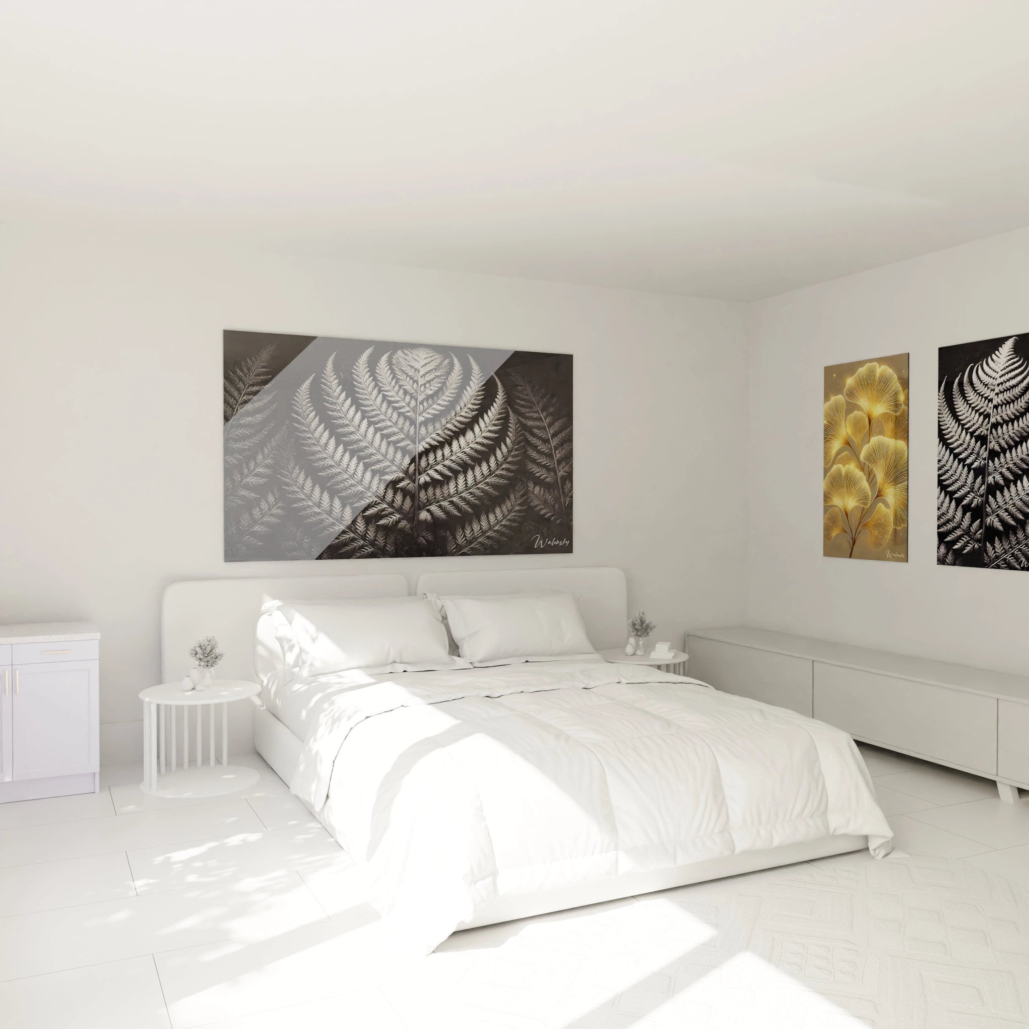
Spatial Optimization Through Large-Format Monochrome Design
The integration of a large black and white waiting room wall art radically transforms the volumetric perception of medical spaces. The large wall surfaces characteristic of healthcare facilities require proportional visual solutions to avoid a destabilizing sense of emptiness. An extended monochrome composition structures the space visually without weighing it down, creating a subtle architectural presence that defines zones without partitioning. This approach proves particularly relevant in waiting rooms with high ceilings or atypical configurations.
Why prioritize large formats in medical environments?
Medical spaces often impose important viewing distances between seats and walls. A reduced format would be lost in these volumes, depriving patients of an engaging focal point. Large black and white compositions maintain their visual impact even when observed from several meters away, guaranteeing constant presence in the visual field. This monumental scale also communicates a message of professionalism and investment in patient comfort, reinforcing the qualitative perception of the establishment. Extended graphic patterns create visual rhythms that invigorate the rectangular spaces typical of waiting rooms.
Managing artificial light through monochrome
Medical environments function mostly under standardized, often cool artificial lighting. A black and white wall art accommodates these constraining lighting conditions perfectly, unlike colored works whose nuances degrade under certain color temperatures. Binary contrast remains stable regardless of lighting intensity or quality, ensuring constant visual coherence from morning to evening. This aesthetic predictability avoids disappointments related to lighting variations typical of multi-windowed or exclusively artificial spaces.
Coordination with standardized medical furniture
Waiting room furniture generally complies with strict hygiene standards favoring smooth materials and neutral tones. A black and white wall art naturally harmonizes with these sober palettes without creating visual clash. Metal chairs, glass side tables and light sanitary finishes find in this chromatic approach a logical extension that unifies the whole without monotony. The monochrome composition acts as a bridge between medical functionality and the aspiration for comfort, humanizing the space without compromising its professional character. This compatibility facilitates decorative integration without requiring costly furniture modifications.
Selection Strategies for Maximum Professional Impact
Choosing a black and white waiting room wall art involves strategic reflection beyond immediate aesthetics. The typology of patterns directly influences the perception of the establishment: organic compositions evoke fluidity and nature, while geometric structures communicate rigor and precision. Pediatric offices will favor soft, curved forms, while surgical centers will opt for affirmed architectural lines. This correspondence between visual content and medical specialty subtly reinforces professional identity without resorting to explicit signage.
Which black and white patterns suit different medical specialties?
General medicine practitioners benefit from balanced compositions mixing organic elements and graphic structures, reflecting the diversity of their practice. Neurology specialists can select stylized neural networks or branching trees subtly evoking their field. Dermatologists will favor textures and nuanced gray material effects. Cardiologists will orient toward rhythmic compositions suggesting movement and flow. This discreet personalization creates thematic coherence appreciated by both patients and professional referents during accreditation visits.
Simplified maintenance of monochrome surfaces
Medical environments require rigorous hygiene protocols extending to decorative elements. The supports of black and white wall art, typically treated against humidity and dust, withstand regular cleaning without visual degradation. The absence of colored pigments eliminates risks of discoloration from disinfectant products or exposure to certain UV lighting used in sanitary protocols. This technical resilience guarantees the longevity of the decorative investment, a non-negligible economic criterion for budget-conscious structures. Large smooth surfaces clean quickly, minimizing activity interruptions.
Strategic positioning in the waiting space
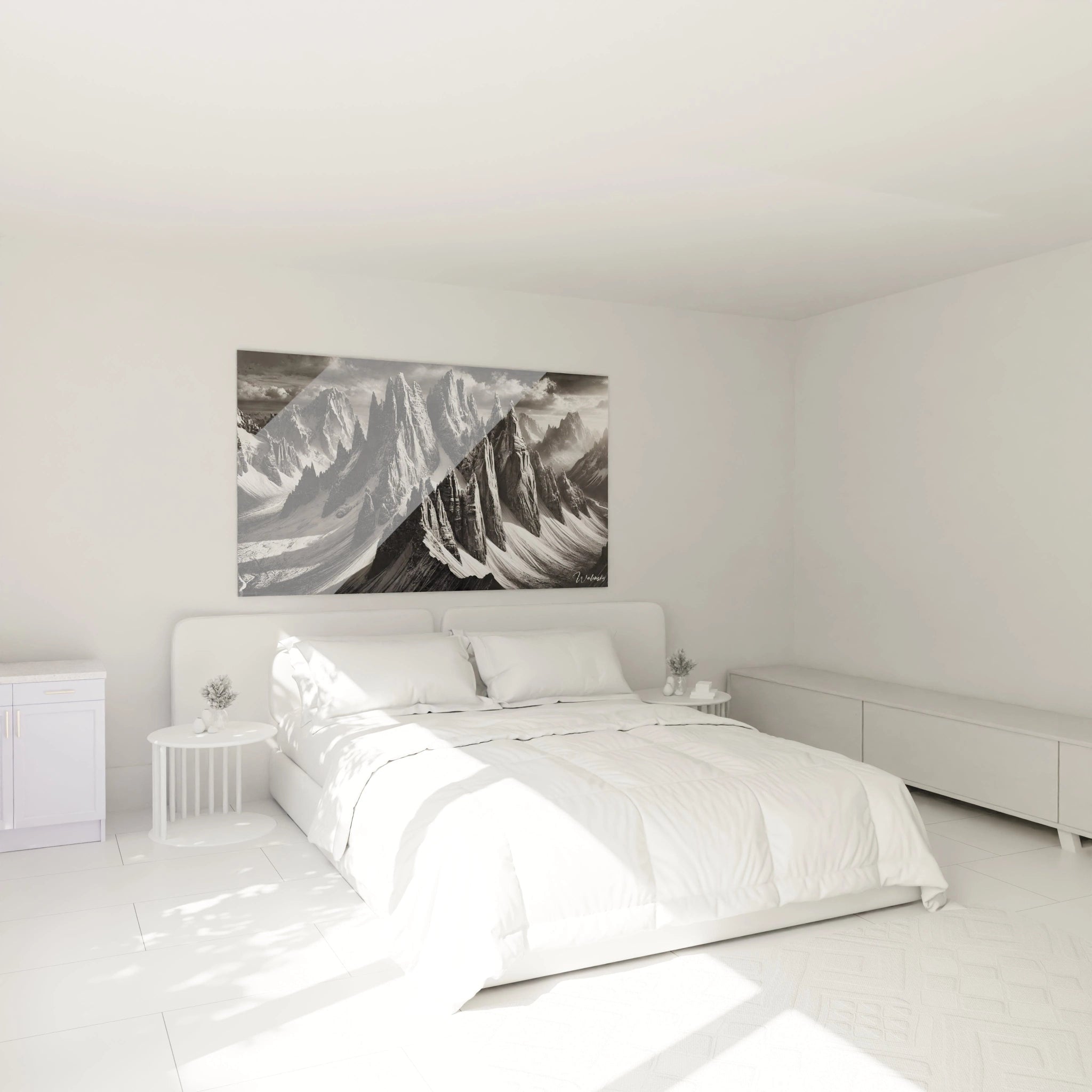
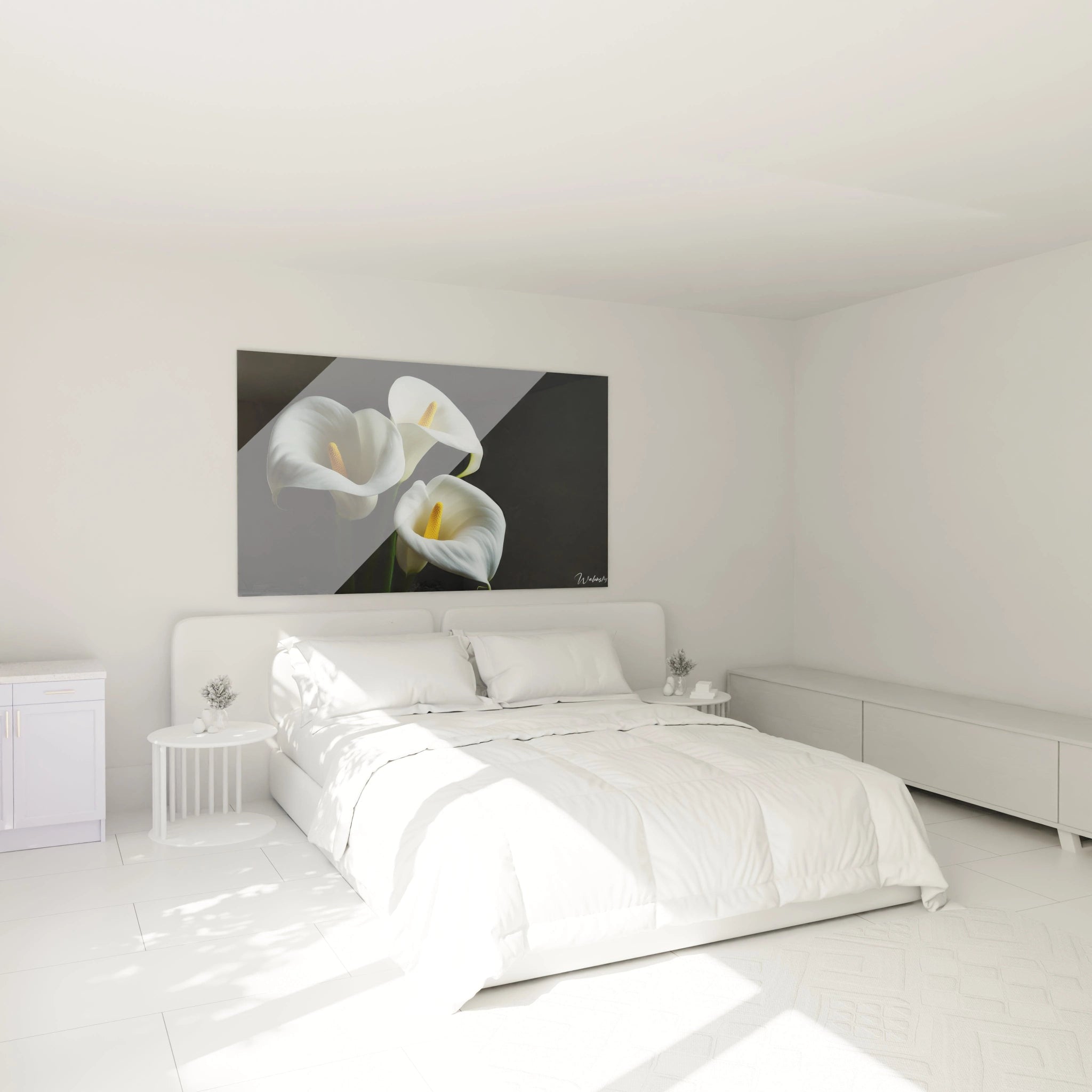
The placement of a large-format monochrome wall art determines its psychological effectiveness. The wall facing the entrance constitutes the privileged location, offering a structuring first impression upon patient arrival. This frontal position naturally captures attention and sets the tone for the waiting experience. Angled or side wall configurations suit L-shaped spaces or multifunctional rooms. Avoid placements behind reception counters where the wall art would be partially obscured by staff. Hanging height should consider prolonged sitting position, privileging visual centering from seats rather than standing.
Does black and white wall art suit all waiting room sizes?
Large formats remarkably adapt to vast spaces as well as small rooms. In restricted volumes, an extended monochrome composition paradoxically creates an impression of enlargement by eliminating visual fragmentation of walls. For spacious areas, the imposing format avoids dispersion by creating a federating focal point. The essential lies in respecting wall proportions: the wall art should occupy approximately 60 to 75% of the wall width for optimal impact.
How to coordinate multiple black and white wall artworks in the same space?
When configuration imposes multiple simultaneously visible walls, prioritize a coherent series sharing common graphic language but with varied compositions. Alternate dense patterns and refined compositions to create visual rhythm without saturation. Maintaining format uniformity reinforces professional coherence, while different sizes can suit deliberately asymmetrical spaces or contemporary architectures.
Does black and white work in already-colored waiting rooms?
A monochrome wall art acts as a visual neutralizer capable of tempering chromatically charged environments. It brings visual breathing in spaces with colored walls, creating balance without requiring complete decorative overhaul. This flexibility makes it a progressive optimization solution, allowing ambiance improvement without heavy renovation investments.