- Pink painting
- Pink wall art
- Pink wall decoration
How to integrate a pink painting into your modern interior decoration ?
How to integrate a pink painting into your modern interior decoration?
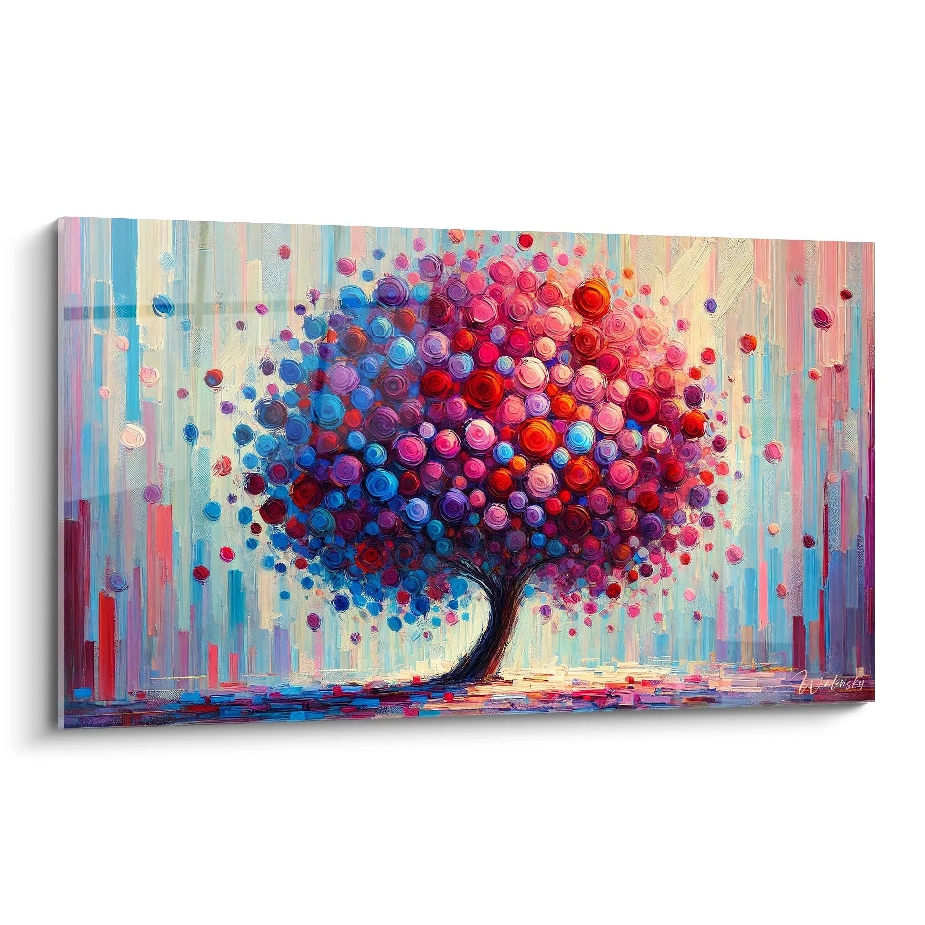
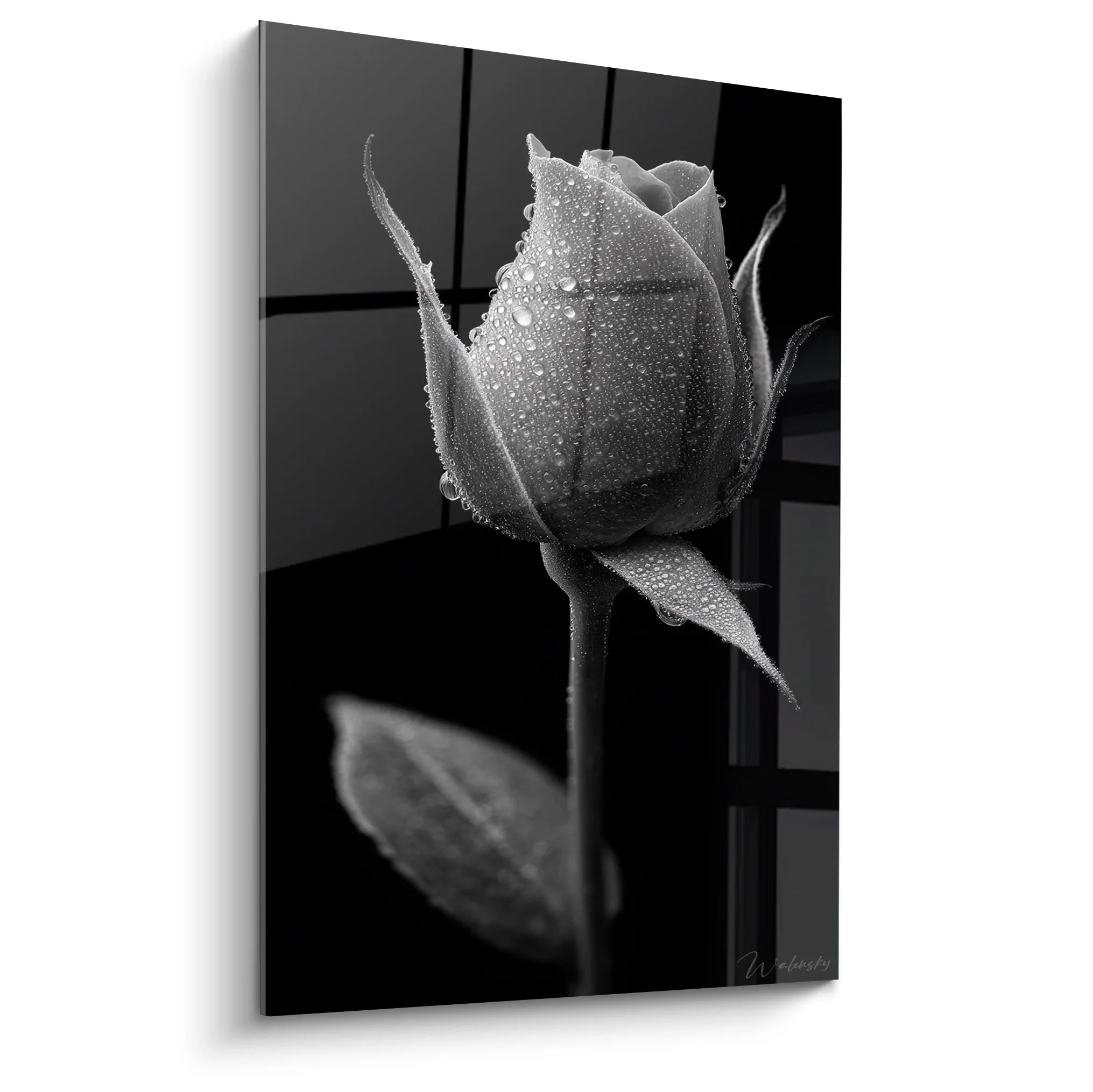
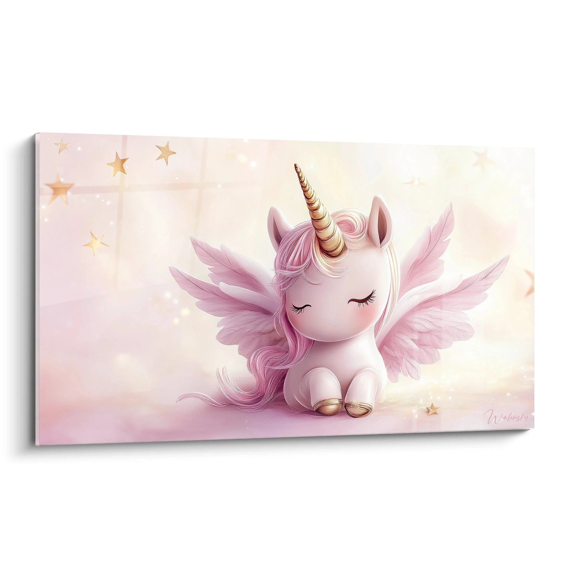
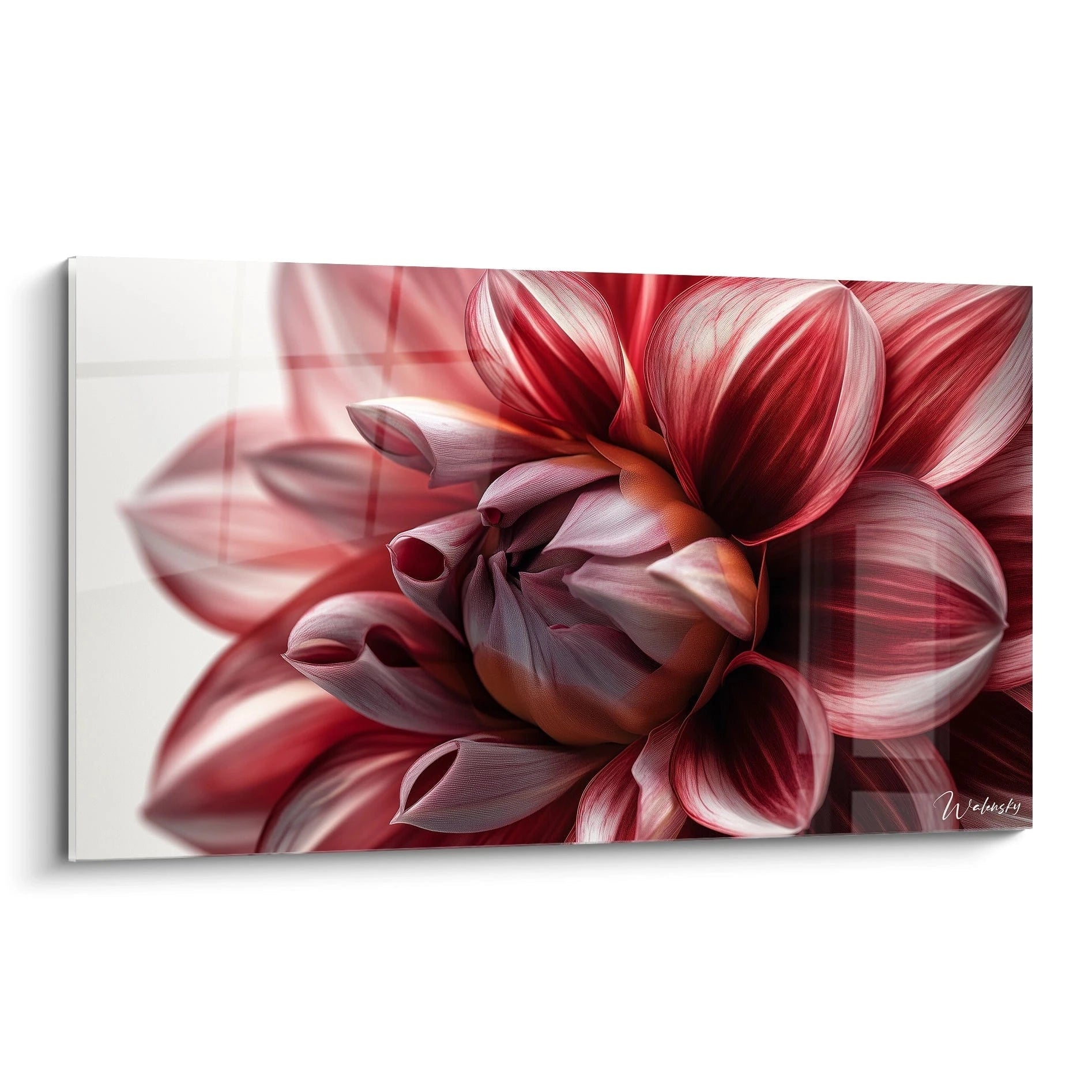
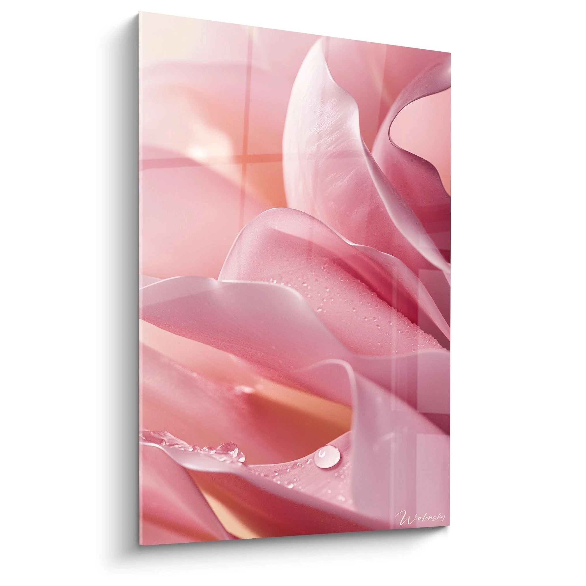
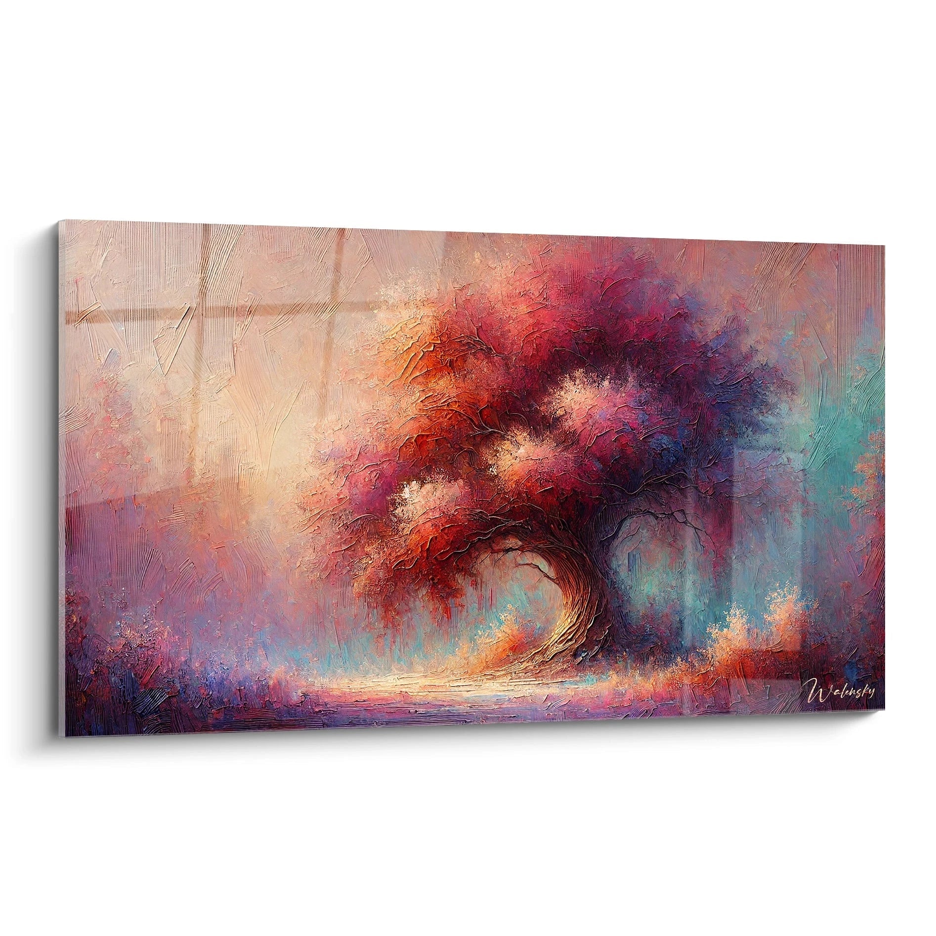
The pink painting has become an essential element in the world of modern interior decoration. Its rich palette, ranging from delicate powder pink to vibrant fuchsia, brings a touch of femininity and subtle energy to any space. More than just a decorative element, it acts as a true focal point, capable of transforming a room through its bold presence. Its integration into a contemporary interior is based on balancing colours, materials and shapes to create refined visual harmony.
The influence of pink in contemporary design
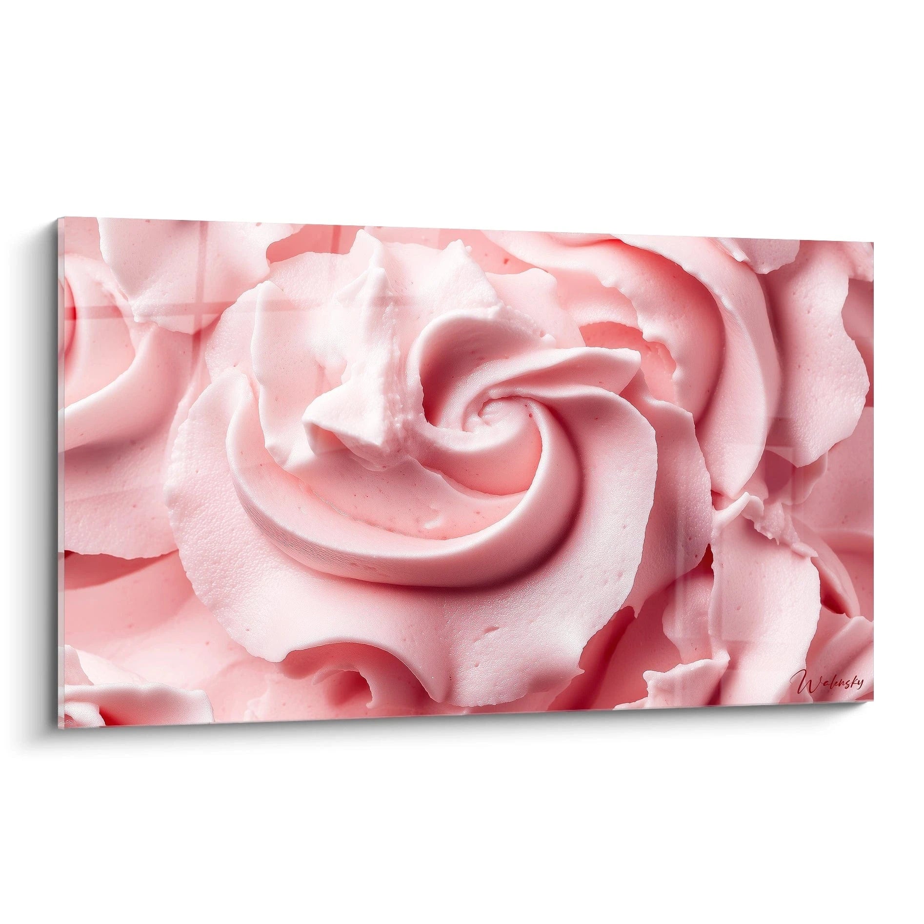
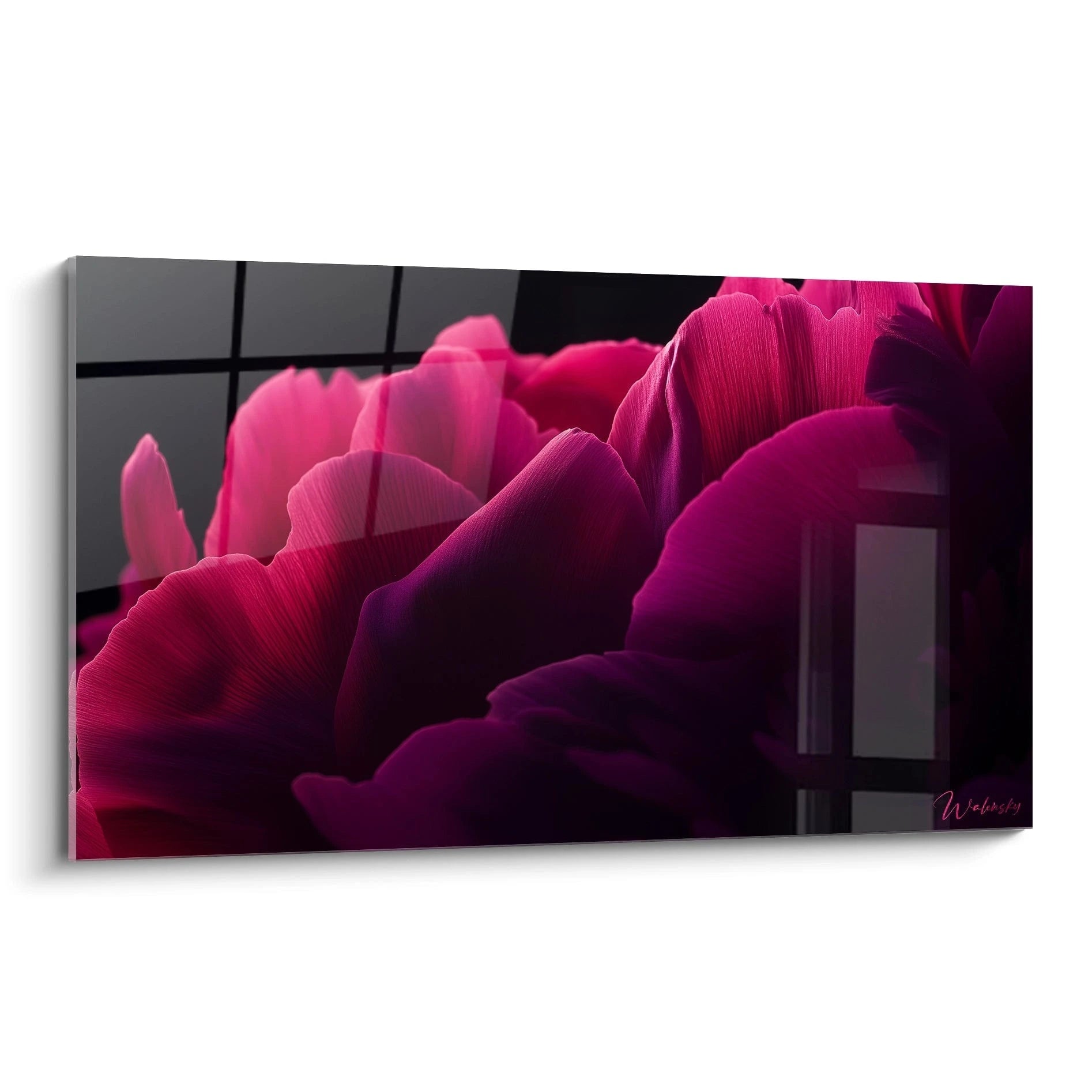
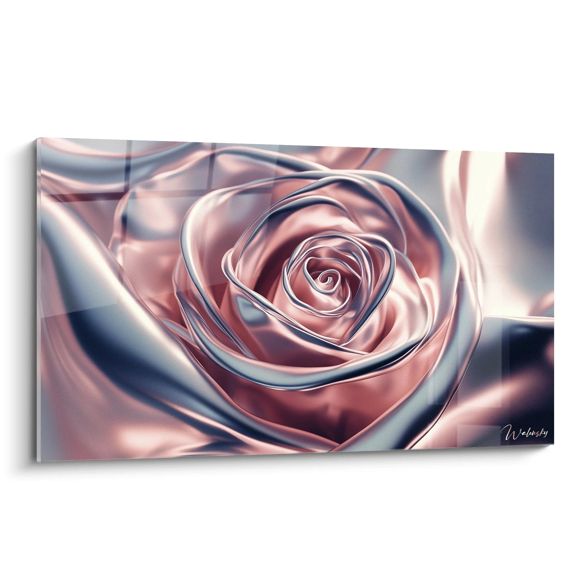
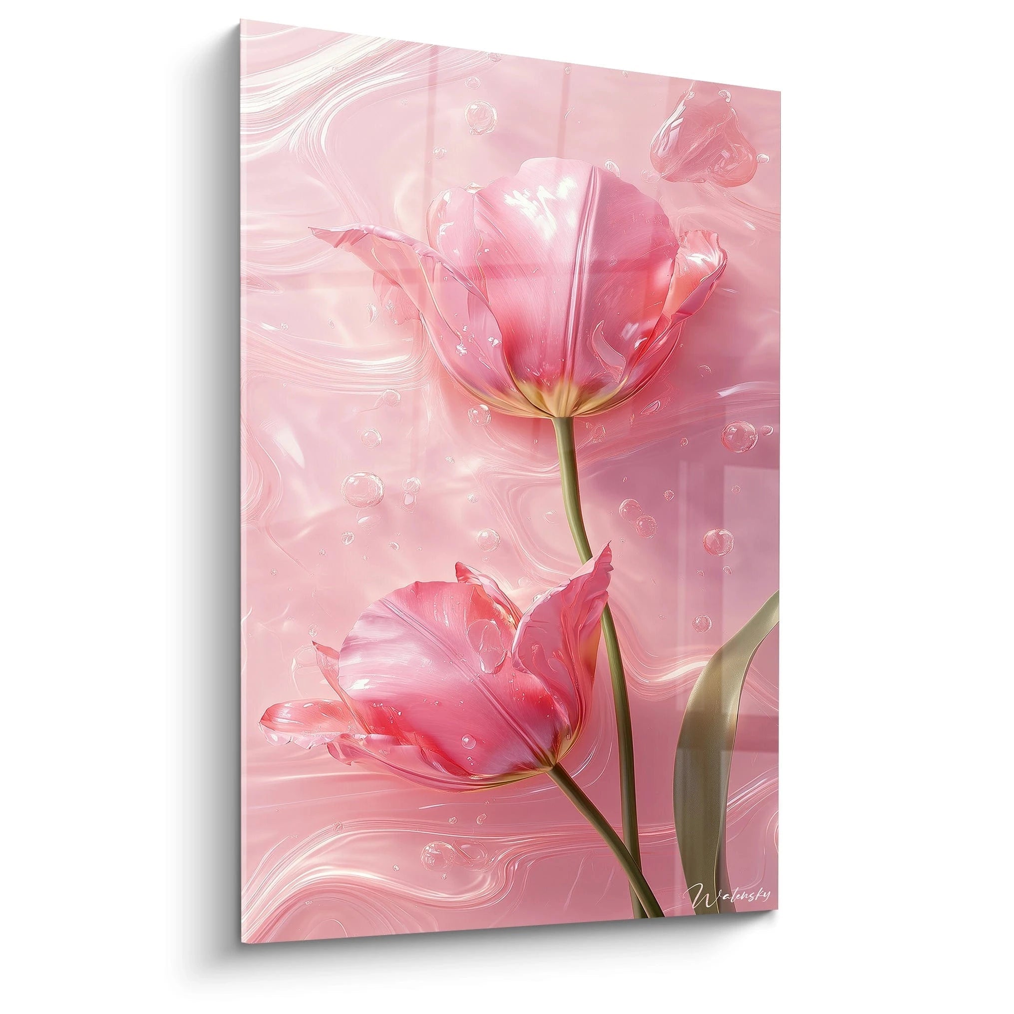
In contemporary design, pink is no longer perceived as an exclusively soft or feminine colour. It now asserts itself as a sophisticated hue capable of defining varied atmospheres. Used in pink wall art or pink wall painting, it infuses an atmosphere that is both warm and elegant. The pink gradient, from pastel shades to more intense tones, offers striking visual contrasts, perfect for minimalist spaces or bold décors. This subtle colour can evoke softness, passion, or even a certain discreet luxury, depending on its intensity and association with other decorative elements.
Pairing pink with neutral tones for perfect balance
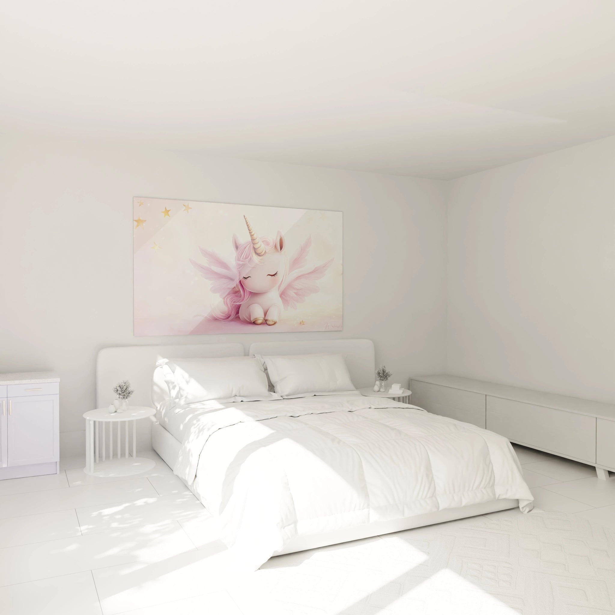
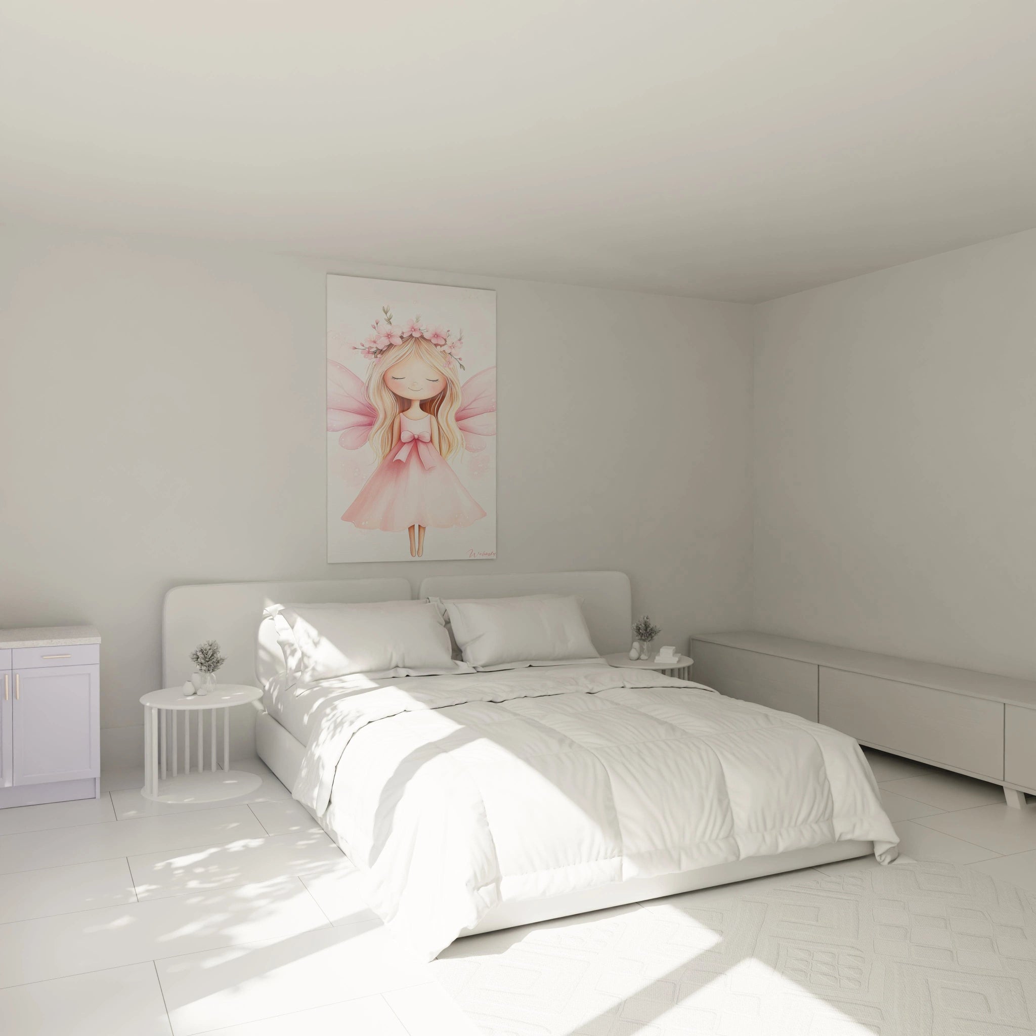
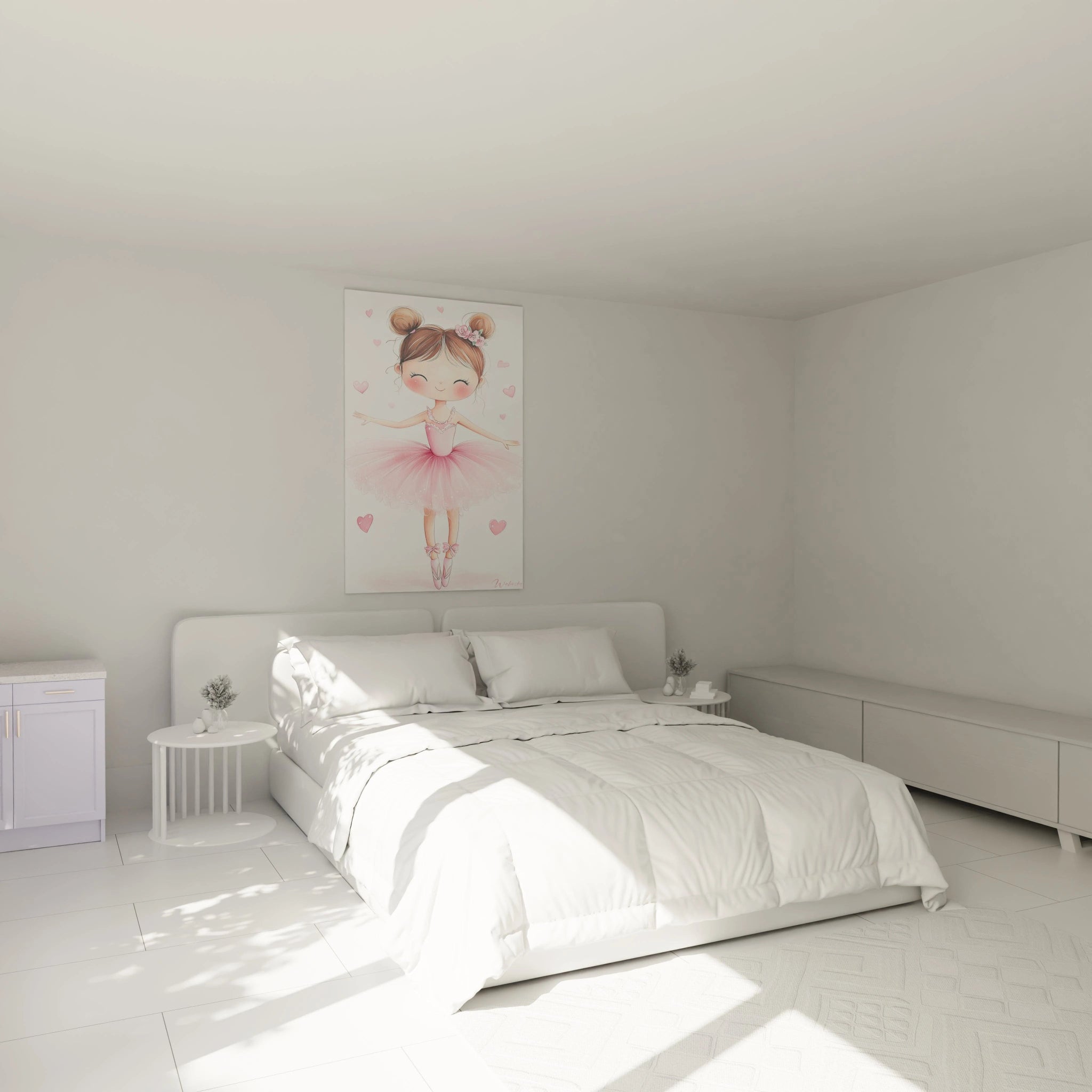
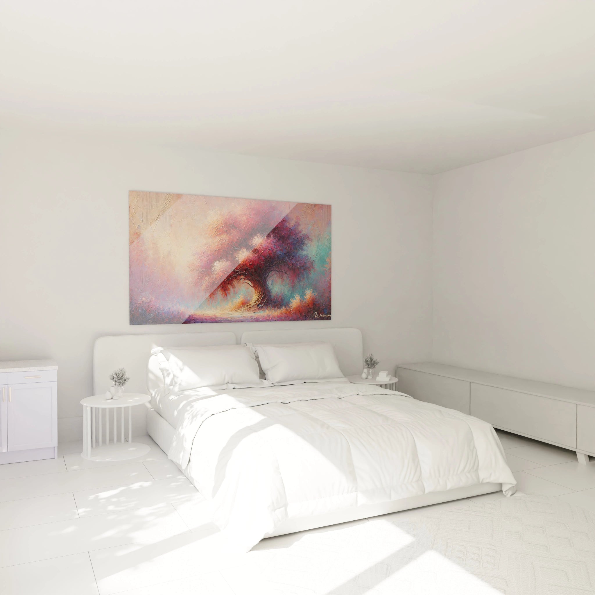
Pairing the pink painting with neutral tones is essential for maintaining harmonious visual balance. Light grey, beige, off-white or taupe shades allow you to soften the intensity of pink while highlighting it. This combination creates an elegant contrast, ideal for clean-lined interiors. For example, a pink frame hung on an immaculate white wall catches the eye without being overwhelming. The addition of natural materials such as light wood or matte black metal details reinforces this balance, while preserving a contemporary aesthetic.
The importance of materials and textures around the pink painting
The choice of materials and textures around a pink design painting is crucial to enhance its visual impact. Combining smooth surfaces such as glass, brushed metal or polished concrete with softer textures such as velvet, linen or wool creates an enriching sensory contrast. For example, a vibrant pink poster hung on a raw concrete wall will add warmth to an industrial décor. Conversely, soft textiles in pastel colours will reinforce the softness of a light pink, creating a soft atmosphere that is both calming and soothing.
Creating an accent wall with a bold pink painting
To give character to a room, a contemporary pink painting can be used as the central element of an accent wall. It immediately catches attention, creating a striking focal point. A large format in intense pink tones can transform a blank wall into a work of art in its own right. To accentuate this effect, it is advisable to choose a neutral background, such as pearl grey or sand beige, which will highlight the intensity of the painting. Pairing this with graphic elements and minimalist accessories reinforces its central role in the room, while preserving a clean aesthetic.
Mistakes to avoid when integrating a pink painting
Although the pink painting is an undeniable décor asset, certain mistakes can harm its integration. One of the most common is an excess of pink in the room, creating an overly uniform and overwhelming effect. It is preferable to limit this colour to well-placed touches to maintain balance. Also avoid pairing pink shades that are too contrasting without a coherent colour palette logic. Finally, poor lighting can diminish the visual impact of the painting: favour soft, warm light to reveal all the depth of its nuances and highlight its luminous brilliance.
The best colours to complement a pink painting in your living room
The Best Colours to Complement a Pink Painting in Your Living Room
The pink painting is much more than a simple decorative element: it embodies a true artistic statement capable of transforming the atmosphere of your living room. Its charm lies in its ability to bring both a touch of femininity, a luminous glow and a soothing effect. But how to showcase it? The choice of colours surrounding it plays a key role. Here are harmonious and inspiring combinations that will reveal the full richness of your pink wall art.
Pink and Grey: The Timeless Duo for a Chic Atmosphere
The combination of pink and grey is a classic that never goes out of style in pink wall decoration. Grey, neutral and sophisticated, enhances the softness of a pink design painting without overshadowing it. Imagine a pink abstract painting delicately framed in a pink frame on a pearl grey or slate grey wall: the balance is perfect. Grey softens the intensity of pink while strengthening its presence, creating an atmosphere that is both modern and refined. To accentuate this effect, add light grey cushions and textiles in powder pink: the result is a chic interior, minimalist and elegant.
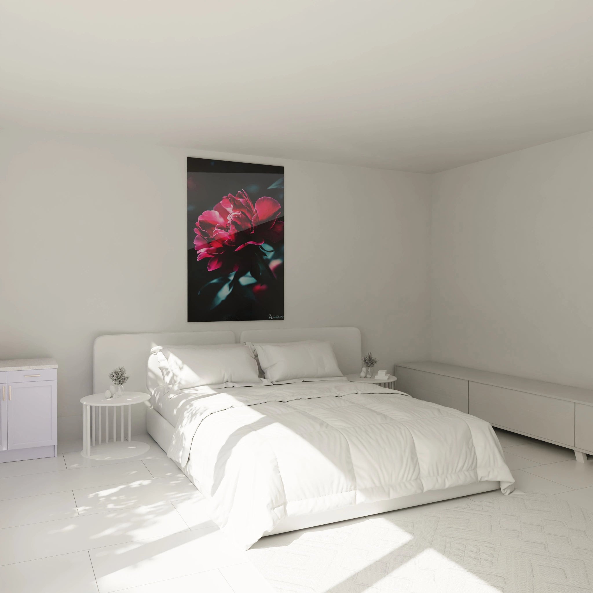
Contrast pink with dark shades for a dramatic effect
For those seeking a bold style, pairing a contemporary pink painting with dark colours such as midnight blue, emerald green or deep black creates a spectacular visual effect. This strong contrast energises the space and gives pink a vibrant intensity. For example, a pink poster on an anthracite wall instantly captures attention, adding character to the room. Complete this look with dark velvet furniture or black metal accessories to reinforce the theatrical atmosphere. This approach is ideal for a modern style living room, where each colour expresses itself fully.
Combine pastel tones for a soft and soothing atmosphere
If you aspire to a more serene atmosphere, pair your pink painting with pastel colours such as sky blue, mint green or pale yellow. These delicate shades create a light and soothing atmosphere, perfect for a living room conducive to relaxation. Imagine a pink poster against a cream wall, surrounded by cushions in pink gradient and soft natural linen textiles. This combination evokes a romantic spirit and a sense of freshness. The use of natural materials, such as light wood or rattan, enhances the harmony of this palette and reinforces the softness of the whole.
Pink and Gold: A Luxurious Combination for a Refined Interior
For sophisticated décor, pair your pink abstract painting with gold accents. Gold, with its warm and luminous reflections, creates an elegant and luxurious contrast. A pink frame with gold details, brass lighting or cushions with metallic touches elevate the whole by adding a precious note. The combination of gold with shades of powder pink or pink gradient offers a chic and refined aesthetic. To avoid any visual overload, favour discreet but strategically placed gold touches, such as vases, mirrors or furniture handles.
Harmonise a pink painting with green plants for a natural touch
Finally, to infuse an organic dimension to your décor, pair your pink painting with green plants. The contrast between vibrant pink and natural green creates a soothing visual harmony, reminiscent of lush flowering gardens. Place plants with varied foliage, such as ferns, succulents or a monstera, around your pink canvas. The integration of these natural elements brings texture and dynamism to the space while accentuating the warmth and luminosity of the work. This simple yet effective combination infuses positive and invigorating energy into your living room.
The pink painting offers endless possibilities to enhance your interior. By playing with contrasts, colour harmonies and the addition of natural elements, you can create a unique living room where every detail contributes to an elegant, warm and inspiring atmosphere.
How can a pink painting transform the ambiance of a room ?
A pink painting is much more than a simple decorative element: it acts as a true lever for transforming the atmosphere of a room. Its visual, emotional and aesthetic impact is capable of metamorphosing a space, giving it new dynamics. Whether in a minimalist interior, a warm living room or a soothing bedroom, a pink painting infuses unique energy, oscillating between softness and vitality.
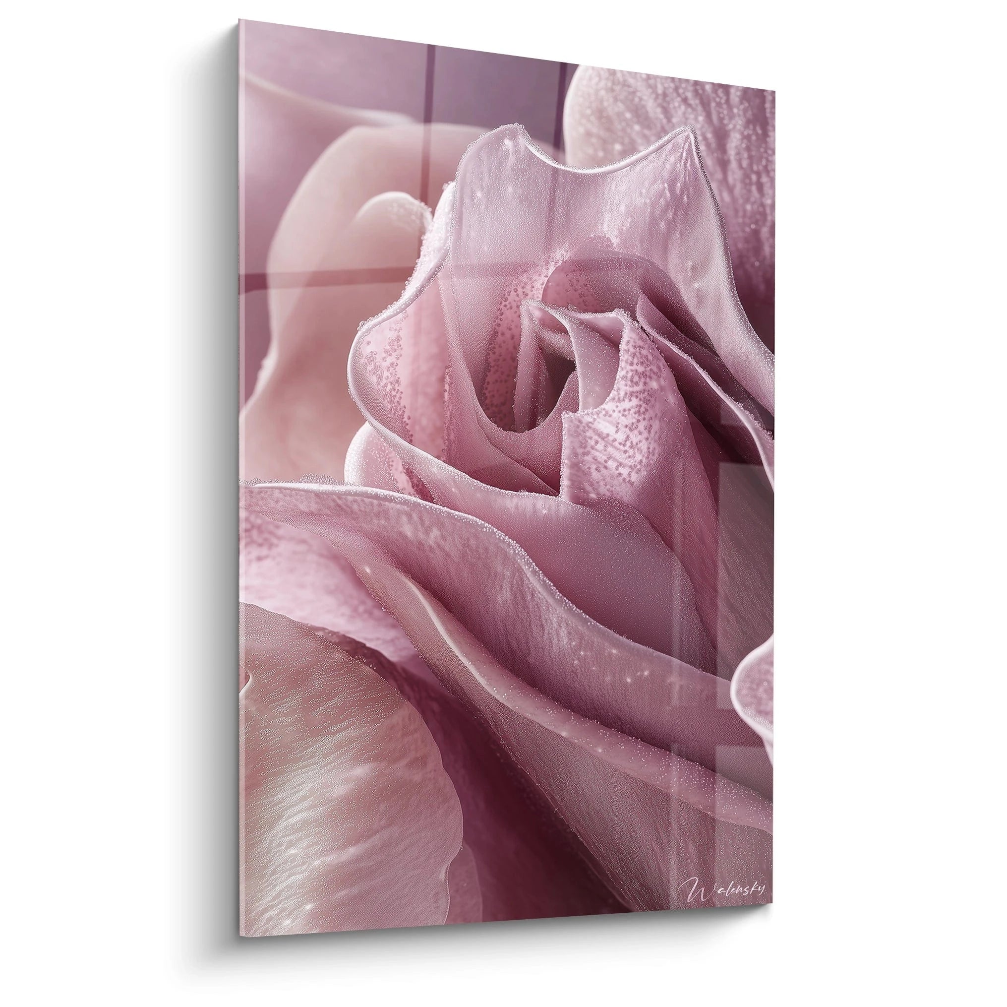
The psychological impact of different shades of pink
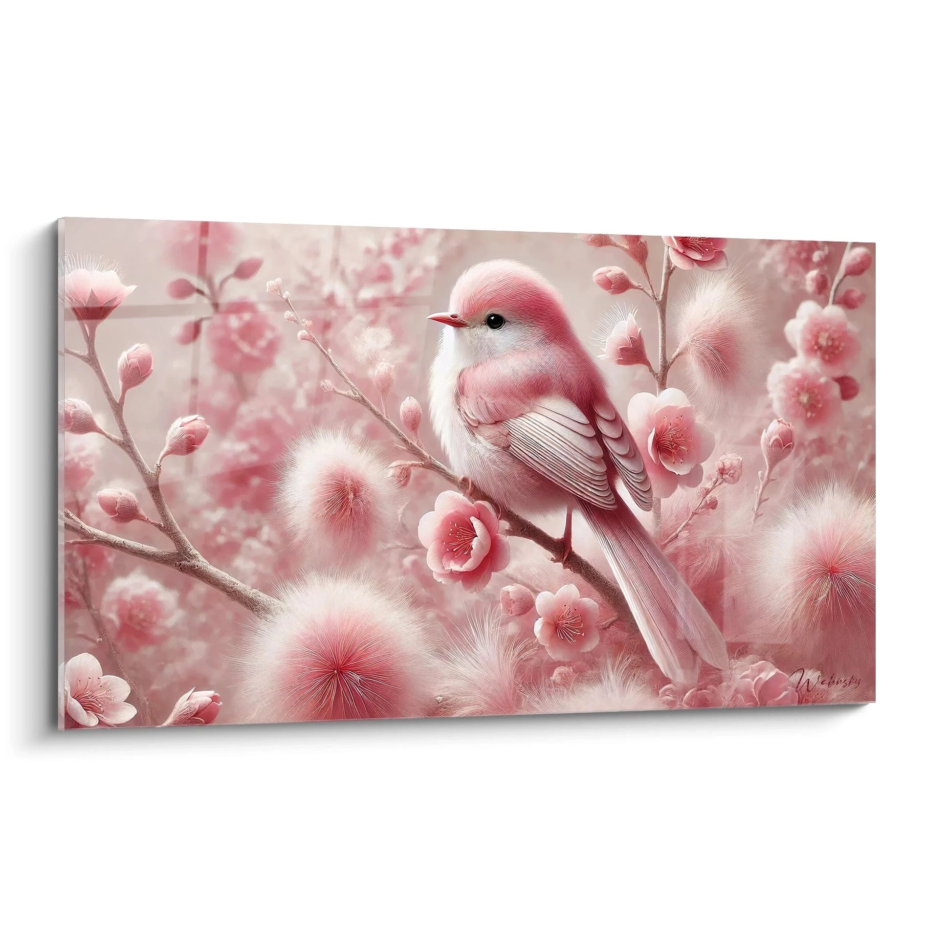
Each shade of pink has its own influence on our mood and emotions. Powder pink, a symbol of delicacy, promotes serenity and creates a soothing atmosphere, ideal for relaxation spaces. Pastel colours such as pale pink bring a sense of calm and comfort. Conversely, fuchsia or magenta pink stimulates energy, promoting creativity and enthusiasm. Coral pink infuses subtle dynamism, perfect for brightening a work environment. This diversity allows the pink painting to be a true vector of emotions, adapting to the desired atmosphere.
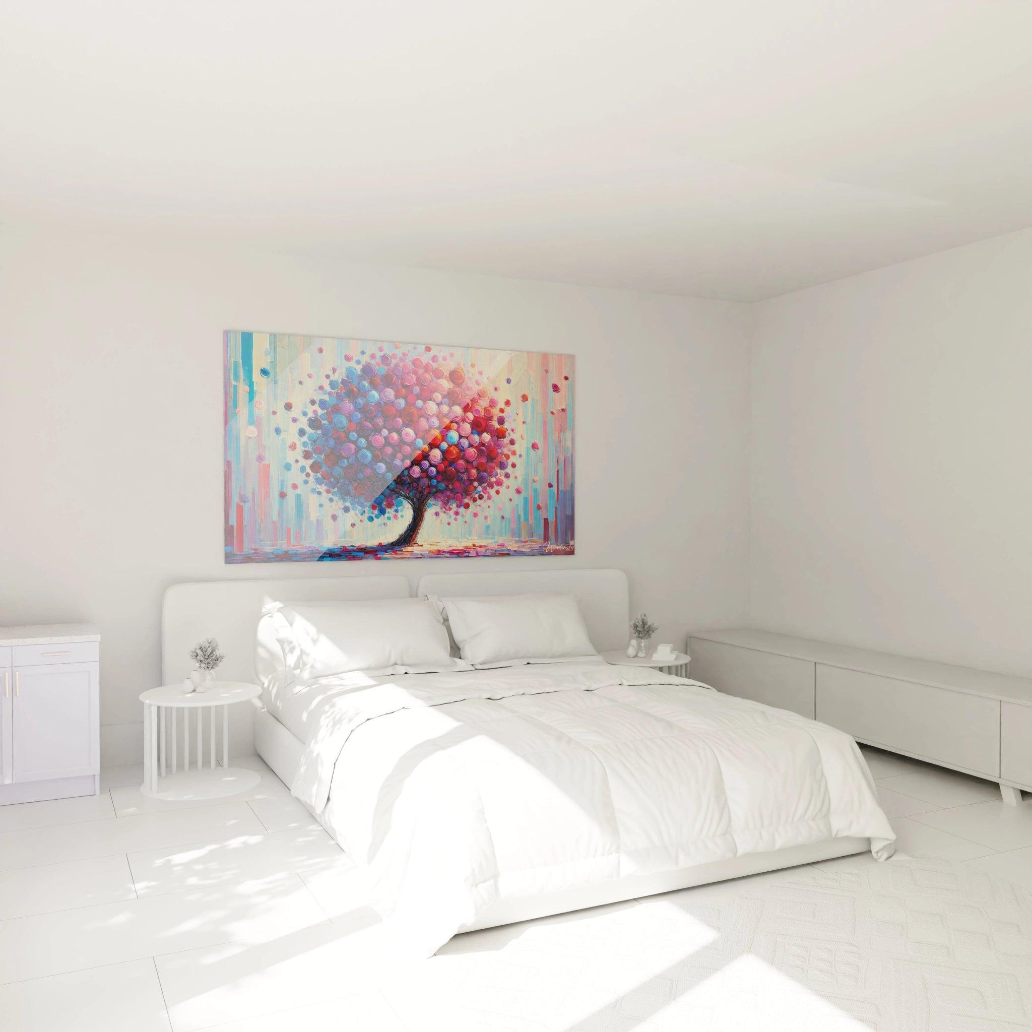
The pink painting as a focal point in a minimalist space
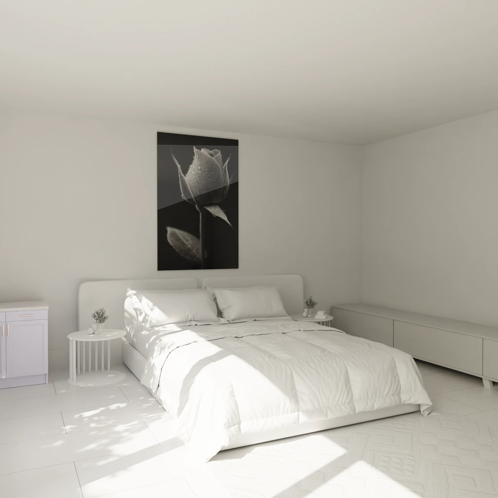
In a clean décor, dominated by neutral tones and simple lines, a pink design painting can become the focal point of the room. Its bright or soft hue immediately catches the eye, creating a striking visual effect without disrupting the overall harmony. Placed on a white or grey wall, it injects a dose of character and personality into the space. This approach is ideal for those who appreciate minimalist décor, where each element is carefully chosen for its aesthetic impact. The addition of a refined pink frame accentuates this effect, while maintaining discreet elegance.
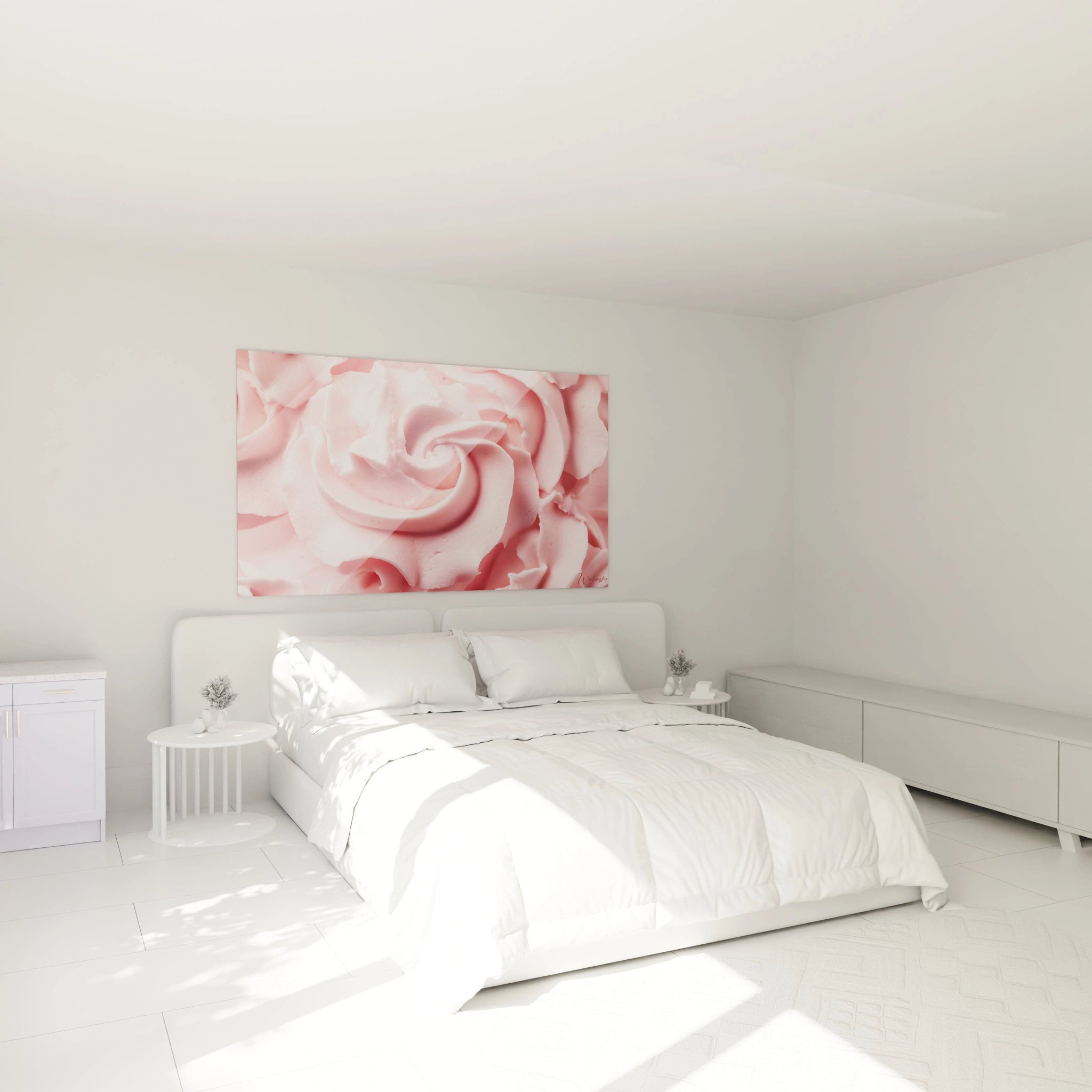
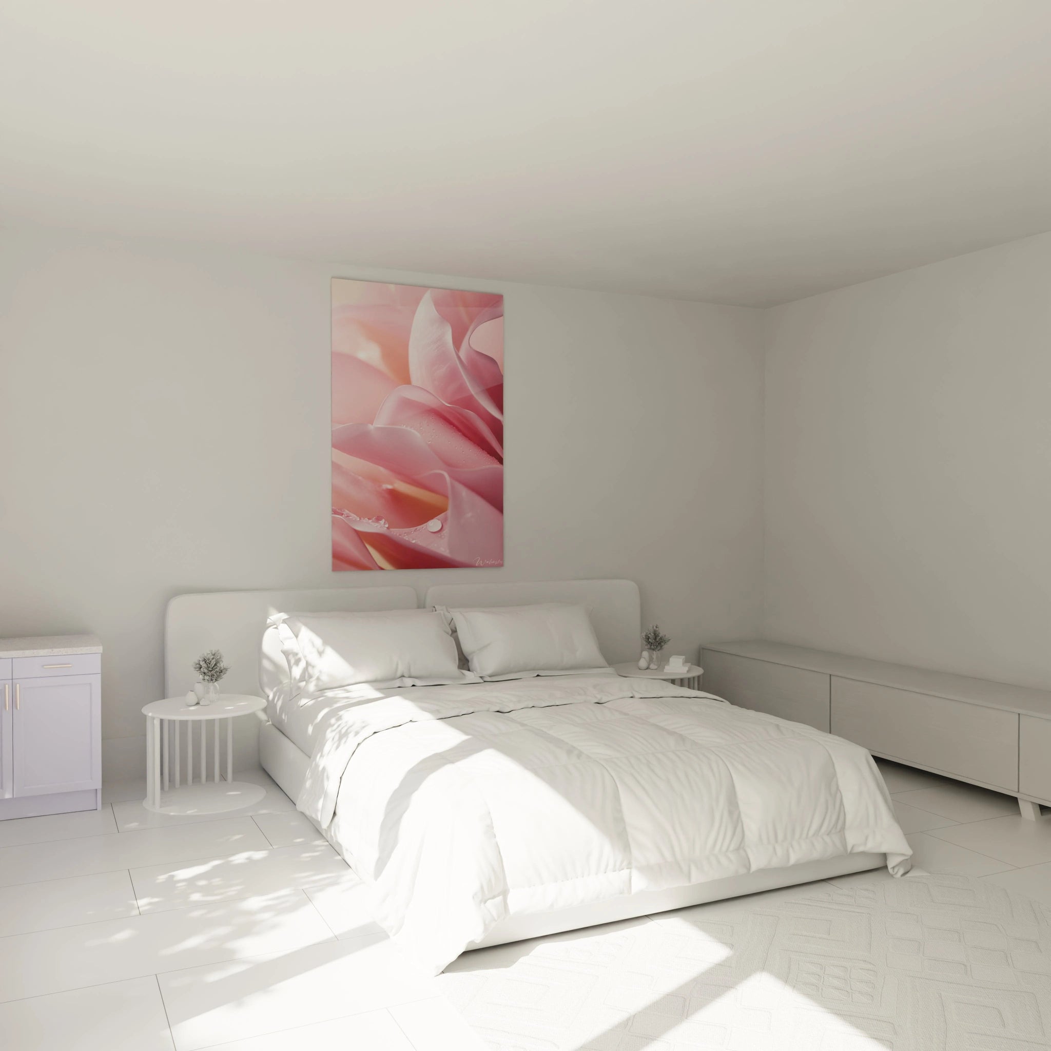
Bringing warmth and softness with pale pink shades
Pale pink shades, such as blush or powder pink, diffuse subtle warmth and enveloping softness. A pink painting in these nuances instantly transforms an interior into a comforting cocoon. Combined with natural materials such as light wood or linen, it accentuates the sense of well-being. In a living room, a soft pink wall painting creates a welcoming atmosphere, while in a bedroom, it invites relaxation and unwinding. This type of pink wall art is perfect for tempering cold or minimalist environments, adding a warm and luminous touch.
Creating vibrant contrast with bright colours around the painting
A pink painting can also make an impact in bold compositions, creating dynamic contrasts with vibrant colours. For example, a pink poster combined with turquoise, mustard yellow or emerald green tones generates a striking coloured accent. This contrast catches attention and energises the space, particularly in creative environments or lively living spaces. The integration of a pink gradient in the artwork allows you to nuance this effect, offering a harmonious balance between intensity and subtlety. This colour play is ideal for those who wish to infuse vibrant energy into their interior decoration.
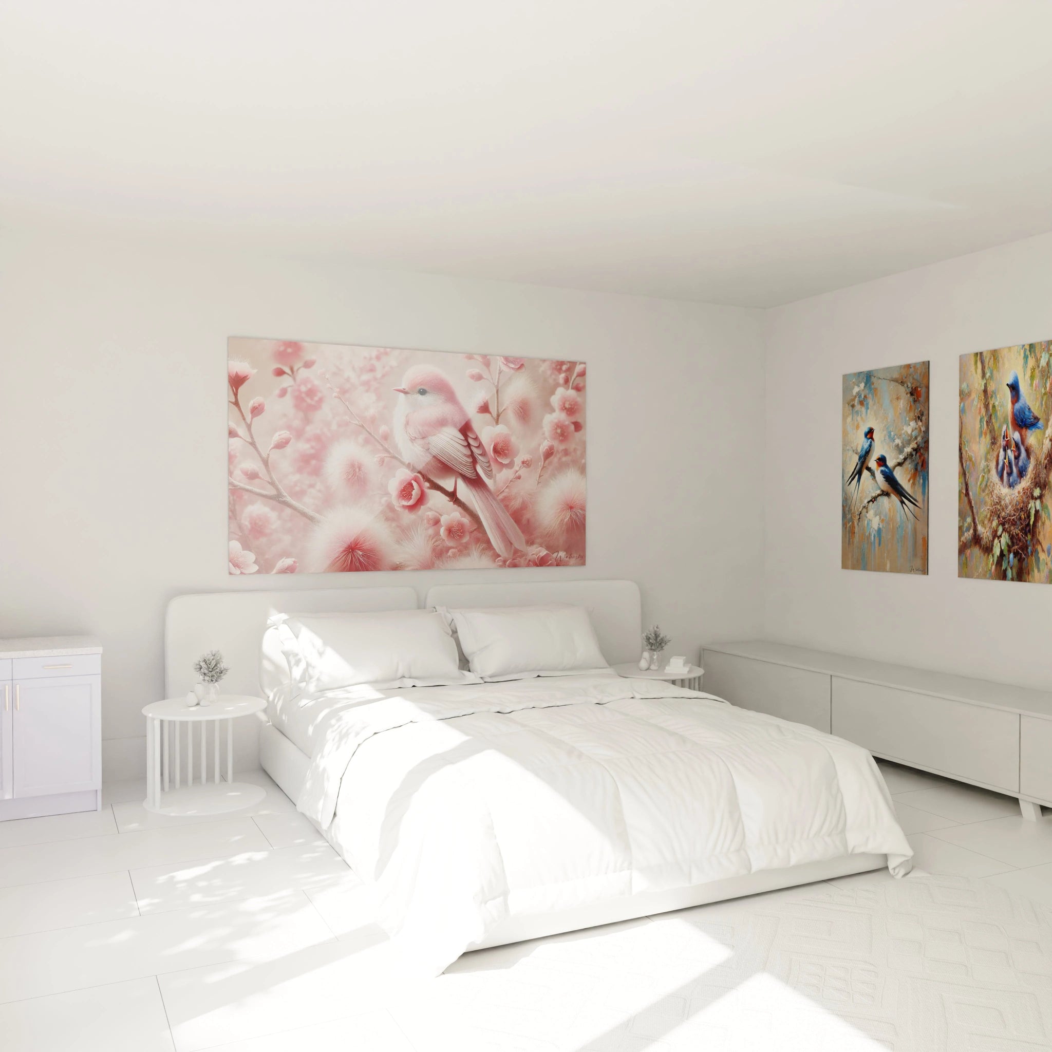
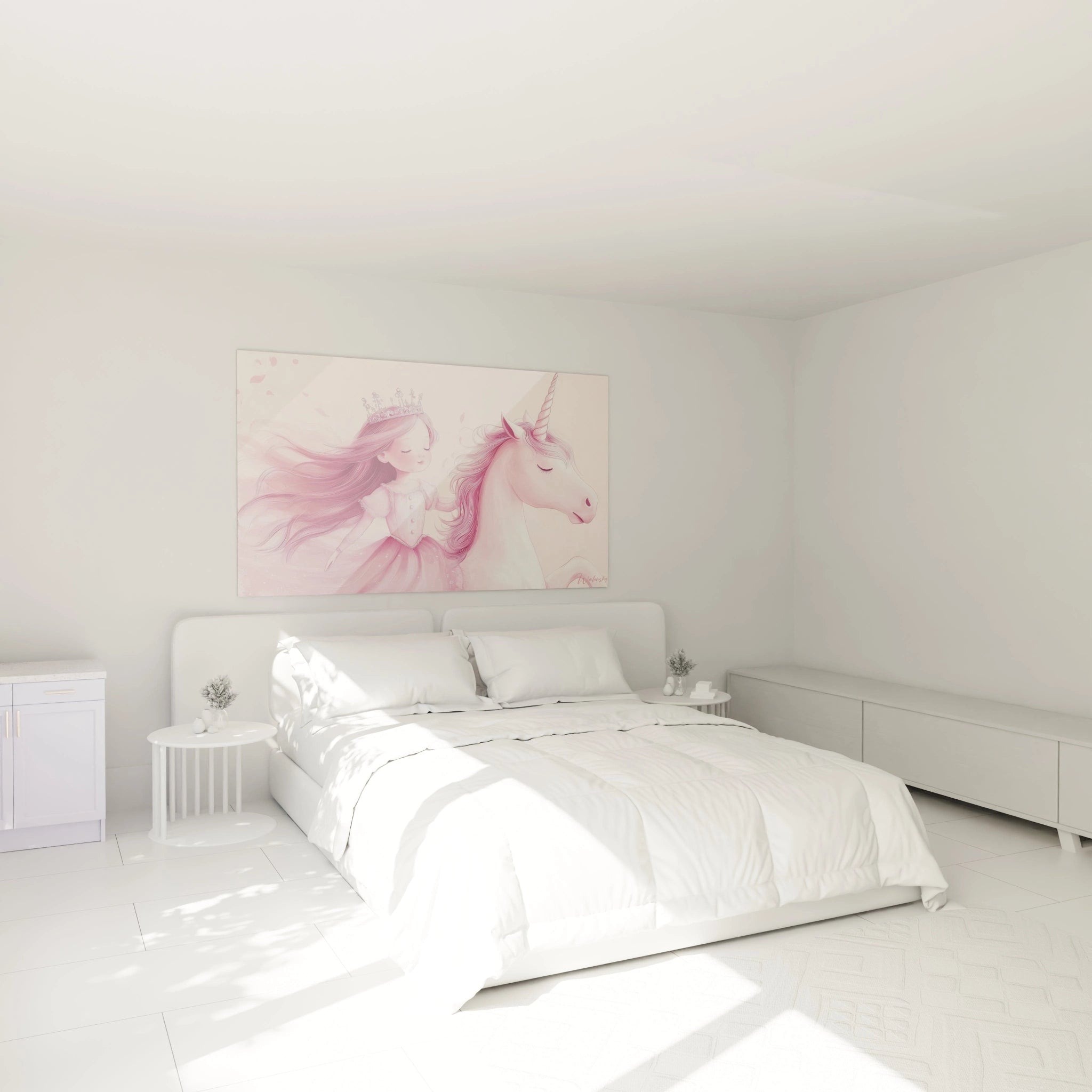
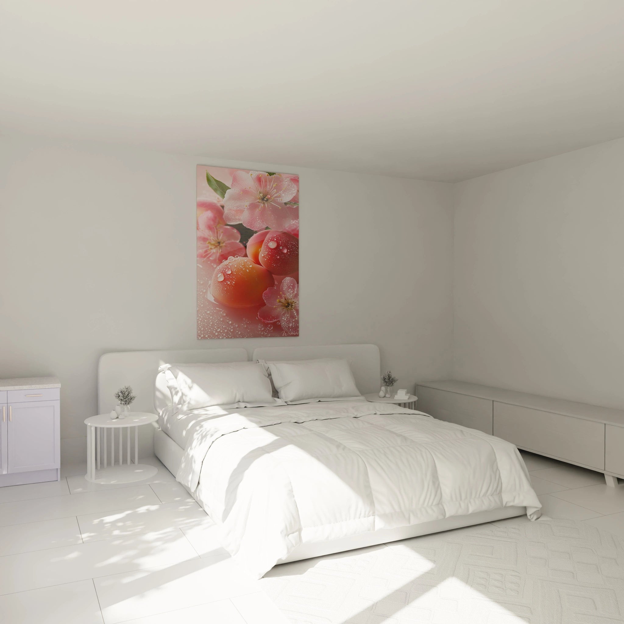
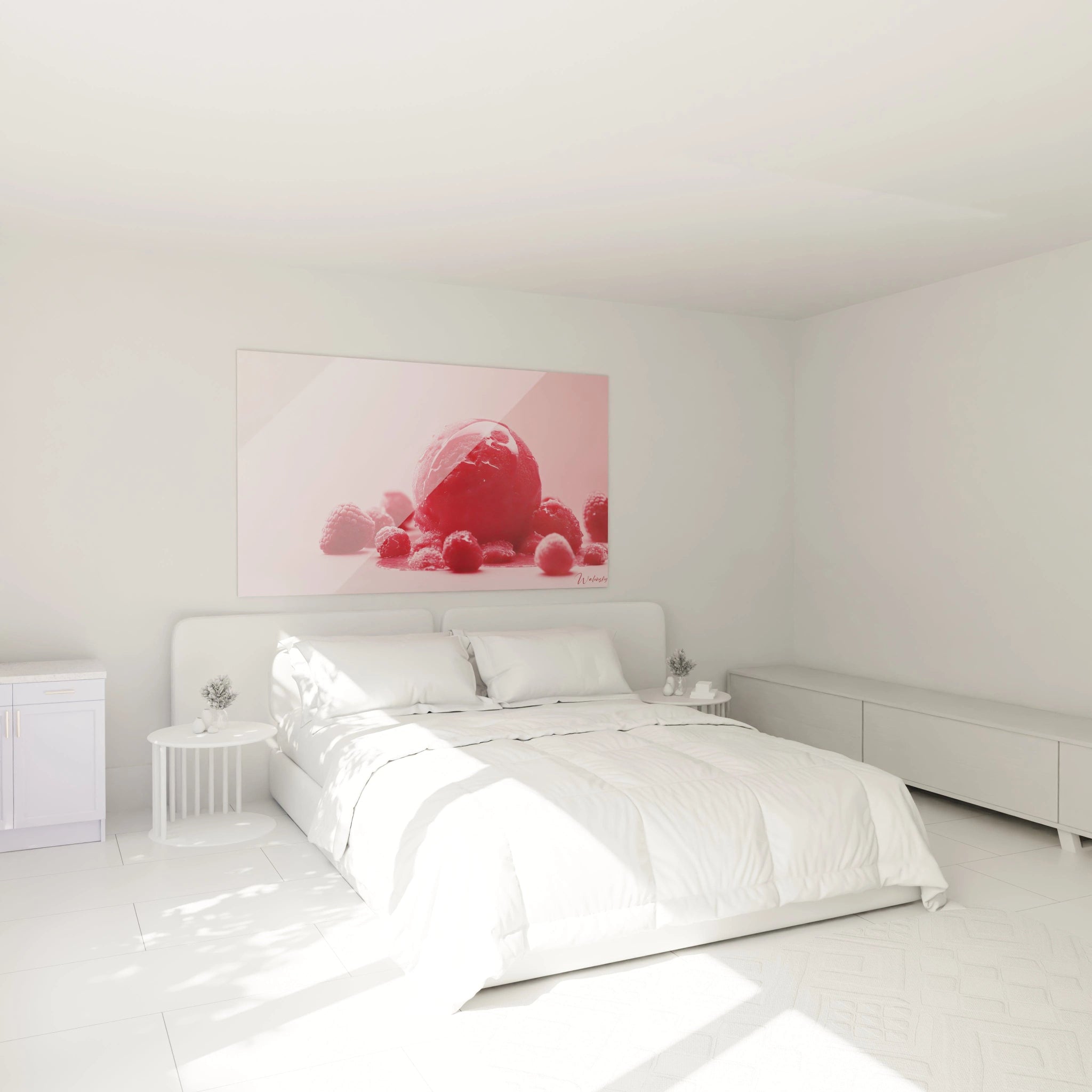
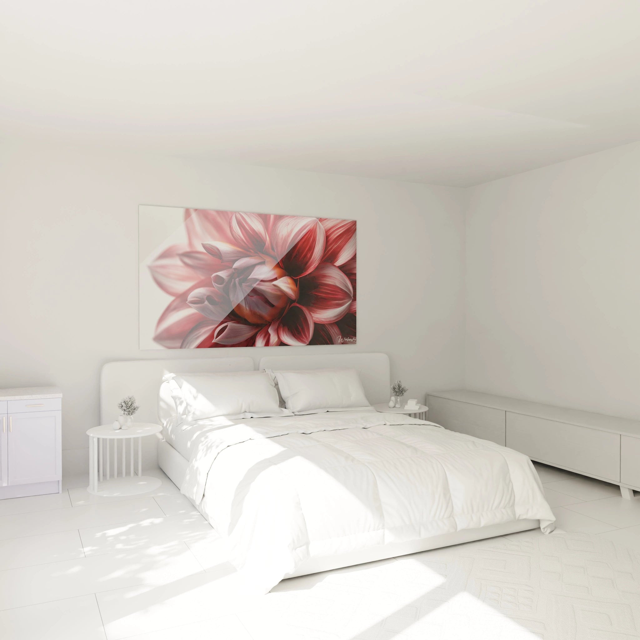
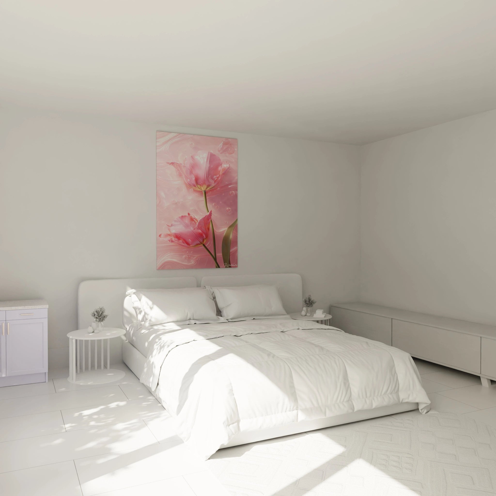
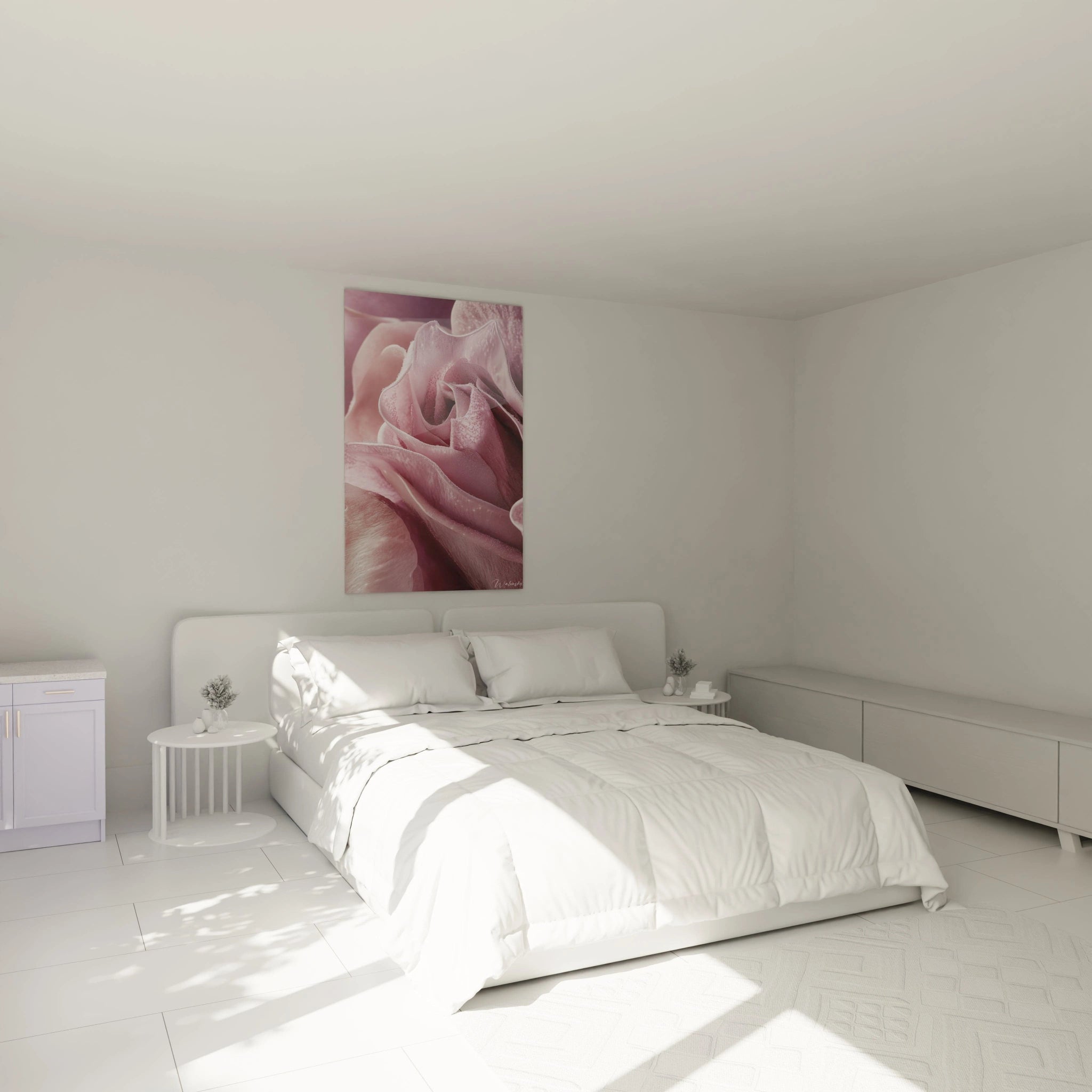
The soothing effect of pink in relaxation spaces such as the bedroom
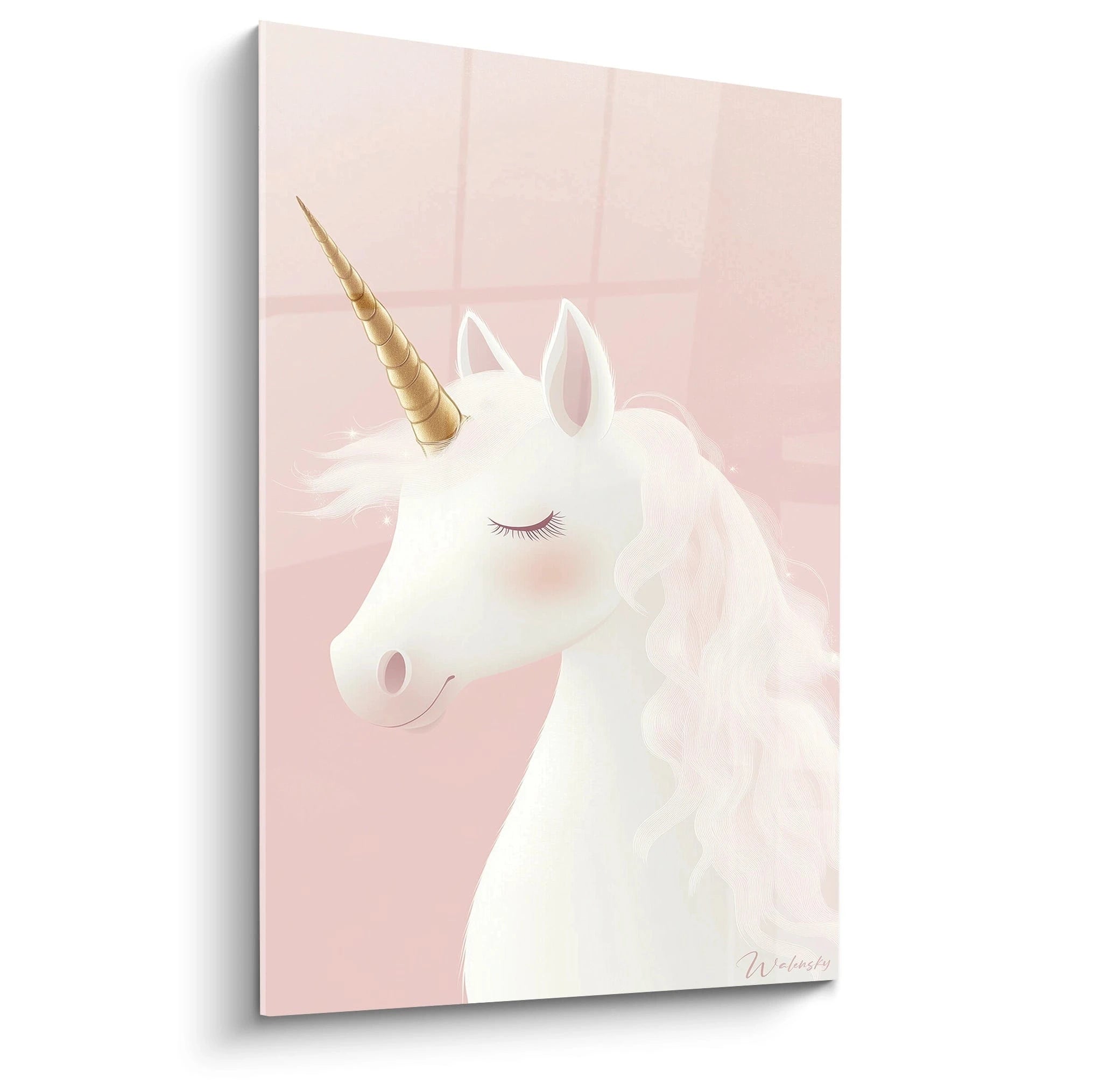
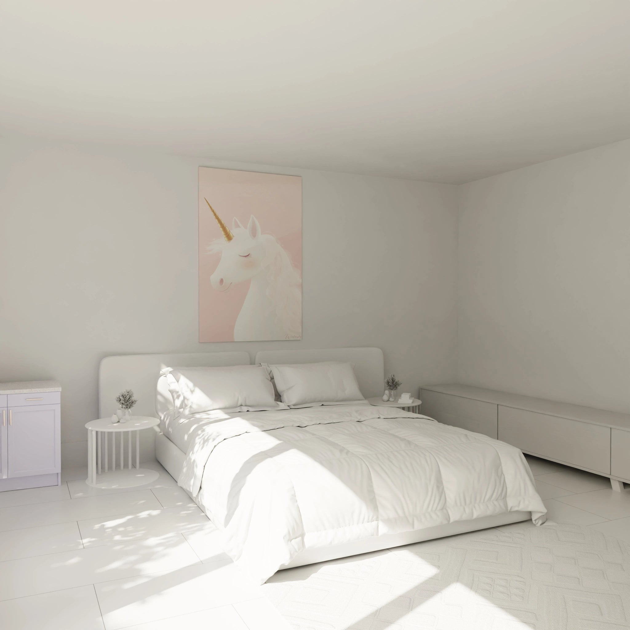
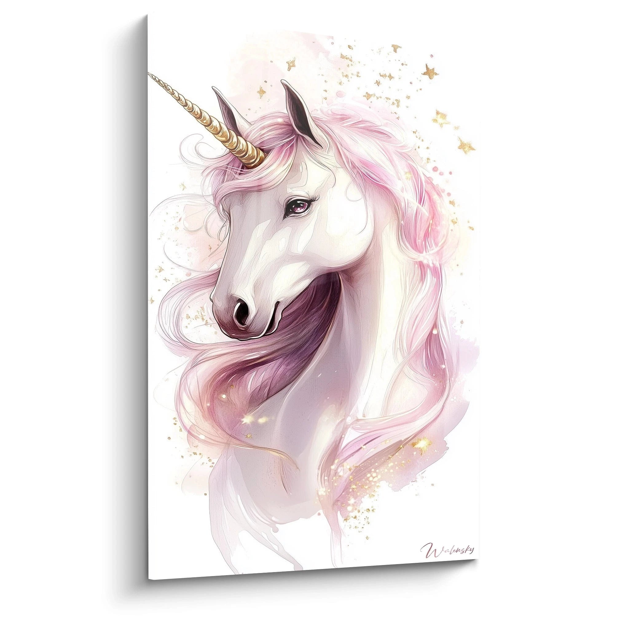
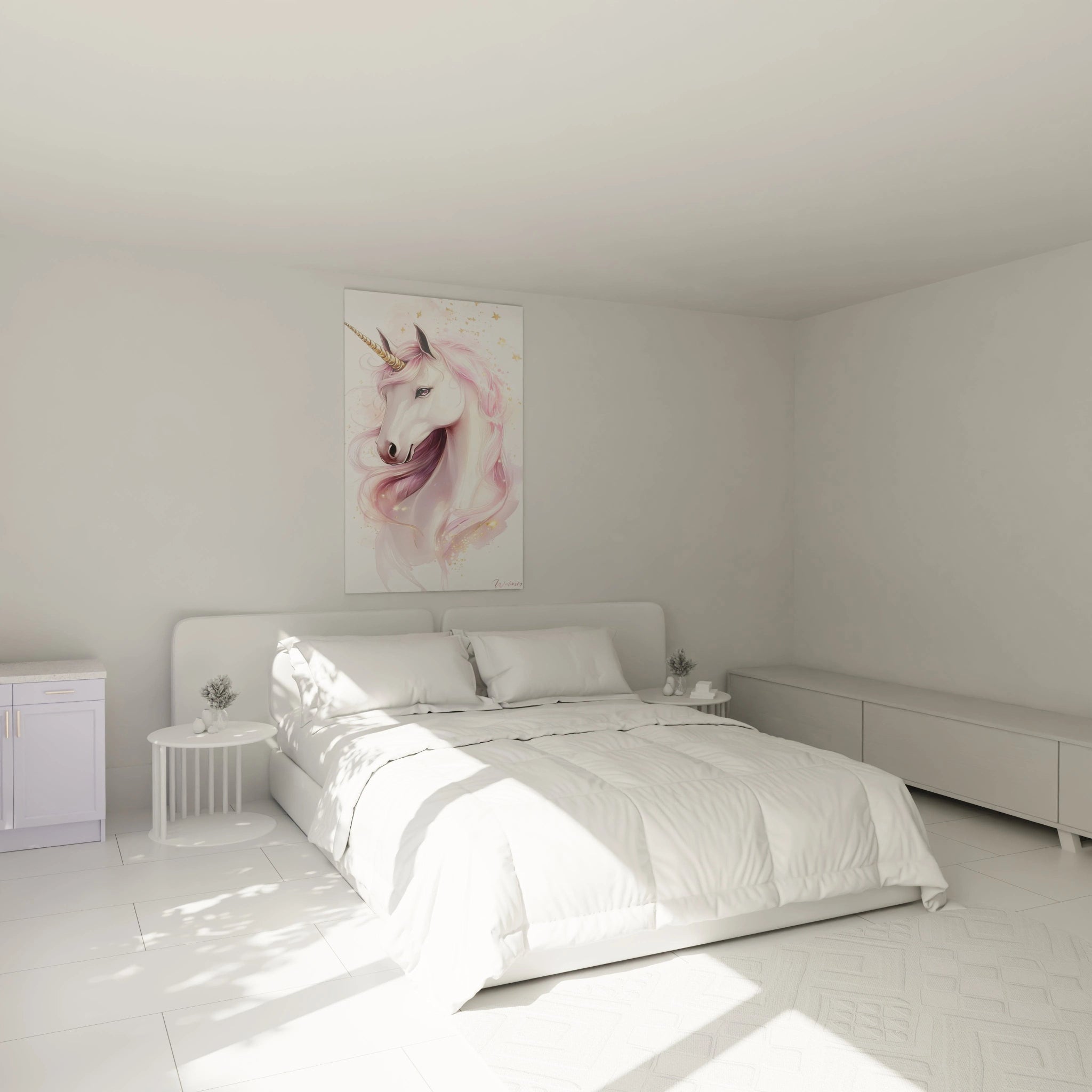
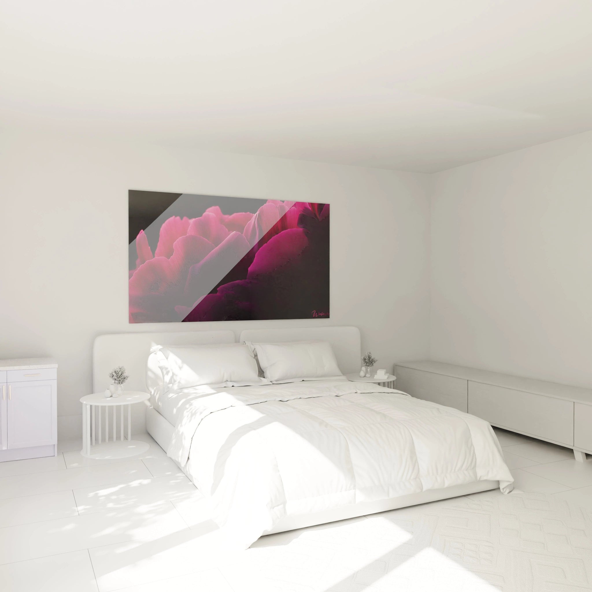
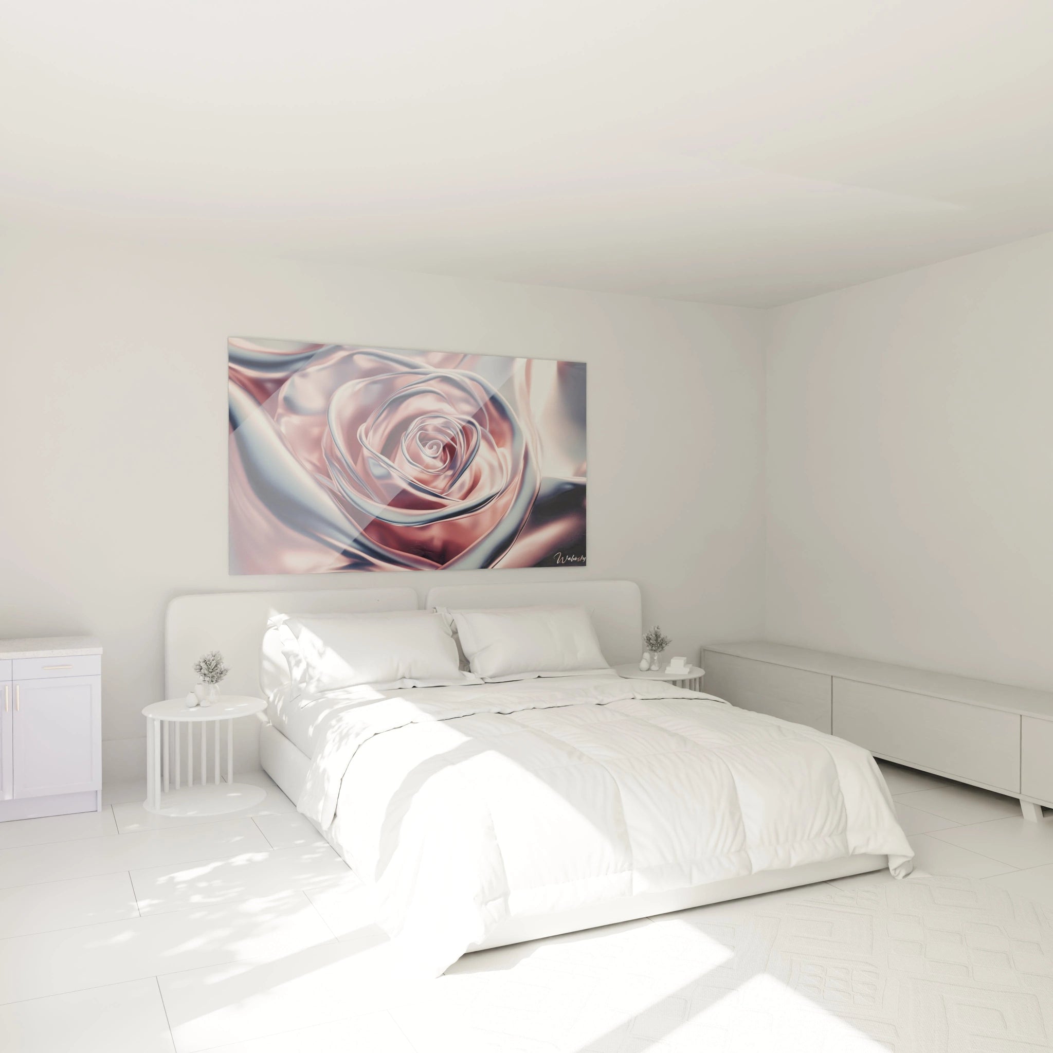
In places dedicated to rest, such as the bedroom, pink reveals all its soothing potential. A pink painting with soft nuances, ranging from powder pink to light salmon, contributes to creating a romantic spirit and serene atmosphere. Placed above a bed or facing a natural light source, it diffuses warm and comforting ambiance. By pairing it with soft textiles and natural materials, the cocooning effect is reinforced. A well-chosen contemporary pink painting or pink canvas then becomes a central element, promoting relaxation and well-being, while adding discreet elegance to the room.
By exploring the different facets of the pink painting, we discover its incredible ability to transform the ambiance of a space. Whether creating a soothing atmosphere, adding a touch of modernity or infusing vibrant energy, pink proves to be an audacious and refined choice for pink wall decoration. Its visual and emotional impact makes it a precious ally for enhancing every room, in harmony with your style and desires.