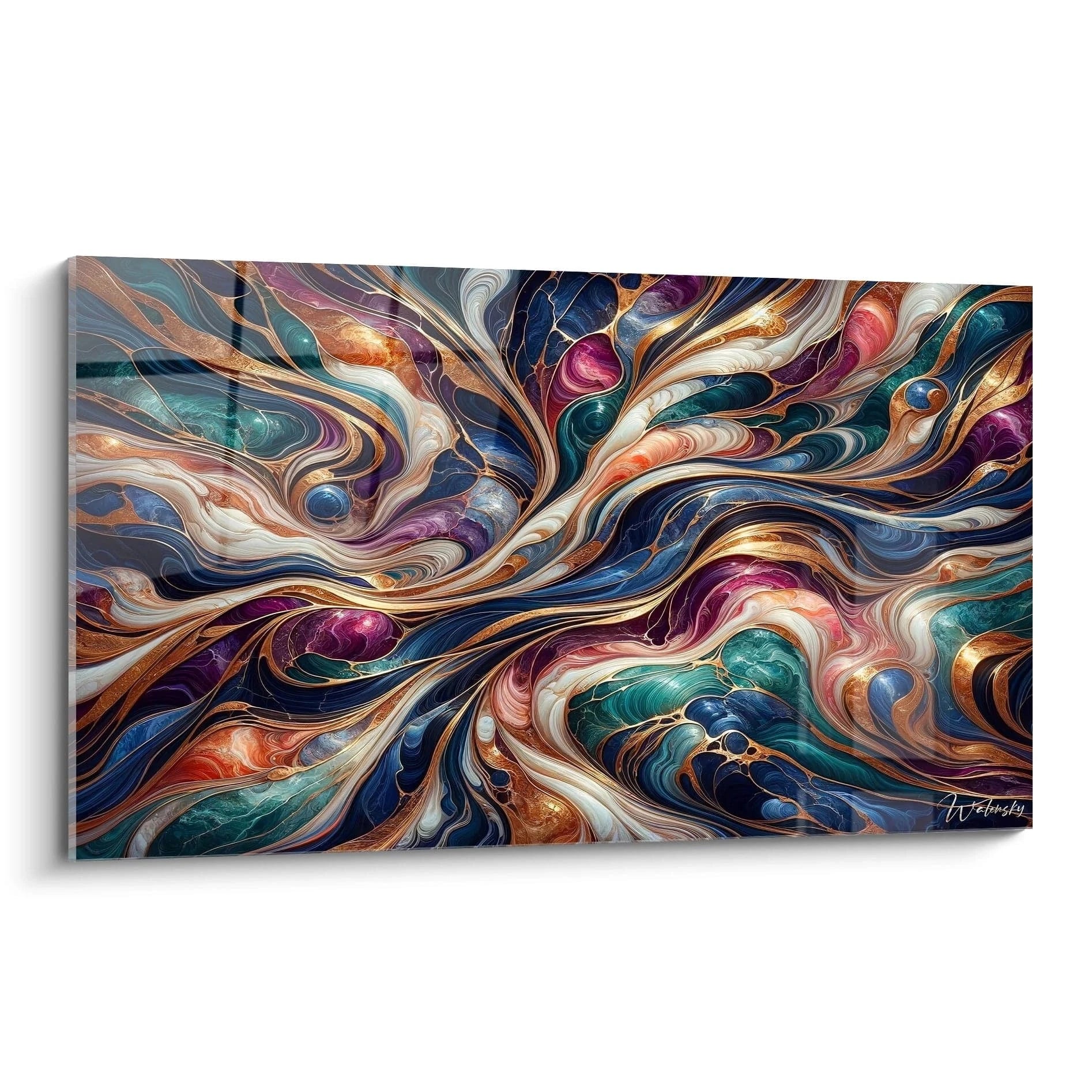
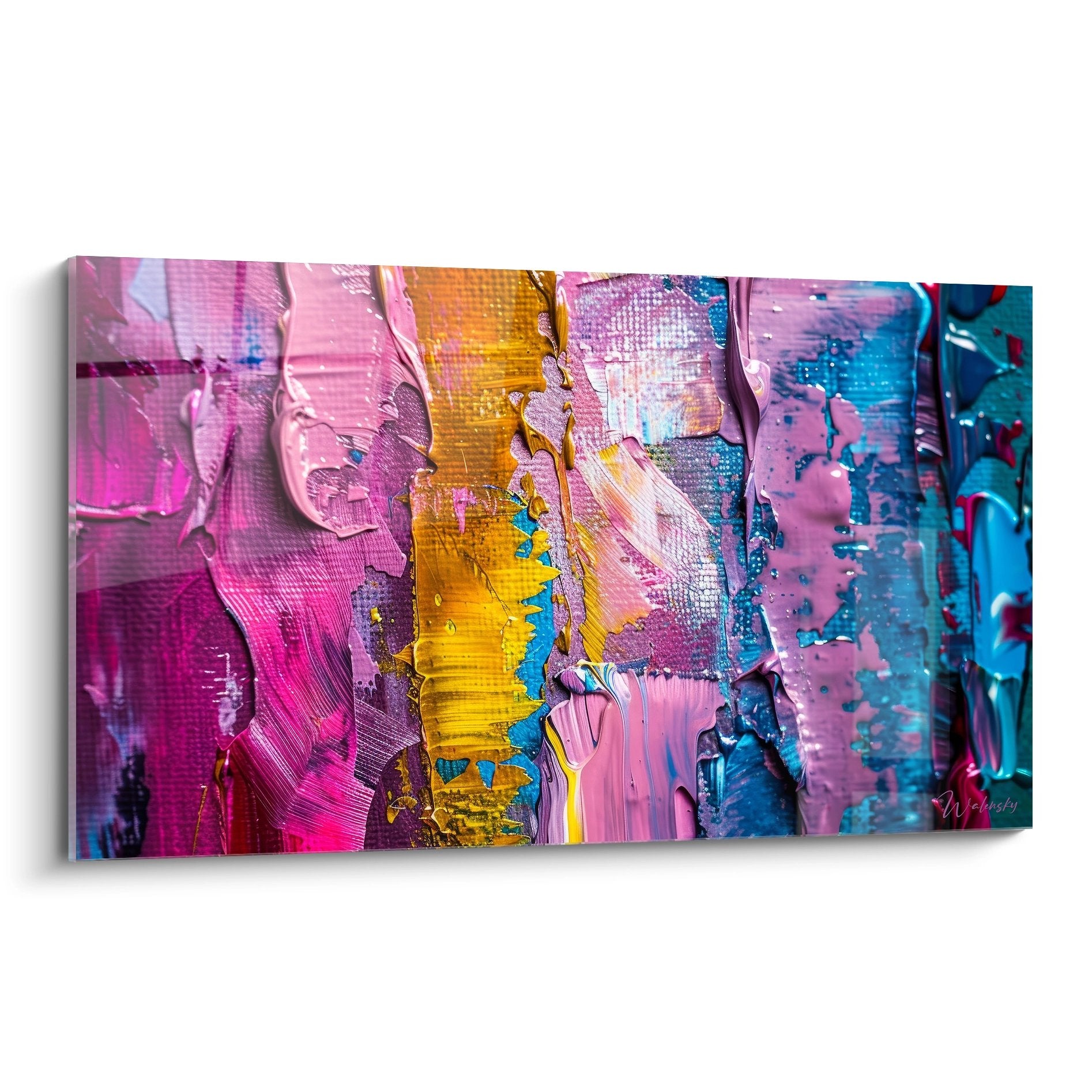
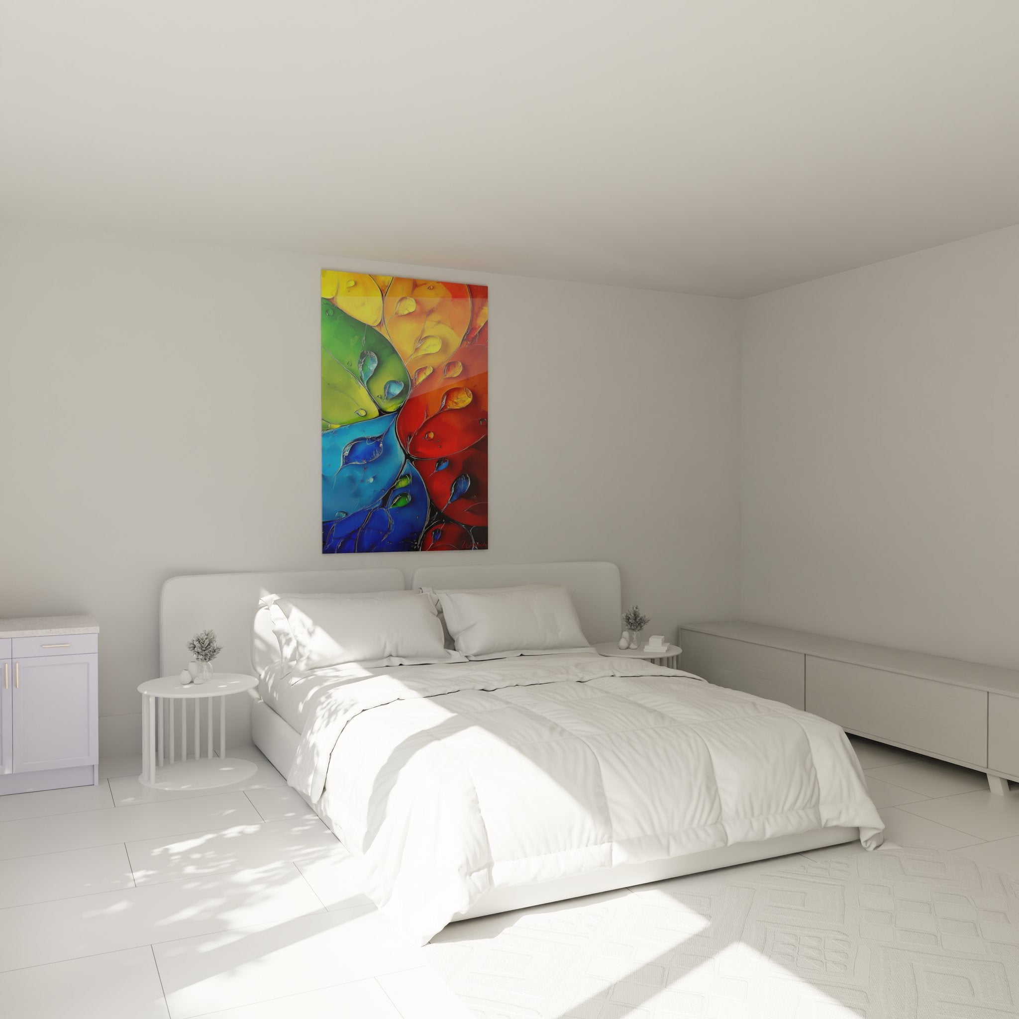
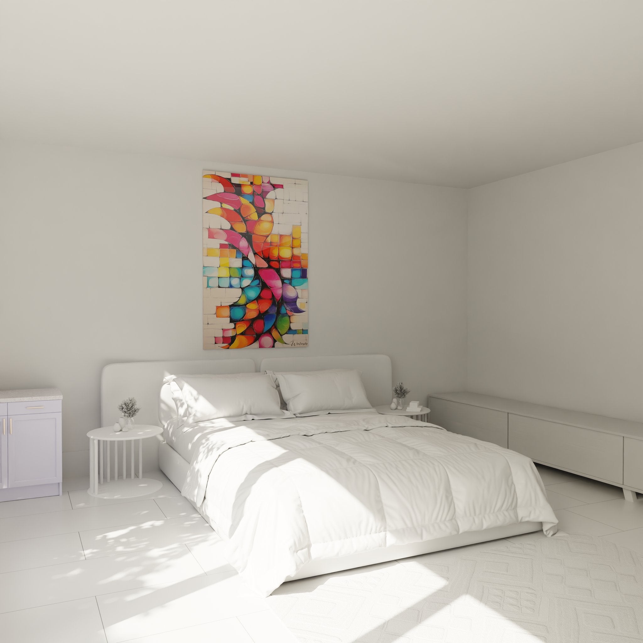
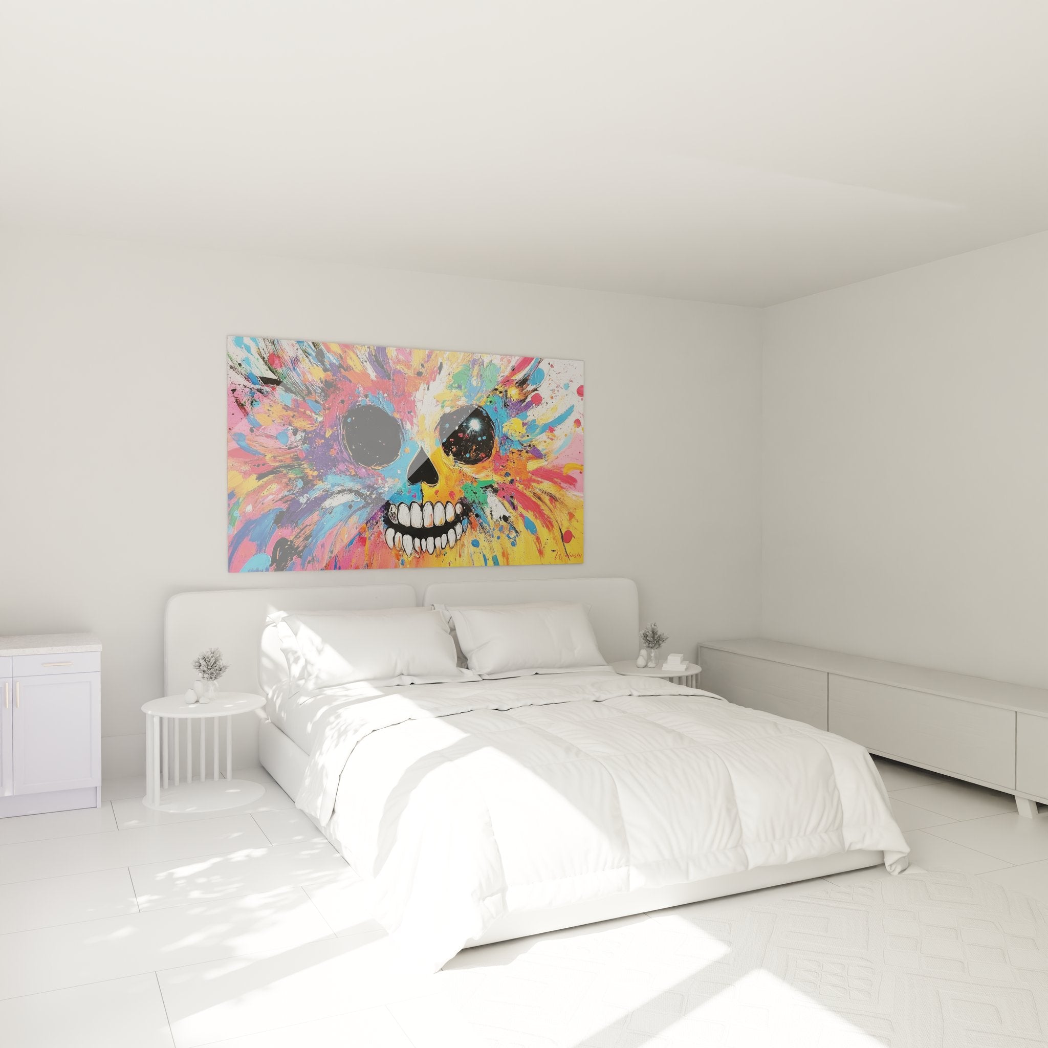
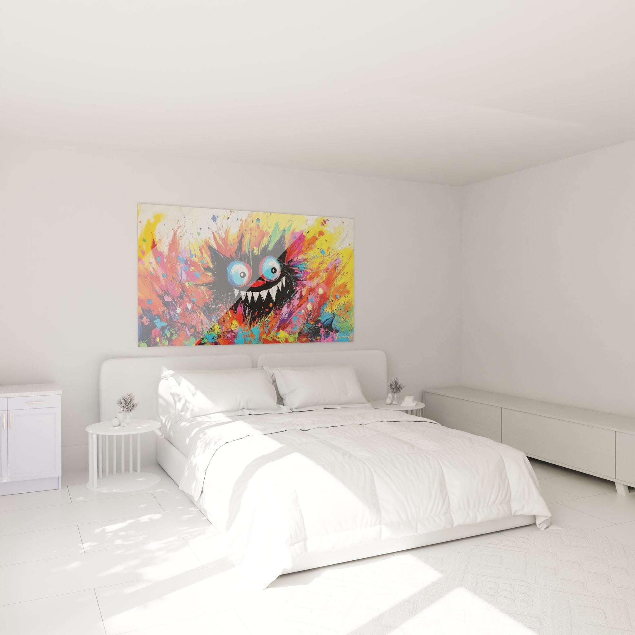
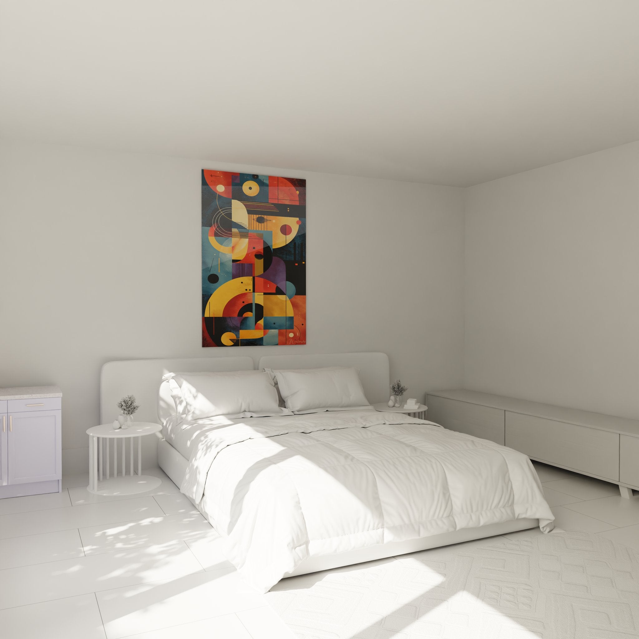
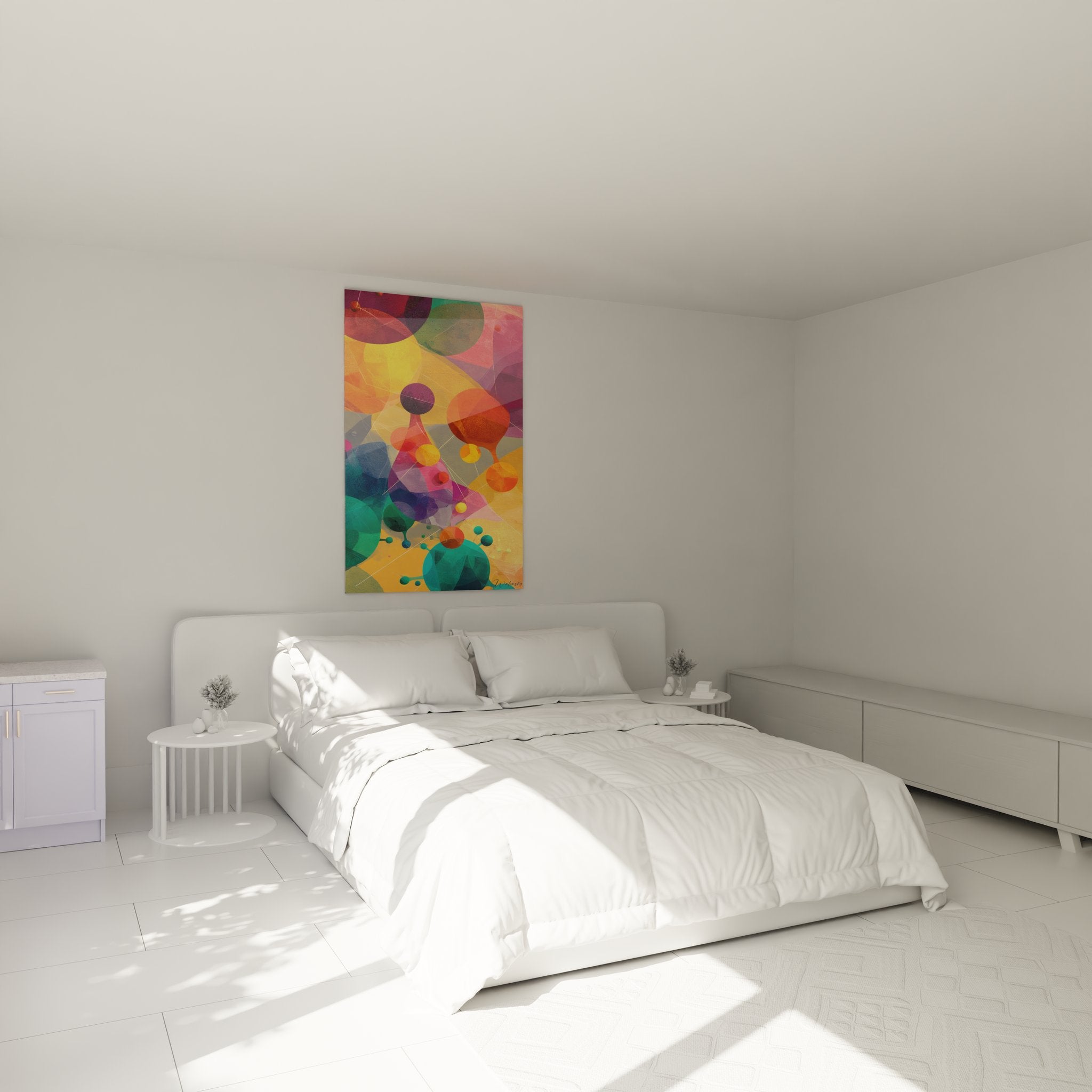
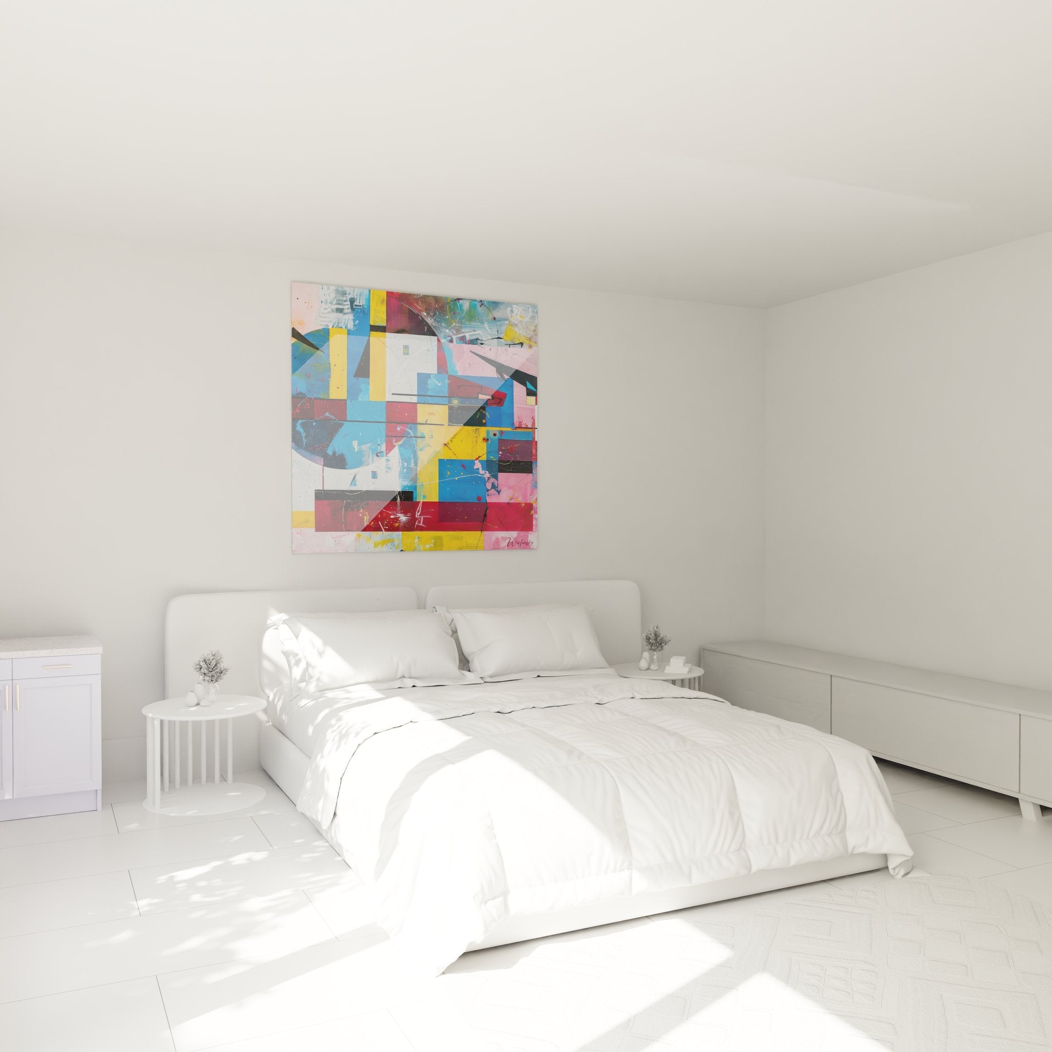
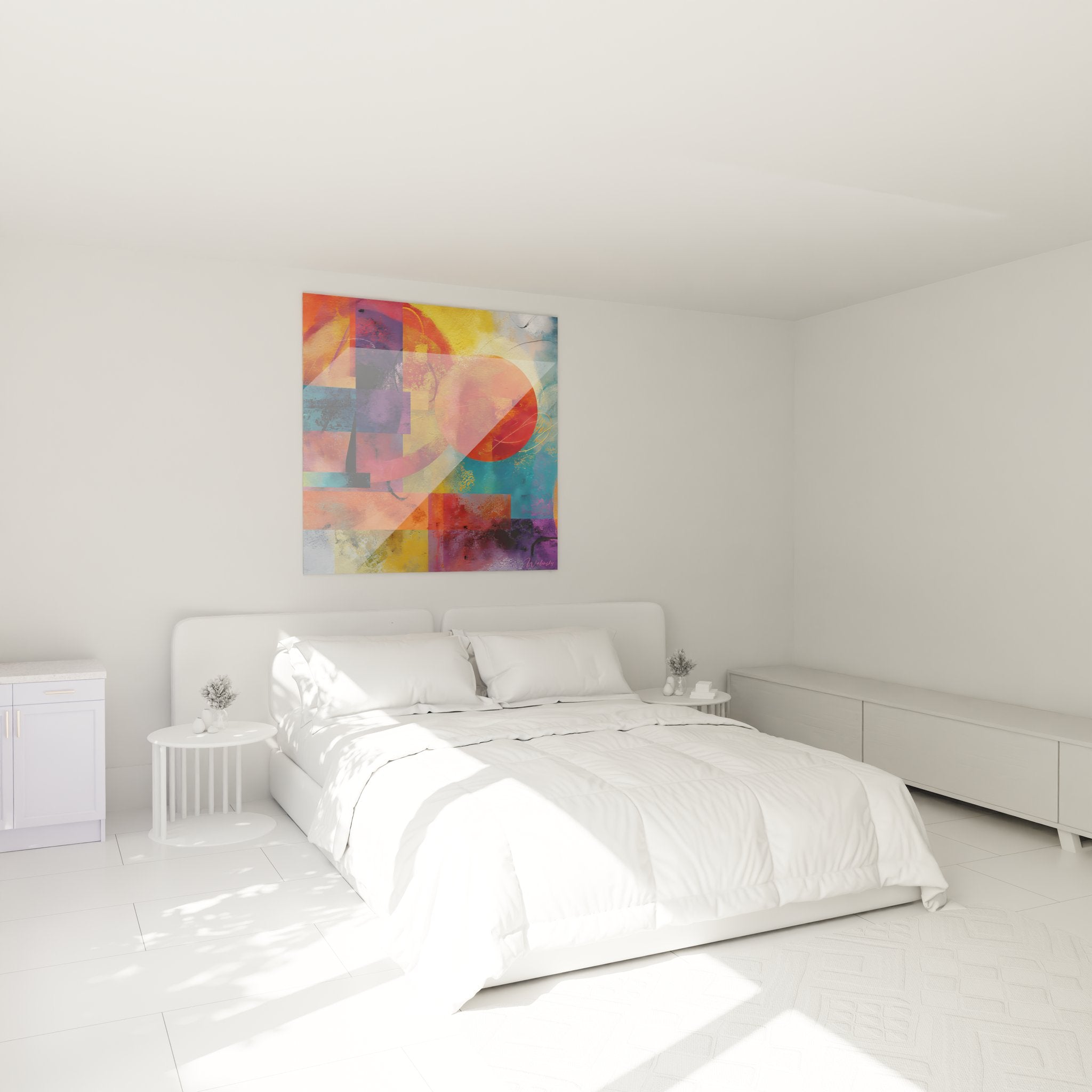
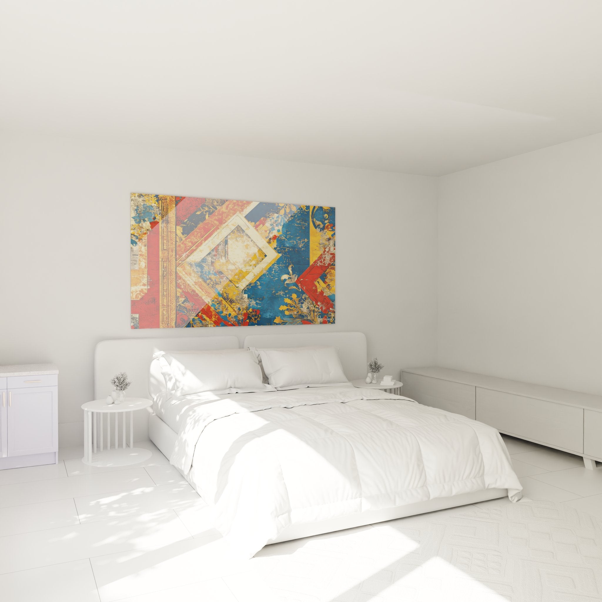
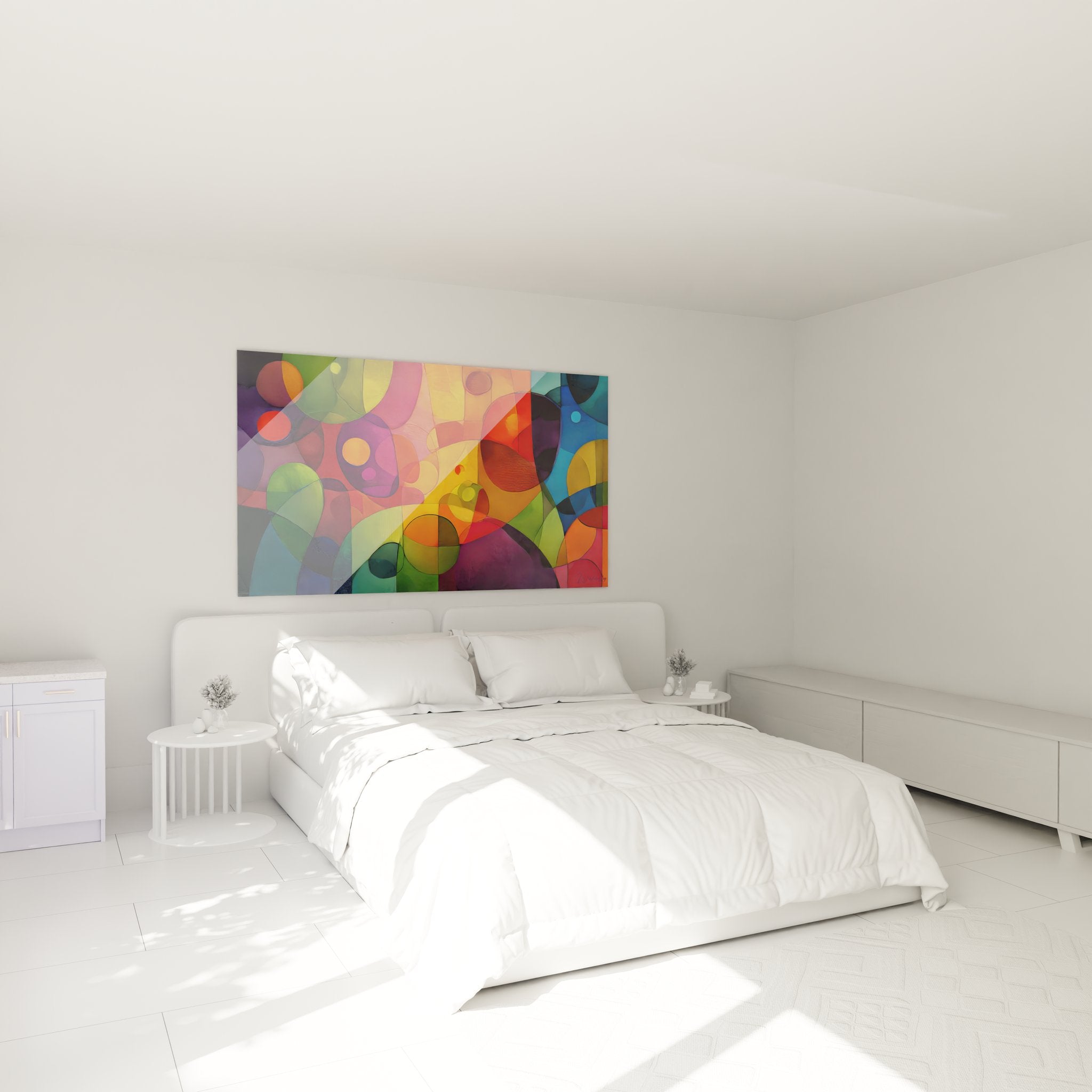
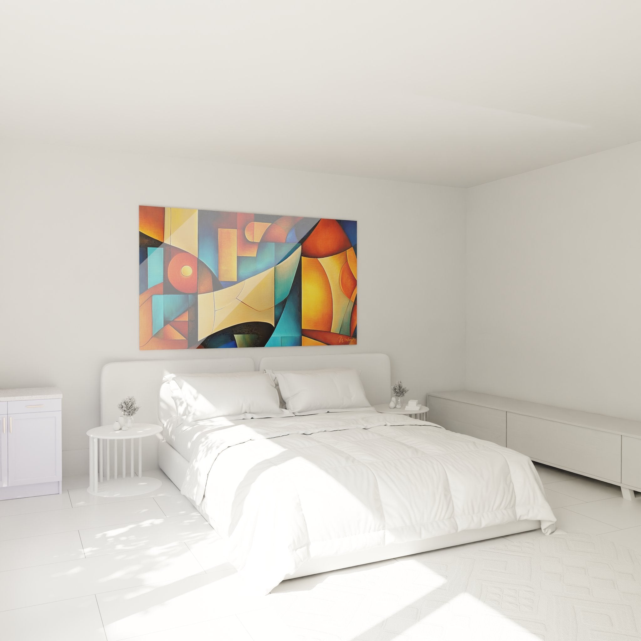
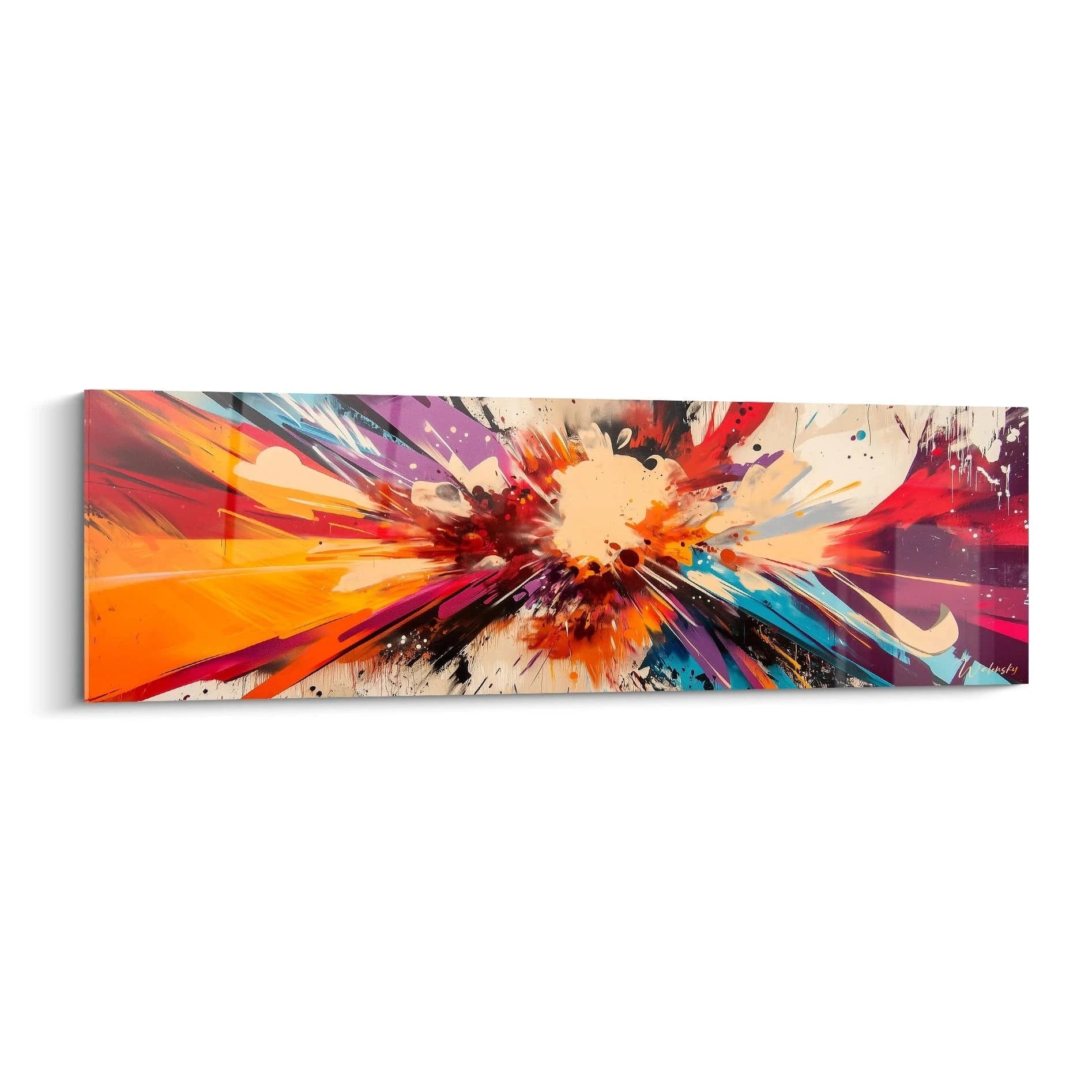
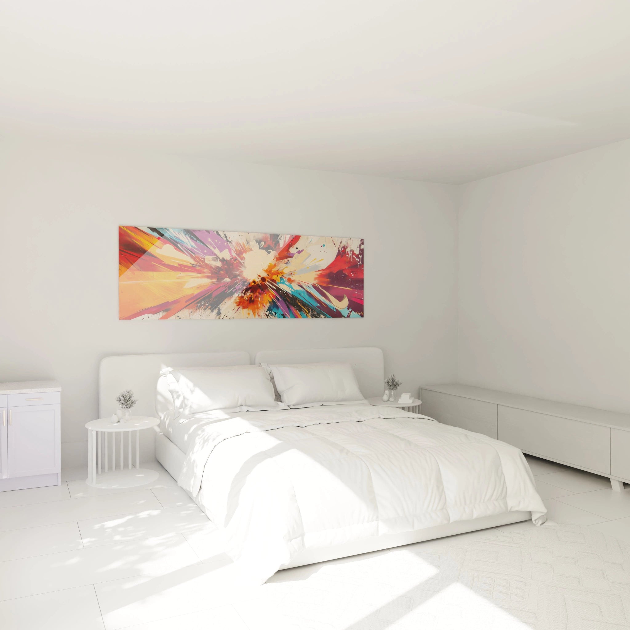
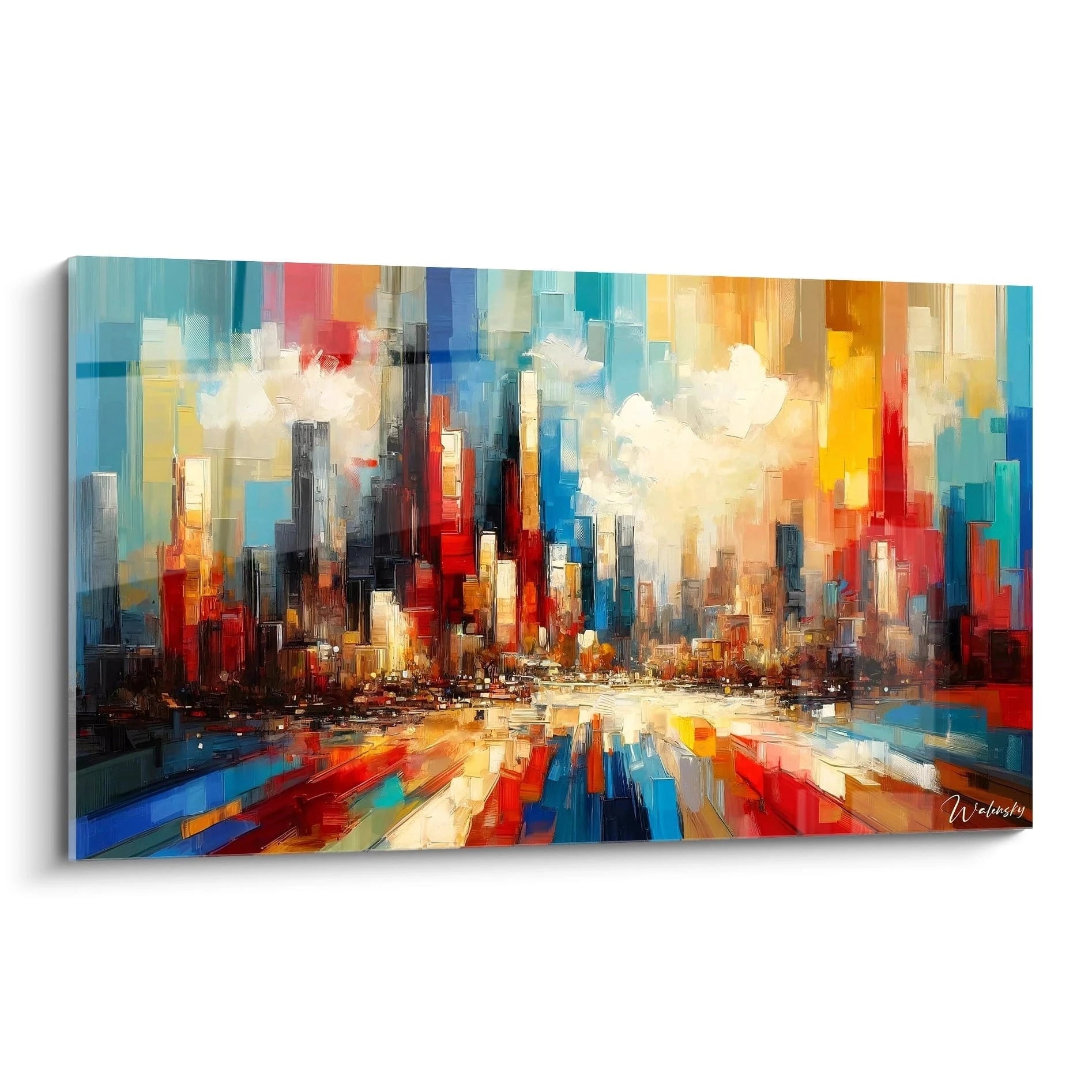
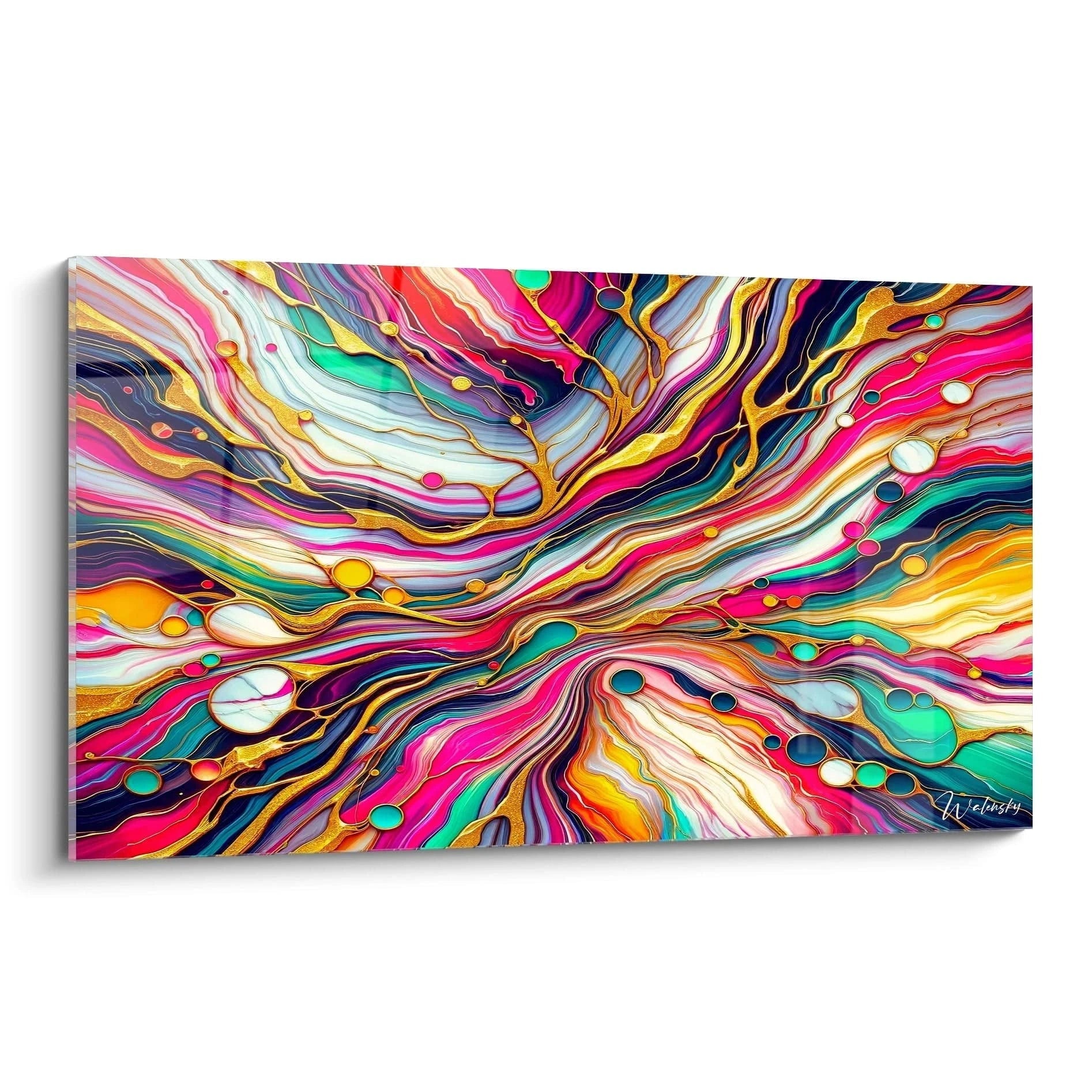
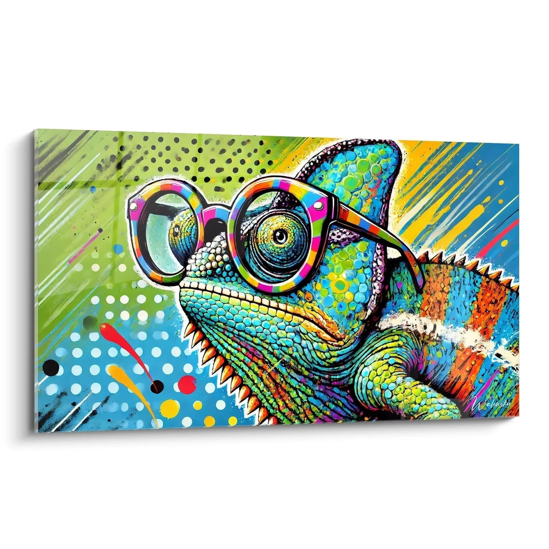
A colorful wall art piece for apartments radically transforms the atmosphere of your urban space by bringing strong emotional depth through a vibrant and bold color palette. In city environments often dominated by neutral tones and industrial materials, these large-format artistic creations become essential focal points that breathe life, optimism, and personality into the space. Unlike larger interiors, apartments require a strategic chromatic approach where each color dialogues with the compact architecture to create an impression of spaciousness rather than overcrowding. The generous dimensions of our colorful artworks establish an assertive visual presence that structures limited volumes while generating sensations of spatial openness. Pigment intensity becomes an architectural tool capable of redefining perceived proportions, emphasizing ceiling height, or visually widening a narrow wall.
Psychology of Vibrant Hues in Confined Urban Settings
The integration of a colorful wall art piece for apartments addresses a fundamental psychological need of city dwellers confronted daily with urban greyness and frantic metropolitan rhythms. Neuroesthetic research demonstrates that regular exposure to saturated chromatic compositions stimulates dopamine production and reduces cortisol levels, particularly in reduced living spaces where nature is absent. Brilliant pigments function as emotional compensators, creating micro-visual environments that counterbalance the concrete monotony of the exterior.
How do intense colors modify spatial perception in apartments?
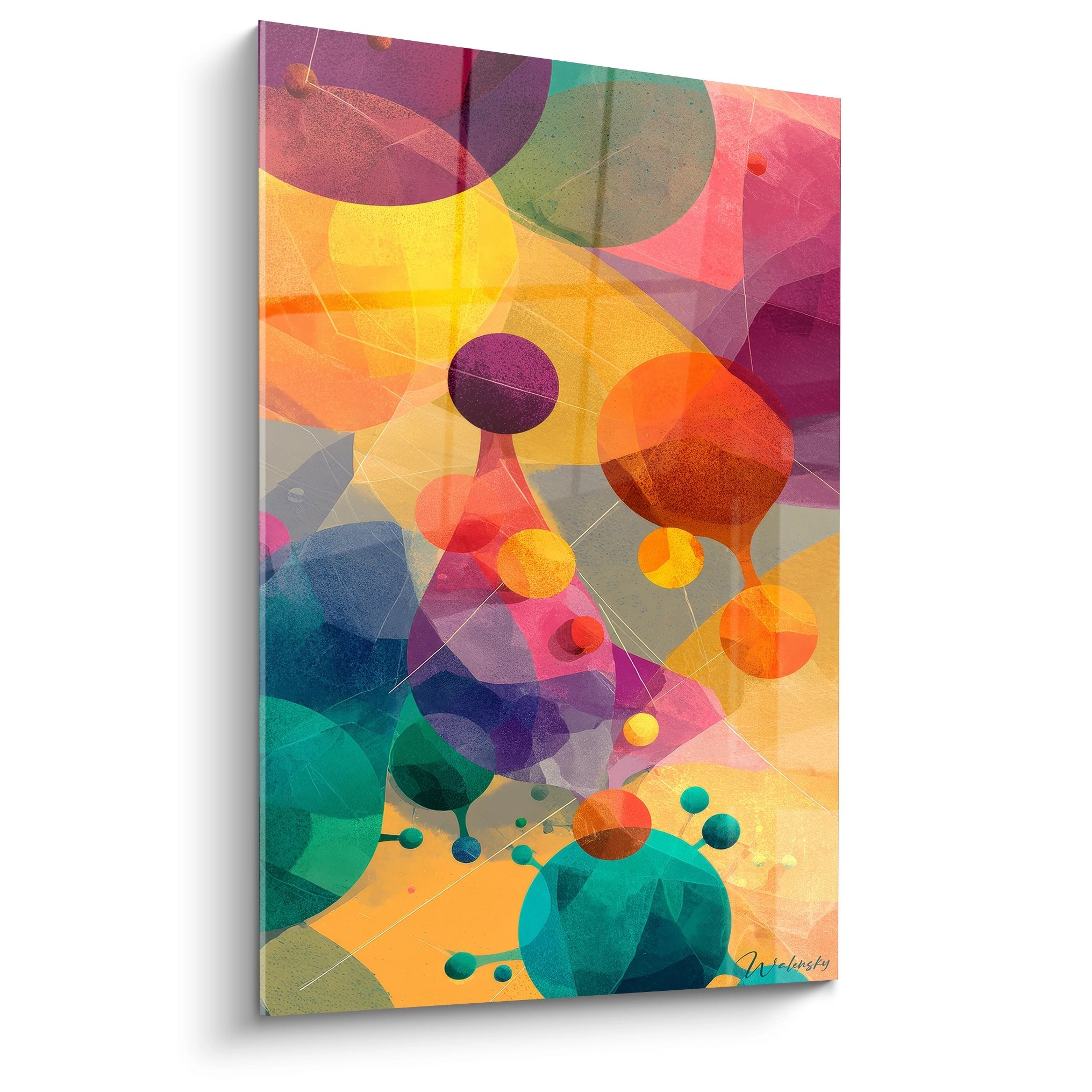
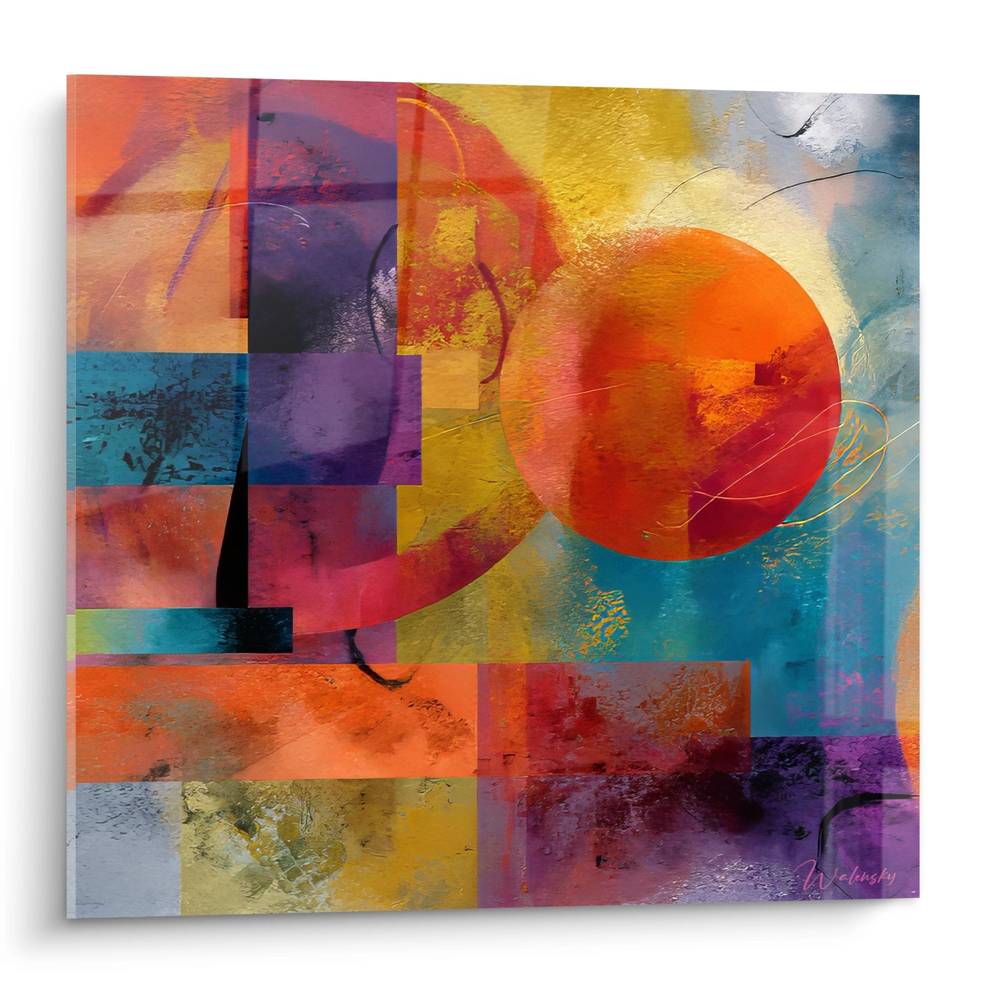
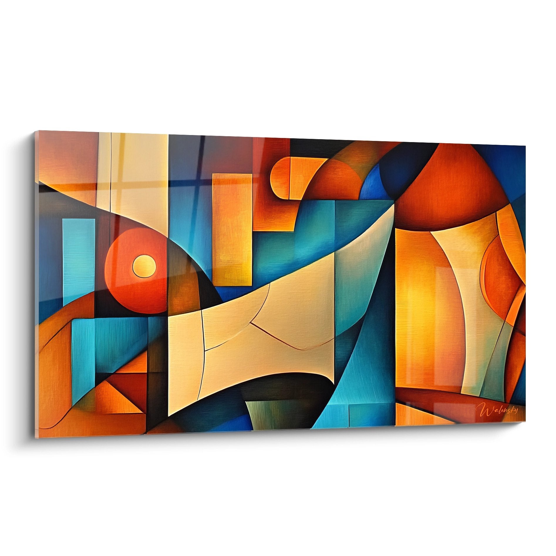
Warm colors such as incandescent oranges, crimson reds, or solar yellows exercise a visual advancement effect that, when deployed across large dimensions, paradoxically create a sensation of valued intimacy rather than oppression. Conversely, electric blues, cosmic violets, and emerald greens generate an illusory depth that optically pushes back wall boundaries. This chromatic duality allows orchestration of proximity-distance games adapted to each room's specific configurations.
Chromatic rhythms and daily temporality
The impact of a large-format colorful artwork evolves considerably with diurnal and nocturnal light variations. Mornings bathed in natural light reveal subtle nuances and pigment interactions invisible in the evening, while artificial nighttime lighting exalts certain fluorescent or metallic tones. This temporal transformation converts the work into a living element that accompanies activity cycles, stimulating morning energy through its assertive contrasts while favoring evening relaxation through its calming harmonics.
Chromatic saturation and urban density
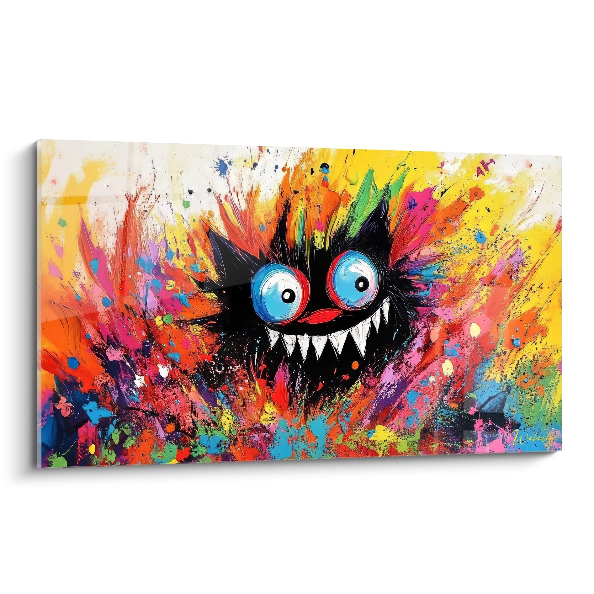
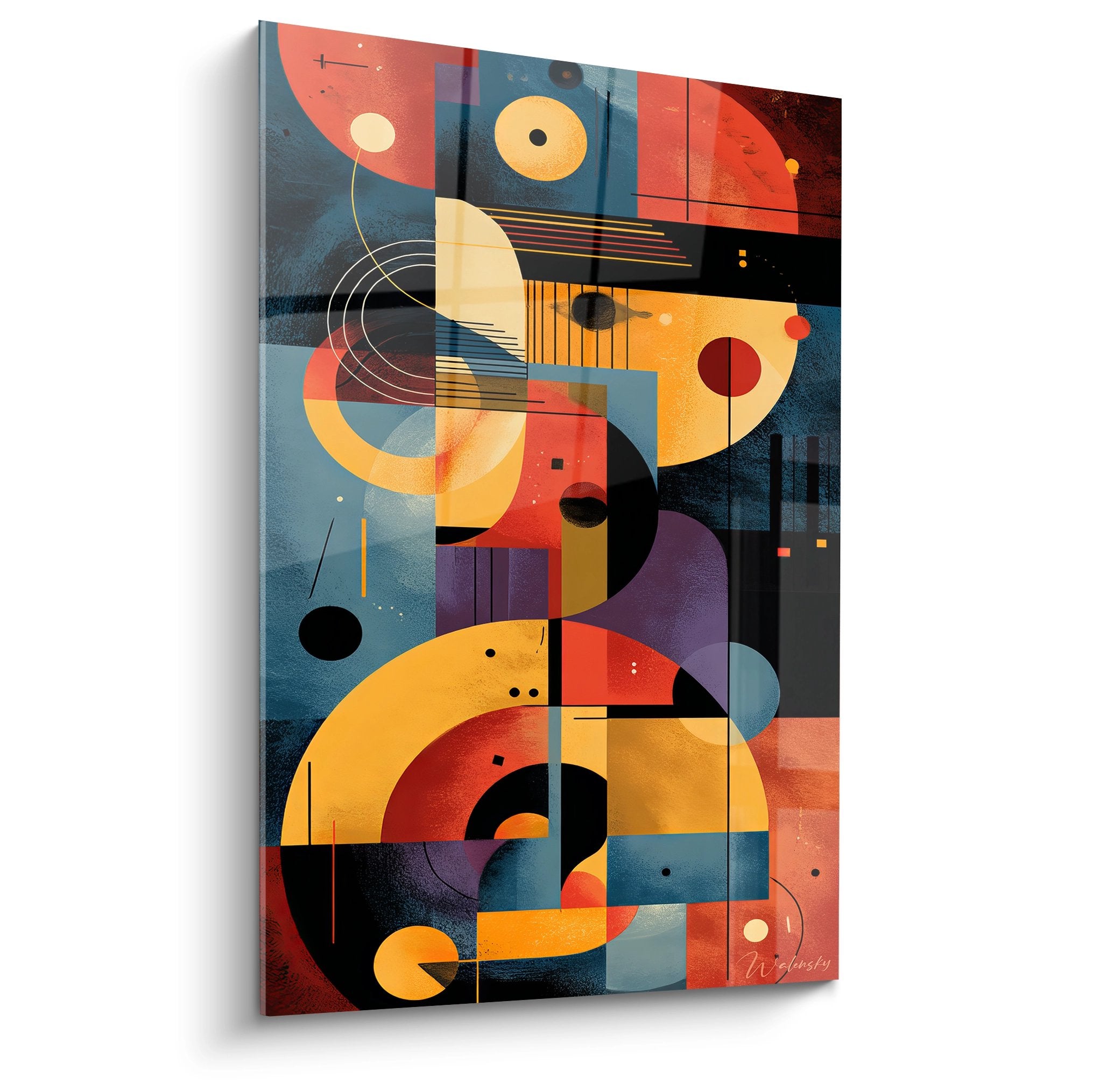
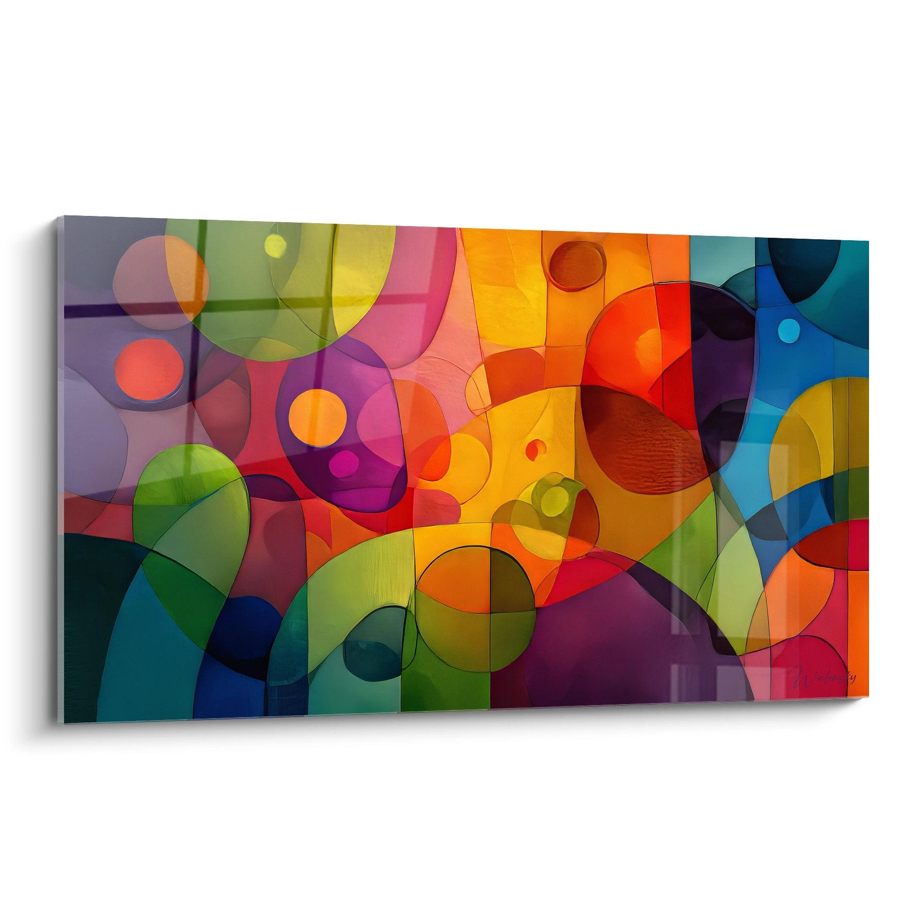
Urban apartments particularly benefit from bold polychromatic compositions that create necessary counterpoint to surrounding architectural monotony. Sophisticated multicolor palettes establish complex dialogues between complementary and analogous tones, generating perceptual richness that compensates for spatial constraints. To explore approaches where color meets formal deconstruction, abstract apartment compositions offer solutions particularly suited to contemporary spaces.
Chromatic Integration Strategies in Compact Residential Architecture
The successful deployment of a colorful wall art piece for apartments demands deep understanding of interactions between pigment mass and spatial configuration. In a 25m² open-plan living-kitchen, an imposing 150x100cm format with a vibrant palette functions as a visual zoning element, subtly defining functional areas without resorting to physical partitions. Chromatic power creates distinct perceptual territories that organize space while preserving the circulatory fluidity essential to small surfaces.
Which chromatic associations enhance contemporary furniture?
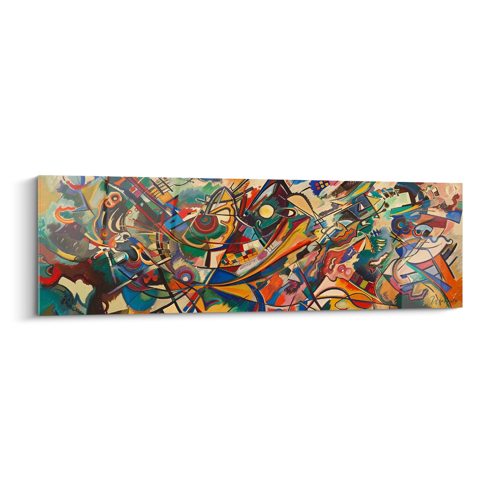
Scandinavian furniture with light wood finds sublimation facing artworks deploying deep turquoises, vibrant corals, or sophisticated mauves that exalt the material's natural warmth. Industrial metal furniture gains nobility when associated with orange-red-yellow compositions that warm cold surfaces. Minimalist monochromatic sets require conversely polychromatic explosions containing seven to ten different tones to avoid visual flatness and create necessary balance between architectural restraint and artistic exuberance.
Visual flow management and circulation
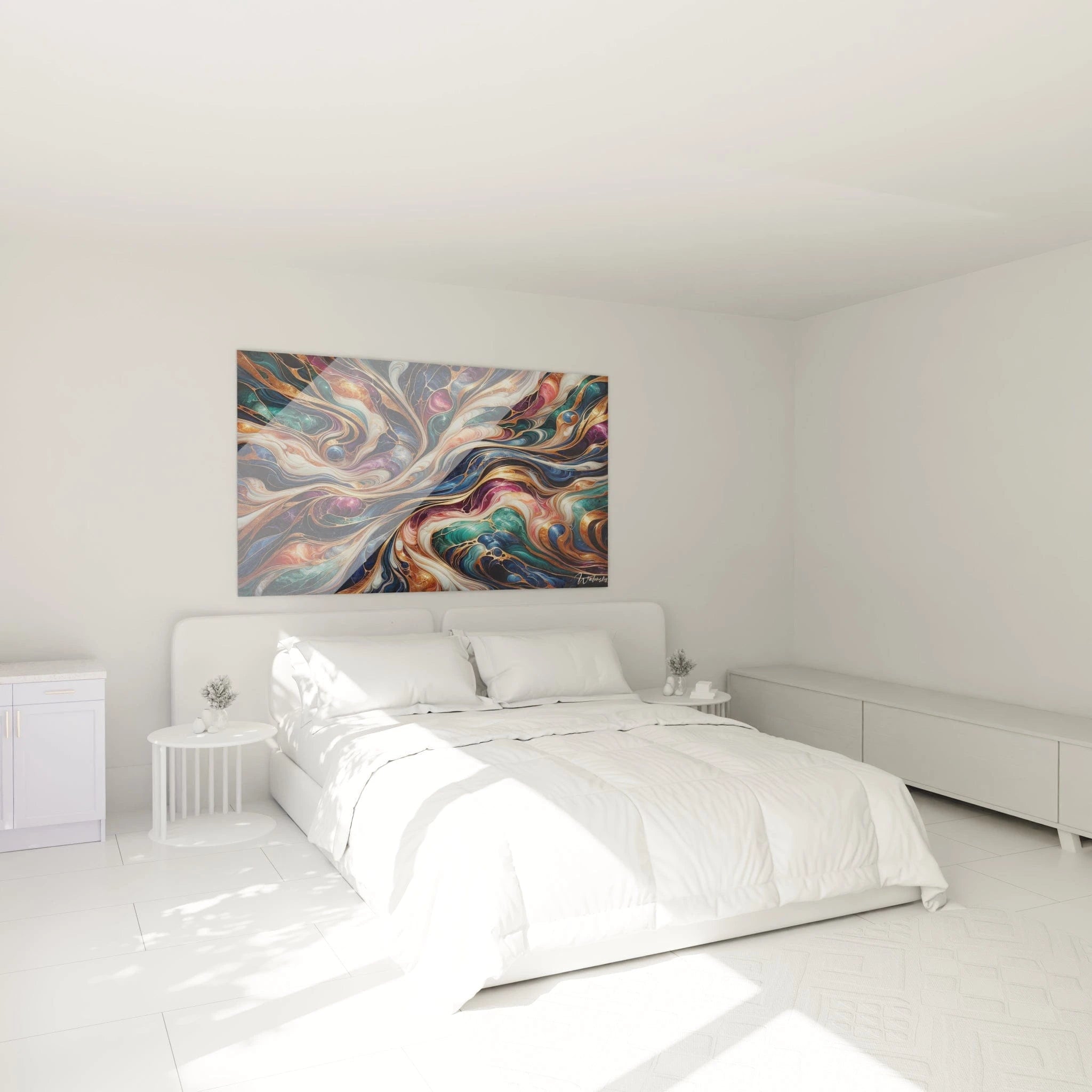
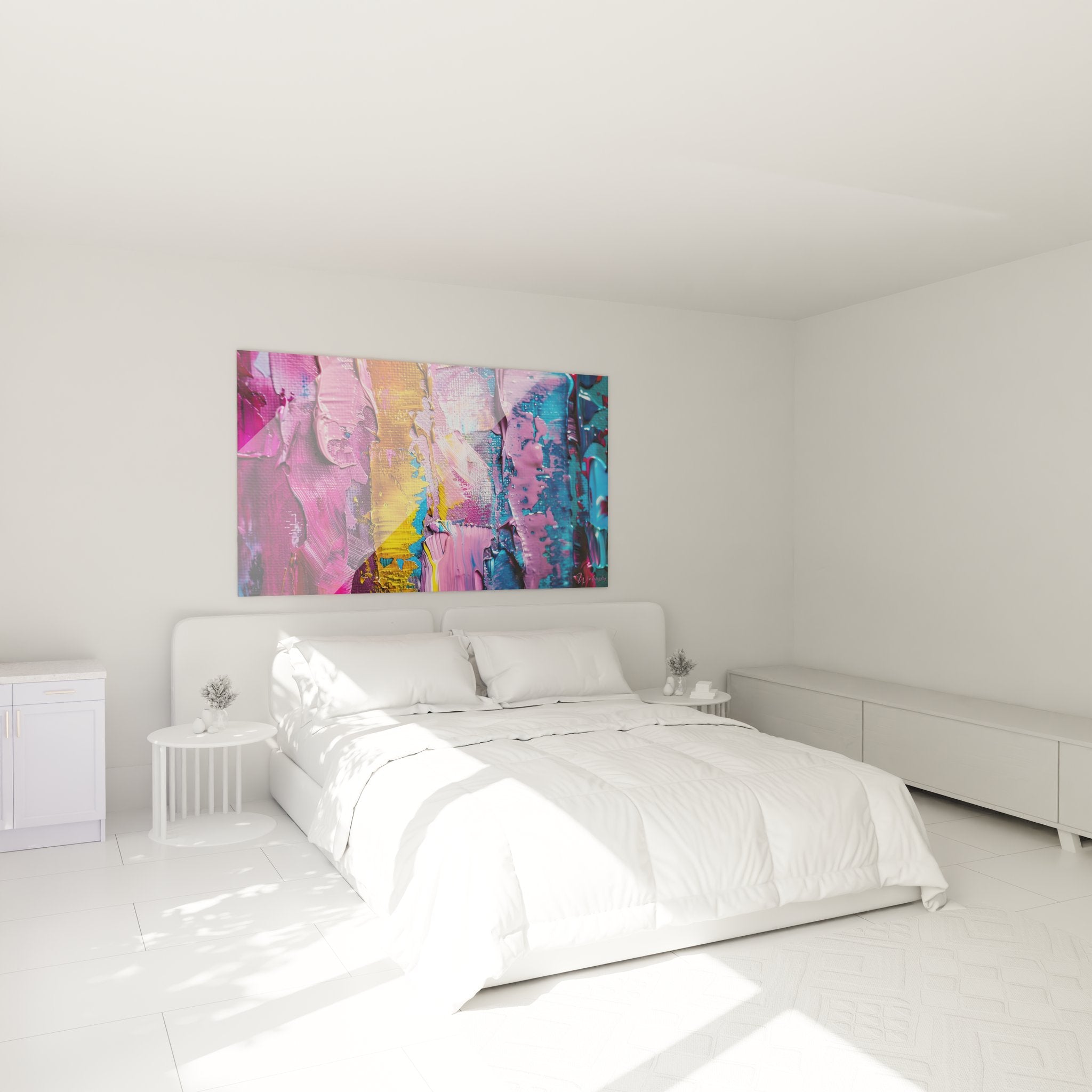
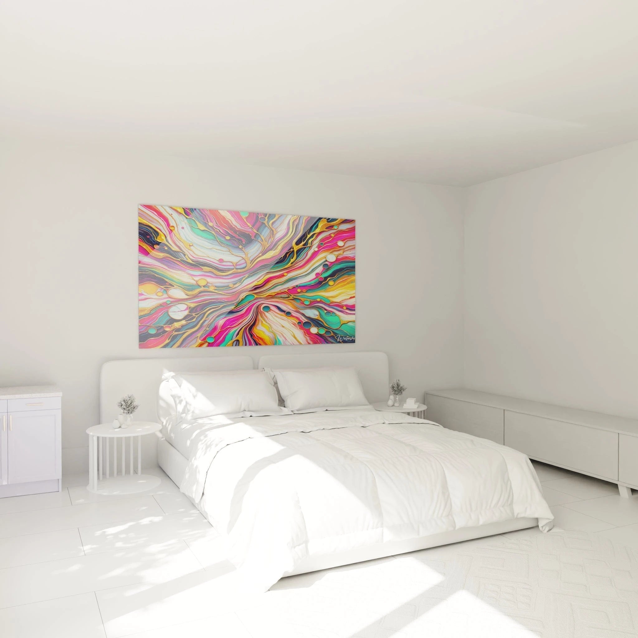
A strategically positioned large-format colorful artwork naturally directs the gaze and influences movement patterns throughout the apartment. Placed at the end of a narrow corridor, it attracts the eye toward depth, transforming utilitarian passage into rewarding visual experience. In a compact entryway, it immediately establishes residential character and announces the overall chromatic personality of the dwelling, creating psychological transition between external public space and domestic intimacy.
Color resonances between adjacent rooms
The chromatic approach in apartments gains coherence when the main artwork generates a pigment signature that subtly propagates toward adjacent spaces. A dominant tone extracted from the composition can be reprised in discrete touches in the neighboring bedroom via textiles or accessories, creating a visual thread that unifies the home without uniformizing it. This strategy of modulated chromatic repetition provides a sensation of perceptual amplitude that transcends physical wall limitations.
Chromatic Vitality and Extended Residential Experience
The acquisition of a colorful wall art piece for apartments constitutes a long-term emotional investment whose perceptual value evolves with time and lifestyle transformations. Unlike ephemeral decorative trends, a rich and complex chromatic composition progressively reveals its layers of meaning, unveiling pigment subtleties and formal balances that escape initial observation. This interpretive depth guarantees resistance to visual fatigue, a crucial phenomenon in domestic spaces where daily exposure could generate detrimental habituation.
The colorful artwork as catalyst for decorative evolution
The generous dimensions and chromatic intensity of a major artwork transform it into a structuring element around which subsequent decorative modifications gravitate. When renewing textiles, replacing curtains or acquiring new cushions naturally orient themselves toward harmonies complementary to the established palette. This visual centrality paradoxically simplifies future aesthetic decisions by providing a stable chromatic reference that ensures stylistic coherence despite progressive furniture evolution.
What psychological benefits does daily chromatic immersion provide?
Regular exposure to stimulating color compositions progressively develops refined aesthetic sensitivity and enhanced ability to discriminate subtle nuances. This informal visual education enriches overall perceptual experience and positively influences personal creativity. Residents frequently report improved baseline mood and reduced anxiety manifestations, particularly during winter periods when natural luminosity declines. The artwork then becomes a partial substitute for missing sunlight.
Chromatic adaptability to life cycles
A sophisticated colorful artwork possesses the remarkable capacity to accompany existential transitions without losing relevance. The young single professional perceives assertion of independence and modernity, while the couple with children finds stimulating and reassuring family anchor point. This semantic versatility stems from pigment richness that permits multiple readings according to individual preoccupations and sensitivities, guaranteeing rare emotional longevity in the decorative universe.
Is a colorful wall art piece suitable for remote work spaces?
Absolutely, integrating a vibrant chromatic composition in a home office stimulates creativity and combats the monotony of extended professional workdays. Energizing tones favor morning concentration while their visual complexity offers regular regenerative micro-pauses during cognitive saturation moments, thus optimizing overall productivity.
How does colorful wall art influence perceived property value?
During a property viewing or photographic presentation, an apartment featuring large-format colorful artworks immediately projects an image of refinement and attention to detail. This artistic staging unconsciously valorizes the entire property by suggesting superior living standards and care devoted to the daily environment, determining factors in potential buyers' subjective property assessment.
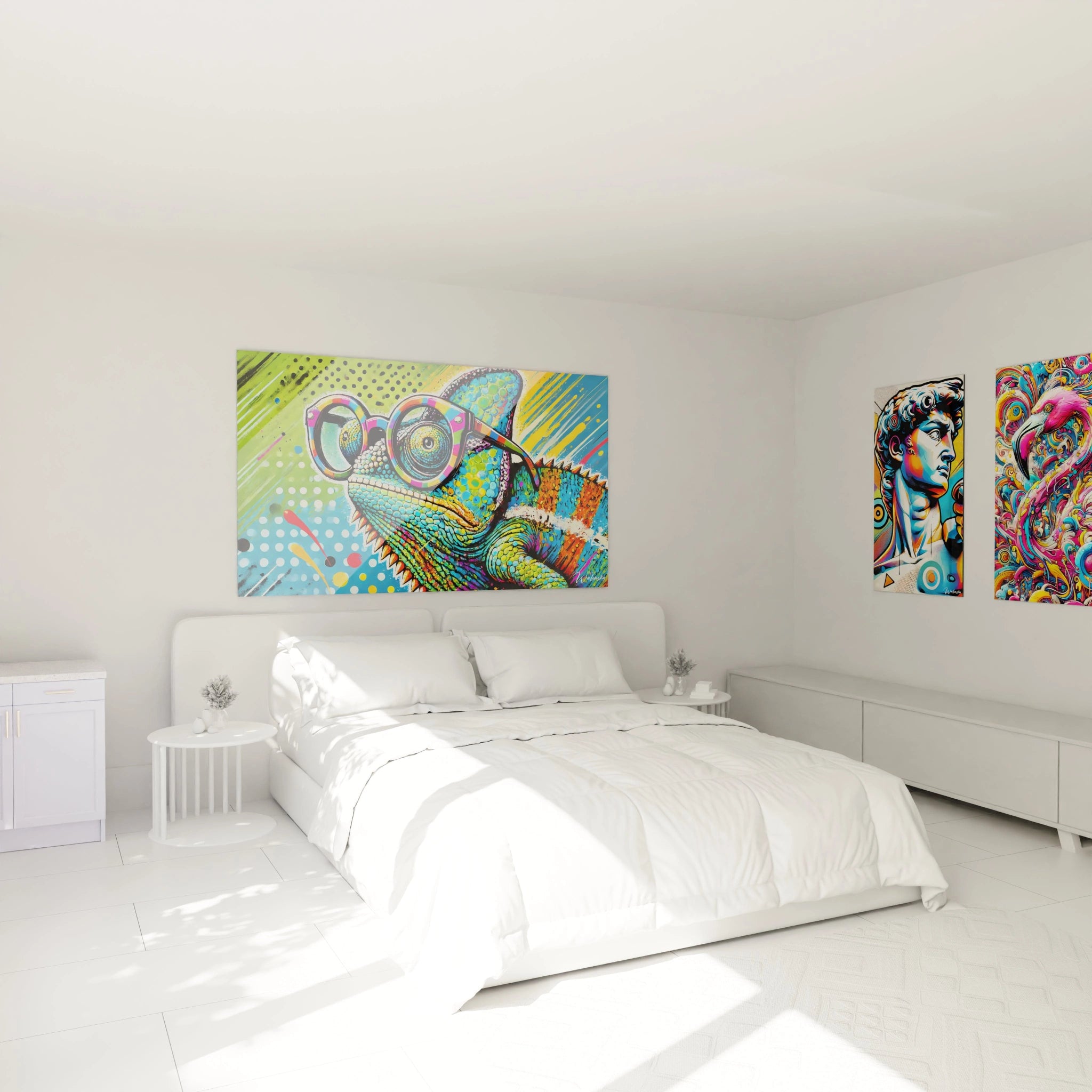
Can multiple colorful artworks be combined in the same apartment?
Multiplying colorful pieces requires rigorous chromatic orchestration to avoid visual cacophony. The optimal approach establishes clear hierarchy with a dominant masterpiece complemented by satellite compositions sharing certain common tones. This strategy creates chromatic conversation between spaces while preserving the distinctive identity of each residential zone.