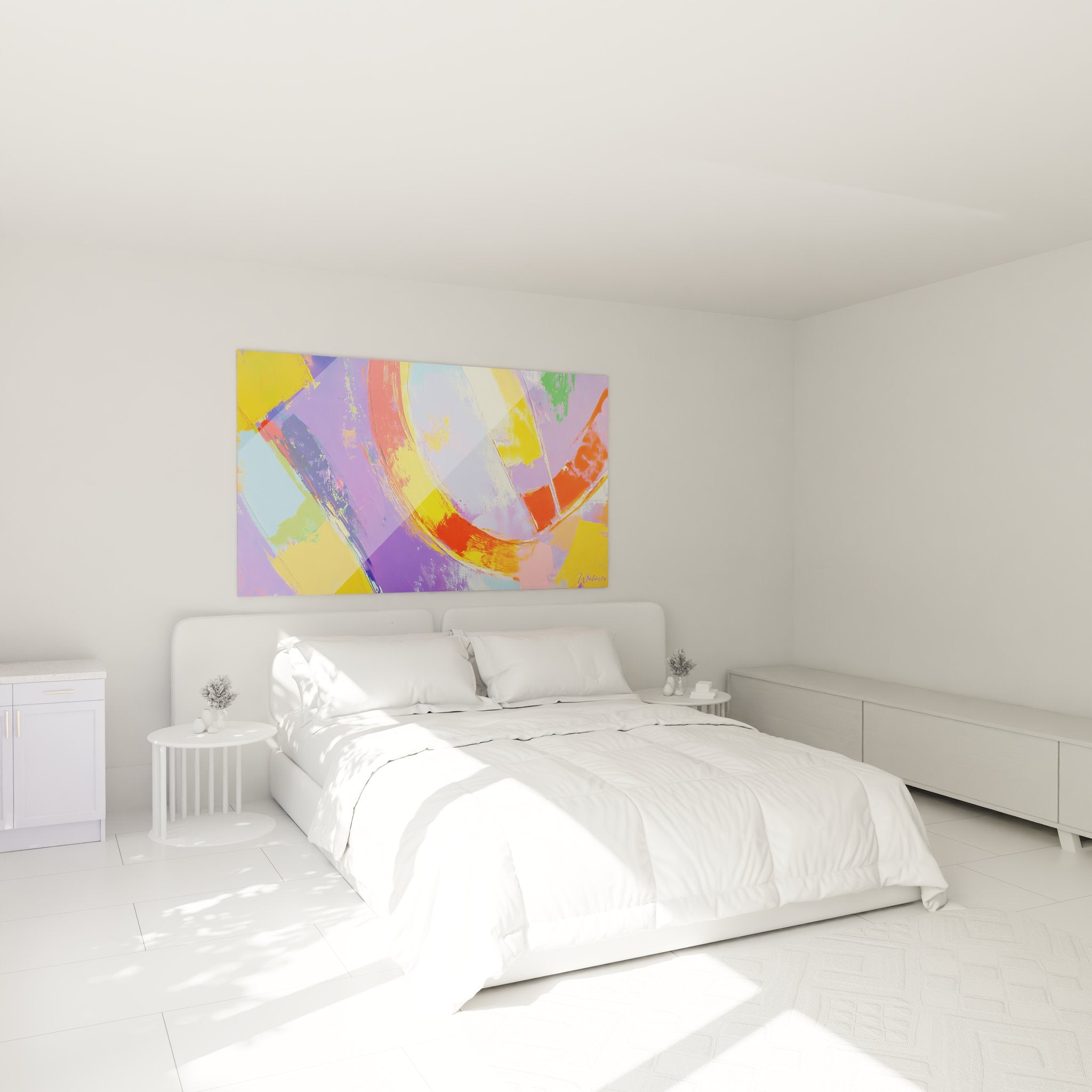
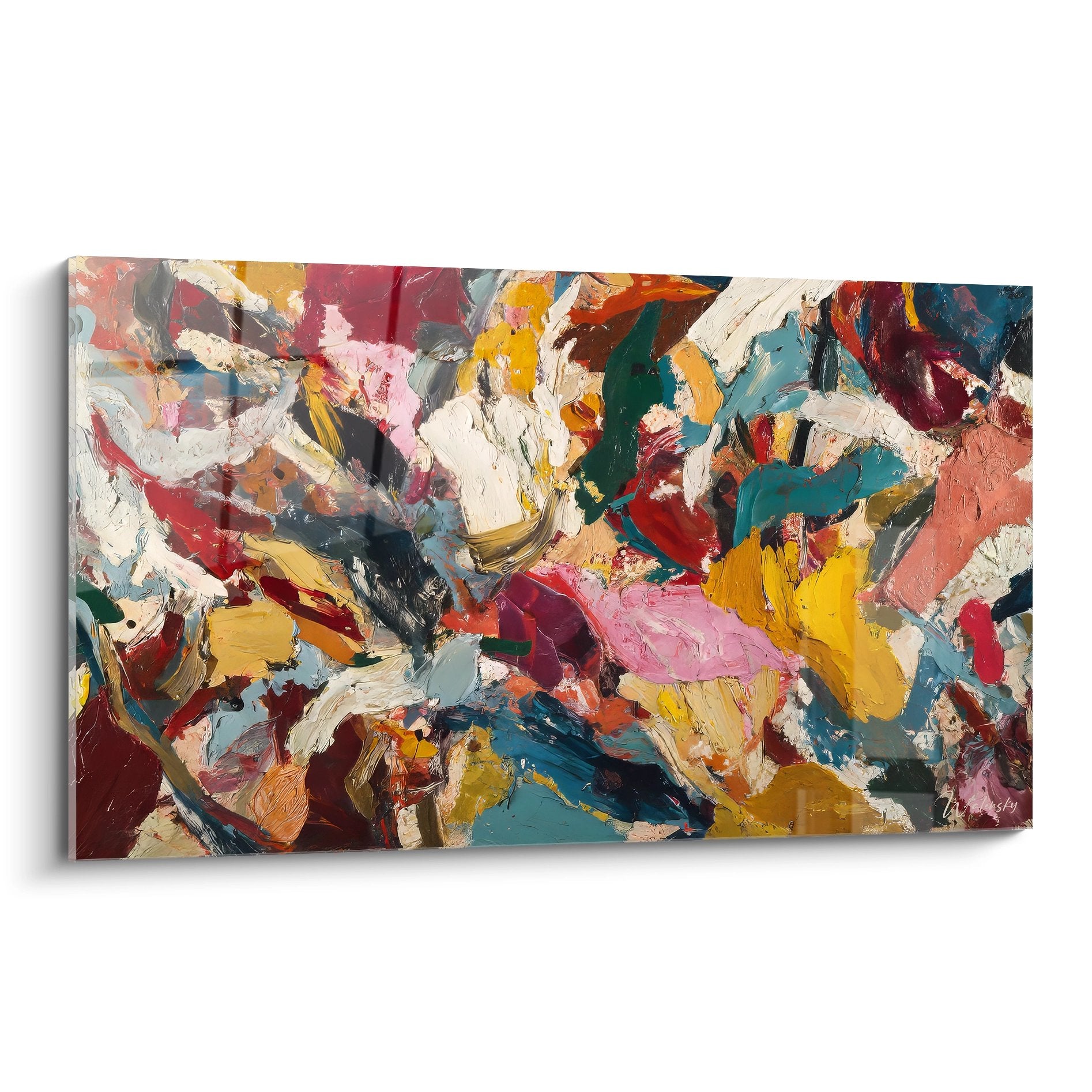
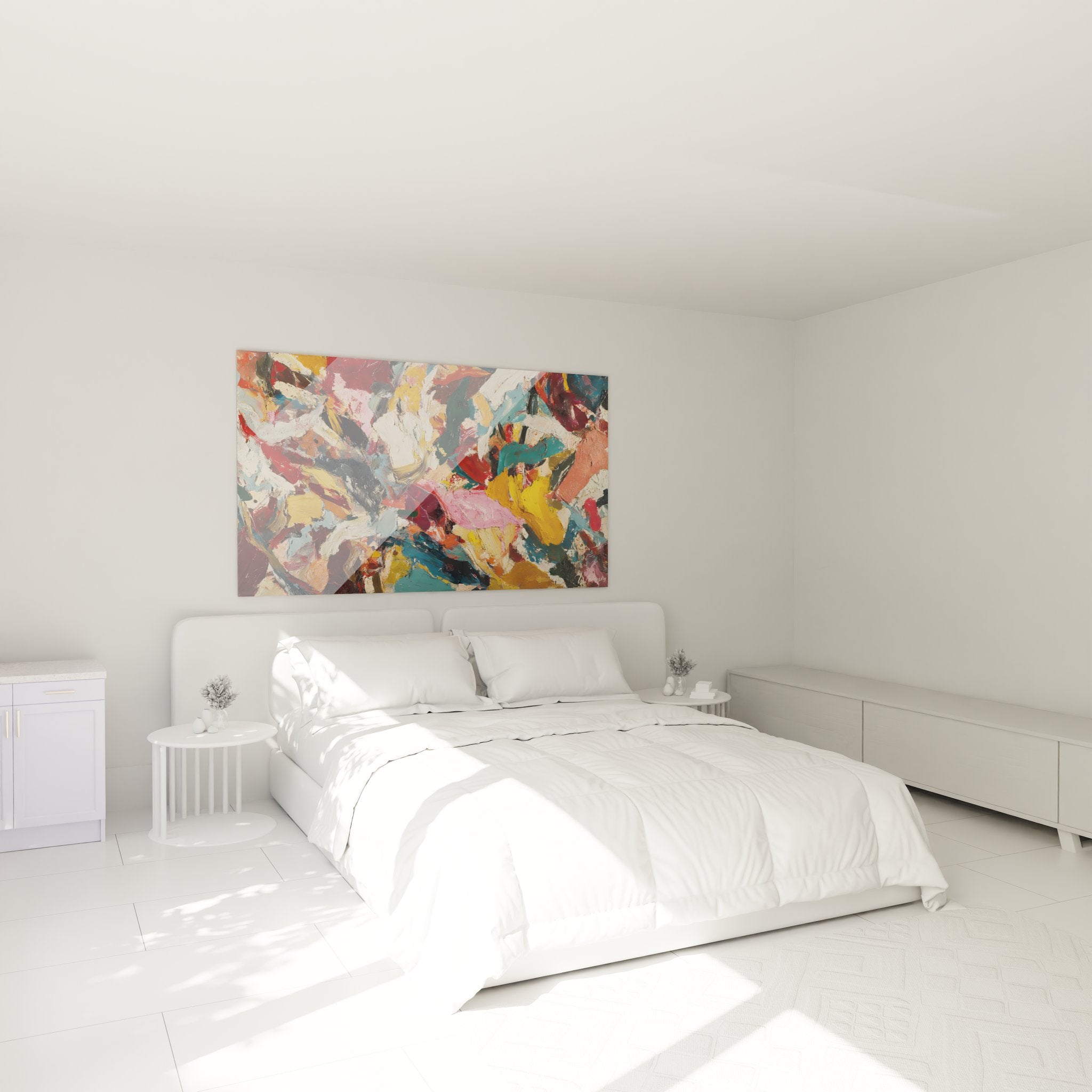
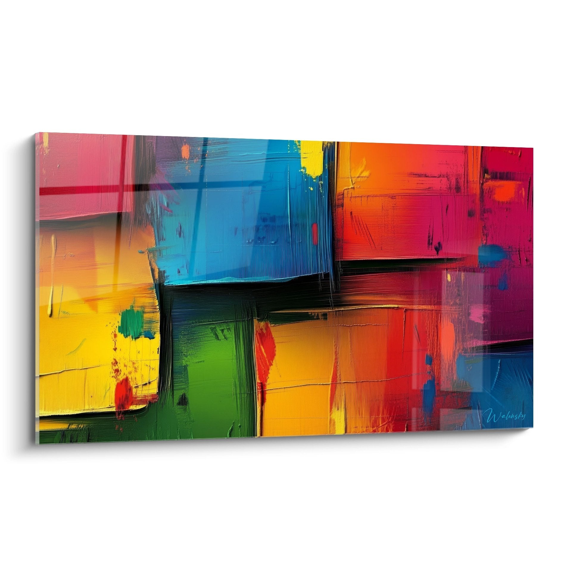
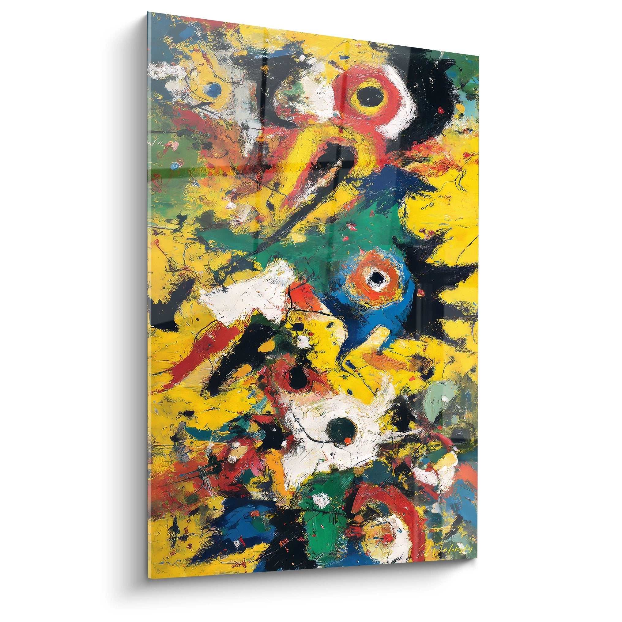
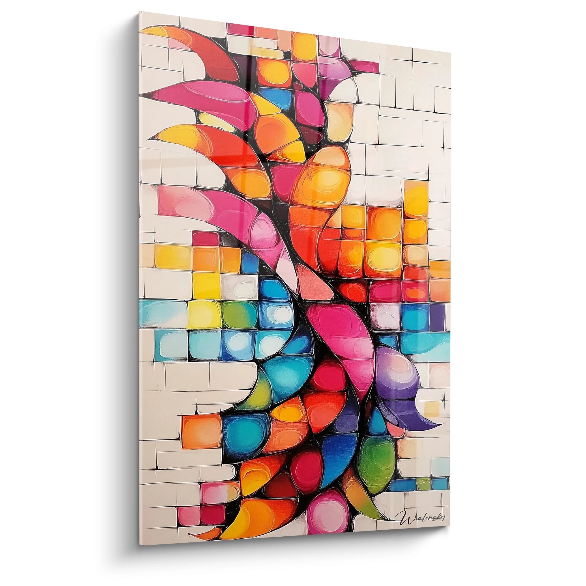
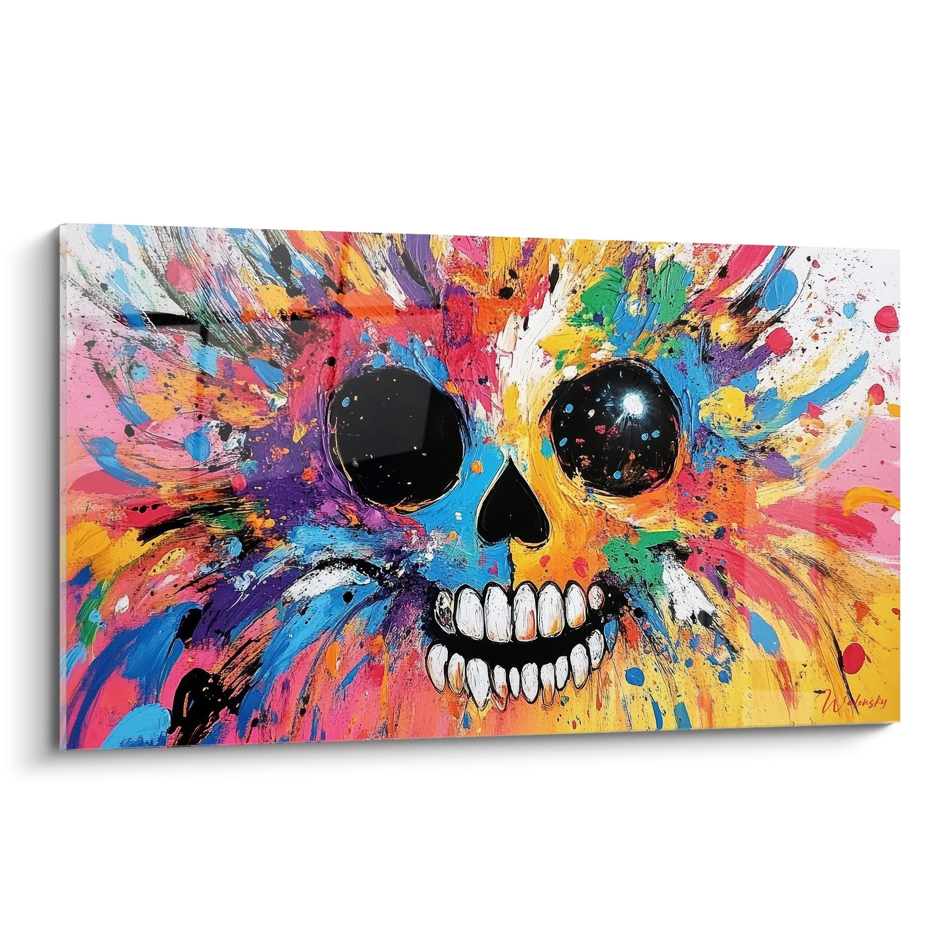
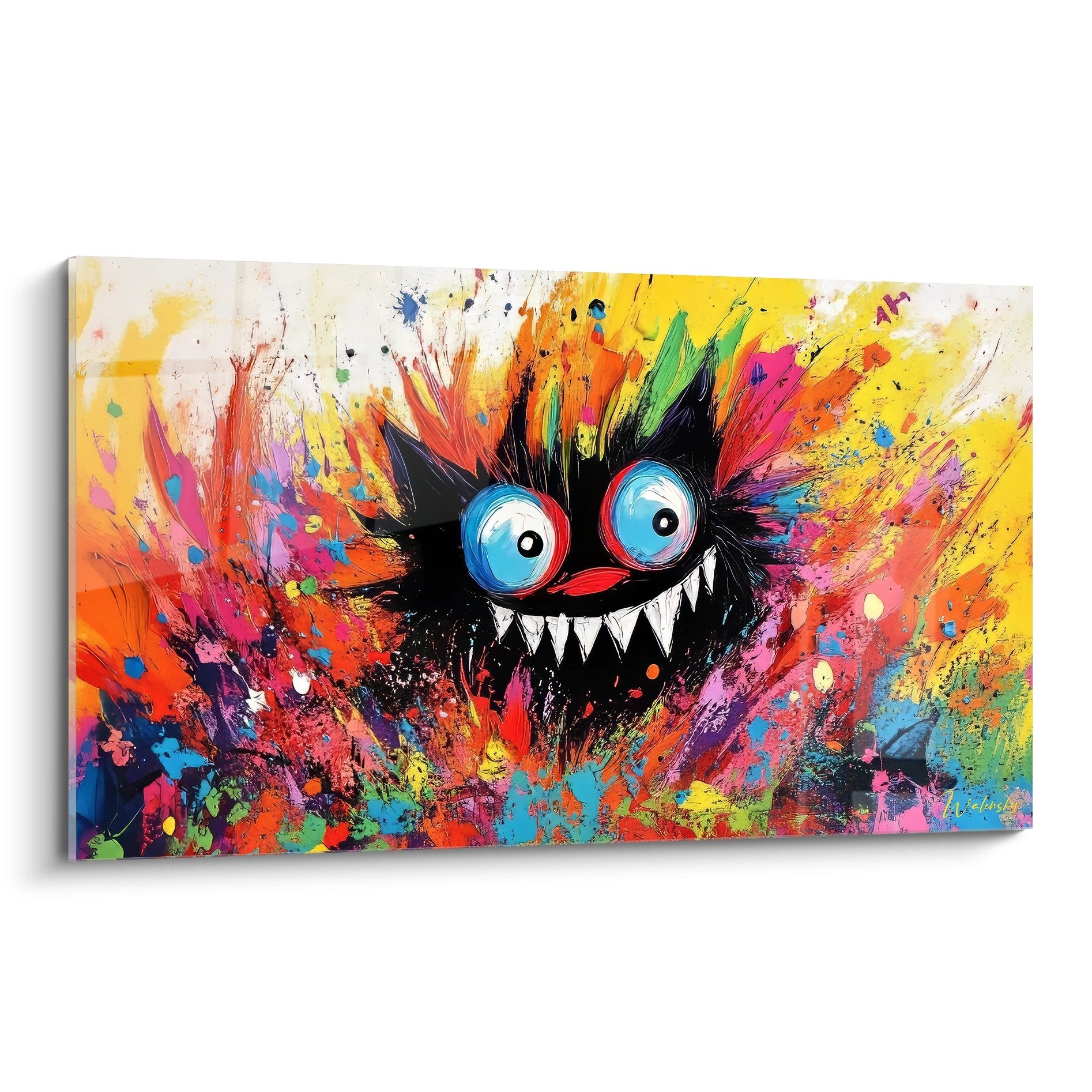
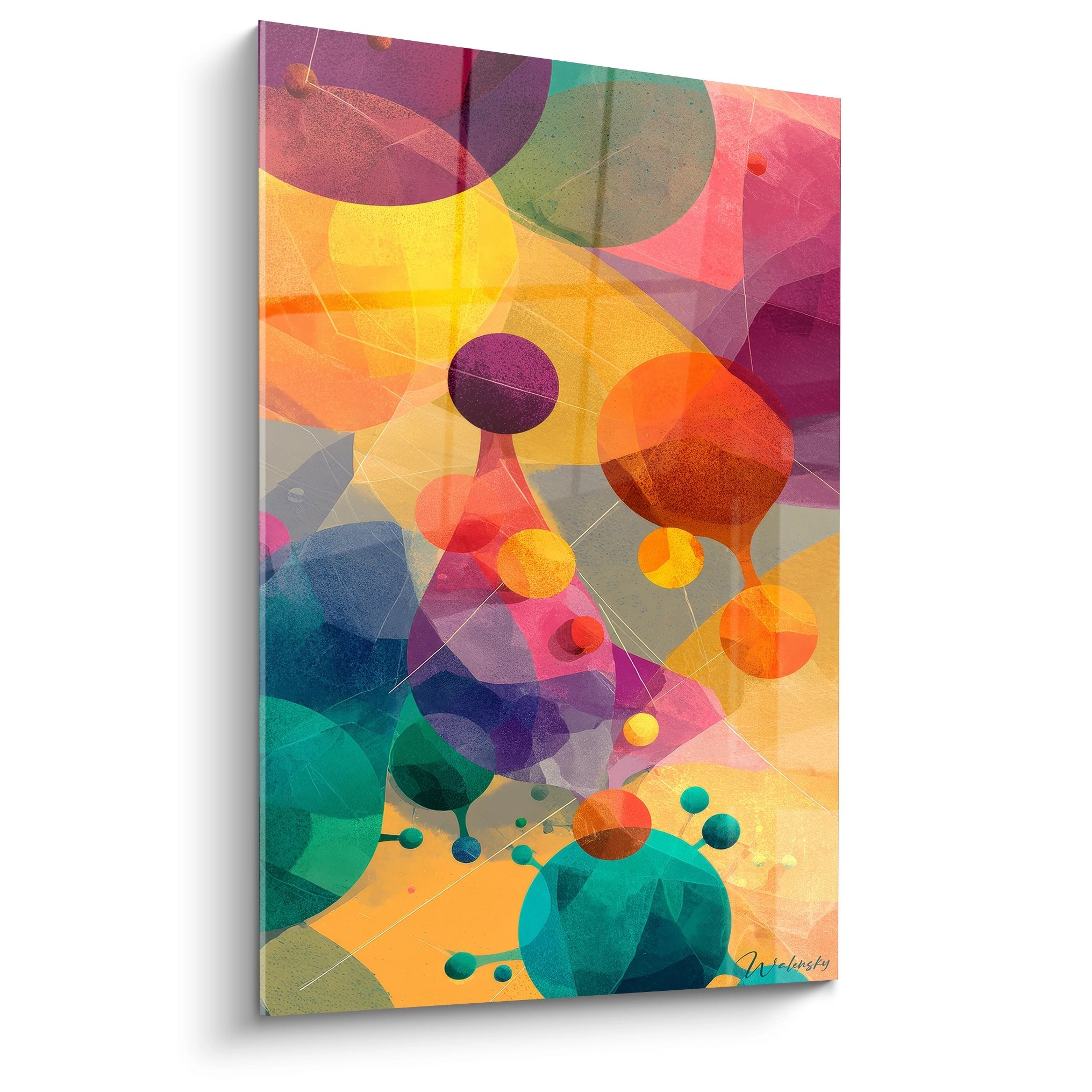
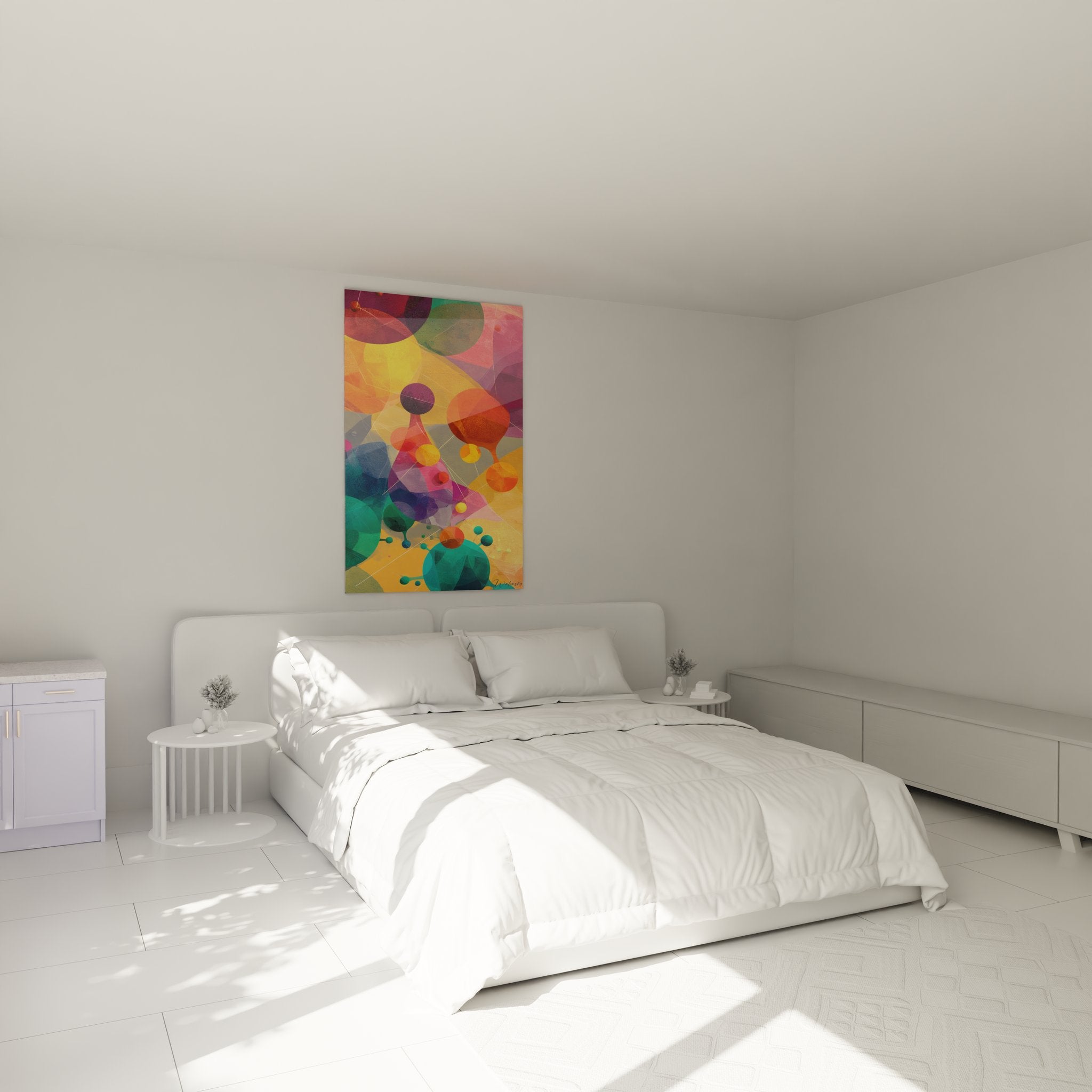
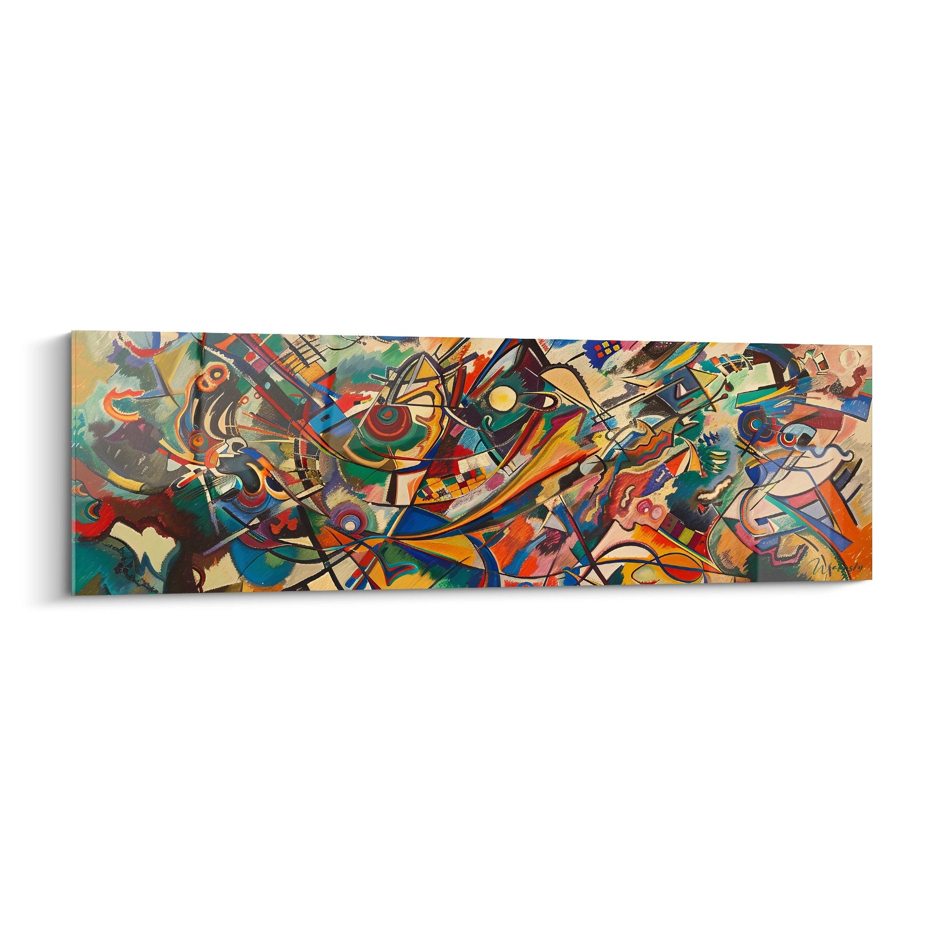
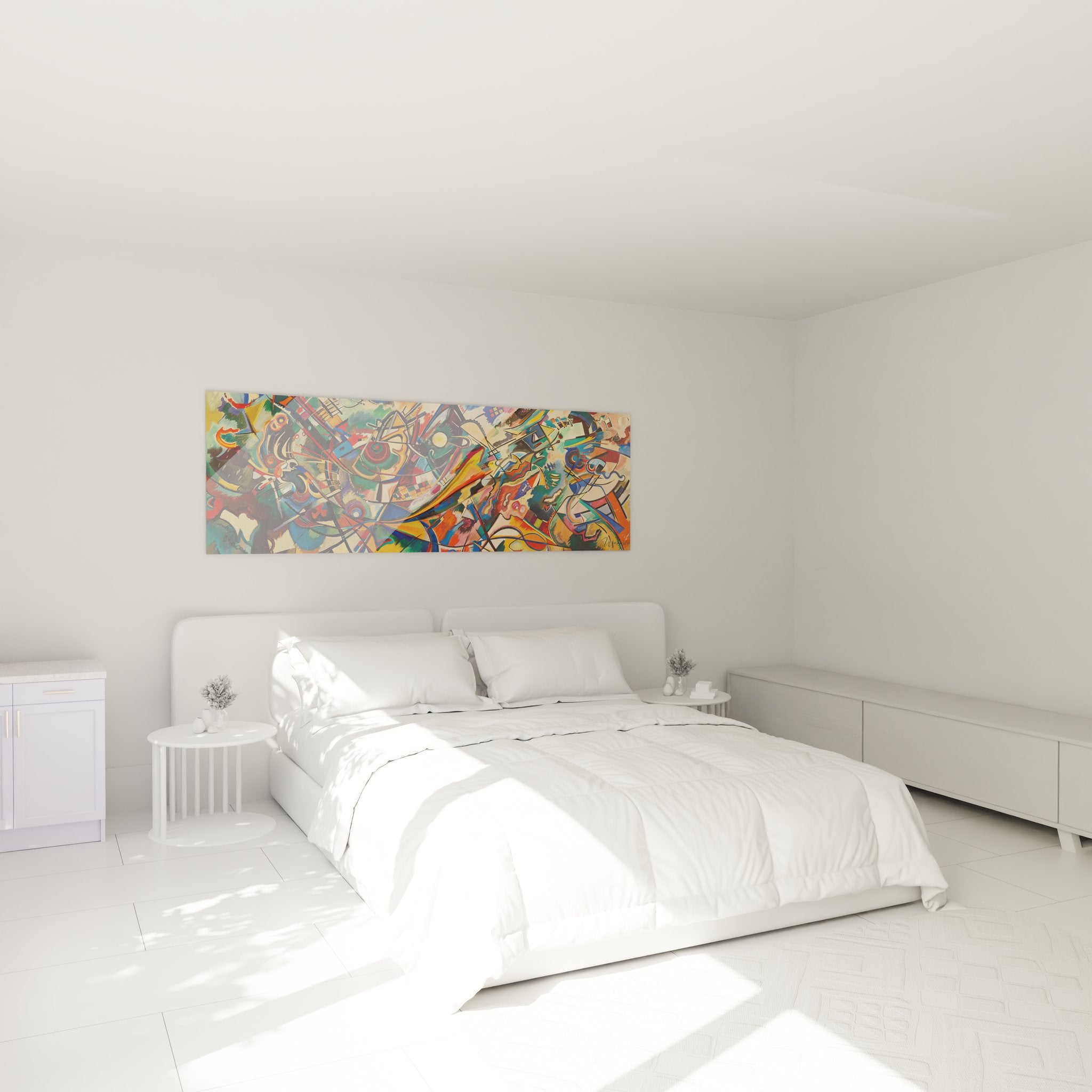
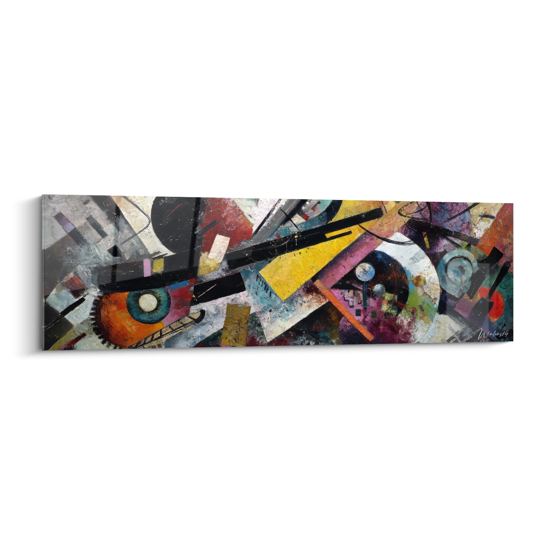
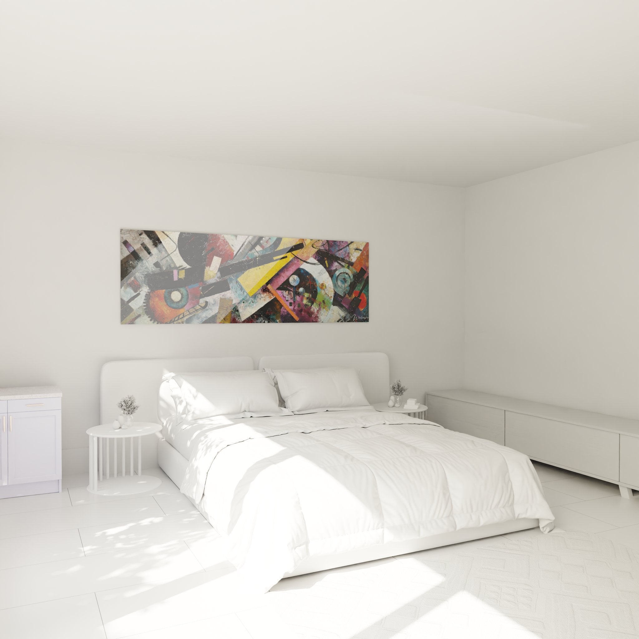
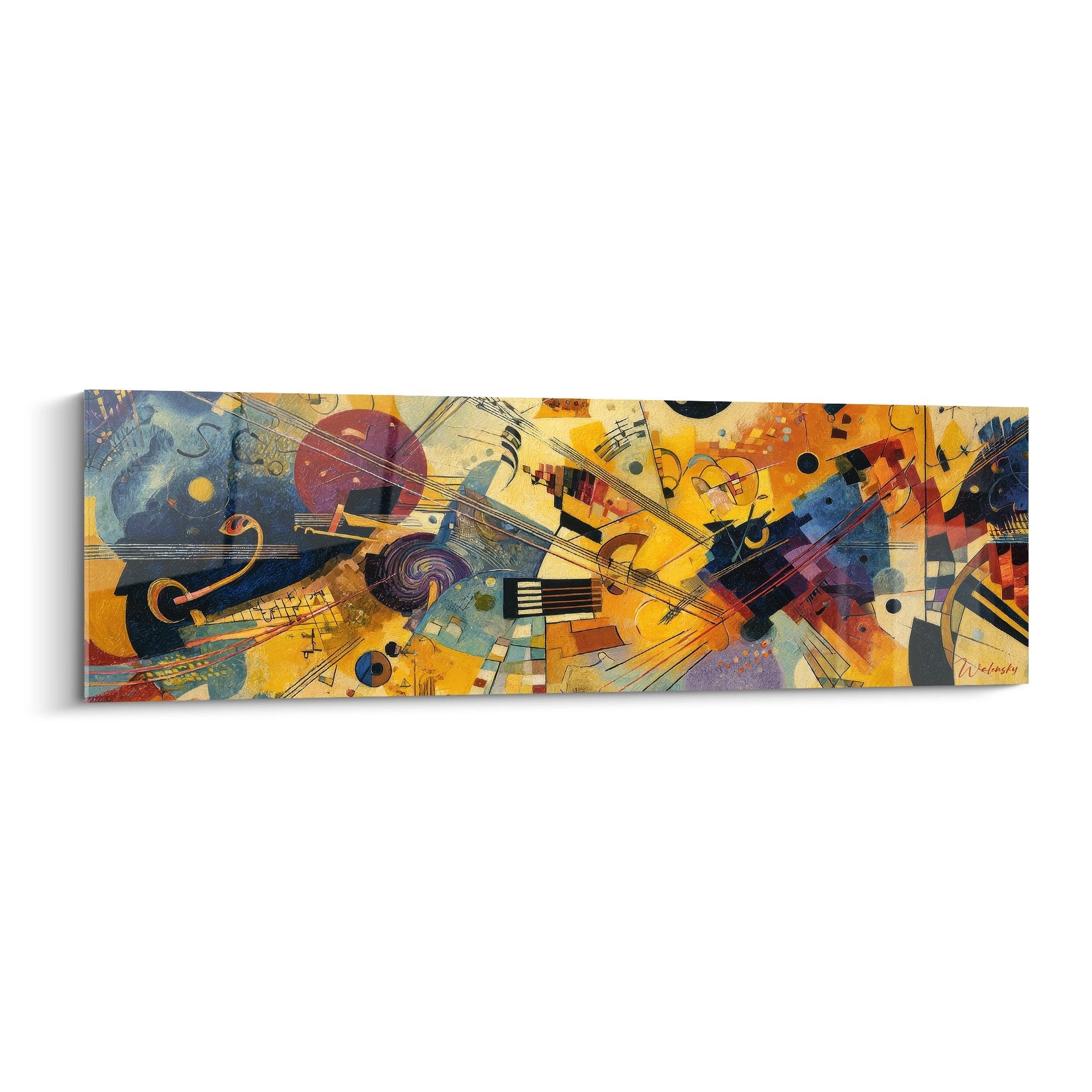
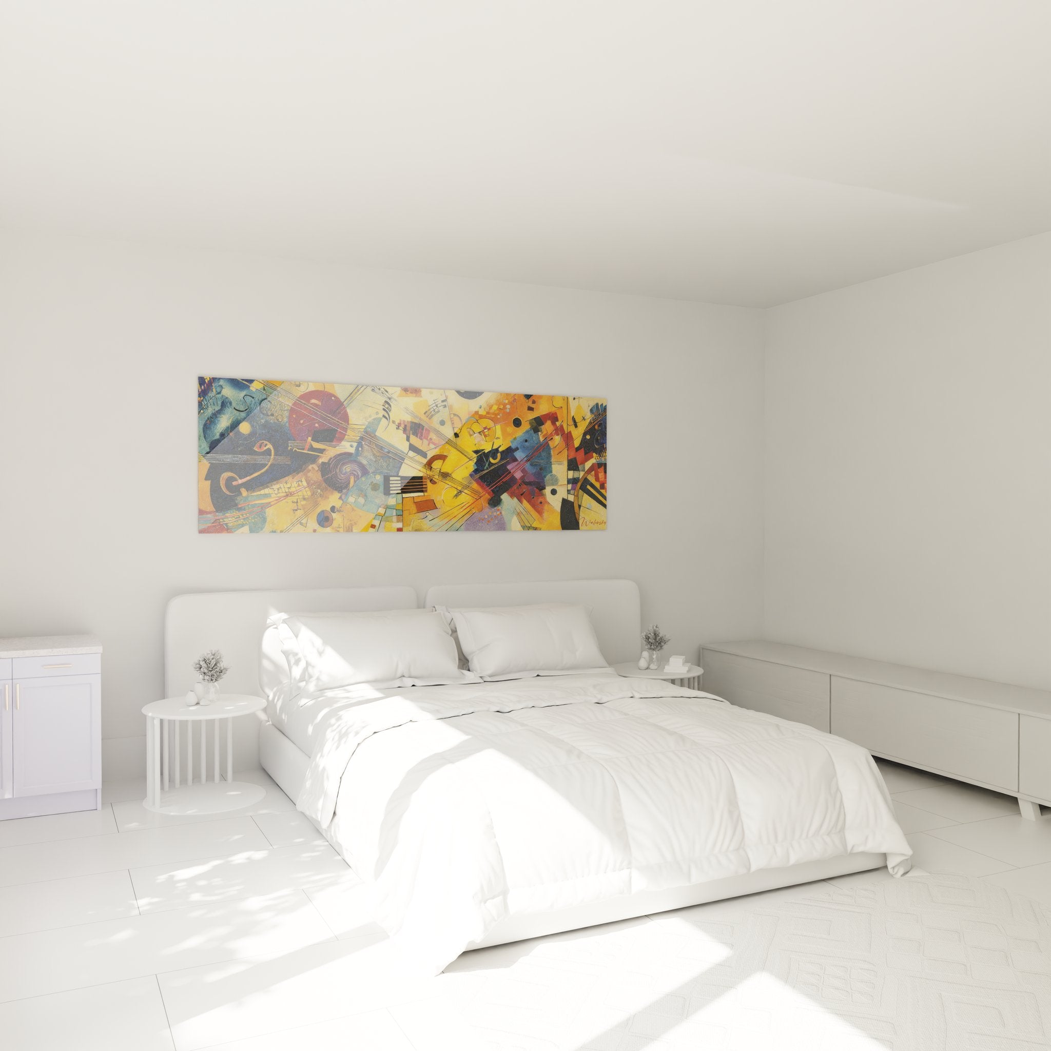
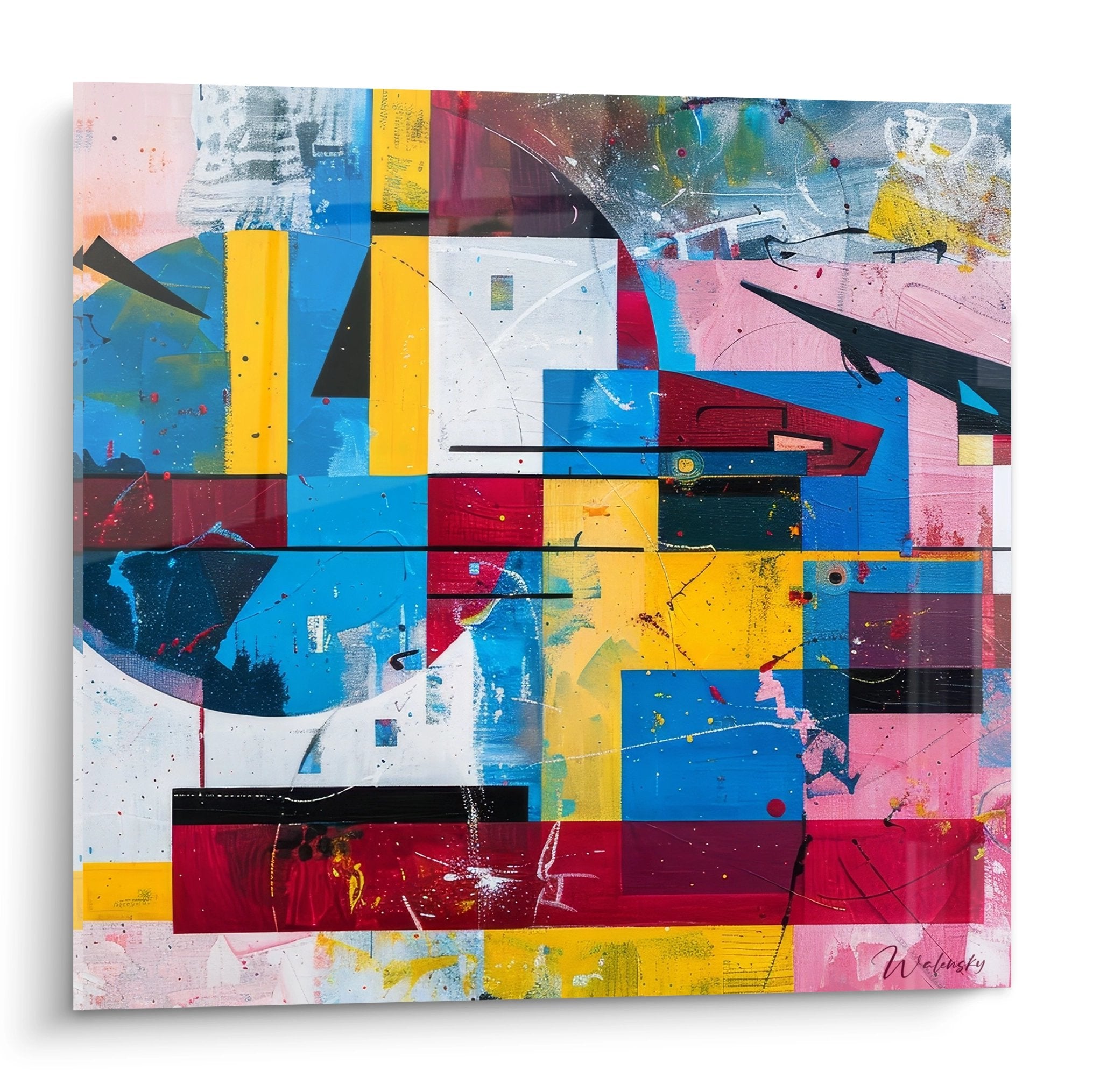
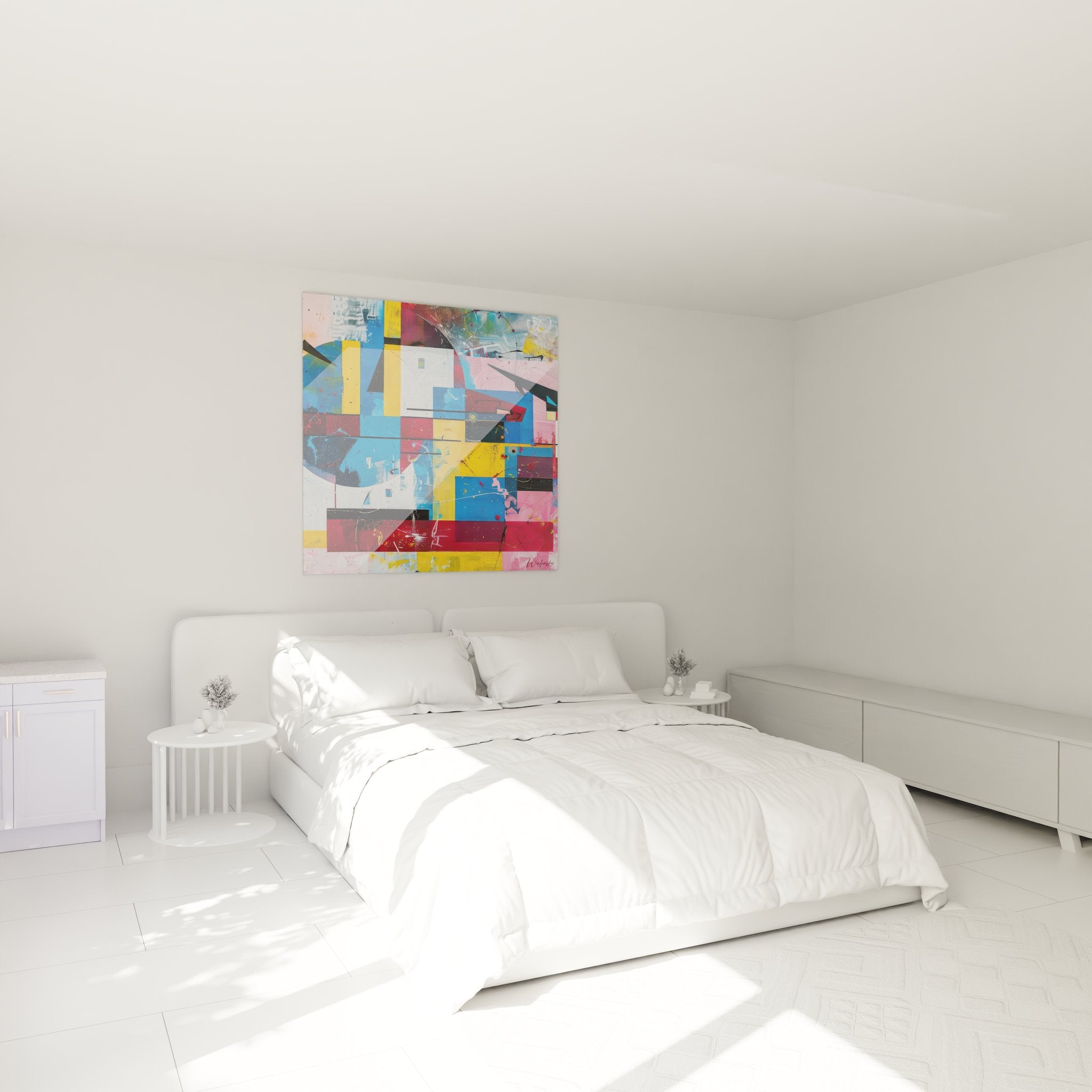
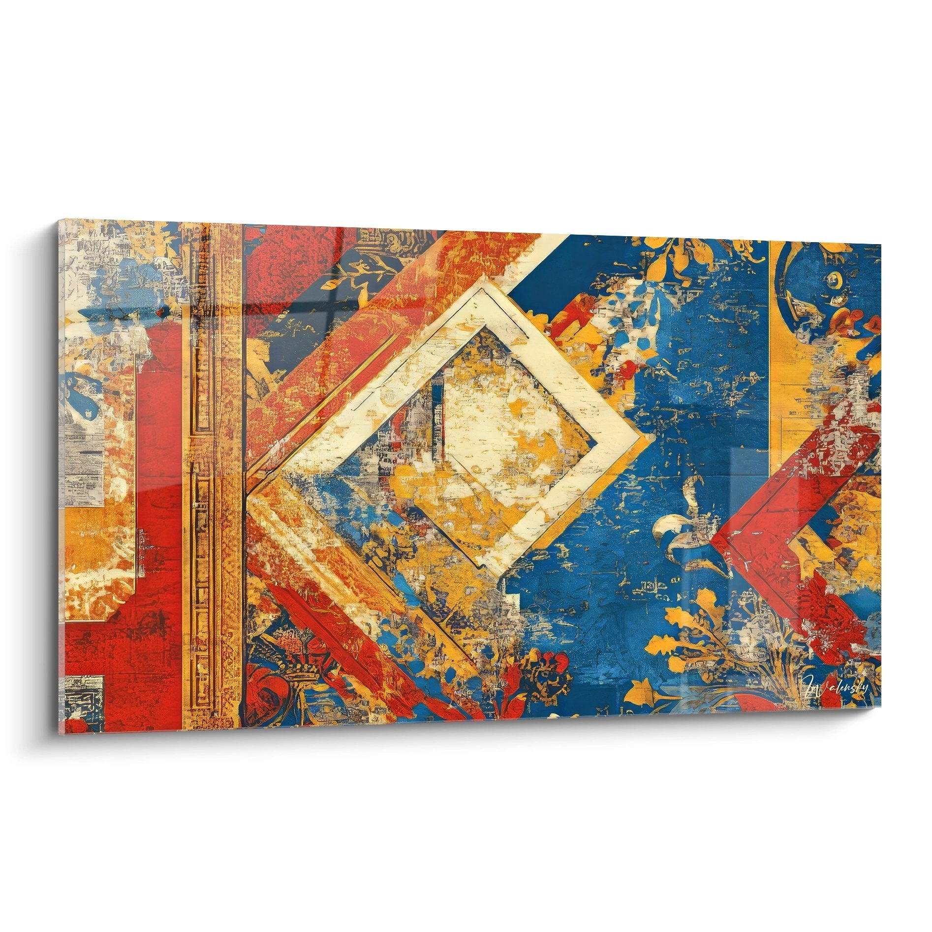
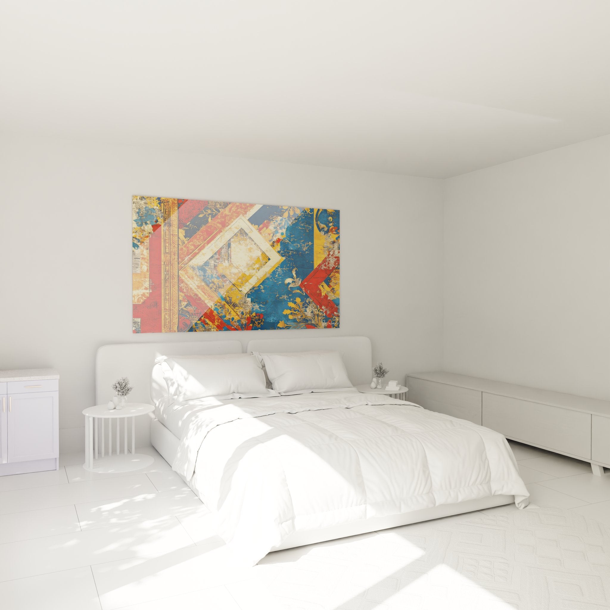
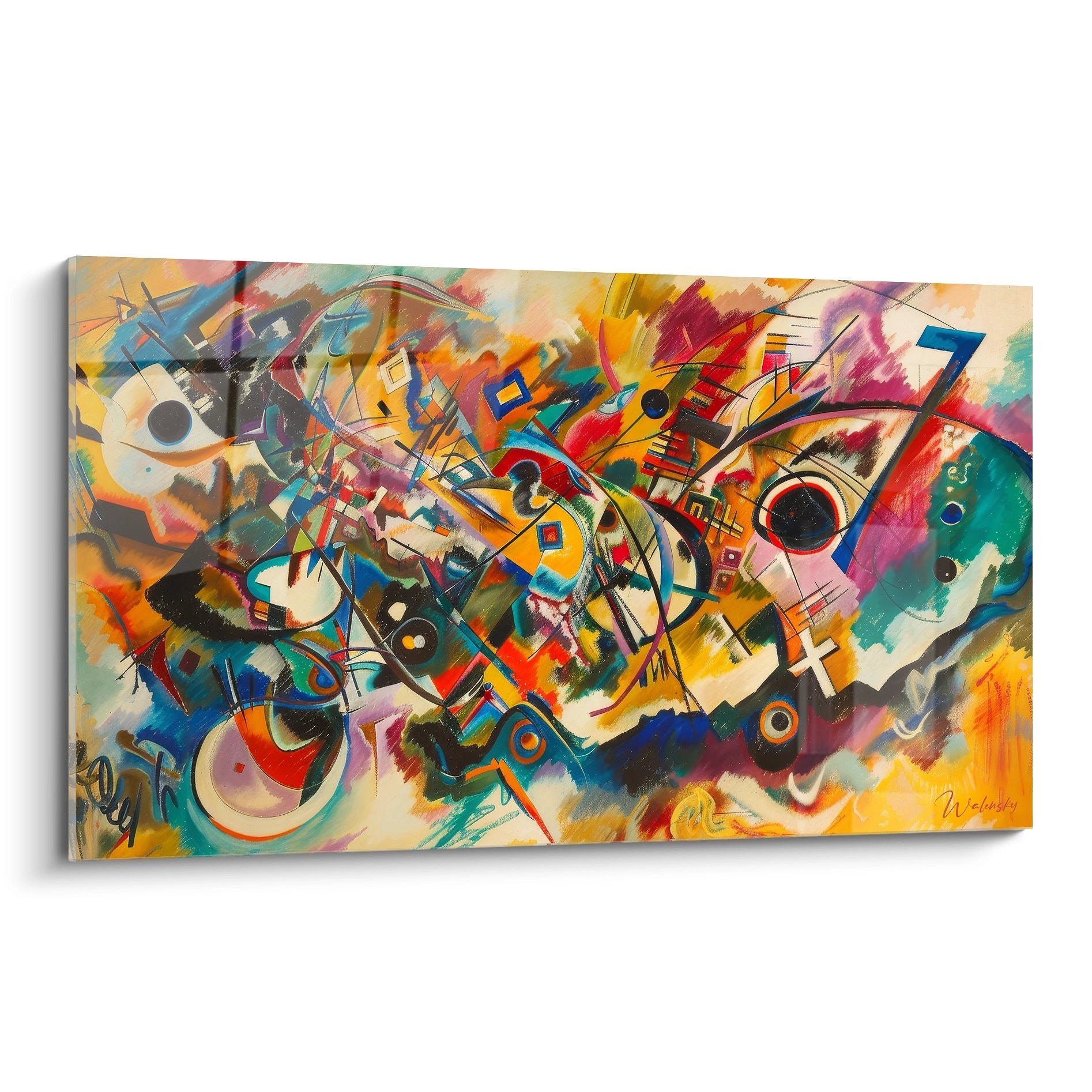
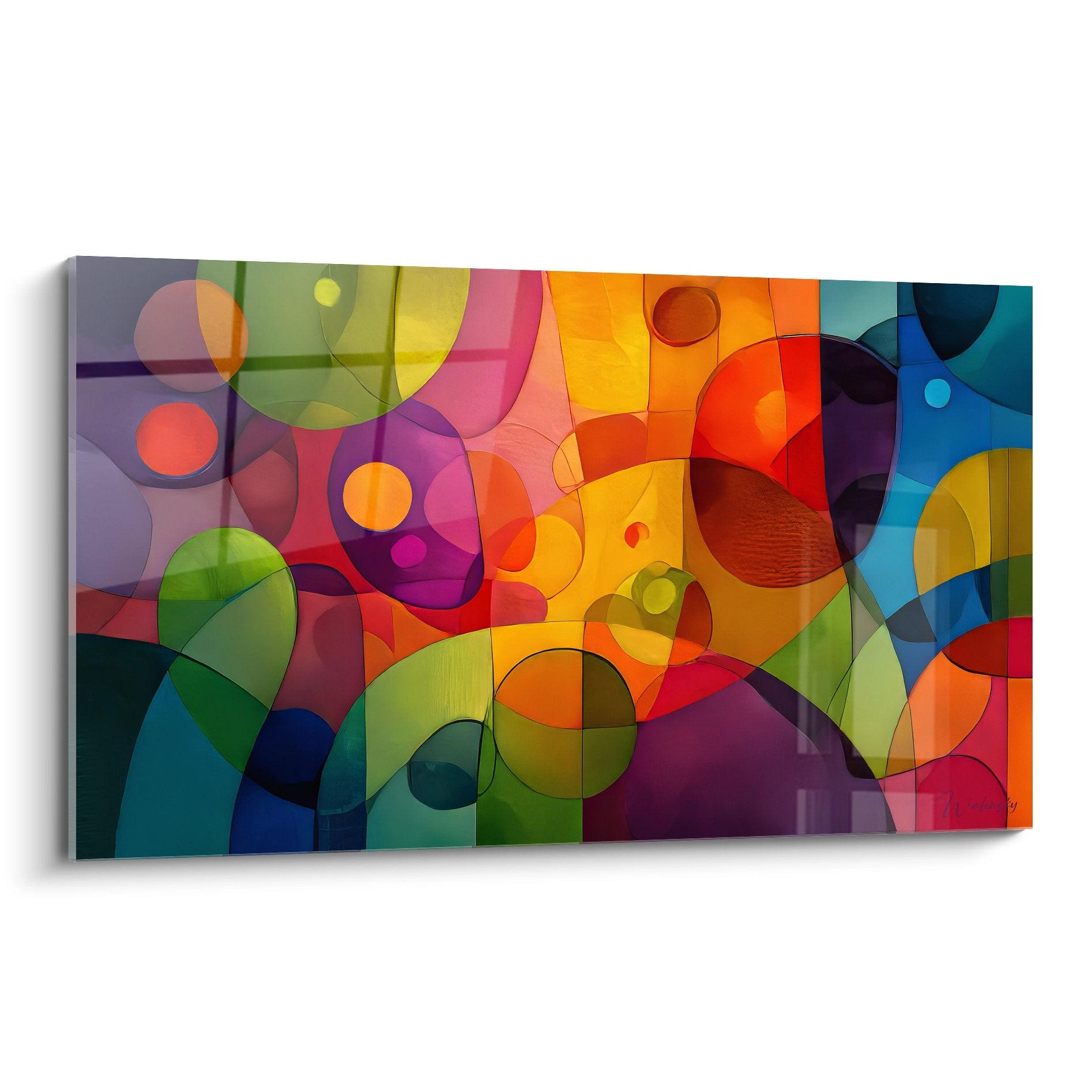
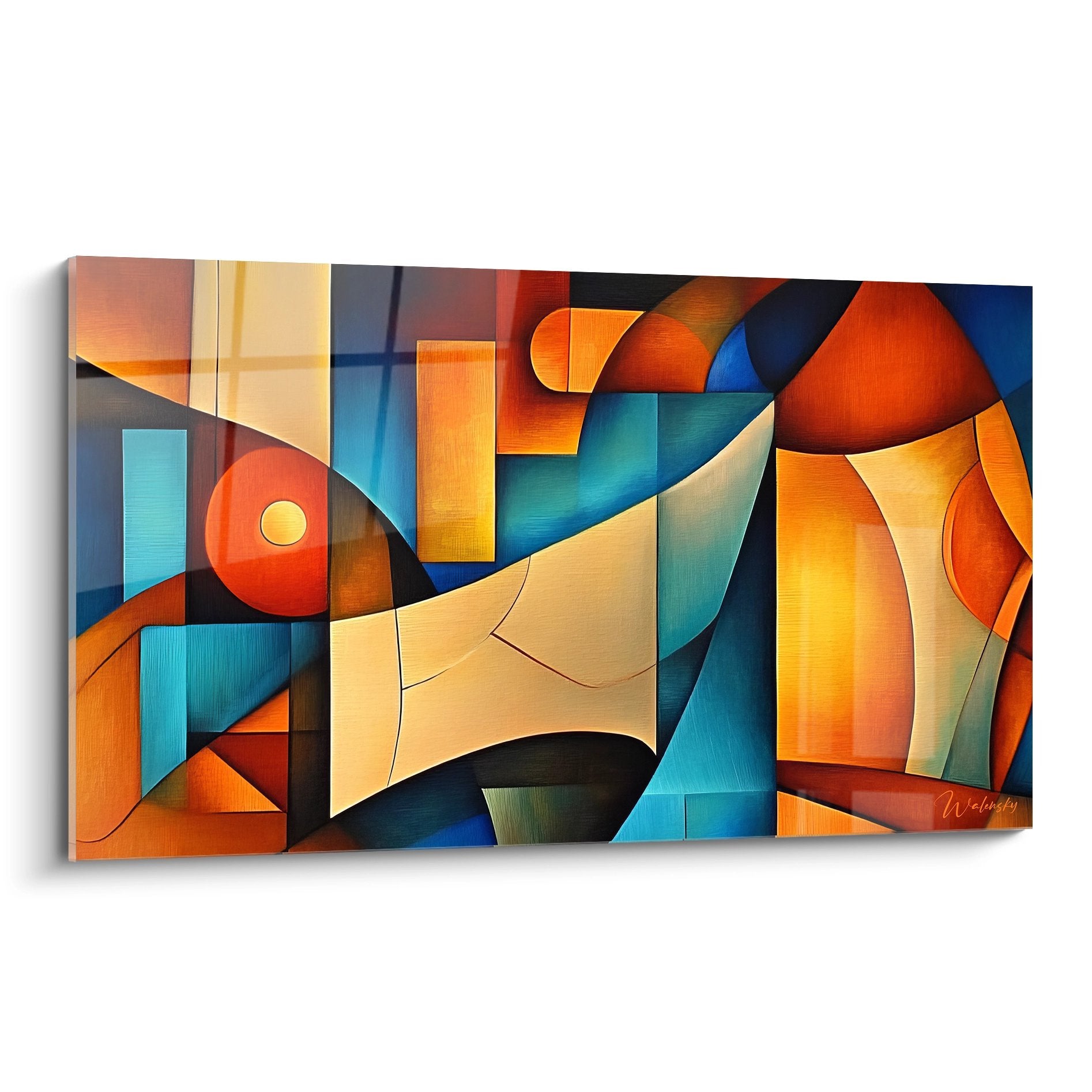
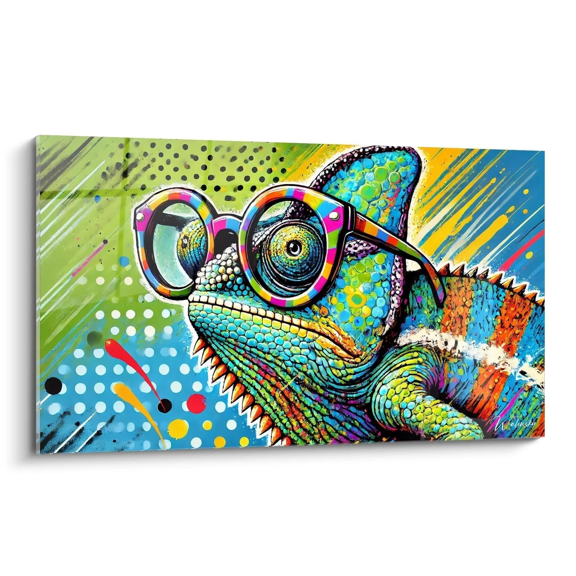
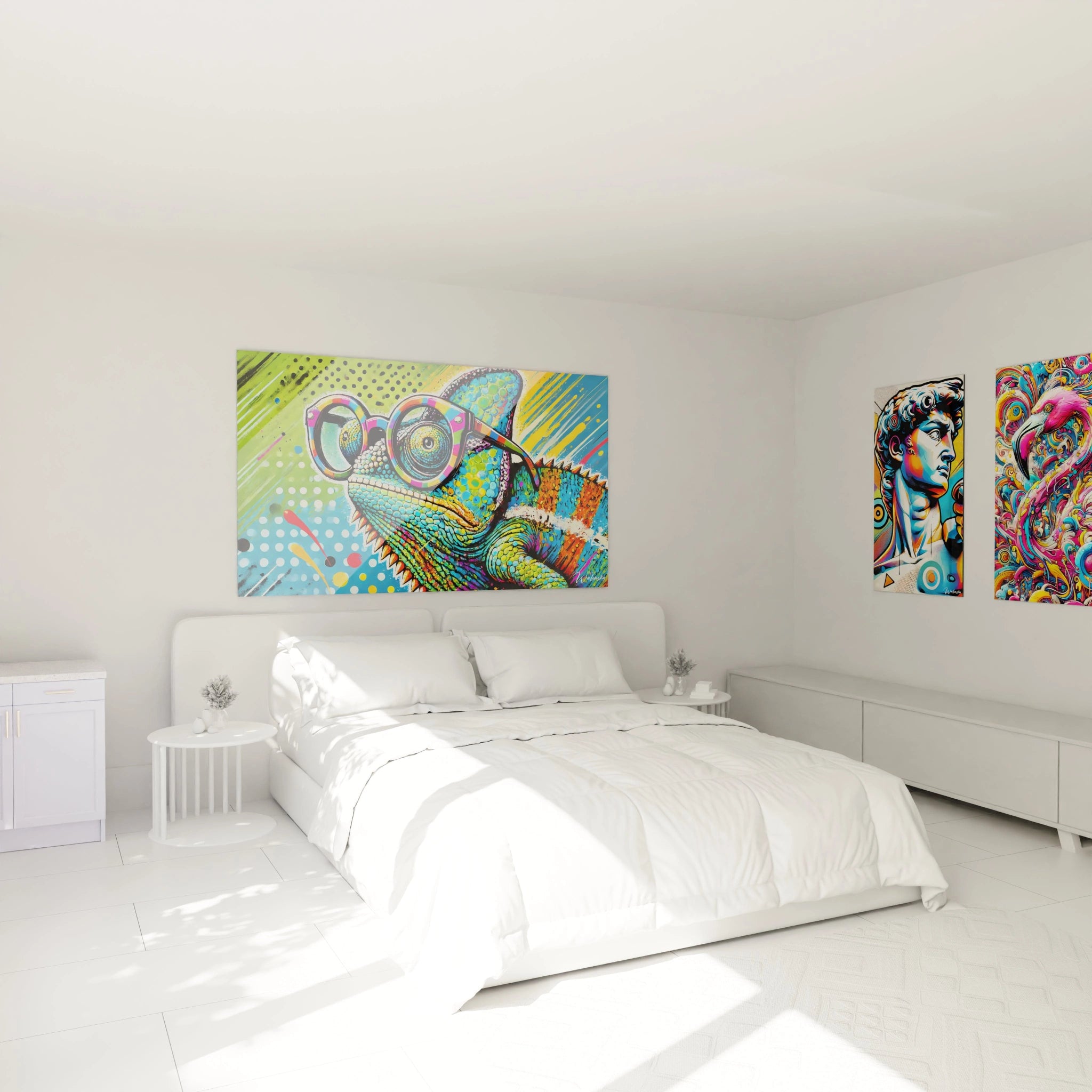
A colorful school wall art instantly transforms the learning atmosphere by stimulating student attention and creating an engaging visual environment. These large-scale wall displays combine pedagogical functionality with vibrant aesthetics to meet the needs of contemporary educational institutions. They adapt perfectly to classrooms, school libraries, motor skill spaces, and educational hallways where visual impact becomes a genuine learning lever. Designed to captivate young minds, these decorative panels integrate vibrant color palettes that promote concentration and memorization. Their imposing format guarantees optimal visibility from any point in the room, facilitating group sessions and pedagogical demonstrations.
The Energy of Color in Service of School Attention
The colorful school wall art exploits the psychological properties of bright hues to maintain learner engagement during educational sessions. Saturated shades like stimulating red, energizing yellow, or calming green create visual reference points that rhythm the school day and mark transitions between activities. This intentional chromatic approach addresses the specific needs of educational environments where visual fatigue and attention dispersion constitute daily challenges.
How do chromatic contrasts improve pedagogical readability?
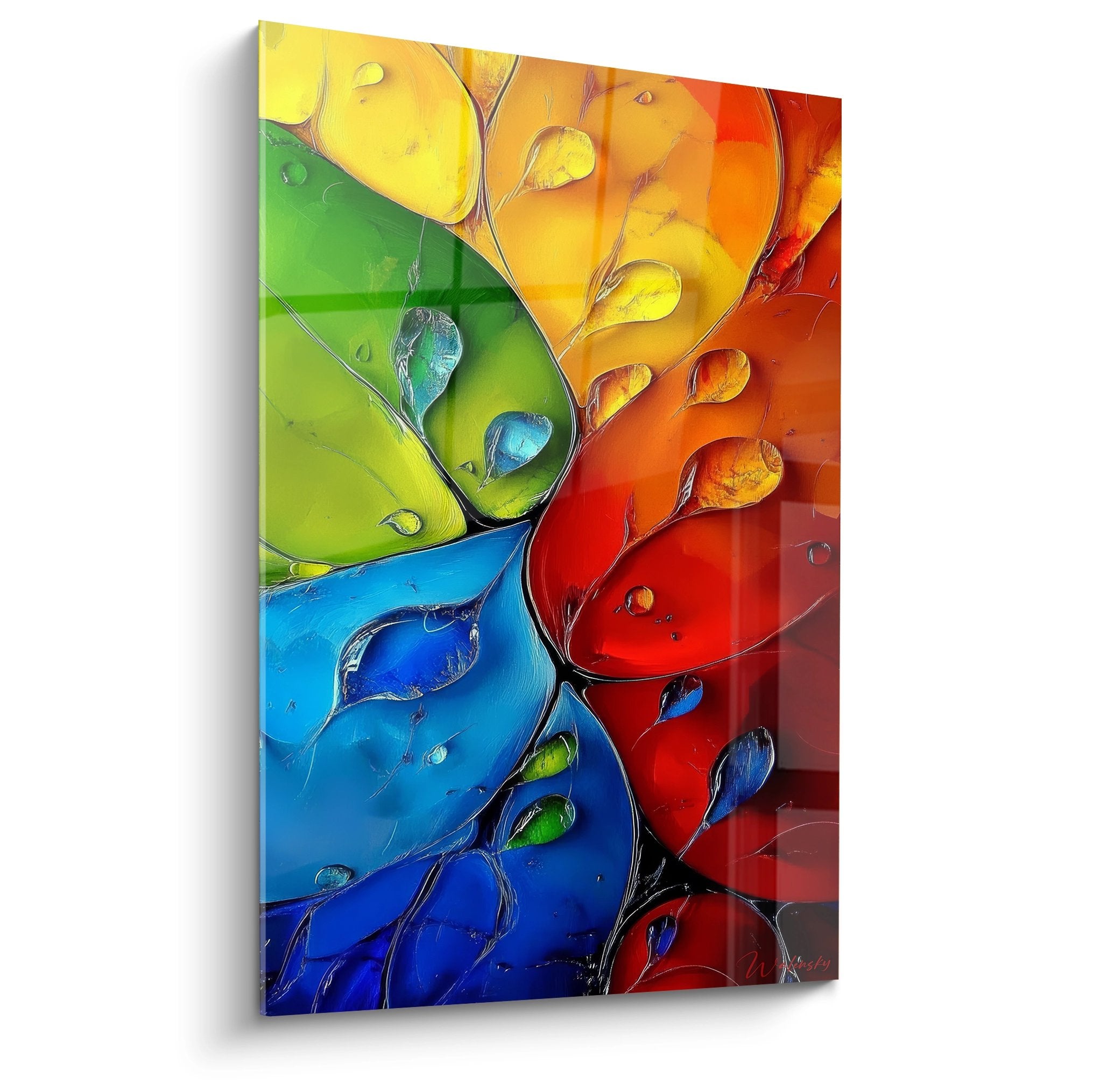
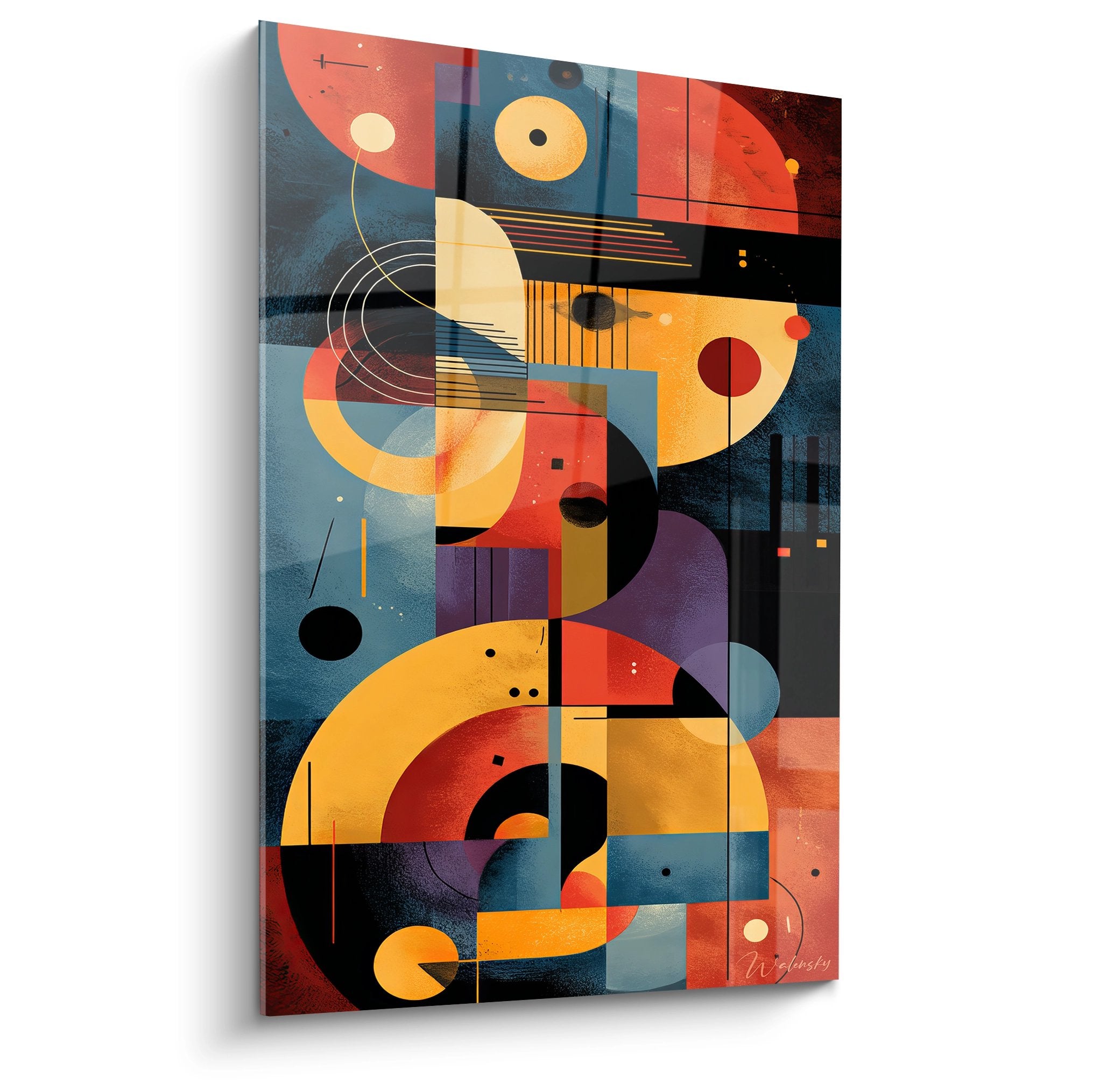
Complementary color combinations present on a school decorative panel generate contrasts that facilitate visual discrimination of information. An electric blue background paired with orange or yellow motifs creates perceptual tension that naturally guides the viewer's gaze toward areas of pedagogical interest. This visual strategy proves particularly effective for classroom rule displays, educational calendars, or language learning supports. Schools seeking a multicolor school wall art thus benefit from a tool that structures informational space without cognitive saturation.
Chromatic Zones Dedicated to Different School Subjects
The colored segmentation of a large mural panel allows associating each school discipline with a specific chromatic family. Mathematics can be represented through blue tones evoking logic, while natural sciences embody themselves in organic greens. This systematic visual organization facilitates students' mental transition between pedagogical sequences and reinforces memory anchoring of taught content. For primary schools adopting active pedagogy, this colorful school wall art becomes a spatial reference that structures the school day.
Energizing Palettes for Motor Skills and Recreation Spaces
Physical activity rooms and covered playgrounds require visual supports that amplify collective energy and encourage movement. A decorative panel integrating vibrant reds, dynamic oranges, and stimulating fuchsias creates an atmosphere conducive to physical activities and group games. These chromatic choices increase perceptual heart rate and prepare students for physical exercises. School directors seeking vibrant educational wall panels thus find solutions that transcend mere decoration to become catalysts for activity.
Cognitive Activation Through Chromatic Visual Stimulation
A colorful school wall art acts as a neurological trigger by simultaneously engaging multiple brain zones involved in visual processing and selective attention. Research in educational neuroscience demonstrates that exposure to visually rich environments accelerates memory encoding processes and promotes information retention. This neuropsychological property justifies the integration of chromatically elaborate wall supports in classrooms, particularly for preschool and elementary levels where brain plasticity remains maximal.
What effects do multicolor panels produce on children's creativity?
The daily presence of a decorative panel with varied tones nourishes young learners' imagination by offering them a diverse visual repertoire. Unlike monochromatic environments that standardize perception, colorful compositions stimulate divergent thinking and encourage unconventional idea associations. Students regularly exposed to these supports develop chromatic ease that translates into bolder graphic expression during art classes. To further enrich the school visual environment, some schools complement their decoration with a school abstract wall art that introduces complex geometric shapes.
Chromatic Coding of Pedagogical Progressions
The strategic use of colors on a large mural panel allows visually materializing learning pathways and mastery levels. A gradient ranging from violet to yellow can represent the term's progression, while colored dots indicate acquired skills. This pedagogical visualization system transforms abstract notions of progress into tangible and motivating reference points for students. Teachers adopting this approach observe improved autonomy and better student appropriation of learning objectives.
Visual Supports for Alternative and Inclusive Pedagogies
Institutions practicing Montessori, Freinet, or Steiner methods find in the colorful school wall art a valuable ally for concretizing their educational principles. Natural palettes combined with vibrant accents create atmospheres that respect individual learning rhythm while maintaining sufficient sensory stimulation. For students with attention or sensory particularities, these wall supports offer stable visual anchoring points that secure the learning environment without over-stimulation. Chromatic educational wall decorations thus become universal accessibility tools.
Pedagogical Architectures and Contemporary School Design
The integration of a colorful school wall art is part of global reflection on interior architecture of modern educational institutions. Designers specializing in educational environments now advocate for visually differentiated spaces that accompany pedagogical evolutions toward greater interactivity and modularity. These large-scale wall formats constitute focal points that structure space without partitioning, creating instantly identifiable functional zones. Their presence transforms standardized rooms into singular learning places that reflect the pedagogical identity of the institution.
Chromatic Zoning of Collaborative Learning Spaces
Schools developing work clusters and flexible configurations use colorful panels as spatial markers delimiting functional territories. A collective reading area can be signaled by a panel with calming blue tones, while a brainstorming space is identified by energizing red-orange. This chromatic semiotics facilitates student circulation and appropriation of different learning modes proposed. School architects incorporating these principles design polychromatic educational environments that foster learner autonomy and responsibility.
How to harmonize multiple colorful panels in the same school?
Visual coordination among different school spaces requires a coherent chromatic strategy that avoids cacophony while maintaining vitality. The recommended approach consists of establishing a basic institutional palette (three main colors) then declining it in intensity variations according to room functions. Circulation hallways adopt desaturated versions, while classrooms integrate full tones. This chromatic graduation creates a fluid visual journey accompanying daily movements without generating perceptual fatigue. Coordinated school decorative panels thus reinforce the institution's visual identity.
Seasonal Renewal of Educational Chromatic Atmospheres
Some innovative schools practice seasonal rotation of their visual supports to maintain visual interest and mark school year cycles. Autumn-toned panels (ochres, rusts, warm browns) succeed spring compositions (soft greens, pinks, luminous yellows). This periodic variation stimulates student curiosity and creates structuring temporal rituals. It also allows renewing attention to displayed pedagogical messages, avoiding the habituation effect that diminishes the impact of permanent supports. School directors appreciate this flexibility that dynamizes the environment without heavy structural investments.
Is colorful school wall art suitable for all school levels?
Absolutely, although chromatic palettes must adapt to age groups. Preschools benefit from saturated and contrasting primary colors that support perceptual learning, while elementary and middle school levels favor more nuanced compositions integrating secondary and tertiary colors. The essential element lies in balancing visual stimulation and perceptual comfort, avoiding over-saturation that could generate distraction. Large formats adapted to spacious rooms guarantee optimal visibility regardless of student age.
How to maintain the chromatic vibrancy of colorful school wall art?
Educational institutions expose their visual equipment to demanding conditions: variable natural light, frequent handling, regular cleaning. To preserve color intensity, prioritize positioning avoiding prolonged direct sun exposure, particularly for south-facing walls. Weekly dry dusting with a microfiber cloth generally suffices, supplemented monthly by gentle cleaning with a non-aggressive product. These simple precautions maintain chromatic brilliance for several years, preserving the institution's decorative investment.
Can one combine colorful school wall art with traditional school furniture?
The cohabitation between classic furniture (natural wood desks, metal chairs) and dynamic colorful panels creates an interesting contrast that values both elements. Understated furniture serves as a neutral frame that amplifies the visual impact of the colored wall support, avoiding visual competition. This mixed approach allows institutions to modernize their spaces progressively without complete furniture replacement. The essential element consists in maintaining coherence of intention: the colorful panel becomes the contemporary visual signature of an educational space anchored in its fundamental pedagogical principles.