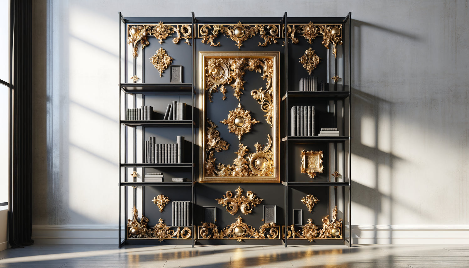
I have spent twelve years helping collectors integrate artworks into their interiors, and this question invariably arises: can you really marry the brilliance of a classic gold frame with the austerity of an industrial black metal bookshelf? The answer is not only yes, but this alliance represents one of the most electrifying trends in contemporary design.
Here's what the combination of gold frames and industrial bookshelves brings to your space: a visual depth that captures light and structures the gaze, a perfect balance between historical refinement and raw modernity, and that touch of boldness that transforms an ordinary room into an unforgettable personal gallery. You may hesitate, fearing you will create an unsightly stylistic clash. You imagine these two universes confronting each other rather than dialoguing. I understand this apprehension; I have seen it in dozens of clients before you. But I'm going to show you how this apparent contrast becomes your best decorative asset.
The art of mastered contrast: when opposition becomes harmony
The principle is simple but powerful: classic gold frames and industrial black metal bookshelves work precisely because they oppose each other. Gold captures and reflects light while black metal absorbs and anchors it. This dynamic creates a visual tension that prevents the eye from getting bored. I observed this phenomenon in a Parisian loft where my client had installed a monumental five-meter long industrial bookshelf. He hesitated to place his collection of botanical engravings in their original gold frames. The result? Each piece seemed to float in space, magnified by the contrast.
The key lies in proportion. A black metal bookshelf offers an ideal neutral canvas: it does not compete with your artworks; it puts them on display. Gold frames then become luminous points that structure the space. Think of a constellation of stars in the night sky: it is the darkness that reveals their brilliance. Your industrial bookshelf plays exactly this role for your classic gold frames.
The play of materials: metal, gilded wood and light
Beyond color, it is the dialogue of materials that makes this combination so rich. The black metal of your industrial bookshelf often has a matte or slightly satin texture, which contrasts beautifully with the brilliance of gold frames. I always encourage my clients to play with different gold finishes: a faded and patinated gold for a softer vintage effect, a bright and shiny gold for a bold statement. On a black metal bookshelf, both work wonderfully.
The golden rules for successful integration
First rule: don’t saturate the space. If your industrial bookshelf is two meters wide, three to five gold frames are more than enough. The common mistake is wanting to fill every shelf. Let it breathe. The empty space around your classic gold frames isn't wasted space; it's space that gives them value. I saw a collector transform her perception of an entire room by removing half of her frames: the remaining works revealed themselves with tenfold strength.
Second rule: create intentional groupings. On a black metal bookshelf, arrange your gold frames in groups of two or three at different levels. This approach guides the eye in a vertical and horizontal exploration. Avoid perfect symmetry which stiffens the whole thing. A slight asymmetry brings dynamism and naturalness, while maintaining overall visual balance.
The importance of lighting in this association
A gold frame without appropriate light loses 70% of its impact. On an industrial metal black bookshelf, lighting becomes even more crucial. I systematically install adjustable LED spotlights that create focal points on each classic gold frame. The grazing light reveals the reliefs of the frame and makes the gold vibrate against the deep black of the structure. If you can only install one lighting element, place it high to create a professional gallery effect.

What type of gold frames to prioritize?
Not all gold frames are equal when facing an industrial metal black bookshelf. Very ornate rococo frames create maximum contrast, ideal for a spectacular effect in a large space. They assert their presence and claim the eclecticism of the place. Conversely, thin and refined gold frames, in Florentine or minimalist style, bring a more discreet touch of refinement, perfect for small spaces or subdued atmospheres.
I have a particular affection for slightly patinated or aged gold frames. Their softened gold wonderfully dialogues with the raw appearance of an industrial bookshelf. They tell a story, suggest a temporal depth that enriches the reading of space. A classic gold frame with slightly worn corners never clashes; it bears witness to a life lived, a transmission, an authenticity that industrial design deeply appreciates.
Adapt the frame content to the support
The choice of artwork framed in your gold frame significantly influences the result. On a black metal bookshelf, black and white photographs create a striking graphic effect, the gold of the frame adding the only warm touch to the whole. Antique engravings, botanical prints or vintage maps also excel in this context. Their classic aesthetic resonates with the gold frame while respecting the industrial spirit of the furniture.
Compose with the other elements of the bookshelf
Your classic gold frames will not float alone on your industrial bookshelf. They will coexist with books, decorative objects, perhaps plants. This overall composition determines the success of the whole. I recommend alternating zones: one shelf with books with neutral covers, the next shelf with one or two gold frames, then an area of objects in natural materials such as wood, ceramic or glass.
Books constitute an excellent visual bridge between the black metal of the structure and the gold of the frames. Favor old leather bindings, colored spines or paperback editions in warm tones. They soften the transition and create a harmonious chromatic gradation. A green plant also brings a welcome organic touch that humanizes the mineral alliance of metal and gold.

The influence of the surrounding room's style
The combination of gold frames and industrial bookshelf adapts remarkably to different contexts. In a refined contemporary interior, it brings a valuable visual complexity and avoids coldness. In a classic space, the black metal bookshelf modernizes the whole while the gold frames maintain a stylistic continuity. In a loft industrial, this combination adds a refined sophistication that avoids the showroom effect.
I accompanied a couple who were transforming an old print shop into a home. Their custom-made black metal industrial bookshelf structured the open space. The addition of classic gold frames containing family portraits and flea market finds transformed the place: from functional space, it became a warm and personal home. The contrast was not jarring, it told their story, this mix of heritage and modernity that defines so many contemporary interiors.
Ready to enhance your industrial bookshelf?
Discover our exclusive collection of Bookshelf art that will transform your space into a captivating personal gallery.
The confidence to dare the mix
The real obstacle is never aesthetic, it's psychological. We have been conditioned to think in terms of "hermetic" styles: industrial with industrial, classic with classic. This compartmentalized vision stifles creativity and produces predictable and soulless interiors. Classic gold frames do not clash with your black metal industrial bookshelf because good taste lies not in stylistic conformity, but in the balance of proportions, the harmony of contrasts and the authenticity of choices.
Start modestly if you are still hesitant. Place a single gold frame on your black metal bookshelf. Observe how the light plays differently throughout the day. Note how this golden point immediately attracts the eye and structures the space. You will see that this combination, far from clashing, creates a relaxed sophistication, a mastered eclecticism that characterizes the most successful interiors. Harmony is not born of uniformity; it emerges from the thoughtful dialogue between different elements that reveal themselves to each other.
Frequently Asked Questions
How many gold frames can you place on an industrial bookshelf without overloading it?
The general rule is to never fill more than 30% of the visible surface of your black metal bookshelf. For a standard size structure (approximately 2 meters wide by 2 meters high), three to five gold frames of varying sizes are quite sufficient. The empty space around each frame is not wasted space, it is space that breathes and gives value to your rooms. Think of your industrial bookshelf as an art gallery: museums never hang works side by side, they give them air. Prioritize quality over quantity, and let each classic gold frame tell its story without competition.
Do all the gold frames need to have the same finish to create consistency?
Conversely, the variation in gold finishes considerably enriches the visual result on a black metal industrial bookcase. You can mix aged and patinated gold with a brighter gold, a fine gilded frame with another more sculpted one. This diversity creates a collection that seems to have been built up over time, bringing authenticity and depth to your decor. The unifying element is not the similarity of gold frames, but the black structure of your bookcase which plays the role of a neutral background. It naturally harmonizes different elements. Simply look for consistency in the overall tone: all frames in warm gold tones or all in cooler gold and silver tones.
Does this combination work in a small space or only in large volumes?
The gold frames and industrial bookcase combination works wonderfully well in small spaces, provided you adapt the scale. In a compact room, opt for a narrower industrial bookcase and smaller-sized classic gold frames. The black-gold contrast visually structures the space and gives it depth, avoiding the cramped effect that would be created by an accumulation of elements in the same style. The black metal recedes visually while the golden touches create points of light which perceptually enlarge the room. I have seen this combination transform a 10m² office into a refined and elegant space. The trick: limit yourself to a maximum of two or three gold frames in a small space, and choose them with generous mats that create ventilation.