

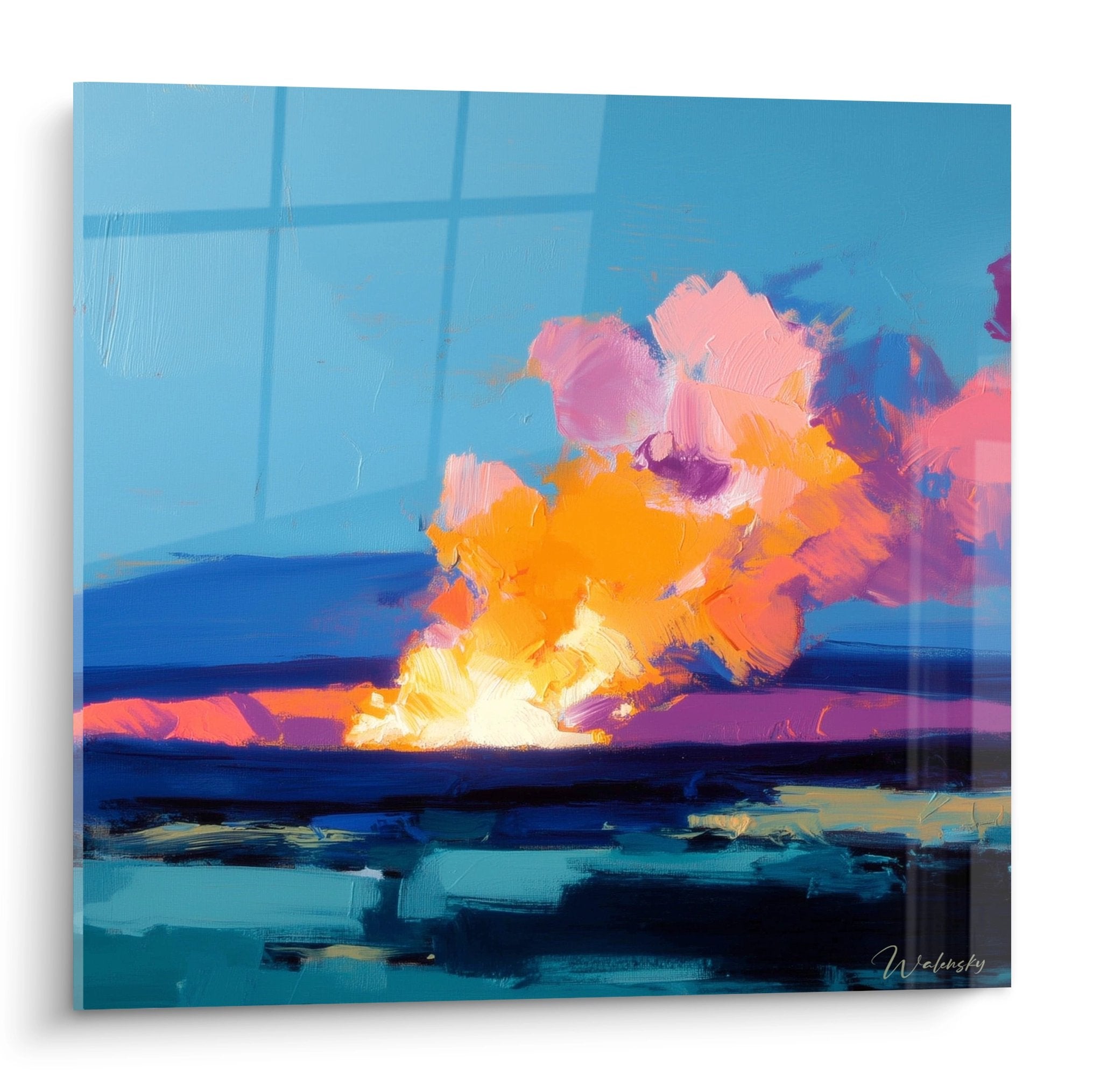






Square abstract architecture painting: structuring an industrial-style open-plan kitchen
8 min read · by Walensky
ABSTRACT ARCHITECTURE PAINTING
A stainless steel island, a suspended range hood, a brick wall we spent months tracking down at a demolition yard. And then that large empty stretch, above the banquette or between two workshop windows, that seems to be waiting for something without our quite knowing what. The reflex is often to fill it with a vintage poster or a round mirror. Wrong choice: in an industrial-style open-plan kitchen, it's the square format, and particularly the square abstract architecture painting, that does the job everything else fails to do.
- The square format naturally balances the verticals (brick, hood) and horizontals (worktop, island) of an industrial kitchen.
- The motif is chosen according to the layout: façades for a solid wall, staircases or arches for an enfilade with perspective.
- An anthracite and terracotta palette extends the raw materials rather than contradicting them.
Why the square abstract architecture format suits industrial open-plan kitchens
The square has no dominant top or bottom, no left or right that pulls the eye. That is precisely what makes it an ally in a room already saturated with lines: the workshop glazing bars, the exposed pipes, the brick joints running horizontally. An elongated format would add one more direction to manage. The square absorbs.
In an open-plan kitchen, the eye constantly moves between the central island, the worktop and the living area. A square painting acts as an anchor point that stops this visual wandering without creating an abrupt break. It plays a role similar to a well-placed window in a façade: it structures without overwhelming.
In an industrial kitchen, the painting doesn't decorate a wall: it brings order to a room already running on raw material.
To explore further this relationship between geometry and raw materials, our article on the square black-and-white painting in contemporary open-plan kitchens delves into a more minimalist variation of this principle.
Which architectural motifs to choose based on your kitchen layout
The motif isn't merely a matter of taste: it responds to the actual shape of the space in front of you. An L-shaped kitchen isn't treated like an enfilade kitchen opening onto the living room. The same logic applies to an abstract architecture painting for a design entrance, where corridor constraints call for different trade-offs.
Façades and volumes for a solid wall
Facing a large stretch of wall without a door or window, a façade or stacked-volume motif mirrors the blocks of the central island. The White Building painting with superimposed anthracite blocks, with its imaginary city of towers facing a heavy sky, echoes this stacking logic found in a kitchen where upper storage dialogues with the lower units.

Staircases and perspectives for an enfilade space
When the kitchen opens widely onto the living room, a staircase or arch motif creates a perspective that visually extends this circulation. This is the case of the Orange Staircase and Black Striped Façade painting, which plays precisely on a glimpse between two striped façades. Placed at the end of the enfilade, it invites the eye to continue on its way rather than running into a wall.

A motif with strong perspective (staircase, arch, vanishing line) works better in a visual corridor than facing a still viewer seated at the table. Reserve more static volumes, such as stacked façades, for walls viewed head-on.

Favorite
Painting Golden circles on grey and white blocks - Golden remnants - Abstract Architecture Edition
From €228.90
Discover this paintingWhere to position the square painting in an open-plan kitchen
The center of the artwork should sit at eye level, not in the middle of the available wall. This hanging rule is too often overlooked in kitchens, where there is a tendency to aim too high in order to 'free up' the worktop.
- Above a banquette or dining nook: the center of the painting at the eye level of a seated person, therefore lower than above a standard sofa.
- On the transition wall between kitchen and living room: a strategic spot that marks the boundary without partitioning.
- Above a low unit or an industrial sideboard: leave a gap equal to one third of the painting's height between the furniture and the bottom edge of the artwork.
— Our selection

Pairing several square abstract architecture paintings without overcrowding the space
Two square paintings of the same format side by side create a wall composition that extends the openness logic between kitchen and living room. The classic mistake is mixing different sizes thinking it adds dynamism: the result is often messy in a room already rich in materials.
The Fragmented City painting with anthracite and marbled grey volumes and the Golden Circles painting on grey and white blocks share an anthracite base that lets them coexist without one overpowering the other, one playing geometric rigor, the other bringing a more precious touch with its golden accents.

For a different approach to this visual continuity between the two spaces, our article on the panoramic painting that unifies open-plan kitchen and living room explores the same question from the angle of a more elongated format.
Color palette and materials: harmonizing with the existing industrial style
Matte black metal and reddish-orange brick already impose a strong color language. A painting that is too pastel or too saturated would create an awkward visual break, like a wrong note in an otherwise well-constructed piece.
Anthracite remains the safest value: it extends the matte black of the metal structures without overdoing it. Terracotta, for its part, dialogues directly with the exposed brick without repeating it identically, which avoids a 'total look' effect. The Curved Glazing painting in terracotta and teal tones illustrates this pairing well, with its floating curves and architectural breath that soften the surrounding rigidity.
| Dominant material of the kitchen | Recommended painting palette |
|---|---|
| Reddish-orange exposed brick | Terracotta, teal blue, anthracite |
| Matte black metal and brushed steel | Anthracite, black and white, golden touches |
| Light waxed concrete | Blue, orange-yellow, anthracite |
A series of paintings designed specifically for these spaces can be found in the kitchen painting collection, useful for comparing palettes before deciding.

Frequently asked questions
Which painting format should you choose for an industrial open-plan kitchen?
The square format, from 100x100 cm, remains the most suitable for balancing the vertical and horizontal lines typical of the industrial style. For a wider wall, the XL 120x120 cm or XXL 140x140 cm formats occupy the space better without getting lost in a room with generous volumes.
How do you hang a painting above a kitchen island?
It is not hung directly above the island, an area of passage and splashes, but on the wall facing it or perpendicular to it, in the visual axis of someone standing in front of the worktop.
Can you mix several abstract painting styles in an open-plan kitchen?
Yes, provided you keep a common thread: same format, same architectural sub-theme or same dominant palette. Mixing without logic creates an impression of chance rather than a thoughtfully composed wall.
Which painting color for a kitchen with exposed brick?
Terracotta and anthracite remain the safest choices, as they extend the brick's tone without duplicating it. Teal blue brings a fresher contrast if the kitchen lacks visual freshness.
A square abstract architecture painting is never a mere decorative filler in an industrial open-plan kitchen: it is a spatial composition tool, just like a well-placed island or a properly sized glazed roof. It structures what the room, through sheer raw materials, sometimes struggles to organize on its own. To delve further into the subject, the abstract architecture painting collection allows you to compare the motifs, formats and palettes discussed here, and our articles on the panoramic abstract architecture painting in an adult bedroom or integrating an abstract architecture painting into a minimalist room extend the reflection beyond the kitchen.
Explore our collections


