





How to integrate an abstract architecture painting into a minimalist room
8 min read · by Walensky
ABSTRACT ARCHITECTURE PAINTING
A white wall, a low sofa, a window without curtains. The room breathes because there is nothing in it. And this is precisely where most people go wrong: they see this emptiness as a problem to fill, when it is half of the composition. An abstract architecture painting does not fill this emptiness — it answers it.
- The painting should be chosen according to the real lines of the room, not only the available wall.
- A single well-sized work is worth more than an accumulation of formats.
- The monochrome or muted palette of the painting must continue that of the walls, never contradict it.
Why architectural abstraction naturally suits minimalism
Architectural minimalism does not seek the absence of form, it seeks the right form. This is exactly what an abstract architecture painting offers: clean lines, a perspective suggested rather than told, volumes that are hinted at in mist or contrast. Both languages speak the same grammar — that of full and empty.
In a Scandinavian or Japandi room, where furniture is rare and surfaces bare, a busy figurative painting creates a break in tone. An abstract architecture painting, by contrast, acts as an extension of the built structure: it continues the room instead of opposing it. This logic applies just as well to a square abstract architecture painting in an open industrial-style kitchen.
In a minimalist room, the painting does not decorate the void: it becomes its anchor point.
The 3 technical criteria before choosing your painting
Three parameters determine whether the artwork will reinforce the room's austerity or break it: scale, palette, and direction of lines. Neglecting them means hanging a beautiful painting in the wrong place.
Calculating the right proportion relative to the wall
The professional rule is simple: the artwork ideally occupies 60 to 75% of the width of the wall or of the furniture placed beneath it. Too small, it floats and loses all visual authority. Too large, it crushes the full-and-empty balance that gives minimalism its strength.
On a 3-metre living room wall, for example, a format such as the 2XL 180x100 cm or the 4XL 240x140 cm (depending on the specifications of the chosen painting) easily achieves this proportion without competing too closely with the surrounding furniture.
Choosing a palette that extends the room
In a minimalist room with white or light grey walls, a monochrome palette — black, white, anthracite — blends in effortlessly. A touch of colour can exist, but it must remain unique and muted: a powdery pink, a terracotta ochre, never a saturated block that draws the eye before the room's own volumes. For a warmer living room, abstract architecture paintings in warm colours offer a cosy and trendy alternative.
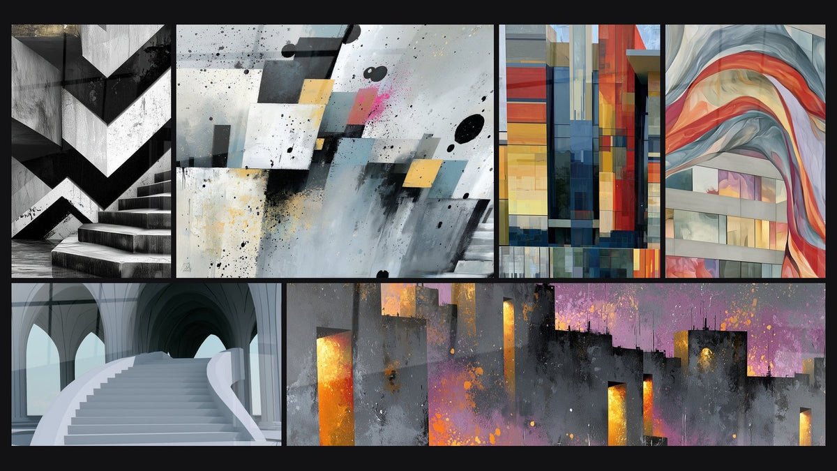
This is the whole point of a painting like the one showing an anthracite and white staircase with zigzags : it picks up exactly the two dominant tones of a Scandinavian interior without adding visual noise.

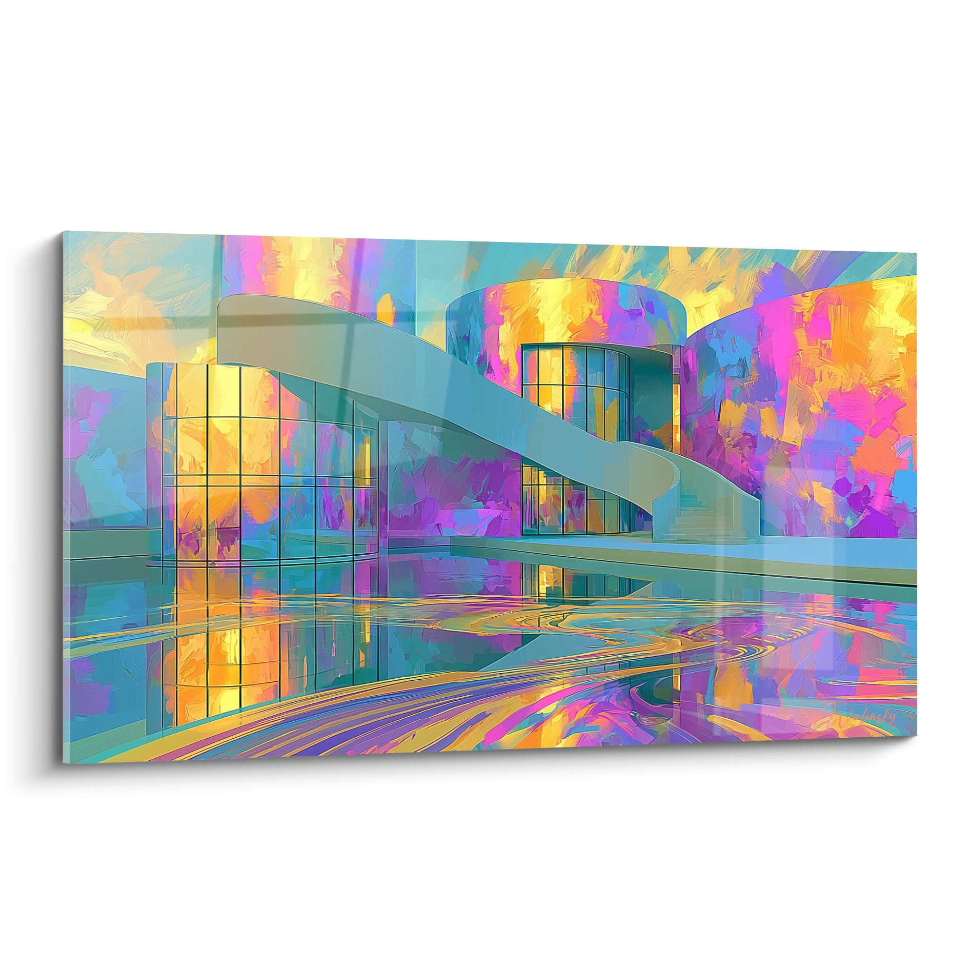
For a slightly softer interior, where grey is tempered by light wood, a work in cream and sage green will work better than a stark black and white contrast. The curved cream and sage green building is a good example, especially in a square format that respects the volumes of a Japandi living room.


Favorite
Painting White and grey staircase under gothic vaults - Silent nave - Abstract Architecture Edition
From €273.90
Discover this paintingWhere and how to hang the painting depending on the room layout
The room's layout dictates almost everything. A bare wall is not treated like a corridor, and a living room with an exposed staircase is not treated like a bedroom without relief.
Very bare room with a single focal point
When the room has only one low piece of furniture — a sideboard, a console, a sofa against a solid wall — the painting becomes the room's single focal point. This is the simplest and most effective case: a single work, well centred above the furniture, is enough to structure the whole room.
Centre the painting on the width of the furniture beneath it, not on the width of the entire wall. The eye naturally associates the artwork with the furniture, not with the overall architecture of the room.
Room with a staircase or visible architectural volumes
Here, the trap and the opportunity coincide. If your room has a staircase, an exposed beam or a mezzanine, the painting should follow the direction of these real lines — vertical for a staircase, horizontal for a low beam — rather than contradicting them with an opposing diagonal.
A painting like Silent nave, which depicts a monumental staircase beneath gothic arches, works particularly well facing a real interior staircase: the two vertical structures answer each other instead of competing.
If, on the contrary, the room lacks architectural relief — a simple rectangle with no beam or change in level — it is the painting that must bring this vertical tension or this perspective, to prevent the space from becoming flat. The idea developed in our article on integrating an abstract painting into contemporary architecture applies here.
— Our selection


Combining several architecture paintings without overloading
Can you multiply artworks in a minimalist room? Yes, but on one strict condition: a single palette, a single logic of lines, and generous spacing between frames — allow at least the width of one painting between two pieces.
- A wide format and a square format only coexist well if they share the same palette of grey or off-white.
- Avoid more than two artworks per wall in a minimalist room: beyond that, the gallery effect overtakes the focal point effect.
For a coherent display, a selection of paintings all evoking the staircase or facade but in slightly different tones works better than a mix of disparate subjects. That is the whole spirit of the Architecture Paintings collection.
Common mistakes that break the minimalist effect
The first mistake, and the most common, is an overly violent contrast: pure black on pure white, in a room where everything else is in soft shades. The eye no longer has any room to breathe.
Second trap: undersizing out of caution. A painting that is too small on a large wall gives the impression of an oversight rather than a choice. It is better to aim wide and stay within the 60-75% range mentioned above, even if it means choosing a made-to-measure format for an unusual wall.
Third mistake: ignoring the room's natural light. A very bright room, facing a window, pairs better with a matte finish such as Alu Dibond, which avoids annoying reflections. A dimmer room with controlled light may, on the contrary, benefit from the more vibrant rendering of acrylic glass.

Frequently asked questions
What size of painting should you choose for a minimalist wall?
Aim for 60 to 75% of the width of the wall or of the furniture beneath it. On a standard-sized wall, this often corresponds to the XL to 2XL formats offered on each painting's specification sheet.
How do you hang an abstract painting without overloading a bare room?
Limit yourself to one artwork per wall, centred on a single focal point, with no decorative objects around it. The room must remain breathable around the frame.
Can you put several architecture paintings in the same minimalist room?
Yes, provided they share the same palette and the same logic of lines, with generous spacing between them. Beyond two artworks per wall, the minimalist spirit fades.
Which colours work best with a minimalist interior?
Monochrome palettes — grey, white, anthracite — or muted tones such as sage green and terracotta blend in best. A single bold touch of colour is enough, never several.
An abstract architecture painting succeeds in a minimalist room not because it is beautiful on its own, but because it continues the lines that already exist — those of the window, the staircase, the wall itself. The coherence of lines matters more than the chosen motif. To find the artwork that complements your own volumes, the abstract architecture painting collection gathers compositions designed for this dialogue between full and empty, and our article on integrating an abstract marble painting into a minimalist interior extends the reflection to other visual materials.
Explore our collections