


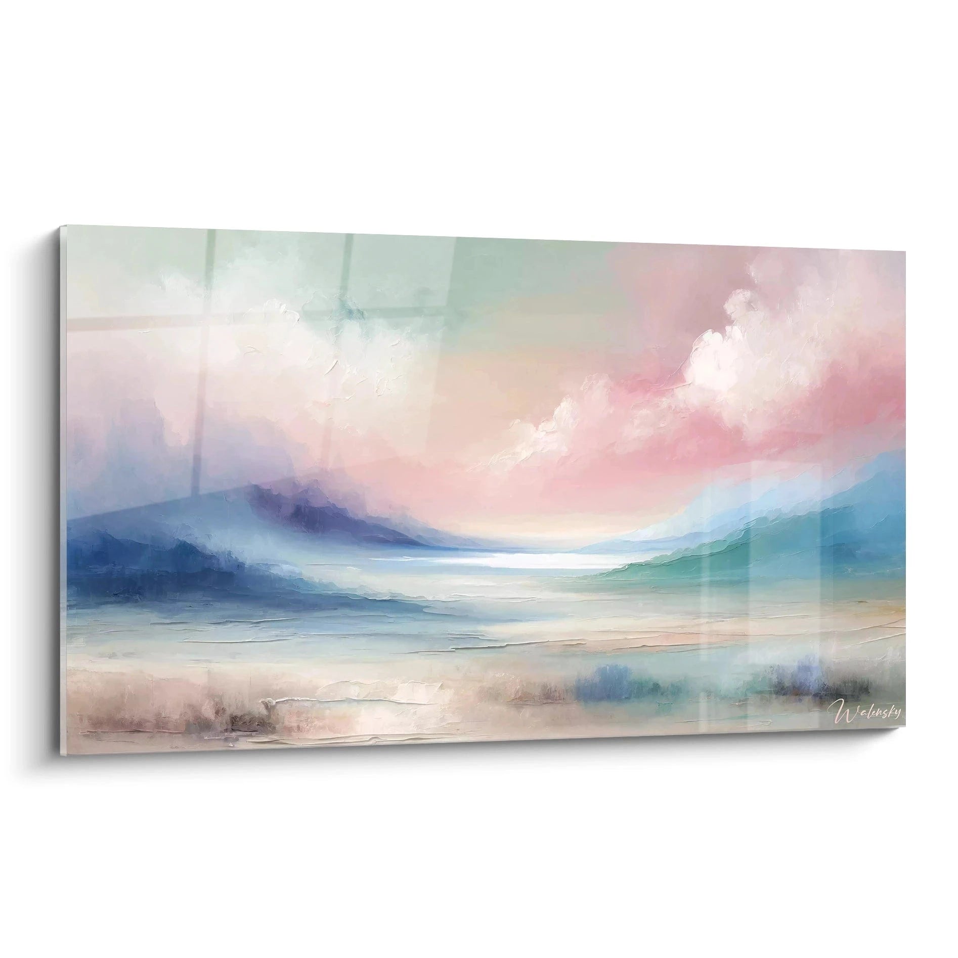

How to Integrate an Abstract Marble Painting into a Minimalist Interior
8 min read · by Walensky
ABSTRACT MARBLE PAINTING
A white wall, a grey sofa, a slightly cool northern light. This living room has everything to be elegant, except something is missing: a breath, an anchor point for the eye. This is where an abstract marble painting can either save the room or tip it into excess.
Minimalism does not mean absolute emptiness. It means deliberate choices. And veined marble, with its lines winding across a neutral background, has the rare ability to bring material without breaking the purity of the space. Provided you know where to place it, at what size, and in which tone.
- One abstract marble painting per wall, never two competing motifs within the same field of view.
- The tone of the veining should echo a material already in the room (wood, concrete, stone).
- The finish matters as much as the visual: Acrylic Glass for controlled light, Dibond Aluminium facing a window.
The Abstract Marble Painting, a Balance of Texture and Emptiness in Minimalism
Minimalism does not exclude texture, it sorts it. A successful Scandinavian interior is never bare: it holds a raw wool rug, a light wood chair, a raw ceramic piece on a shelf. The abstract marble painting fits this logic because it adds visual depth without telling a figurative story that would overload the spirit of the space.
Unlike a very pronounced geometric pattern or a floral composition, veined marble keeps a calm reading. The eye follows the veins without being caught by a narrative detail. This is precisely what makes it compatible with simplified volumes, straight lines and a monochrome palette.
A minimalist interior does not need less material. It needs material that knows how to stay silent.
Choosing the Location According to Light and the Room's Volumes
The location of an abstract marble painting is decided before its size, not after. A poorly chosen wall ruins even the most beautiful golden veining.
Solid wall vs wall with an opening
A solid wall, without window or door, offers the best ground: the gaze is not disturbed by a side light source that would create stray reflections. If the chosen wall faces a window, favour a matte Dibond Aluminium finish, which absorbs natural light without reflecting glare. If the room is rather dark or artificially lit in the evening, Acrylic Glass will instead give greater depth and more vibrant colours.
Optimal height and viewing distance
Beyond this height rule, keep a sufficient viewing distance: in a minimalist living room, the painting is often seen from the sofa, not from standing right against the wall. An XL or XXL format is better read from three or four metres away than at close range.

Favorite
Wall painting in blue and gold tones with white crystals - Mineral Fusion - Abstract Marble Edition
From €233.90
Discover this paintingMatching the Marble Veining to Materials Already Present
An abstract marble cannot be improvised in isolation: it must engage with its surroundings. A poor match of tones is enough to break all the sobriety sought.
Waxed concrete, light wood, natural stone
Against a waxed concrete wall, blue-grey or blue-gold tones naturally extend the mineral coolness without creating a break. In front of light wood such as oak or ash, warm tones (gold, deep burgundy, terracotta) provide the warm counterpoint that avoids a clinical effect. On an exposed natural stone wall, the white and grey abstract marble blends almost into the wall, which may be intended or, on the contrary, too discreet depending on the effect sought.
Cool tones (blue, grey) vs warm tones (gold, terracotta)
A simple rule: in a room already rich in warm tones (wood, terracotta, beige linen), a blue and gold marble brings contrast without aggressiveness. In a very cold room (concrete, metal, glass), a marble in burgundy or terracotta tones warms the whole without overloading it.
| Dominant material of the room | Recommended marble tone | Effect achieved |
|---|---|---|
| Waxed concrete | Blue, grey, crystal white | Mineral continuity, calm atmosphere |
| Light wood | Gold, burgundy, navy blue | Warm contrast, depth |
| Light natural stone | Navy blue and gold, black and gold | A clear focal point without rupture |
To explore the choice of tones according to uses further, our complete guide to the abstract marble painting details the most common pairings.
Among the compositions that work particularly well in a living room with waxed concrete or cold surfaces, you will find works playing on oceanic shades and crystals:
For a warmer interior, dominated by wood and golden tones, a composition with deep burgundy veining creates an anchor point without ever weighing down the whole:
— Also to discover


Integration Examples by Living Space
In a living room with a beige sofa and light parquet, a navy blue and gold painting in XL or XXL format becomes the centrepiece above the sofa, respecting visual balance at between 60 and 75% of the furniture's width.
In a dining room with a raw wood table and black chairs, a composition with black and gold flows echoes both the wood and the metal of the light fittings. In a bedroom with neutral beige and terracotta tones, a softer, almost monochrome marble extends the cocooning atmosphere without breaking the calm sought before bedtime, a principle detailed in our article on choosing a neutral-toned abstract painting for the bedroom.
— In the same spirit


Common Mistakes and Expert Tips for a Clean Result
The first and most common mistake is choosing a painting that is too small for the wall: an L format of 120x70 cm lost in the middle of a large living room wall gives an impression of oversight rather than intention.
Another pitfall: hanging the painting too high, above the eye line, which breaks the sense of balance typical of minimalism. And conversely, wanting to 'look minimalist' by choosing a marble that is too pale and too low in contrast, which ends up visually disappearing instead of structuring the space.
- One marbled motif per room, never two abstract paintings competing with each other.
- Respect the proportion of 60 to 75% of the width of the furniture or wall concerned.
- Choose the finish (Acrylic Glass or Dibond Aluminium) according to the actual light exposure, not just the visual.
To go further on integrating the abstract into very minimalist contemporary architecture, our article on integrating an abstract painting into contemporary architecture usefully complements this approach.

Other selected pieces
Fluid Black Grey and Gold Intertwined Painting - Elegant Fusion - Abstract Marble Edition
From €233.90
Discover this painting →Frequently asked questions
What painting size should you choose for a minimalist living room?
Aim for a width representing 60 to 75% of that of the sofa or wall concerned. For a 200 cm sofa, an XL or XXL format from the chosen painting's product sheet will work better than an overly discreet L format.
Which abstract marble colours go with a Scandinavian interior?
Blue-grey and crystal white tones blend naturally with light wood and the white walls typical of the Scandinavian style. A touch of gold, used sparingly, adds the contrast that prevents flatness.
What matters is the proportion to the wall, not the size of the room itself.
How to keep an abstract painting from weighing down a minimalist decor ?
By limiting accent points: one strong tone (gold, burgundy or navy blue), one painting per wall, and generous empty space around the piece rather than a wall cluttered with other decorative elements.
Conclusion
Three levers, and nothing more: the light of the room, the material already present on the walls and furniture, and the scale of the painting relative to its support. Master these three parameters, and an abstract marble painting becomes the element that structures an entire minimalist interior without ever overloading it.
The empty wall that has been staring at you since you moved in no longer really has an excuse to stay bare. Explore our collection of abstract marble paintings or our selection of abstract blue marble paintings to find the piece that completes your space without ever betraying it.
Explore our collections


