


Northern Lights Mountain Wall Art
The Painting Aurora borealis Mountain captures the splendor of Nordic luminous phenomena dancing above majestic peaks. This collection celebrates the extraordinary encounter between colored polar lights and snowy mountain reliefs, creating visually stunning compositions. Each work evokes the mystical atmosphere of Scandinavian nocturnal landscapes, where the sky is adorned with green, violet and pink veils. Transform your interior with these creations that invite escape.
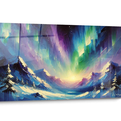
 Mountain Northern Lights Painting - Arctic Majesty - Northern Lights Edition273,90 €
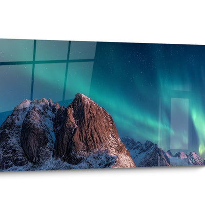
 The Colors of the Sky Painting - Northern Lights Space Edition273,90 €
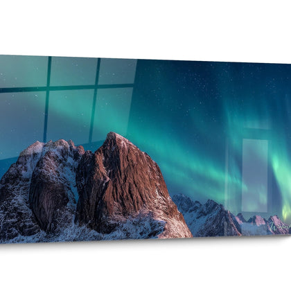
 The Sky Mirror Painting - Northern Lights Space Edition273,90 €
Explore further
In Northern Lights Mountain Wall Art
All about Northern Lights Mountain Wall Art
- Painting Presentation Northern Lights Mountain
- Altitude Visual Impact
- Contemporary Nordic Decor
- Natural Chromatic Balance
A painting northern lights mountain captures the extraordinary optical phenomenon of luminous veils unfolding above snow-covered reliefs. This composition offers a visual duality between the terrestrial majesty of the peaks and the celestial energy of green, violet, or pink lights. Each large-format artwork transforms your interior space into a window open onto Scandinavian or Icelandic landscapes, combining atmospheric depth and cosmic spectacle to create a captivating focal point.
The Dramatic Power of the Mountain-Sky Contrast
The association of a painting northern lights mountain in a spacious living room creates an exceptional visual tension between geological immobility and magnetic fluidity. The dark ridges in the foreground reinforce the luminous intensity of the celestial trails, generating a depth of field that amplifies the impression of immensity. This vertical stratification naturally guides the eye from the glacial valleys to the dancing light bands.
Which spaces enhance these vertically accentuated compositions?
Rooms with high ceilings particularly benefit from this vertical mountain-sky organization. A panoramic painting northern lights exploits this structure to create an immersive window effect. Entrance halls, mezzanines, or cathedral-like living rooms amplify the sensation of progressive elevation provided by the natural geometry of the steep summits topped with undulating auroras.
Architectural integration of diagonal lines
Mountain ridges create dynamic diagonals that energize conventional rectangular spaces. Facing a linear sofa, these oblique orientations break the monotony of architectural horizontals. The snow-covered slopes reflecting the auroral hues establish a chromatic conversation between earth and atmosphere, particularly suited to minimalist Scandinavian interiors where every decorative element has a precise function.
How to amplify the perception of spatial depth?
Positioning a painting northern lights mountain on a wall perpendicular to natural openings maximizes the illusion of depth. Lateral daylighting accentuates the nuances between dark areas (rocky reliefs) and luminous areas (polar veils). Formats exceeding 150 cm in width transform this perception into a true spatial extension, creating a visual escape in confined urban apartments lacking distant perspectives.
Nordic Aesthetics Applied to Modern Interiors
A painting northern lights mountain fits perfectly within the hygge and lagom decorative codes, prioritizing the nature-habitat connection. The dominant cold palette (deep blues, emerald greens, glacial whites) naturally harmonizes with raw materials such as bleached wood, gray stone, or polished concrete. This chromatic convergence creates effortless stylistic coherence in contemporary lofts or urban chalets.
What complementarity with authentic Nordic furniture?
The pure lines of Scandinavian furniture find their echo in the compositional simplicity of mountain-aurora. Facing a Muuto or String ensemble, these natural representations inject the necessary dose of emotionality to temper the minimalist rigor. Neutral textiles (ecru linen, bouclé wool) gain character when a painting northern lights brings its spectacular dimension as the sole source of saturated colors.
Visual thermal balance in cold spaces
Unlike popular belief, the cool tones of a mountain boreal painting create a beneficial thermal contrast in rooms exposed to full sun or overheated spaces. This chromatic coolness visually compensates for excessive physical heat in southwest-facing rooms. The green auroral glows act as a psychological regulator, mentally refreshing the atmosphere during summer months.
Material associations to reinforce authenticity
Emphasizing the polar theme requires targeted decorative additions: faux fur rugs, black-and-white graphic cushions, driftwood lighting fixtures. These elements visually contextualize the aurora boreal mountain painting without falling into museum-like recreation. A long-pile pearl gray rug physically anchors this Nordic aesthetic while creating a tactile transition to the glacial wall imagery.
Managing Complex Chromatic Harmonies
A mountain aurora boreal painting presents a stratified chromatic richness: cool dominant tones (white-blue glaciers), electric accents (phosphorescent greens), crepuscular nuances (pinks-violets). This complexity requires a calibrated decorative approach to avoid visual overload while fully exploiting the colorimetric potential of the large-format artwork.
How to extract secondary tones without redundancy?
Rather than replicating the dominant green auroras, prioritize tertiary shades: a plum cushion picks up the high-altitude violets, a turquoise vase recalls deep ice. This strategy of subtle harmonization creates a sophisticated coherence without a mirror effect. Nocturnal aurora boreal paintings offer a complementary palette to develop this polychromatic approach in adjacent rooms .
What luminous intensity preserves the readability of details?
The dark mountainous areas require accent lighting without dazzling the auroral luminous portions. An adjustable LED rail at 3000K (warm white) placed at 45° preserves the subtle gradations without creating parasitic reflections. Rooms benefiting from diffused Nordic natural lighting (north-facing windows) offer ideal conditions to appreciate the delicate nuances between the mountainous twilight and the magnetospheric explosion.
Seasonal adaptation of color perception
A mountain aurora boreal painting evolves visually according to seasonal ambient light. In winter, under prolonged artificial lighting, the cool tones intensify, reinforcing the cocooning atmosphere. In summer, abundant natural light reveals the rocky details and atmospheric stratification. This perceptual mutability justifies the investment in a generous format capable of revealing these changing subtleties.
Chromatic association errors to avoid
Ban saturated warm colors (vivid oranges, primary reds) that clash frontally with the polar palette. Dark exotic woods (wenge, palisander) create a stylistic dissonance with the clear Nordic aesthetic. Instead, favor bleached oak, natural ash, or birch to maintain visual coherence. Gold or copper metals fade before brushed stainless steel or matte aluminum, more aligned with the mineral-glacial spirit of the composition.
Is a mountain aurora boreal painting suitable for children's bedrooms?
Absolutely, these natural representations stimulate the imagination without excessive agitation. Cool tones promote pre-sleep relaxation while the spectacular dimension nourishes curiosity about scientific phenomena. Prioritize balanced compositions where the peaks occupy at least 40% of the surface to visually anchor the kinetic energy of the auroras.
What is the minimum dimension for optimal visual impact of a mountain aurora boreal painting?
To capture the inherent grandeur of the subject, aim for a minimum width of 120 cm in a standard living room. Formats exceeding 180 cm create the desired immersion, transforming the wall into a true panoramic opening. The height should respect a 2:3 or 3:4 ratio to preserve the characteristic vertical skyscraper balance of these compositions.
Do these paintings work in warm Mediterranean interiors?
Their effectiveness lies precisely in the visual thermal contrast created. In a Provencal villa with ocher-terracotta tones, a northern lights mountain painting brings a welcome chromatic freshness, acting as a refreshing counterpoint. This mastered stylistic opposition generates a sophisticated decorative tension, avoiding the monotony of a uniformly warm palette.
Further reading
Our articles on this topic
- Misty fjord Scandinavian landscape painting: Nordic minimalism at its finest
- Nordic Landscapes: Fjords and Northern Lights in Painting
- Original Nordic Landscape Painting for a Home Office: Breaking Away from Classic Scandinavian Codes
- Marshes and Bogs in Nordic Art: The Mystery of Wetlands
- Mountain print on acrylic glass with a luminous effect: how to elevate your wall?
- Winter Mountain Snowy Landscape Painting Scandinavian Style: Complete Decor Guide
L'art qui suscite l'envie
Maison belge d'art mural grand format
14 jourspour changer d'avis*
Protection Walenskyincluse
Fabriquéen Italie
FormatXXL
Kit de fixationtoujours fourni
* Hors tableaux personnalisés et tailles personnalisées


