Pale pink Japanese cherry blossom painting: which white to choose for a perfect match
8 min read · by Walensky
ZEN JAPANESE CHERRY BLOSSOM PAINTING
You painted the living room white six months ago. The Japanese cherry blossom painting you spotted, powdery pink with graphic branches, has been catching your eye for weeks. Yet a doubt remains: will this pink float on your wall like a lost confetti, or will it instead blend in with that obvious harmony that beautiful pairings have?
White is never really white. That is the whole problem, and the whole solution.
The direct answerA pale cherry blossom pink pairs best with a slightly warm white, such as off-white or cream, which avoids the greyed look of cool white and does not compete with the softness of the pink. In a very bright south-facing room, a pure white also works, provided you keep warm materials around it (light wood, brass, linen).- Cool white tends to slightly "green" or "grey" pale pink, which loses its softness.
- Off-white and cream warm the pairing without weighing it down, ideal in north-facing rooms.
- A gold frame on pure white can create too stark a contrast: it is better reserved for off-white or cream.
Why pale pink reacts differently depending on the wall's white
The powdery pink of a flowering cherry is not a pure colour: it is a white tinged with red, almost a shade of colour rather than a clear hue. This chromatic fragility makes it extremely sensitive to its surroundings, far more than a bright red or a deep blue, which remain recognisable whatever the background.
Colour theory calls this chromatic assimilation: two hues close in lightness and saturation influence each other through temperature contrast. A white with a blue undertone will make the pink look cooler, almost mauve. A white with a yellow or beige undertone will, on the contrary, warm it and give it that "peach" nuance found in the finest sakura watercolours.
A pale pink has no fixed colour: it takes on the temperature of the white surrounding it.
That is why the same painting can look dazzling at your neighbour's and slightly dull at yours. The subject is not the painting. It is the white.
The 4 shades of white and their effect on a cherry blossom painting
Each white tells a different story to the cherry blossom pink. Here is how the four main families behave in practice.
Pure white: sharp and modern contrast
Pure white (close to RAL 9010 or snow white) creates a crisp, almost clinical contrast. It suits a very minimal japandi style, where you want the pink to be the only colour note, clean and isolated like calligraphy on white paper.
The risk: in a dimly lit room, this white turns bluish grey and the pink loses its warmth, becoming slightly cold, almost sickly.
Off-white and cream: softness and warmth
This is often the safest choice. Off-white (slightly tinted with beige or warm grey) and cream absorb a touch of yellow that directly nourishes the pale pink. The whole feels softer, more enveloping: the spirit of Japanese minimalism without Scandinavian coldness.
Cool white: clean Scandinavian mood
Cool white, tinted with blue or light grey, suits Scandinavian settings and very sober palettes. With a pale pink cherry blossom, it works mainly if the room receives plenty of warm natural light in the late afternoon, otherwise the pairing quickly turns dreary.
To test your wall's shade without repainting, place a sheet of pure white paper (a new A4 sheet) against the wall in full daylight. If the wall looks greyer, yellower or bluer than the sheet, you have your answer.
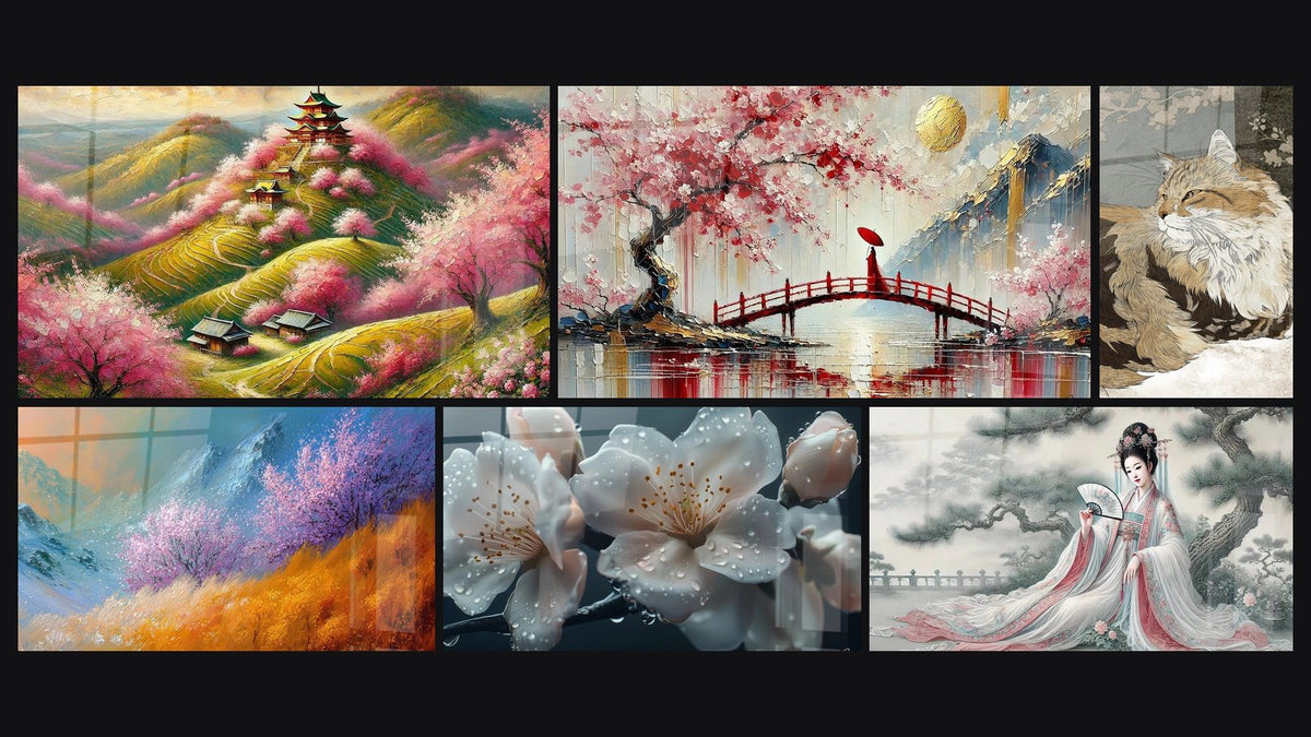
A series of sakura paintings can serve precisely as a visual test: hang a printed photo of the painting you covet against your wall before buying, at the time of day you spend the most time in the room. This is the most reliable method, more so than any theoretical white shade. To vary compositions around this theme, a series of sakura paintings offers several variations of pink and staging.

Staging the pairing according to the room's light
Natural light changes everything, quite literally. The same off-white can look warm at noon and slightly dull at dusk.
North-facing exposure: warming up the pairing
A north-facing room receives cold, steady light, without direct sunbeams. On a cool white wall, the pale pink of the cherry blossom risks looking washed out, almost absent. The remedy: opt for a cream or off-white, and add light wood (oak, maple) to offset the ambient coolness.
South-facing exposure: preserving the freshness of the pale pink
Conversely, a full south-facing room, bathed in warm light in the late afternoon, can afford a pure white without fear of a dull effect. The pink keeps its freshness, and the contrast stays elegant rather than garish.
In a north-facing bedroom, for example, the choice of wall colour for a powdery pink cherry blossom flower painting deserves to be reconsidered with this shade in mind: sometimes it is enough to shift from pure white to an off-white to save the whole balance of the room.
— Our selection


Pairing mistakes to avoid with a pale pink cherry blossom painting
Certain combinations come up often, and they always spoil the same effect: the delicacy of the powdery pink.
- Cold white with no compensation: on a bluish white wall with no warm materials around, the pink looks greyish, almost dirty.
- Gold frame on pure white: the contrast becomes too harsh, almost garish. Brass or gold suits off-white far better.
- Decorative overload: multiplying pink accents (cushions, curtains, vases) around the painting dilutes its impact instead of reinforcing it. One strong focal point is worth more than ten whispers.
- Overly cold artificial lighting: a cool white bulb (above 4000K) accentuates the same flaws as cool white on the wall.
— Also to discover


Completing the pairing with materials and accent colours
A successful white-pink pairing never depends on the wall alone. The materials around it do at least as much work as the colour itself.
Light wood (whitewashed oak, birch) brings the warmth that cool white sometimes lacks. Natural linen, in cushions or curtains, softens the whole without adding a competing colour. Brass, however, requires a little finesse: it shines strongly on pure white, but blends elegantly on off-white or cream.
For those seeking an extra breath of freshness, a touch of sage green (a cushion, a plant, a vase) creates a natural bridge between the pink and the white, a bit like the leaves that accompany cherry blossoms on the tree itself.
This Dancing Cherry Tree Painting, with its graphic branches on a light background, illustrates this principle well: the elongated landscape format sits particularly well above a sofa or a light wood console, where the two materials echo each other without ever competing for attention.
If you are torn between several compositions, the collection of paintings inspired by Japan offers a good ground for visual comparison, from the temple under cherry trees to the Japanese lantern at dusk.

In the same spirit
Mountain landscape painting with cherry blossoms - Glacial Harmony - other landscapes edition
From €273.90
Discover this painting →Frequently asked questions
Which white goes best with pale pink?
In most interiors, off-white or cream offers the safest pairing: they slightly warm the pink without weighing it down. Pure white remains a good choice only in a very bright room.
Can pale pink look bland on a white wall?
It can, if the white is too cool or if the room's light lacks warmth. With an off-white and a few natural materials (wood, linen), the pink on the contrary keeps all its character.
How to warm up a cool white wall with pink decor?
Add light wood, natural linen and warm lighting (below 3000K). These three elements largely offset the coldness of a bluish white.
Which colours to pair with a pale pink Japanese cherry blossom painting?
Sage green, natural beige and discreet gold (brass rather than shiny gold) complement the pink well without overshadowing it.
There is no universal rule guaranteeing the perfect match between a pale pink Japanese cherry blossom painting and a white wall: everything depends on the exact shade of that white, the light flowing through the room, and the materials surrounding it. But once these three parameters are aligned, the effect is immediate: that wall which taunted you for months finally becomes the point the eye seeks on entering the room.
Before deciding, one last step remains: choosing the right format for your wall. the right size of Japanese cherry blossom painting for a white wall will help you turn this colour pairing into a truly successful staging. And to browse all the variations of pink, white and light, the Japanese cherry blossom painting collection remains the simplest starting point.
Explore our collections