

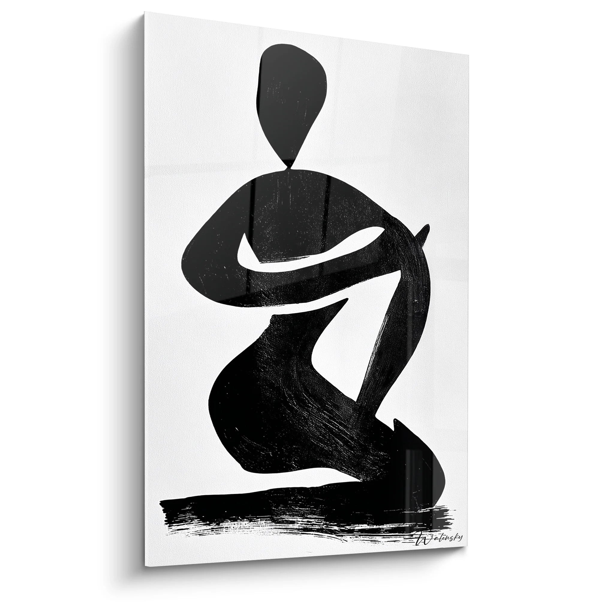







You've just hung your latest artwork on the wall, and something deeply bothers you, though you can’t quite put your finger on it. The whole thing seems either too safe, too predictable, or completely chaotic.
You step back a few paces, tilt your head, but this feeling of incompleteness persists. The colors seem to be fighting each other, or conversely, everything blends into a disappointing monotony that makes your living room terribly bland.
You’ve already tried following the classic rules: matching colors, respecting proportions, creating symmetry. Yet, the result lacks personality and that little spark that makes an interior captivating from the moment you walk in.
Rest assured, it's not a lack of taste on your part. The problem is that you’ve been taught to seek either perfect harmony or total contrast, while magic lies in the subtle alchemy between the two.
By the end of this article, you will master the delicate art of balancing harmony and visual tension to create wall decor that captures attention without overwhelming the eye, and that reveals your personality with sophistication.
Why is perfect balance a dangerous myth?
Pure harmony kills emotion and creates bland interiors that go unnoticed. If you wait to find the
The 70-30 rule changes everything: 70% of your composition should reassure the eye (close colors, familiar shapes), while 30% create surprise and interest. This proportion naturally generates that feeling of "it's beautiful but I don't know why", with just a few adjustments.
Understanding what’s really happening in your brain
You feel this frustration when: your living room seems "nice" despite all your efforts, your guests compliment politely without lingering, and you yourself no longer want to settle into a room that bores you. You know something is wrong, but it's impossible to say what.
What’s really happening is that your brain gets bored facing too much predictability, or conversely gets tired from too much stimulation. It's not a problem of personal taste, but a universal neurological mechanism: we need familiar patterns AND surprises to stay captivated.
Imagine your gaze as a walker: it needs marked paths to feel safe, but also unexpected discoveries to want to continue exploring.
The illusion of the single rule
Contrary to what we believe, there is not ONE good way to create harmony. Magazines show us "perfect" interiors that scrupulously respect the codes, but these same interiors often leave us cold because they lack soul and personality.
It's like comparing a robot reciting a poem perfectly to a human who says it with their imperfections: which one moves you really?
This discovery transforms your approach: instead of searching for the perfect solution, you learn to orchestrate several elements that complement AND challenge each other. Result: a decoration that has character and resembles you.
✨ Immediate test: Look at your main wall for 30 seconds. If your eye doesn't move naturally from one point to another, it means the whole lacks creative tension. On the contrary, if it flits without ever settling, there is too much visual competition.
The trap of uniform saturation
Many think that you either need bright colors everywhere, or very soft colors everywhere. In reality, this uniformity creates a feeling of blandness or aggressiveness. The secret lies in the variation of intensities, even within a harmonious palette.
Think of a sunset: even in warm tones, there are tender oranges AND deep reds, delicate yellows AND intense purples.
When you understand this principle, you stop searching for the perfect color to start composing a symphony of nuances that reveal each other. Your decoration instantly gains richness and sophistication.
The error of the single scale
Here’s what almost no one notices: monotony often comes from similar dimensions rather than colors. Three paintings of the same size, even beautiful, create a repetitive rhythm that lulls attention.
You can easily spot this problem: if all your decorative elements are roughly the same size, your eye has no hierarchy to follow. It gets lost in uniformity.
This revelation immediately changes the way you see your wall: you realize that impact comes as much from proportions as it does from colors themselves. A small intense element can balance a large soft element.
🔍 3 warning signs to detect:
- The wandering eye: Your gaze glides over the whole without stopping, as if desperately searching for an anchor
- The "store window" effect: Everything is pretty taken individually, but the overall lacks cohesion and personality
- Visual fatigue: After a few minutes, you naturally look away, a sign of poorly calibrated stimulation
The turning point
The real click comes when you realize that visual tension is not something to be avoided, but a tool to master. It's like learning to drive: at first, we are afraid of the accelerator, then we understand that you need to know how to alternate between acceleration and braking to move forward effectively. Spot this moment in your decor by observing if each element has a "dance partner": something that highlights it through contrast or complementarity.
The rule of the partner: Each dominant element must have its showcase. A colorful painting flourishes near a neutral area, a geometric shape reveals itself next to an organic texture. Test by alternately hiding each element: if it's not missed, then it is redundant.
| ❌ Classic approach | ✅ Harmonious balance | 💡 Why it works | 🎯 Concrete result |
|---|---|---|---|
| Everything must match perfectly | 70% match, 30% contrast | The brain needs both familiar AND novelty | A decor that intrigues and soothes at the same time |
| Same color intensity everywhere | Subtle variations in intensity | Creates a natural visual hierarchy | The eye knows where to settle first |
| Objects of similar sizes | Complementary scale game | Generates a captivating visual rhythm | Each element has its legitimate place |
| Avoid anything that "clashes" | Orchestrate contrasts | Controlled tension creates emotion | A unique and memorable decor personality |
The 3-layer method to create your perfect balance
Rest assured, creating this subtle balance is not as complex as it seems. Imagine you are preparing a refined dish: first you lay the basic flavors, then add the character notes, and finally the finishing touches that reveal the whole. In 3 progressive steps, your wall transforms from a flat surface into a living composition that tells your story.
⏱️ Time: 10 minutes | ✅ Successful when: Your eye naturally moves back and forth between the two elements | ⚠️ Attention: If the repetition is too close or too obvious, it becomes redundant rather than harmonious
Test of overall atmosphere: Observe your entire ensemble at different times of the day to check that the harmony works in all lights. Natural light reveals true colors, while artificial lighting can completely transform an ambiance.
⏱️ Time: 24 hours of observation | ✅ Successful when: The ensemble pleases you as much in the morning as it does in the evening | ⚠️ Attention: A harmony that only works in one light will create frustration on a daily basis
✨ Validation of your base: Your foundation is successful when you feel a peaceful satisfaction looking at your wall, without wanting to add anything immediately. Check that the ensemble "breathes": there should be areas of visual rest. If you feel an urge to add elements, it means the base lacks solidity. Take the time to refine it before moving on to the next step.
OUR RECOMMENDED PRODUCTS
Layer 2: Introduce Creative Tension
Now that your base is solid, you can dare to personalize it. This step is more exciting because this is where your decoration really comes to life and reveals your unique character. You will introduce the elements that surprise and captivate, while keeping the basic harmony as a safeguard. The effect is immediate: your space goes from "pretty" to "memorable".
🎭 Your Tools for Mastered Contrast
- The element of surprise: Choose a piece that deliberately stands out from your main palette, but remains within a complementary color range. For example, if your base is in warm tones, a touch of blue-green will bring that necessary tension. Prioritize quality over quantity: one strong element is better than several lukewarm elements. The game of scales: Vary the sizes intentionally to create a visual rhythm. If your main artwork is large, add one or two smaller pieces, or vice versa. This variation in scale naturally guides the eye and avoids the monotony of uniform formats. Contrasting texture: Introduce a material that dialogues with your base: rough with smooth, matte with shiny, organic with geometric. This tactile variation adds a sensory richness that makes the whole ensemble more lively and engaging.
🚀 Creating Your Decor Personality
Placement of the surprise element: Position your contrasting piece approximately 60-80cm from your main artwork, creating a visual triangle with your chromatic echo element. This arrangement generates a natural eye movement while maintaining overall balance. Avoid placing it in direct opposition, which would create a visual competition.
⏱️ Time: 20 minutes | ✅ Success when: The element pleasantly surprises without shocking | ⚠️ Attention: If the addition creates a feeling of chaos, it means the contrast is too strong or poorly positioned
Intensity calibration: Adjust the "strength" of your contrast by playing with its size or saturation. A very strong contrast can be balanced by a small size, while a soft contrast can support a larger presence. The goal is to create an interesting point that enriches without dominating.
⏱️ Time: 15 minutes of adjustments | ✅ Success when: Your eye is attracted and then naturally returns to the whole | ⚠️ Attention: An under-dosed contrast goes unnoticed, an over-dosed one vampirizes the rest
This final step transforms a beautiful composition into a sophisticated ensemble that truly resembles you. Finishing details are like spices in a dish: used sparingly, they reveal and sublimate all the other elements. This is where your personal aesthetic sense fully expresses itself, in these subtle choices that make an interior have a unique soul.
✨ Your refined finishing touches
- Accent lighting: A discreet spotlight or wall lamp directed at your composition reveals textures and intensifies colors in the evening. Choose a light temperature that respects your colors: rather warm (2700K) for warm tones, more neutral (3000K) for cool tones. Micro-linking elements: Small objects that subtly pick up on the codes of your composition: a thin frame, a plant in a pot of matching color, a book whose cover echoes. These details create a subtle coherence that reveals your attention to detail. Depth element: Something that creates physical depth: a thin shelf, a narrow console, or even just a play of reliefs in the hanging. This third dimension adds visual richness and avoids the "catalog" effect.
🎨 Finalizing your masterpiece
Lighting orchestration: Test your composition under different artificial lighting conditions to ensure it retains its charm in the evening. Good accent lighting can completely transform the impact of your wall and reveal nuances invisible in natural light.
⏱️ Time: 30 minutes of testing | ✅ Successful when: Your composition is as beautiful in the evening as it is during the day | ⚠️ Attention: Lighting that is too strong crushes the nuances, too weak dulls the whole thing
The rule of smart progression: Move to the next step only when the current step fully satisfies you. Objective criteria: your eye naturally rests on the whole, you don't have a compulsive desire to "correct" something, and you enjoy observing your creation. Patience in construction is better than haste towards the result.
You now master the subtle art of decorative balance. Here are the expert nuances that will make the difference between a beautiful decoration and a truly personal composition. These pro tips give you that edge that makes people always ask you for advice on decorating.
🎯 Master decorator's secret: The "detail that doesn't fit" rule - In any successful composition, there must be ONE element that seems to stand out but, in reality, reveals all the others. It is this famous 5% of unexpectedness that transforms a correct decoration into a memorable crush. Test by removing this element: if the whole becomes dull, you have found your "rebellious detail".
💭 Question from a passionate reader
"How do I know if I have the right dosage? I'm afraid of doing too much..."
This hesitation is absolutely normal and even reassuring: it shows that you are developing your aesthetic sensitivity. The "too much" is easily recognizable: your butterfly eye flits without ever settling, you feel tired after a few minutes of observation. The right dosage makes you want to stay in the room. Always start softer than your instinct: you can always intensify, but it is more delicate to go back. Trust your feelings after 48 hours of cohabitation: this is the time needed for the novelty effect to fade and reveal the true impact.
🔍 Validation test: Photograph your wall with your phone then observe the photo. The objective reveals imbalances invisible to the naked eye and gives you the necessary perspective to objectively judge your composition.
The pitfalls that ruin even the most beautiful intentions
Warning, some mistakes can turn your masterpiece into a real decorative disaster. These traps are insidious because they seem logical on paper, but create reverse effects in reality. Knowing these pitfalls avoids you months of frustration and saves you valuable time.
- 🚫 The "matchy-matchy" syndrome : Wanting everything to be perfectly coordinated instantly kills personality. Your brain interprets this uniformity as disguised boredom. Result: an interior that looks like a shop window, technically correct but emotionally empty. Keep 20% of elements that "don't go together" but reveal themselves to each other. This is a very common mistake among perfectionists who confuse harmony and monotony. ⚡ The focal point overdose : Multiplying "wow" elements creates an exhausting visual competition. Like several people talking at the same time, the message gets lost in the cacophony. Your eye doesn't know where to land and quickly abandons exploration. One hero per wall, all others are supporting actors. This mistake often happens when you accumulate crushes without an overall vision. 📏 The tyranny of perfect symmetry : Centering and balancing each element within a millimeter creates rigidity that lacks life. Your interior then resembles a museum: respectable but not inviting. Controlled asymmetry brings dynamism and humanity to your composition. Slightly offset one element in three to create movement. Many fall into this trap thinking "straight = beautiful". 🌊 The compensatory accumulation : Constantly adding elements to "correct" a imbalance often worsens the problem. It's like trying to fix a leak by adding more water. When something is wrong, the solution is usually to remove rather than add. Start by identifying and correcting the disruptive element. This error is born of impatience and refusal to accept that a single misplaced element can spoil the whole. 💡 The neglected lighting : Creating a beautiful composition during the day that becomes dull or aggressive in the evening due to a lack of suitable lighting. Your colors transform, your reliefs flatten, and all your work disappears. A beautiful interior must function 24/7. Systematically test your composition under artificial lighting and adjust as needed. This is the most expensive mistake because it makes half your life in the space unusable.
🛡️ Your anti-error verification system : Daily check : does your eye naturally settle on your composition? Recessed test : does the effect work from 3 meters away? Night validation : does the magic operate under artificial lighting? Major alarm signal : if you feel like "correcting" something every time you look at your wall, stop everything and identify the disruptive element before adding anything.
🎁 Special readers offer
Because you took the time to learn, enjoy 10% off on your first order:


