I've spent seven years transforming rental apartments into spaces where families feel immediately at home. And each time, the same question comes up: how to decorate walls without offending everyone’s tastes? I’ve seen hosts lose bookings due to overly personal artwork, and others receive comments “impersonal, soulless.” Wall art for family Airbnb is that delicate balance between reassuring neutrality and welcoming warmth.
Here's what well-chosen wall art brings to your family rental: it creates a positive first impression that generates 5-star reviews, it establishes an emotional connection without imposing a personal style, and it enhances your property justifying a higher rate.
The challenge? You want parents to relax, children to feel safe, and grandparents to enjoy their stay. Impossible with white and cold walls. But add a scene too bold or a portrait too personal, and you risk creating discomfort. The frustration of the owners I work with is always the same: “How do you make sure everyone feels comfortable?”
Rest assured, this alchemy exists. After equipping more than 150 vacation rentals, I’ve identified visual codes that universally work with families. And no, it doesn't mean sacrificing the character of your space. On the contrary, it’s an opportunity to create a memorable atmosphere that transforms an ordinary stay into an experience people still talk about months later.
The psychology of colors in family rentals
In a family Airbnb, wall colors are not just a matter of aesthetics. They directly influence the behavior of your guests. I learned this lesson with Sophie, owner of a three-room apartment in Lyon. She had hung magnificent bright red paintings in the living room, thinking it would bring energy. Result? Families consistently mentioned that children struggled to calm down in the evening.
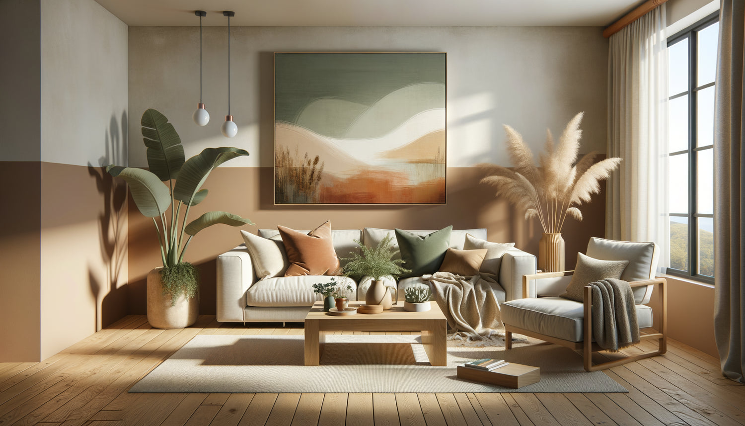
The shades that create the perfect balance between neutral and warm are those that recall nature: sandy beiges, sage greens, muted blues, soft ochres. These colors subconsciously activate our sense of security. They tell the brain: “You can relax here.”
For wall art specifically, prioritize:
- Earthy tones for common areas (70% of your selection)
- Touches of soothing blue in bedrooms
- Accents of honey yellow in the kitchen or dining room
- A touch of green vegetation to connect with nature
The 60-30-10 rule applies perfectly: 60% neutral tones, 30% soft secondary colors, 10% more assertive accents. This proportion visually creates a balanced environment that appeals to 90% of family profiles.
Universal themes: what always works
Some subjects transcend cultures, generations and personal tastes. After analyzing hundreds of customer reviews, I identified five themes of wall art that consistently generate positive comments in family homes.
Abstract Landscapes
A suggested sunset, stylized mountains, a forest in blocks of color. These works tell a story without imposing one. Each family member projects their own interpretation. The business father sees a moment of pause, the child an adventure, the grandmother a memory. It is this emotional versatility that makes abstract landscapes so effective for an Airbnb.
Clean Botanical Motifs
A monstera leaf in line art, stylized eucalyptus branches, wild herbs in silhouette. Nature instantly brings warmth without being intrusive. These visuals work particularly well in kitchens and bathrooms, where they create a soothing visual continuity.
Soft Geometric Compositions
Attention, I'm not talking about aggressive geometry. But rounded shapes, circles that intertwine, organic arches. These motifs appeal to adults who see contemporary design in them, and reassure children with their softness. They add visual structure to a neutral space without stiffening it.
Minimalist Lifestyle Scenes
A table set from above, magnified everyday objects, a window open onto a blurred landscape. These images create a subtle narrative: “Here, beautiful moments are lived”. They suggest the experience without dictating it, leaving your guests to write their own story.
Textures and Materials
Reproductions of linen, marble, wood, sand. These wall arts add tactile depth to a space. They create visual richness without adding thematic complexity. Perfect for entrances and hallways.

Where to place what: the emotional mapping of your Airbnb
Each room in your family rental fulfills a different emotional function. Wall art should accompany these energy transitions.
The entrance is your visual handshake. Opt for a unique, medium-sized piece in warm but contained tones. An abstract landscape with sandy and terracotta hues says: “Welcome, you’re in the right place”. Avoid black, bright red or complex subjects that create unconscious hesitation.
The living room requires a more elaborate composition. This is where families gather. I like to create a focal wall with a triptych or a composition of three different sized artworks. The trick? Maintain color consistency but vary the themes: a landscape, a botanical print, a texture. This diversity in unity appeals to all ages.
The kitchen and dining room call for lighter, almost joyful visuals. Warm tones subtly stimulate appetite and conviviality. Works depicting stylized markets, abstract fruits, or simply games of ochre and mustard colors create this balanced atmosphere between functionality and comfort.
Bedrooms require the greatest subtlety. For the master bedroom, prioritize cool, soothing tones: grayish blues, aqua greens, lunar beiges. For children's rooms, allow yourself more fantasy while remaining soft: stylized animals, abstract clouds, minimalist stars. The goal? Stimulate imagination without preventing sleep.
The bathroom is often overlooked, a fatal mistake. It’s an intimate space where your guests spend time alone. A wall art resistant to humidity (print on aluminum or acrylic glass) with aquatic or plant motifs transforms a utilitarian room into a moment of well-being.
Sizes and proportions: the €200 mistake I made
Let me tell you about my biggest blunder. For a seaside studio, I had chosen a magnificent marine painting. Problem? It measured 40x40 cm on a 3-meter wall. The effect was pathetic, like a lost postage stamp. I had to buy back an adapted artwork. Since then, I have religiously respected proportions.
The rule of thirds: your painting or composition should cover approximately 60-75% of the width of the furniture it overlooks (sofa, bed, console). Above a 2-meter sofa, aim for 120-150 cm in total width.
The hanging height follows the museum rule: the center of the painting 145-150 cm from the floor, approximately at eye level. In a dining room, calculate this height with seated guests.
For family Airbnbs, I have developed a formula: “The bigger it is, the simpler it is”. A large painting calls for a purified subject. A wall of small works allows for more diversity. But beware of visual chaos: limit yourself to 3-4 pieces per wall, maximum.

Smart Budgeting: Investing Without Breaking the Bank
Let's talk money. For a 60 m² apartment, budget between €300 and €600 for wall art. That seems high? Let’s break it down: with 6-8 strategically placed artworks at €50-€100 each, you create an atmosphere that justifies an extra €10-€15 per night. With a 70% occupancy rate over a year, that's an additional €1,800 - €2,600 in revenue. ROI in 3-4 months.
My favorite sources for value for money :
- Canvas prints : Affordable, lightweight, easy to install. Choose thick grammages (minimum 350g) to avoid a cheap look. Framed posters : With a quality frame (real wood, not plastic), a poster becomes a true piece of art. Reproductions by emerging artists : Many offer limited edition prints at attractive prices. The advantage? Less common pieces, therefore more memorable. Marketplaces specialized in short-term rentals : Some creators specifically design for Airbnb, with formats and themes optimized.
Avoid the three classic pitfalls: thin prints that warp, plastic shiny frames that scream “cheap”, and hyper trendy subjects that will be dated in two years.
Wow Factor Without Risk: My 3-Step Method
Want to create a visual impact without making mistakes? Here's my proven process for finding the balance between neutral and warm in an Airbnb family home.
Step 1: Define your palette
Choose a maximum of 3 dominant colors. I recommend: a neutral (beige, warm grey, off-white), an earthy tone (terracotta, ochre, olive green), and a soft accent (powder blue, clay pink, honey yellow). All your wall art must incorporate at least two of these colors.
Step 2: Create your moodboard
Before buying anything, gather images on Pinterest or Instagram. Roughly print them to the correct scale, stick them to the walls. Live with them for 48 hours. Photograph under different lights. This step avoids 80% of purchase errors.
Step 3: Test it out on your first guests
Once installed, include in your welcome message:
Transform your rental into a memorable space
Discover our exclusive collection of Airbnb art that creates the perfect balance between reassuring neutrality and welcoming warmth, specially designed to appeal to families and generate 5-star reviews.
The mistakes to absolutely avoid
After correcting dozens of failed decorations, I can give you the list of errors that sabotage the atmosphere of a family Airbnb.
Art that is too personal : Your vacation photos, your children, your wedding. These memories are precious to you, uncomfortable for your guests who feel they are in someone else's intimacy. Keep the boundary between your private life and their rental space.
Textual messages :
Incoherent mix of styles : A Scandinavian painting here, an ethnic artwork there, a Provencal landscape elsewhere. This visual cacophony exhausts the eye. Even in a
Visualize your Airbnb transformed
Now imagine. Your next guests walk through the door. Their eyes immediately rest on this abstract landscape with sand and ochre tones in the entrance. Sigh of relief:
In the evening, while the little ones sleep, the parents settle into this living room where each
This transformation requires neither work nor particular artistic talent. Just an understanding of a few universal visual codes, a little method, and the courage to invest in what differentiates an ordinary rental from a memorable experience.
Start with a room. Your living room. Three coordinated artworks. Observe the difference in your guests' behavior, in their messages, in their reviews. Then extend this attention to your entire space. Your family Airbnb will never be perceived as impersonal or too neutral again. It will become that rare place where balance is perfect: neutral enough to welcome all tastes, warm enough to create memories.
Frequently Asked Questions about Art for Family Airbnbs
How many artworks should I plan for a 50m² apartment?
For an apartment of this size accommodating families, I recommend 6 to 8 pieces of wall art strategically distributed. Specifically: a welcome piece in the entrance, a composition of 2-3 artworks in the living room, a visual in the kitchen or dining room, one per bedroom, and ideally one in the bathroom. This density creates a refined atmosphere without visually saturating the space. The common mistake is to put too few (2-3 only), which leaves an unfinished impression, or too many (15+), which creates an uncomfortable museum. Think balance: each room where your guests spend time deserves visual attention, but not every wall needs to be dressed. Breathing spaces are just as important as the artworks themselves to maintain that warm and neutral ambiance sought after in a family rental.
Should I adapt the wall art according to the location of my Airbnb?
Yes and no. The basic principle remains universal: codes of warm neutrality work everywhere. But a subtle local touch can strengthen the experience without falling into cliché. In a Provençal Airbnb, lavender and ochre tones will subtly recall the territory. By the sea, blues and beiges naturally evoke the environment. In the mountains, deep greens and grays create continuity with the landscape. However, avoid overly literal representations (Eiffel Tower for Paris, gondola for Venice) which infantilize the decor. Prefer abstract evocations: the colors of the place rather than its monuments. The goal is for your guests to feel a consistency between the outside and inside, without it becoming an imposed theme. A family Airbnb should first be a comfortable cocoon, then only a reminder of destination. This hierarchy is essential to find the perfect balance.
How do I protect artworks from damage in short-term rentals?
Durability is crucial in seasonal rentals. First, prioritize canvas or aluminum prints over paper under glass, which is more fragile. Frames must be securely attached with double hooks (never a single nail). For areas at risk such as children's rooms or passageways, install the artworks slightly higher than standard to avoid accidental bumps. Use screws and anchors suitable for your wall type, not simple adhesive hooks that come off with humidity variations. In the bathroom, choose supports resistant to water (aluminum, acrylic glass) with anti-mold treatments. Photograph each artwork before guest arrival; this facilitates damage management. Finally, consider insurance: some specific Airbnb contracts cover decoration. With these precautions, your investments in wall art will easily last through several years of intensive use while maintaining that warm atmosphere that makes your difference.