Japanese teapot painting for a tea room or restaurant: the professional decor guide
8 min read · by Walensky
TEAPOT PAINTING JAPANESE
A customer pushes open the door of your tea room on a grey Tuesday afternoon. Before tasting anything, they look. The walls speak before the menu does, and in that tenth of a second as the eye sweeps the room, a well-chosen Japanese teapot painting already does the work no sign ever could: it announces what is about to happen in the cup.
The direct answerFor a tea room or restaurant, the best choice is a Japanese teapot painting printed on matte Dibond aluminium (non-reflective, better suited to dining room lighting) in a size large enough to be read from the entrance or the back tables, typically from size L, often XL or XXL depending on wall height. It should echo your visual identity (blue and gold for a ceremonial atmosphere, sea green for a calm, zen approach) rather than being picked at random for beauty alone.A restaurant is not decorated like a living room. A painting hung at home is glimpsed in passing; a painting hung in a commercial space works full time, under lighting that never switches off and in front of eyes that don't already know it.
- In the dining area, favour Dibond aluminium: a matte surface with no glare under spotlights or in front of glass frontages.
- Choose the size according to the real reading distance, not the size of the available wall.
- Match the painting's colours to your menu and atmosphere, not the other way round.
Why the Japanese teapot painting stands out in dining establishments
The Japanese tea ritual rests on slow gestures, attention paid to objects, and an aesthetics of the almost-nothing known as wabi-sabi — the beauty of imperfection, of the natural, of the moment that never repeats. A painting that captures that moment, a steaming teapot, porcelain set down with care, tells in a single glance what the Japanese tea ceremony takes years to convey.
In a restaurant or tea room, this image does not merely decorate: it prepares. It sets an expectation, a rhythm, before the customer even sits down. That is the whole point of wall decor conceived as a customer experience tool, rather than mere wall filler.
A well-chosen painting does more than dress a wall: it tells the customer, before the first sip, the kind of moment they are about to enjoy.
Visual codes count double in an Asian-style dining establishment: white porcelain, motifs evoking ukiyo-e, a confidently zen atmosphere. These are signals customers decode within seconds, often without even realising it.
Specific criteria for commercial use
A painting for a private lounge has different constraints from one displayed eight to twelve hours a day, under spotlights, in front of constant foot traffic.
Durability and upkeep under heavy footfall
In a dining room, a wall is not cleaned the way it is at home. Acrylic glass surfaces offer a superb glossy finish, close to a gallery piece, but they catch more reflections from restaurant lighting — spotlights, pendant lamps, daylight on a covered terrace.Dibond aluminium, with its matte surface, usually copes better: zero glare, softer colours, and easy maintenance that tolerates kitchen steam and the humidity variations typical of a tea room without complaint.
If your room is bathed in natural light all day (large windows, glazed terrace), Dibond aluminium avoids the mirror effect that would hinder reading the painting from certain tables.
Size and visibility according to room layout
A painting hung 4 or 5 metres from a table must be readable without effort, even between two courses. Small formats, perfect in a flat entrance hall, literally disappear in the volume of a restaurant.
For a dining room or a reception wall, the XL (140x80 cm) or XXL (160x90 cm) formats available on several works in the collection provide sufficient presence without overwhelming the space. For a narrow corridor leading to the toilets or storeroom, an L format remains preferable to a tiny one that would look like a stain.
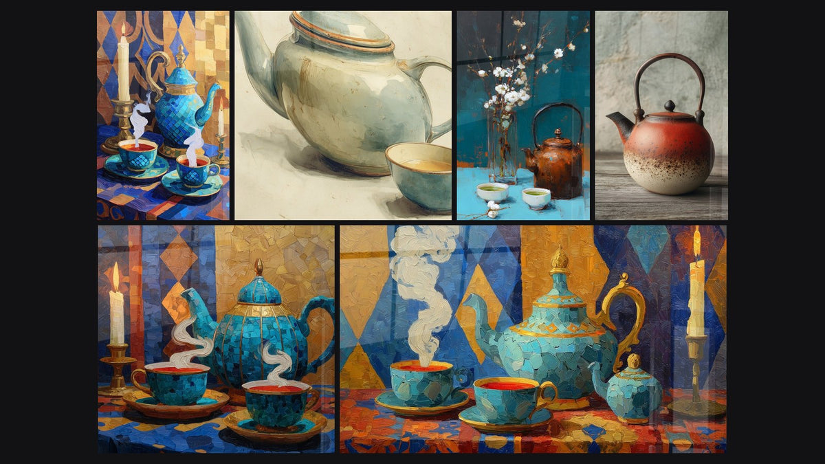
This is precisely where a piece like the azure blue tea set painting with candle and gold geometric pattern finds its place: its warm palette and square format up to 200x200 cm suit a corner wall as well as a dividing partition between two areas of the room.


Favorite
Still life painting of white porcelain and yellow roses on blue tablecloth - Refined elegance - Japanese teapot edition
From €232.90
Discover this paintingMatching the painting to the restaurant's atmosphere and menu
A painting's colour tells the story of a cuisine style before the waiter even brings the menu. Azure blue enhanced with gold evokes the elegance of a traditional tea ceremony; white porcelain on a light background sets a more contemporary sobriety, close to a minimalist tea room.
- Traditional Japanese cuisine : ornate blue teapot, golden mosaics, motifs evoking the tea ceremony.
- Contemporary tea room : watercolours in soft tones, white porcelain, yellow or pastel roses.
- Fusion or oriental restaurant : turquoise and gold tea service, bold geometric motifs.
The ornate blue teapot painting with cups and candles in a mosaic setting illustrates this ceremonial register well, while a piece such as the turquoise and gold tea service painting with colourful geometric motifs will suit better an establishment that claims a more assertive, almost luxurious oriental style.

For a softer, more subdued pastel decor, also consider a series of Japanese paintings combining several soft tones — a simple way to keep visual coherence across several walls without repeating yourself. Japanese paintings
— Our selection


Placement examples by space
Entrance and window area
The entrance of a tea room is the only place where every customer, without exception, sets their gaze. This is where a generous format makes the most sense: an XL or XXL in Dibond aluminium, visible from the street through the window, catches passers-by's attention before they even come in.
Dining room and tasting corner
Inside the room itself, it is better to distribute rather than accumulate. One painting per table zone, rather than three side by side on the same wall, lets the decor breathe and avoids a catalogue effect. One detail many restaurateurs overlook: height. The centre of the artwork should sit at the eye level of a seated customer, not a standing one.
If your menu features a specific tea service, why not reflect it directly on the wall opposite? A tableware still life with brown teapot and cherry blossoms installed near the service counter creates a subtle echo between what the customer sees and what they receive in their cup.
— Also to discover

Advice for coherent and lasting wall decor
A common mistake is wanting to change everything at once. It is better to build a lasting coherence, then let it evolve gently.
Keep a base of 2 to 3 fixed paintings that define your visual identity, and reserve a wall or small area for seasonal rotation — floral motifs in spring, warmer tones in winter.
Dedicated lighting changes everything: a spotlight angled at roughly 30 degrees avoids reflections on acrylic glass surfaces and reveals the depth of the colours. To explore the Japanese atmosphere in dining further, our article on how to integrate a geisha painting into a modern lounge offers complementary ideas on balancing tradition and contemporary style. how to integrate a geisha painting into a modern lounge
If your establishment cultivates a greener, more plant-inspired atmosphere, another option is worth a look: the sea-green tones of certain compositions pair very well with a planted decor. Our article dedicated to green-toned Japanese teapot paintings for a zen kitchen details this approach. green-toned Japanese teapot paintings for a zen kitchen

Frequently asked questions
What type of painting suits a Japanese restaurant?
Compositions centred on the tea ceremony — teapot, cups, candles, porcelain — work best because they directly reflect the culinary universe without needing any explanation.
How to decorate a tea room with wall paintings?
By building a colour palette coherence across the whole room rather than multiplying styles, and by reserving the largest formats for the most visible areas: entrance, wall facing the counter, back of the room.
What painting size should you choose for a restaurant?
It depends on the reading distance. For a wall seen from several metres away, an XL or XXL format is necessary; an L format suffices for a corridor or a more intimate alcove.
Can a painting replace a themed decor in a tea room?
Partly. A strong painting can carry much of the visual identity, but it works best combined with other coherent elements: tableware, lighting, wall colour choices.
Choosing a Japanese teapot painting for a tea room or restaurant is not merely about dressing an empty wall: it is deciding, in advance, the impression each customer will take away when they leave. Between elegant white porcelain, an ornate blue teapot or a softer watercolour, the right choice depends less on the manager's personal taste than on the story the venue wants to tell through its menu.
To explore the full range of available themes, our collection of Japanese paintings brings together the pieces best suited to professional use, from ceremonial atmosphere to contemporary serenity. collection of Japanese paintings
Explore our collections