

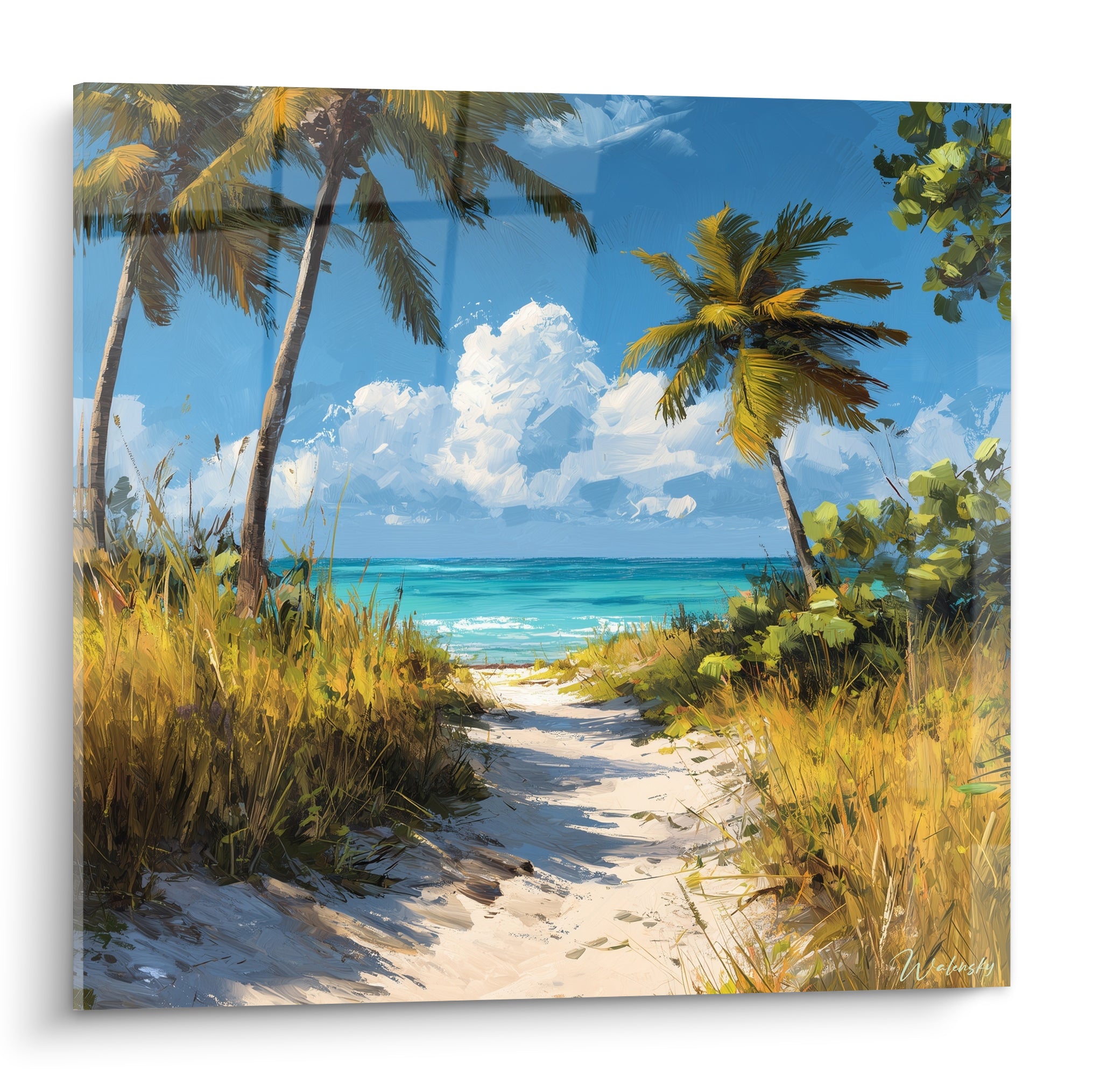






Modern home interior design: which painting to choose for your style?
6 min read · by Walensky
ART & DECORATION
You've placed the beige sofa exactly where it belonged, found the right pendant light, sourced the perfect rug. And yet, something feels off. The wall above the sofa remains bare, or worse: it holds a painting that clashes with everything else, like a lapse in taste you can't quite name.
That's often where things go wrong. We plan the furniture, the colors, the light, and treat wall art as a final touch, almost an afterthought fixed in a hurry with whichever painting is at hand. That's a mistake: in a design-led home interior, the artwork on the wall isn't an accessory, it's a pillar of the style, just as much as a sofa or a coffee table.
- The painting should extend the color palette of the room, not contradict it.
- A simple rule: the artwork should span 60 to 75% of the width of the furniture or wall beneath it.
- One strong, well-chosen piece is better than an accumulation of unrelated works.
Why choosing a painting can make or break a design interior
A design interior is judged by its coherence, not by the sum of beautiful pieces. A flawless Japandi setup loses all its logic if the painting above the bed is a grandiose landscape in saturated colors: the eye no longer knows where to rest, and the balance the rest of the room aims for collapses.
Wall art works like a signature. At a glance, it confirms or denies the style you spent weeks building. It's also the fastest element to change, and therefore the fastest to correct when something isn't right.
A design interior is never finished with furniture alone: it is signed on the walls.
The 5 design interior styles and their ideal painting
Each decor movement has its own visual grammar. The painting that suits it isn't merely a matter of personal taste: it answers to precise codes, almost unspoken rules.
Scandinavian: simplicity and soft tones
Scandinavian style relies on light and inhabited emptiness. A painting with clean lines, in a palette of off-white, pearl grey or glacier blue, works better than a busy composition. Abstract or minimalist botanical subjects fit naturally into this airy setting.
Minimalist: one piece, one impact
Here the rule is blunt: one piece, strong, with no neighbors. Minimalism does not tolerate half-measures on the wall. A graphic composition in black and white or a single geometric shape is enough to fill the whole visual field without ever cluttering it.
Industrial: contrasts and raw materials
Exposed brick, black metal, aged wood: industrial style loves pronounced contrasts. A painting in deep tones, with urban energy or bold graphic motifs, completes this setting without artificially softening it.
Boho chic: layering and warm colors
Boho chic embraces visual density: several textures, several motifs, earthy or floral colors that talk to one another. It is one of the rare styles where layering two or three paintings works, provided a shared hue ties them together.
Japandi: zen balance and clean lines
A fusion of Japanese and Scandinavian design, Japandi seeks warm restraint. Natural subjects treated with simplicity, a branch, a stylized wave, a flat earth-toned field, find their place here naturally, without ever overloading the wall composition.
For a result faithful to the spirit of Scandinavian or Japandi style, opt for a matte finish such as Alu Dibond: it avoids reflections and respects the softness these styles seek, especially if the wall faces a window.
Criteria for selecting a painting that suits your interior
Beyond style, four concrete criteria truly guide the choice: size, color palette, finish and subject.
- Size : the artwork should occupy 60 to 75% of the width of the furniture or wall it hangs above, no more, no less.
- Color palette : picking up a color already present in the room (cushion, rug, curtain) creates an immediate visual bridge.
- Finish : acrylic glass for a room with controlled light and a vibrant rendering, Alu Dibond for abundant natural light and a minimal style.
- Subject : abstract to impose nothing, figurative to tell a story. Both work, but rarely mixed within the same room.
Common mistakes that break the harmony of a design interior
Wall overload is the number one trap: hanging three or four paintings with no common thread gives an impression of clutter, even if each piece is beautiful on its own.
The second classic error is the wrong scale. A painting that is too small, lost in the middle of a large wall, looks like a sticky note; too large on a narrow wall, it crushes the room. Finally, a mismatch of tone, such as a pastel subject in an industrial living room, remains the hardest mistake to correct after the fact.
In practice: examples of living rooms and bedrooms for each style
In a Scandinavian living room with a natural linen sofa, a painting with soft shapes and neutral tones closes the composition without freezing it. In a Japandi bedroom with earthy tones and clean lines, a restrained naturalist artwork above the bed extends the calm the whole room aims for.
An industrial living room with exposed brick walls is better suited to a painting with pronounced, almost graphic contrasts that engage with the raw material rather than contradicting it. And in a boho chic reading nook, two warm-toned paintings layered together tell a story the eye takes its time to follow.
FAQ
What type of painting for a modern interior ?
A modern interior favors graphic compositions, clean lines and a restricted palette of two or three tones. Geometric abstraction works particularly well.
How to choose a painting based on your home's decor?
First identify the dominant style already in place (Scandinavian, industrial, boho…), then look for a piece that picks up its color palette and level of visual density, rather than a subject chosen at random.
What size painting for a design living room?
The proportion rule holds that the artwork should occupy 60 to 75% of the width of the sofa or the wall concerned. For a narrow wall, a custom format starting at 80x46 cm remains a relevant option.
How to harmonize several paintings in the same room?
Keep a shared hue or subject across the works, and respect a regular spacing. Boho chic tolerates layering; minimalism and Scandinavian style prefer a single focal piece.
The painting never arrives last in a successful modern home interior: it arrives on equal footing with the sofa, the table or the pendant light, as a style decision in its own right. The wall that has been taunting you since you moved in isn't waiting for a mere decorative object: it's waiting for the piece that will finally hold the whole ensemble together.


