Which rice field painting style to choose for a modern interior?
8 min read · by Walensky
RICE FIELDS PAINTING
A white wall, a linen sofa, evening light filtering through Japanese blinds. And then that empty space, right there, above the raw wood sideboard, calling out for an image. Rice fields often come naturally to mind for this spot: their curves, their gradients, their horizon that breathes. But not all rice field paintings are alike, and a poor style choice can instantly break the balance of a minimalist interior.
The direct answerFor a modern interior, the graphic minimalist style or the soft pastel watercolor blend most naturally: their clean lines and gentle tones dialogue with neutral palettes and raw materials. The realistic photographic style, denser in detail, is better suited to rooms that can absorb a strong focal point, such as a spacious living room with a clear wall.The question remains which of the three to choose, depending on your room, your light, and the atmosphere you want to create at home.
- Three major style families: realistic photographic, pastel watercolor, minimalist graphic.
- The choice depends less on the motif than on the palette and the visual texture of the room.
- A rice field painting pairs easily with other natural motifs (dragonflies, ducks, water lilies) to compose a cohesive gallery.
The rice field painting, between nature and modernity
Rice fields fascinate because they condense into a single image lines that nature took centuries to sculpt. Concentric terraced curves, a flat horizon, gradients of sage green or ochre: this motif carries an almost abstract geometry without ever losing its organic character.
It is precisely this tension between nature and structure that appeals in contemporary interiors. A living room with clean lines, a bedroom where everything breathes Japanese minimalism, a Scandinavian-Japanese-inspired dining room: these spaces look for images that don't shout but tell something. Rice fields, with their horizontal composition and visual calm, tick that box effortlessly.
A successful rice field painting doesn't just decorate a wall: it extends the silence of a room already designed to breathe.
The 3 major rice field painting styles to know
Before rushing to the first image you see, it's worth comparing the three major stylistic families. Each tells the story of rice fields in its own way, with a very different impact on a modern interior.
The photographic and realistic style
Here, material comes first: you see the water's furrow, the texture of the ears of grain, sometimes the hands of a farmer harvesting. It is the most narrative style, capturing a precise moment — a sunset setting the terraces ablaze, a dawn in crimson tones. In a modern interior, this realism works mainly as a centerpiece, on a clear wall that can absorb this visual density without being overwhelmed.
The soft pastel watercolor
Watercolor softens everything: outlines blend, colors dilute, the painter's gesture leaves areas of deliberate blur. It is the most versatile style for a minimalist interior, as it brings softness without ever weighing down the space. Powdery pink, tender green, or sandy beige tones pair especially well with linen, light wood, and the wabi-sabi style.
The minimalist graphic style
Simplified forms, flat areas of color, an almost abstract composition: the graphic style treats rice fields as a motif rather than a scene. It is the most radical choice, often close to contemporary Asian art, and the one that best matches a very stripped-back zen wall decoration — waxed concrete, raw wood, almost no ornament at all.
All three styles exist in acrylic glass (glossy surface, vibrant colors, gallery-art effect) or Alu Dibond (matte surface, no glare, softer rendering). Facing a very bright window, Alu Dibond avoids distracting reflections; in a room with subdued lighting, acrylic glass better reveals the depth of the colors.
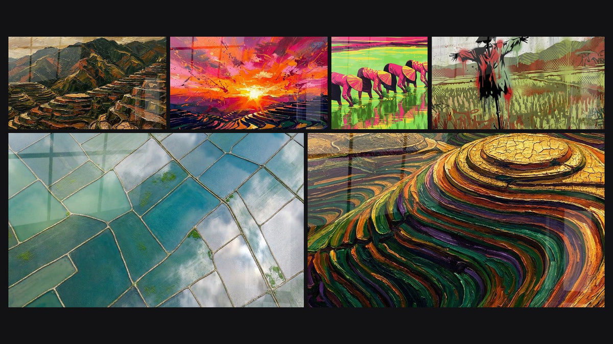
For a concrete glimpse of what the realistic style looks like in a warm palette, the dazzling sunset painting over golden terraces plays precisely on this photographic intensity:
Conversely, for a more intimate and narrative approach without falling into pure graphics, the watercolor painting of hands holding ears of rice tells the ancestral gesture of harvesting with a softness that suits a calm bedroom or hallway:

Favorite
Dazzling sunset painting over golden terraces - Symphony of Fire - Rice Fields Edition
From €232.90
Discover this paintingWhich style depending on the room and the desired atmosphere
The right rice field painting style doesn't exist in the abstract: it exists only in relation to the room it must inhabit. A bright living room tolerates more visual density than a bedroom designed for rest.
- Minimalist living room: favor a wide format in graphic or photographic style, on the main wall, facing the sofa. The rule is that a painting should occupy 60 to 75% of the width of the piece of furniture it hangs above.
- Clean adult bedroom: pastel watercolor is almost always the most restful choice, in soft tones, far from any overly busy motif. For a green rice field wall decoration in an adult bedroom, this gentle, soothing style imposes itself naturally.
- Scandinavian-Japanese-inspired dining room: the minimalist graphic style, in a palette of sage green or ochre and terracotta tones, naturally extends the natural materials already present — linen, raw wood, rattan.
If your dining room is precisely looking for this meeting of ochre and green, the terraced farmland painting in ochre and green tones captures these curves of cultivated mountainside in a palette that pairs perfectly with a Scandinavian interior warmed by wood:
— Our selection


Pairing the rice field painting with other natural elements
A single rice field painting rarely suffices to tell an entire atmosphere. Most modern interiors that work visually play on a small gallery, two or three pieces that echo each other without copying one another.
Ducks in pastel watercolor, zen frogs on a water lily, or dragonflies dancing above the water share the same color family as the rice fields: tender greens, faded blues, natural beiges. Combined on a single wall, they compose a cohesive gallery that evokes an entire Japanese garden rather than a simple agricultural scene.
To compose this gallery, keep the same medium (acrylic glass or Alu Dibond) on all the pieces of a single wall: consistency of finish matters as much as consistency of color.
This approach fits within the codes of zen wall decoration, where each natural element — water, foliage, discreet fauna — contributes to a single visual breath rather than competing with the others.
— Also to discover


Current trends: toward bolder palettes
Classic sage green remains a safe bet, but 2026 interiors are allowing themselves more incandescent rice fields. Ochre, terracotta, and sunset tones are gaining ground, driven by a more assertive taste for warm palettes in contemporary interiors.
The terraced farmland painting at sunrise in crimson and orange tones illustrates this shift well: the rice fields become almost abstract there, crossed by a light that recalls an incandescent dawn more than a calm agricultural scene.
This shift toward more dynamic colors doesn't exclude pink: certain compositions, such as women in pink garments planting rice, blend traditional scene and dreamlike palette, between magenta and deep green. A way of modernizing the motif without giving up its human and narrative dimension.
To explore these chromatic variations further, you can also turn to the modern painting collection, which gathers works playing on equally assertive palettes, beyond the rice field motif alone.

Frequently asked questions
Which rice field painting color for a modern living room?
Sage green remains the safest choice for a living room with neutral lines, but ochre and terracotta tones bring interesting warmth against very mineral furniture (concrete, stone, matte black metal).
How to match a rice field painting with Scandinavian decor?
Favor a graphic or watercolor style in soft tones, rather than dense photographic: Scandinavian-Japanese style values emptiness and simplicity, not an overload of detail.
Should you choose a realistic or abstract painting for a minimalist interior?
For a very minimalist interior, the minimalist graphic or watercolor blends more easily. Realism requires a wall clear enough to avoid visual overload — this is the question that often comes up in our article on choosing between an abstract or figurative painting.
Which rice field painting format to choose for an adult bedroom?
L (120x70 cm) or XL (140x80 cm) formats work well above a standard headboard, respecting the idea that the painting covers about 60 to 75% of the width of the furniture.
There is no 'right' rice field painting style in the abstract — only the one that extends the atmosphere already established in your home. A minimalist living room calls for an image that structures; a clean bedroom calls for an image that soothes. To go deeper and see how other zen interiors composed their wall, our article on the rice field painting in an Asian zen living room nicely completes this reflection. And if you want to directly compare styles with one another, the rice field painting collection remains the best starting point for finding the piece your wall is still missing.
Explore our collections