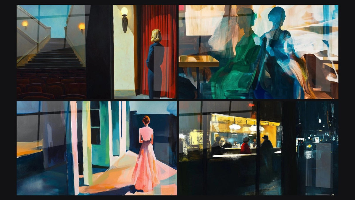
Recognizing a true Edward Hopper style: a 5-criteria reading grid
7 min read · by Walensky
PAINTINGS INSPIRED BY EDWARD HOPPER
A lonely gas station under a sky turning violet. A diner window lit like a lighthouse in the New York night. For several years now, this visual vocabulary has taken over decor shops, reproduced on mugs, posters and paintings. But between a genuine tribute to Edward Hopper and a mere "vintage American" mood with no real lineage, there is a world of difference, and most buyers don't know how to see it.
The short answerA true Hopper-style painting can be recognized by five precise signs: raking light that carves out sharp shadows, a highly structured geometry of facades and windows, isolated human figures who never look at each other, a restrained palette dominated by muted yellows, nocturnal blues and somber reds, and a framing that keeps the viewer at a distance, as if seen through a pane of glass. A generic "vintage American" imitation often borrows the colors without the rigor of composition.- Raking light and drawn shadows are the easiest signature to spot.
- Facades and windows follow a strict, almost architectural geometry.
- The figures are isolated, never in direct interaction with the viewer's gaze.
- The palette stays deliberately restrained, not a riot of "retro" tones.
Why not every "American mood" painting is Hopper
The misunderstanding comes from confusing an era with a style. American life of the 1930s to 1950s, with its chrome diners and Esso gas stations, has become an aesthetic backdrop that is easy to recycle. But Edward Hopper was not an illustrator of nostalgia: he was a painter of American realism, trained in the wake of the Ashcan School, obsessed with light and urban solitude far more than with retro charm.
A painting that multiplies colored neon signs, convertible cars and jukeboxes without thinking about composition is not Hopper: it is pastiche. The difference lies in how the image is constructed, not in the props it contains.
Criterion 1: raking light and its drawn shadows
Light in Hopper never floats: it cuts. It always arrives from one side, often low, like the sun at the end of the day or a neon light at night, and it carves shadows with sharp, almost geometric edges across walls and sidewalks.
On a true Hopper-inspired painting, you should be able to trace with your finger the exact line where the shadow begins. If the light is diffuse, soft, with no clear direction, that is the first warning sign: the work borrows the mood without the technique.
This raking light works particularly well printed on acrylic glass, whose glossy finish accentuates the contrast between lit areas and shadow, an effect close to what the painter himself sought.
Criterion 2: the geometry of facades and windows
In Hopper, architecture is never mere backdrop: it structures the entire canvas. Facades are treated in flat planes, windows form regular grids, and roof and cornice lines draw clean diagonals that organize the gaze.
Look for these signs of architectural composition:
- Rectangular windows aligned in rows, rarely rounded or whimsical
- Flat, solid areas of color on the walls, without added decorative texture
- A horizon or roofline that cuts the image cleanly
- Few or no superfluous ornamental details
A generic imitation tends to overload facades with picturesque details, signs, exposed bricks, electrical cables, whereas Hopper strips things down to the essential.
Criterion 3: the absence or isolation of human figures
The gaze that never meets ours
A Hopper character never looks at the viewer. They look through a window, into empty space, or simply elsewhere. This detail, tiny as it seems, changes everything: it establishes distance, a sense of discreet voyeurism rather than complicity.
Silhouettes as compositional elements, not as narrative
The figures do not tell a precise story. They occupy a space, like one geometric form among others. We never really know what they are thinking, and that is intended.
It is not solitude that makes Hopper. It is the way solitude is composed, framed, almost architected.
The painting inspired by Summer Evening by Edward Hopper No. 2 – Famous Artist Tribute illustrates this principle well: the female silhouette occupies the space without ever soliciting the viewer's gaze, integrated into the structure of the setting more than into a narrative scene.

Favorite
Painting inspired by Nighthawks by Edward Hopper No. 2 – Famous Artist Tribute
From €273.90
Discover this paintingCriterion 4: the restrained, high-contrast palette
Hopper works with few colors, but pushes them to the limit. Recurrently we find muted yellows close to electric light, deep nocturnal blues, cool sea greens and sometimes a somber red placed like an isolated note.
What betrays an imitation is often the opposite: an overly wide, oversaturated palette, where every American vintage color is summoned at once, cherry red, turquoise, mustard yellow, silver chrome, without hierarchy or restraint.
Criterion 5: cinematic framing and distance
Hopper often composes as if filming through a window: the viewer is outside the scene, slightly low-angled or in a wide shot, never at the heart of the action. This distance creates an almost voyeuristic effect, the sensation of watching without being seen.
The panoramic format lends itself particularly well to this effect of an extended static shot, letting the architectural space breathe around the figures rather than zooming in on them.
Comparison: true Hopper style vs generic imitation in our paintings
Let's apply the grid to concrete examples. The original Nighthawks, with its lit diner isolated in the urban night, alone concentrates all five criteria: electric raking light, the geometry of the storefront, characters who do not look at each other, a restrained yellow-blue palette, and a static shot from outside.
| Criteria | True Hopper style | Generic "vintage" imitation |
|---|---|---|
| Light | Raking, directional, sharp shadows | Diffuse, no clear source |
| Architecture | Flat planes, strict geometric lines | Overloaded decorative details |
| Figures | Isolated, averted gaze | Posed, sometimes smiling toward the viewer |
| Palette | 2-3 muted dominant tones | Multicolored and saturated |
| Crop | Static shot, distance maintained | Centered composition, no distance |
The painting inspired by Edward Hopper's Chop Suey No. 2 – Famous Artist Homage, inspired by Chop Suey, and the painting inspired by Edward Hopper's New York Movie No. 1 – Famous Artist Homage, inspired by New York Movie, follow this same logic: structured interiors, figures absorbed in their thoughts, a restrained palette. To explore the journey and obsessions of the painter behind these codes, our biography of Edward Hopper traces his path as the painter of American emptiness.
If you're unsure about the finish, know that acrylic glass heightens the light contrasts typical of this style, while matte Dibond aluminum softens the contrasts slightly for a very bright room. Both work, depending on the exposure of your wall.
Frequently asked questions
What defines Edward Hopper's style?
Very directional raking light, architecture rendered in geometric flat areas, isolated figures, and a framing that keeps the viewer at a distance, like an outside witness.
How do you tell whether a painting is inspired by Hopper or just vintage?
Check the rigor of the composition: a true lineage keeps a restricted palette and strict architectural geometry, whereas generic vintage multiplies props and colors without structure.
What colors did Edward Hopper use?
Muted yellows evoking artificial light, deep nocturnal blues, sometimes cold greens and somber reds, always in limited number.
Why do Hopper's figures seem so isolated?
Because they never look at each other or at the viewer: they are treated as compositional elements, not as protagonists of a story.
Conclusion
The next time an "American mood" painting catches your eye, run it through these five criteria. Light, geometry, solitude, palette, framing: this grid, rather than nostalgia for a chrome diner, is what distinguishes a true homage to Hopper from an imitation without memory. To see these codes applied with rigor, our collection of paintings inspired by Edward Hopper gathers the most faithful variations on this universe, so you can choose something that holds up well beyond the retro effect.
Explore our collections