

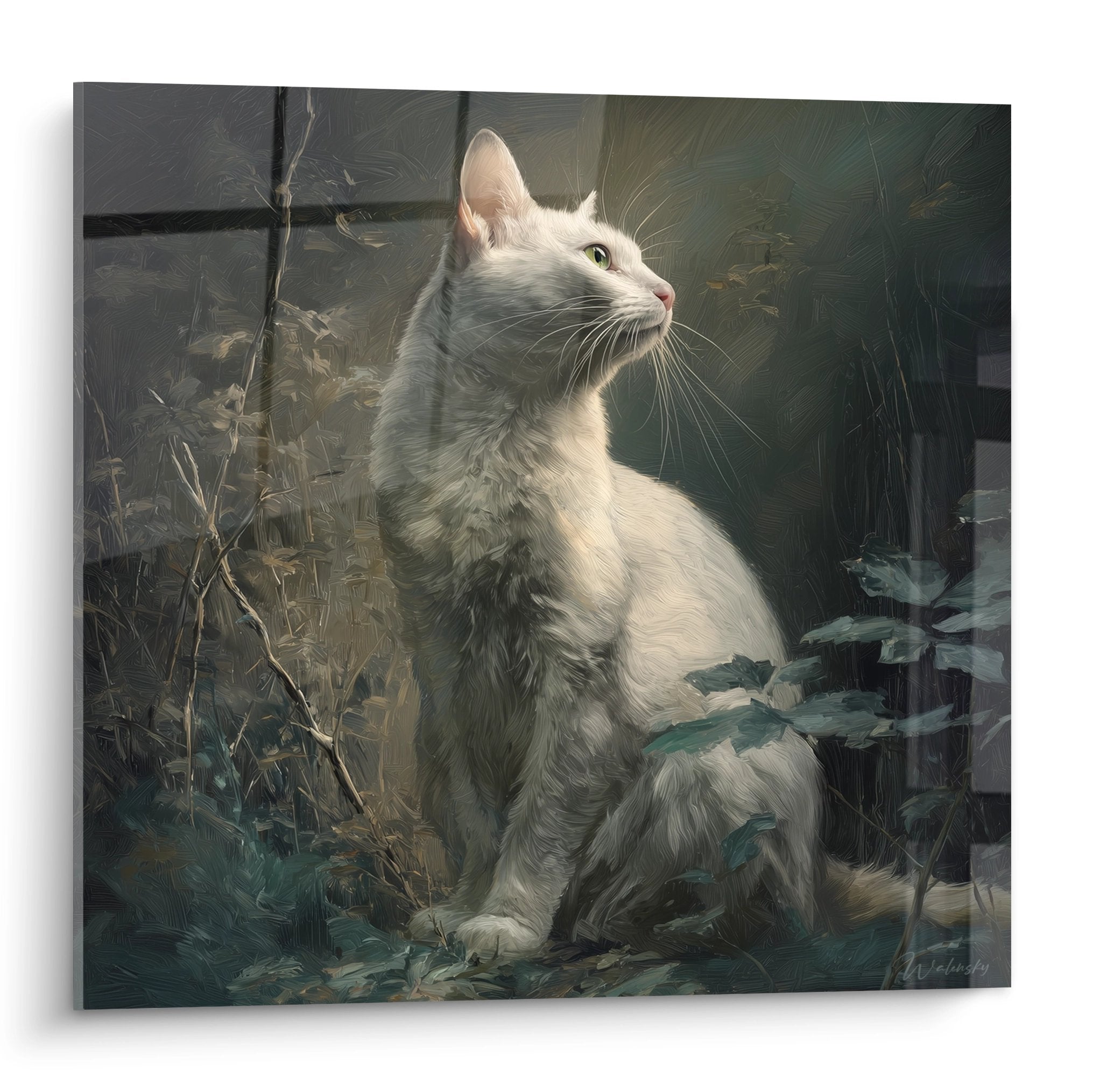






Highlight Your Subjects with a High-Contrast Wall Art
October 11, 2025 · 14 min read · by Walensky
You've just hung your new favorite artwork on the living room wall, but something feels off. The piece seems to blend into the background, losing its brilliance, as if it has become invisible.
This frustrating feeling of seeing your artistic investment remain unnoticed gnaws at you. You had imagined this room transformed, sublimated by this acquisition, but the result is bland and disappointing.
You may have tried changing the lighting, moving some furniture, but nothing seems to work. The artwork remains in the shadow of your decor, always failing to reveal its true potential.
Rest assured, it's not your fault. The real reason for this failure? You haven’t yet mastered the art of decorative contrast, a technique passed down through generations that makes all the difference between a bland decor and a striking interior.
By the end of this article, you will know exactly how to create a powerful contrast that reveals the beauty of your artworks and transforms your space into a true personal gallery.
Why is contrast the secret weapon of interior designers?
Contrast in decor works exactly like a theater spotlight. Without it, even the most talented actor remains invisible in the darkness. Your artwork, however beautiful it may be, needs this contrasting staging to reveal all its splendor and captivate the eye.
🎨 Testimony of a transformation: Sarah, an enthusiast of contemporary art, had an abstract canvas with vibrant red tones that she adored. Hung on her beige wall, the artwork seemed dull and lifeless. By daring to paint this wall matte black, she created a striking contrast immediately transforming her living room into a modern gallery.
Conversation with a decor expert
Golden rule of contrast: The greater the difference between your artwork and its background, the more presence and visual impact the piece gains. A visible result from the first glance.
What’s really behind an artwork that “doesn't stand out”
Does your situation seem familiar? Your artwork blends into the wall, guests pass by without noticing it, and you wonder if you really made the right artistic choice.
In reality, the problem isn't your taste or the quality of the artwork. It’s a problem of visual readability: your brain processes decorative information as a uniform set instead of distinguishing important elements.
It's exactly like trying to read black text on dark gray background: technically possible, but exhausting for the eye. Your artwork deserves better than involuntary camouflage.
First trap: the tyranny of total harmony
Contrary to popular belief, too much harmony kills harmony. A room where everything matches perfectly becomes monotonous, lacking relief and personality. Your eye has nothing exceptional to discover.
Imagine an orchestra where all instruments play the same note: technically correct, but terribly boring. Contrast is that different note that creates the melody.
This "everything matches" approach deprives you of decorative emotion and turns your interior into a store catalog. As a result, your artistic personality completely disappears.
🔍 Immediate test: Stand at the entrance to your room and count how many seconds it takes you to spot your artwork. More than 3 seconds = unsufficient contrast!
Second revelation: the illusion of the "neutral wall"
You think a white or beige wall is neutral? That's the biggest mistake in decoration. These colors have a chromatic temperature that directly influences the perception of your artwork.
A "neutral" wall acts like a photographic filter: it subtly alters all the colors of your work, often dulling or unbalancing them.
This apparent neutrality makes you lose 30% of the visual impact of your artwork and explains that feeling of "something missing" in your decoration.
Third secret: the effect of visual saturation
Your eye quickly gets used to its environment. A painting on a wall of similar color gradually becomes invisible due to visual habituation.
That's why this artwork that amazed you in the gallery seems to lose some of its magic at home: it lacks visual shock to maintain your attention on a daily basis.
Without sufficient contrast, your brain literally "forgets" the presence of your artwork after a few weeks.
3 alarm signals to watch out for:
- The chameleon effect: Your painting seems to change color depending on the time = background too neutral
- Family forgetfulness: Your loved ones no longer notice the artwork = blatant lack of contrast
- Photographic disappointment: The painting doesn't look good in photos = problem of visual readability
The trigger factor: the theory of focal point
The real secret lies in creating a dramatic focal point. Like a visual magnet, contrast irresistibly attracts the gaze and prioritizes your decoration. Without it, everything is equal, something doesn't stand out.
The revisited 60-30-10 rule: 60% dominant color, 30% secondary color, and 10% powerful contrast to reveal your artworks. Quick test: photograph your wall from the entrance.
| ❌ Classic approach | ✅ Contrast mastery | 💡 Explanation | 🎯 Visible benefit |
|---|---|---|---|
| "I want everything to match perfectly" | "I create a staging for my favorites" | Contrast gives relief and personality | Unique and memorable interior |
| "A white wall goes with everything" | "Each color reveals my art differently" | Colors interact and enhance each other | More intense and expressive artwork |
| "It's too risky to play with colors" | "Controlled contrast is elegant and sophisticated" | Technique used by all great decorators | Professional and refined decoration |
| "My artwork should blend into the whole" | "My work deserves to be the hero of the room" | Decorative art requires specific highlighting | Artistic investment with a return on investment |

The progressive method to create a striking contrast
Creating an effective contrast follows a simple logic: analyze, choose, apply. Like a chef who balances flavors, you will learn to dose the visual effects to reveal the beauty of your paintings without ever falling into excess.
🎯 Overview of the transformation: Step 1 = analyze your painting and its environment, Step 2 = choose the most flattering type of contrast, Step 3 = apply the technique with finesse. Each step reveals a little more of the potential of your work.
Step 1: Decipher your painting like an expert
Before any transformation, you must understand your artwork as a detective analyzes a scene. This diagnostic phase will avoid costly mistakes and give you confidence for the next step of your decorative project.
Necessary analysis tools
- Color wheel or color application: Identify precisely the dominant shades of your painting. Avoid "eyeball" approximation which often distorts perception. A good color wheel costs less than 10€ and transforms your decorative approach.
- Neutral white lighting (4000K LED): The color temperature radically changes the perception of tones. Lighting that is too warm or too cold leads you astray about the true colors of your painting.
- Visual notes notebook: Note your observations at different times of the day. Natural light reveals nuances that you don't suspect in the evening.
Let's move on to the analysis proper
Complete diagnosis of your artwork
Identify the dominant color: Observe your artwork from 2 meters away and note the first color that catches your eye. This main hue will determine all of your contrast choices. Ignore the details for now.
⏱️ Time: 5 minutes | ✅ Success when: You can name this color without hesitation | ⚠️ Attention: Don't confuse dominant color and favorite color
Measure the overall intensity: Is your artwork rather dark, bright, or in mid-tones? This crucial information influences the choice of contrast. A dark artwork on a dark wall = guaranteed invisibility.
⏱️ Time: 3 minutes | ✅ Success when: You locate your work on a scale from 1 (very dark) to 10 (very bright) | ⚠️ Attention: Current lighting may distort your evaluation
Evaluate the chromatic temperature: Does your artwork convey a rather warm impression (reds, oranges, yellows) or cold (blues, greens, violets)? This characteristic determines the most effective type of contrast.
⏱️ Time: 2 minutes | ✅ Success when: You clearly feel the thermal atmosphere | ⚠️ Attention: Some artworks mix both, identify the dominant one
✅ Validation of step 1: You must be able to describe your artwork in one sentence: "Artwork with a [color] hue of [dark/medium/bright] tone with a [warm/cold] atmosphere". If it's blurry, restart the analysis with better lighting.
— Our selection


OUR RECOMMENDED PRODUCTS
Step 2: Choose your contrast strategy
Now that you know your artwork, you're going to discover the 4 most effective types of contrasts. Each produces a different effect: dramatic, sophisticated, energizing or soothing. The choice depends on the atmosphere you want to create.
The 4 expert contrast strategies
- Chromatic contrast (opposite colors): Use the complementary color of your artwork on the wall. Immediate and spectacular effect. Red with green, blue with orange. Be careful not to saturate the space. Value contrast (light/dark): Light artwork on a dark wall or vice versa. The safest technique for beginners. Guaranteed impact without risk of bad taste. Particularly effective with monochromatic works. Temperature contrast: Warm artwork on a cold wall or vice versa. Creates a sophisticated visual tension. Widely used in high-end contemporary interiors. Texture contrast: Wall with textured effect (concrete, wood, metal) behind smooth artwork. Adds a tactile and modern dimension. Requires more technical mastery.
Choose the strategy that suits your artwork
Test chromatic contrast: Identify the opposite color on the color wheel and visualize the result. If your artwork contains a lot of red, imagine it on a sage green wall. The effect should seem balanced, not aggressive.
⏱️ Time: 10 minutes | ✅ Successful when: The combination seems harmonious and dynamic | ⚠️ Attention: Avoid colors that are too saturated as they tire the eye
Evaluate value contrast: If your artwork is predominantly light, consider a dark wall (anthracite, black, navy blue). If it's dark, opt for a light wall (off-white, warm beige, pearl grey). Mentally test the result.
⏱️ Time: 8 minutes | ✅ Successful when: You can clearly visualize your artwork "standing out" from the wall | ⚠️ Attention: A contrast that is too violent can make the whole thing aggressive
💡 Strategic validation: Your choice should answer this question: "Does this contrast highlight MY artwork without stealing the show?" The background should reveal the work, not compete with it.
🏆 Step 3: Masterful application of your contrastApplication requires method and progressiveness. Like a painter who builds their artwork in successive layers, you will create your contrast step by step, always keeping the possibility to adjust the intensity.
Materials for perfect application
- Large format paint samples: Order testers of at least 20x20cm. Small samples do not give a realistic view of the final result. Investment: €15-€25 to avoid a €200 mistake.
- Directional accent lighting: Adjustable LED spotlight to test the effect of your contrast under different lighting conditions. The rendering changes drastically between day and night.
- High quality masking tape: To precisely define the test area. Cheap tape can damage your current wall or leave traces.
Professional application protocol
Full-size test: Attach your sample behind the artwork and observe the rendering for at least 3 days. Colors evolve according to natural light and your perception becomes more refined over time.
⏱️ Time: 3 days of observation | ✅ Successful when: The result pleases you as much in the morning as in the evening | ⚠️ Attention: Don't rely on first impressions, which are often misleading
Progressive adjustment: If the effect seems too intense, opt for a softer version of your color (adding white or grey). If it is too timid, intensify slightly. The goal: impact without aggression.
⏱️ Time: 1-2 days of refinement | ✅ Successful when: The balance seems perfect to you | ⚠️ Attention: Each modification requires a new visual adaptation time
Methodical final application: Carefully prepare the wall, apply a primer if necessary, then your color in 2 thin coats rather than one thick. The uniformity of the result depends on this method.
⏱️ Time: 1 full day | ✅ Successful when: The color is uniform and the artwork perfectly highlighted | ⚠️ Attention: Always work with sufficient and constant lighting
Rule of progression: Never move on to the next step until you are completely satisfied with the current one. A successful contrast should give you a "love at first sight" every time you enter the room.
You now master the basics of contrast. Here are the expert secrets that transform a good result in true mastery. These subtleties make the difference between an amateur and a professional decoration.
💎 Professional decorator tip: Create a "contrast halo" by painting only the area directly behind your artwork (the "color blocking" technique). Spectacular effect with a lesser impact on the entire room. Perfect for testing before committing to the whole wall.
"But what if I get tired of this color in a few years?"
"I'm afraid of regretting such a marked choice..."
This concern is totally understandable! In reality, a well-chosen contrast ages better than a neutral color. Why? Because it creates a true decorative signature that gains in character over time. Plus, you can always evolve your collection of artworks to renew the atmosphere.
🎯 Reassuring solution: Start with the "partial accent wall" technique: only the area behind your artwork changes color. You test the effect without a major commitment and can extend or modify according to your wishes.
— You may also like


The 5 mistakes that ruin everything (and how to avoid them)
Attention! These traps are tempting but devastating for your project. I reveal them to you to protect your decorative investment and save you from costly regrets. Rest assured, these errors are common but perfectly avoidable with the right information.
- ⚠️ The "catalog" contrast: Copying exactly an association seen in a store without taking into account your specific artwork. Each work has its personality and deserves a custom treatment. Result: faded and impersonal effect. Alternative: get inspired but always adapt to your situation.
- 🚫 Chromatic overconfidence: Applying the final color directly without prior testing. The lighting in your home changes everything! Consequence: major disappointment and rework. Solution: always test for at least 72h before you start.
- ❌ Neglecting lighting: Forgetting that your contrast must work day AND night. A beautiful color during the day can become dull in the evening under artificial light. Provide accent lighting to sublimate your creation.
- ⛔ Impatience of the result: Judging the final effect immediately after application. Your eye needs 3-7 days to get used to the novelty. Many "failures" are actually successes judged too hastily.
- 🔴 Forgetting the rest of the room: Creating a contrast that works with the painting but clashes with existing furniture. Your accent wall must harmonize with the whole. Think global, act local.
🛡️ Anti-error verification system: Before final application, photograph your test and show it to 3 different people. Ask them what they notice first in your room. If it's your painting, you’ve won! Warning signs: hesitations, grimaces, or comments about "the color of the wall" rather than about "the beautiful painting".

In the same vein
Architecture Wall Art Stairs of Infinity - Trompe l'Œil Edition
233,90€
Discover this artwork →Your expert questions on decorative contrast
Realistic budget: 50-150€ to transform a standard wall (paint + supplies). Time to complete: 1 weekend for a professional result. Economical tip: start with a partial "color-blocking" behind your painting only, budget divided by 3 and guaranteed effect. The result will amaze you as soon as it is completely dry.
On the contrary! A mastered contrast visually enlarges the space in creating depth. Secret: use a value contrast (light/dark) rather than chromatic in small rooms. The accent wall “recedes” visually and your painting becomes a window to another space.
Identify the color that occupies the largest area in your painting (not necessarily the brightest). Work the contrast with this dominant color. Sophisticated alternative: choose the complementary color of the one you want to highlight specifically in the artwork.
Gentle solution: add a colored glaze (very diluted paint) to soften a contrast that is too violent, or ambient lighting to warm/cool the whole. Radical but economical solution: transform your "mistake" into a base for a gradient or textured effect.
Your decorative transformation begins now
In a few weeks, you will enter your living room with a smile of pride. Your painting, finally revealed by its perfect contrast, will captivate every eye and elicit compliments from your guests. This artwork that you already loved will become the living heart of your decor.
Beyond visual beauty, you will have developed an eye for decoration. This understanding of contrast will transform your approach to interior design and give you the confidence to dare other decorative boldness. Your interior will never be ordinary again.
The hardest part was understanding the mechanism of contrast. Now that you master it, start by carefully observing your painting in this new reading grid. Your first transformation will surprise you with its simplicity and effectiveness.
✨ Your first step towards excellence: This weekend, place a large colored cardboard behind your painting and immediately discover the magic of contrast. Your dream decor is just one color away!
Explore our collections


