

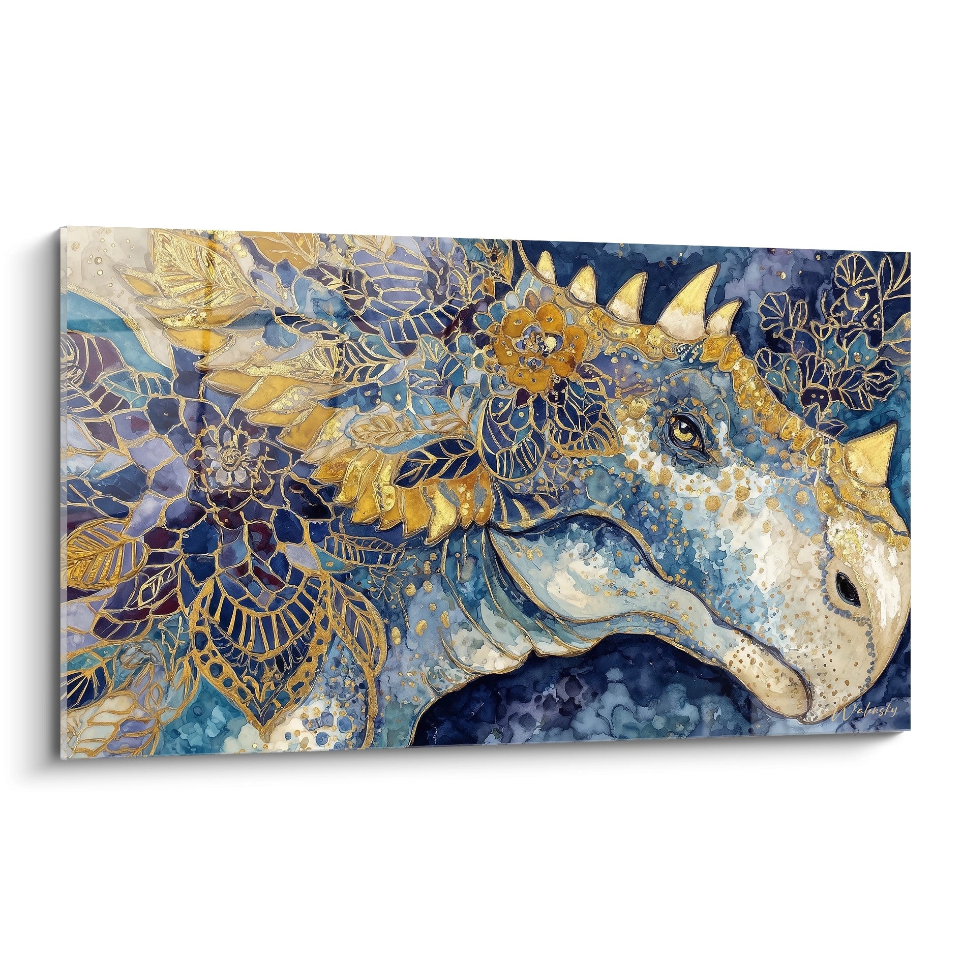






Duplex rental: using paintings to visually connect the two levels
June 1, 2026 · 11 min read · by Walensky
The first time I stepped into a poorly planned duplex, I immediately felt that unpleasant sense of fragmentation. The lower floor seemed to belong to one apartment, the upper floor to another universe. Two spaces coexisting without ever speaking to each other, linked by a cold staircase that felt more like a border than a connection. For short-term rental owners, this visual disconnect between the two levels can turn a potentially magical stay into an ordinary, disjointed one.
Here is what the strategic use of paintings to visually connect the two levels of a duplex delivers: a narrative coherence that guides the eye through the space, an impression of amplified volume that enhances your property, and a memorable visual identity that generates enthusiastic reviews.
The problem is that most owners think about decoration floor by floor, as if they were furnishing two separate apartments. The result: an accumulation of decorative elements with no guiding thread, where each level tells its own story without any dialogue with the other. Guests subconsciously perceive this incoherence, and it directly affects their overall impression.
But don't worry: creating a harmonious visual link between the two levels of your rental duplex requires neither a degree in interior architecture nor a huge budget. It simply takes understanding a few fundamental principles about how the eye moves and applying a consistent strategy in choosing and placing your artworks.
I'll show you how to transform this dividing verticality into an architectural asset that unites, using paintings as visual bridges between your two levels.
The untapped power of vertical dialogue
In a rental duplex, the staircase is not merely a functional passage: it is the nerve center of your decorative strategy. This is where the first impression of continuity or, on the contrary, of rupture is decided. When a guest climbs these steps, their gaze naturally sweeps the adjacent walls, seeking visual landmarks that reassure them about the coherence of the space.
The key lies in creating a visual narrative thread that accompanies this ascent. Imagine a sequence of three paintings arranged along the stairwell: the first, at ground level, features deep ocean tones with touches of coral; halfway up, a second painting picks up this coral as its dominant color while adding golden notes; finally, upstairs, a third painting makes these golds interact with luminous whites. You have just created a chromatic progression that naturally guides the eye and unifies both levels.
This gradual transition technique also works with themes. A duplex I recently advised used a series of botanical photographs: roots and trunks at the bottom, foliage halfway up, flowers and sky at the top. This plant metaphor created a symbolic ascent that tenants found soothing without consciously understanding the mechanism.
Dialogue zones never to neglect
Beyond the staircase, identify the visual axes that naturally connect your two levels. From the living room sofa, what can be seen of the mezzanine or the upstairs bedroom? From the upper railing, which painting on the lower level falls directly within your field of view? These lines of sight are your valuable allies.
Strategically place paintings at these points of visual intersection, making sure they share at least one common element: a color palette, an artistic style, a similar energy. An abstract painting with dynamic lines below can dialogue with a geometric work above, even if their compositions differ. It is this subtle resonance that creates harmony without falling into repetition.
The three-color-chord rule
Let's now turn to the most effective method for visually unifying a rental duplex through paintings: the three-color-chord rule. The principle is simple yet powerful: choose three colors that will form the backbone of your vertical decoration.
Your dominant color (60% of your chromatic presence) should appear in at least one painting on each level. It creates the main visual anchor. Your secondary color (30%) brings variation and richness, while your accent color (10%) creates the points of punctuation that capture the eye and generate interest.
In a bright duplex with white walls, I recently applied this formula with petrol blue as the dominant, terracotta as the secondary, and brushed gold as the accent. On the ground floor, a large abstract painting in the living area displayed broad petrol-blue areas with terracotta touches. The golden accents appeared more discreetly in both works, creating subtle echoes that unify without becoming tiresome.
This strategy works particularly well for rental duplexes because it allows each level to be personalized while maintaining overall coherence. The living room can have a more lively, social atmosphere, the bedroom a calmer, more intimate one, but the paintings ensure the chromatic link that makes the whole a harmonious space.

Playing with scale: from monumental to detail
A common mistake in rental duplexes is using similar formats for all the paintings. Yet it is the variation in scale that creates visual rhythm and guides the eye from one level to the other.
On the lower level, generally more spacious and social, dare a monumental format that asserts the character of the space. A large 120x80 cm painting above the sofa creates a strong focal point that visually anchors the ground floor. This generous format brings presence and personality to your rental.
Upstairs, where spaces are often more intimate and the ceiling sometimes sloped, favor medium and small formats that respect the more compact proportions. A series of three 40x30 cm paintings in the bedroom creates a refined gallery effect without overwhelming the space. This difference in scale between the levels is not an inconsistency: it is an intelligent adaptation that respects the function and proportions of each area.
The link is then made through colors and themes rather than formats. A large abstract seascape below can dialogue with a small still life in similar tones above. The variation in scale even becomes an asset: it avoids monotony and creates a visual hierarchy that structures the spatial experience.
The effect of perceived multiplication
Here is a secret few owners exploit: in a duplex, paintings reflect each other, are partially visible from different angles, and create effects of visual multiplication. A painting placed facing the staircase will be glimpsed several times during the climb, from different angles. This natural repetition amplifies its impact without any extra effort on your part.
Make the most of this phenomenon by choosing works that benefit from being seen at different angles and distances. Geometric abstracts, rich textures, layered compositions work particularly well under these conditions. They reveal different details depending on whether you observe them up close or from afar, from below or from above.
— Our selection


The narrative journey technique
Turn your rental duplex into an immersive experience by creating a narrative journey through your paintings. This approach goes beyond simple aesthetic coordination: it tells a story that your guests will discover progressively.
Imagine a seaside duplex. On the ground floor, your paintings evoke the shoreline: beach, breaking waves, golden sand. Halfway up the stairs, a transitional painting shows the horizon where sea and sky meet. At the top, in the night space, your works depict the sky, clouds, perhaps stars. You have just created a thematic progression from earthly to celestial that naturally follows the vertical architecture of your duplex.
This narrative can be literal, with photographs or figurative illustrations, but it works just as well in an abstract way. A journey through the seasons, a shift from day to night, a transition from mineral to vegetal: each is a narrative thread that adds depth to your decoration and creates that visual cohesion between the two levels.
The advantage for short-term rentals is twofold: on one hand, this strategy gives your property a strong identity, making it memorable and encouraging recommendations; on the other, it creates an immersive experience that justifies a higher pricing position.

The fatal mistakes that break continuity
As important as knowing what to do, let's understand what must absolutely be avoided so as not to sabotage the visual link between your two levels.
The first mistake is a radical change of style between floors. A ground floor decorated with minimalist black-and-white photographs cannot dialogue harmoniously with an upstairs covered in colorful floral canvases in English cottage style. This stylistic dissonance creates visual confusion that destroys all coherence in your rental duplex. Choose one artistic direction and stick to it throughout, even if you vary the themes.
Second pitfall: excessive accumulation at the expense of breathing room. Some owners, wanting to do well, multiply paintings to the point of visually saturating the space. In a duplex, this overload is even more problematic because it prevents the eye from moving freely between the levels. Always prioritize quality over quantity : five well-chosen and strategically placed paintings will create more cohesion than fifteen works scattered without logic.
Third fatal mistake: ignoring natural light in your placement strategy. A dark-toned painting placed in a poorly lit corner upstairs will never dialogue effectively with a bright work below bathed in sunlight. Observe how light moves through your duplex at different times of day, and place your paintings so they remain visible and showcased.
The overloaded wall syndrome
In rental duplexes, the temptation is strong to furnish every available wall, especially in the stairwell where the vertical surface is considerable. Resist this impulse. An overcrowded staircase wall turns the passage into a stifling gallery. Prefer an airy composition with generous gaps between works, allowing each one to breathe and the eye to move freely.
This restraint paradoxically creates more impact: each painting becomes an anticipated visual event rather than an element lost in the mass. Your guests will appreciate this refined simplicity that respects the architecture of your property.
Transform your rental duplex into a coherent visual experience
Discover our exclusive collection of Airbnb paintings that naturally create visual dialogues between your spaces.
— Also to discover


From concept to reality: your four-step action plan
Now let's move on to concrete implementation. How can you transform your rental duplex into a visually unified space with paintings? Follow this progressive method, which has proven its worth.
Step 1: Map your lines of sight. Before any purchase, spend thirty minutes in your duplex identifying all the viewpoints that connect the two levels. Sit on the sofa and look toward the upper floor: what do you see? Go upstairs and lean over the railing: which walls of the ground floor fall within your view? Photograph these views: they will determine your strategic locations.
Base your choices on the colors already present in your furniture and textiles. Identify a color you like that is already there as the dominant, then choose two complementary colors that will create your unifying palette. Note these three colors: they will guide all your painting choices.
Step 3: Start with the visual anchors. First invest in two key paintings: a large format for your main living area below, and a medium format for your main space upstairs (bedroom or mezzanine). These two works must absolutely share your chromatic palette defined in step 2. They will form the visual pillars of your strategy.
Step 4: Complete with the visual bridges. Once your anchors are in place, gradually add connecting paintings: in the staircase, in the corridors, in transitional zones. These secondary works should pick up elements from the main paintings, creating the subtle connections that unify the whole. Proceed in small touches, checking after each addition that you are reinforcing coherence rather than diluting it.
This methodical approach spares you impulse purchases and costly mistakes. It gradually builds a solid visual coherence that will genuinely transform the experience of your guests in your duplex.

In the same spirit
Painting inspired by Edward Hopper's Chop Suey No. 1 – Tribute to a Famous Artist
€233.90
Discover this painting →When detail changes everything: the finishes that unify
Finally, let's discuss an often overlooked yet decisive aspect: the choice of frames and hanging. In a duplex, where the goal is to create visual continuity between two levels, these technical details become strategic elements of cohesion.
Opt for uniform finishes across your frames. If you choose light natural wood for your main living room painting, maintain this finish for the upstairs works, even if the formats vary. This material consistency creates a discreet but effective common thread that strengthens the unity of the whole.
The contemporary alternative, particularly suited to modern short-term rentals, is to eliminate frames altogether. Paintings on thick stretcher bars, with the edges painted in continuation of the artwork, create a contemporary gallery effect that naturally runs through all the levels. This option also has the practical advantage of holding up better to wear in a rental context.
As for hanging height, maintain consistency in your alignments. If you hang your ground-floor paintings at standard height (centre of the artwork 1.60 m from the floor), follow the same logic upstairs, adapting it of course to architectural constraints such as sloped ceilings. This regularity of alignment, even if unconsciously perceived, contributes to the feeling of order and harmony.
Now imagine your duplex transformed: a traveler pushes open the door, and immediately their eye catches a reassuring visual coherence. Climbing the staircase, they discover a chromatic dialogue that naturally guides them upstairs. From the bedroom, they glimpse the painting in the living room below and feel that continuity that turns the space into a true temporary home. This fluid visual experience will translate directly into their enthusiastic reviews and their willingness to recommend your property.
Strategically using paintings to visually connect the two levels of a rental duplex is not just a matter of aesthetics: it is a smart investment in the overall perception of your property, its memorability and, ultimately, its profitability. Start today by mapping your sightlines, defining your unifying palette, and laying the first foundations of that visual cohesion that will make all the difference.
Frequently asked questions
How do you visually connect the two levels of a duplex?
By treating the staircase as the heart of the décor. A sequence of paintings that progresses in color from bottom to top guides the eye and unifies the levels. The same effect can be achieved through theme: roots and trunks at the bottom, foliage at mid-height, flowers and sky at the top.
Should the paintings be the same size on both floors?
No, and that is even a common mistake. The lower level, more spacious and social, can support a monumental format that anchors the space, for example a 120x80 cm painting above the sofa. Upstairs, often more intimate or under the eaves, a series of smaller formats better respects the proportions.
How many colors should you use to harmonize a duplex's décor?
Three is enough: a dominant color present in at least one painting on each level, a secondary color that adds variation, and an accent color that punctuates and catches the eye. Reversing the proportions from one floor to the next personalizes each space while maintaining the chromatic link.
Where can you hang paintings outside the staircase?
Identify the sightlines that connect the levels: what you see from the mezzanine from the sofa, or from the ground floor from the railing. Place the works at these intersections, giving them at least one common point, palette, style or energy, without making them identical.


