

You come home after a long day, you push open the door to your living room open onto the kitchen, and that feeling washes over you again: the whole space blends together, no area has its own identity, your gaze doesn't know where to settle...
Your loft or open space seemed so promising at first! This feeling of space, modernity, freedom... But today you realize that living in a large volume without demarcation is like trying to cook in a living room or relax in a dining room.
You may have already tried some solutions: screens that fall over, cluttered shelves that block the light, or rugs meant to define areas but which end up creating more visual chaos than harmony.
Rest assured, this feeling of frustration is perfectly normal! The problem doesn't come from your space or your tastes: it’s simply that structuring an open volume without partitions requires a totally different approach to traditional decoration.
By the end of this article, you will know exactly how to use artworks to create distinct and harmonious zones in your open space, while still preserving that precious feeling of volume and light that made you fall for it in the first place.
Why are artworks the secret solution of interior architects?
Imagine a conductor leading his musicians: he doesn't need walls between the violins and cellos for each section to play its part. That’s exactly what artworks do in an open space: they visually orchestrate your different zones without ever isolating them. And unlike mobile partitions which can feel heavy, a painting brings this invisible structure that naturally guides the eye and defines the use of each space.
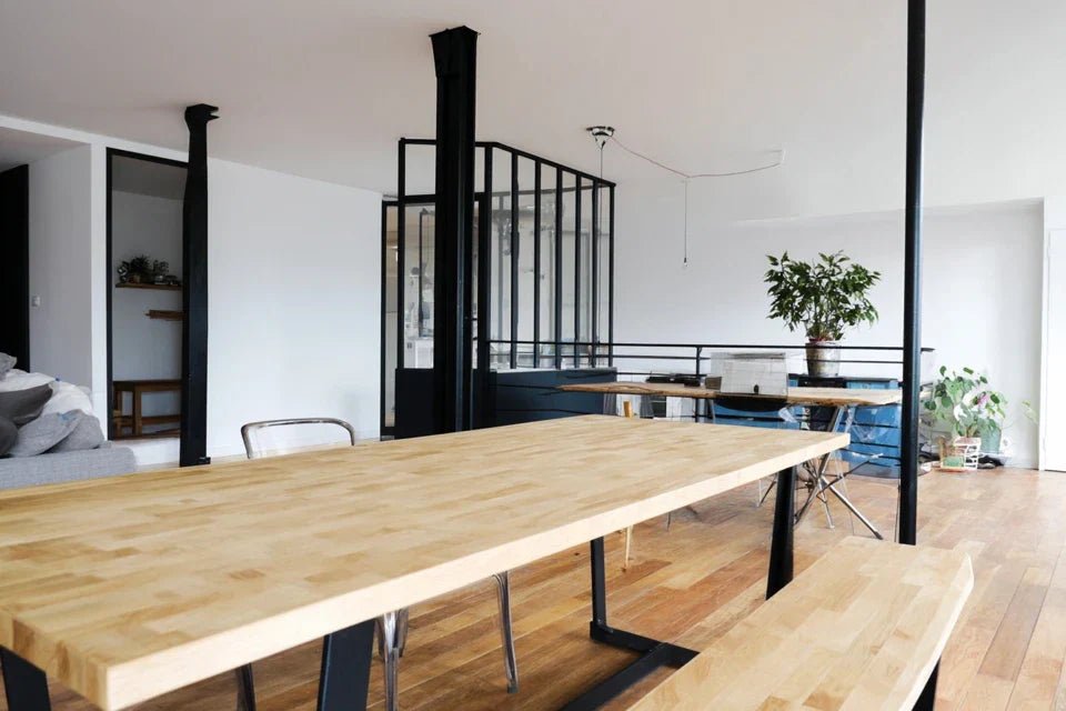
🏠 Case study: Sarah, a Parisian architect, transforms her 80m² loft in 2019. Rather than installing expensive glass walls (budget €8000), she invests in three strategically placed large format artworks. Result: her reading corner, dining area and living room each have their identity, for less than €1500 and with the possibility of reorganizing everything according to her wishes.
💬 Conversation with a decor expert
The golden rule of structuring with art: A well-chosen painting creates a visual attraction zone that naturally defines the space around it, like an invisible magnet that organizes your furniture and guides your guests, all within a maximum of 24 hours after hanging.
What's Really Happening in Your Brain When Faced with a "Floating" Space
Do you recognize these situations: you never know where to put your book when you get home, your guests stand around not knowing where to sit, or do you have this strange feeling that your furniture "floats" in the void without ever creating a warm atmosphere?
What you're experiencing is called "spatial cognitive fatigue": your brain consumes an insane amount of energy trying to understand where each function begins and ends in your space. It’s like trying to read a book without punctuation: technically possible, but exhausting!
Think of a restaurant that immediately makes you feel comfortable: without realizing it, your eye has spotted the "visual anchors" that define each space. Paintings play exactly this role of anchors in your interior.
The Truth About the "Vacuum Effect" of Large Volumes
Contrary to what one might think, a large empty space does not visually enlarge a room: it sucks it in! Your eye desperately seeks visual reference points and, failing to find them, gives you the feeling that the space "lacks something" without you being able to identify what.
It's like looking at a snow-covered landscape: beautiful in photos, but destabilizing on a daily basis. Your brain needs visual rhythms to feel safe and relaxed.
This discovery changes everything in your approach: instead of trying to "furnish" your space, you will strategically "punctuate" it with works that create breaths and focal points.
🧠 Instant test: Standing in the center of your space, close your eyes for 5 seconds then open them. Does your gaze immediately settle somewhere or does it wander aimlessly? This first reflex reveals whether your space needs visual anchors.
The Trap of "Peripheral Decoration"
Many think that you have to decorate the walls as a backdrop and leave the main partitions free. In reality, it's the opposite: structural walls (those that define living areas) are those that most need striking works.
Imagine a theater: it’s not the backstage area that structures the show, but the main stage. Your "scene" walls deserve your finest artistic pieces.
This mistake explains why you sometimes have the impression that your decoration "doesn't take hold": it hides on secondary walls instead of structuring your main living areas.
The Illusion of "One Size Fits All"
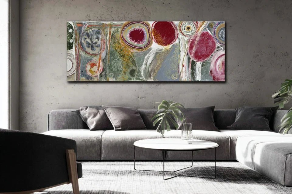
Here's the secret decorators jealously guard: in an open space, it’s not the colors that define zones, but the proportions of artworks. A small painting creates intimacy, a large format imposes a zone of prestige.
This is exactly the principle of village squares: the small fountain creates a convivial corner, the imposing monument defines the main square. Each format has its spatial power.
This revelation transforms your gaze: you no longer choose a painting solely for its colors, but for the spatial effect it will create in your targeted zone.
🎯 The 3 signals that your space needs visual structure:
- The "airport hall" effect: Your guests remain standing and seem to be waiting for something, as if they don't feel "arrived"
- The "everything-mixed-up" syndrome: You mechanically tidy the same objects several times a day without knowing where their "real" place is
- The "wandering gaze" fatigue: You never find a truly relaxing seating position, your eye continues to "scan" the space
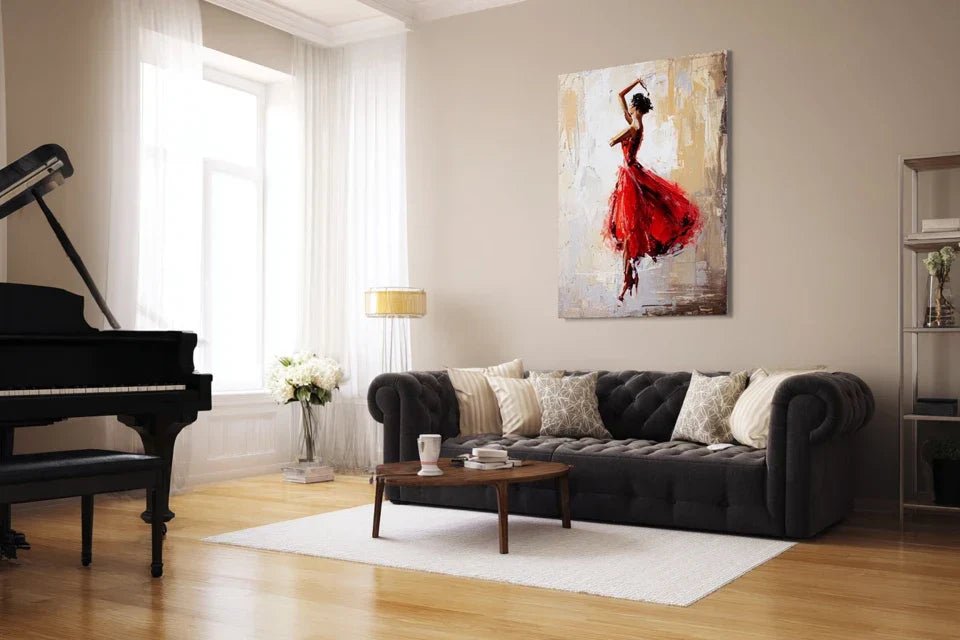
The secret of spaces that "work" immediately lies in a fascinating phenomenon: the visual magnetic effect. Like a magnet attracts iron filings, a well-positioned artwork naturally attracts furniture, objects and even people in a radius of 2 to 3 meters around it. You will recognize this effect when your guests spontaneously choose the same area to settle down and your objects finally seem to have found their "real" place.
Rule of 3 meters: Any element placed within a radius of 3 meters around a painting automatically "organized" by this artwork, create your zones starting from this principle rather than scattering art randomly.
| ❌ Intuitive approach | ✅ Structuring approach | 💡 Why it changes everything | 🎯 Immediate benefit |
|---|---|---|---|
| "I put a painting where there is space" | "I place a painting to create a zone" | Art becomes a space organizer | Each zone has its clear identity |
| "I choose according to my personal taste" | "I choose according to the desired spatial effect" | Format is more important than style | Overall harmony is guaranteed |
| "The more there are, the more it's decorated" | "Fewer but better placed" | Placement quality counts more | Immediate "professional gallery" effect |
| "It has to match perfectly" | "It has to structure effectively" | Function is more important than pure aesthetics | Flexibility to change the decor |


