


Turquoise Summer Wall Art
The Painting Summer Turquoise captures the essence of sunny days and crystal-clear waters. This artistic collection celebrates the turquoise hues of the ocean with a vibrant palette evoking Mediterranean shores and summer escape. Each piece transports your interior to azure horizons, creating a fresh and soothing atmosphere. Perfect for brightening up a living room, bedroom, or relaxation space, this decorative painting in turquoise tones infuses a positive energy and a vacation spirit all year round.
 Sailboat Turquoise Tide Painting - Summer Edition273,90 €
 Face Marine Freshness Painting - Summer Edition273,90 €
 Iced Cocktails Painting Cocktail Paradise - Summer Edition273,90 €
 Shell Painting Sparkling Azure - Summer Edition273,90 €
 Sunglasses Warm Sand Canvas - Summer Edition273,90 €
 Ice Cream Mint Canvas - Summer Edition273,90 €
 Tender Pink Hat Painting - Summer Edition273,90 €
 Woman Freedom Salty Painting - Summer Edition228,90 €
 Woman Bathing Charm Painting Summer Edition228,90 €
 Marine Landscape Ocean Whispers - Summer Edition228,90 €
 Sailboat Gentle Light Painting - Summer Edition273,90 €
 Woman Mermaid Earthly Painting - Summer Edition273,90 €
 Sunglasses Painting Vibrant Coral - Summer Edition273,90 €
 Beach Painting Vibrant Contrast - Summer Edition242,90 €
Explore further
In Turquoise Summer Wall Art



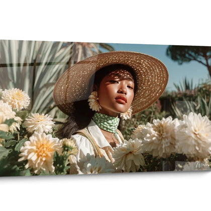

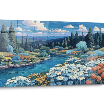
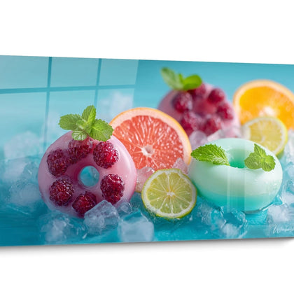
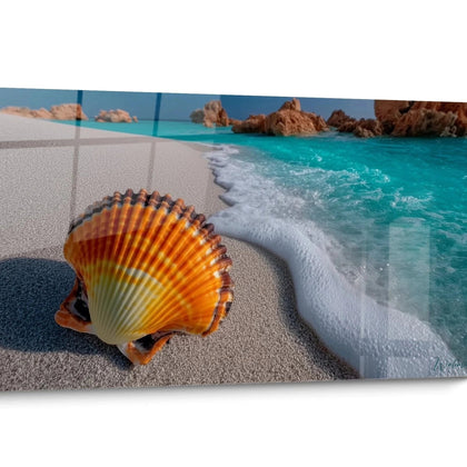
All about Turquoise Summer Wall Art
- Presentation Painting Summer Turquoise
- Summer aquatic atmospheres
- Mediterranean evocations
- Turquoise chromatic impact
The painting summer turquoise embodies the very essence of coastal getaways and marine horizons bathed in light. This cyan hue instantly evokes crystalline waters, paradisiacal lagoons, and that summery vibration that characterizes popular seaside destinations. Beyond a simple wall decoration, these large-format compositions radically transform the interior atmosphere by creating a visual connection with aquatic landscapes. The turquoise palette captures this particular luminosity of sunny days where sky and sea blend, offering an incomparable chromatic depth that instantly energizes the living space.
Immersion in the cyan tones of summer landscapes
A painting summer turquoise repositions the habitat towards a coastal residential aesthetic where chromatic freshness becomes an architectural element. This specific shade of blue-green translates visually the refreshing temperature of seaside mornings, creating a perceptible thermal contrast particularly sought after in contemporary interiors exposed to strong natural light.
Why prioritize cyan tones for a primary residence?
Turquoise compositions offer a distinctive luminous reverberation that naturally amplifies ambient lighting. This optical property transforms reception areas into true visual extensions of marine environments, particularly valuable in open architectures where visual circulation between rooms requires a fluid chromatic consistency. The cyan saturation maintains a constant visual presence without creating perceptual fatigue, unlike more aggressive primary colors.
The association with light natural materials
The dialogue between summer turquoise and surfaces in bleached oak, light marble, or polished concrete creates a sophisticated decorative stratification. These material combinations evoke contemporary Mediterranean architecture where minerality and aquatic chromaticity coexist naturally. The size of the formats offered allows for bold compositional balances in front of substantial furniture volumes.
In balneary or suburban residential configurations, these large-format representations establish a thematic continuity between the exterior environment and the interior layout. The turquoise vibration functions as a permanent seasonal marker, maintaining the summer ambiance regardless of climatic cycles. For a complementary approach exploring more classic nautical codes, the compositions inspired by nautical themes offer an alternative to more contrasting tones.
The visual evocations of Mediterranean destinations
The painting summer turquoise directly transposes the imaginary of Greek coves, Adriatic coasts, and Balearic shores into everyday habitat. This specific chromaticity captures the particular light interaction between the southern sun and shallow waters on light sandy bottoms, an optical phenomenon impossible to reproduce with other color ranges.
How to recreate the atmosphere of the Aegean islands?
Integrating a monumental format in turquoise tone immediately establishes the desired geographical and climatic reference. This mental association functions as a sensory trigger, activating the memory of vacation experiences and generating a measurable positive emotional response. Abstract compositions exploiting cyan-white gradients visually reproduce the foam and depth variations characteristic of sheltered Mediterranean bays.
The decorative effectiveness relies on the chromatic saturation maintained across the entire surface. Generous dimensions amplify this impact by creating an immersive visual field that noticeably alters the surrounding ambient light. This color reverberation particularly transforms spaces with generous south-facing openings, where direct light naturally intensifies the turquoise vibrancy.
The composition with white architectural elements
The fundamental white-turquoise association reproduces the iconic contrast of the Cycladic villages and emblematic seaside resorts. This chromatic duality functions as a stylistic signature, instantly establishing the Mediterranean aesthetic register without requiring additional accessories. White woodwork, clean ceilings, and light floors constitute the optimal frame to fully enhance the intensity of the cyan.
In coastal second homes as well as urban dwellings, this evocative palette maintains a permanent connection with the seaside universe. The chromatic depth of summer turquoise brings this sensory dimension often absent from conventional layouts, radically transforming the spatial perception and daily experience of the places.
The color psychology of summer aquatic nuances
The turquoise summer painting strategically exploits the documented psychological properties of cyan-green hues in residential environments. This intermediate position on the color spectrum simultaneously combines the soothing serenity of blues and the refreshing vitality of greens, creating a perceptual dynamic particularly suited to relaxation and reception areas.
What perceptual effects does turquoise generate in large volumes?
Monumental formats in turquoise tone noticeably alter spatial perception by creating an impression of openness and depth. This visual extension works particularly effectively in configurations where the actual space is constrained, the gaze being naturally drawn to the chromatic depth evocative of distant horizons. The perceived temperature of the room decreases psychologically by several degrees, generating a pleasant sensation of coolness during summer periods.
The light intensity reflected by turquoise surfaces also creates a diffused indirect lighting that softens the overall ambiance without requiring additional technical installations. This particular quality of light radically transforms the morning and evening atmosphere, moments when natural light interacts most favorably with this color range.
The perceptual evolution according to lighting cycles
Unlike static neutral tones, summer turquoise dramatically evolves according to the intensity and orientation of natural light. This variability maintains a renewed visual interest throughout the day, the composition revealing different nuances and depths. In the evening, under warm artificial lighting, the cyan hues develop a deeper dimension evoking tropical sunsets.
Which turquoise summer painting to choose for a spacious living room?
For generous volumes with significant ceiling height, prioritize vertical formats exploiting the gradients from deep turquoise to bright cyan tones, visually reproducing the stratification of coastal waters. This orientation amplifies the impression of verticality while maintaining the aquatic reference.
How to combine turquoise with dark contemporary furniture?
The contrast between anthracite or graphite furniture and a turquoise composition creates a sophisticated visual tension evoking high-end coastal architecture. This tonal opposition simultaneously enhances the depth of the furniture and the brilliance of the wall composition, establishing a clear decorative hierarchy.
Would a turquoise summer painting be suitable for professional spaces?
In tertiary environments seeking a distinctive visual identity, particularly in creative, tourism, or wellness sectors, a summer turquoise wall art instantly communicates values of creativity, escape, and well-being. Large formats transform reception areas into memorable and differentiating experiences.
Further reading
Our articles on this topic
- Beach painting in sand and blue tones: the ideal palette for Scandinavian decor
- Turquoise beach painting: the soothing color ideal for your adult bedroom
- Turquoise rafting painting: the ideal colour for a calm, productive office
- Choosing the right shade of turquoise for each area of your beauty salon
- Turquoise painting for the bathroom: how to install it properly and keep it looking great over time
- Turquoise sea painting and white sofa: the perfect match for a bright living room
L'art qui suscite l'envie
Maison belge d'art mural grand format
14 jourspour changer d'avis*
Protection Walenskyincluse
Fabriquéen Italie
FormatXXL
Kit de fixationtoujours fourni
* Hors tableaux personnalisés et tailles personnalisées


