


Turquoise Gold Wall Art
The Turquoise Golden painting embodies the perfect alliance between freshness and luxury. This exclusive collection celebrates the harmony of turquoise and gold tones to create a refined and contemporary atmosphere. Each artwork captures the brilliance of precious nuances and brings a touch of sophistication to your decoration. Ideal for modern and elegant interiors, this collection transforms your walls into true art galleries. Explore our universe of decoration turquoise goldene and let yourself be seduced by these unique creations.
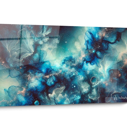
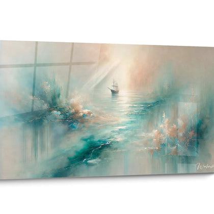
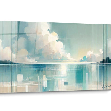
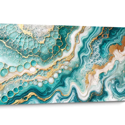
 Sparkling Shores Canvas - Epoxy Style Edition273,90 €
 Sapphire Waves Wall Art - Epoxy Style Edition273,90 €
 Enchanted Flows Wall Art - Epoxy Style Edition273,90 €
 Silk Ocean Wall Art - Epoxy Style Edition273,90 €
 Crystalline Waves Wall Art - Epoxy Style Edition273,90 €


All about Turquoise Gold Wall Art
- Presentation Turquoise Gold Artwork
- Turquoise and Gold Pairing
- Luxurious Atmospheres
- Acquisition Guide
The turquoise gold artwork represents the bold alliance between the soothing freshness of aquatic shades and the timeless elegance of precious metallic finishes. This exceptional color combination instantly transforms high-end residential spaces, boutique hotels, and executive offices by creating a sophisticated balance between modernity and refinement. Compositions combining deep turquoise and shimmering gold capture natural light to generate changing reflections throughout the day, enhancing the interior architecture. Our large-format creations exploit this duality to offer an unparalleled visual presence, positioning each work as a true architectural focal point in spacious living rooms, prestigious entrance halls, and reception areas.
Chromatic Balance between Cyan Turquoise and Gold Accents
The turquoise-gold combination is rooted in a millennial aesthetic tradition, recalling Byzantine mosaics and oriental architectural ornaments. On contemporary turquoise artworks , this association creates a fascinating thermal contrast: turquoise, a cool color evoking crystalline water, meets the radiant warmth of gold that captures and diffuses ambient light. This chromatic dialogue generates exceptional visual depth, particularly sought after in premium interior decorations.
Why do gold finishes enhance turquoise compositions?
Gold pigments applied in strategic touches or large areas on a turquoise background create zones of high light intensity. This technique amplifies the spatial perception in rooms with generous volumes, transforming a simple wall into a dynamic surface. Panoramic formats exploiting this two-color palette work remarkably well in contemporary spaces with high ceilings, where zenithal light activates the metallic particles to produce changing effects according to the hours. Interior architects prefer this combination for spacious vestibules and cathedral-like living rooms requiring a visual centerpiece.
The tonal variations between mint turquoise and ocean turquoise deep
The turquoise spectrum offers an extended palette, from pastel turquoise evoking tropical lagoons to saturated petrol hues reminiscent of marine depths. When paired with gold, these variations generate radically different atmospheres. A painting combining light turquoise and rose gold creates a delicate atmosphere ideal for luxurious master bedrooms, while an intense turquoise with yellow gold produces a dramatic impact perfect for reception areas. Discerning collectors select their acquisitions based on light exposure: light shades for south-facing rooms benefiting from generous sunlight, deep tones for spaces with controlled lighting.
The impact of metallized textures on spatial perception
Beyond color, the gold textures integrated into turquoise compositions physically alter light reflection. Layering techniques create reliefs that capture grazing light, a particularly spectacular phenomenon in spaces equipped with directional lighting. Contemporary turquoise artworks in large format exploit this property to generate a three-dimensional presence, transforming the flat surface into a participatory architectural element. This approach is particularly suitable for converted industrial lofts where exposed structures dialogue with precious finishes.
Creating Sophisticated Atmospheres with Turquoise and Gold
Integrating a golden turquoise monumental artwork instantly redefines the perceived level of refinement of a space. This two-tone palette simultaneously conveys serenity and opulence, a rare balance in contemporary decoration. High-end residences adopt this combination for reception rooms where the goal is to impress without excessive ostentation. The freshness of the turquoise tempers the richness of the gold, avoiding the pitfall of decorative overload while asserting an assumed aesthetic positioning.
How does this palette integrate into luxurious contemporary interiors?
Contemporary minimalist architectures, characterized by their clean volumes and raw materials, find in the XXL golden turquoise artwork a perfect counterpoint. On a concrete-rendered anthracite wall or facing a panoramic bay window, these compositions bring the necessary chromatic touch without compromising architectural purity. The reflective properties of the gold dialogue with modern polished surfaces – brushed steel, glass, natural stone – creating a material coherence. Residential prestige specialists recommend these works for double-height rooms where their imposing dimension is fully expressed.
Furniture combinations that enhance this chromatic combination
Contemporary furniture with clean lines constitutes the ideal setting to enhance a golden turquoise artwork. Sofas in neutral tones – pearl gray, natural beige, off-white – allow the artwork to visually dominate without chromatic competition. The introduction of decorative elements with patinated brass or bronze finishes creates subtle echoes with the gold leaf of the artwork, reinforcing the overall coherence. Rugs in sand or cream tones soften the whole while preserving the visual attention on the centerpiece mural. This layered approach generates a decorative depth characteristic of interiors designed by professionals.
Optimize the visual impact in premium commercial spaces
Artwork with ocean turquoise enhanced with gold also finds its place in commercial spaces targeting a high-end clientele. Boutique hotel lobbies, exclusive beauty salons and prestigious professional firms use this palette to communicate professionalism and creativity simultaneously. The soothing dimension of turquoise promotes visitor relaxation, while gold signals excellence and attention to detail. Monumental formats create visual landmarks facilitating spatial navigation in large areas while reinforcing the establishment's visual identity.
Selecting and Valuing Your Golden Turquoise Artwork
Acquiring a large-format golden turquoise artwork represents a major decorative investment requiring careful consideration of several technical and aesthetic criteria. The first consideration concerns the artwork-space proportion : in a generously sized living room, a panoramic horizontal composition visually amplifies the width of the room, while a vertical monumental format accentuates the ceiling height. Experienced collectors visit the space intended to accommodate the artwork taking precise measurements before any acquisition to guarantee proportional harmony.
What technical criteria distinguish high-end creations?
The quality of a gold turquoise painting is first measured by the depth and stability of the pigments used. Premium compositions employ UV-resistant pigments, guaranteeing chromatic durability even in spaces with significant exposure to natural light. Superior gold finishes use authentic metallic particles rather than synthetic substitutes, producing a richer and more nuanced light reflection. Close examination also reveals the complexity of the stratification: sophisticated works superimpose multiple layers of turquoise and gold to create a visual depth impossible to reproduce with a single application.
Strategies for integration into different spatial configurations
Each architectural configuration calls for a specific integration approach. In open-plan loft spaces, a gold turquoise painting can function as a visual separator, subtly defining functional areas without physical partitions. For traditional living rooms with multiple walls, positioning it facing the main entrance maximizes the impact upon discovering the space. Monumental staircases also offer exceptional opportunities: a vertical composition accompanying the ascent of the stairs creates a progressive visual experience. Owners of residences with mezzanines particularly appreciate extra-large formats visible from multiple levels simultaneously.
How to evaluate consistency with your existing color scheme?
Overall color harmony largely determines the success of integration. An environment dominated by warm tones – terracotta, ochre, honeyed woods – benefits from a painting where gold predominates over turquoise, creating a smooth transition. Conversely, interiors with cool tones – grays, whites, chrome metals – are enriched by compositions where turquoise occupies the majority of the surface, gold intervening in strategic accents. Abstract turquoise paintings with gold accents often offer the necessary interpretive flexibility to adapt to varied environments, their non-figurative composition allowing for a personalized reading according to the context.
Why choose a gold turquoise painting for my contemporary living room?
This combination simultaneously brings visual freshness and sophistication, an ideal balance for contemporary living spaces seeking a relaxing and refined atmosphere. The large format creates a focal architectural point, enhancing the real estate investment.
How to maintain the gold finishes of a gold turquoise painting?
Metallic surfaces only require delicate dusting with a dry microfiber cloth. Avoid any chemical products or excessive humidity that could alter the shine of the gold particles. A location away from direct heat sources preserves the brilliance of the finishes.
What size gold turquoise painting is suitable for a 4-meter wall?
For a wall of this dimension, prioritize a work occupying 60 to 75% of the available width, or approximately 240 to 300 cm wide. This proportion ensures a visually assertive presence while preserving balanced side margins, avoiding a saturation effect.


