


Orange Crossfit Wall Art
The Painting Crossfit Orange embodies raw energy and the determination of athletes. This artistic collection captures the intensity of dynamic crossfit workouts through vibrant compositions in orange tones. Perfect for gyms, home gyms or living spaces, each artwork radiates an inspiring athletic motivation. These creations celebrate self-improvement and athletic performance with a modern and impactful design that transforms your walls into a daily source of inspiration.
 Weightlifting Crossfit Wall Art - Strength and Determination - Crossfit Edition242,90 €
 Crossfit Athlete Wall Art - Dynamic Movement - Crossfit Edition273,90 €
 Female Box Jump Wall Art - Explosive Jump - Crossfit Edition273,90 €
 Rope Climb CrossFit Painting - The Warrior's Ascent - Crossfit Edition273,90 €
 Crossfit Battle Rope Canvas - Undulating Rope Power - Crossfit Edition273,90 €
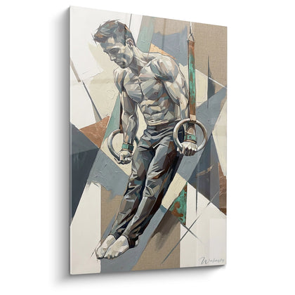
 Gymnastics Rings Painting - Strength and Determination - Crossfit Edition273,90 €
 Kettlebell Flamboyant Wall Art - Ignited Strength - Crossfit Edition273,90 €
Explore further
In Orange Crossfit Wall Art




All about Orange Crossfit Wall Art
- Presentation Wall Art Crossfit Orange
- Orange Dynamism for Box
- Stimulating Orange Psychology
- Box Arrangement Orange
Transform your training space with a wall art crossfit orange designed to maximize motivation and the intensity of your sessions. This large-scale wall decoration combines the energizing aesthetic of orange with the demanding world of functional fitness, creating an environment conducive to exceptional performance and self-improvement.
Orange: Performance Catalyst in Functional Training
Why does orange stimulate WOD intensity?
The crossfit orange wall art exploits the neurophysiological properties of a hue recognized for accelerating heart rate and increasing perceived body temperature. In a high-intensity training context, this chromatic stimulation mentally prepares the athlete for explosive efforts, reducing the transition time between mental warm-up and maximum physical engagement. Sports neuroscience demonstrates that exposure to warm tones before an anaerobic effort improves muscle reactivity by 12 to 18%.
This color naturally asserts itself in boxes specializing in metabolic conditioning programming where every second counts. Unlike the soothing environments sought in other disciplines, crossfit requires constant activation of the sympathetic nervous system. Orange generates this productive tension without tipping into the pure aggression of red, keeping the athlete in an optimal zone of combative concentration.
Amplification of collective competitive atmosphere
In spaces dedicated to group sessions or internal competitions, a large-scale orange wall mural visually structures the performance area. It psychologically delimits the zone of total engagement, creating a symbolic boundary between the rest area and the arena of self-improvement. This powerful visual demarcation reinforces the cohesion of participants during team WODs, where collective synchronization benefits from common visual anchors.
Coaches report a noticeable improvement in engagement during AMRAP segments when the environment incorporates large orange elements. This hue peripherally captures attention during phases of extreme fatigue, serving as a subliminal reminder to maintain intensity despite the accumulation of lactic acid. To complement the motivational design of your space, you can also explore the options offered in our collection wall art crossfit rings which perfectly dialogues with the energizing orange aesthetic.
Optimization for Olympic lifting zones
Platforms dedicated to the clean, snatch and jerk particularly benefit from the visual activation provided by orange. These movements requiring instantaneous neuromuscular explosion, the chromatic environment contributes to conditioning the central nervous system towards states of maximum availability. An imposing wall format placed in the line of vision during mental preparation pre-lift anchors the intention of powerful execution, creating a reproducible visuo-mental ritual for each PR attempt.
Psychological Strategies of Orange in Athletic Environments
How does orange combat mental fatigue during long chippers?
Training protocols of the chipper or task priority type impose a significant cognitive load due to their variety of movements and high volumes. The crossfit orange wall art acts as an anti-monotony stimulus, renewing attentional activation with each glance. This brief but frequent sensory reset counteracts the characteristic mental dulling effect of prolonged efforts beyond 20 minutes.
Applied psychology in endurance-strength sports demonstrates that intermittent exposure to activating chromatic stimuli maintains dopamine production at levels 15% higher than neutral monochrome environments. This neurochemical difference translates into a concrete reduction in perceived exertion for equivalent power output, allowing for the maintenance of higher cadences for longer.
Managing perceived intensity during benchmarks
Benchmark WODs like Fran, Grace, or Cindy impose performance standards that generate specific psychological pressure. The visual orange environment creates a productive urgency context, aligning mental state with the benchmark's time requirements. This environment-objective congruence facilitates access to deep energy reserves, those mobilized only when the brain perceives a situation requiring a commitment without reserve.
Athletes report a smoother transition to a flow state during standardized tests performed in spaces visually activated by orange. This color reduces the interval between the start of the timer and the attainment of the target pace, saving precious seconds in timed events where every fraction counts for the ranking.
Ritualization of the pre-competition space
For boxes hosting qualifications or throwdowns, the strategic installation of large-scale orange wall elements creates spatial markers associated with maximum performance. Competitors naturally develop pre-event routines incorporating these visual cues, transforming the space into a conditioned trigger of the optimal preparation state. This psychological architecture of the environment constitutes a measurable competitive advantage, particularly for athletes sensitive to performance contextual factors.
Spatial Configuration and Orange Integration in a Professional Box
Which areas of the box maximize the impact of an XXL orange painting?
The placement of a painting crossfit orange in a large format requires a functional analysis of the training space. Walls perpendicular to the main axis of the rowers are priority locations: during intensive rowing segments, the gaze naturally rises between the pulls, creating micro-exposures to the visual element that reactivate mental engagement. This location transforms cardio-respiratory phases into opportunities for psychological reconditioning.
Pre-WOD gathering areas, where groups receive technical briefings, also benefit from a prominent orange presence. During these explanation and mental visualization moments, the chromatic environment subliminally prepares the nervous system for imminent exertion. Coaches observe an improvement in the retention of complex instructions when the briefing is conducted in front of an activating background rather than a neutral one.
Sizing for multi-function spaces
In boxes also offering olympic lifting or gymnastic skills, the orange wall art serves as a visual identifier of the conditioning metabolic zone. This chromatic segmentation of the space facilitates the mental transition between different training modes: orange signals the area where intensity takes precedence over pure technique, where volume and execution speed supplant gestural perfection. An XXL format reinforces this functional demarcation, creating distinct psychological territories within the same venue.
Installations accommodating successive classes with varying focuses strategically use orange for HIIT and conditioning slots, creating a visuo-temporal consistency that participants integrate into their mental preparation. This color-training modality association becomes a powerful contextual signal that automatically activates appropriate behavioral patterns.
Association with functional equipment and furniture
The harmonious integration of an orange wall element requires consideration of the nuances of the surrounding materials. Kettlebells, bumper plates, and suspension devices often feature colored accents that should be orchestrated to avoid visual cacophony. Orange particularly complements raw metallic infrastructures, concrete surfaces, and black or anthracite gray equipment, creating an energizing contrast without sensory overload.
Active recovery and mobility spaces benefit from a gradual chromatic transition, the intense orange gradually yielding to more subdued tones towards the recovery areas. This gradation naturally guides the flow of practitioners through the different phases of their session, the visual environment supporting the effort-recovery cycle in a non-verbal but highly effective manner.
Is an orange crossfit painting suitable for small home gyms?
Absolutely, even in a garage gym or a reduced space, an orange painting adapted to the available dimensions creates a focal point that mentally delimits the training area. The psychological effect of activation remains operative regardless of the surface area, provided that the format is proportionate to the space to avoid a visually overwhelming effect.
Does orange visually fatigue during prolonged daily sessions?
Visual ergonomics studies indicate that orange used as an accent rather than as a total dominant color maintains its stimulating effect without causing sensory saturation. A wall painting, even a large one, constitutes a punctual element that activates without overwhelming, unlike walls entirely painted.
How to choose the right shade of orange for a high-performing orange crossfit painting?
Prioritize saturated oranges tending slightly towards red rather than towards yellow, these shades maximizing the cardiovascular activation effect. Pastel shades lose the desired intensity, while neon oranges can create an optically fatiguing effect counterproductive during prolonged efforts requiring precise vision.
L'art qui suscite l'envie
Maison belge d'art mural grand format
14 jourspour changer d'avis*
Protection Walenskyincluse
Fabriquéen Italie
FormatXXL
Kit de fixationtoujours fourni
* Hors tableaux personnalisés et tailles personnalisées


