


Chartreux Cat Watercolor Wall Art
The Painting Blue Chartreux Cat Watercolor celebrates the nobility of this iconic feline breed through poetic and delicate creations. Each artwork captures the natural elegance of the Chartreux with soft watercolor nuances and subtle artistic touches. These paintings bring a soothing and refined atmosphere to your interior. Perfect for cat lovers and contemporary feline art, they transform your walls into an intimate gallery celebrating the mysterious beauty of the Chartreux.
 Reclining Chartreux Cat Painting - Amber Gaze - Chartreux Cat Edition273,90 €
 Trio of Cats with Piercing Eyes Painting - Feline Harmony - Chartreux Cat Edition273,90 €
 Chartreux Cat Portrait Painting - Feline Elegance - Chartreux Cat Edition273,90 €
 Chartreux Cat Painting Watercolor - Golden Gaze - Chartreux Cat Edition228,90 €
 Three Cats Watercolor Painting - Tender Gazes - Chartreux Cat Edition228,90 €
 Chartreux Cat Watercolor Painting - Tender Gaze - Chartreux Cat Edition228,90 €
Explore further
In Chartreux Cat Watercolor Wall Art
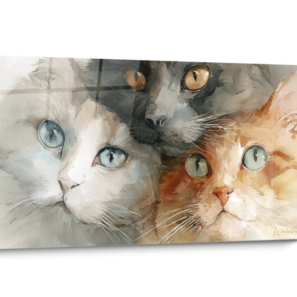
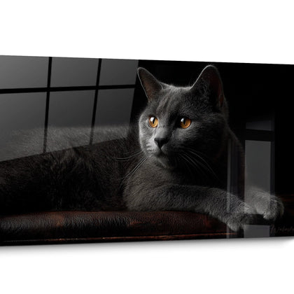
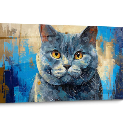
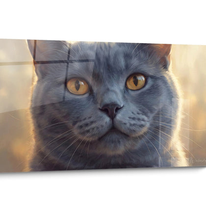
All about Chartreux Cat Watercolor Wall Art
- Presentation Painting Blue Chartreux Cat Watercolor
- Blue Chartreux Cat Watercolor Design
- Transparency and Fluidity
- Serene Ambiances
The art of watercolor applied to the blue-gray feline immediately distinguishes these wall creations from traditional, static representations. A painting blue Chartreux cat watercolor captures the vaporous essence and legendary softness of this French breed through translucent gradients and evanescent nuances. The colored washes reveal the silky texture of the silver fur while diluted areas suggest feline movement and natural grace. These large-format works instantly transform contemporary spaces into contemplative refuges where the spontaneity of the medium meets the aristocratic elegance of the Chartreux. The fluid pictorial approach is particularly suitable for interiors seeking a serene atmosphere without visual rigidity.
The Watercolor Technique Serving the Silver-Gray Fur
The painting blue Chartreux cat watercolor masterfully exploits the unique properties of the liquid medium to reproduce the changing luminosity of the blue-gray fur. Translucent superimpositions create an atmospheric depth impossible to reproduce with other techniques, each successive layer enriching the characteristic silver nuances. Artists mastering this approach deliberately leave behind the runs and halos that become aesthetic signatures, recalling the very fluidity of feline movement.
How do watercolor gradients enhance the Chartreux's copper eyes?
The golden to intense orange irises of the Chartreux particularly benefit from the contrasts generated by watercolor. The deep gaze emerges thanks to concentrated pigments surrounded by pale washes, creating a striking inner luminosity effect. This juxtaposition of saturated and diluted areas generates an emotional intensity sought by collectors of painting blue Chartreux cat portrait for their refined interiors.
Spontaneous gesture capturing the independent spirit
Watercolor imposes a quick and intuitive execution perfectly suited to the autonomous nature of the Chartreux. Energetic brushstrokes and controlled splashes visually translate the observant and discreet personality of this breed. Collectors appreciate this graphic liveliness that avoids the staticism of photographic renderings that are too rigid, preferring compositions suggesting arrested movement rather than forced poses.
Cool pigments and minimalist chromatic harmony
The restricted palette of cerulean blues, Payne's grays, and touches of ultramarine naturally reflects the monochrome coat of the Chartreux. This chromatic economy generates a soothing visual coherence in clean spaces of Scandinavian or Japanese style. Monochrome compositions enriched with subtle tonal variations easily integrate into decors that prioritize visual calm and discreet sophistication, unlike saturated, multicolored works.
Watercolor Transparencies and the Luminous Architecture of Interiors
A painting blue Chartreux cat watercolor of large dimensions radically transforms the perception of space through its airy zones and preserved whites. The characteristic transparency of the medium naturally dialogues with the natural luminosity of south or west-facing rooms, sunlight visually passing through the diluted washes. This optical permeability is ideally suited to spaces bathed in light where opaque works would create too heavy visual masses.
Why do watercolor compositions visually enlarge space?
Evaporated gradients and dissolved outlines generate an atmospheric depth that pushes the perceived limits of walls. Unlike uniform or saturated backgrounds, vaporous transitions create a visual continuity between the artwork and its environment. Interior architects favor this quality for urban apartments with limited surfaces, where every decorative element must contribute to the impression of volume without visual clutter.
The breathing of negative spaces in the composition
The unpainted areas revealing the support create essential breaths in the visual reading. These strategic voids balance the concentrated color masses representing the feline silhouette, generating a contemplative and restful rhythm. Collectors seeking a modern Chartreux cat painting particularly appreciate this compositional purification, avoiding the visual saturation of traditional, overloaded artworks.
Integration with natural materials and organic textures
The organic fluidity of watercolor resonates harmoniously with the raw materials favored in contemporary interiors: natural wood, crinkled linen, limestone. This textural coherence between the pictorial rendering and the material environment creates a sophisticated aesthetic unity. Decorators frequently pair these artworks with plant elements to reinforce the natural and soothing atmosphere, the Chartreux’s vaporous fur visually dialoguing with airy foliage.
Creating Contemplative Sanctuaries with Feline Watercolor
The installation of a watercolor Chartreux cat painting instantly transforms a functional space into a meditative refuge. The softness of the chromatic transitions and the absence of hard edges generate an enveloping atmosphere particularly sought after in master bedrooms or reading areas. This soothing quality stems directly from the fluid nature of the medium, where no aggressive lines disrupt the visual calm sought by zen decor enthusiasts.
Which spaces benefit most from these watercolor compositions?
Reading nooks, meditation corners, and relaxation areas favor these creations with gentle visual energies. The representation of the Chartreux in its characteristic posture of quiet observation psychologically reinforces the invitation to silent contemplation. Therapists and wellness professionals frequently choose these artworks for their offices, exploiting their ability to reduce visual anxiety and promote mental relaxation.
Association with neutral palettes and soft materials
The natural gray tones of the Chartreux fur harmonize perfectly with decorative trends favoring beiges, taupes, and off-whites. This chromatic neutrality facilitates integration without requiring a complete recomposition of existing color schemes. Owners of a Chartreux cat painting appreciate this versatility allowing the evolution of the surrounding decor without compromising the overall coherence.
The psychological effect of dissolved outlines
The absence of sharp limits in the watercolor rendering generates a soothing visual perception, the brain not having to process aggressive boundaries. This perceptual fluidity contributes to decreasing excessive visual stimulation characteristic of saturated urban environments. Neuropsychologists confirm that compositions with soft transitions favor cognitive recovery, explaining the growing success of these artworks in contemporary residential spaces.
Complementarity with indirect and subdued lighting
Diffused light sources particularly enhance the subtle nuances of the watercolor, revealing details invisible under direct lighting. Warm-toned LED strips (2700-3000K) positioned as wall grazing light create variable depth effects depending on the time of day. This perceptual variability maintains long-term visual interest, the artwork seeming to transform according to viewing conditions, a quality absent from more static representations like realistic Chartreux cat painting .
Frequently Asked Questions about Chartreux Watercolor Paintings
How does watercolor capture the unique texture of the Chartreux’s coat?
Translucent layers and pigment granulation effects naturally reproduce the silky appearance and density of the characteristic undercoat. Areas of white reserve suggest the luminous reflections on the silver fur without resorting to opaque impasto, creating a remarkable tactile illusion despite the flatness of the support.
Why choose a Chartreux cat watercolor painting over another technique?
Watercolor offers a visual lightness and spontaneous elegance impossible to achieve with opaque mediums. The transparency of washes creates a poetic atmosphere perfectly suited to the discreet and refined temperament of the Chartreux, establishing an aesthetic consistency between subject and pictorial treatment. This intrinsic harmony particularly appeals to collectors sensitive to form-content correspondence.
What size should be prioritized to maximize the impact of watercolor gradients?
Generous formats fully reveal the subtleties of color transitions and the richness of random textures. A large-scale composition allows for the appreciation of technical details such as controlled halos and saturation variations, elements lost in reduced-size reproductions. Monumental scale also amplifies the immersive and contemplative effect sought by lovers of experiential decoration.
Further reading
Our articles on this topic
- Chartreux cat painting in Scandinavian style: the perfect choice for an entryway
- Chausie Cat Painting: The Gift Idea for a Cat Breed You Won't Find Anywhere Else
- Cat painting gift idea for cat lovers: the guide to giving the perfect artwork
- Which panoramic cat painting to choose according to your sofa style
- Chausie golden painting in Art Deco style: elevate your entrance wall
- Persian cat watercolor poster painting: the right choice for your entrance
L'art qui suscite l'envie
Maison belge d'art mural grand format
14 jourspour changer d'avis*
Protection Walenskyincluse
Fabriquéen Italie
FormatXXL
Kit de fixationtoujours fourni
* Hors tableaux personnalisés et tailles personnalisées


