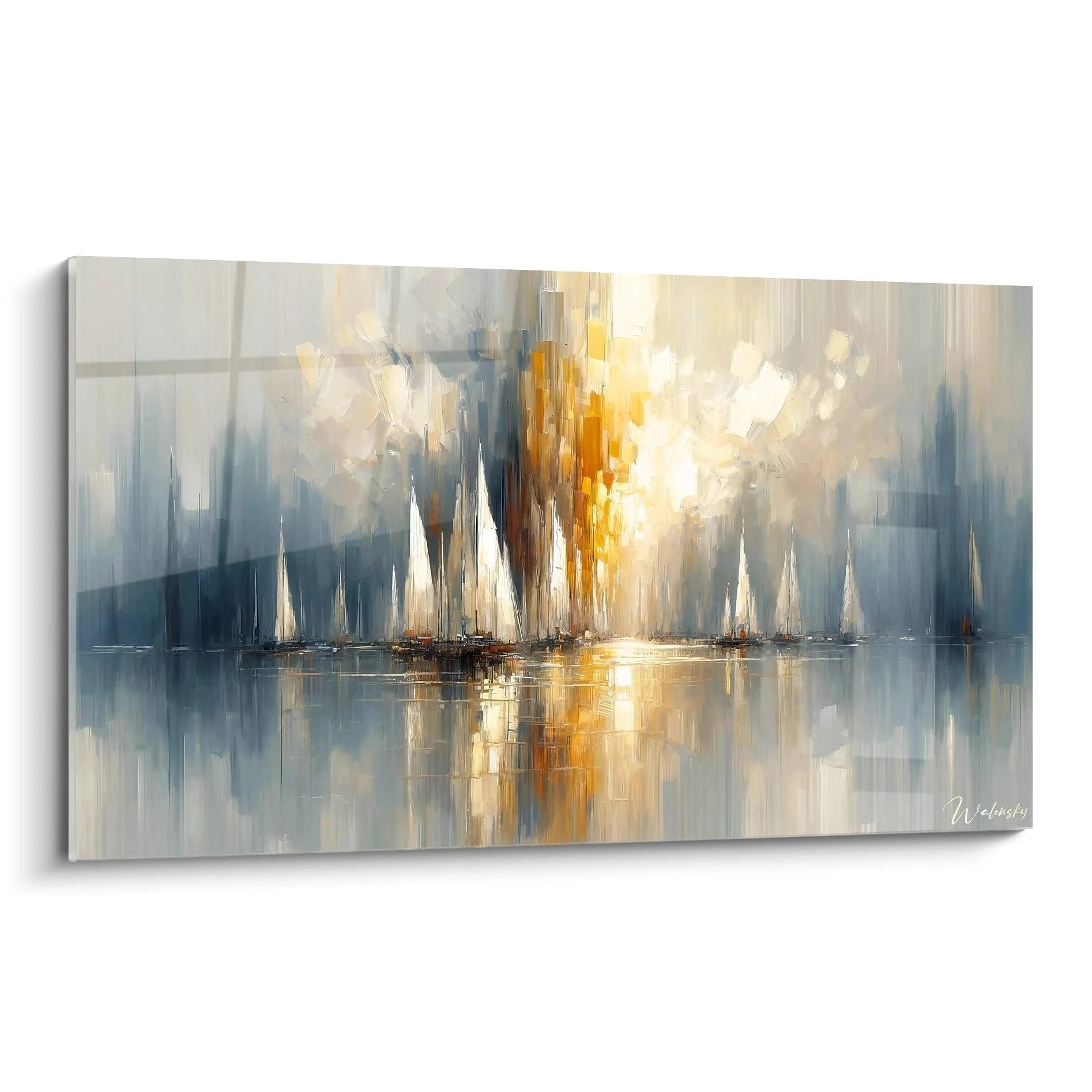
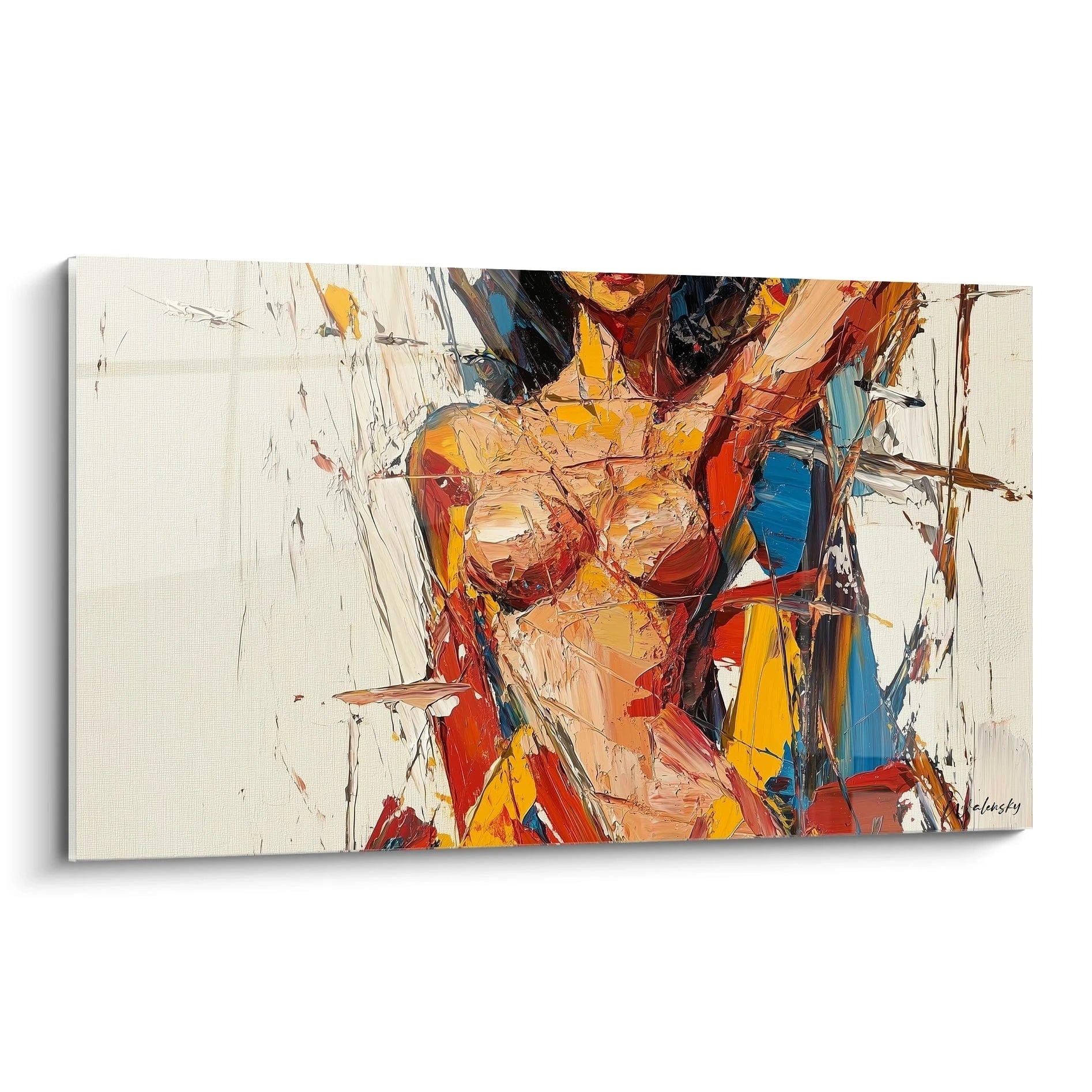
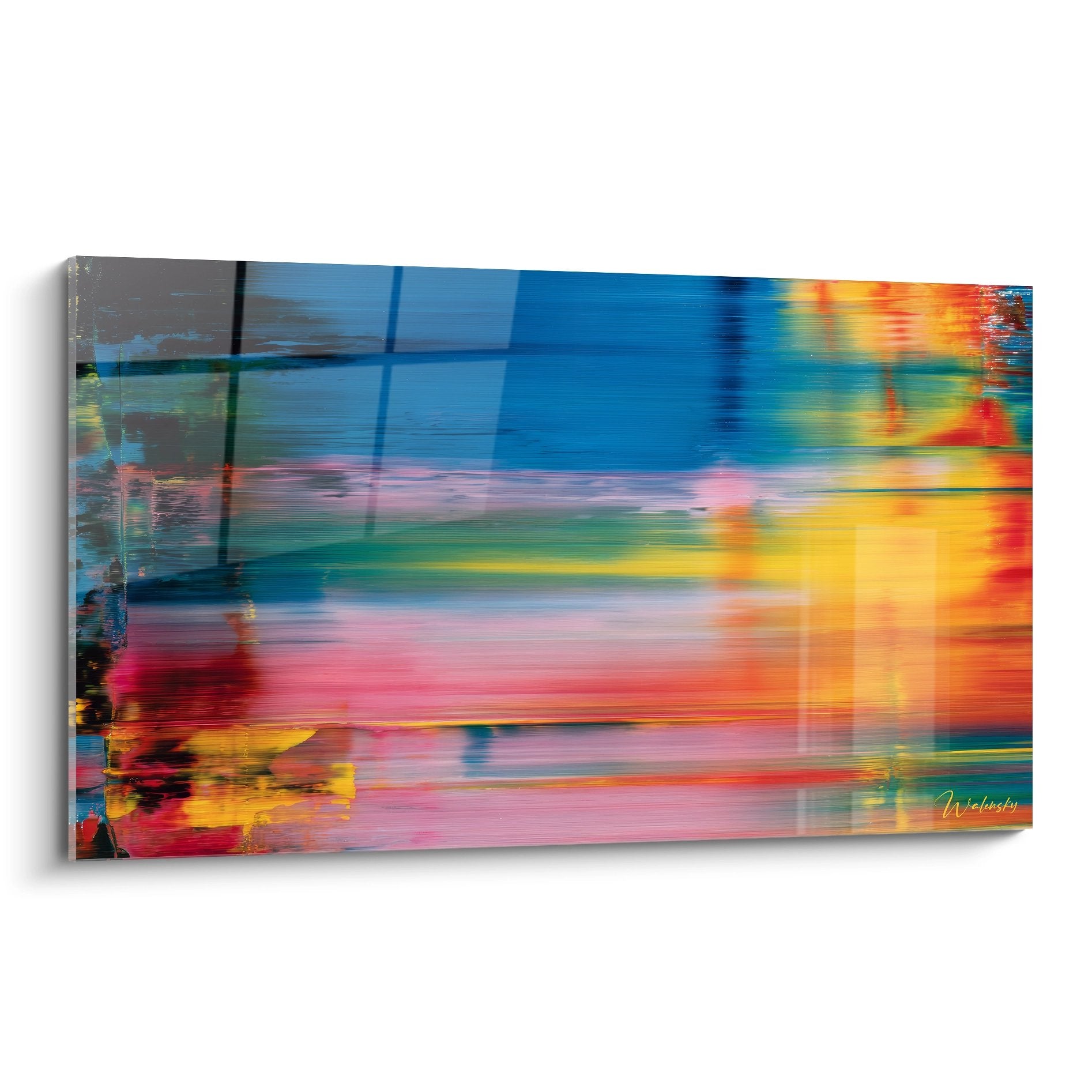
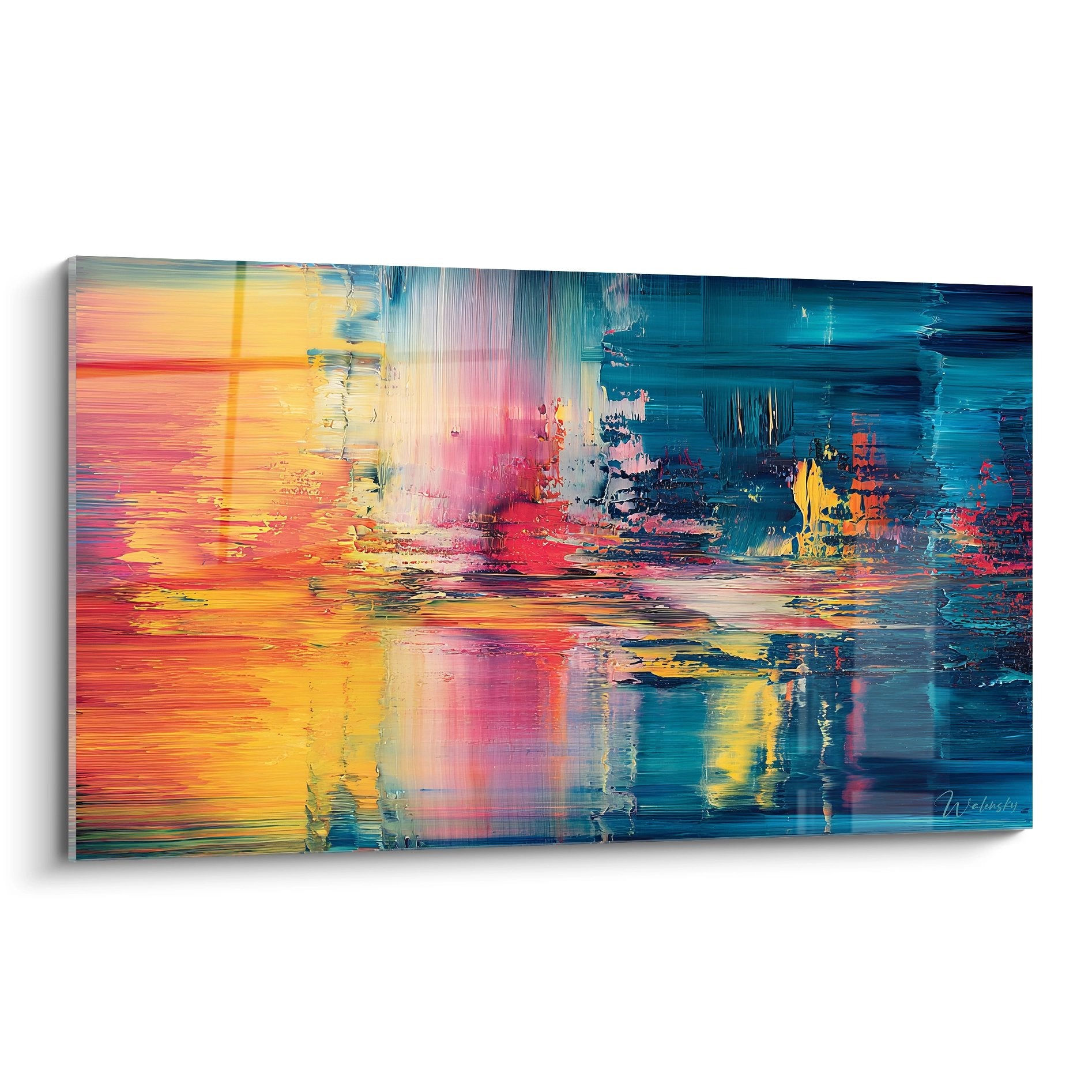
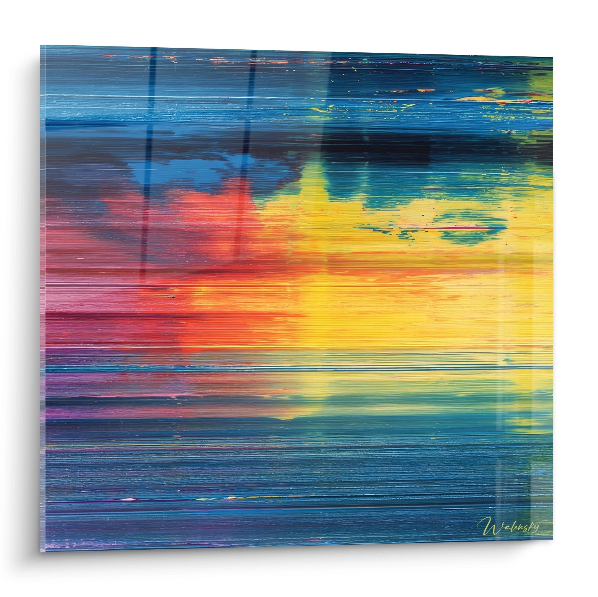
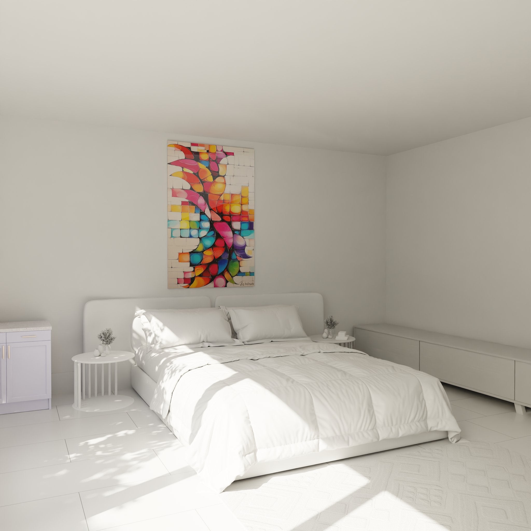
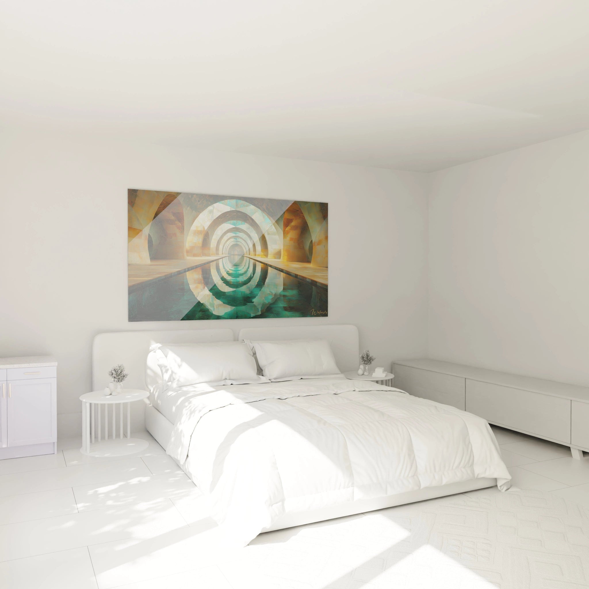
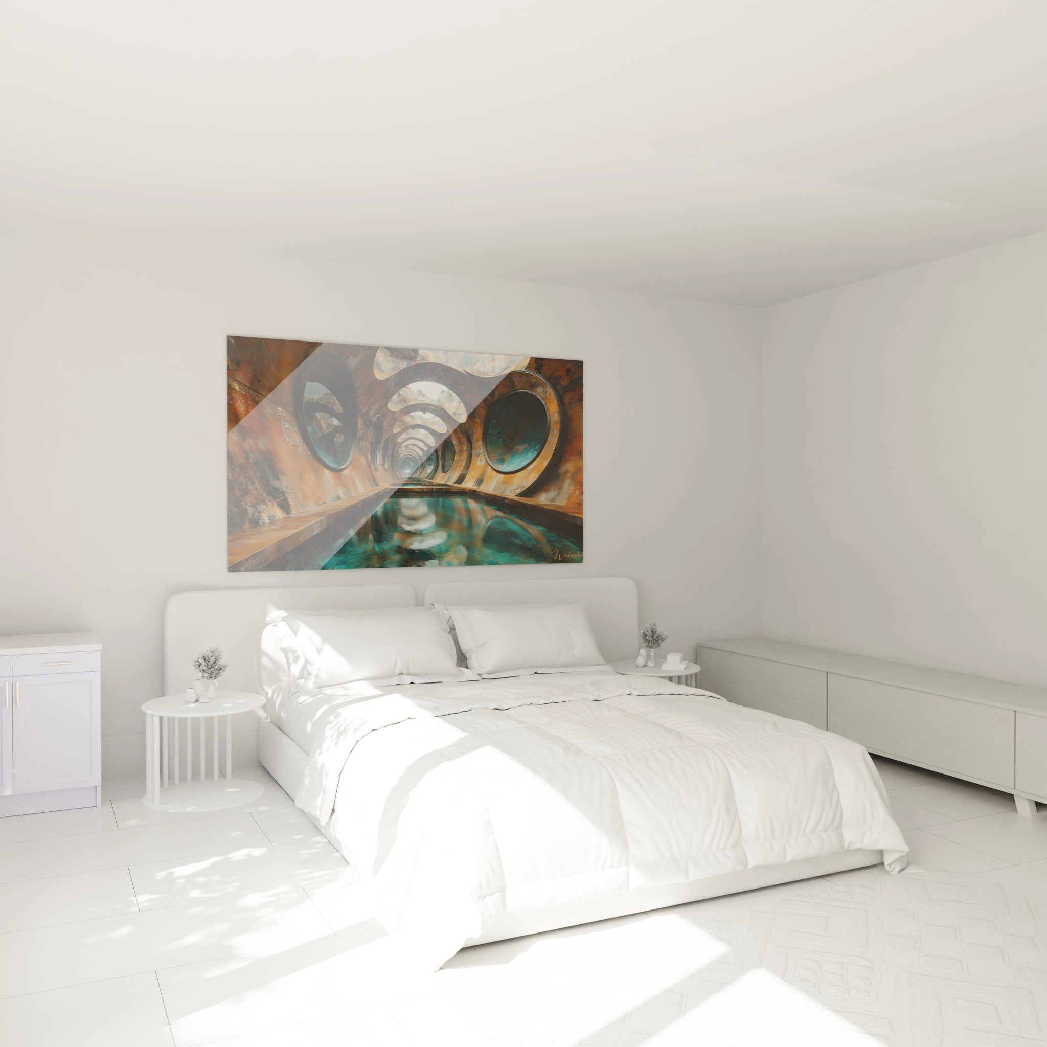
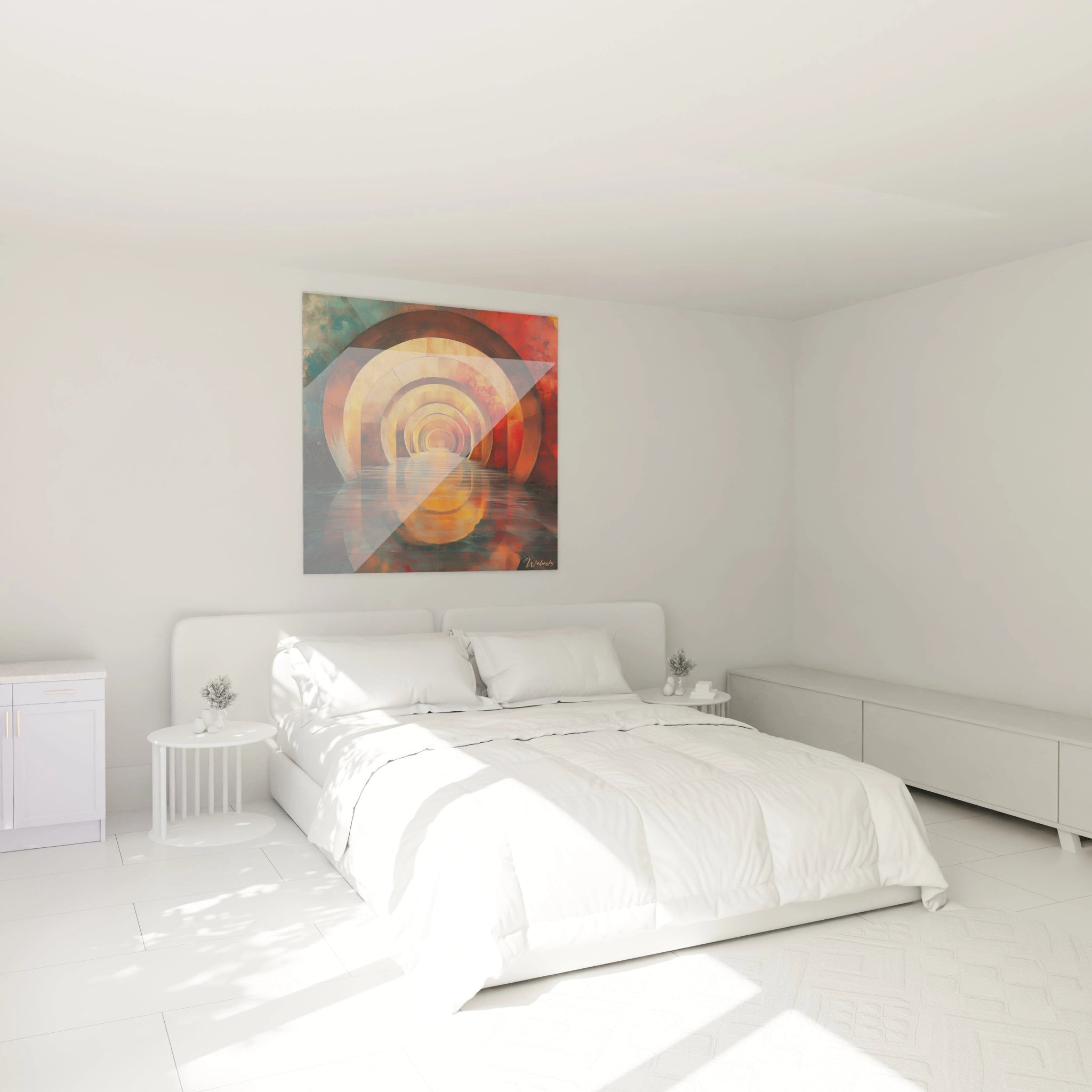
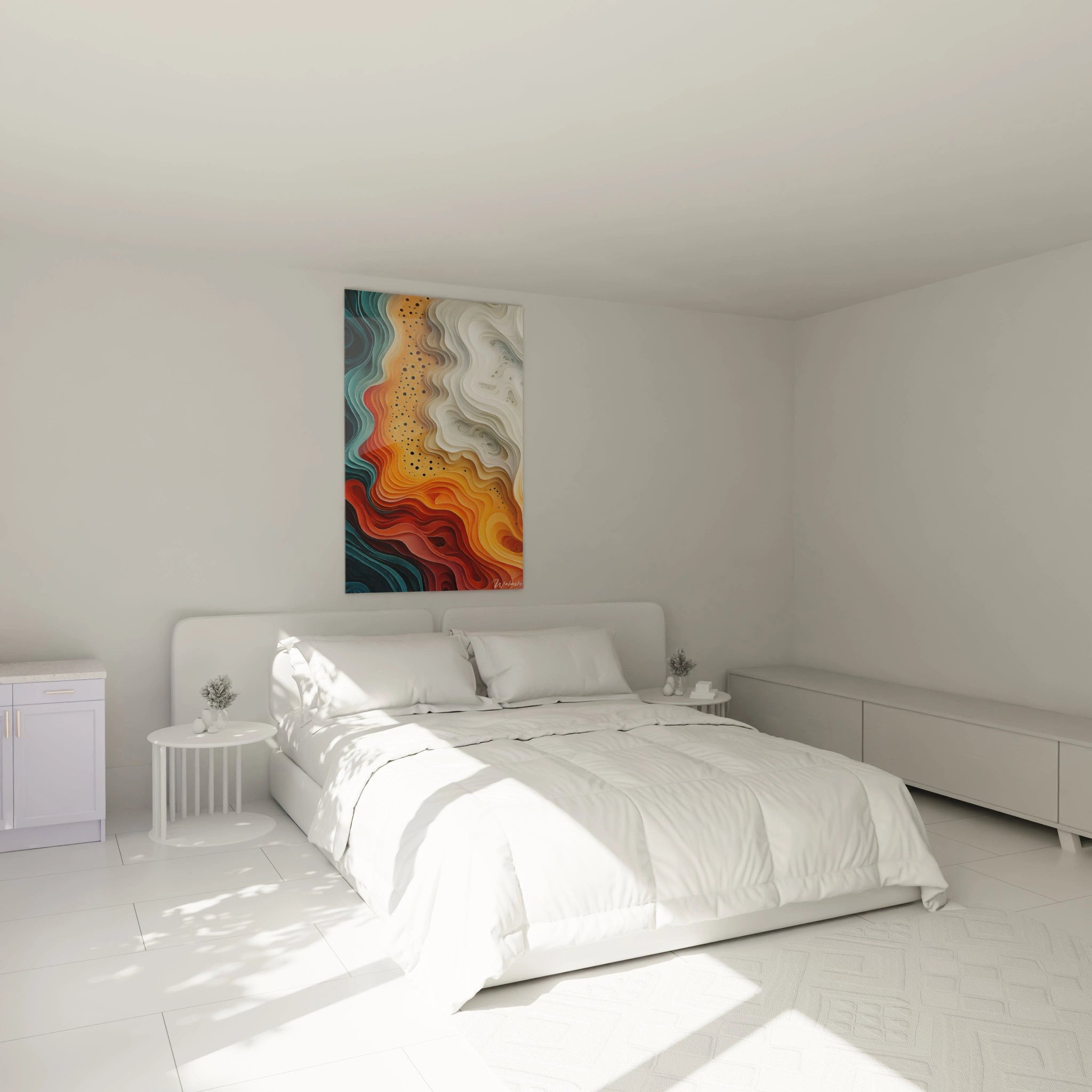
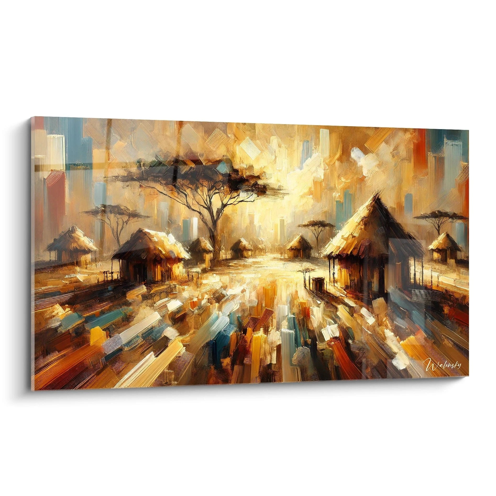
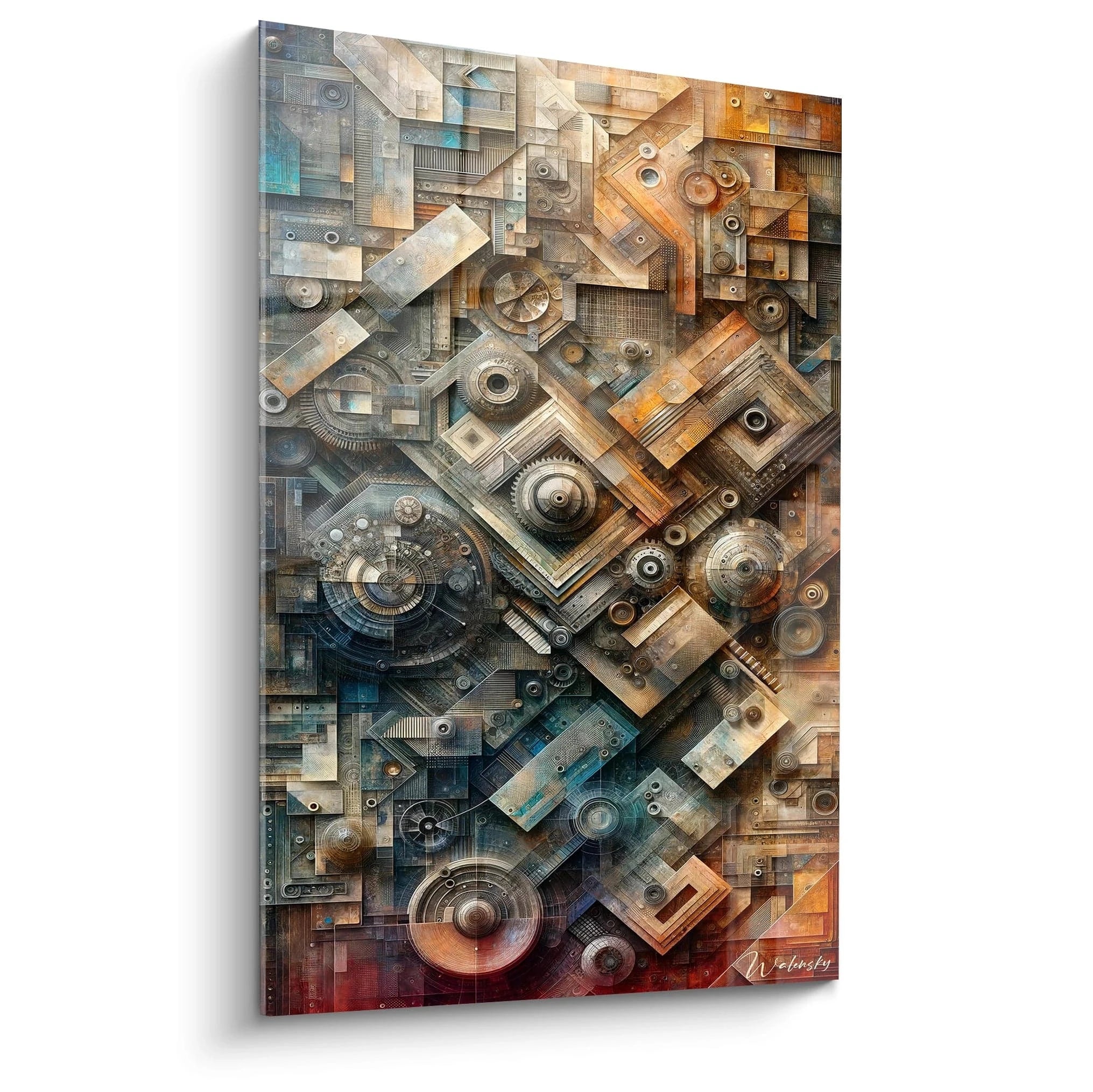
An orange abstract painting radically transforms the spatial perception of your interior by deploying incomparable chromatic energy. This solar hue creates a monumental presence that naturally asserts itself in contemporary and architectural environments of grand scale. Generous formats fully exploit the optical vibration of orange, generating visual tension that amplifies volumes while creating magnetic focal points.
The Thermal Power of Orange in Abstract Composition
An orange abstract painting generates visual thermal radiation that modifies the atmospheric ambiance of an architectural space. This chromatic wavelength activates retinal receptors with maximum intensity, creating an immersive perceptual experience particularly sought after in industrial lofts and open triple-height spaces.
How does orange influence the volumetric perception of spaces?
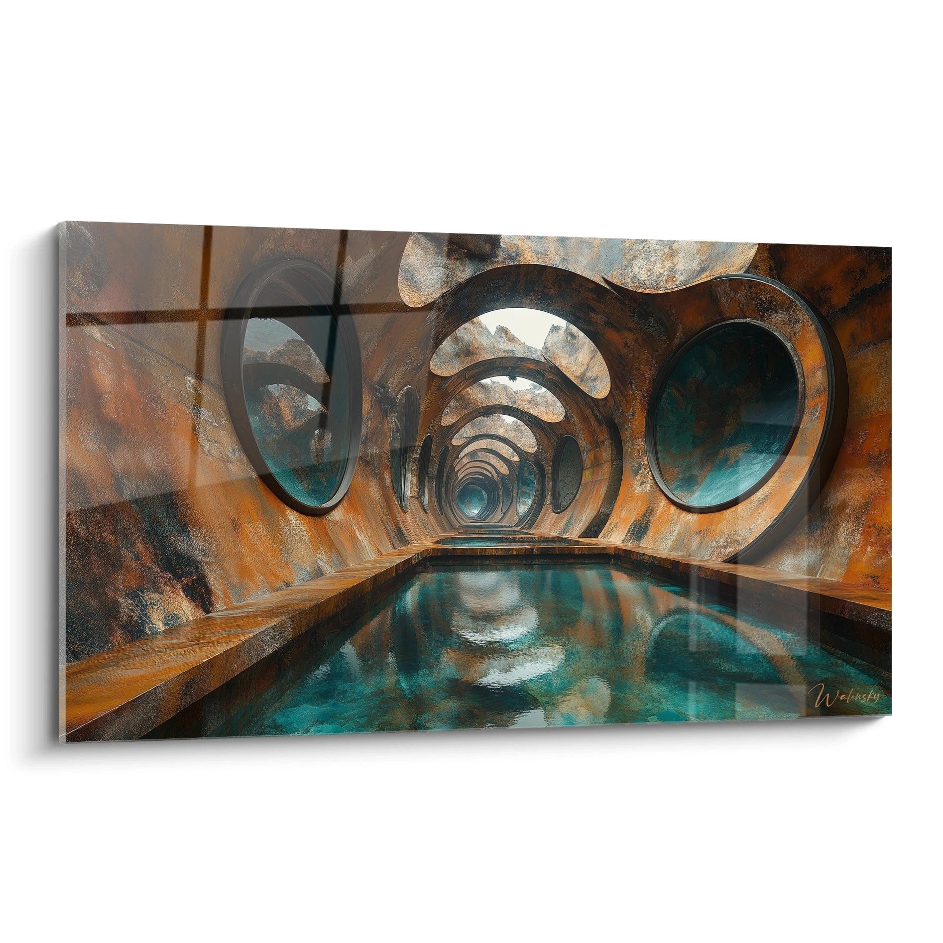
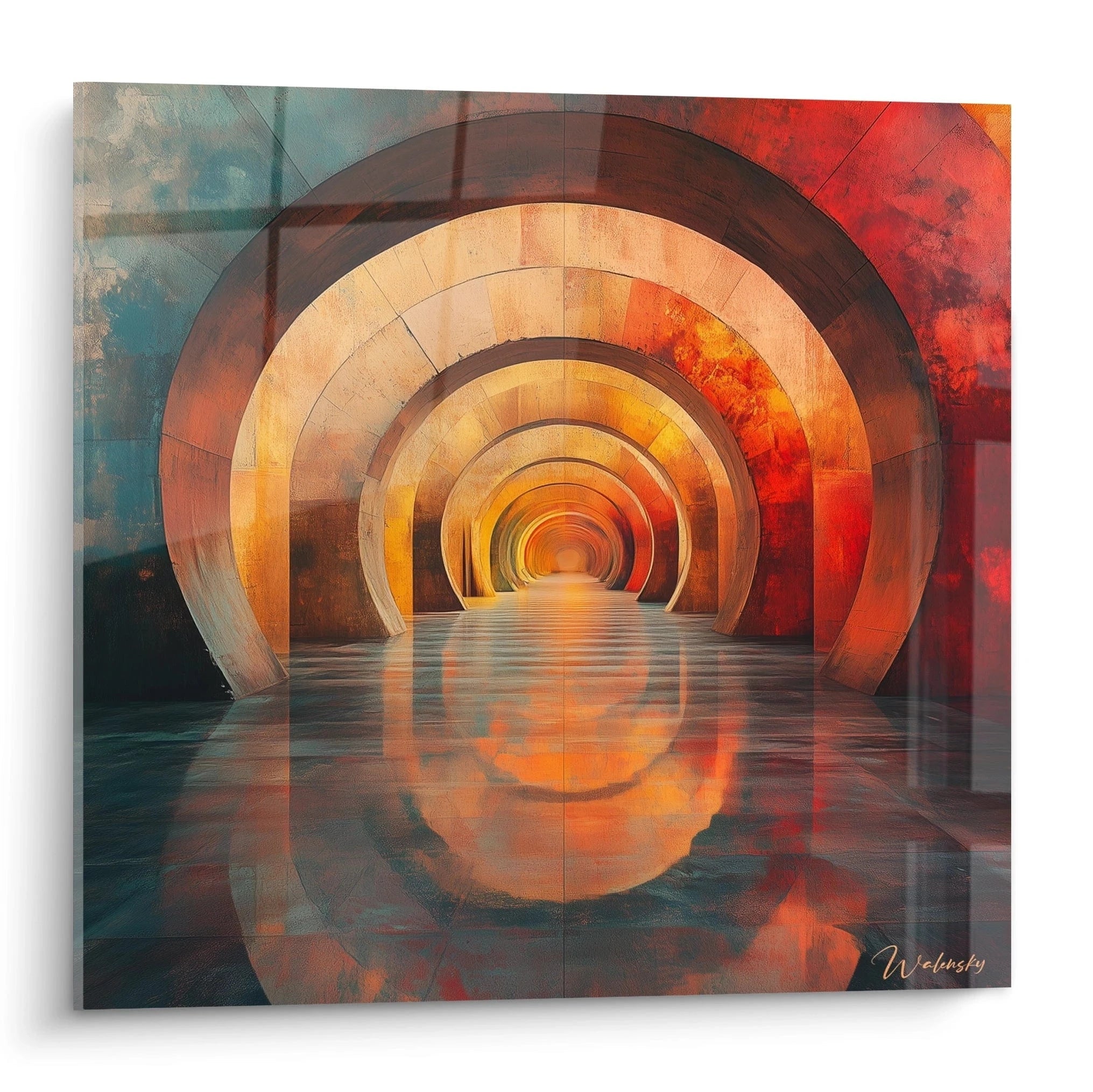
Orange pigments deploy an optical advancement that visually compresses depth while amplifying wall presence. This chromodynamic property transforms reception walls into active energetic surfaces, particularly effective in abstract compositions evoking movement and fluidity. Monumental formats exploit this chromatic progression to structure complex spatial sequences.
The interaction between orange saturation and architectural materiality
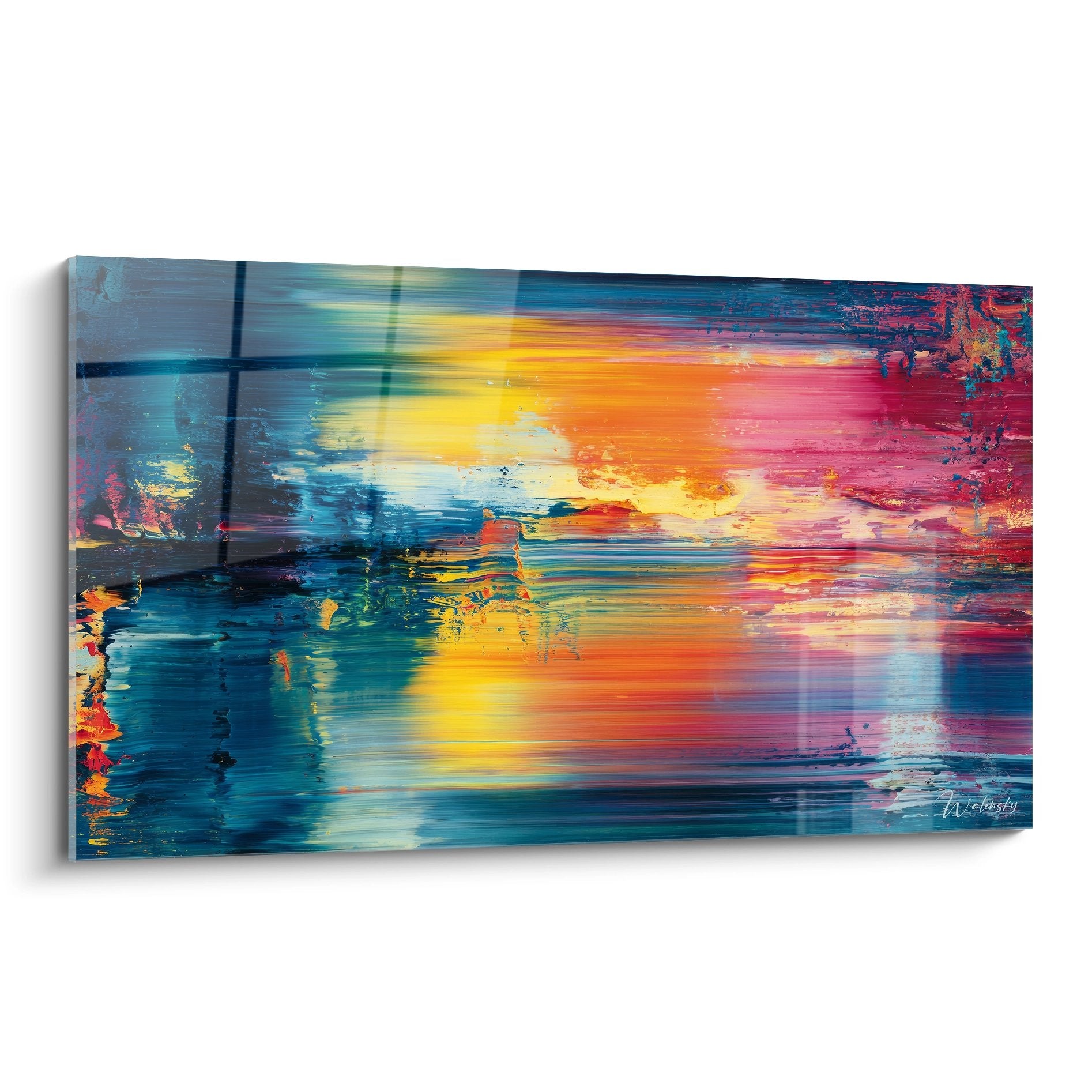
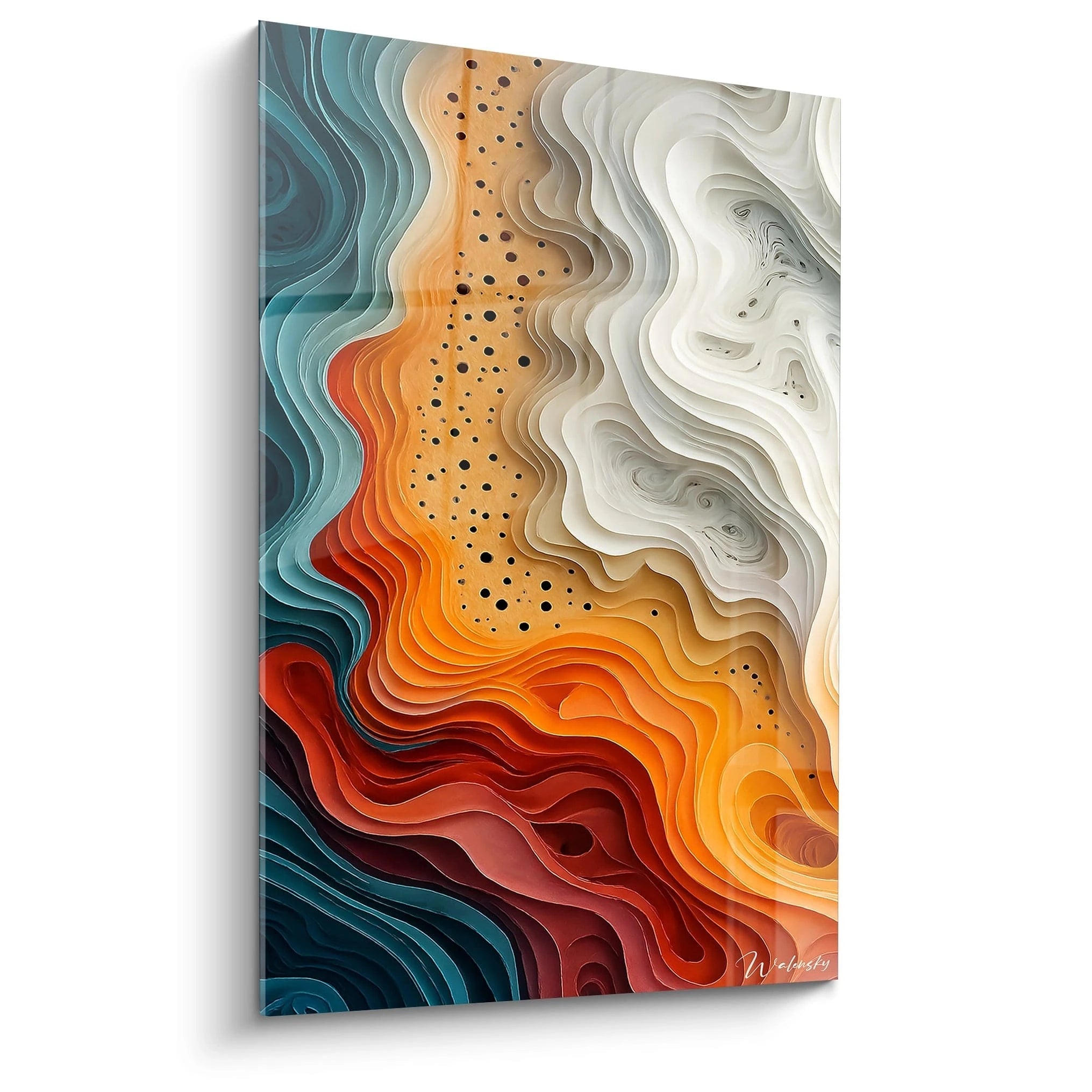
The high saturation of a large-format orange abstract painting creates contrasting dialogues with raw materials like polished concrete, brushed steel, or architectural glass. This material tension generates visual polarities that enrich spatial reading. Copper, mandarin, and vermillion nuances establish sophisticated thermal gradients that respond to circadian light variations.
Chromatic strategies to maximize orange impact
Orange deploys its maximum potential when dialoguing with deep architectural neutrals: anthracite, graphite, mineral off-white. This chromatic orchestration avoids sensory overload while maintaining the visual dominance of the work. Orange abstract compositions incorporating black or titanium grey fragments create rhythmic breaks that structure optical reading and prolong visual engagement.
Architectural Positioning and Orange Spatial Orchestration
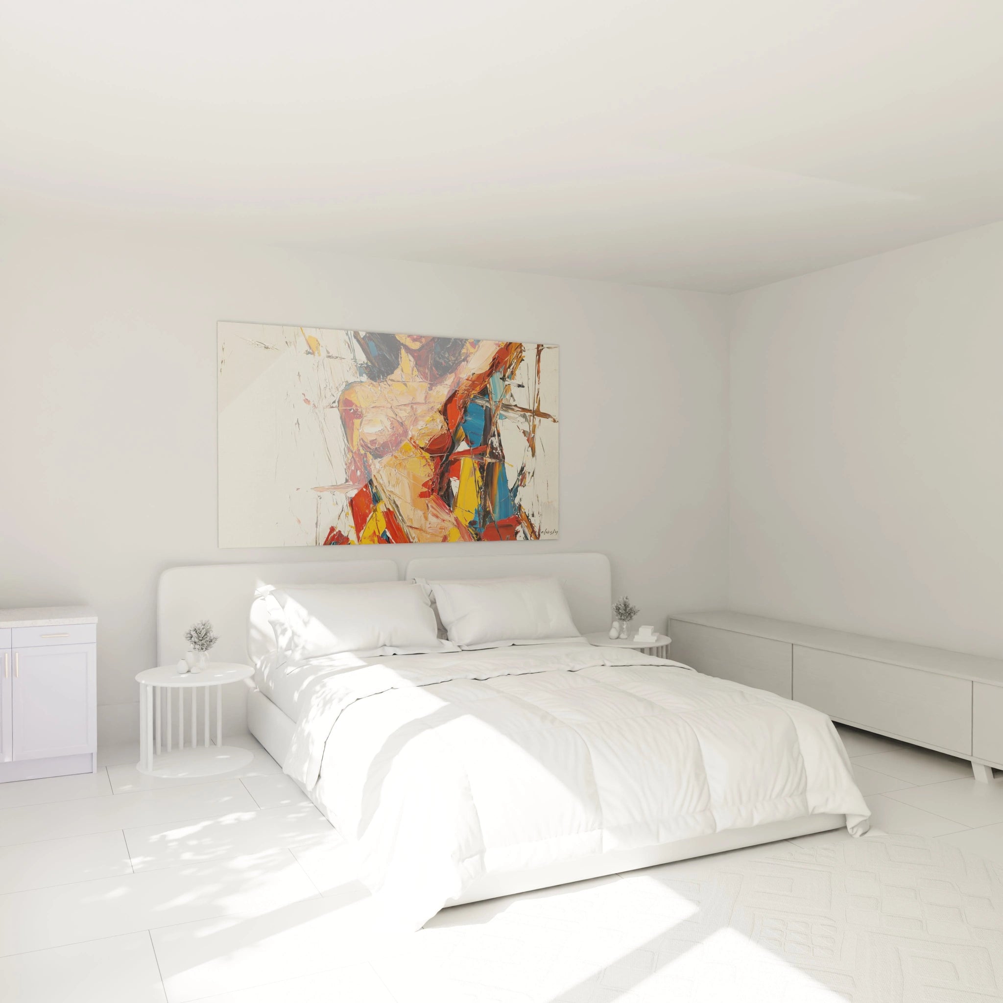
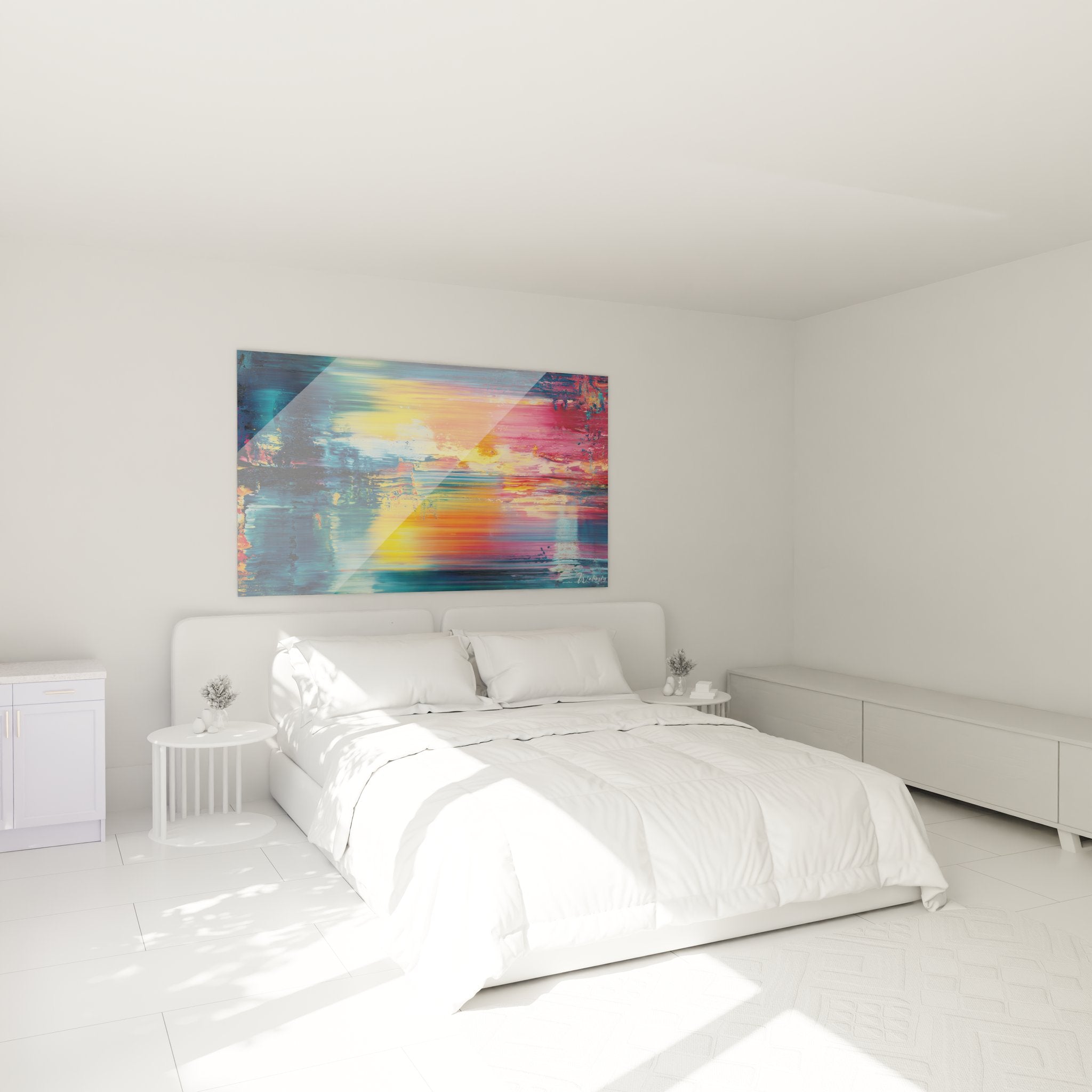
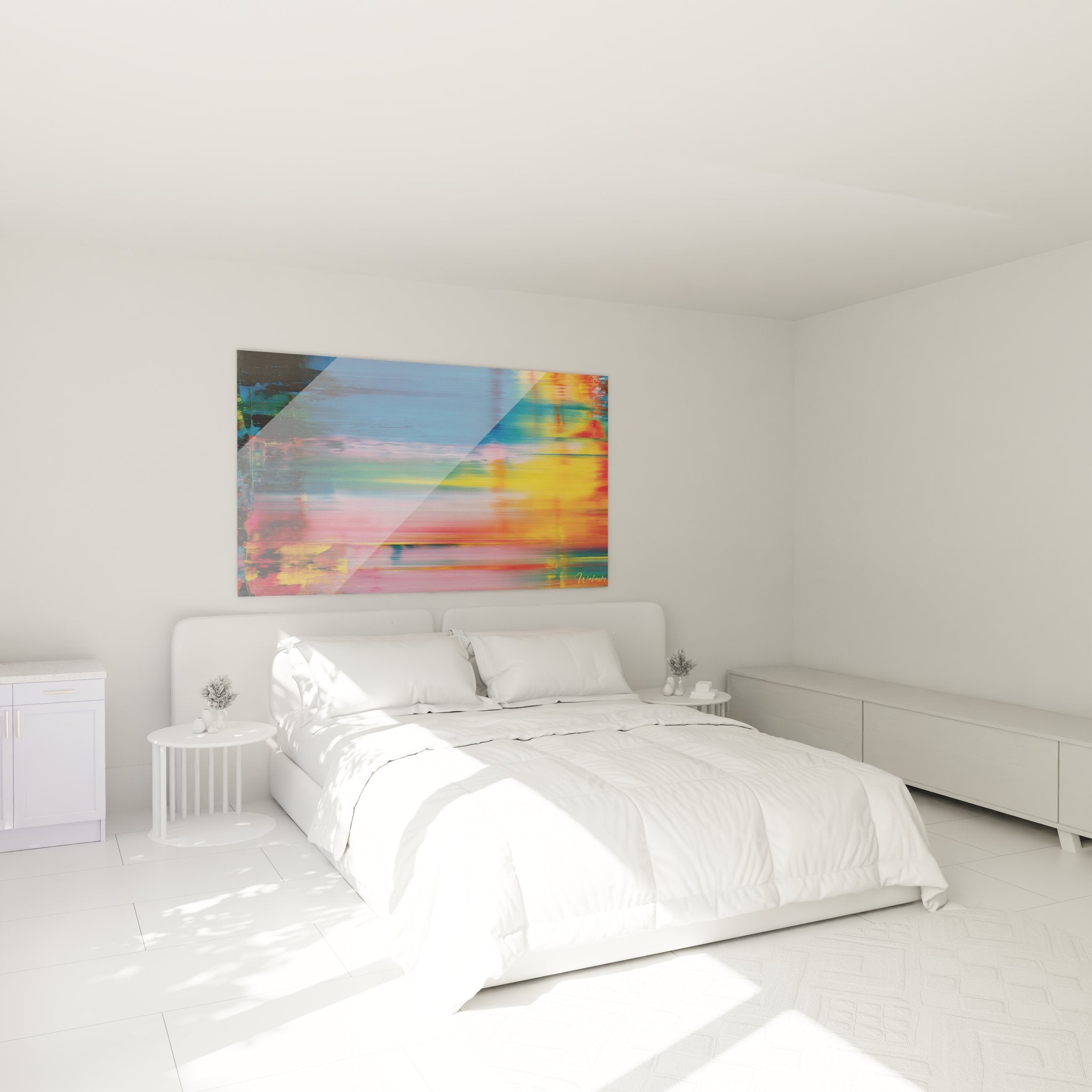
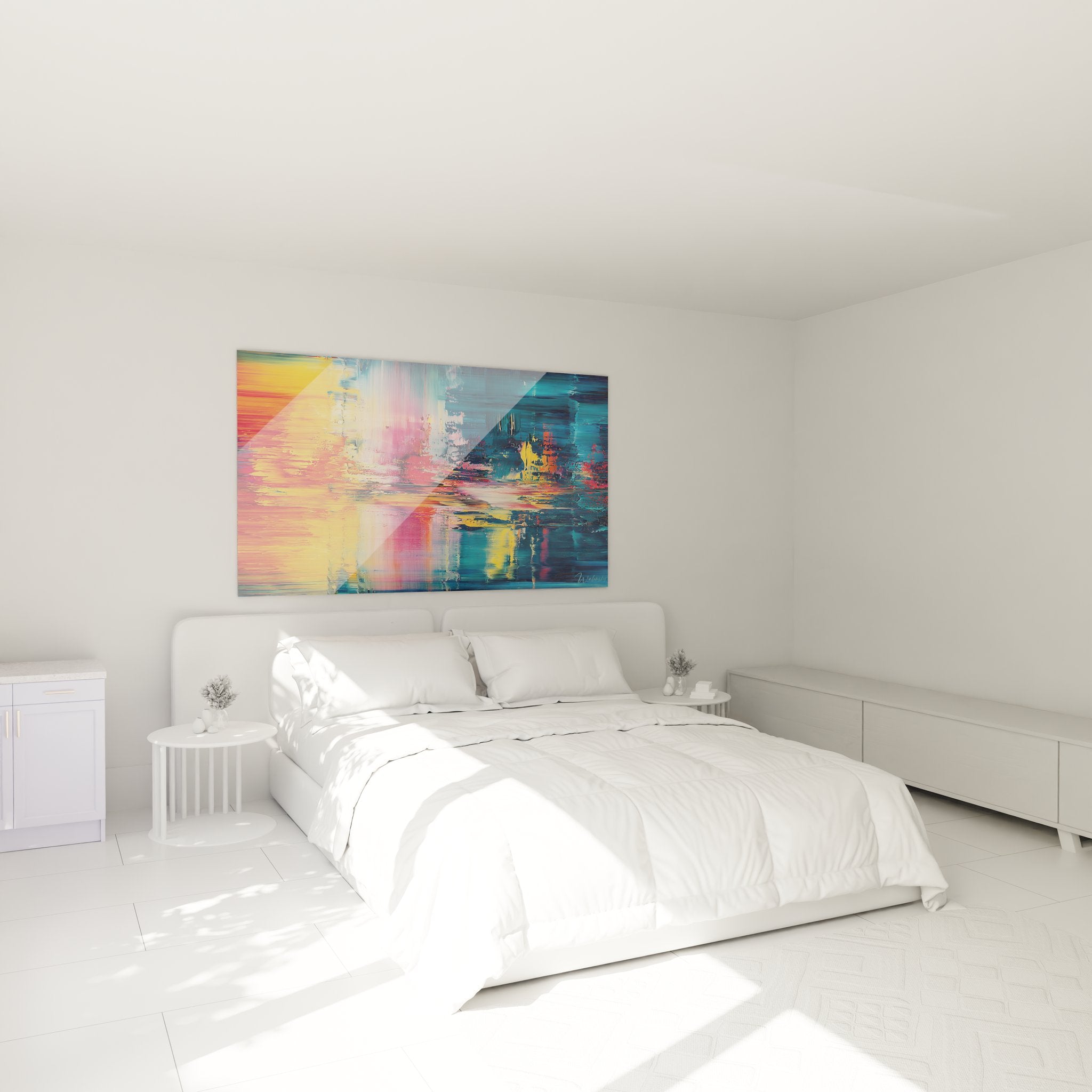
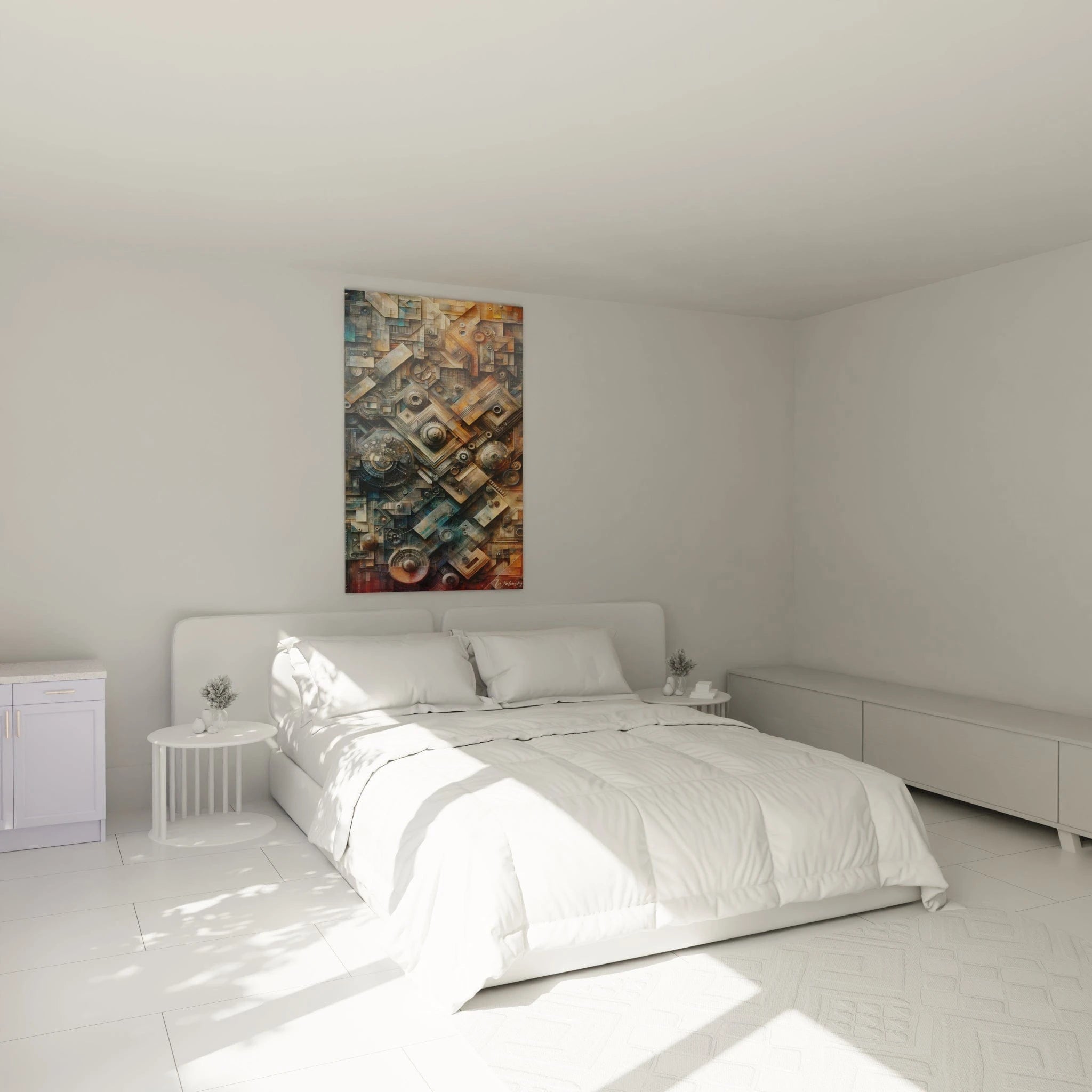
A large-dimension orange abstract painting requires calculated spatial integration to fully exploit its energetic charge. Environments with fluid circulation—entry halls, mezzanines, transition spaces—particularly benefit from this chromatic pulsation that intuitively guides movement while marking perceptual thresholds.
What is the optimal distance to appreciate a large orange painting?
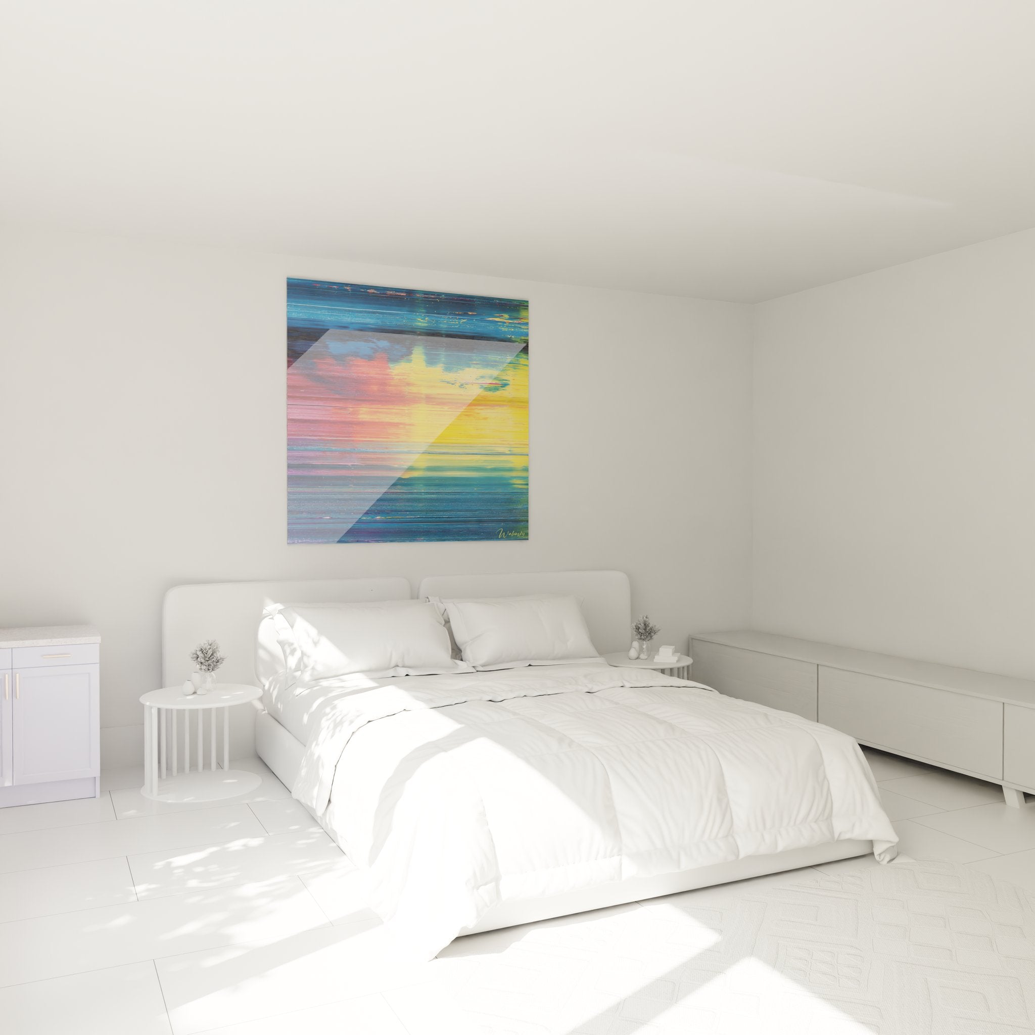
The critical appreciation distance for a monumental orange format lies between 2.5 and 4 meters, enabling simultaneous absorption of the overall composition and textural variations. This visualization zone favors chromatic immersion without retinal saturation, creating a balanced contemplative experience. Reception spaces benefiting from substantial distances ideally enhance these imposing dimensions.
Multi-wall configuration and orange amplification
Installing an orange abstract painting on a wall perpendicular to openings creates secondary chromatic reflections that enrich the overall luminous atmosphere. This color reverberation transforms the space into an immersive volume where color becomes an architectural dimension. Angular configurations exploit light transitions to progressively reveal compositional subtleties.
Synergy between orange scale and architectural proportions
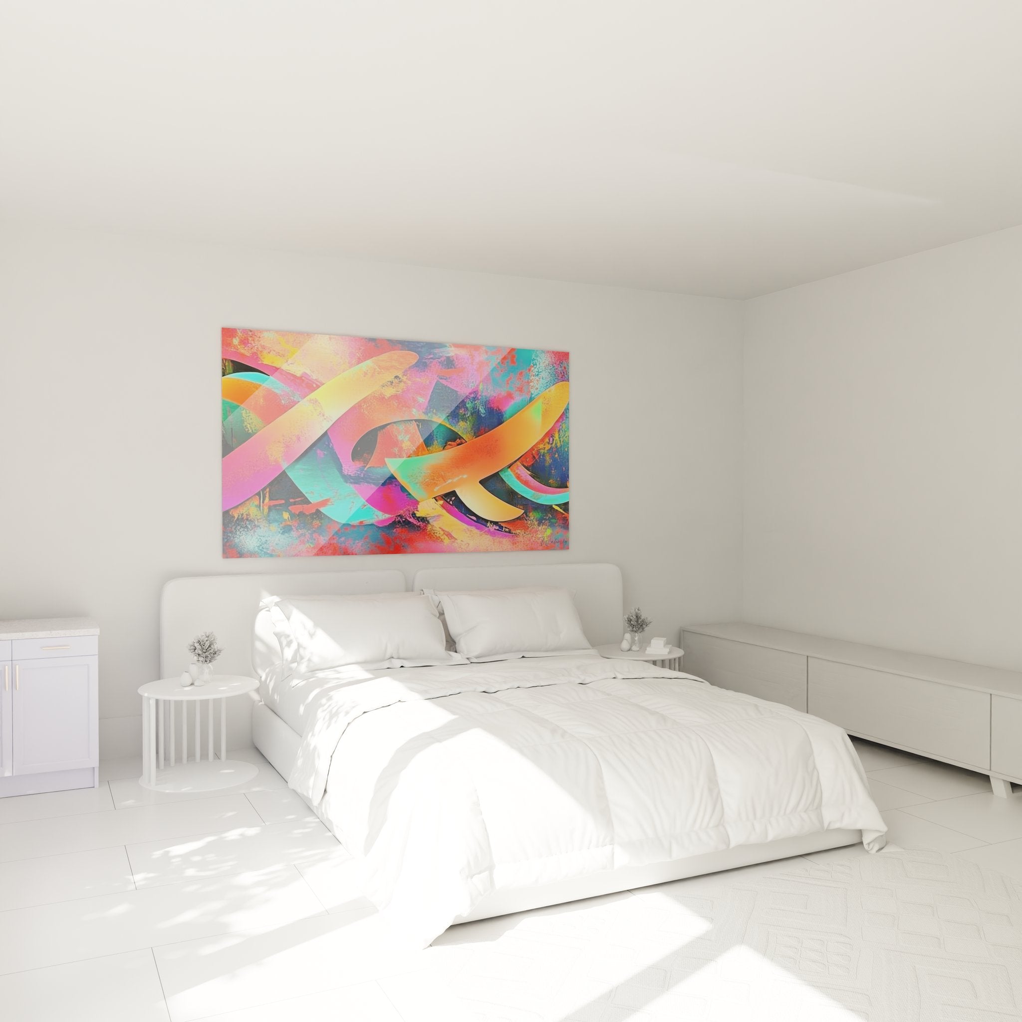
An extended horizontal format (180-240cm) creates a cinematographic continuity that accompanies lateral viewing, particularly suited to longitudinal spaces like gallery corridors or through-room living areas. Conversely, vertical compositions accentuate ceiling height and create dynamic visual ascensions. The orange abstract painting exploits these proportions to establish rhythmic correspondences with existing architecture, creating formal coherence between artwork and spatial envelope.
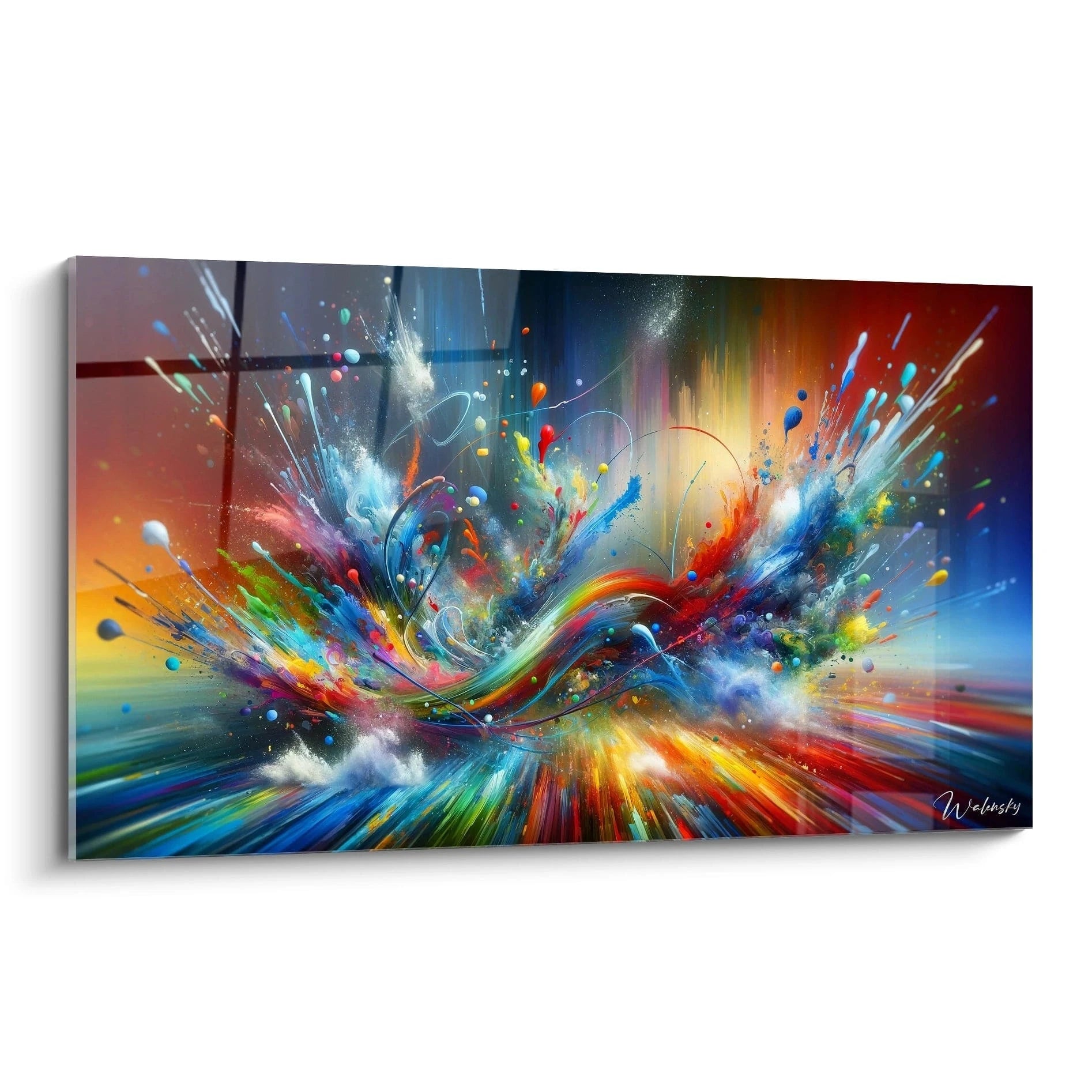
Formal Vocabulary and Visual Grammar of Orange Abstractions
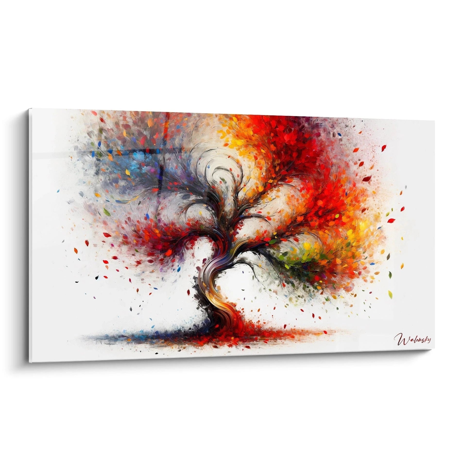
Orange abstract compositions deploy a specific visual language combining spontaneous gestures and intentional structures. This duality creates narrative tension that sustains perceptual engagement over time, transforming each observation into the discovery of new formal and chromatic stratifications.
What compositional elements characterize contemporary orange abstraction?
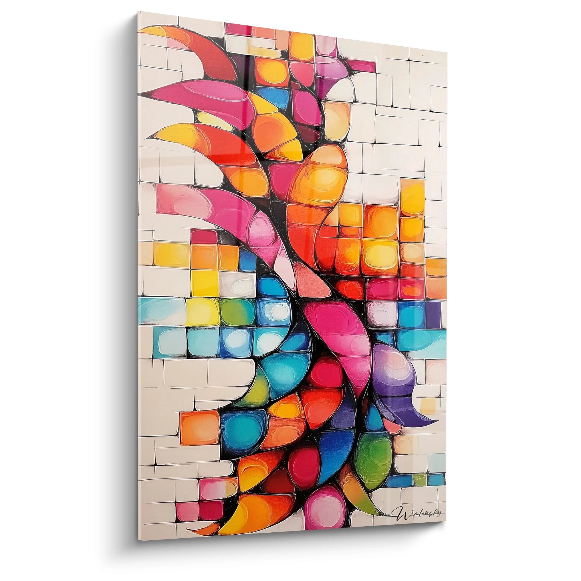
Formal strategies privilege transparent superimpositions, geometric collisions, and controlled textural accidents. These devices generate optical depth that contradicts physical flatness, creating illusory spaces where the gaze circulates between different perceptual planes. Density contrasts—saturated zones versus breathing spaces—establish visual rhythms that structure the contemplative experience.
Orange as a decorative cohesion agent
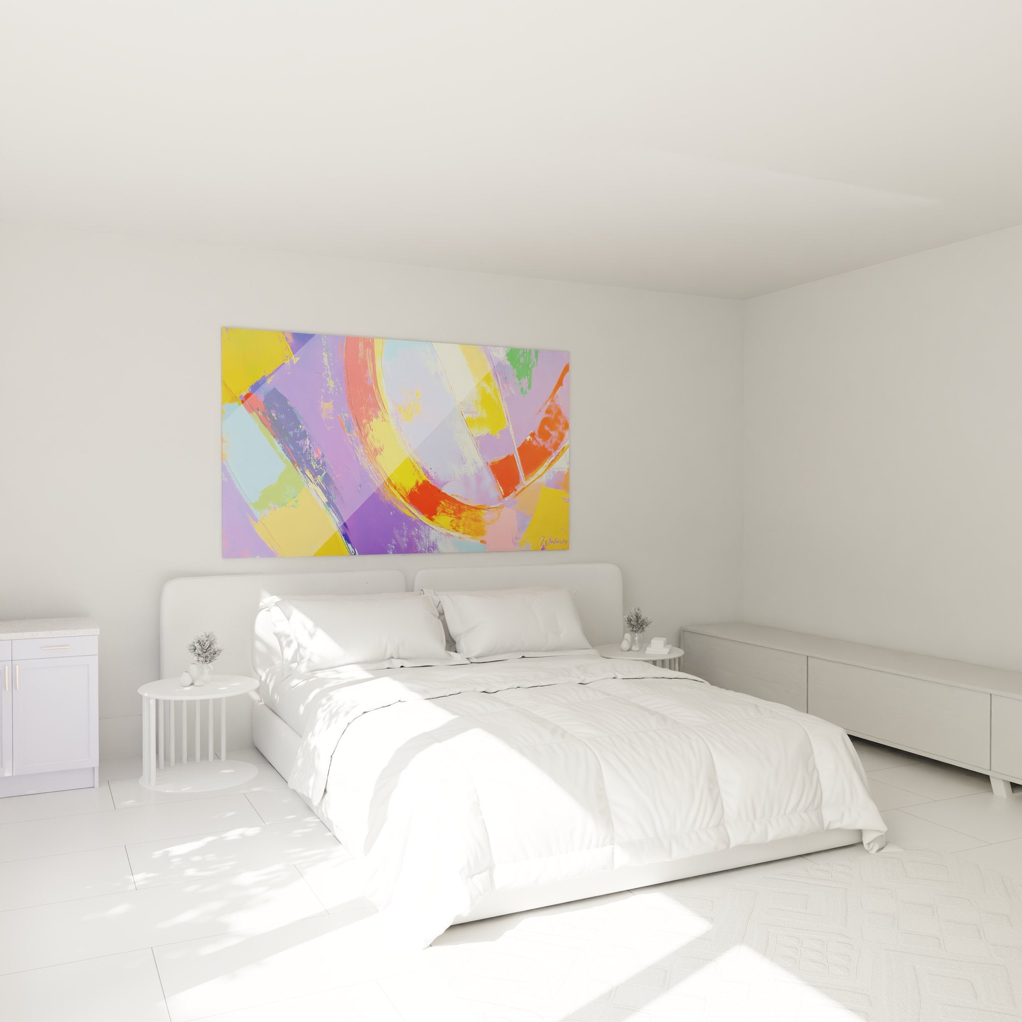
A monumental orange abstract painting functions as a chromatic anchor enabling unified dispersed decorative elements. Copper accessories, burnt sienna textiles, or ochre ceramics establish chromatic echoes that create sophisticated visual continuity without literal repetition. This tonal orchestration transforms the space into a chromatically coherent environment where each element participates in a global color narrative.
Perceptual evolution and orange temporality
The perception of a large orange format evolves substantially according to light cycles: bright and expansive in direct light, deep and contemplative in indirect lighting. This perceptual variability enriches daily experience, transforming the artwork into a dynamic surface that dialogues with circadian rhythms. Matte finishes absorb light to create velvety depths, while slightly glossy surfaces generate subtle optical vibrations.
Is an orange abstract painting suitable for professional spaces?
Absolutely, an orange abstract painting brings measured visual stimulation to coworking spaces, creative meeting rooms, or innovative company reception halls. This hue promotes energetic concentration without aggression, creating an atmosphere conducive to dynamic exchanges.
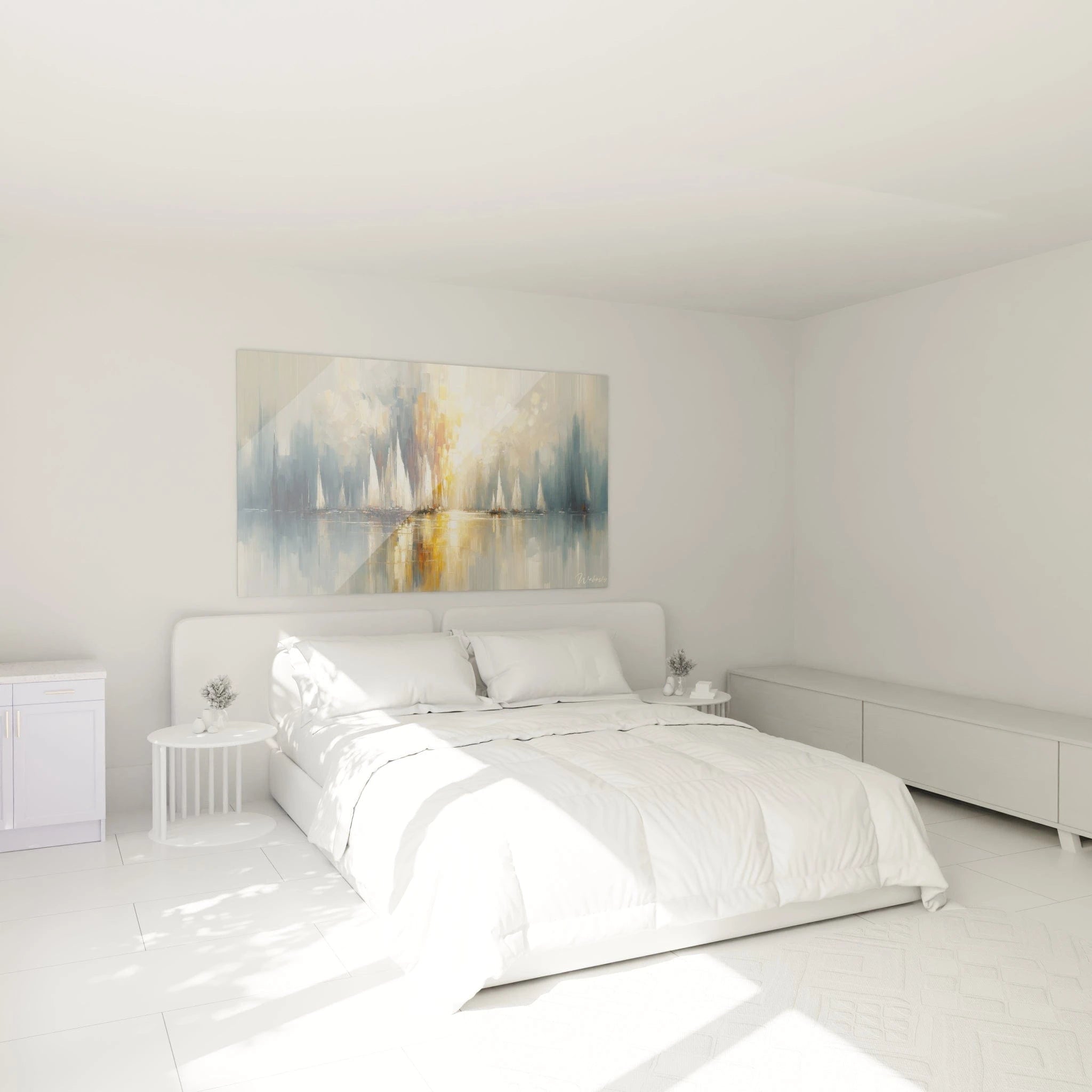
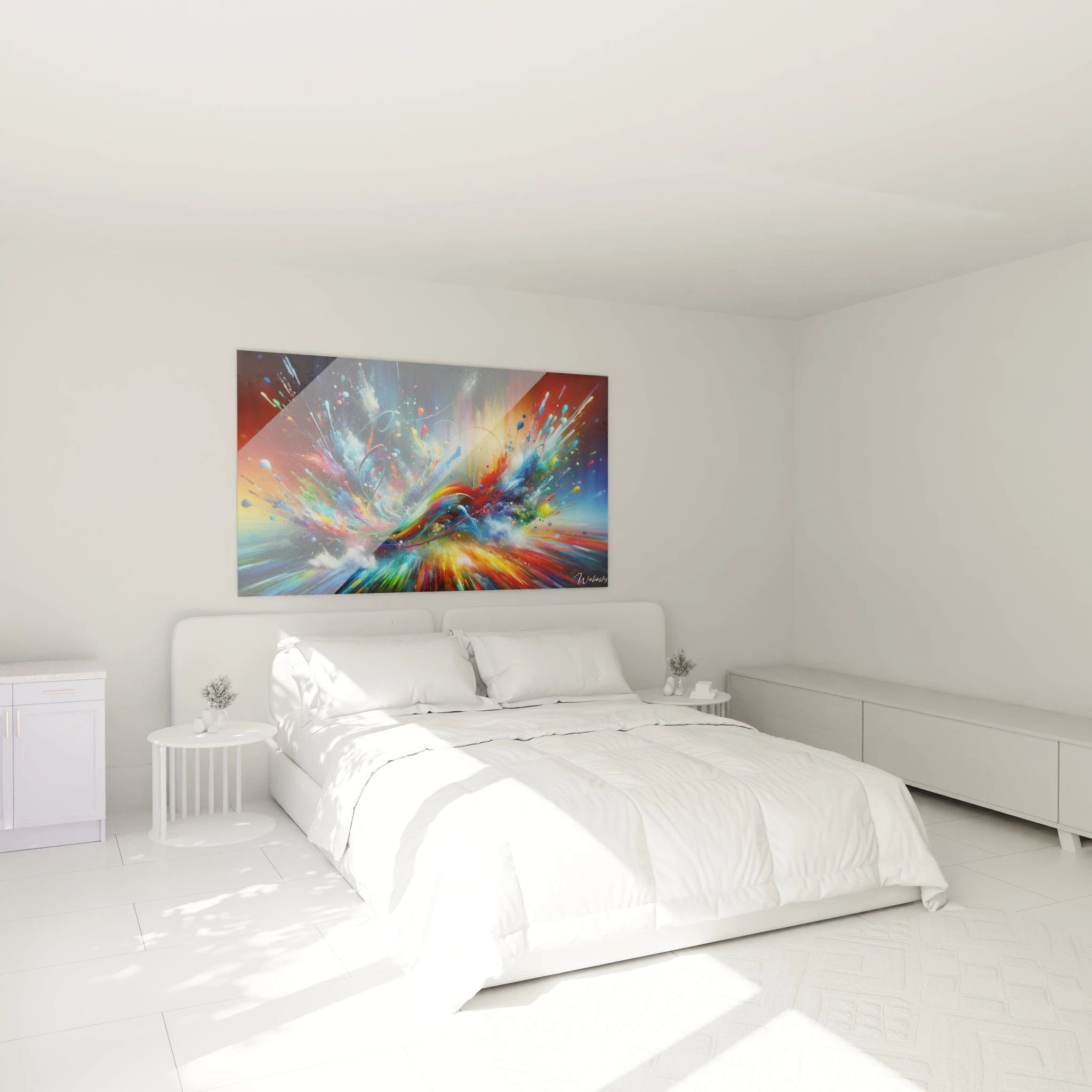
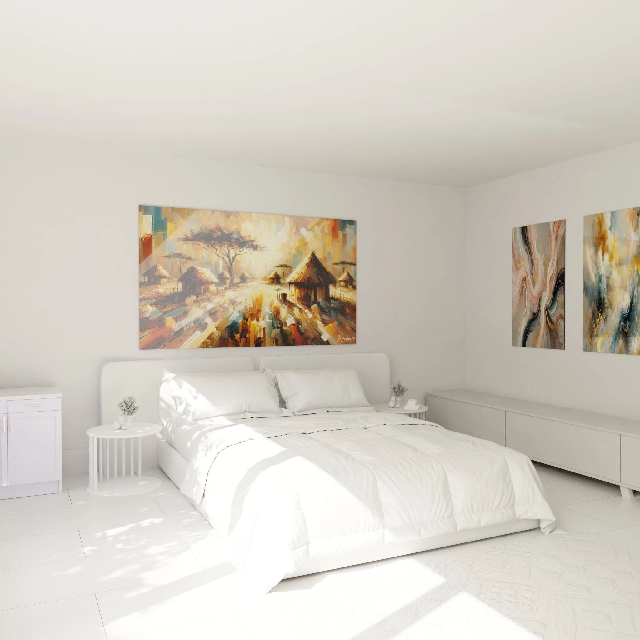
What dimension should be favored for an orange abstract painting in a living room?
For a contemporary living room, opt for dimensions between 120x80cm and 200x140cm depending on available wall surface. The format should occupy approximately 60-75% of the width of the main facing furniture to establish balanced presence without excessive space domination.
How to maintain a large orange abstract painting?
Monthly dusting with a dry microfiber cloth is sufficient to maintain chromatic brilliance. Avoid prolonged direct UV exposure that could alter orange pigment saturation over time, particularly for works positioned facing full south-facing windows.