TABLE TENNIS PAINTING
A white ball snapping across a green table, the sharp crack of the paddle, that little burst of competition between two friends on a Sunday afternoon. Ping-pong has something joyful, almost nostalgic, and yet thoroughly current. So why not carry that energy onto the living room wall, without falling into the cliché of the sports club poster?
- Table tennis differs from classic tennis by its more urban, relaxed character: perfect for a contemporary living room without forcing the "English club" look.
- Blue, gold or monochrome tones blend naturally with Scandinavian style and contemporary furniture.
- The rule of 60 to 75% of the sofa or wall width remains the most reliable benchmark for choosing the size.
Why table tennis has become a trending decor theme
Ping-pong has left garages and club rooms to settle into trendy bars, New York lofts and Parisian rooftops. This cultural shift changes everything: the subject no longer evokes school competition, but an urban, almost lounge-like art of living.
It is precisely this shift that makes the theme interesting for wall decoration. Unlike classic tennis, often associated with a somewhat stiff imagery (Wimbledon, white outfits, English lawns) — or with the ochre clay of Roland-Garros — table tennis remains playful and graphic. A red paddle on a neutral background, a ball frozen mid-trajectory: the subject lends itself to an almost abstract reading, which suits a modern living room where one seeks clean forms rather than overly narrative scenes.
Table tennis does not have the heritage aura of classic tennis — and that is precisely what makes it available for contemporary decor, free from the weight of older codes.
Which table tennis painting style suits a modern living room
The right choice depends first on the light and dominant colour of the room, even before the subject depicted.
Colour palette: neutral, pastel or contrasting
In a modern living room, three families of shades work particularly well. Blue, first: it recalls the classic colour of competition tables and pairs wonderfully with a Scandinavian interior with white walls and light wood furniture. Gold and ochre next, for a warmer, almost sunset atmosphere. Finally monochrome, the safe choice for a very minimalist living room.
Avoid compositions overloaded with bright, contrasting colours if your living room already embraces minimalism: the painting should complete the space, not compete with it.
Abstract vs figurative formats
A figurative work — a player in full action, a paddle in a still life — tells a story and works well as a centrepiece. A more abstract composition, where you merely sense a ball's trajectory or bursts of colour, blends more discreetly into a setting already rich in decorative objects.
Paintings printed on aluminium Dibond have a matt finish with no reflection: ideal if your living room faces a picture window. Acrylic glass, glossier, enhances colours in a room with subdued lighting or with well-placed indirect lighting.
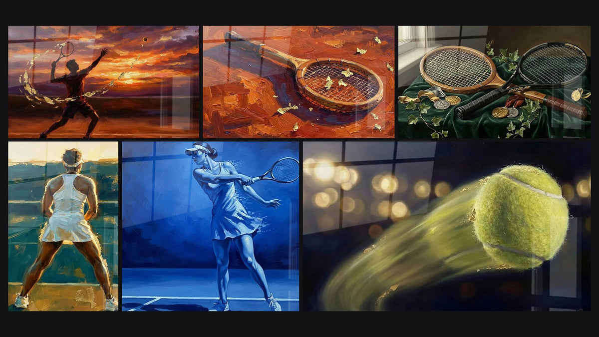
For a first approach to the subject in terms of colours and materials, the Female Tennis Player painting in blue gradients illustrates this monochrome yet dynamic approach well.

Favorite
Female Tennis Player Painting - Blue Power - Tennis Edition
From €213.90
Discover this paintingWhere and how to hang the painting in your living room
Placement changes almost everything: a perfectly chosen painting can look wrong if poorly positioned, and vice versa.
Above the sofa
This is the most natural spot in a modern living room. The centre of the artwork should sit roughly 1.50 m from the floor, the average eye height, and its width should represent 60 to 75% of the sofa's width to create a harmonious visual balance. These sizing benchmarks also apply to an office: the right tennis painting size for an office follows similar rules, adapted to a more constrained space.
Alongside a bookcase or TV unit
A square or slightly vertical format works well beside a contemporary bookcase, balancing the shelves. Above a low TV unit, prefer a wide format that follows the horizontal line of the furniture rather than a square that would break the line.
- Above the sofa: L to XXL format depending on width, centre at 1.50 m from the floor.
- Above the TV unit: horizontal format, slightly narrower than the unit.
- In a reading corner: a more modest square format, complementing an armchair.
To go further on choosing dimensions for each room configuration, our article on choosing the size of a ping-pong painting by room details concrete cases.
— Our selection


Pairing the painting with your furniture and wall colours
A painting never lives alone: it converses with the cushions, the rug, the wall colour, the evening light.
If your living room plays the card of navy blue and light wood typical of Scandinavian style, a painting in blue tones naturally extends this atmosphere without a break. Conversely, an off-white wall welcomes very well a work in gold or orange tones, which warms the whole without weighing it down.
Echo one of the painting's colours in a cushion or a small textile touch (throw, vase): this creates a subtle visual thread between the wall and the rest of the room, without tipping into an overly perfect match.
Indirect lighting, a wall-washing sconce or a discreet LED strip, radically changes how colours are perceived in the evening. On acrylic glass the light catches and makes the tones vibrate; on aluminium Dibond the render stays softer, more matt, more composed.
Our favourites for a modern living room
For a living room with contemporary lines, certain compositions stand out in particular for their graphic quality and palette.
The paddle surrounded by yellow and blue splashes brings a dynamic touch without being garish; the player in turquoise and gold is appealing for its elegance; and the vintage orange and red version suits living rooms seeking a bit of warmth. Three very different readings of the same subject, all designed for a current interior.
To explore sports themes in wall decoration more broadly, the collection of sports and leisure paintings brings together other worlds, from classic tennis to urban cycling.

Also to discover
Vintage Tennis Racket Painting - Passion for the Court - Tennis Edition
From €233.90
Discover this painting →Frequently asked questions
Which type of painting should you choose for a modern living room?
Favour a piece with a clean graphic style, in a palette of two or three colours at most, rather than a highly detailed photorealistic composition. An abstract or semi-figurative style blends more easily into a contemporary interior.
How to pair a sports painting with minimalist decor?
The secret lies in the restraint of the rest of the room: clean-lined furniture, plain walls, few competing decorative objects. The painting then becomes the focal point without extra effort.
What painting size for a modern living room?
The rule of 60 to 75% of the sofa or wall width remains the most reliable benchmark. For a 200 cm sofa, this corresponds to an artwork roughly 120 to 150 cm wide, depending on the formats available on the chosen painting's product page.
Where to hang a sports-themed painting in a living room?
Above the sofa remains the most readable spot, but a hallway wall leading into the living room or the space above a low TV unit works just as well depending on the room's layout.
Conclusion
The crack of the ball, the quick flick of the wrist, that slightly playful energy: this is what a table tennis painting can bring to a modern living room, far from a mere sporting nod. Chosen in the right palette and properly sized, it becomes a true focal piece of wall decoration.
If you feel like personalising your choice further, our article on gift ideas for a tennis enthusiast who loves decor offers other avenues to explore. And to find the piece that will perfectly complete your interior, the living room painting collection gathers every available theme, table tennis included.
Explore our collections