

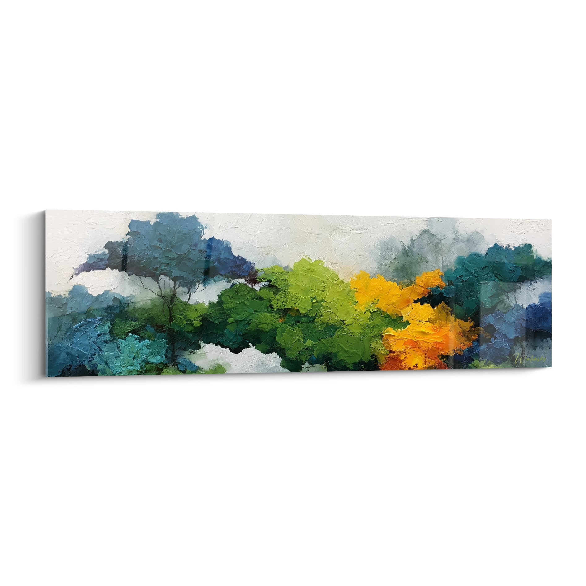






Rectangular abstract painting in warm colours: the guide to warming up your kitchen
8 min read · by Walensky
PAINTING COULEURS EN FOLIE
There's that wall, between the fridge and the window, that has stayed bare for months. You've repainted, changed the cupboard handles, bought the right teapot. Yet that wall still waits. What if the answer weren't a new paint colour, but a rectangular painting in warm tones that does the job in a single piece?
- Warm tones (red, orange, ochre, terracotta) trigger a sense of conviviality and appetite, which is particularly well suited to dining areas.
- The classic rectangular format (120x70 cm and up) works well on narrow walls or spaces between furniture, where a panoramic piece would be too wide.
- Harmony works best when the painting picks up a shade already present in the room: wood, brass, terracotta tiles.
Why warm colours work so well in a kitchen
Restaurateurs don't choose red, orange and ochre at random for their dining rooms. These tones create a sensation of warmth and conviviality that naturally encourages people to linger, chat and sit at the table without rushing. It's an almost physiological reflex: we associate these colours with fire, terracotta and ripe harvests.
In a kitchen, this effect comes with another advantage: warm colours better mask the imperfections of artificial evening light. A white wall under a cold neon light looks clinical; a touch of ochre or terracotta softens the atmosphere immediately.
A kitchen is never just a functional room: it is the only place in the home where we cook, eat, chat and laze about in pyjamas on Sunday mornings. Warm colours finally give it the character it deserves.
Be careful, however, not to rely on a single saturated shade. A mustard yellow or brick red in a small touch, through a painting, works far better than an entire wall repainted in that colour, which soon tires the eye.
The classic rectangular format: advantages and differences from the panoramic
The classic rectangular format, neither too elongated nor square, remains the most versatile choice for a standard kitchen. It adapts to medium-width walls, spaces between two tall units, and areas where a panoramic piece would simply be too wide. The same format also suits the entrance hall, as our selection of rectangular mountain landscape paintings with snowy peaks for the entrance shows.
When to prefer rectangular over panoramic or square
The panoramic format excels on a long kitchen wall open to the living room, to visually unify the two spaces. But if your kitchen is more compact, or the available wall measures between 100 and 150 cm wide, the classic rectangle avoids the "cramped" effect of an overly stretched format. It is also the most natural choice above a rectangular table, echoing its proportions.
The square suits a space that is square by nature: an isolated stretch of wall, a central island seen from afar. For most French kitchens, the rectangle remains the format easiest to integrate without complicated calculations.
Ideal proportions according to wall size
In practice: above a 160 cm table, aim for a painting about 120 cm wide, like the L format offered on most of our pieces. On a more generous wall, the XL (140x80 cm) or XXL (160x90 cm) formats take up more space without overwhelming the room.
For a narrow wall, between two tall units for example, the made-to-measure format from 80x46 cm lets you fit a work in warm colours even into a small space, without sacrificing proportions.

Favorite
Dancer Painting red and beige with rectangular stripes - One hand on the floor - Breakdance Edition
From €273.90
Discover this paintingWhere to place a rectangular painting in warm colours in your kitchen
The question of placement is often settled by observing where the eye naturally rests during meals. Two areas stand out in most French kitchens.
Above the table or breakfast bar
This is the most obvious location, and often the most rewarding. The centre of the painting should sit at eye level for a seated person, roughly 140 to 150 cm from the floor once hung. This avoids the "painting floating too high" effect that looks odd once you're seated at the table.
For this spot, an abstract geometric composition in red and orange tones works particularly well: it energises the dining area without telling a story that distracts during dinner.
On a free wall between two windows or pieces of furniture
Another common configuration: this stretch of wall wedged between two windows, or between a wall unit and a door frame. The L format (120x70 cm) or a made-to-measure size fits effortlessly, provided you respect the rule of 60 to 75% of the available width, no more. This type of rectangular format suits the office as well as the kitchen, as shown in our selection of rectangular Alu Dibond paintings for professional offices.
- Wall between two kitchen windows: opt for a made-to-measure format fitted to the exact space.
- Above a breakfast bar or island: the L or XL format is the obvious choice, depending on the length of the worktop.
- Passage wall, corridor leading to the kitchen: a more discreet piece, soft ochre or terracotta, avoids visual overload.
The Dancer painting in red and beige with rectangular stripes illustrates well what a strong geometric composition can achieve on a passage wall: the movement captured in the image animates the space without weighing down circulation.
— Our selection


Matching warm colours to the materials and tones of your kitchen
The classic pitfall: choosing a stunning painting from a photo, then discovering at home that it clashes with the worktop. Chromatic harmony is built upfront, not afterwards.
In a kitchen with light wood (oak, beech), ochre and mustard yellow naturally extend the warmth of the wood. Against brass or gilded handles, terracotta and burnt orange create a very successful metallic echo. And on terracotta tiles already present on the floor or splashback, it is better to choose a painting that picks up a complementary shade rather than an identical one, to avoid a "total look" effect.
| Dominant material | Recommended warm tone |
|---|---|
| Light wood (oak, beech) | Ochre, mustard yellow |
| Brass, gilding | Terracotta, burnt orange |
| Terracotta floor tiles | Brick red as an accent, or complementary green |
| White or grey cabinets | Vivid red, bright orange for contrast |
For a resolutely minimalist kitchen, with white or grey cabinets, warm tones in bold contrast often work better than a too-subtle harmony that blends into the décor without adding much. That is precisely the challenge of an contemporary kitchen open to the living room : colour becomes the visual anchor of the entire room.
Here are two pieces that illustrate this logic of chromatic harmony in the kitchen:
— Also to discover


Our favourite rectangular abstract paintings in warm colours
Among the compositions printed in Italy on acrylic glass or Alu Dibond, some lend themselves particularly well to the warm-toned kitchen.
This red and black geometric composition, in an abstract mosaic style, suits modern kitchens seeking bold contrast rather than soft harmony. It pairs very well with a dark wood worktop or a matt black island.
For a softer, nature-inspired mood, the Sunflower painting in yellow and green on an ivory background brings a summery touch that works all year round, especially in kitchens with a predominantly light palette.

Frequently asked questions
Which painting colour should you choose for a kitchen?
Warm tones (red, orange, ochre, terracotta, mustard yellow) remain the most suitable for a kitchen, as they stimulate conviviality and appetite. Avoid, however, a single overly saturated shade across a large surface: prefer a composition that mixes several warm hues.
Which painting format for a small kitchen?
For a narrow wall, the made-to-measure format (from 80x46 cm) remains the best option: it fits the actual available space without forcing a standard format that is too large. Failing that, the L format (120x70 cm) is the most compact of the classic sizes.
Do warm colours make you hungry?
This is a widely recognised idea in colour psychology and in the restaurant industry: red and orange visually stimulate appetite and create an impression of welcoming warmth, which explains their frequent presence in dining areas.
How do you hang a rectangular painting above a kitchen table?
The centre of the artwork should sit roughly 140-150 cm from the floor, which is eye level for a person seated at the table. The width of the painting should represent 60 to 75% of the width of the table for a successful visual balance.
A kitchen that lives, that makes you want to sit down without checking the time, sometimes depends on a single well-dressed wall. The wall between the fridge and the window, the one that has been waiting for months, only asks for one thing: a rectangular painting in warm colours that finally gives it a role. To go further on choosing tones according to the size of your room, our article on the panoramic abstract painting to unify kitchen and living room usefully complements this reflection. And to explore the full range of vibrant shades suited to the kitchen, head to the Colours Gone Wild collection.


