


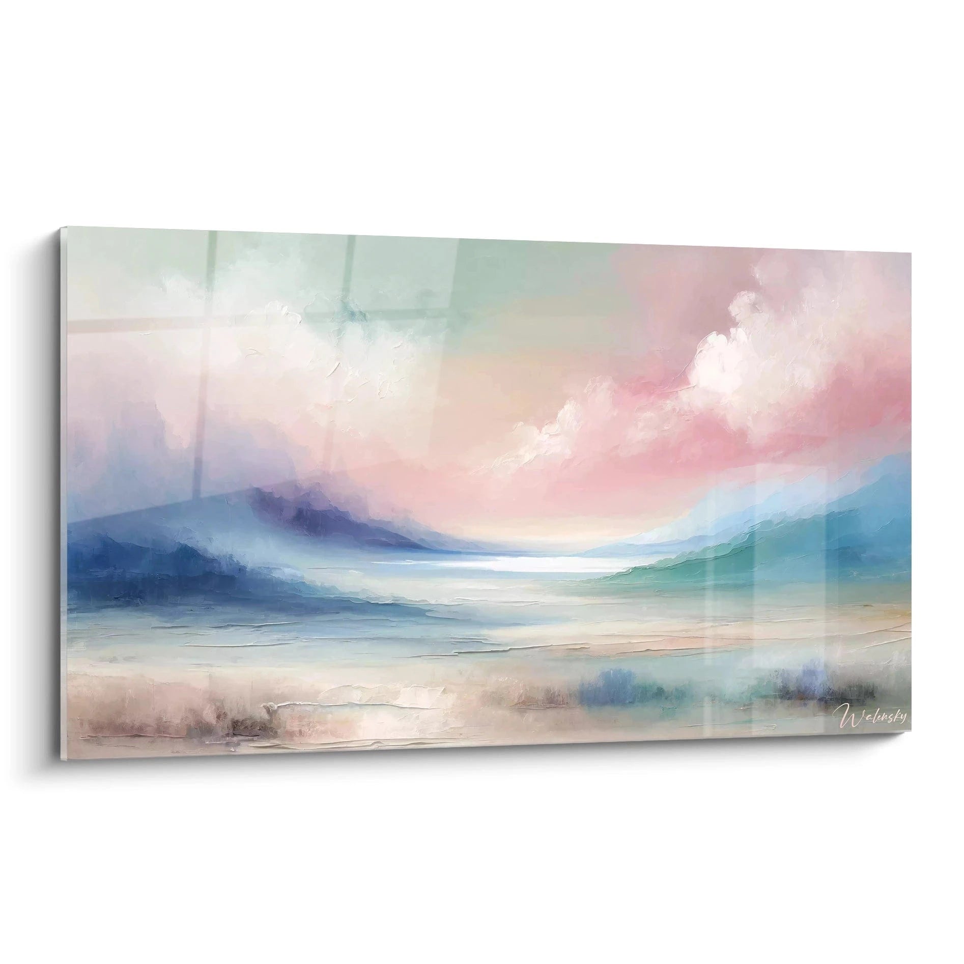

Seascape Painting in Landscape Format: Creating a Calming Relaxation Space for Seniors
8 min read · by Walensky
PAINTINGS FOR A SENIOR RESIDENCE
An armchair facing a bare wall. That is all it takes for a relaxation corner to become a place people simply pass through, never a place where they linger. In a senior residence or at home, a relaxation area deserves better than an empty wall: it deserves a horizon.
The landscape format, horizontal, wide and soothing, is precisely the one that recreates that horizon. It still needs to be chosen in the right size and hung in the right place so that it truly works from an armchair or sofa.
The direct answerFor a senior relaxation corner, a seascape painting in landscape format (width greater than height, starting at 120x70 cm) is preferable to a square or vertical format because it reproduces the natural horizon line and remains easy to view from a seated or semi-reclined position. Ideally, hang it about 1.40-1.50 m from the floor at the centre of the artwork, facing the main armchair, with a blue-beige or blue-violet palette that soothes without overstimulating the eye.- The landscape format mirrors the horizon line, while a square or vertical format breaks it.
- The painting's size depends on the distance from the armchair, not just the width of the wall.
- The hanging height is calculated relative to the seated eye, which is lower than the standing norm.
Why is the landscape format particularly suited to senior relaxation spaces?
The human eye naturally scans a space from left to right, especially during prolonged seated periods. A landscape format follows this movement of the gaze, whereas a square or vertical format constrains it, forcing the eye to move up or down.
Faced with a sea painted across its width, the gaze glides effortlessly from one edge of the canvas to the other, as it would on a real beach. It is this absence of visual interruption that produces the desired sense of calm, far more than any question of colour alone.
A painting that respects the horizon line asks nothing of the eye. It simply accompanies it.
In a shared lounge or residence library, this detail matters twice over: residents often look at the same wall, for long periods, sometimes every day. A format that tires the eye over time quickly becomes a problem rather than a decorative asset. Other themes, such as French countryside canvases in acrylic print for a rest room, meet the same demands for visual gentleness.

Ideal dimensions according to your relaxation space layout
The right size is not determined by the metres of wall available, but by the distance between the wall and the armchair or sofa. The greater that distance, the more generous the format must be to remain legible.
Reading corner or bookcase: small and medium formats
For a reading corner with a single armchair, an L format at 120x70 cm is more than sufficient if the wall faces the seat from less than two metres away. Beyond that, the XL format at 140x80 cm retains its legibility without overwhelming the space.
- Armchair close to the wall (less than 1.5 m): L format, 120x70 cm
- Armchair at medium distance (1.5 to 3 m): XL format, 140x80 cm
- Narrow wall: favour the L format over a non-standard dimension
Shared lounge: large panoramic formats
In a room shared by several residents, where armchairs are sometimes arranged in a semicircle, the painting must carry far. The XXL (160x90 cm), 2XL (180x100 cm) and even 3XL (200x112 cm) formats then come into their own.
A wall facing several armchairs benefits from a single large format rather than two medium ones: fewer visual interruptions and more calm for the whole room.
For a very spacious room, bespoke sizing allows up to 4.48 m², a useful option when the available wall far exceeds standard formats.
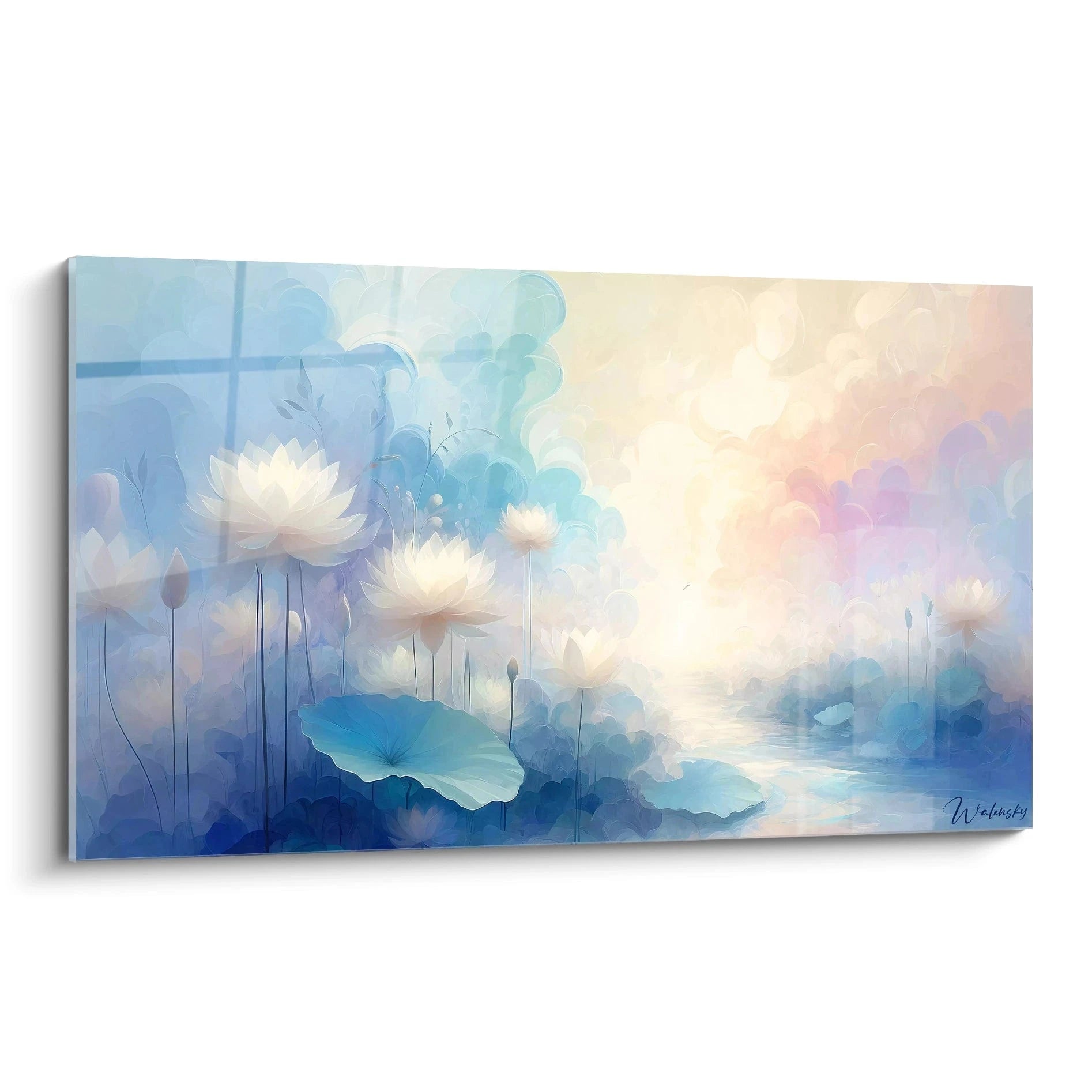
These two works illustrate well the difference in mood between a luminous turquoise blue and a more subdued blue-violet gradient, both designed for a calm seaside atmosphere.
Where and how should the painting be positioned in the relaxation room?
Hanging height changes everything when the viewer sees from an armchair rather than standing. The classic museum rule, which places the centre of the artwork at 1.50 m, targets a standing visitor: it does not suit this setting.
The line of sight from a seated or semi-reclined position is lower than when standing. Lowering the painting slightly keeps the gaze naturally resting on it, without having to lift the chin.
Lighting matters too. Acrylic glass reflects a little light, which makes it ideal in a room where brightness is controlled, for example a lounge with curtains or shutters partly closed during the day. Alu Dibond, with its matte surface free of glare, is better suited opposite a window or in a very bright room where reflections would become bothersome for tired eyes.
To explore the choice between these two approaches to light in a corridor or circulation area, our article on landscape nature paintings in panoramic format for a retirement home corridor sets out additional guidance.
— Also worth discovering


Our selection of seascape paintings in landscape format for these spaces
All the works in the abstract seascape painting collection share the same underlying logic: a soothing horizon line, gentle colours, and a format designed to stay easy on the eye without ever tiring it.
| Painting | Atmosphere | Available formats |
|---|---|---|
| Azure Mist | Turquoise blue, cream beige, minimalist | 120x70 to 240x140 cm |
| Lavender Waves | Blue and violet, delicate waves | 120x70 to 240x140 cm |
| Twilight Softness | Golden sunset, calm sea | 120x70 to 240x140 cm |
For a very bright room where any reflection must be avoided, the Jade Reflections painting, with its green and white nuances, offers a variant just as soothing as the classic blue tones.
— In the same spirit


Matching the painting to the overall atmosphere of the relaxation space
A seascape painting never works alone. It interacts with the cushions, the throw draped over the armchair, the accent lamp, sometimes even the flooring. For a bedroom, a square floral painting can play that same role of gentle anchoring in the space.
For simple harmony, pick up one of the painting's tones in a nearby textile: a pale blue cushion beneath a work in turquoise shades, a beige throw beneath a golden sunset. This subtle echo anchors the painting in the room rather than leaving it floating, isolated.
- Warm lighting (2700K) to bring out the golden tones of twilight
- Neutral lighting for blues and greens, so they do not turn yellow
- Avoid direct spotlights that create reflections on acrylic glass
Seascape lovers who prefer a more classic look, in the spirit of 18th-century marines, will also find what they need among the paintings inspired by Claude Joseph Vernet, a more narrative alternative to the abstract style.

Other Selected Pieces
Atlas of the Depths Painting - Relief Abstract Edition
From €273.90
Discover this painting →Frequently Asked Questions
Which painting size should you choose for a small relaxation room?
The L format at 120x70 cm remains the smallest standard size and works very well in a reading corner with a single armchair placed near the wall. For a truly narrow wall, a custom size from 80x46 cm lets you fit the space without sacrificing proportions.
Is landscape format better than square format for a relaxation corner?
Yes, in most cases: the landscape format follows the natural horizon line and guides the eye, whereas the square format creates a more static reading. Square remains relevant on a narrow but tall wall, where a landscape would not find its place.
At what height should you hang a painting so it is visible from an armchair?
Between 1.40 and 1.50 m for the center of the artwork, which is slightly lower than the standard height designed for a standing view. The goal is to align the center of the painting with the eye level of a seated person, not with that of a passing visitor.
Which seaside painting colors help seniors relax?
Soft blues, cream beiges and pale purples are the shades most often associated with visual calm, far from overly sharp contrasts. The golden tones of a sea sunset also work well at the end of the day, echoing the fading natural light.
A relaxation corner that turns a bare wall into a seaside horizon is never just a decorative detail. It is a space that finally invites you to sit, to stay, to look. The right landscape-format painting, well sized and well placed, makes all the difference between a wall you forget and a landscape you truly live with.
To compose your own relaxation space, the seaside painting collection brings together all the formats and moods discussed here. And to explore further the specific use of seaside tones in senior living, our guide to panoramic seaside wall art for senior residences and our article on choosing a soothing painting for the bedroom in a retirement home offer useful complementary benchmarks.
Explore our collections


