

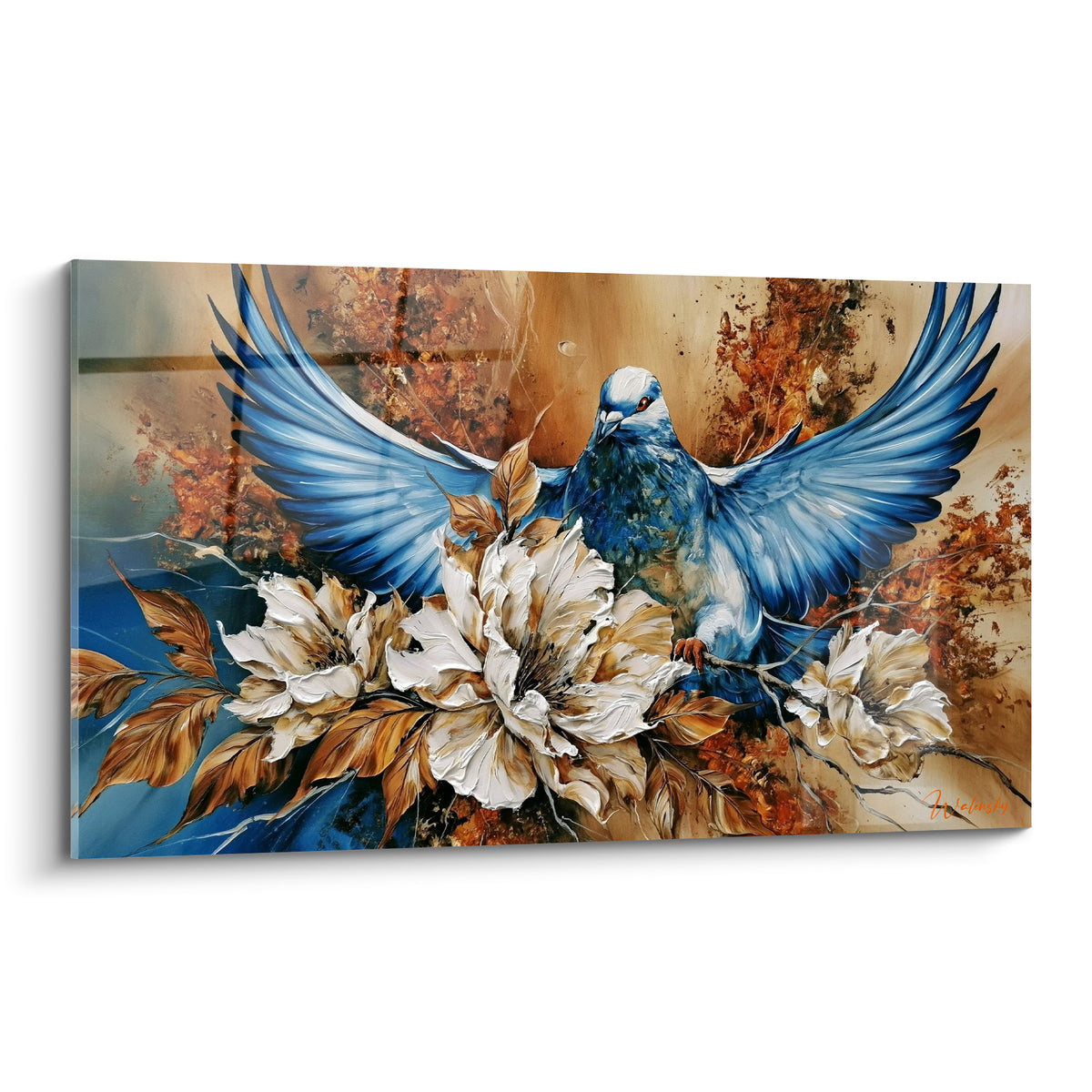






Bedroom painting modern and colorful for teens: the natural, vitamin-packed version that soothes without boring
8 min read · by Walensky
PAINTING FOR BEDROOM
Quarter past midnight. The teen is still scrolling under the duvet, and the wall facing the bed reflects back either an awkward emptiness or a neon poster shouting louder than their music. Between the two, there is a third path no one has suggested: bright colors, carried by natural motifs that never overheat the eye.
That is exactly the ground this guide explores: how to choose a modern, colorful teen bedroom painting that holds up at 4 p.m. as well as at 11 p.m., without ending up in the closet six months later because it made the room scream too loudly.
- Pure, saturated color (neon, highly contrasting graphics) overstimulates the eye at bedtime: colorful natural motifs offer the same visual energy, gently.
- A wall gallery of 2 to 3 paintings adapts better to a teenager than a single fixed piece, and can evolve with their tastes.
- The main painting should cover roughly 60 to 75% of the width of the furniture or reference wall to keep a visual balance.
Why pure color quickly saturates a teen bedroom
A wall entirely covered in highly saturated graphic motifs tires the eye long before the brain notices. Chromotherapy, the approach that studies the effect of colors on mood and sleep, reminds us of an obvious fact: very bright, contrasting hues stimulate; they do not soothe.
In a bedroom, the room where the teen is supposed to disconnect from screens and the day, this constant stimulation works against them. A neon poster or a highly contrasting ultra-geometric motif creates a kind of visual noise that keeps acting even after the light is off, leaving an overly strong afterimage.
- Too much black/bright color contrast = eye fatigue on waking as well as at bedtime.
- An overly graphic print quickly looks "childish" once tastes evolve.
- A single very saturated piece dominates the whole wall and prevents adding anything else later.
The trap is not the color. The trap is color without breathing room.
Colorful nature: the compromise between energy and calm
The most effective solution is still to keep vivid hues, but to run them through an organic motif: a flower, a tree, a sky, a landscape. The natural subject mechanically softens how the color is perceived, even when the palette is bold.
Colors that energize without aggression
The burnt orange of a poppy, the gold of an end-of-day sky, the soft green of tropical foliage: these are warm or luminous colors, but always anchored in a recognizable natural reference. The eye reads them as "alive," not as "aggressive."
This is the logic behind the colorful Scandinavian decor that has conquered teen bedrooms in recent seasons: keep the vivid palette, but place it on organic shapes rather than on pure geometric blocks.
Examples of suitable motifs: poppy, canna, dream tree
An orange poppy on a neutral background, a lily or canna with vivid petals, a stylized tree in red and violet tones: these three families of motifs cover a broad chromatic range, from the softest to the most assertive.
A natural motif always keeps a recognizable anchor point (a stem, a horizon, a cloud). This visual landmark reassures the eye, even when the color is bold.
For a bedroom facing due north or receiving little light, acrylic glass will give these colors a more vibrant, almost gallery-like rendering. Facing a very bright window, Dibond aluminum, with its matte surface free of glare, keeps equally bold hues that are softer on the eye.

Composing a wall gallery rather than a single painting
Two or three paintings side by side tell a teen bedroom's story better than a single imposing piece, because they leave air between the colors and allow moods to be mixed.
Composition rules (size, spacing, focal point)
The rule that almost always works: a larger painting serving as the focal point, framed by one or two more modest formats. The whole should occupy between 60 and 75% of the width of the wall or furniture it sits above, so it neither floats nor overwhelms the space.
- Space the paintings 5 to 10 cm apart, no more.
- Align the centers on a shared horizontal line to keep coherence.
- Keep one dominant palette per wall: green and orange, or blue and gold, but not both sets together.
Evolving the gallery with the teen (progressive budget)
This is the quiet advantage of the wall gallery: you start with one painting, add a second six months later, a third the following year. The budget spreads over time, and the decor grows with the teen's tastes rather than staying frozen after the first purchase.
— Our selection


Our selections for a modern, nature-inspired teen bedroom
For a sky and luminous serenity mood, the Éveil des Nuages painting plays on a blue and gold gradient that stays lively without ever turning garish. For a more abstract, zen plant touch, the landscape decor painting N°1 features soft green and beige, perfect as a second element in a wall gallery.
In a collection designed for younger children, you'll also find this same balance between color and calm, to explore in the children's painting collection for bedrooms still shared between kids' and teen decor.
The Jardin des Reflets, with its green and beige water lilies, suits bedrooms meant for relaxation and reading. The Canna N°1, more floral and vibrant with orange, is for teens who want a bolder touch. Rouge et Or, its golden autumn landscape, brings warmth ideal as a complement to a rather cool wall.
— Also to discover


Mistakes to avoid when decorating a teen bedroom with color
The first mistake, and the most common, is choosing a format too small for the intended wall: a painting that floats without relating to any proportion of the furniture below loses all its impact. Always refer to the formats listed on the product page, from size L at 120x70 cm up to custom sizes.
The second mistake: ignoring the room's exposure. A south-facing bedroom in Dibond aluminum avoids distracting reflections on waking; a dimly lit room gains intensity with acrylic glass.
The third, more insidious one: wanting everything to fit into a single painting. It's better to spread the chromatic energy across two or three pieces than to crush the wall with one overly busy image.

In the same spirit
Red and Gold Painting - Autumn Landscape Edition
From €273.90
Discover this painting →Frequently asked questions
Which colors to choose for a teen bedroom?
Vivid hues carried by a natural motif: the orange of a poppy, the green of foliage, the gold of a sky. They energize without creating the visual fatigue of purely graphic blocks.
How to hang several paintings in a teen bedroom?
Align the centers at the same height, space them 5 to 10 cm apart, and keep a larger painting as the focal point around which the other two are organized.
Can a colorful painting prevent good sleep?
Not the color itself, but excessive saturation without a recognizable motif. A colorful natural motif remains soothing even in bright tones, unlike a highly contrasting graphic block.
What style of painting for a teen girl's or boy's bedroom?
No natural motif is inherently gendered: a stylized tree, a cloud sky or a flower suit a boy's bedroom as well as a girl's; the chosen palette makes the difference.
For teens who prefer a more graphic and vibrant approach, our article on colorful pointillism painting for teen bedrooms explores another, more pop direction within the same kind of problem.
The wall that has been staring back since move-in doesn't need a single spectacular gesture. It needs a color that lives with the teen, not against their sleep: that is the whole bet of vitamin-packed nature, and of a wall gallery that grows at the same pace as they do. To compose yours, our teen bedroom painting collection brings together the formats and palettes discussed here, also available in the selection of assorted paintings for children if the room still needs to accommodate younger tastes.
Explore our collections


