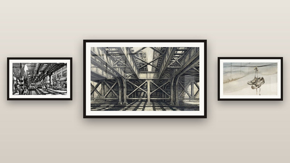
Which color to pair with a black and white street art painting depending on your room
9 min read · by Walensky
LE BRONX PAINTING
A white wall, a black and white street art painting on it, and then nothing more. This is often where it gets stuck: the artwork is hung, it holds its own, but the room around it stays silent. No color to interact with it, no accent to bring it to life.
The good news is that black and white demands almost nothing. It goes with just about everything. What remains is deciding which color to place around it, and that depends less on current trends than on your room: its light, its furniture, its purpose.
The direct answerThere is no universal color to pair with a black and white street art painting: the choice depends on the room's natural light, the color already present in the furniture, and the atmosphere you want. As a rule, a bold accent (brick red, mustard yellow, petrol blue) works better than a pastel, which tends to fade against the strong contrast of black and white.- Black and white acts as a neutral base: it pairs with nearly every color, provided you choose a bold hue rather than a pastel one.
- The room's natural light determines whether a warm or cool color will work better.
- A single dominant accent color per room is enough: a cushion, an accent wall or an accessory, not all three at once.
Why black and white is a neutral base that changes everything
A colorful street art piece imposes its palette on the entire room. Black and white, by contrast, dictates nothing: it works like a press photo, pure contrast that leaves all the space to what surrounds it.
This is exactly the opposite of a colorful painting, which requires you to echo its tones elsewhere in the room or risk a clash. Black and white works equally well with a vivid accent or a neutral palette. It welcomes burnt ochre, petrol blue, brick red without ever conflicting with them, because it has no color of its own to defend.
Black and white doesn't choose a color for you. That's precisely what makes the choice tricky: everything is allowed, so nothing is obvious.
This freedom has a downside: without a method, you end up adding a color at random, or worse, adding nothing at all. The room then sits in a neutral in-between, clean but without character. Exactly the opposite of the effect you want from a street art piece.
A 3-question method for choosing your accent color
Before heading to the color chart, three questions are enough to frame the choice. They prevent impulse buys like a mustard cushion that clashes with everything else.
What natural light does the room receive?
A south-facing room, bathed in light all day, can handle bold and even dark colors without feeling heavy. A north-facing room, cooler and greyer, needs warm colors to avoid gloom: ochre, terracotta and mustard yellow instantly warm a wall that never sees direct sun.
This is also a technical consideration for the painting itself: facing a window or in strong natural light, a matte Alu Dibond finish with no glare is the right choice. In a room with more controlled lighting, acrylic glass reveals deeper contrasts and a rendering closer to a gallery.
Which color already dominates the furniture?
A navy blue sofa, light oak flooring, grey microcement walls: these fixed elements, costly to change, should dictate the accent color, not the other way around. The color wheel helps here: a complementary color to the one already present creates a lively chromatic contrast, while an analogous color (neighboring on the wheel) sets a more subdued mood.
There's no need to repaint an entire wall to test an accent color. A cushion, a vase or the back of a shelf is often enough to judge whether the hue works with your painting before committing further.

Favorite
Urban black and white street painting with metal structure and cars - Industrial Metropolis - Le Bronx Edition
From €273.90
Discover this paintingLiving room, bedroom, office, hallway: the right pairings room by room
Theory is fine. But each room has its own constraints. Here's how the method translates concretely depending on how the space is used.
| Room | Typical context | Recommended accent color |
|---|---|---|
| Living room with a colored sofa | Blue, green or terracotta sofa already in place | Echo this hue as a complementary tone on a cushion or object, without overloading |
| Neutral bedroom | White or beige walls, light bedding | Petrol blue or sage green as a soft touch, never garish |
| Industrial office | Metal, raw wood, loft atmosphere | Rust, burnt orange, mustard yellow as a punctual accent |
| Dark hallway | Little natural light, quick passage | Mustard yellow or brick red to energize without darkening |
In a living room with a colored sofa, the classic mistake is wanting to add a third color on top of the sofa and the painting. Better to let black and white play neutral arbiter and echo only one hue, that of the sofa, on one or two accessories.
For an industrial-style office, a weathered metal structure as a backdrop pairs remarkably well with rust or ochre accents. The Rusted Metal Structure and Urban Buildings painting illustrates this kind of atmosphere well, where grey and rust naturally interact with raw metal furniture.

In a dark hallway, often overlooked in decoration, a touch of mustard yellow on a console or coat rack instantly brightens the space. Paired with a black and white urban scene, the effect is sharp without being garish.
These three atmospheres from the Le Bronx collection show that color choice is never abstract: it depends on what the depicted scene already conveys, and on what surrounds it in the room.
— Our selection


Pairing mistakes to avoid with a black and white street art painting
The first and most common mistake is piling on several vivid colors at once: a red cushion, a yellow rug, a blue vase. The black and white painting, meant to calm the whole, ends up drowned in a room that shouts from every side.
- Too many different accent colors in the same room: one is enough, two at most if they are complementary.
- Choosing a timid pastel: it disappears completely against the powerful contrast of black and white.
- Neglecting the painting's finish: acrylic glass facing a south-facing picture window will produce distracting reflections that break the reading of the artwork.
- Wanting to add a colored frame: the boutique paintings hang without a frame, directly on the wall, to keep the graphic sharpness characteristic of street art.
Building a cohesive wall gallery with several black and white paintings
Hanging several black and white paintings side by side requires a simple rule: keep a consistent subject or style, even if the scenes differ. The Le Bronx collection lends itself well to this, since each piece shares the same urban, melancholic universe.
The Train in Motion on Metal Bridge painting and the Lone Man on Urban Steps painting, for example, depict two sides of the same city: movement on one hand, contemplative stillness on the other. Hanging them together creates a narrative, not a visual collision.
For the accent color, the principle remains the same as for a single artwork: one hue, repeated across two or three elements of the room (cushion, throw, door frame), is enough to unify the whole without ever competing with the artworks themselves.
If your interior already leans toward abstraction rather than figurative scenes, the collection of abstract black and white paintings offers another way to explore this graphic contrast, even more stripped back.
— Also to discover


Frequently asked questions
What wall color with a black and white painting?
A white or light grey wall remains the safe choice to let the painting's contrast speak. To dare more, an anthracite or navy blue wall makes the whites of the artwork shine with great intensity, provided the room is sufficiently lit.
How to pair several street art paintings together?
Favor a coherent theme (urban scenes, industrial architecture) over strict color coherence, since black and white already visually unifies the whole. Keep regular spacing between the artworks so the gallery can breathe.
Does a black and white painting suit every room?
Yes, that's precisely its strength: unlike a highly colorful artwork, it fits equally well in a warm living room, a minimalist office or a neutral bedroom. Only the choice of finish changes depending on the room's light exposure.
Should you choose a colored or neutral frame for a black and white street art painting?
The boutique paintings are sold unframed, ready to hang, which preserves the sharpness of the black and white contrast. If you were looking to add color this way, shift that choice to the room's accessories instead.
This debate between colorful and monochrome paintings deserves a wider look: our comparison of colorful and monochrome street art details the arguments on both sides.
Conclusion
Color was never in the painting. It lives in the sofa, the wall, the cushion you choose afterward. A black and white street art painting imposes nothing on you: it leaves the choice in your hands, and that is precisely what makes it a solid and adaptable base.
All that's left is to find the artwork that will serve as the starting point for this palette. the street art painting collection gathers the urban scenes that make up the Le Bronx universe, from the rusted metal structure to the lone silhouette in the rain. Once the artwork is chosen, the color will follow, almost on its own.
Explore our collections