

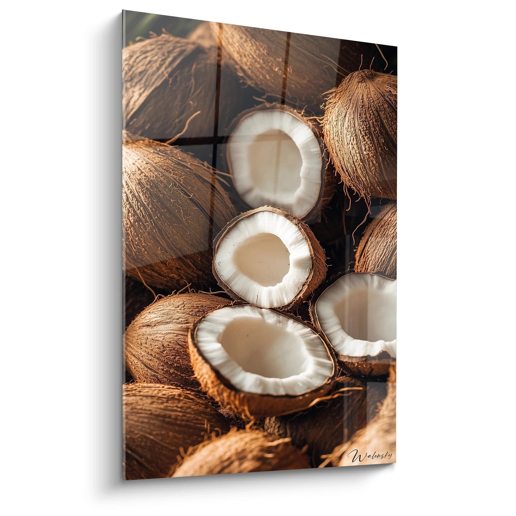






GREY PAINTINGS
A fully grey apartment, walls included, can feel like living in the waiting room of a high-end clinic. Cold, sharp, almost clinical. Yet two streets away, another equally grey interior radiates warmth, comfort, and the urge to settle in with a good book. The difference has nothing to do with budget or furniture. It comes down to the shade of grey you choose, and what you place around it.
That is the whole challenge of a warm modern home decor: juggling clean lines and a sense of welcome, without one killing the other.
- Grey is not a cold colour by nature: it all depends on its undertone (yellow/red = warm, blue = cool)
- Taupe and greige are allies of a modern base that doesn't chill the room
- Light wood, brass and wool textiles offset neutrality through texture
- A well-chosen wall painting acts as a warm accent against a grey base
Why grey is the go-to colour for warm modern interiors
Grey has no fixed temperature: it borrows one from its neighbours. In colour science, we speak of chromatic temperature, that scale running from orange-red (warm) to blue (cool). A grey can lean one way or the other depending on the proportion of warm or cool pigment it contains, invisible to the naked eye until you compare it with another shade.
That is precisely what makes it the go-to colour for interiors that want to be modern without tipping into hospital-like coldness. Grey keeps the neutrality, sobriety and clean lines favoured by contemporary minimalism. But depending on the shade chosen, it can either welcome or repel.
A grey is never neutral: it is always a little warm or a little cool, and that invisible nuance decides whether your living room makes people want to sit down or leave.
This logic aligns with the Japanese and Scandinavian movements that have theorised warm minimalism: wabi-sabi celebrates imperfection and raw material, hygge seeks a visual cocoon. Both avoid clinical white and icy grey in favour of tones that absorb light rather than coldly reflecting it.
The 3 families of grey to know for warming up an interior
Not all greys behave the same on a wall. Three families are enough to find your way without getting lost among nuance charts with 400 references.
Warm greys (taupe, greige)
Taupe and greige (a blend of grey and beige) are the easiest greys to live with. Their yellow or rosy undertone brings them close to sand, natural stone and raw linen. Across a full wall, they create a base that absorbs light rather than harshly reflecting it, an effect close to well-dosed waxed concrete.
- Taupe works particularly well in living spaces, paired with light wood
- Greige pairs with off-white for a discreet gallery-like effect
- These shades age well over time, without turning or yellowing
Cool greys to reserve for accent touches
Greys with a blue or green undertone (pearl grey, slate grey, mouse grey) are striking in small doses and risky in large amounts. They work very well on a single accent wall, in a very bright kitchen, or alongside brushed metal. Spreading them over four walls without enough openings is the classic trap that turns a living room into a hospital corridor.
To check the undertone of a grey before buying a pot of paint, place the sample next to a pure white and a beige: if it leans pink or yellow against the beige, it is warm; if it looks almost bluish next to the white, it is cool.

Pairing grey with materials and accents to break the coldness
A single colour never warms up a room on its own: it is the material that carries the warmth. The warmest grey in the world still feels cold if it sits on glass, lacquered metal and glossy tiles everywhere.
Light wood (oiled oak, ash, beech) is the number one ally: its grain, its irregularities and its matte texture break the flatness of grey. Brass and gilded metal, in handles, lamp bases or frames, bring a warm glow that contrasts with the surrounding neutrality, a gesture repeated tirelessly in Scandinavian interiors and in the Japandi style.
Textiles play the same role horizontally: a bouclé wool throw, a jute rug, washed linen cushions. These are materials that make you want to touch, not just look. This is also what we detail in our complete method for a warm modern living room, room by room.
— Our selection


The role of decorative art in balancing warm and cool in a room
Art is not just decoration: it is the easiest accent to adjust in a room that is already painted. You cannot redo the walls every season, but a painting can be changed in ten minutes and instantly rebalances the visual temperature of a living room.
On a taupe grey base, a painting in golden, terracotta or warm beige tones fills what is missing without overloading the room. This is exactly the logic behind our selection of brown paintings : earthy shades that naturally converse with a grey wall without creating a sudden break.
Conversely, on an already very warm interior (dark wood, terracotta, lots of textiles), a painting with cooler, graphic tones can reintroduce the modern clean look that was missing. This is the principle behind our Grey Paintings collection: works designed to play this pivotal role between modernity and visual comfort.
Hang the centre of the painting at eye level, about 1.50 m from the floor: this is the rule that applies in almost every living space, whatever the size of the wall.
— Also to discover


Common mistakes that make an interior grey, cold and impersonal
The first and most frequent mistake is painting every wall in the same cool grey with no breathing space at all. The eye then has no warm point to rest on, and the room ends up looking like a soulless open-plan office.
The second is a total absence of texture: smooth laminate flooring, lacquered furniture, not a single thick fabric. Even the most beautiful grey in the world needs a raw material to counterbalance it.
Third pitfall: forgetting the lighting. A cool-white bulb (above 4000 kelvins) brutally intensifies the coldness of an already pale grey. Prefer warm light, below 3000 kelvins, especially in the evening.
| Common mistake | Simple fix |
|---|---|
| Cool grey on every wall | One cool grey wall, the others in taupe or off-white |
| Zero visible texture | Add light wood, wool, jute |
| Lighting that is too white | Bulbs below 3000 kelvins |
| No warm focal point | A painting in golden or terracotta tones |

Frequently asked questions
Is grey a cold or warm colour in decoration?
Neither by nature: it depends on its undertone. A grey based on yellow or red (taupe, greige) is warm; a grey based on blue or green (pearl grey, slate grey) is cool.
Which colour should you pair with grey for warm home decor ?
Terracotta, camel, golden beige and ochre work particularly well with a taupe grey. Brass, in occasional touches, strengthens this effect without ever overloading the space.
How do you warm up a living room that is too grey?
Add light wood on the floor or in furniture, a wool or jute rug, a painting in warm tones as a focal point, and switch your lighting to bulbs below 3000 kelvins.
Which painting should you choose for warm modern decor?
Favour subjects in beige, gold or terracotta tones rather than overly cool compositions, and opt for a format that occupies roughly 60 to 75% of the width of the wall or sofa concerned.
The warmth of a modern interior has never been a question of a single colour. It is born from balance: between a warm grey and a cool grey, between a smooth surface and a raw material, between the clean lines and the accent that warms everything up. Well chosen, grey is not an enemy of warmth. It is often its best ally.
To compose this balance in a single gesture, our collection of grey paintings gathers works designed precisely for this pivotal role. And to go further, room by room, our guide to the warm modern living room usefully complements this colour-led approach.
Explore our collections


