How to Choose a classic painting for an elegant entrance
8 min read · by Walensky
CLASSICISM PAINTING
An entrance lasts a few seconds. The time it takes to take off your coat, drop your keys, glance at the mirror. Yet those few seconds decide everything: the impression a guest takes away, the feeling you yourself experience when coming home in the evening. A well-chosen classic painting can turn a passageway into a true statement of style.
The direct answerTo choose a classic painting for an entrance, favor a subject drawn from the classical pictorial repertoire (portrait, genre scene, architectural landscape), a powdery or muted palette rather than a garish one, and a format that occupies 60 to 75% of the width of the wall or entrance furniture. The paintings in the shop follow this spirit of classicism without ever being copies of museum works: they are original creations, printed in Italy on acrylic glass or Dibond aluminum.Classicism is not the gilded excess one sometimes imagines. It is a discipline, a rigor of composition inherited from centuries of painting. Let us see how to recognize it, and above all how to bring it into your home without missteps.
- Classicism is recognized by its subjects (court portrait, genre scene, neoclassical architecture) and by its palette, often powdery, never garish.
- The painting's format should occupy 60 to 75% of the width of the wall or entrance furniture, no more, no less.
- A classic painting pairs very well with contemporary furniture, provided you play on contrast rather than on an accumulation of styles.
Classical Style in Painting: Landmarks to Recognize It
A classic painting is first recognized by its subject, even before its color or size. We are speaking here of pictorial classicism: a movement born in the wake of the Renaissance, codified in France under the Ancien Régime, which favors order, symmetry and the nobility of the subject over formal experimentation.
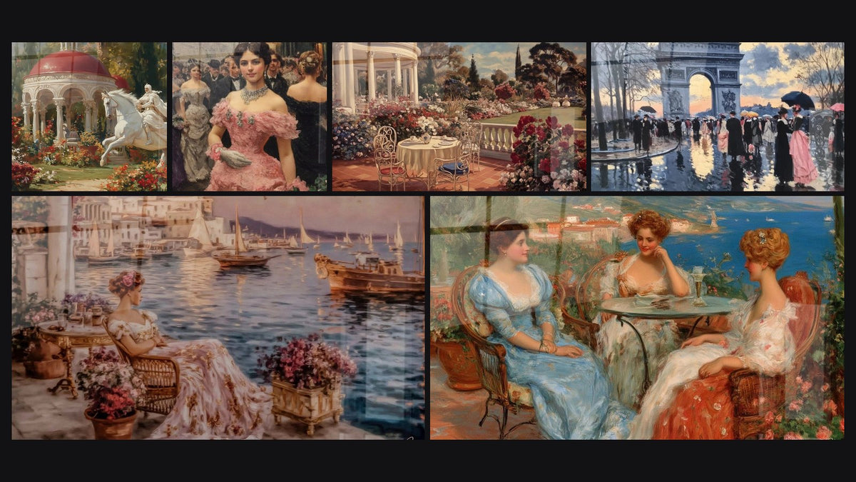
In practice, this gives three major families of images. The court portrait, an isolated figure, a dignified pose, a gaze that never seeks the viewer's by chance. The genre scene, those moments of everyday life painted with an almost theatrical care: a conversation between women on a terrace, a couple seated in a café. And the architectural landscape, often inspired by neoclassical architecture — columns, pediments, orderly perspectives, in the manner of the 18th-century Italian vedute.
Classicism does not seek to surprise. It seeks to endure.
Historically, these works were produced in oil paint, a technique that allows those deep glazes and that almost tangible light found in the great portraitists of the 18th and 19th centuries. The creations offered today draw on this aesthetic — composition, palette, subjects — without being reproductions of existing works: they are contemporary interpretations, designed to dress a wall of today.

The Essential Criteria for Choosing a Classic Painting for an Entrance
Choosing a classic painting for an entrance comes down to answering four simple questions: what size, what color, what hanging, what subject. Let us address them one by one, because that is where the difference between an elegant entrance and one that rings false is decided.
Format and proportions according to the size of the entrance
The basic rule of wall decoration holds that an artwork should occupy between 60 and 75% of the width of the wall or furniture on which it is placed. In an entrance, we apply this rule to the free wall, the console, or the space between door and corner.
For a narrow entrance, an L format (120x70 cm) remains more than sufficient and lets the walls breathe. For a more generous entrance, with a high ceiling, you can go up to XXL (160x90 cm) without hesitation. Made-to-measure, available from 80x46 cm, also allows you to fit precisely into a long, narrow hallway.
The visual center of the painting should sit roughly 1.50 m from the floor, that is, at eye level. In an entrance, you can lower this height slightly if a low piece of furniture is positioned directly beneath it.
Gilded, Wood or Minimalist Frame: Which to Choose
This is the question that comes up most often, and the answer is almost always simpler than one thinks. The gilded frame immediately evokes classicism, but it quickly becomes heavy if poorly dosed — an overly busy baroque frame turns elegance into pastiche. A painting printed on Dibond aluminum, without any frame, produces a radically different effect: the matte surface reflects light softly, and the classic subject gains modernity, almost like a quotation rather than a copy.
Acrylic glass, for its part, brings a brilliance and depth of color that particularly flatter scenes rich in detail, such as genre scenes with several figures. It is our preferred choice for a vestibule that benefits from controlled lighting, with a wall sconce or ceiling light rather than direct daylight.
— Our selection


Pairing a Classic Painting with Contemporary Entrance Furniture
The marriage of a classic image and resolutely modern furniture works, on one condition: never seek perfect harmony. It is contrast that creates elegance, not resemblance. This principle applies just as much to a classicist painting chosen for an elegant living room.
A console in black metal with clean lines, placed beneath a court portrait, produces a striking effect: the ancient subject stands out against a resolutely current background. Conversely, furniture already laden with moldings or gilding, combined with a classic painting on top, ends up creating an overloaded entrance, almost a theatre set.
Keep only one 'talkative' element per entrance: either the painting or the furniture. If your console is already sculpted, choose a sober painting in a powdery palette and let the subject speak on its own.
The Paix Aristocrate garden painting illustrates this principle well: its tones of white and pink remain soft enough to coexist with Scandinavian or industrial furniture, while still bringing that touch of elegance inherited from classicism.
Another interesting option for an entrance opening onto a contemporary living room: the Regards Complices Parisian café painting, whose street scene in blue and pink works as well with light wood as with black metal.
If you wish to explore this question of pairing styles further, our article on combining a classicism painting with contemporary furniture details precise combinations room by room.
— Also to discover


Mistakes to Avoid and Professional Tips
The first mistake, and the most common, is choosing a painting that is too small for the available space. A format that floats on a large entrance wall loses all its strength, whatever the quality of the subject depicted.
Second trap: lighting. A painting on acrylic glass placed facing a glass wall will throw back reflections that prevent you from enjoying the subject — the visual rendering of a classic painting on acrylic glass deserves careful consideration depending on the exposure. In that case, always prefer Dibond aluminum, whose matte surface absorbs natural light without reflecting it.
- Avoid overly saturated palettes in a small entrance: prefer powdery tones that visually enlarge the space.
- Never place a classic painting directly above a heavily used coat rack: repeated rubbing eventually damages the lower part of the work.
- Think about the coherence of the subject with the use of the hallway: an equestrian scene suits a house entrance, less so a small apartment vestibule.
Finally, a tip few people apply: orient the gaze of the painted subject toward the interior of the house rather than toward the door. A portrait whose eyes 'accompany' the visitor toward the living room creates a far stronger sense of welcome than a gaze turned toward the exit.
For an entrance playing the card of Mediterranean architecture, the Sanctuaire Bleu painting brings immediate serenity, with its white columns and deep blue evoking neoclassical architecture without ever tipping into touristic pastiche.
If you are still torn between several classic universes, the neoclassical painting collection lets you compare subjects and palettes at a glance.

In the same spirit
Women Precious Conversation Painting - classicism edition
From €233.90
Discover this painting →Frequently asked questions
What style of painting goes with a classic entrance?
A court portrait, a genre scene, or a landscape inspired by neoclassicism work best. Avoid abstract or overly contemporary compositions, which break stylistic coherence right at the threshold of the home.
How do you pair an old painting with a modern interior?
Play contrast rather than fusion: a classic subject on minimalist, uncluttered furniture creates a more elegant effect than an attempt at total harmony between the two worlds.
What painting size should you choose for an entrance?
The format should cover 60 to 75% of the width of the wall or console. The L format (120x70 cm) suits most standard entrances; beyond that, XL or XXL formats are required for more generous spaces.
Does a classic painting need a gilded frame?
Not necessarily. Paintings delivered without a frame, printed on acrylic glass or Dibond aluminum, offer a more contemporary rendering that avoids the overly heavy effect of a massive gilded frame, while keeping the classic spirit of the subject.
Conclusion
Choosing a classic painting for an elegant entrance is first and foremost about choosing a subject, a proportion and a light that answer one another. The rest — frame, gilding, ornament — is secondary to this underlying coherence. An entrance that works is one where the painting seems to have always been there, without ever shouting its presence.
To go further in reflecting on the styles that set the tone of an entire room, our article on choosing a statement painting to set the tone of a decoration usefully completes this approach. And to compare universes before deciding, the Classicism Painting collection gathers all the creations embodying this timeless spirit.
Explore our collections