

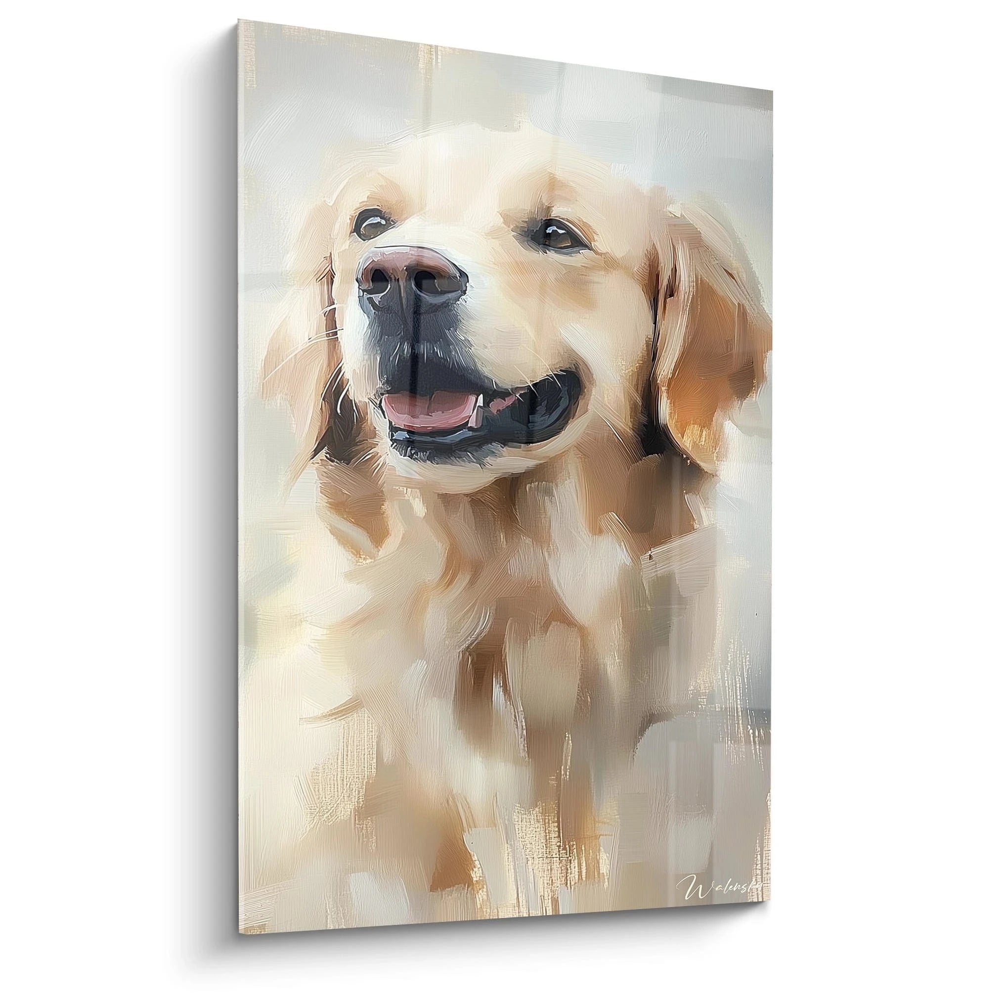






Painting and small living room : the formats that visually enlarge the space
8 min read · by Walensky
PAINTING FOR LIVING ROOM
Twenty-two square meters, a three-seat sofa already eating half the wall, and that empty rectangle above it, staring at you for months. You've measured ten times, hesitated between two sizes, and asked the question on a decor forum. The problem isn't the tape measure. It's that no one told you how a painting can literally trick the eye and make a small room breathe.
The direct answerIn a small living room, the format that visually enlarges the space is not the smallest one but the one that respects the width of the furniture beneath it (60 to 75% of that width) while remaining a single piece rather than split into several small frames. One large horizontal painting above the sofa, in light tones and a clean composition, structures the wall and creates an impression of height and depth far more effectively than a scattering of small frames that fragment the gaze.- A painting that is too small on a large wall shrinks the room visually by creating a void around it.
- The horizontal format elongates a narrow wall: the eye follows a continuous line rather than a stack.
- A single well-proportioned work enlarges more than a wall gallery in a small space.
Why the format of a painting influences the perception of a small living room
A painting is not a mere decorative object placed on a wall; it is a visual landmark that tells the eye where to stop and where to continue. In a small room, every line, every border, every break in colour matters: it can either stretch the space or compress it without one understanding why the room looks smaller than it really is.
The optical illusion works on a simple principle: the brain interprets continuous lines as extensions of the real space. A format that follows the proportions of the wall and the furniture creates continuity. A poorly chosen format, on the other hand, introduces a break that the eye perceives as a boundary, and therefore as a shrinking.
This proportion rule is not a gratuitous aesthetic constraint. It avoids the two classic pitfalls: the tiny painting floating in empty space, and the oversized painting that overwhelms the furniture. In both cases, the eye no longer knows where to rest, and it is precisely this hesitation that makes a room look smaller.
Single composition vs wall gallery: which option gains visual space
One large painting structures a wall, a gallery of small frames fragments it: in a small living room, the first option is often the one that enlarges the space best. A wall gallery works wonderfully in a corridor or a large living room, where the gaze has time to circulate between areas. In a confined space, it multiplies visual breaks and gives an impression of clutter, even if each frame taken on its own is pretty.
A single composition, by contrast, offers a clear focal point. The eye settles there, rests, then moves on to the rest of the room without a hitch. That is the whole spirit of a work such as the Harmonie Abstraite Painting, whose minimalist beige and blue palette creates exactly this kind of calm anchor point without overloading the wall.
This principle echoes the logic of minimalism found throughout the whole minimalist painting collection : fewer elements, but each one designed to occupy exactly the right place.
— Our selection


Format mistakes that shrink a small living room
The most frequent pitfall is not choosing a painting that is too large, contrary to popular belief, but choosing one that is too small for fear of overdoing it. A tiny format lost on a large white wall creates a void that the eye reads as a lack of scale, and the entire room then appears less lived-in and less structured.
- A painting too small for the wall: it isolates a single point without creating any link with the furniture; the space around it seems abandoned.
- A frame that is visually overloaded: dense patterns, harsh contrasts or a multiplicity of colours tire the eye in an already constrained space.
- Wrong proportion with the sofa: a painting wider than the piece of furniture below unbalances the entire wall composition.
- Hanging too high or too low: it breaks the natural reading line of the room.
In a small living room, it is never the size of the painting that shrinks the space; it is the imbalance between its format and that of the wall.
— Also to discover


Combining format, colours and style to maximise the enlarging effect
The format builds the structure, but colour creates the atmosphere: the two must work together for the illusion of space to truly succeed.
Light colours and soft contrasts
A light palette, such as beige, off-white, pale blue or sage green, reflects light and visually extends the surrounding walls. Overly strong contrasts, on the other hand, create sharp breaks that fragment the space instead of unifying it. This is why a painting like the Équilibre Organique Painting, with its green and beige spheres in gentle opposition, works particularly well in a small living room bathed in natural light.
Minimalist and abstract styles suited to small spaces
Clean geometric abstraction leaves the eye areas of breathing room that busy figurative scenes do not offer. In an industrial bohemian decor, where raw materials already dominate, a minimalist abstract painting soothes the whole rather than adding yet another layer of detail.
For a very bright room facing a window, prefer the matt, glare-free Alu Dibond support. For a living room with more controlled light, acrylic glass brings greater depth and more vibrant colours that reinforce the focal-point effect.
If your living room also includes a reading corner or an adjoining sleeping area, the same proportion reasoning applies to the selection of paintings for the bedroom, where small surfaces benefit just as much from a format designed to enlarge rather than to fill.

Frequently asked questions
What painting size for a small living room?
The L format (120x70 cm) remains the safest starting point: it respects the 60 to 75% of sofa width rule without ever overwhelming a small wall. For a truly narrow wall, made-to-measure sizes from 80x46 cm let you adjust the work to the exact centimetre.
Does a large painting make a small room look bigger?
Yes, provided it stays proportionate to the furniture: a large format well placed above the sofa creates a focal point that structures the room, whereas a format that is too small leaves a void that on the contrary accentuates the cramped feeling.
Is one large painting better than several small ones in a small living room?
A single well-sized painting enlarges the space better than a wall gallery, which multiplies visual breaks over an already limited surface. The wall gallery finds its place in larger rooms or corridors.
What is the ideal height to hang a painting in a small living room?
The centre of the artwork should sit roughly at eye level when seated, around 1.40 to 1.50 m from the floor depending on the height of the sofa. This height avoids the "floating painting" effect that breaks the visual continuity of the wall.
The right painting format for a small living room is never decided by the tape measure alone: it is decided by eye, by testing how a work dialogues with the width of the sofa, the light in the room and the colours of the walls. Before buying, feel free to browse our living room painting collection to compare the available formats, or to read our article on the large orca painting for a living room if you are considering a space with more generous volumes. The empty wall that has been taunting you for months only needs one thing: a format designed for it, not against it.
Explore our collections


