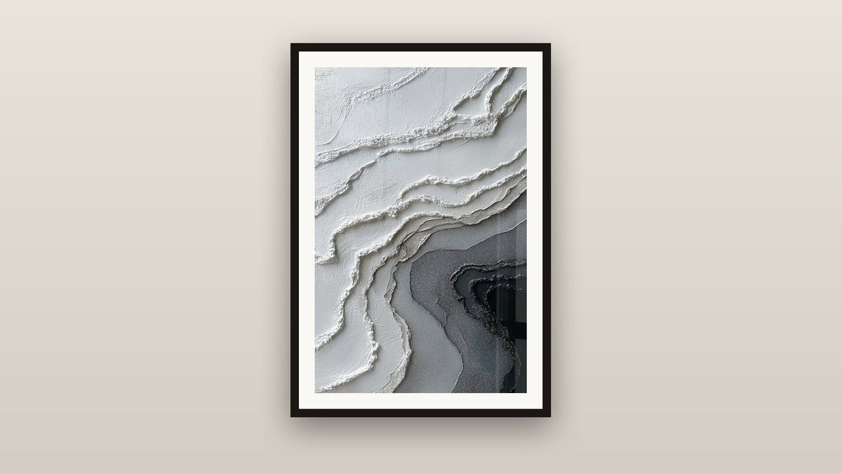
Grey and white zen painting: the essence of the Japandi living room
8 min read · by Walensky
ZEN PAINTINGS
A cream linen sofa, a light wood coffee table, a rug that almost disappears because it blends so well into the floor. And then that wall, just above the sofa, which has stayed bare for months because no colour seems to belong there. It's the classic trap of a successful Japandi living room : everything has been harmonised, except the essentials.
In an atmosphere where every object breathes, a grey and white zen painting for a Japandi living room is not simply a matter of taste. It's a question of visual balance, almost of the physics of light.
- Grey and white are not a default choice: they are the shared visual vocabulary of Japanese wabi-sabi and Scandinavian minimalism.
- An abstract texture (relief, cloud, crack) brings life to a wall without disrupting the calm of the palette.
- The support matters as much as the motif: matte Alu Dibond facing a window, acrylic glass in a room with controlled light.
Why grey and white embody the Japandi spirit
The Japandi style is not a trend that randomly mixes two aesthetics. It is an almost logical meeting between Japanese wabi-sabi, the acceptance of imperfection and the passage of time, and Scandinavian minimalism, which seeks function before ornament. The two meet on common ground: neutrality.
Grey and white never shout. They let light do the work and let materials (wood, linen, ceramic) exist without competition. In a living room where every piece of furniture was chosen for its sobriety, an overly colourful painting becomes a false note, like an out-of-tune instrument in a minimalist piece.
Visual silence is not emptiness: it is a space left for the eye to breathe.
This monochrome palette also works because it doesn't date. A powder pink or sage green, very popular a few years ago, eventually dates a room. Grey-white, on the other hand, passes through the seasons of decor without ever looking outdated.
Criteria for choosing your grey and white zen painting
The first reflex, faced with such a restricted palette, is to think that everything is equal. That's false: in a grey and white tonal range, every detail of texture or proportion shows up twice as much as elsewhere.
Texture and material: from smooth to textured
Without colour to create contrast, material takes over. A work with a smooth, glossy surface, printed on acrylic glass, will reflect soft light that changes throughout the day. Conversely, a composition playing with textured reliefs (cracks, undulations, sculpted volumes) catches shadow and light in a far more organic way.
A painting with pronounced textures changes appearance throughout the day: the raking morning light carves the reliefs, while the afternoon light softens them. That is the whole appeal of a textured work in a room crossed by natural light.
Format and proportions according to the room
The rule that never fails: the artwork should occupy between 60 and 75% of the width of the furniture beneath which it is hung. Above a 220 cm sofa, an L format of 120x70 cm breathes perfectly without overwhelming the space.
For a Japandi living room with a wide, open wall, panoramic formats bring a horizontality that echoes the low lines typical of this style. This logic is found in the abstract grey and white painting with cloud-like textures, whose cloudy tones evoke morning mist, while remaining discreet above a low light wood cabinet.

Also to discover
Abstract grey and white painting with gold flecks - Metallic Harmony - Western Metal Feng Shui Edition
From €232.90
Discover this paintingAbstract, floral or geometric: which style for which living room
Three families share the territory of zen grey-white, and they do not tell the same story. Pure abstract, first, relies on material and movement: vertical streaks, mists, undulations that represent nothing specific but occupy the space softly.
Geometric, on the other hand, introduces a more architectural structure: cubes and volumes that create an illusion of depth on a flat wall. It is a more assertive choice, suited to already very minimalist living rooms where one seeks a clear focal point.
Sculpted floral occupies a place of its own: raised petals on an anthracite background, halfway between nature and abstraction. It is the gentlest option for those who fear a pure abstract might look too cold.
| Style | Atmosphere created | Suits |
|---|---|---|
| Textured abstract | Contemplative, soothing | Bright living room, wide wall |
| Geometric | Structured, architectural | Clean interior, sharp lines |
| Sculpted floral | Soft, organic | Living room with warm wooden furniture |
For a decor already very graphic, the Sculpted White Flowers on Anthracite Grey Background painting introduces an organic touch without ever breaking the sobriety of the whole: the white flowers in relief on an anthracite grey background play the same game of shadow as the abstract compositions.
— In the same spirit


Pairing the painting with the rest of the Japandi decor
A grey-white painting never lives alone: it converses with the light wood of the furniture, the natural linen of the cushions, and the light passing through sheer curtains. The common mistake is wanting the painting to match perfectly with the textiles, whereas a slight difference in tone creates visual depth.
- Light oak furniture calls for a painting with rather cool tones to create a gentle contrast.
- Raw or beige linen textiles pair well with slightly off-white tones rather than pure white.
- A jute or raw wool rug reinforces the wabi-sabi character of a textured work.
This is the whole purpose of a collection designed for this use: you can browse our living room painting selection to see how different textures work with a Japandi interior already put together.
Where to place your grey and white zen painting in the living room
Natural light largely dictates the choice of support. Facing a window or in a very bright room, matte Alu Dibond avoids annoying reflections and lets the soft colours express themselves without glare. In a room with more controlled light, acrylic glass enhances depth and gives a gallery-like finish.
This painting with organic undulations illustrates the logic well: placed above a low cabinet, in a room crossed by late-afternoon light, its sculpted reliefs take on a depth that a flat photo could never convey.
For corridors or entrances that accompany a Japandi living room, a narrow panoramic format such as the Textured Cracked Wall White and Grey painting works particularly well: its white and grey cracks tell a story of raw material, without ever overloading a passage space.
— Other pieces selected


Frequently asked questions
Which painting colour for a Japandi living room?
Grey and white remain the safe values, optionally nuanced with a touch of ochre or gold metal to break the coldness. Avoid bright colours that disrupt the neutral balance this style seeks.
How to pair a grey and white painting with Scandinavian decor?
Play on the contrast of material rather than colour: a textured painting against smooth-wood furniture, or the reverse. The natural linen of the cushions bridges the two worlds.
Which painting size to choose for a zen living room?
Aim for 60 to 75% of the width of the furniture under the painting. For a standard sofa, an L format (120x70 cm or 120x40 cm depending on the model) suits most living rooms.
Does an abstract painting suit minimalist decor?
Yes, it is even the most coherent choice: an abstract composition without a specific figurative motif lets the eye rest while bringing depth through texture and light.
Each painting mentioned here is an original digital creation, imagined by Walensky's artists and printed in Italy on acrylic glass or Alu Dibond, delivered unframed and ready to hang.
A successful Japandi living room is never built on a single impulse purchase: it is a series of sober, patient, almost silent choices. The painting you choose for this wall should not draw attention to itself; it should simply let the room breathe a little more deeply.
To extend this search for visual serenity throughout the home, our article on the zen Asian painting for a minimalist living room explores the art of emptiness and line, and our article on the white orchid painting for a Japanese-style living room offers a more floral alternative to the same atmosphere. To see all the pieces designed for this spirit, the zen painting collection gathers the compositions best suited to a Japandi living room.
Explore our collections