

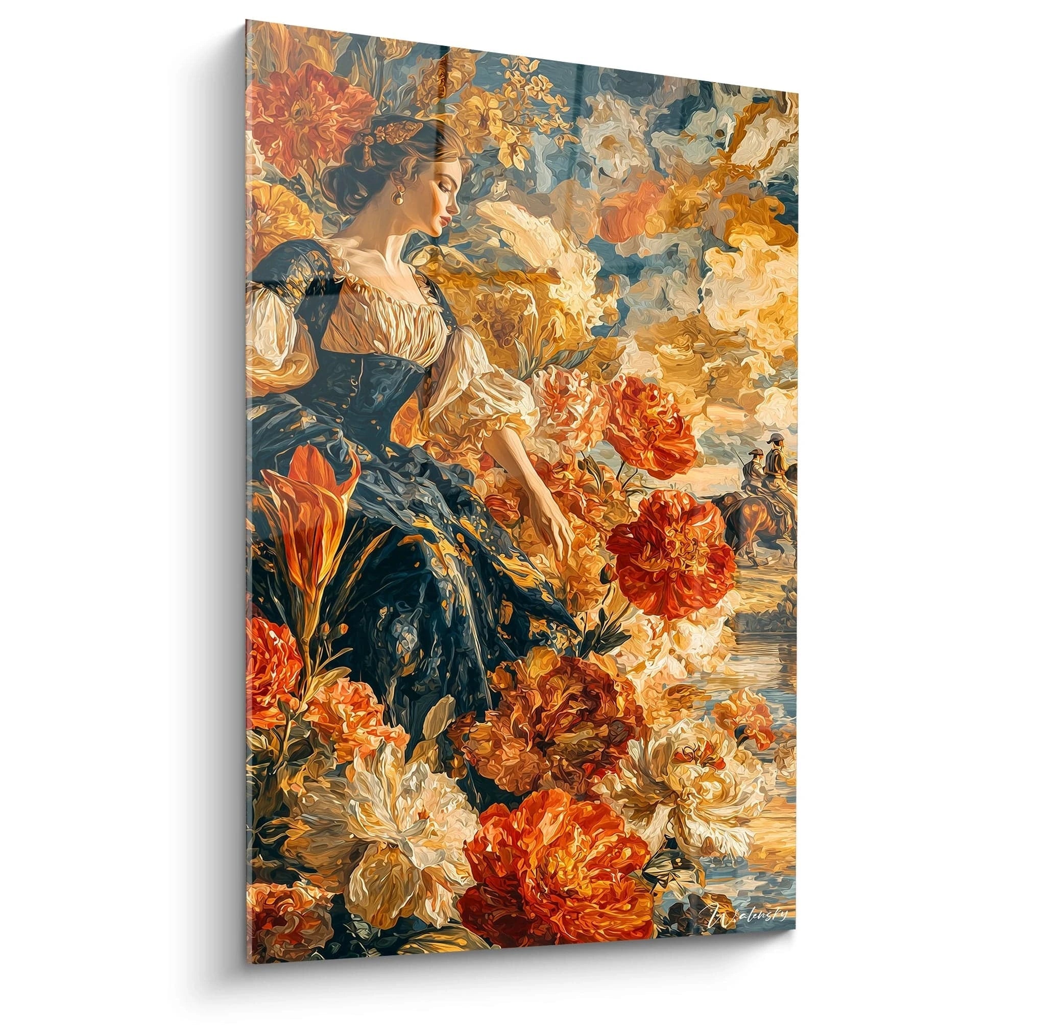






Gourmet Gallery Wall: Composing a Painting Ensemble for a Chic Country Kitchen
9 min read · by Walensky
ART & KITCHEN
One wall. Three, four, five paintings. And suddenly that kitchen, which looked like any other chic country kitchen, starts telling a story about you: cherries against a turquoise backdrop, a bowl of mushrooms gathered who knows where, golden madeleines that make you hungry just looking at them. That is what a well-thought-out gourmet gallery wall is, and it is far more subtle than randomly piling up frames.
The direct answerTo compose a coherent gourmet gallery wall in a chic country kitchen, choose 3 to 5 paintings from the same collection (same color proportions, same finish), arrange them in a grid or a light staggered pattern on a clear wall away from grease splatter, and plan a seasonal rotation of one or two artworks to refresh the whole look without changing everything.- 3 to 5 paintings of the same format or a single family of sizes are enough for a readable gallery, without clutter
- Hang the arrangement away from splash zones (hob, sink) and at eye level
- A seasonal rotation of one or two artworks is enough to refresh the mood without recomposing everything
Why a gallery wall rather than a single painting in a chic country kitchen
A single painting decorates. A gallery inhabits. It is the difference between placing a full stop and writing a sentence: a wall of frames creates rhythm, narrative and depth that a single piece, however successful, will never achieve on its own.
The rustic-glam style that defines the chic country kitchen loves precisely this controlled density: exposed beams, zellige backsplash, brass pendant lights, and on the wall a still life echoing the fruit set on the worktop. It is this deliberate accumulation, never haphazard, that gives the room its character.
A single painting decorates a wall. A gallery wall tells the story of an entire kitchen.
The risk, obviously, is clutter. A failed gallery does more damage than no wall decor at all. Hence the value of having a method before you reach for the hammer.
The composition rules for a gourmet painting wall
A successful gallery wall follows simple rules: consistency of formats, balance of subjects, and a chromatic thread running through the set. Without these, even the most beautiful artworks cancel each other out.
Choosing your formats and number of pieces
Three paintings of the same format create a clean, easy-to-hang line: a 3x1 grid above a worktop, for example, with an L format of 120x70 cm repeated three times. Five paintings allow more breathing room, with a slightly larger central format to anchor the whole.
- Grid arrangement : all paintings in the same format, aligned with regular spacing of 5 to 8 cm between each piece. The simplest option to get right, ideal for beginners building a gallery wall.
- Staggered arrangement : paintings offset vertically by a small consistent gap, breaking the rigidity while keeping horizontal coherence.
- Asymmetrical arrangement : an XL format as the centerpiece, surrounded by two or three L formats. Bolder, it requires a genuine sense of visual balance.
Balancing fruit, pastry and mushroom motifs
The temptation is strong to multiply different subjects in the name of "variety". That is often the mistake. A coherent gourmet gallery revolves around a tight palette: reds and burgundies for fruit, golds and ambers for pastry, browns and beiges for mushrooms and dried fruit.
Mixing these three families works, provided you keep a thread: either a dominant color, a shared background (neutral throughout), or a common graphic treatment. Three red paintings and one gold painting create a warm accent. Five paintings with completely disparate palettes, by contrast, create cacophony.
In a kitchen with warm tones (wood, brass, ochre stone), favour burgundy and golden visuals. In a cooler kitchen (blue zellige, stainless steel, white marble), turquoise or blue tones will create a livelier contrast without clashing.
These three visuals, for example, work together effortlessly: the bright red of the cherries echoes the deep burgundy of the pomegranate, while the gold of the madeleines softens the whole. A three-piece gallery often comes together faster than you might think, once you have found the right trio.

Where and how to hang your gallery near the worktop or backsplash
Hanging height above a worktop is not the same as in a living room. Allow a minimum distance of 15 to 20 cm between the top of the worktop (or backsplash) and the bottom of the first painting, to let the working area breathe and avoid contact with splashes.
Three points to check before driving the first nail:
- Keep the gallery away from direct cooking zones: heat and greasy vapour dull any surface over time, even matte ones.
- Avoid lining up directly above the sink, where water splashes are unavoidable.
- Check the lighting: a gallery placed under an angled spotlight will create distracting reflections on a glossy finish, whereas a wall with indirect natural light suits all materials.
As for finishes, acrylic glass reflects light slightly and gives very vibrant colours: ideal on a wall that receives little direct sunlight. Matte Dibond aluminium, non-reflective, is better suited to a window or fairly strong kitchen lighting. For a full gallery, it is best to keep the same finish across all the paintings: the eye instantly perceives a break in material within a set.
— Our selection


Composition example with the Edition Cuisine collection
The Edition Cuisine collection was designed precisely for this kind of exercise: gourmet subjects, palettes that answer each other, one format available in several sizes. Enough to compose a gallery without wondering whether two pieces will clash.
This mushroom painting in earthy tones makes an excellent anchor piece: its browns and beiges pair equally well with warm tones and with a more neutral setting. Around it, you can build a four-piece gallery by alternating plant textures and touches of brighter colour.
For a five-painting wall, one possible composition: the mushroom at the centre, flanked by the Cassis painting and the Pignon painting on the brown side, then the Cerise painting and a fresh blue-turquoise piece to break the monochrome. The whole tells a story of seasons and terroir, without sliding into folklore.
Éclats Gourmands painting brings a more contemporary touch with its coffee beans, useful for a wall corner or a narrow niche where a classic format would not fit.
Before getting started, a look at the kitchen painting collection lets you visualise all the available formats and spot the palettes that best complement your own backsplash.
— Also to discover


Evolving your gourmet wall through the seasons
A gallery wall is not set in stone. That is precisely its appeal: unlike a single painting, it renews itself in small touches, without ever having to rehang everything.
In autumn, favour brown and golden tones: mushroom, pine nut, madeleine. In spring and summer, let in more freshness: cherry, pomegranate, or a touch of turquoise blue like an iced cocktail. Replacing a single painting out of five is enough to change the atmosphere without touching the structure of the gallery.
Keep the same fixing points from one season to the next: by choosing paintings in an identical format from the collection, you replace a piece in a few minutes, with no re-drilling or redesigning the hanging plan.
This rotation logic also avoids the weariness that threatens any fixed wall decor: after a few months, the eye no longer really sees what it looks at every day. An occasional change re-engages attention, without the cost or effort of a full overhaul.

Frequently asked questions
How do you hang several paintings in a kitchen without overloading the space?
Limit yourself to one dedicated wall, choose formats that are consistent with each other, and leave a regular spacing of 5 to 8 cm between each piece. Three well-aligned paintings are better than seven mismatched ones that saturate the eye.
What is the ideal height for hanging a painting above a worktop?
Allow at least 15 to 20 cm between the top of the worktop and the bottom of the painting, and aim for a composition centre around 1.50 m from the floor for a natural, standing view.
Can you hang paintings near a cooking zone or sink?
This is best avoided as far as possible: airborne grease and water splashes damage surfaces over the long term. If the space truly requires it, a single matte Dibond aluminium piece, easy to wipe down, will hold up better than a full gallery in that area.
How do you refresh your kitchen wall decor without changing everything?
Replace one or two paintings in the gallery according to the season, keeping the same format so you do not have to touch the existing hanging. That is the very principle of a successful seasonal rotation.
This painting in amber honey tones makes an excellent transitional piece between two seasons, neutral enough to stay in place all year if you prefer a more stable gallery.
Composing a gourmet gallery wall means treating your chic country kitchen as a living ensemble, not a fixed set design decided on move-in day. Start small: two or three paintings from the Edition Cuisine collection are enough to test a composition, then build up through the seasons, always keeping that chromatic thread that makes the difference between a cluttered wall and one that breathes.
To go further on the balance between rusticity and elegance in this type of kitchen, our article on where to position a Provence painting for a chic country kitchen usefully complements this method. And if you are looking for the full range of styles to compose your own wall, the chic country kitchen painting collection remains the simplest starting point.
Explore our collections


