

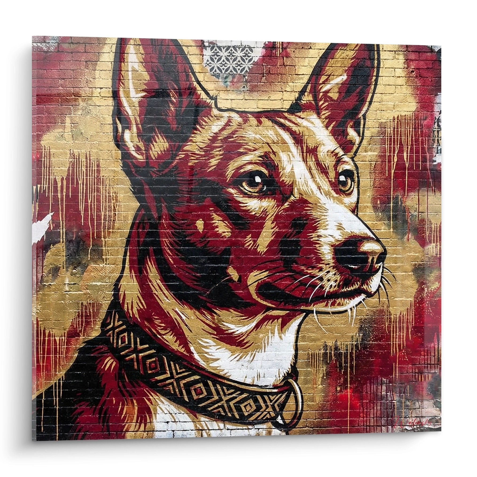






Birman Sacred Cat painting: creating a soft atmosphere with textures and cream tones
7 min read · by Walensky
BIRMAN CAT PAINTING
A chunky knit throw draped over a washed linen sofa. Late afternoon light slides across a cream wall. And right above it, a piercing blue gaze seems to keep watch over the room: that of a Birman cat, painted in tones so soft you almost want to touch them. It's not just a matter of matching colours. It's about textures, fur and light.
The direct answerTo create a cosy atmosphere around a Birman cat painting, pair its cream and golden tones with tactile materials: crumpled linen, ribbed velvet, bouclé and light wood. The harmony doesn't come from the painting's colour alone, but from the contrast and dialogue between the textures around it: cushions, curtains, the sofa's upholstery.- A Birman cat painting in cream tones calls for soft materials around it: linen, velvet, bouclé, light wood.
- Vary your cream and gold shades to avoid a flat look: at least three tones in the room.
- Raking natural light reveals cream tones better than harsh frontal lighting.
The Birman Sacred Cat, an icon of softness for wall decor
This cat has something of living velvet about it. Its cream coat, darker extremities and deep blue eyes all evoke texture rather than form. No doubt that's why it works so well as a painting in an interior seeking calm rather than impact.
Unlike a graphic motif or an abstract composition with sharp contrasts, a Birman portrait in cream tones doesn't seek to catch the eye through contrast. It invites you to linger, much like an animal dozing in the sun. It's this quality, more than the symbolism, that matters here: how this painting can become the starting point for a whole room designed for sensory comfort.
A cocooning painting isn't just looked at: it's felt, almost as much as it's seen.

Favorite
Sleeping Birman Cats Painting - Golden Tenderness - Birman Cat Edition
From €273.90
Discover this paintingPairing a painting with soft materials: linen, velvet, bouclé
However visually soft, a painting remains a smooth, cold surface on the wall. It's up to the surrounding textiles to extend that sense of softness into the room, at body level: on the sofa, under your feet, against the skin.
The role of textiles in perceiving softness
The eye perceives colour, but it is the hand that confirms the feeling of comfort. A living room can be perfectly coordinated in tones yet still feel cold if everything is smooth: faux-leather sofa, thin curtains, glossy laminate flooring. Add a bouclé throw and a ribbed velvet cushion, and the perception changes immediately, even without touching the colour palette.
Bouclé, with its irregular grain catching light in small touches, works particularly well under a painting in cream tones: it echoes the texture of the coat without copying it.
Which materials to favour depending on the room
Not all soft materials are equal depending on how a room is used. Here are the pairings that work best with a Birman Sacred Cat painting:
- Living room: ribbed velvet on the seat, bouclé throw, washed linen cushions to break up an overly uniform look.
- Bedroom: washed linen bedding in cream or beige, velvet upholstered headboard, bouclé wool rug at the foot of the bed.
- Reading corner: light bouclé armchair, velvet pouf, small table in raw or limed light wood.
Light wood deserves a special mention: bleached oak, ash, natural rattan. It brings warmth without heaviness, which is exactly what makes it indispensable in an atmosphere aiming for lightness rather than opulence.
Pairing ideas: living room, bedroom, reading corner
In a living room designed for entertaining, a large format in beige and gold tones, such as a painting of Birman cats dozing against each other, finds its place above a ecru linen sofa. Add pale mustard velvet cushions and an ivory bouclé throw, and the job is done: the artwork no longer stands alone, it becomes the visual extension of the furniture.
In a bedroom, the exercise is more intimate. A tighter portrait focused on the cat's face, with its intense blue eyes, works as a gentle presence rather than mere decoration. Pair it with a taupe velvet headboard and cream washed linen bedding: the contrast of materials alone creates depth without ever breaking the harmony of tones.
For a reading corner, think compact and warm: a narrow panoramic format, a bouclé armchair, a lamp with a natural linen shade. This is where the soft evening light does the most beautiful work on the cream tones.
— Our selection


Advanced tips: light, accessories and layering cream tones
The classic pitfall of cream is monotony. Used alone, without contrast or relief, it can quickly look flat, almost lifeless, like a room you forgot to finish.
Light plays a decisive role here. Raking light coming from the side at the end of the day reveals the subtle nuances of a cream-toned painting far better than a harsh central ceiling light. If your painting is printed on Alu Dibond, its matte surface handles changing natural daylight very well in a room exposed to sunshine. On acrylic glass, however, opt for more controlled lighting to avoid reflections that would flatten the softness of the image.
Add a golden touch: a mirror frame, a brushed brass furniture handle, a candle in an amber candle holder, to warm the whole without ever leaving the cream and beige palette.
The Birman Sacred Cat has its origins in the temples of Southeast Asia, a lineage that can also be seen in some compositions from our collection of traditional Asian paintings. For a cocooning corner geared towards meditation rather than the living room, you can also pair this feline softness with the simplicity of a visual from our Buddha painting collection, in the same cream and gold tones.

Also to discover
Birman Cat Painting with Blue Eyes - Floral Tenderness - Birman cat edition
From €273.90
Discover this painting →Frequently asked questions
Which materials to pair with a cat painting for a cosy atmosphere?
Favour washed linen, ribbed velvet and bouclé. These three materials catch light differently and create tactile depth around a visual that is inherently smooth.
How to keep cream tones from looking flat in a decor?
Layer your shades (ivory, sand, camel, gold) rather than staying with a single tone. Contrasting materials (matte and glossy, smooth and bouclé) also do a lot of the work.
Which Birman Sacred Cat painting to choose for a cocooning living room?
A large horizontal format in beige and gold tones, such as a visual of cats dozing together, works particularly well above a linen or light velvet sofa.
How to play with light to highlight a cream painting?
Raking light at the end of the day reveals subtle nuances better than frontal lighting. On an Alu Dibond finish, natural daylight is generally more than sufficient.
Composing a cocooning room around a Birman Sacred Cat painting means accepting that decoration is played out with the hands as well as the eyes. Crumpled linen, velvet that invites you to sit, light wood that warms without weighing down: all of this turns a wall into a refuge. All that's left is to choose the feline face that will watch over your corner of softness, to discover in our collection of Birman Sacred Cat paintings, and to extend it, for the bedroom, with our advice on the ideal light to bring out the golden reflections of a Birman cat painting in a bedroom.
Explore our collections


