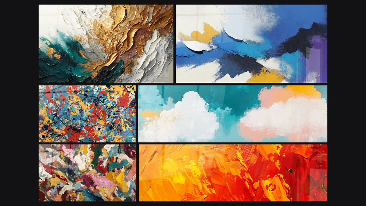
Abstract large-format painting above the sofa: which colors to choose?
8 min read · by Walensky
PAINTING CANVAS STYLES
The sofa has been in place for months. The wall above it stays bare, or worse: it still holds that photo frame inherited from the old apartment, too small, too lonely. You know you need a large abstract painting. What you don't know is which color to pick so it truly works, and not just "more or less".
The direct answerThe choice of colors depends on your sofa's shade: on a grey sofa or beige one, play with harmony using pastel tones or contrast with vivid colors; on a black or dark velvet sofa, favor a multicolored painting that brings out every nuance; on a white sofa, dare to use warm, deep hues like saffron or turquoise to avoid a washed-out look.There is no single right answer, but there is a logic to follow depending on whether you are seeking harmony or chromatic contrast. Here it is explained, with examples.
- Grey or beige sofa: harmony in pastel tones, or contrast with bright colors depending on the mood you want
- Black or dark velvet sofa: multicolored paintings and paint splashes come alive with full intensity
- White sofa: go for warm, deep tones (saffron, turquoise, orange) to avoid a room that feels too sleek
- The 60-30-10 rule remains the most reliable benchmark for balancing colors without getting it wrong
Why the color of an abstract painting changes everything above the sofa
A large-format abstract painting is not a simple decorative object placed to fill an empty space. Above the sofa, it is the focal point of the living room: the eye lands there first, even before the rug or the cushions. The choice of support matters as much as the colors: the difference between a print on acrylic glass and a true painting can radically change the final result.
Shape and abstract subject matter of course count. But it is color that decides whether the whole thing breathes or clashes. A beautiful painting in itself can overwhelm a sofa if it conflicts with its shade, and conversely, a good match can enhance even a plain sofa.
Shape catches the eye; color decides whether it stays.
Two logics oppose and complement each other: harmony, which extends the sofa's tones into the painting for a calm atmosphere, and contrast, which plays on opposition to create visual tension and dynamism. Neither is superior; it all depends on the energy you want to give the room. If you opt for a soft figurative style, an impressionist painting for a modern living room can reconcile both approaches with elegance.
Grey or beige sofa: aim for harmony or colorful contrast
Grey and beige are the most common sofa colors in France, and that's good news: they are also the easiest to pair, because they accept almost anything.
Soft harmony with pastel tones
On a light grey or linen beige sofa, a painting in pastel blue-pink tones creates a soothing visual continuity, almost cottony. You stay within a gentle palette, with no sudden break.
This is exactly the spirit of the Rivage Mouvant painting, which blends shades of blue and pink in fluid forms, evoking a faded seascape.

Sharp contrast with brilliant colors
Conversely, a charcoal grey or sand beige sofa handles paintings with bold colors very well: yellow, fuchsia pink, electric blue. The grey then acts as a neutral background that makes the vivid tones explode, somewhat like a contemporary art gallery wall.
The more neutral your sofa, the more freedom you have with the painting. It is the most comfortable setup for trying something bold without risking a mistake.
For this contrast option, an explosion of colors painting mixing pink and blue in a modern, artistic composition works particularly well against a grey background.

Favorite
Explosion of colors painting - Abstract emotion - Painting style edition abstract
From €273.90
Discover this paintingBlack or dark velvet sofa: make vivid colors stand out
A black sofa or a midnight blue velvet sofa is a dark base that absorbs light rather than reflecting it. Against this background, the vivid colors of an abstract painting gain an intensity they would never have against a light background.
This is the ideal playground for multicolored paintings and paint splashes. The black or deep velvet acts as a natural frame, somewhat like a jewel case: it concentrates attention on the bursts of color without ever diluting them.
A painting like Éclaboussures orange et blanches (Orange and White Splashes) on a cracked wall, with its black vertical drips and bright orange projections, finds its full relief against a dark velvet sofa: the dark background makes each splash stand out like a spark.
Another option: a denser multicolored painting, where several tones overlap. On a black sofa, the "creative chaos" effect takes on its full meaning, provided the wall is left room to breathe, without piling on other decorative objects.
— Our selection

White or light sofa: play the card of warm, deep colors
A white or off-white sofa is a blank page. The risk with this kind of background is choosing a painting that is too tame, too pale itself, and ending up with a living room that lacks character, almost clinical.
The solution: warm, deep tones that wake up the whole. Saffron, deep turquoise, burnt orange work particularly well, because they bring exactly what white lacks: density, warmth, movement.
The turquoise and saffron Flow painting with marbled curls illustrates this logic well: deep blue and tawny orange meet in fluid forms, creating a strong chromatic contrast without ever becoming garish.

On a light sofa, you can also consider a more luxurious atmosphere with golds and deep blues, for a more subdued effect than the vivid contrasts mentioned above. If you are looking instead for a beige base and detailed advice on this ground, our guide to modern abstract art above a beige sofa goes deeper into this specific pairing.
— Also to discover


Our tips for testing the color match before buying
Before buying, test. A screen never renders a color faithfully, and the light in your living room changes everything depending on the time of day.
- Photograph your sofa in full daylight and compare it to product visuals at the same brightness
- Apply the 60-30-10 rule: 60% dominant color in the room, 30% secondary color, 10% accent color — the painting often plays this accent role
- Use a simplified color wheel: opposite colors create contrast, neighboring colors create harmony
- Look at the painting from its real viewing distance, from your usual seat on the sofa, not only up close
If you are torn between two shades, think about the light in the room. A very bright room handles acrylic glass well, with its ultra-vibrant colors and gallery-art look. A dimmer room or one facing a window pairs better with Dibond aluminum, which is more matte, with no glare.
To explore the possible styles more broadly, the collection of abstract artistic paintings offers a good starting point for comparing palettes before deciding.

In the same spirit
Multicolored acrylic painting - Chromatic Brilliance - abstract painting style edition
From €273.90
Discover this painting →Frequently asked questions
What painting color for a grey sofa?
Both logics work: soft blue-pink pastel tones for gentle harmony, or vivid colors (yellow, fuchsia, turquoise) for dynamic contrast. Grey accepts almost every palette; it is the most flexible sofa color.
How do you match the colors of a painting with your living room?
Start from a color already present in the room (cushion, rug, curtain) and find it again, even discreetly, in the painting. This creates a visual thread without forcing everything to match identically.
Should the painting match the cushions or the rug?
No, not identically. An echo is enough: a single shade in common between the painting and one or two textile elements. Too many perfect matches give a frozen "decor kit" effect rather than a living interior.
What size abstract painting should you choose above a sofa?
Count on a painting that occupies roughly 60 to 75% of the sofa's width. For a classic 3-seater sofa, L formats (120x70 cm or 100x100 cm depending on the painting) work well; for a corner sofa, XL to 3XL formats come naturally.
There is no universal color for dressing the wall above the sofa, but there is a simple logic: harmony to soothe, contrast to energize. The rest is a matter of eye and of the mood of the moment, not a rule carved in stone.
To find the large-format abstract painting that will truly converse with your sofa, head to our collection of large-format abstract paintings : a broad base for comparing palettes and formats and finding the one that will finally silence that empty wall.
Explore our collections