

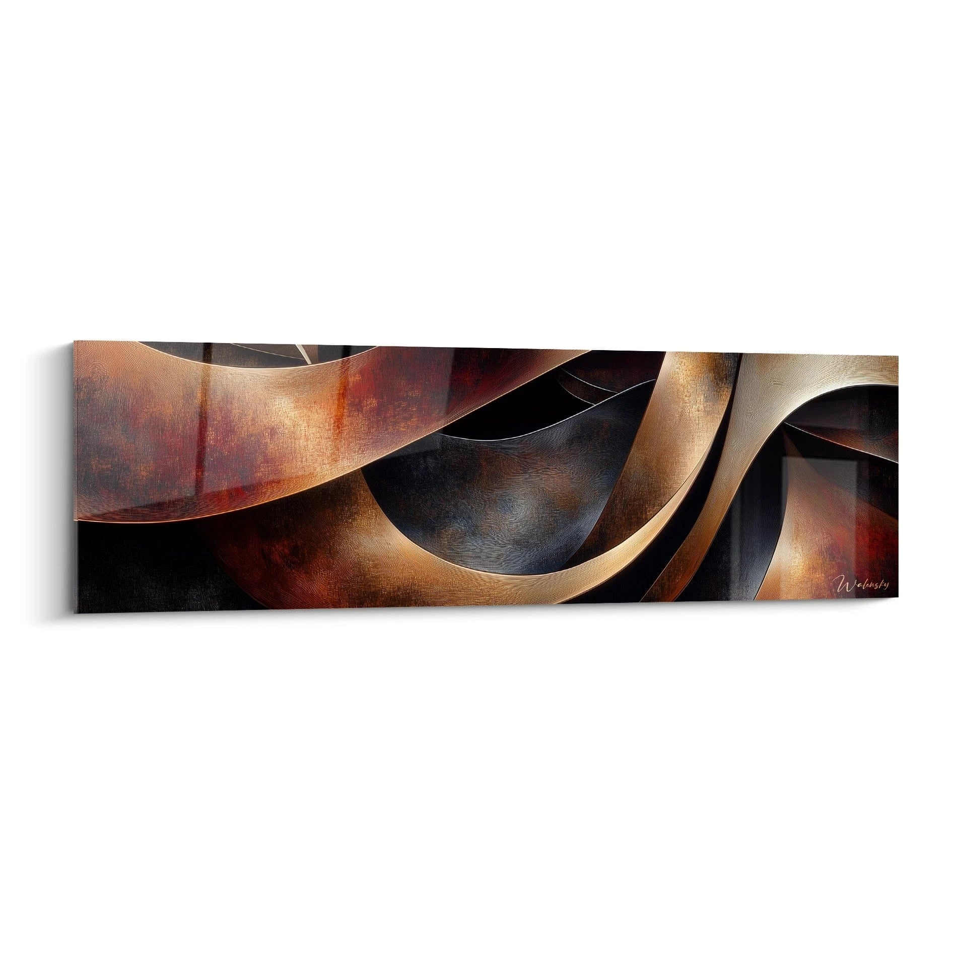






Minimalist abstract painting for an entryway: the guide to proportions done right
8 min read · by Walensky
ABSTRACT PAINTINGS
The entrance wall is 90 centimeters wide between the door and the console. You've probably already imagined three different paintings on it, and none of them convinced you. That's normal: an entryway isn't a miniature living room, it's a passageway that follows its own rules, and most decorating advice ignores them.
The direct answerFor an entryway, the right move is an L format (from 120x40 cm or 100x100 cm depending on the painting's spec sheet) hung with its center between 145 and 155 cm from the floor, on a clear wall where the artwork covers at least 60 to 75% of its width. A single minimalist abstract painting in neutral tones works better than several small formats in a circulation space.A hallway isn't viewed like a sofa you contemplate for hours. You pass through it, brush past it, glance at it while looking for your keys. The painting therefore needs to make its impact quickly, without requiring any effort to read, and that is exactly what minimalist art offers.
- A narrow hallway suits a panoramic L format (120x40 cm) rather than a large square.
- The reference height stays at 145-155 cm at the center, adjusted if an entry table sits beneath it.
- One well-proportioned painting is better than three small frames that fragment the eye.
Why the entryway imposes different constraints than the living room
An entryway is crossed in a few seconds, often offers only one usable wall, and natural light there is almost always scarce, sometimes absent in apartments without a direct window on that section. These three realities change everything compared with a living room, where you choose a painting to be admired from a sofa.
In a living room, you compose an atmosphere across several meters of wall. In an entryway, you have a handful of seconds and sometimes less than a meter of free width between the front door, the mirror and the coat rack. The painting must therefore be readable instantly, with no details to decode up close.
In an entryway, the painting doesn't have time to be looked at for long: it must be understood at a glance.
This is precisely why busy compositions, with multiple shapes or a ten-color tonal range, lose their effect here. A fluid line, a wave, a restrained gradient: that's what works in a space you only pass through.
Which format to choose depending on your entrance layout
The format of a painting for an entryway is decided first by the real width of the available wall, not by the size of the whole room. Two typical configurations call for two opposing logics.
Narrow entryway or hallway: favor the panoramic format
For a hallway 80 to 100 cm wide, an elongated panoramic format like the L 120x40 cm remains the most coherent: it stretches horizontally without crushing the space vertically, and leaves air above and below. This is the format offered, for example, by the Infinite Blue Meditation painting or the Silent Wave Cyan painting, both designed for this kind of elongated configuration.

In an entryway without a window, favor acrylic glass: its glossy surface compensates for the lack of natural light by reflecting some of the artificial lighting. Facing a window or a glazed door, matte Alu Dibond avoids distracting reflections.
Wide entryway with a clear wall: dare a square or more generous format
If your entryway offers a genuine clear stretch of wall, with no door or furniture nearby, a square format like the L 100x100 cm changes the perspective. The Silky Silver Flow painting, with its fluid black-and-white lines, then stands out as a strong focal point without multiplying visual elements.

To see concrete layout examples, the best abstract paintings for a minimalist entryway details several real configurations.

Favorite
Infinite Blue Meditation Painting - minimalist abstract edition
From 242.90 €
Discover this paintingThe ideal height and placement for hanging
The reference height for hanging a painting at its center is between 145 and 155 cm from the floor, roughly the eye level of a standing adult. In an entryway, this rule is slightly adjusted depending on what sits below.
If there is a console or entry table under the painting, allow roughly 15 to 20 cm between the top of the furniture and the bottom of the painting. This space breathes, and it avoids the "crammed" effect that gives an impression of overload even with a single artwork.
On the width side, the proportion rule applies to the entryway too: the artwork ideally occupies 60 to 75% of the width of the wall or furniture beneath which it is placed, no more (overwhelming effect) and no less (lost, floating effect). A square abstract painting in earthy tones naturally respects this proportion in a clear space.
— Our selection


Palette and minimalist style: what really works in an entryway
Neutral tones — beige, taupe, off-white, soft blue — work better in an entryway than a saturated palette, because they don't clash with the materials already present: parquet, door, mirror, often themselves visually busy enough. The idea is to place a calm note, not to add another layer of stimulation. If you nonetheless opt for brighter shades, the advice on pairing a colorful abstract painting with furniture will help you avoid missteps.
The Silent Foam painting, in white and beige, illustrates this principle well: an almost monochrome, soothing composition that doesn't compete with the rest of the decor. The Underground Mysterious Roots painting, on the other hand, adds a more organic touch while staying within a very sober beige and black range.
For entryways that adjoin a living room in a contemporary spirit, the collection of modern paintings lets you keep a stylistic consistency between the two spaces without duplicating motifs.
- Favor one dominant hue per artwork, not a five-color tonal range.
- Clean lines and fluid shapes (waves, flows, horizons) are read more quickly at a glance than a complex geometric composition.
- An abstract face or silhouette, like the beige and taupe profile of the Dreamlike Silent painting, can also work if the line remains spare.
— Also to discover


Common mistakes to avoid in a small entrance
The first and most common mistake is choosing a painting that is too large "to make a statement" in a space that can't carry it. A 4XL format in a 90 cm entryway overwhelms everything, including the sense of welcome you were trying to create.
| Mistake | Why it doesn't work | Alternative |
|---|---|---|
| Format too large for the wall | Crushes circulation, gives an impression of clutter | Respect 60-75% of the available width |
| Accumulating several small frames | Fragments the eye in a space already crossed quickly | A single strong, well-proportioned painting |
| Ignoring the lighting | A dark entryway makes an artwork dull, even invisible | Adding an accent LED aimed at the painting |
| Stacking mirror, coat rack and painting | Visual overload, no element breathes | Choose one focal point per wall |
An entryway without a window loses much of its effect without dedicated lighting. A simple LED spot angled at 30-45° toward the painting is enough to reveal the contrasts, especially on an Alu Dibond finish that doesn't reflect light on its own.
Another, subtler pitfall: wanting the painting to match the coat rack or doormat at all costs. Minimalism doesn't demand perfect harmony among all objects, only the absence of superfluous visual noise.

In the same spirit
Minimalist beige and taupe female profile painting - Silent Dream - Abstract Face edition
From €273.90
Discover this painting →Frequently asked questions
What size painting for a small entrance?
An L format remains the starting point, whether panoramic (120x40 cm) for a narrow hallway or square (100x100 cm) for a wider wall. Avoid very large formats unless the wall is well over 1.50 m wide.
At what height should you hang a painting in an entrance?
The center of the artwork goes between 145 and 155 cm from the floor. If furniture sits beneath, leave 15 to 20 cm between the top of the furniture and the bottom of the painting.
Should you have one large painting or several small ones in an entryway?
A single well-proportioned painting almost always works better in a passageway. Several small formats demand precise alignment and a wider wall to avoid visual confusion.
What style of abstract painting suits a modern minimalist entryway?
Fluid compositions with a single dominant hue — waves, flows, horizons — in neutral or soft blue tones fit best. For a more graphic look, a clean abstract portrait like a minimalist female face painting for the entryway also works very well.
Conclusion
In an entryway, it's neither the amount of color nor the size of the painting that creates the effect sought the moment the door opens: it's the rigor of the proportions. Panoramic format for a narrow hallway, square for a clear wall, hung at eye level, and a single artwork that speaks clearly rather than several competing for attention.
Apply these three benchmarks — format matched to the real width, height around 150 cm, restrained neutral palette — and the wall that has been taunting you since you moved in will become the first good impression of your home. To go further, the collection of minimalist paintings brings together formats designed for this kind of constrained space.
Explore our collections


