

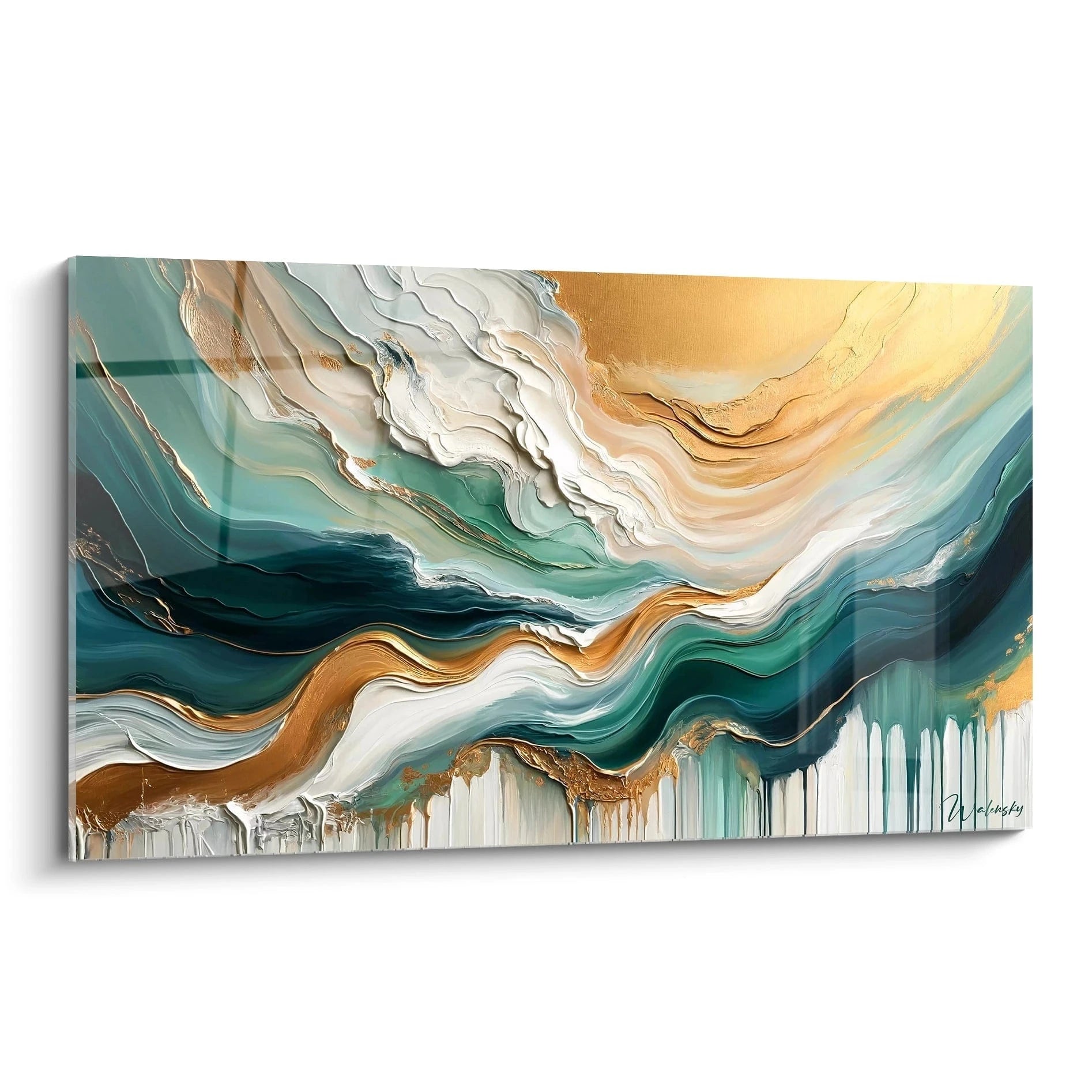






Which frame format for a artwork above a low entryway console?
June 16, 2026 · 10 min read · by Walensky
Every time I step through a front door, my eye instinctively settles on the entrance. And without fail, I notice this low console, elegant and functional... yet too often topped by a bare wall that shouts its untapped potential. It is right there, at this strategic spot, that a well-chosen artwork can turn a simple passage into a true statement of intent.
Here is what a suitably sized frame above a low entryway console brings: an elegant verticality that structures the space, a welcoming focal point from the very first glance, and a visual coherence between furniture and wall decor that reveals your eye for detail.
The challenge? Too many people choose a format at random: too small and it floats in the void, too large and it overwhelms the piece of furniture, or in poor proportions that create visual imbalance. The result: an entrance that lacks character, an invisible artwork, and that lingering sense that something is off without knowing exactly what.
But rest assured: there are simple rules, drawn from classic interior design and visual composition, that will help you select the ideal frame format to showcase your low entryway console. From harmonious proportions to optimal dimensions, including the orientation of the format, I will guide you to the perfect choice.
In the next few minutes, you will know exactly which format to favor, how to adapt it to the dimensions of your furniture, and above all how to create that balanced composition that will make your entrance a memorable space.
The two-thirds rule: your proportional compass
Whenever I work on designing an entrance, I always start by pulling out my measuring tape. The first rule I systematically apply when choosing the frame format above a low console is the well-known two-thirds rule. In practical terms, the width of your artwork should represent between 60% and 75% of the total width of your console.
Why this proportion? It creates a natural visual balance. A frame that is too narrow (less than 50% of the furniture's width) will float in space as if lost, without anchoring. Conversely, a format that is too imposing (beyond 80%) will give an impression of crushing, as if the artwork were spilling over its support.
Let's take a concrete example: your low console measures 120 cm wide. The ideal frame width should therefore fall between 72 cm and 90 cm. This range leaves you room to choose among standard formats available, while guaranteeing the visual harmony essential in an entrance where every element counts.
The importance of architectural context
But be careful, this two-thirds rule must adapt to your space. If your entrance has a low ceiling (under 2.40 m), favor the lower end of the range to avoid a sense of oppression. Conversely, in a bright entrance with generous ceiling height, you can opt for a more generous format that will assert its presence more strongly.
Horizontal or vertical format: the orientation dilemma
This is a question I hear constantly: should you favor a horizontal format or a vertical format to hang above a low entryway console? The answer depends on your aesthetic goal and the configuration of your space.
The horizontal format (landscape) is the classic and reassuring choice. It naturally follows the lines of your console, creates visual continuity and reinforces the impression of width. It is particularly relevant if your entrance is narrow: the horizontal orientation visually widens the space. I generally recommend a panoramic format such as 70x50 cm or 90x60 cm for a standard console of 100 to 130 cm wide.
The vertical format (portrait), on the other hand, brings a bolder and more contemporary dimension. It creates an interesting break with the horizontality of the furniture, draws the eye upward and adds perceived height to your entrance. This orientation works beautifully in spaces with high ceilings or when you want to create an assertive focal point. A format such as 50x70 cm or 60x80 cm suits a medium-sized console perfectly.
The square format : the balanced option
Do not forget the square format, too often overlooked. A 60x60 cm or 70x70 cm frame offers elegant neutrality and a soothing symmetry that suits minimalist and contemporary interiors particularly well. This format creates a centered focal point without imposing a visual direction, ideal if your low console itself has a geometric or minimalist design.

Favorite
Golden Fusion Painting on White and Black Background - Mineral Elegance - Abstract Marble Edition
€233.90
Discover this paintingStandard dimensions that work every time
After years of composing harmonious entrances, I have identified frame formats that work consistently above a low console. These universal dimensions will help you easily find suitable artworks, whether photographs, prints or paintings.
For a console of 80 to 100 cm wide (compact format for small entrances), opt for a 50x40 cm frame in horizontal or 40x50 cm in vertical. These dimensions remain proportionate without dominating the furniture.
If your console measures between 100 and 130 cm (the most common size), the 70x50 cm (horizontal) or 50x70 cm (vertical) formats are the optimal choice. You may also consider a 60x60 cm square format, which will offer a pleasing visual balance.
For larger consoles of 130 to 160 cm, do not hesitate to go bigger: 90x60 cm in horizontal, or even 100x70 cm if your ceiling allows. These generous dimensions will fill the wall space without appearing disproportionate.
The trap of unusual formats
Beware of overly unusual formats or extreme ones (triptychs, ultra-panoramic formats). In an entrance, the zone of transition par excellence, restraint and balance outweigh excessive originality. A classic format well chosen will always have more impact than an eccentric format poorly adapted.
— Our selection


Hanging height: the detail that changes everything
Choosing the right frame format is not enough: you must also hang it at the right height. It is often this technical detail that makes the difference between a successful composition and an awkward arrangement.
The golden rule: the center of your artwork should sit between 145 cm and 155 cm from the floor, which roughly corresponds to the eye level of an average-height person. But be careful, this rule must adapt to the specific context of a low entryway console.
First measure the height of your furniture. A typical low console measures between 70 cm and 90 cm. Ideally, plan for a 15 to 25 cm gap between the top of the console and the bottom of the frame. This breathing space is crucial: too tight (under 10 cm), the artwork will look awkwardly placed on the furniture; too far (over 30 cm), the visual connection between the two elements is lost.
Concretely, if your console reaches 80 cm and you choose a 70x50 cm frame (vertical format), the bottom of the frame should sit around 95-100 cm from the floor, thus placing the center of the artwork at about 130 cm. This arrangement creates a natural visual line that guides the eye effortlessly.

Matching the format to your artwork's style
The frame format is not chosen solely based on the dimensions of your console. The very content of the artwork, its style and its visual energy should guide your decision.
For a landscape photograph, the horizontal format imposes itself naturally. It respects the original composition and creates that contemplative window that invites travel from the entrance. A 80x60 cm or 90x60 cm format will give a seascape or mountain scene all the scope it deserves.
Portraits, whether photographic or painted, logically call for a vertical format. This orientation concentrates attention on the subject and creates an almost human presence in your entrance. A 50x70 cm or 60x80 cm format will suit an expressive portrait perfectly.
For abstract art or graphic compositions, you enjoy complete freedom. Here, the format becomes a purely architectural choice: what do you want for your entrance? To stretch the space (horizontal), create height (vertical), or establish a symmetrical calm (square)?
The frame's thickness matters too
Do not forget that the frame itself adds a physical dimension to the artwork. A thick frame (5 cm or more) will visually increase the final size of the ensemble and alter the proportions. If you opt for an imposing frame, slightly reduce the size of the inner format to maintain balance with your console.
— Also to discover


Creating a multiple composition: the bold alternative
Who said you must limit yourself to a single frame above your low console ? If you feel comfortable with wall decoration, consider a composition of several smaller formats.
The symmetrical gallery approach works wonderfully: two identical 40x50 cm frames placed side by side, spaced 10 to 15 cm apart, create a sophisticated and rhythmic effect. This arrangement is especially suited to long consoles (over 140 cm) and contemporary entrances.
The asymmetrical composition alternative mixes different formats (for example a 50x40 cm with two 30x30 cm) for a more relaxed and personal effect. This approach demands greater mastery, but the result can be spectacular if you respect a visual logic: a shared colour palette, thematic coherence, or uniformity of frames.
In every case, your multiple composition as a whole should respect the two-thirds rule: the total width of all the frames combined (gaps included) should represent 60 to 75% of the width of your console.
Transform your entrance into a true art gallery
Discover our exclusive collection of Library paintings that will showcase your space from the first glance with formats perfectly suited to it.

In the same spirit
Floating Hope Blue Painting - Multicolor Abstract Edition
€232.90
Discover this painting →The most common mistake (and how to avoid it)
Let me share the mistake I see most often during my visits: choosing a frame format that is too small out of fear of overdoing it. This excessive caution creates a frustrating visual imbalance where the artwork seems timid, almost apologetic, lost on this large wall above the console.
Remember: your entrance is the first impression of your home. It is the moment to assert your personality, not to apologise for existing. A generous, well-proportioned format creates that welcoming and sophisticated presence you are seeking.
The other classic mistake: neglecting lighting. Even the most perfect format will lose its impact if your artwork sits in shadow. Plan for indirect lighting (adjustable spotlights, side wall sconces) or a dedicated picture light to fully reveal your composition.
Picture yourself stepping through your door after a long day. Your gaze immediately settles on this perfectly proportioned artwork that seems to have always been there, naturally, as if it were part of the architecture itself. The low console, far from being a mere functional piece of furniture, becomes the elegant base of a thoughtful visual composition. It is precisely this subtle balance between proportions, format and placement that turns an ordinary entrance into a memorable space.
The right frame format is not a universal magic formula, but an informed decision that takes into account your specific dimensions, your personal style and the atmosphere you wish to create. Take your measurements, apply the two-thirds rule, respect the breathing spaces, and trust your instinct. Your entrance will thank you with every passage.
Frequently Asked Questions
Can you use a frame wider than the console?
Technically yes, but I strongly advise against it in an entrance. A frame that overhangs the console creates visual imbalance and gives the impression that the furniture is too small for the space, or conversely that the artwork is too imposing. The exception: if your console is part of a wider wall composition (with side shelves for example), you may then consider the whole piece of furniture as the base for calculation. In all cases, respect the two-thirds rule relative to the widest element of your composition.
What minimum distance between the frame and the ceiling?
Allow at least 30 cm between the top of your frame and the ceiling, ideally 40 to 50 cm. This breathing margin prevents the artwork from looking trapped or crushed by the ceiling. If you have an entrance with a low ceiling (2.40 m or less) and a tall console, you may have to compromise: either slightly reduce the format of your frame, or hang it a bit further from the console (25-30 cm instead of 15-20 cm). The essential thing is to maintain that visual breathing space at the top.
Should the format be adapted if you change artworks regularly?
If you enjoy regularly refreshing your entrance decor, I advise investing in two or three standard frame formats (for example a 70x50 cm horizontal, a 50x70 cm vertical, and a 60x60 cm square) that match the proportions of your console. Choose frames of the same style (same colour, same finish) to maintain visual coherence whatever the artwork. You can thus vary the visuals with the seasons or your wishes without compromising the harmony of your entrance. Favour frames with an easy opening system to simplify changes.
Explore our collections


