

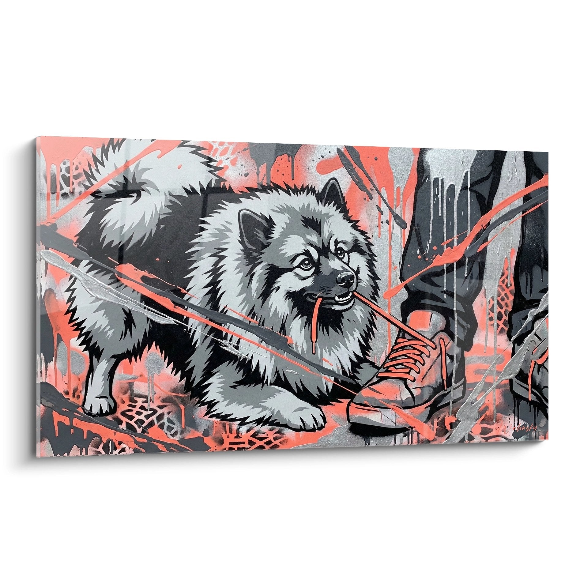






Do paintings with pronounced textures add depth to a flat space?
January 27, 2026 · 10 min read · by Walensky
I remember this Parisian apartment, third floor with no elevator, where the white walls seemed to suck every bit of life out of the room. The owner confided his unease to me: "Everything is clean, modern, but I feel like I'm living in a shoebox." Then I hung a single textured canvas above the sofa. The effect was immediate. The relief caught the daylight and created dancing shadows at dusk. The room finally breathed.
Here is what paintings with pronounced textures bring to a flat space : they create a true architecture on the wall that plays with light, they generate a visual movement that instantly animates the room, and they offer a tactile depth that radically transforms the perception of volume.
You have probably felt this frustration before. Your interior is well arranged, the colors harmonious, the furniture perfectly chosen. Yet something is missing. The space remains desperately flat, one-dimensional, as if the walls pushed the gaze away instead of inviting it to explore. You have tried adding frames and photos, but nothing truly changes this sense of flatness.
The solution does not lie in multiplying elements, but in their physical dimension. Paintings with pronounced textures do not merely decorate: they literally sculpt the space, creating reliefs that interact with natural and artificial light. I will show you how these works transform the perception of volume and, above all, how to integrate them to reveal the hidden potential of your rooms.
When matter becomes luminous architecture
Texture in a painting is not a mere decorative effect. It is a genuine small-scale architectural intervention. Over the past eight years, I have watched how a textured canvas radically alters the atmosphere of a space depending on the time of day.
In the morning, the low-angled sunlight catches the relief of the thick paint, creating micro-shadows that give the illusion of a depth measured in centimeters becoming measured in meters. At noon, the overhead light reveals the color nuances trapped within the impasto. In the evening, the lateral artificial lighting completely transforms the work, as if you owned three different paintings.
This dynamic interaction with light is impossible to achieve with a smooth printed canvas or a framed poster. Pronounced textures capture, reflect and diffuse light in a three-dimensional way. They create what I call "visual anchor zones": points where the eye pauses, explores, and discovers details that were not visible a few hours earlier.
In a flat space dominated by smooth surfaces – plaster, glass, metal – this tactile presence breaks the sensory monotony. The gaze no longer slides across the walls: it finally finds an anchor point that generates spatial depth.
The three dimensions of textured depth
Let us talk concretely about what "adding depth" means. When I work on an interior design project, I distinguish three types of depth that textured paintings can create.
Physical depth: leaving the wall
Certain techniques such as knife impasto, mixed-media applications (sand, plaster, fabric) or sculpted reliefs create a genuine thickness. I have seen canvases where the material protruded three centimeters beyond the stretcher. This physical projection casts shadows onto the wall, creating a play of successive planes: the wall, the shadow, the canvas, the reliefs. Four levels of depth where there was none before.
Optical depth: fooling the eye
Textures create illusions of perspective. Material applied as a gradient – dense in the foreground, smoother toward the back – suggests spatial recession. Vertical striations visually elongate walls, while circular textures create focal points that "hollow out" the space. This optical dimension turns a flat wall into a dynamic surface.
Emotional depth: inviting touch
This is perhaps the most subtle. Pronounced reliefs generate an irresistible urge to touch the work. This tactile promise creates a stronger emotional connection than a smooth surface does. The visitor approaches, observes up close, moves to see how the light changes. This physical movement through the space reinforces the perception of depth in the entire room.

Favorite
Painting Veiled Female Face - Ethereal Mystery - Black and white face edition
213,90€
Discover this paintingWhere to place textures to maximize the depth effect
The location of a textured painting is never trivial. Experience has taught me that certain positions dramatically amplify the effect of depth, while others neutralize it completely.
Walls perpendicular to the light sources are your best allies. If your window is on the east wall, place your textured canvas on the north or south walls. The light rays will graze the reliefs sideways, creating maximum shadow-light contrast. Conversely, a textured painting facing the window will be lit head-on, which flattens the reliefs.
In narrow spaces such as corridors, I systematically install textured works on the far wall. The material captures the gaze and gives the illusion that the wall is closer than it really is, while paradoxically creating a sense of something "contained" within the space. This is what I call the "jewelry box" effect: the space gains precious intimacy rather than confinement.
For rooms with low ceilings, favor textures with a vertical dominance placed slightly above eye level. Vertical striations or impasto guide the eye upward and visually elongate the walls. I have seen living rooms 2.40 m high appear 20 cm taller thanks to this simple principle.
— Our selection


Types of textures and their spatial effects
Not all textured paintings create the same type of depth. After observing hundreds of installations, I have identified clear patterns between the nature of the texture and the spatial effect it produces.
Organic textures – poured, splattered, fluid materials – generate directional movement. A pour running down the canvas draws the gaze downward, visually anchoring the space. Conversely, upward projections create a sensation of lift. I use this principle in entrance halls to set the tone immediately: dynamic and ascending for a lively space, fluid and horizontal for a calming atmosphere.
Geometric textures – raised squares, grids, repeated patterns – structure the space in an architectural way. They work particularly well with contemporary interiors dominated by straight lines. A painting with raised cubes, even monochrome, creates several superimposed planes of depth. The eye moves from relief to relief as it would climb steps.
Mineral textures – sand, crushed stone, metallic inclusions – bring a telluric dimension that visually "weighs down" a space. I recommend them in attic rooms or spaces with asymmetrical volumes, where they create a reassuring counterpoint to the instability of the ceiling lines. Raw material absorbs light differently than smooth textures, creating shadow zones that densify the space.

The mistake that cancels out any depth effect
I have seen so many spaces where a magnificent textured painting brought absolutely no depth. The reason? Poorly planned lighting.
A classic mistake is to light the entire room with a central ceiling fixture diffusing uniform light. This "flat" light completely neutralizes the reliefs of your canvas. The shadows disappear, the texture fades, and you are left with a work whose materiality you no longer perceive.
The solution: create lateral light sources. An adjustable spotlight placed at 45° to your painting will spectacularly reveal the textures. A floor lamp with a directional shade in the corner of the room will create cast shadows that visually extend the reliefs beyond the frame. Even a simple LED strip positioned behind the painting produces a halo that detaches the work from the wall and multiplies the effect of depth.
Intensity matters too. Light that is too strong crushes the reliefs. Light that is too weak drowns them in darkness. The sweet spot? Roughly 2000 to 2500 lumens for a medium-sized painting (80x100 cm), with a color temperature around 3000K that reveals the warm tones of the materials without distorting the colors.
— Also to discover


Combining textures and styles to amplify the effect
A painting with pronounced textures never lives alone. It converses with your furniture, your materials, your architecture. This visual dialogue can either amplify or diminish the perception of depth.
In a minimalist interior with clean surfaces – waxed concrete, glass, brushed steel – a textured canvas becomes the necessary point of rupture. It introduces the tactile dimension these smooth materials lack. I have seen industrial lofts transformed by a single large textured format: the space kept its architectural rigor while gaining immediate warmth.
Conversely, in a classic interior rich in ornament, moldings and fabrics, opt for more subtle textures. Delicate impasto or discreet reliefs are enough. Too much material would create visual cacophony. Here, the texture must converse with the ceiling moldings, respond to the reliefs of the Versailles parquet, complement rather than compete.
Scandinavian interiors, with their light woods and soft textiles, welcome organic textures beautifully: white pours, natural reliefs, raw materials in neutral tones. These textures extend the material philosophy of the whole while adding the vertical dimension that these horizontal spaces often lack.
Your space deserves this third dimension
Discover our exclusive collection of paintings for law firm offices that bring this textured depth and tactile presence capable of instantly transforming your flat walls into living, architectural surfaces.

In the same spirit
Dawn over the Bay painting - Abstract Boat edition
€233.90
Discover this painting →The transformation begins today
Think back to your flattest room, the one where you feel that indefinable spatial discomfort. Now imagine a wall transformed by a textured work that catches the morning light, creates dancing shadows in the afternoon, and reinvents itself every evening under your lamps. Picture how your gaze no longer slides over inert surfaces, but stops, explores, discovers.
Paintings with pronounced textures do not simply add depth to a flat space : they reveal the dimensional potential hidden in your walls. They turn light into an architect, create volume without construction work, and offer that tactile dimension that physically reconnects us to our environment.
Start with a single wall, a single work. Observe how it changes throughout the day. Notice how your perception of the space shifts, how the proportions seem to adjust, how the room finally breathes. This is the transformation I have seen happen hundreds of times, and it always begins with this simple decision: giving thickness to what was flat.
Frequently asked questions
Are textured paintings suitable for small spaces?
Absolutely, and that is often where they are most effective. Contrary to popular belief, pronounced textures do not overwhelm a small space: they give it character and depth. The key lies in choosing the format and placement. In a room under 15 m², favor a medium format (60x80 cm maximum) placed on the wall most visible from the entrance. Vertical textures visually elongate the space, while subtle reliefs in light tones create depth without weighing it down. I have furnished 18 m² Parisian studios where a single well-placed textured painting completely transformed the perception of volume. The mistake would be to multiply works: in a small space, one strong textured piece is worth more than several smooth works.
How do you maintain a painting with a lot of texture?
Maintaining textured paintings often worries people, but it is actually very simple. Dust does accumulate in the reliefs, but monthly dusting with a soft feather duster or a camera blower is largely sufficient. Absolutely avoid damp cloths that could alter the materials, especially if they are porous like plaster or sand. For varnished or resin-coated textures, a slightly damp microfiber cloth once or twice a year is suitable. The advantage of pronounced reliefs? They hide small imperfections and dust better than a shiny smooth surface where every mark shows immediately. Simply position your painting away from grease sources (kitchen) and excessive humidity (bathroom without ventilation), and it will last through the years without trouble. I have clients who have owned textured canvases for more than fifteen years, as vibrant as on the first day.
Which texture color should you choose to maximize the depth effect?
Color greatly influences the effect of depth, but not in the way one might imagine. Dark tones (anthracite gray, midnight blue, forest green) create an "absorbing" depth: the gaze plunges into the material, the space seems to hollow out. Excellent for large bright rooms where you want to create an intimate focal point. Light tones (off-white, beige, pearl gray) generate a "reflecting" depth: light bounces off the reliefs, multiplies the planes, visually enlarges the space. Perfect for darker or confined rooms. My advice? Look at the dominant color of your room and create a subtle contrast of one or two shades. In a white interior, a textured painting in beige or light gray will reveal the reliefs better than pure white that would blend into the walls. The goal is for the texture to be visible without the color shouting. Monochrome textures with tonal variations (gradients of a single color) often offer the best compromise: enough contrast to reveal the reliefs, enough harmony not to fragment the space.


