

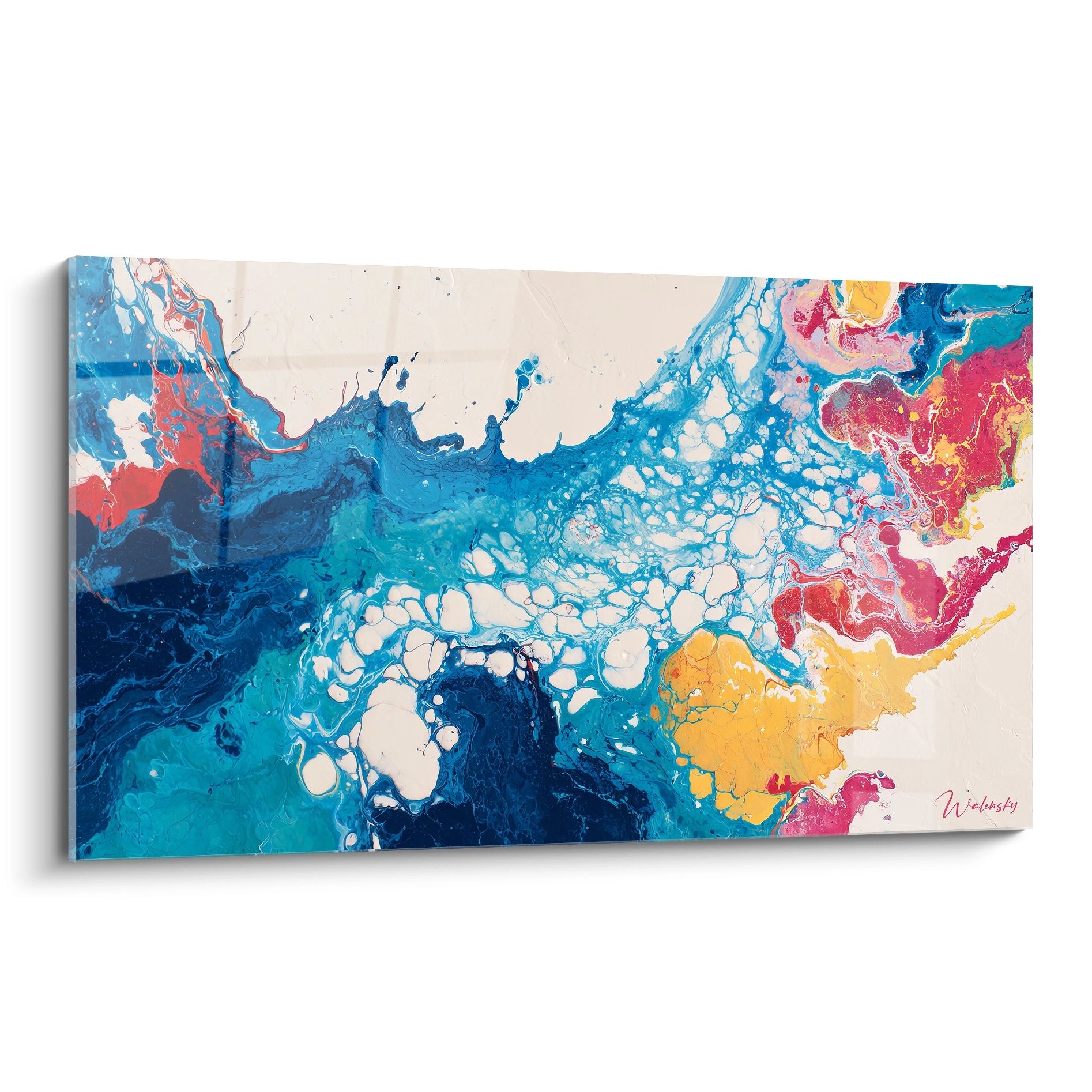






Tableaux to avoid when you want a premium decor
11 October 2025 · 17 min read · by Walensky
You’ve just invested in beautiful high-end furniture, carefully chosen each element of your decor... and yet, something feels off. Your living room desperately lacks character, as if all your efforts were undermined by a detail that escapes your gaze.
This frustrating feeling of unfinished decor haunts you every time you have guests. You scrutinize every corner of the room, desperately searching for what makes your interior look like a soulless showroom rather than a true luxurious cocoon.
You may have tried adding some decorative paintings found in stores, thinking that would be enough to personalize the space. But the result disappoints you: instead of elevating the standing of your decor, these works seem to rather cheapen it.
Rest assured, it's not your taste that's at fault. The problem lies in the choice of these paintings themselves, which, despite their seductive appearance in the store, betray a budget-friendly decor approach once hung in your home.
By the end of this article, you will know exactly which types of paintings to avoid to preserve the elegance of your premium interior, and how to instantly recognize the visual traps that spoil a high-end decor.
Why do some paintings sabotage your luxury decor?
In the world of premium decor, every detail counts enormously. A single poorly chosen element can tip the balance of the visual harmony of your room, transforming a sophisticated interior into a confusing mix of contradictory styles. It's like wearing a bespoke suit with sneakers: the ensemble instantly loses its credibility.
🏠 Customer testimonial: Sarah, a Parisian interior architect, tells us: "I visited a beautifully renovated Haussmannian apartment, Roche Bobois furniture, solid parquet flooring... But the owners had hung a series of framed posters bought from a discount website. The effect was striking: it felt like a student studio disguised as a luxury apartment."
Conversation with a decor expert
Gold rule of premium decor: An authentic painting transforms the atmosphere of a room by creating a unique emotional resonance. You will feel it from the first days: your space will gain depth and character in a spectacular way.

These alarm bells that reveal a "cheap" decor choice
Ave you ever felt that inexplicable embarrassment when observing your decor? That impression that something feels wrong despite all your efforts? Perhaps your paintings seem faded under certain lighting, or they give a sense of "déjà-vu" that annoys you?
This discomfort actually reveals your decorative instinct detecting stylistic inconsistencies. Your brain subconsciously picks up visual signals that betray a lack of refinement, even if you can't identify them precisely yet.
It's exactly like tasting wine : even without being a sommelier, you can tell the difference between a grand cru and a supermarket bottle. Your decorative palate works the same way.
First trap: mass-produced reproductions that kill exclusivity
Contrary to what one might think, the problem isn't so much the price as originality. A reproduction sold in thousands of copies will never create that feeling of uniqueness essential to true luxury.
Imagine wearing the same suit as three other people at a formal dinner: the embarrassment would be total! With mass-produced paintings, the same phenomenon occurs in your living room.
The impact on your well-being is deeper than it appears: your interior no longer resembles you, it becomes impersonal and you lose that pride so important when you host guests at home.
🔍 Instant revealing test: Type your painting's title into Google Images. If it appears on more than 5 different sites, you have a mass-produced reproduction that automatically devalues your decor.
Second fatal mistake: low-end supports and finishes
Many people think that a beautiful visual is enough to make a successful decorative painting. In reality, it is the quality of the support, the colors, and the finish that determine the final visual impact and the durability of the artwork.
It's like the difference between a paperback and a hardcover book : same content, totally different experience. The texture, the weight, the feel influence our perception of value profoundly.
Direct consequence: your guests will subconsciously notice these details of quality, which will influence their overall perception of your standing and your attention to detail.
Third invisible trap: standardized formats without personality
"One-size-fits-all" dimensions (50x70, 40x60) immediately reveal a purchase thought for ease rather than for the harmony of your specific space. It's a detail that few people notice consciously, but which betrays a "ready-to-wear" decor approach.
You can easily check this: observe the proportions of your wall and the available space around your furniture. A standardized format often creates unsightly empty spaces or unbalanced proportions.
The effect on your daily life? Your gaze constantly catches on these failed layout details, creating a permanent visual tension that fatigues and annoys.
🚨 5 alarm bells to detect immediately:
- Colors that fade in the sun: reveals cheap inks that will not last over time
- Plastic-like reflections under lighting: indicates an industrial varnish that gives an artificial appearance
- Disproportionate or sloppy frame: betrays a chain-assembled assembly without aesthetic concern
- Insufficient paper thickness: creates ripples and a poor texture
- Illegible or missing artist's signature: sign of an anonymous production without artistic value
The decisive factor: the absence of emotion and storytelling
What truly distinguishes a premium artwork from any ordinary wall decor is its ability to tell a story and create an emotional connection. It's like the difference between a chain hotel and a charming bed and breakfast: one is functional, the other has a soul that leaves a lasting impression. Industrial reproductions are technically correct but emotionally empty, incapable of creating that mysterious alchemy that makes a space magical.
Fundamental principle of authentic luxury: A true artwork transforms the energy of a room as soon as it's hung. If you don't feel this difference within 48 hours, it means the artwork lacks that essential emotional dimension.
| ❌ Cheap decor approach | ✅ Premium approach | 💡 Why this changes everything | 🎯 Felt benefit |
|---|---|---|---|
| Choose by price | Select by emotion | Art touches the heart first, then the eyes | Renewed pleasure every day |
| Standardized formats | Custom dimensions | Perfect harmony with architecture | Soothing visual balance |
| Mass reproduction | Original or limited edition creation | Exclusivity that reveals personality | Pride and social distinction |
| Industrial support | Authentic noble materials | Durability and refined texture | Heritage investment |
— Also to discover


How to transform your decor approach in 3 mastered steps
Now that you understand the mechanisms that sabotage a premium decor, let's move on to the methodical reconstruction of your decorative strategy. This approach is akin to creating a French garden : each element must be thought out in the overall harmony, with patience and a global vision. The final result? An interior that breathes authenticity and reveals your refined personality naturally and obviously.
🎯 Your roadmap to excellence: We will proceed in three logical phases: first analyze your space to understand its specificities, then define your artistic identity to create an emotional coherence, finally select exceptional pieces that sublimate the whole. Each step will bring you increasing satisfaction and visible results immediately.
Step 1: Decrypting the architecture of your space
Starting with this analysis is fundamental because it reveals the unique constraints and opportunities of your interior. It's exactly like an architect studying the terrain before drawing: this phase determines all the decisions that will follow. Once completed, you will feel that mental clarity so precious that replaces confusion with a clear vision of your decor goals.
Key elements to observe carefully
- Natural light and orientation: Observe how the light evolves in your room according to the hours. Use your smartphone to photograph the same angle at 9am, 2pm and 6pm. This data determines which colors and contrasts will work. Avoid pastel tones in a dark room: they become dull and lifeless.
- Existing proportions and geometry: Measure the ceiling height, the width of the main walls and note the architectural elements (beams, niches, openings). This mapping reveals the natural focal points where you place your works to maximize their visual impact.
- Dominant color palette: Identify the 3 main colors of your furniture and upholstery. Take detailed photos of your textiles and materials. This analysis guarantees a chromatic harmony that makes all the difference between amateur and expert.
Now, let's move on to concrete practice:
Immediate implementation
Creation of a light plan: Turn on only the natural lighting and photograph each wall at the three key times of the day. This documentation reveals the shadow and light zones that will drastically influence the appearance of your future paintings. A crucial point often neglected!
⏱️ Time: 45 minutes spread throughout the day | ✅ Success when: You clearly distinguish the variations in brightness on your photos | ⚠️ Attention: Never rely on artificial lighting alone - it completely distorts the perception of colors
Mapping of proportions: Draw a simple plan of your room with the main dimensions and mark the circulations axes. This step reveals the strategic locations where the eye naturally rests. That's where your paintings will have the most impact.
⏱️ Time: 30 minutes | ✅ Success when: You identify 2-3 privileged locations for hanging | ⚠️ Attention: Avoid placing a work in a dead corner or facing a window (backlighting guaranteed!)}
Audit of the existing palette: Gather samples of your fabrics, cushions and main materials. Spread them out on a white table and photograph the whole. This physical moodboard becomes your reference for all your future artistic choices.
⏱️ Time: 20 minutes | ✅ Successful when: You obtain a clear photo of your dominant palette | ⚠️ Attention: Include all elements visible from the main viewpoint - even a forgotten detail can create a discordance
✅ Validation of step 1: You must now have a precise understanding of your space: its lighting assets, its proportion constraints and its color palette. If some points remain unclear, review the analysis - this basis conditions the success of your project. Otherwise, congratulations! You have just laid solid foundations.
Step 2: Defining your personal artistic signature
This phase marks your transition from amateur to connoisseur : you will define a consistent artistic line that reflects your authentic personality. This is the moment when your decoration ceases to be an assembly of objects to become an assumed personal expression. The effect is striking: your choices become more confident, your gaze becomes more refined and you develop this decorative confidence characteristic of successful interiors.
Elements to build your identity
- Analysis of your artistic favorites: Create a digital file of 20 works that spontaneously touch you, regardless of medium (painting, photography, sculpture). Don't censor yourself on styles! This collection reveals your natural artistic DNA , more reliable than current trends.
- Definition of your level of boldness: Evaluate your appetite for originality on a scale of 1 to 10. This self-assessment determines whether you will prefer consensus or destabilizing works. No right or wrong answer: authenticity is more important than performance!
- Connection with your deep values: List 5 values that define you (nature, travel, family, innovation...). Each chosen work must resonate with at least one of these values to create this essential emotional coherence for true luxury.
Methodical construction of your profile
Creation of your inspirational moodboard: Select 10 works that provoke an immediate emotion in you (Pinterest, virtual museums, magazines). Analyze the common points: recurring colors, styles, atmospheres. These constants reveal your natural artistic signature.
⏱️ Time: 1 hour | ✅ Successful when: You identify 3 common characteristics in your choices | ⚠️ Attention: Avoid being influenced by what is "trending" - rely only on your instinct
Test of coherence with your interior: Virtually overlay your favorites with photos of your space analyzed in step 1. This confrontation reveals the adjustments necessary between your tastes and your real constraints.
⏱️ Time: 30 minutes | ✅ Successful when: You clearly visualize the harmony or tensions | ⚠️ Attention: A contrast can be desired and successful - do not confuse opposition and discordance!
Step 3: Selection and acquisition of exceptional works
You have now reached the expert level: your trained eye, your analyzed space, and your defined identity allow you to make informed artistic choices. This is the moment you discover the unique pleasure of immediately recognizing a piece that suits you and will enhance your interior. Your guests will notice your new confidence in your decorative choices, a reflection of an assumed and refined artistic personality.
Selection criteria for exceptional artworks
- Authenticity and provenance: Prioritize original creations, limited editions, or works by emerging artists. Always check the signature and request a certificate of authenticity. This traceability guarantees the exclusivity and heritage value of your artistic investment.
- Quality of materials and finishes: Examine the texture of the support, the depth of the colors, the precision of the details. Prioritize noble techniques : linen canvas, stable pigments, quality matte varnish. These details make the difference between a decorative object and a true work of art.
- Custom sizing: Calculate the ideal proportions according to your space analysis. A custom-made artwork often costs the same as a standard size but brings a perfect harmony that is impossible to achieve otherwise.
Professional acquisition process
Validation in a real setting: Before any purchase, request a visualization in your space (photo montage or augmented reality). This crucial step avoids 90% of disappointments and reveals the real impact of the artwork in your specific environment.
⏱️ Time: 15 minutes per artwork | ✅ Successful when: You feel a visual and emotional certainty | ⚠️ Attention: Be wary of immediate enthusiasm - wait 24 hours before confirming a crush
Negotiation and guarantees: Find out about return conditions, the non-fading guarantee, and exchange possibilities. A serious seller always accepts a trial period - this is a sign of total confidence in the quality of their artworks.
⏱️ Time: 20 minutes | ✅ Successful when: You have all the contractual elements | ⚠️ Attention: A truly premium artwork never fears comparison or time
Rule of progression for the connoisseur: Start with a masterpiece that completely transforms the atmosphere, then gradually add complementary artworks. Respect a 2-3 month interval between each acquisition to allow your eye to get used to it and refine your tastes.
You now master the fundamentals of premium art selection. But a few expert subtleties can still transform your approach and save you years of experience.
🔥 Secret of seasoned collectors: The "15-second rule": if a work does not provoke emotion in the first 15 seconds of contemplation, it will never be transformative in your daily life. This first intuition is more reliable than all technical analyses! Great collectors always rely on this first emotional impact.
"What if I make mistakes in my artistic choices?"
"I'm afraid of making a bad investment and quickly getting tired of my painting..."
This concern is perfectly normal and even reveals an encouraging artistic maturity ! The real question is not to make the perfect choice, but to choose a work that grows with you. The best artistic acquisitions are those that reveal new details over time, like a book that you reread with increasing pleasure. Incidentally, rapid fatigue is often a sign of a superficial or poorly chosen work - your instinct is protecting you!
💡 Foolproof regret test: Before buying, live 7 days with the artwork's image as your phone wallpaper. If you still like it after this period, it has that timeless quality essential to true works of art.
— In the same spirit


Our curated selection
Painting Golden Flux and Reflux - Abstract Painting Edition
233,90€
Discover this painting →The 7 fatal traps that ruin a premium decor
Now that you are armed to make the right choices, let's preserve your investment by avoiding these costly mistakes that even enlightened enthusiasts regularly commit. These traps are insidious because they seem harmless at the time of purchase.
- ⚠️ Buying without testing specific lighting: You fall for a painting in a very brightly lit gallery, but at home, the colors seem dull and lifeless. That's normal! Each lighting reveals different nuances. Solution: always ask for a photo of the artwork under standard domestic lighting, or better, test it directly in your environment.
- 🎯 Giving in to the urgency of an "exceptional promotion": True works of art are never sold off. This artificial urgency often hides poor quality or overproduction. Always take the time to think: an exceptional piece deserves a well-considered decision, not an impulsive purchase.
- 📏 Neglecting the harmony of proportions with the furniture: A painting that is too small above a large sofa creates an annoying visual imbalance on a daily basis. Simple rule: your artwork should cover 60 to 75% of the width of the furniture it overlooks to create perfect harmony.
- 🎨 Choosing to follow a trend rather than your tastes: Trends come and go, your interior remains! You will quickly get tired of a work chosen to "do as everyone else does". Rely only on your personal feelings: this is the guarantee of lasting and authentic pleasure.
- 💰 Confusing high price and artistic quality: An unscrupulous seller can artificially inflate the price of a mediocre work. Learn to recognize the real criteria of quality: originality, technique, emotion transmitted, noble materials. The price must correspond to these objective criteria.
- 🖼️ Forgetting the framing in the initial budget: A beautiful painting in a cheap frame immediately loses its impact! Allow 20 to 30% of the price of the artwork for a professional framing that will enhance it. It is an essential investment, not an option.
- 📱 Relying solely on online photos: No photo can faithfully reproduce the textures, color nuances, and aura of a true work of art. Always request to see the original or a high-fidelity reproduction before committing. Your eye deserves this requirement!
🛡️ Safety checklist before purchase: Always check these 4 points: artist's signature clearly visible and legible, certificate of authenticity provided, 15-day return policy, customer recommendations visible. If any element is missing, continue your search rather than taking an unnecessary risk.
— Other selected pieces


Frequently asked questions about premium wall decor
For a spectacular visual impact, budget between €300 and €800 for a quality centerpiece in a standard living room. This is the price of a good original painting with professional framing that will completely transform the atmosphere of your room. Concrete example: Marie invested €450 in a contemporary abstract artwork - her guests now immediately notice the sophistication of her living room!
The effect is immediate ! From the moment it's hung, you'll feel the transformation of the atmosphere. But the real happiness reveals itself in the weeks that follow: you'll discover new details according to the lighting, your mood, the seasons. A true work of art dialogues with you and evolves with your gaze - that's what justifies the investment in quality.
For a valuable artwork, absolutely crucial ! Amateur installation immediately betrays a lack of care and can damage your wall or your artwork. Budget €50 to €100 for professional installation that guarantees safety, perfect level and optimal presentation. Professionals know the fixings suitable for each type of wall and artwork weight.
Observe these reliable indicators : presence in recognized galleries, participation in exhibitions, mentions in specialized press, consistency in their work's evolution. A serious artist has a documented artistic approach and a visible progression. Beware of "discoveries" sold too expensively without verifiable references - prioritize total transparency on their background.
Yes, but with method and moderation ! The art of mixing lies in creating a common thread: common colors, era, technique or emotion transmitted. Limit yourself to 2-3 styles maximum in the same space to avoid visual cacophony. The best interiors tell a coherent story through their artworks, even if eclectic.
Your decor transformation starts now
In a few weeks, you will contemplate your living room with that deep sense of pride that comes from a truly successful interior. Your guests will immediately notice this new sophistication, this subtle harmony that reveals your refined personality. More importantly: you will feel daily that aesthetic well-being so particular when every detail of your environment corresponds perfectly to you.
This transformation goes far beyond simple decoration: you will have developed an expert artistic eye that will serve you in all your future aesthetic choices. This new confidence in your tastes will radiate onto your general assurance and your way of approaching beauty in all areas of your life.
The difference between your current situation and your decor goals ultimately came down to that precise knowledge that you now master. Start today by photographing your space according to our advice - this first concrete step launches your project and already brings you closer to the premium decor you dreamed of!
✨ Your moment has come: You have all the tools to succeed in this spectacular transformation. Trust your newly educated instinct and go for it - your dream interior is waiting for your decision!
Also to read: 📖 Read more articles on premium decor
Explore our collections


