

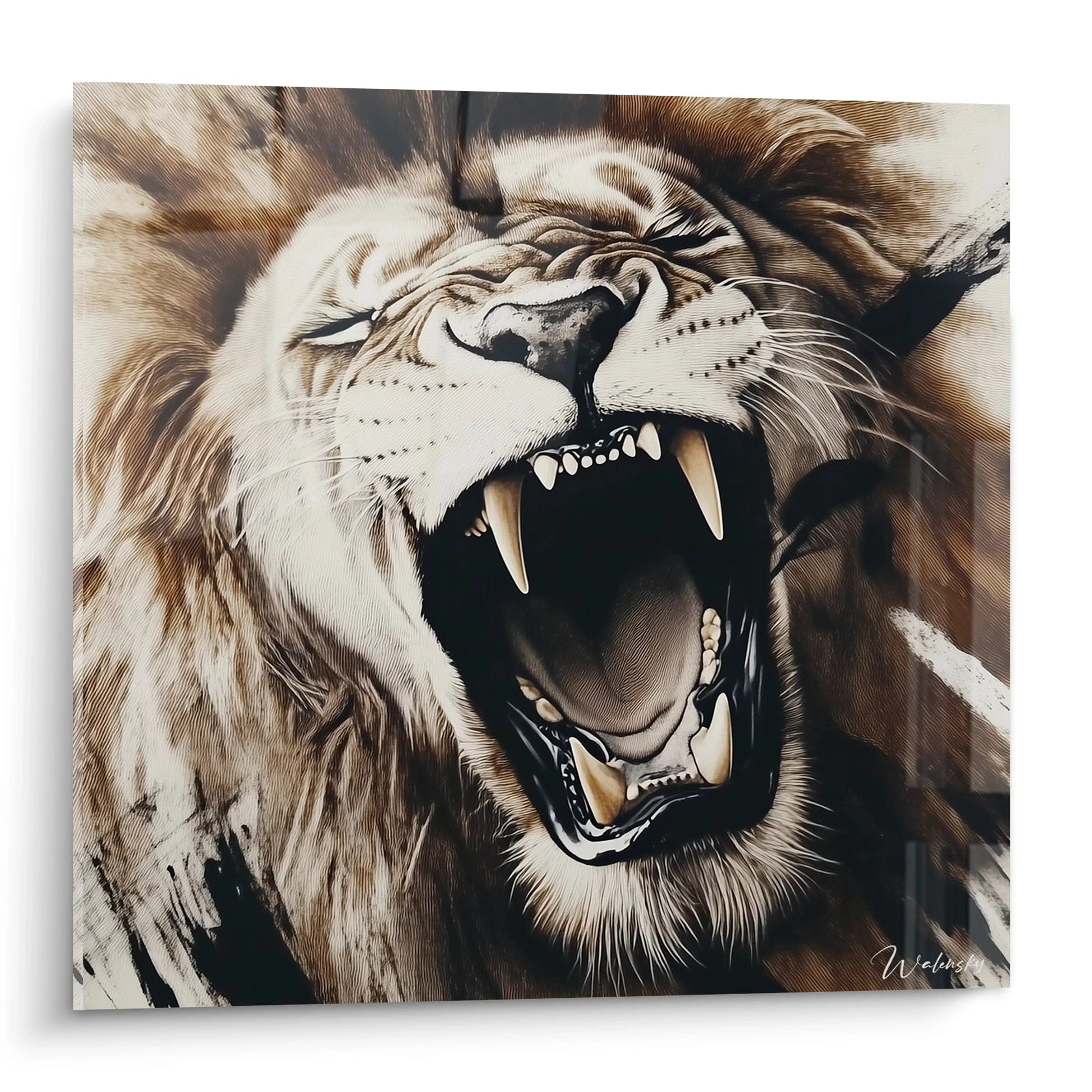






Home decor trends 2026: the styles, colors and artworks that will transform your interiors
May 5, 2026 · 9 min read · by Walensky
ART & DECORATION
That living room wall that has been staring back at you since you moved in, empty and a little accusing — 2026 may be the year you finally give it an answer. Not just any answer. The home decor trend for 2026 marks a clear shift: goodbye to sterile interiors that look like showrooms, hello to spaces that tell a story, breathe, and dare. Deep colors, living materials, bold wall art — five major directions are emerging, and they all share one thing: emotion comes before cold aesthetics.
Why 2026 marks a turning point in interior decoration
We no longer decorate to impress. We decorate to truly live.
From minimalism to bold expressiveness
Minimalism reigned supreme for a good decade. White walls, clean lines, "less is more" repeated like a mantra. The result? Interiors that often looked beautiful in photos but felt cold to live in. In 2026, the pendulum swings back. Not toward clutter — toward something more personal and more narrative. An interior that says who you are, not just what you saw on Pinterest.
This shift is what decor professionals call post-minimalism. Walls are no longer neutral surfaces: they become spaces of expression. A large-format botanical painting above the sofa, a series of framed prints in a hallway — wall art is no longer an accessory, it is the backbone of the style.
How well-being influences decorative choices
Slow decor is not a hashtag, it is a genuine philosophy taking hold. After years of fast consumption and frequent redecorating, people are looking for interiors that last, that soothe, that have a soul. Decorative choices are now made with one question in mind: does this object, this painting, this color make me feel good when I see it in the morning?
This pursuit of coziness shapes everything: materials (raw linen, whitewashed wood, artisan ceramics), palettes (soft but not bland), and artworks chosen for their emotional resonance rather than their visual impact alone.
A successful interior in 2026 is a space that recognizes you when you come home — not a backdrop you inhabit by default.
The 2026 home decor color palettes to adopt at home
The Pantone color of the year sets the tone, but the true interiors of 2026 go far beyond a single shade. An entire palette is built, with earthy foundations and bold accents.
Earthy and natural tones in the spotlight
Picture morning light falling on a raw clay wall. That is exactly the effect earthy tones produce in a living room. Terracotta, warm sand, burnt ochre, cocoa brown — these shades envelop without suffocating. They create a sensation of ground beneath your feet, of grounding, that pure whites simply cannot offer.
On walls, these tones pair perfectly with paintings in natural hues: botanical watercolors, desert landscapes, abstract works in ochre and rust pigments. Together they form a harmony that seems to have always been there — which is precisely the goal.
Color accents: controlled boldness
With the earthy base in place, you can allow yourself some brightness. Deep midnight blue, sage green, muted burgundy, bottle green — these accents are not necessarily painted on walls (though they can be). They come in through textiles, ceramics, and above all, artworks.
A painting with a wide band of Prussian blue in a living room with sand-colored walls: the contrast is striking without being aggressive. That is the principle of controlled boldness — you measure the dose, choose one strong accent, and let it breathe.
To test an accent color without commitment, start with a painting. If the shade suits your space over the days, you can then extend it to other elements. It is the least risky method — and often the most satisfying.

Also to discover
Mechanics of Colors painting - Abstract Cubism edition
From €273.90
Discover this paintingThe 5 essential decor styles of 2026
Five aesthetics dominate 2026 interiors. They are not mutually exclusive — the best interiors often draw from two or three of them.
Evolved Japandi: serenity and warmth
Japandi — the marriage of Japanese simplicity and Scandinavian comfort — has been widely copied, sometimes poorly. In 2026 it evolves toward more warmth and texture. The clean line stays, but we add washi, rattan, and raw wood with visible grain. The space breathes, but it is no longer cold.
Which paintings fit perfectly here? Reimagined Japanese woodblock prints, ink-wash works on ivory backgrounds, minimalist landscapes with misty horizons. Wabi-sabi — the Japanese philosophy that celebrates imperfection and impermanence — infuses the whole style: a slightly asymmetrical work with irregular edges will always be preferred to digital perfection.
Curated maximalism: daring to go big with art
At the opposite end from Japandi, curated maximalism embraces abundance — but with a clear artistic direction. It is not about "putting lots of things," it is about "choosing lots of things that speak to each other." The difference is enormous.
The gallery wall is the centerpiece of this style: an entire wall composed of artworks in varied formats and styles, united by a cohesive palette or a thematic thread. Portraits, abstractions, photographs, illustrations — anything can coexist if the composition is thought through. It is demanding, but when done well, it is the kind of interior you cannot leave without taking a photo.
Biophilic design and modern neoclassicism complete this overview: the first integrates nature at the heart of the space (plants, organic materials, maximized natural light, landscape or botanical paintings), the second reinterprets classical codes with contemporary lines — moldings and symmetry, but updated palettes.
— In the same spirit


How to integrate 2026 trends room by room with decorative paintings
Trends are fine. Knowing where to apply them concretely is even better.
Living room: creating an impactful art wall
The wall behind the sofa is the ideal candidate for a 2026 gallery wall. The basic rule: start with the largest piece (often an 80×100 cm format or bigger), then build around it, leaving even gaps between frames — between 2 and 3 inches, no more. Mix natural oak frames with a few matte black metal frames for visual tension.
For a coherent 2026 decor, choose artworks that share at least one common element: the color palette, the theme (nature, geometric abstraction), or the graphic style. Unity does not come from uniformity — it comes from the conversation between the pieces.
Bedroom and entryway: art serving the atmosphere
In the bedroom, avoid overly stimulating visuals. Soft tones and calming subjects (misty landscapes, wash botanicals, rounded abstract forms) promote rest. A single large format centered above the headboard — rather than a series of small pieces — creates a strong presence without agitation.
The entryway, that corridor you always walk through without looking, deserves better. It is the first thing you see when you come home. Might as well be something you truly love.
For a successful gallery wall, lay your frames out on the floor before drilling a single hole. Photograph the composition, then look at it again the next day with fresh eyes. You will avoid 90% of the regrets.
— Other pieces selected


Advanced tips for sustainable, personalized decor in 2026
Trends have an expiry date. Pieces chosen with intention do not.
Investing in statement pieces rather than chasing every micro-trend
The classic trap: buying ten small trendy decor items that will feel dated within eighteen months, instead of one quality painting that will last for years. A well-chosen painting — for its subject, its colors, what it evokes in you — has no age. It adapts, it ages well, it becomes a reference point in your interior rather than a detail you eventually stop noticing.
Mixing eras is also a winning strategy. An antique print in a contemporary frame, a modern abstract in a Haussmann apartment — deliberate contrasts give character where uniformity gives flatness. In 2026, the most lasting home decor trend is the one that resembles you: not the one of the moment, but the one of you.

Frequently asked questions about 2026 decor trends
What is the trending color for interior decor in 2026?
Earthy tones dominate: terracotta, ochre, clay, warm sand. As accents, midnight blue, sage green and burgundy add depth. Pantone points each year toward a signature color, but in 2026 it is clearly the family of naturals that establishes itself as the base. Quick tip: start with a painting in these tones to test the palette at home before committing to the walls.
What decorating style is trending in 2026?
Three styles dominate: evolved Japandi (simplicity + warmth + wabi-sabi), biophilic design (nature integrated into the space, organic materials, plants) and curated maximalism (embraced abundance with direction, gallery walls, rich colors). These styles do not oppose each other — the most interesting interiors of 2026 combine two of them.
How can I decorate my living room with 2026 trends without redoing everything?
Three actions are often enough. First: change or add a large-format painting — it is the fastest and most impactful intervention. Second: introduce a cushion or throw in an accent shade (sage green, midnight blue). Third: add a voluminous plant in an artisan ceramic planter. These three gestures, without touching the walls or the furniture, completely change the atmosphere.
Are decorative paintings trendy in 2026?
More than ever. Wall art has once again become the central element of interior decoration — not an accessory added last. Gallery walls, large statement formats, artworks with strong emotional content: all of this stands out as the signature of the most desirable interiors of 2026. Ignoring your walls in 2026 means missing the essentials.
Trends fade. A painting chosen with intention does not.
The home decor trend for 2026 says something important: we are done with interiors that try to please everyone and move no one. The spaces that will matter this year are those with a point of view, coherence, and a soul. And wall art — a well-chosen painting, well placed, that truly speaks to you — is the most direct tool to get there.
No need to redo everything. No need to follow every micro-trend to the letter. One wall, one artwork that stops you in your tracks, one composition that makes you want to stay in the room — that is often enough to transform an ordinary interior into something memorable. Your wall is waiting. Discover our selection of decorative paintings and find the piece that will make it a true statement of style.
Explore our collections


