

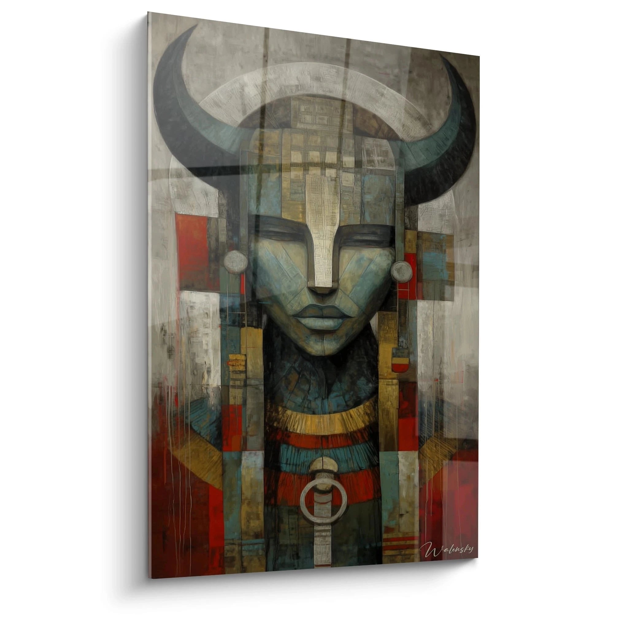






Living room wall art: how to choose and elevate your living space?
May 2, 2026 · 8 min read · by Walensky
ART & DECORATION
That wall facing the sofa — you know it by heart. Too big, too empty, too white. It has been taunting you since you moved in, and every evening you tell yourself you'll do something about it. A well-chosen, well-placed living room wall art piece can transform that space in minutes. No need to repaint or change the furniture. Just the right visual, in the right spot, in the right size.
Still, you need to know which one. This guide gives you the practical keys to choose, pair and display your artworks — without drowning in options.
Why does a wall print change everything in a living room?
The print, the centerpiece of wall decoration
A living room without wall art is a bit like a sentence without punctuation: it lacks rhythm, personality, breath. A wall print is not a mere ornament placed there to fill space. It sets the tone for the whole room. It says something about you before you've even opened your mouth.
A black-and-white photographic print above a grey velvet sofa is a statement of intent. A botanical illustration framed in whitewashed oak facing a window is an invitation to calm. The artwork creates an atmosphere that neither the sofa nor the rug can create alone — because it occupies the eye at eye level, where attention naturally settles.
A well-chosen print doesn't just decorate a wall. It tells anyone who walks into the room who you are.
The major decor styles for the living room
Before looking for an artwork, you need to know which universe you live in. The main families are fairly clear:
- Scandinavian / minimalist : clean lines, neutral colour palette (white, beige, grey), decorative typography, simple geometric motifs.
- Bohemian / ethnic : warm tones, burnt ochre, terracotta, organic illustrations, travel photographs.
- Industrial : black, metal, concrete — vintage prints or large-format urban photographs feel right at home there.
- Classic / Haussmannian : reproductions of old masters, gilded or matt black wooden frame, symmetrical compositions.
- Contemporary : abstraction, bold colours, XXL formats, one strong piece rather than an accumulation.
You don't have to tick a single box. The most successful interiors often mix two registers — provided they keep a common thread.
How to choose the right print for your living room? The essential criteria
Format and dimensions: finding the right scale
The classic pitfall: buying an artwork that is too small. It floats, lost on a large wall, and the effect is worse than the emptiness before. The basic rule is simple — the print should occupy between 60 and 75% of the width of the piece of furniture or wall area it sits above.
For a standard living room, the formats that really work:
- 30x40 cm : ideal for a gallery wall composition, not solo on a large wall.
- 50x70 cm : the all-round format par excellence, readable on its own above a low sideboard.
- A1 format (59x84 cm) : for large walls, wide sofas, open spaces. This is often where it becomes truly impressive.
Before buying, cut a template in kraft paper to the dimensions of the print and tape it to the wall with masking tape. Live with it for 24 hours. You will immediately know whether the size is right.
Colour palette and decorative consistency
The print doesn't need to reproduce the exact colours of the living room — but it must converse with them. A few useful pointers:
- If your sofa is in neutral tones (beige, grey, off-white), you can afford a print with a touch of bold colour — a midnight blue, a sage green, a brick red.
- If the living room is already rich in colour, opt for a black-and-white or neutral-palette print to balance things out.
- Look for at least one colour shared between the print and another element in the room (cushion, rug, vase) — it creates visual coherence effortlessly.

Ideas and inspiration: which artworks for which living room style?
Scandinavian and minimalist living room: favouring restraint
In a Scandinavian interior, visual silence is a quality. You're not trying to fill — you're trying to place. A botanical illustration in black ink on a white background, framed in natural wood or thin black metal, is enough to create an elegant focal point. Decorative typography also works very well: a short phrase, a single letter, a word in Danish or Swedish for authenticity.
This style handles accumulation poorly. Prefer one strong piece over five small ones. And resist the temptation of the gilded frame — it breaks the restraint.
Warm and bohemian living room: playing with textures and colours
The bohemian living room, by contrast, thrives on layering. This is where the gallery wall finds its natural playground. Mix a warm-toned photographic print, a watercolour illustration, a geographic print — and let the frames be mismatched (raw wood, rattan, brushed brass). The key: keep a colour unity. If everything revolves around ochres, terracottas and khaki greens, the whole stays coherent even in its diversity.
One detail that changes everything: picture lighting. A small fairy light placed on the frame or an adjustable ceiling spotlight turns an ordinary print into a genuinely staged work of art.
— Our selection


Advanced tips: staging and arranging artworks in the living room
Creating a gallery wall: rules and tricks
The gallery wall (the famous gallery wall of decor magazines) often intimidates. In reality, it follows a few simple rules:
- Start from the centre : place your main print at the optical centre of the wall, then radiate outwards.
- Vary the formats : one 50x70 cm, two 30x40 cm, a square format — variation creates rhythm without creating chaos.
- Respect the spacing : 5 to 8 cm between each frame. Too tight, and it suffocates. Too loose, and it scatters.
- Test on the floor first : lay all your prints on the floor before drilling anything. Photograph the result to refer to when hanging.
For a successful gallery wall, choose a unifying element: either all the frames share the same colour, or the visuals share the same palette. Not both at once — that becomes too rigid.
Hanging height and lighting: the details that make the difference
The golden rule of museums: the centre of the work at 145-150 cm from the floor, roughly the eye height of a standing adult. In a living room where we are often seated, you can lower it slightly — 130-140 cm — so the print stays within the natural field of vision from the sofa.
For lighting, two simple options: an adjustable ceiling spotlight aimed at the print, or a picture light clipped onto the frame. Grazing light reveals textures and gives a depth that frontal light cannot create. This is what makes the difference between a hung print and a showcased one.
— Also worth discovering


2024-2025 trends: the living room wall art pieces making a splash
What is rising right now in living rooms is the return of bold maximalism — goodbye to the stripped-back all-white look, we dare large formats, deep colours, dense compositions. Botanical illustrations continue to reign, but in darker, almost dramatic versions: monstera leaves on black backgrounds, floral compositions in nocturnal tones.
Art photography in large format is enjoying renewed interest, especially minimalist landscapes (desert, mist, sea horizon) that bring an almost meditative depth to living spaces. On the other hand, decorative typography remains a safe bet for contemporary living rooms: a phrase, a word, a letter — provided the choice is personal rather than generic.
Another strong trend: mixing media. A framed print sits alongside a painted canvas, which converses with a ceramic object placed on a shelf. The wall becomes an assemblage, not a line-up.

In the same spirit
Painting Brilliant Artistic Big Bang - Limited Edition🥇
€233.90
Discover this painting →Frequently asked questions about living room wall art
What print size should I choose for a large living room?
For a large wall, an A1 format (59x84 cm) or at least 50x70 cm is essential as a single piece. Otherwise, compose a gallery wall with several medium prints (50x70 + 30x40) to cover the space without a postage-stamp effect. The rule: the whole should occupy at least 60% of the width of the wall or of the furniture below.
How to hang a poster without damaging the walls?
Adhesive strips (such as Command) hold up to 3-4 kg without drilling — perfect for lightweight paper posters or small frames. For heavier frames, picture rail systems (installed just once at the top of the wall) let you move artworks without multiplying holes. Ideal for renters.
Should you frame a decorative poster for the living room?
A frame adds a premium finish and protects the poster over time — it's clearly recommended for a main room. But an unframed poster, held in place by wooden clips or magnetic strips, has its own charm in a bohemian or industrial interior. The style decides, not an absolute rule.
How do you combine several posters in a living room without it looking cluttered?
Three rules are enough: a unity of color (same palette or same tonality), a variety of formats (avoid making everything identical), and regular spacing between frames (5 to 8 cm). If the visuals are very different, unify the frames. If the frames are mismatched, unify the colors of the visuals. Doing both at once is too much.
Conclusion: the living room decorative poster, an act of personal expression
Choosing a decorative poster for your living room is ultimately much more intimate than it seems. It's not just filling an empty wall — it's deciding what you want to feel every morning as you walk through the room, what your guests will see first, the atmosphere you choose to cultivate at home.
Format, colors, style, layout: all of it matters. But what matters even more is that the poster looks like you. Not like a magazine, not like a recommendation algorithm — like you.
The piece that suits you exists. All you have to do is find it. Discover Walensky's collection of living room decorative posters and find the one that will finally transform that wall that has been taunting you for far too long.


