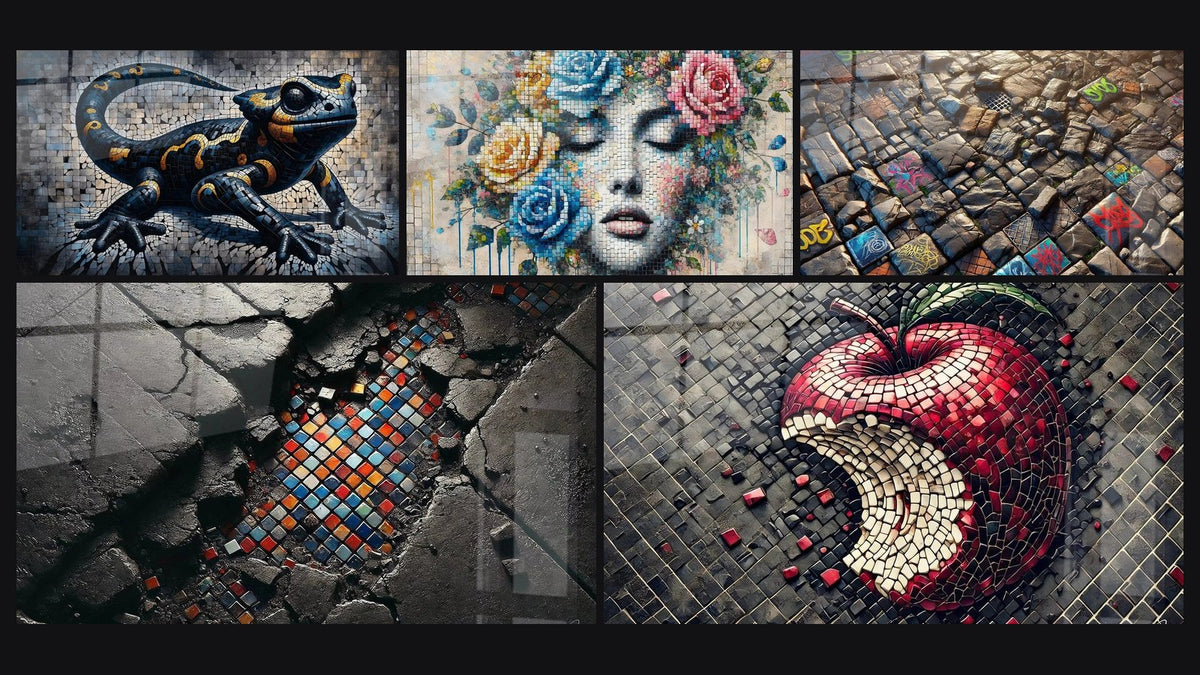
MOSAIC PAINTING
A mosaic painting is never discreet. It fragments the light, multiplies the shades and creates relief where the eye expected a smooth surface. Placed in the wrong spot, between a patterned cushion and a baroque lamp, it quickly becomes one focal point too many in a room that is already full.
Well placed, on the other hand, it becomes the visual anchor of the entire décor: the first thing you look at when you walk in, without the rest of the room competing for attention.
- The mosaic painting already brings its own texture: no need to add more with overly busy furniture.
- A coherent colour palette (2-3 tones echoed elsewhere in the room) makes all the difference.
- Smooth materials (light wood, linen, glass) balance the fragmentation better than rough ones.
The mosaic painting, a piece with a singular texture
Unlike a classic canvas, the mosaic effect plays on fragmentation: hundreds of small areas of colour that, seen up close, look almost chaotic, and that recompose into a clear image as soon as you step back. This double reading — close-up chaos, distant harmony — is exactly what makes the work come alive.
It is also what makes it demanding to pair. The wall texture it suggests (even though it is printed flat, with no real relief) gives an impression of material that the eye catches instantly. It catches light unevenly, a little like a stained-glass window or an old tiled floor, and it is precisely this irregularity that you need to know how to dose in a room.
A mosaic painting does not blend into the décor, it negotiates with it: either it sets the rhythm, or it gets lost in yours.
The key criteria for a successful pairing
Two levers govern everything: the visual density of the room and the consistency of the colours. Master them, and the rest follows almost naturally.
Balancing visual density with neutral spaces
A wall already loaded (full shelves, multiple frames, printed wallpaper) does not need an extra mosaic painting: it needs a wall that breathes. The rule that almost always works: the artwork occupies 60 to 75% of the width of the piece of furniture or wall section it dominates, and the surrounding wall stays empty or very simple.
If your living room already has a patterned rug and graphic cushions, choose a mosaic painting with a single dominant colour rather than a very colourful composition: the fragmentation is enough, no need for an extra chromatic fireworks display.
Choosing a colour palette that suits the room
The mosaic works like a condensed colour chart: it often contains 3 to 5 dominant tones. Identify them and echo one or two elsewhere in the room — a cushion, a vase, a throw — without duplicating all the colours at once.
- A dominant tone echoed in a textile (cushion, curtain, throw)
- A secondary tone echoed in a small object (vase, candle, photo frame)
- The other shades left only in the painting, with no echo elsewhere
Paintings with a dominant blue offer the most latitude: they work equally well with white, light wood or brass. The Flot Céramique painting, for example, runs through almost marine blues and whites, easy to echo with natural materials.


Combining mosaic with other decorative materials
The question is not only chromatic. It is also tactile: which materials can support the presence of a painting already visually textured, and which create sensory overload?
Textiles and cushions
Plain textiles or very discreet patterns (fine chevrons, raw linen, understated corduroy) pair well with a mosaic painting. Avoid, however, dense graphic prints directly below the artwork: two strong motifs competing for the eye within the same field of vision tire more than they enrich.
Ceramics, glass and relief objects
Artisan ceramics, with their surface irregularities, can very well accompany a mosaic as long as they remain restrained in colour. Blown glass or matt stoneware vases play the same role: they add a touch of natural material without multiplying motifs.
For urban and contemporary styles, two works echo each other particularly well in palette: the Trône Urbain painting, with its golden tones and raw luxury atmosphere, and the Visage de la Résilience painting, bluer and more graphic. Each can become the centrepiece of a living room with clean lines, provided you do not pair them together in a small room.


— Our selection


Atmosphere examples by mosaic style
The mosaic's style directly guides the possible pairings: a Mediterranean interior is not decorated like an industrial loft.
- Mediterranean atmosphere: natural materials (light wood, wicker, raw linen), blue and white tones, terracotta light fixtures. The painting becomes a window open onto the sea, with no other strong motif in the room.
- Urban and street art atmosphere: minimalist furniture, waxed concrete, matt black metal. The contrast between the coloured fragmentation of the painting and the raw sobriety of the rest creates a very effective visual tension.
- Floral and gentle atmosphere: pastel pink and blue tones, fluid materials (sheer curtains, light velvet). The Rêverie Florale painting, with its female face surrounded by mosaic flowers, works particularly well in a bedroom or boudoir.
To explore further play of motifs and materials in Mediterranean wall décor, the guide on bookcase paintings and wall shelves offers complementary insight into how to articulate several decorative elements around a single artwork.
Common mistakes to avoid
Most failures come from accumulation, not from a bad choice of painting in itself.
| Mistake | Why it doesn't work | What to do |
|---|---|---|
| Layering graphic motifs with mosaic | Two fragmentation effects fight for attention | Choose a plain or very discreetly patterned setting |
| Lighting too flat or too direct | The chromatic relief of the mosaic disappears | Add accent lighting at a grazing angle |
| Format too small for the wall | The artwork loses its impact and looks lost | Respect the 60 to 75% proportion of the wall or furniture width |
Accent lighting deserves particular attention: grazing light, placed slightly above or to the side of the artwork, reveals the micro-variations of colour inherent in the mosaic effect. Light that is too frontal flattens everything.

Also to discover
The Mark of Sin Painting - Street Art Mosaic Edition
From €233.90
Discover this painting →Frequently asked questions
How to showcase a mosaic painting?
Grazing accent lighting, a simple surrounding wall, and enough viewing distance for the eye to recompose the image as a whole. This two-level reading, up close and from afar, is what gives the mosaic all its interest.
What wall colour for a mosaic painting?
A white, light grey or neutral beige wall leaves full room for the artwork's colours. For a very colourful mosaic, grey paintings offer a particularly balanced background, neither too cold nor too absorbent.
Can several mosaic paintings be combined in one room?
Yes, provided they share a dominant palette and are separated by sufficient neutral space. Two mosaics very different in colour, side by side, almost always create sensory overload.
What furniture style goes with a mosaic painting?
Furniture with simple lines and natural materials (light wood, matt metal, linen) lets the artwork breathe. Heavily carved furniture or furniture already loaded with motifs competes directly with the visual fragmentation of the painting.
Pairing a mosaic painting is not a matter of taste but of balance: between the textural richness it brings on its own and the visual breathing room it needs to fully exist in a room. Too many elements around it and it dissolves into the décor. Too much emptiness and it loses its warmth. It is also a particularly well-chosen housewarming gift, provided you know the atmosphere of the room where it will hang.
The right instinct is often the simplest: let the artwork speak, and choose the rest of the room as a discreet echo rather than a competitor. To find the piece that suits your interior, the mosaic painting collection brings together universes varied enough to adapt to a Mediterranean living room as well as an urban loft.
Explore our collections