

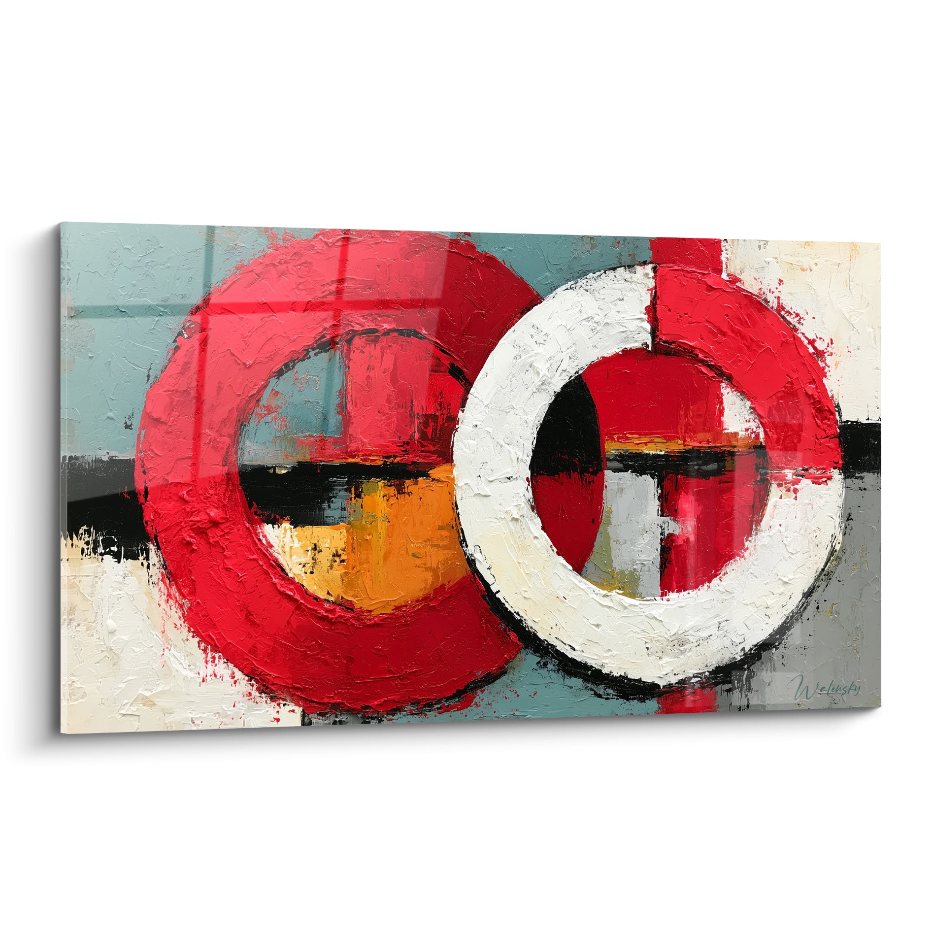






Why do mint-toned paintings create a gentle freshness?
August 4, 2026 · 7 min read · by Walensky
There are mornings when you walk into a room and something settles, almost imperceptibly, on your shoulders. A lightness. Not silence, not light alone — but that particular shade on the wall, that painting in mint tones that seems to breathe on your behalf. You have felt this, perhaps without being able to name it.
Here is what mint-toned paintings bring concretely: a gentle, non-aggressive freshness that soothes the gaze, natural luminosity that visually expands the space, and a chromatic harmony that fits almost every interior without ever imposing its presence. These are works that know how to fade into the background so they can do you good.
Frustration, often, comes from wanting to renew your interior without tearing everything down. You hesitate. You fear a color that is too strong, too fragile, too divisive. You find yourself staring at white walls that tell no story.
The good news: the mint shade, in wall art, is precisely that right answer between boldness and serenity. Understanding why will help you adopt it without hesitation.
The science behind serenity: why mint green soothes
It all begins in the eye — and in the brain. Mint green is a shade belonging to the family of soft greens, slightly desaturated, often enhanced with a touch of blue or gray. This chromatic composition is far from incidental.
Mint tones fall within what color psychology specialists call the zone of soothing cool colors. Unlike saturated greens that stimulate and energize, soft mint green slows things down. It invites rest. It imperceptibly lowers the heart rate and helps regulate mental tension. Chromotherapy studies have shown that spaces bathed in mint shades foster calm concentration and emotional recovery.
In a mint-toned painting, this effect concentrates into a single focal point. The artwork becomes a visual anchor — a place where the gaze can rest in the middle of daily chaos.
This color that captures light without exhausting it
One of the best-kept secrets of mint paintings is their unique relationship with light. Where a dark painting absorbs and weighs down, where a vivid painting reflects and dazzles, mint-toned paint does something more subtle: it filters.
Light mint shades — between celadon, pale sage and icy menthol — have this ability to reflect natural light while warming it slightly. In the morning, under golden light, a mint-toned painting takes on almost pearlescent reflections. In the evening, under warm lighting, it becomes deep, almost aquatic.
This chromatic mutability is precious in interior decoration: it means a work in mint tones will never be quite the same depending on the time of day or the season. It lives with you. It breathes to the rhythm of your home.
The play of materials: how brushwork amplifies freshness
A mint painting executed in smooth flat areas and a mint painting in a textured technique will not offer the same freshness. Material plays a fundamental role. Palette-knife strokes that create relief catch the light differently depending on their angle, multiplying micro-shadows that give that sensation of depth and almost tactile freshness. You want to touch it. You already feel its softness.


Favorite
Painting Dog Wearing Colorful Glasses in Mint and Coral Palette - Artistic Portrait - Keeshond Edition
213,90€
Discover this paintingThe art of contrast: pairing mint so it shines
A mint-toned painting does not live alone — it converses. And it is in this conversation that the magic happens.
Placed on a white wall, it becomes the breathing element of a minimalist room. It brings lightness without weight. Paired with natural materials — linen, rattan, light wood, veined marble — it anchors mint freshness in something sensual and tangible. The combination is instinctively soothing because it evokes nature: fresh grass, wet stone, the foliage of a summer morning.
Against terracotta or ochre tones, soft mint green creates a complementary contrast that energizes without aggression. It is the alliance of warmth and freshness — exactly what a balanced living space seeks. And in a bedroom with pearl gray or slate blue tones, a mint painting slips in naturally, extending the cool palette toward something more alive and more organic.
What size for which space?
In a bedroom, a large format in mint tones placed behind the headboard creates an immediate cocooning effect. In a living room, a composition of several mint paintings of different sizes creates a soft and sophisticated narrative wall.
— Our selection

Mint and well-being: when color becomes a health decision
We hear a lot about domestic well-being and biophilia — the trend of bringing living and natural elements back into our interiors. Mint-toned paintings fit perfectly into this approach.
The color mint immediately evokes a powerful sensory vocabulary: the freshness of air after rain, the garden at dawn, aromatic plants crushed between the fingers. These associations are not innocent. They activate positive memories and emotions of renewal. A mint-toned painting in a bedroom or office does not merely decorate — it subtly programs the emotional atmosphere of the room.
This is why mint tones are particularly recommended for spaces dedicated to rest and concentration: bedrooms, offices, reading corners, meditation spaces. Where you need the environment to work for you, not against you.
Transform your bedroom into a sanctuary of serenity
Discover our exclusive collection of bedroom paintings that bring the gentle, soothing freshness your interior needs.

— Also to discover


Which artwork should you choose to make freshness happen?
Not all mint-toned paintings are equal — and this is where the eye must train itself. What makes the difference between a work that truly soothes and one that falls flat is often the quality of the shades.
Beware of mint tones that are too vivid, almost neon — they lose their calming effect and tip into a stimulation one seeks less in a living space. Look instead for works where the mint is blended with white, gray or beige: celadon green, pale sage green, desaturated mint turquoise. These sophisticated shades create that famous gentle freshness — without ever tipping into coldness.
Abstract compositions in mint tones are particularly successful: they let the imagination work, allowing each person to project their own inner landscape. A wave, a forest, a sky — each sees what they need. This is the mark of great works.

In the same spirit
Painting The Art of Water - Marine Landscape Edition
€233.90
Discover this painting →Gentle freshness, an accessible luxury
What we are ultimately looking for when decorating our interior is a place where we feel better than elsewhere. A space that resembles us and repairs us. Mint-toned paintings have this rare ability to transform an ordinary room into an authentic place of renewal — without architectural effort, without a renovation budget.
A single well-chosen, well-placed work can change the breath of an entire room. Perhaps this is the truest definition of accessible luxury: one color, one canvas, and suddenly everything feels better.
Dare to go mint. Your interior — and your nights — will thank you.
Frequently asked questions about mint-toned paintings
Does mint green suit every room in the house?
Yes, mint tones adapt with great flexibility to all spaces. In a bedroom, they encourage rest and falling asleep thanks to their soothing effect. In an office, they support concentration without tiring the eyes. In a living room, they bring a touch of natural freshness that balances warm materials. Even in a bathroom, a mint-toned painting reinforces the zen, spa-like atmosphere you are seeking to create. The key is to adapt the brightness of the mint to the natural light of the room: opt for a lighter, brighter mint in dark spaces, and a deeper, more nuanced mint in well-lit rooms.
How do you integrate a mint painting into existing decor?
It is simpler than it seems. Mint tones are chameleon colors that naturally converse with almost any existing palette. If your interior is neutral — beige, white, gray — a mint-toned painting blends in seamlessly and brings exactly the living touch that was missing. If you already have natural materials such as rattan, wood or linen, the mint shade will enhance these textures, creating a very on-trend biophilic coherence. The only constraint to avoid: pairing mint with vivid yellow or saturated orange tones, which create an overly busy contrast. For the rest, trust your instinct — and the natural softness of this color.
What is the difference between a mint painting and a sage green painting?
This is an excellent question, as these two shades are often confused. Sage green is a greyer, earthier, more matte color — it evokes dried herbs, the scrubland, dusty Mediterranean landscapes. It brings a soft warmth and a very current sophistication. The mint tone, on the other hand, is brighter and fresher, with a touch of blue or white that gives it an aquatic, airy quality. The mint freshness is more immediate, more sensual, almost younger. Both are magnificent and complementary: some mint and sage paintings combine the two shades to create a particularly rich chromatic depth. If you hesitate, choose a work that blends both — you will enjoy the best of both worlds.


