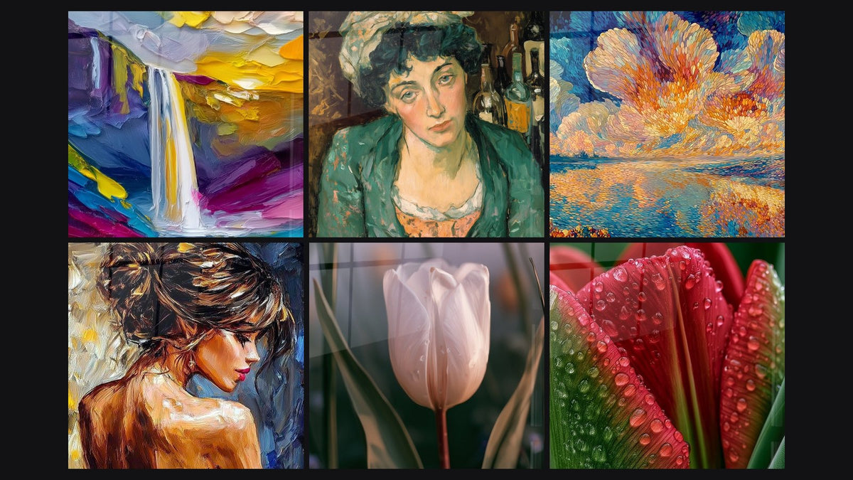
Acrylic print square format: the guide to the glossy look in interior decor
8 min read · by Walensky
ACRYLIC PAINTINGS (STYLE)
A square doesn't forgive anything. No longer side to guide the eye, no natural elongation: just four equal sides that force the composition to stand upright, centered, and self-assured. Hang a square painting on a wall and it becomes a kind of visual anchor, almost a giant medallion. Add a glossy acrylic glass surface, and that anchor turns into a source of light.
That's exactly this pairing we're going to dissect: why the square format in glossy acrylic print behaves differently from a rectangle, how to arrange it on a wall, and which mistakes people who know their stuff avoid.
- The square (1:1) creates a static, centered balance, different from the horizontal dynamism of a rectangle.
- Acrylic glass adds optical depth and reflections: perfect under indirect light, to avoid when facing a window in full sun.
- Whether solo or in a wall grid, what matters is proportion to the wall or the furniture beneath it (60 to 75% of its width).
The square acrylic print: a distinctive aesthetic choice
The 1:1 ratio imposes a frontal reading, with no drift of the gaze to left or right. Unlike a landscape format that carries the eye along a wall, the square fixes attention at its center, somewhat like a square window onto a Flemish interior: everything is contained, nothing spills over.
This symmetry directly affects how space is perceived. A square on the wall appears more stable, almost architectural, whereas an elongated format suggests movement. That's why the square works especially well in interiors seeking serenity rather than momentum: an entrance, a composed dining room, a bedroom designed for calm.
A square doesn't tell an unfolding story: it freezes a moment and invites you to linger.
Why the glossy finish especially enhances the square format
The gloss of acrylic glass is not a simple varnish: it's a layer that creates genuine optical depth, as if the image floated beneath the surface rather than lying on it.
The optical depth of acrylic glass
On a wide rectangle, this depth effect dilutes somewhat along the length. On a square, it concentrates: the eye covers less distance, so it perceives more of the reflection's thickness and the intensity of the colors. This is what gives the well-known "art gallery" look associated with acrylic glass, even more pronounced on a compact, symmetrical format.
Light and reflections: a winning duo on a small surface
Acrylic glass reflects part of the ambient light. On a square format, hung for example above a low sideboard or in a softly lit hallway, this reflection creates subtle variations depending on the time of day. However, facing a window in direct full sun, the reflections become disruptive: the artwork becomes hard to read. For these very bright configurations, matte aluminum Dibond remains the wiser choice.
A painting in acrylic glass pairs particularly well with indirect lighting (floor lamp, angled wall sconce) that brings the reflections to life without creating a distracting glare on the surface.

Favorite
Woman Painting Bohemian Solitude - post-impressionism edition
From €228.90
Discover this paintingHow to properly choose the size and composition of a square painting
The question we hear most often: "what size for my wall?" The answer doesn't depend on a magic number, but on the relationship between the artwork and what surrounds it.
Standard square formats and their uses
In the catalog, square formats start at L (100x100 cm) and go up to 5XL (190x190 cm or 200x200 cm depending on the models), with custom sizes possible from 60x60 cm to 190x190 cm. A 100x100 cm works very well above a low living room sideboard or an entrance console. A larger format, such as XXL (140x140 cm), makes full sense on a clear dining room wall, with no furniture directly beneath to constrain it — which is also the ideal playground for a square painting in golden and beige tones, very on-trend in current interiors.
Single square painting vs. wall gallery mosaic
Two philosophies compete here, and neither is wrong:
- Single piece: one large, centered square that becomes the undisputed focal point of the wall. Understated, strong, unambiguous.
- Decorative wall grid: several identically sized squares arranged in a 2x2 or 3x2 layout, with regular spacing (generally 5 to 8 cm between each piece). The mosaic effect works particularly well with subjects that echo each other in color without necessarily resembling one another in motif.
For a cohesive wall gallery, it's best to keep the same finish (all acrylic glass, for example): uniform reflections prevent some pieces from looking "dull" next to others.
— Our selection


Layout examples by interior style
In a narrow entrance, a single 100x100 cm square often suffices to transform the corridor you always pass through without looking. For this type of space, an abstract, colorful square painting adds an extra touch of life. The gloss catches the light from the vestibule and brings to life a space you only ever walk past.
In a dining room, a more ambitious format, such as 3XL (160x160 cm), above the sideboard creates a visual landmark that structures the room without overwhelming the table. In a bedroom, the square format soothes more than an imposing rectangle would: to explore this logic on a specific subject, our article on the look of a constructivist portrait printed on acrylic glass in a minimalist bedroom explains this approach well.
For enthusiasts of aquatic subjects and natural reflections that engage with the gloss of acrylic glass, our analysis of printing a manta ray on acrylic glass shows how certain motifs specifically exploit the light play of the support.
— Also to discover


Advanced tips for maintaining and showcasing the glossy finish
Acrylic glass is not fragile in the everyday sense: it withstands everyday knocks well and isn't bothered by the ambient humidity of a dining room or living room. Its only enemy is accumulated dust, which slightly dulls the shine.
A slightly damp microfiber cloth, without abrasive products or alcohol, is enough to restore the surface's shine. Always wipe in the same direction to avoid circular micro-marks.
As for lighting, warm, slightly angled light (spotlight or sconce at 30-45°) brings out the depth of the glass without creating too harsh a bright spot on the surface. Often it's this detail, more than the painting's size itself, that makes all the difference between a wall that's merely "fine" and one that captures attention the moment you enter the room.

In the same spirit
Marine Landscape Emotion Impressionist Painting - pointillism edition
From €228.90
Discover this painting →Frequently asked questions
What size should I choose for a square acrylic print?
Allow 60 to 75% of the width of the furniture or wall concerned. For a standard low sideboard, the L format (100x100 cm) works well; for a clear dining room wall, aim for XL (120x120 cm) or larger.
Is the glossy acrylic look suitable for every room?
Not entirely. It's ideal in rooms with controlled or indirect lighting (living room, dining room, hallway). Facing very strong, direct natural light, matte aluminum Dibond avoids distracting reflections.
How do you hang several square paintings together?
Keep identical formats and regular spacing of 5 to 8 cm between each piece, in a 2x2 or 3x2 grid. The alignment must stay crisp: the precision of the installation is what makes the gallery-wall effect hold together.
Is acrylic glass fragile or easy to maintain?
It withstands everyday use well and isn't bothered by ambient humidity. Maintenance is limited to a slightly damp microfiber cloth, with no abrasive product, to preserve the surface's shine.
The square format is not a default choice when you're short on ideas for a rectangle: it's a full aesthetic decision in its own right, one that changes how a wall breathes. Combined with the glossy finish of acrylic glass, it turns a simple visual anchor into a genuine source of light in the room. All that's left is to choose the subject and size that suit your wall: our collection of acrylic print paintings brings together several square formats, from L to 5XL, ready to transform that wall that has been taunting you for far too long.
Explore our collections